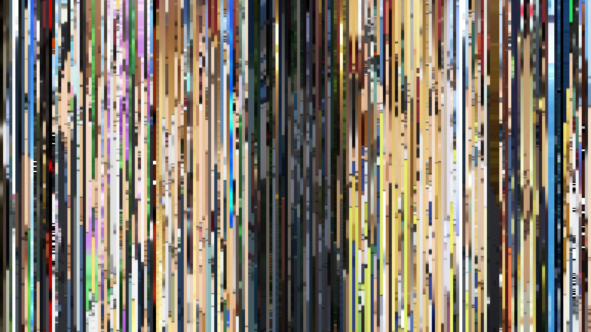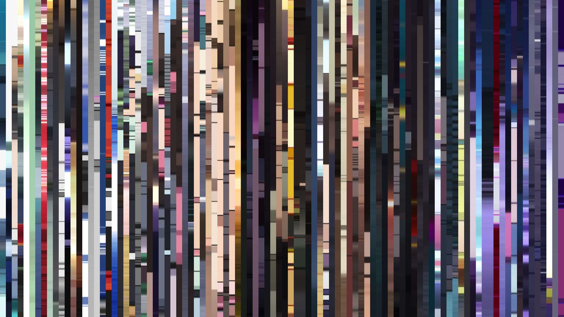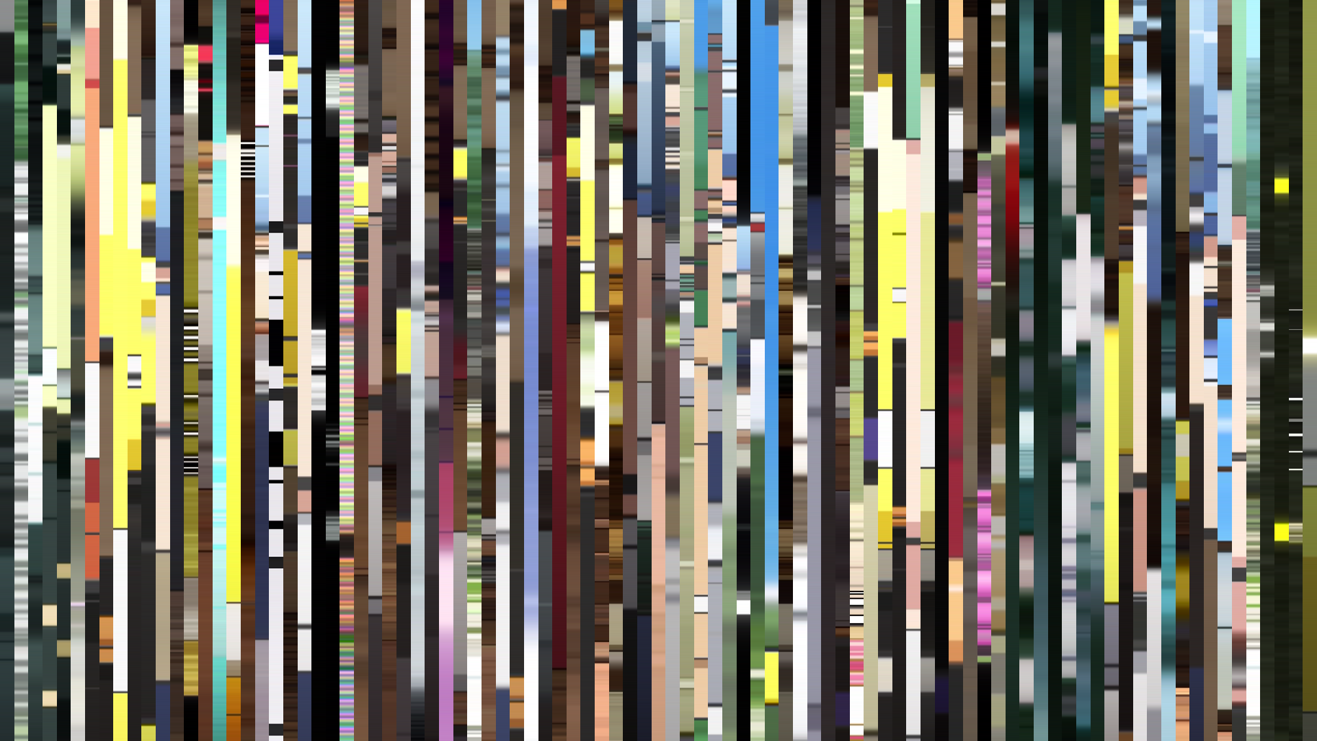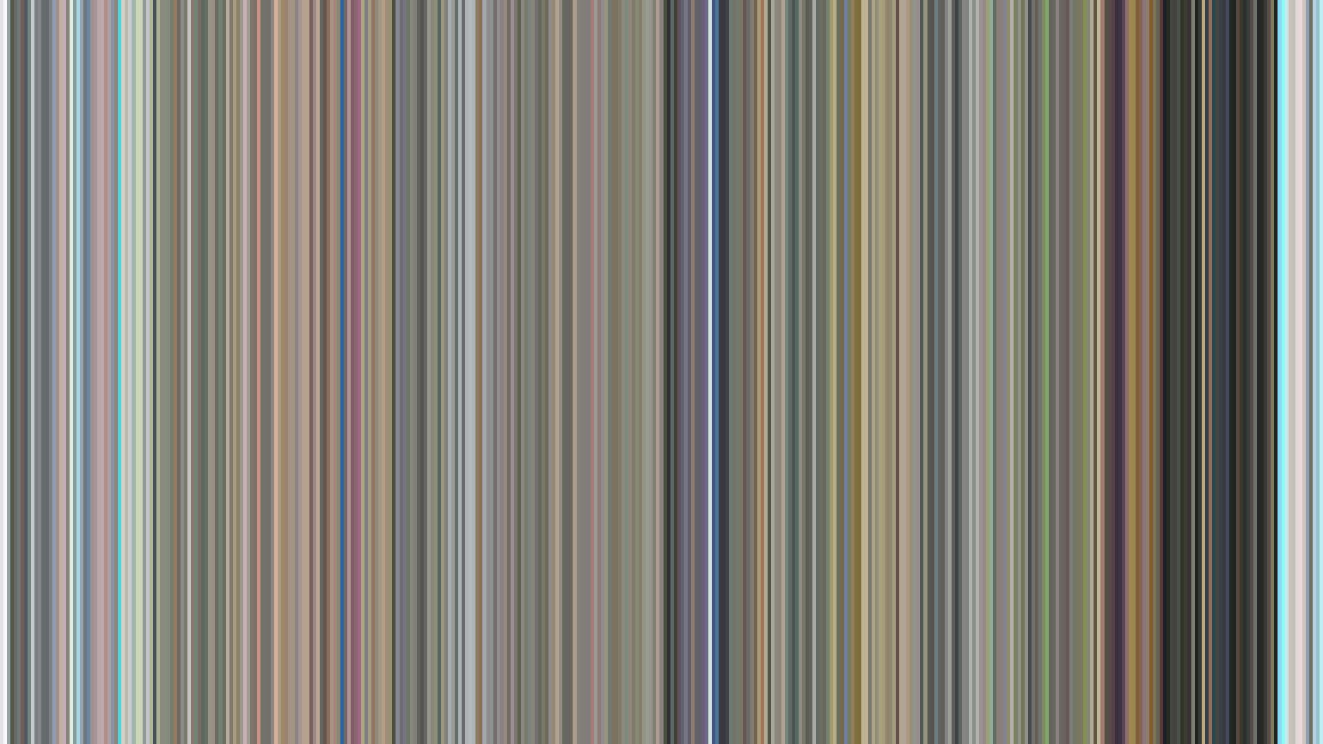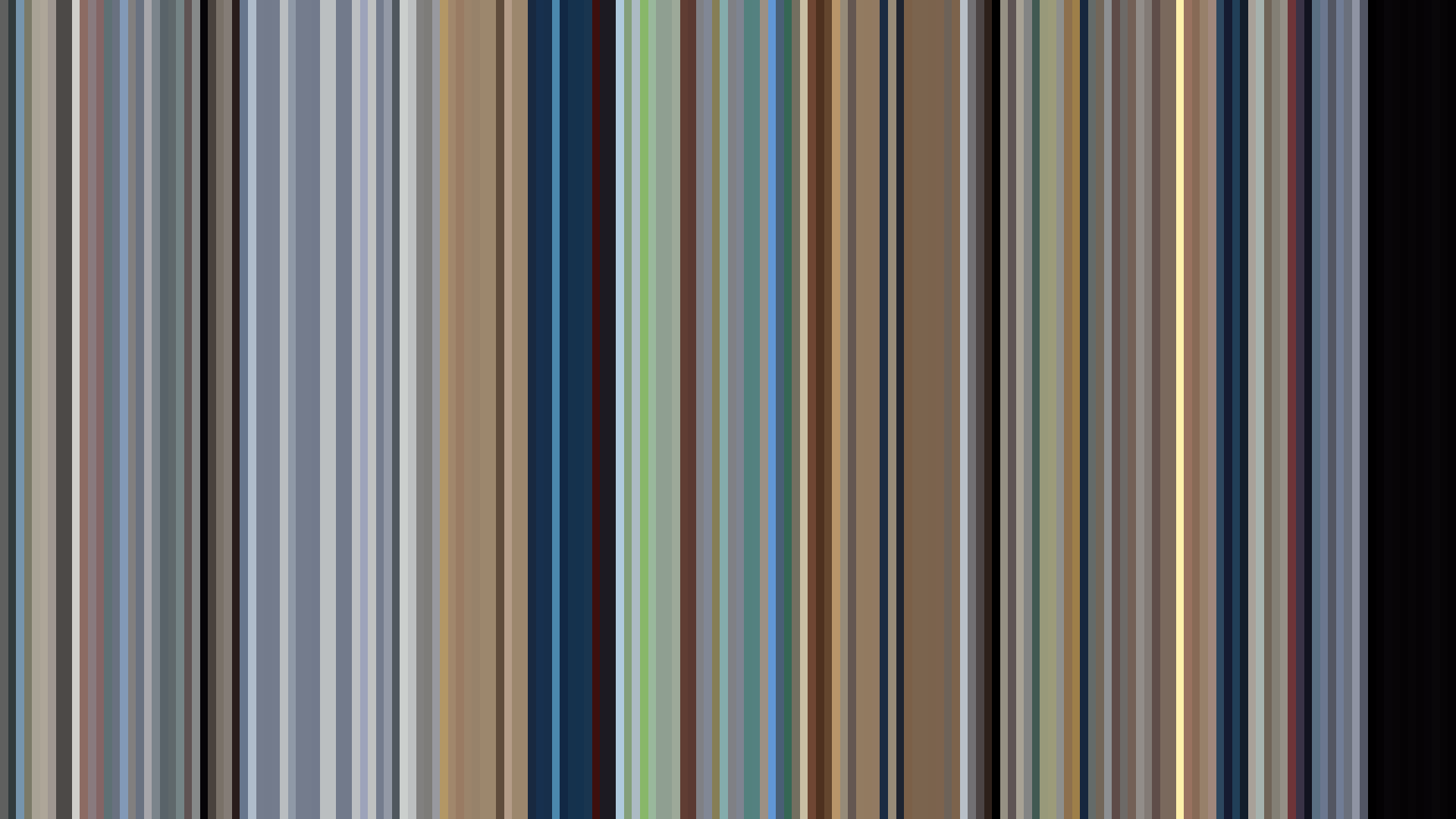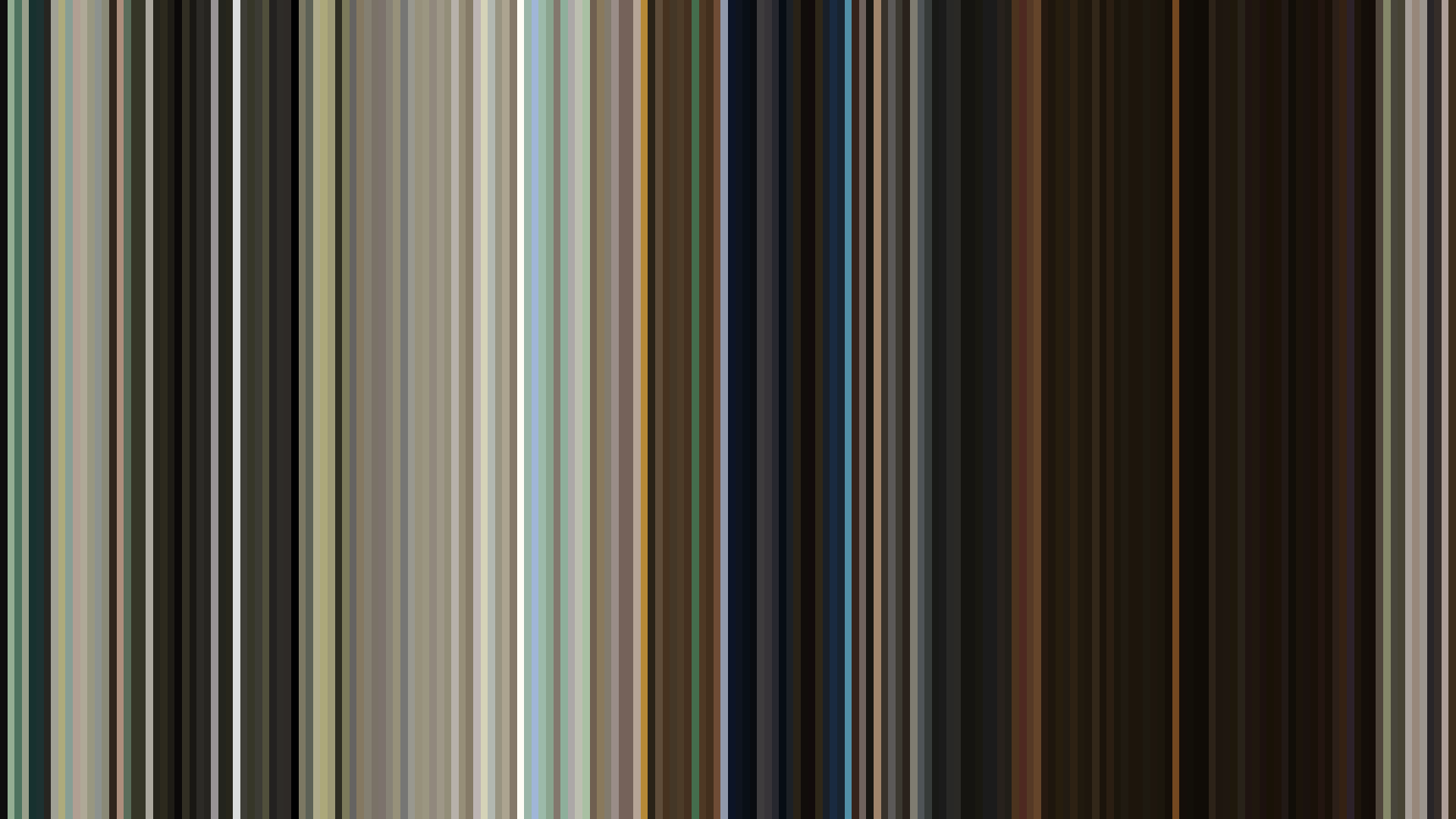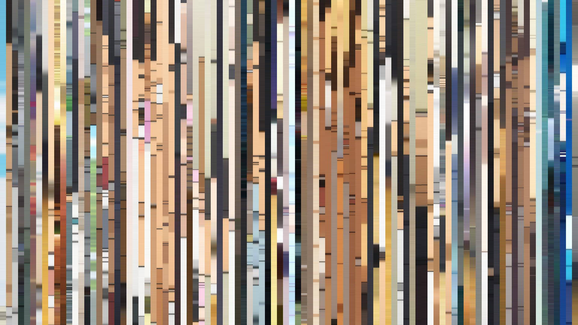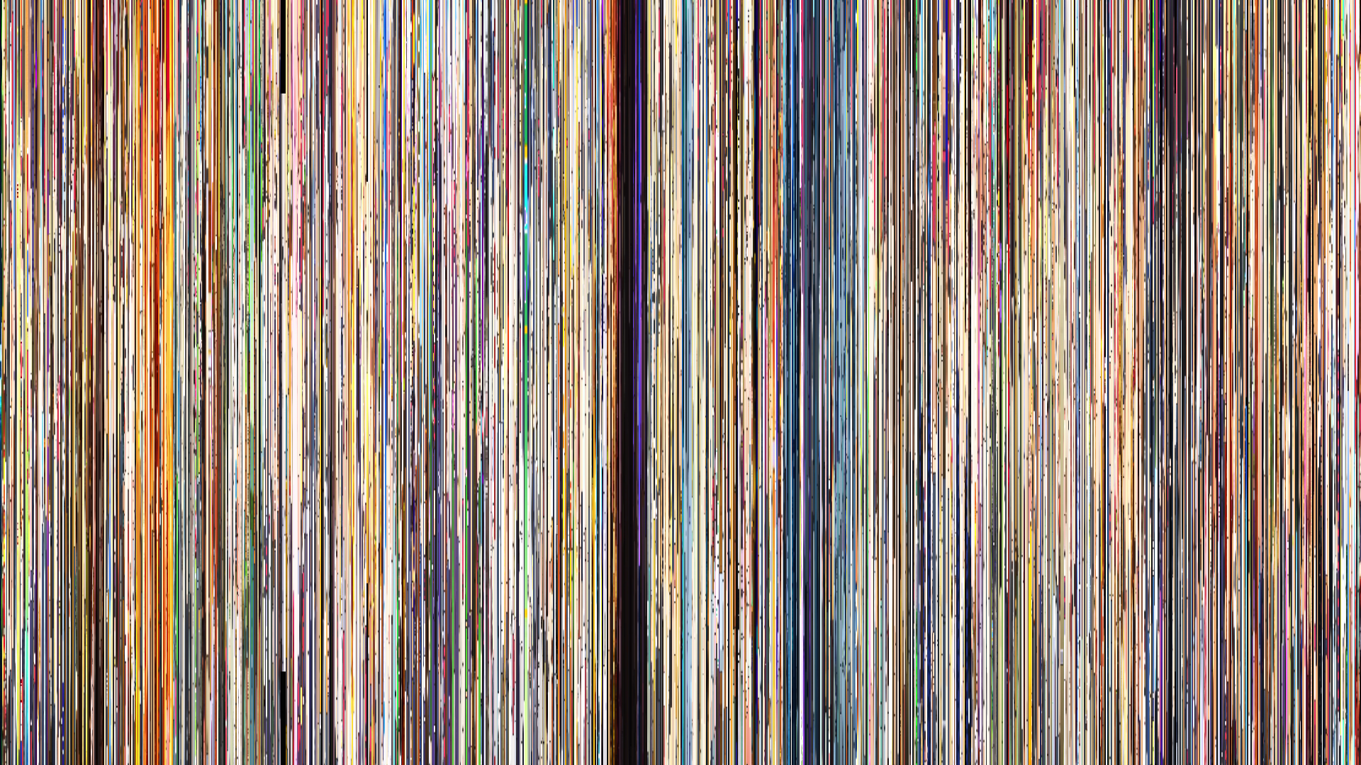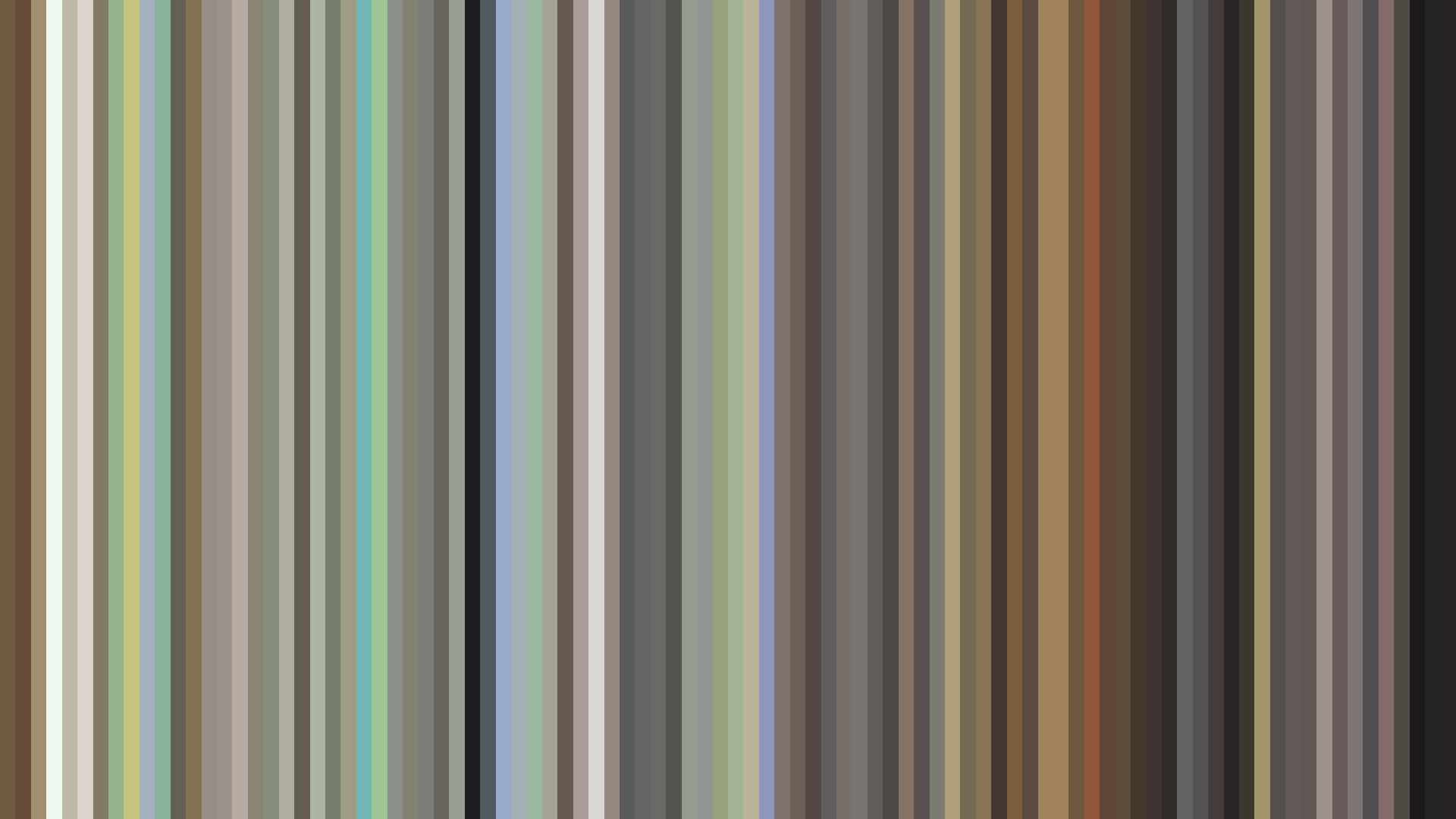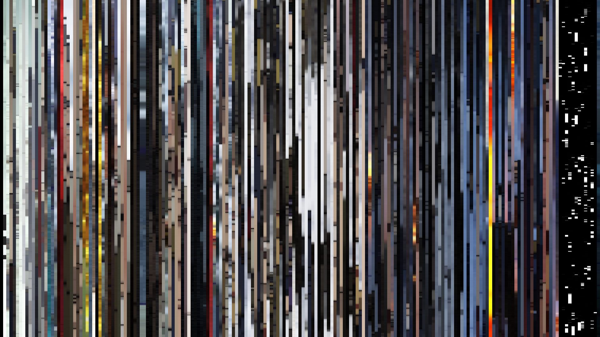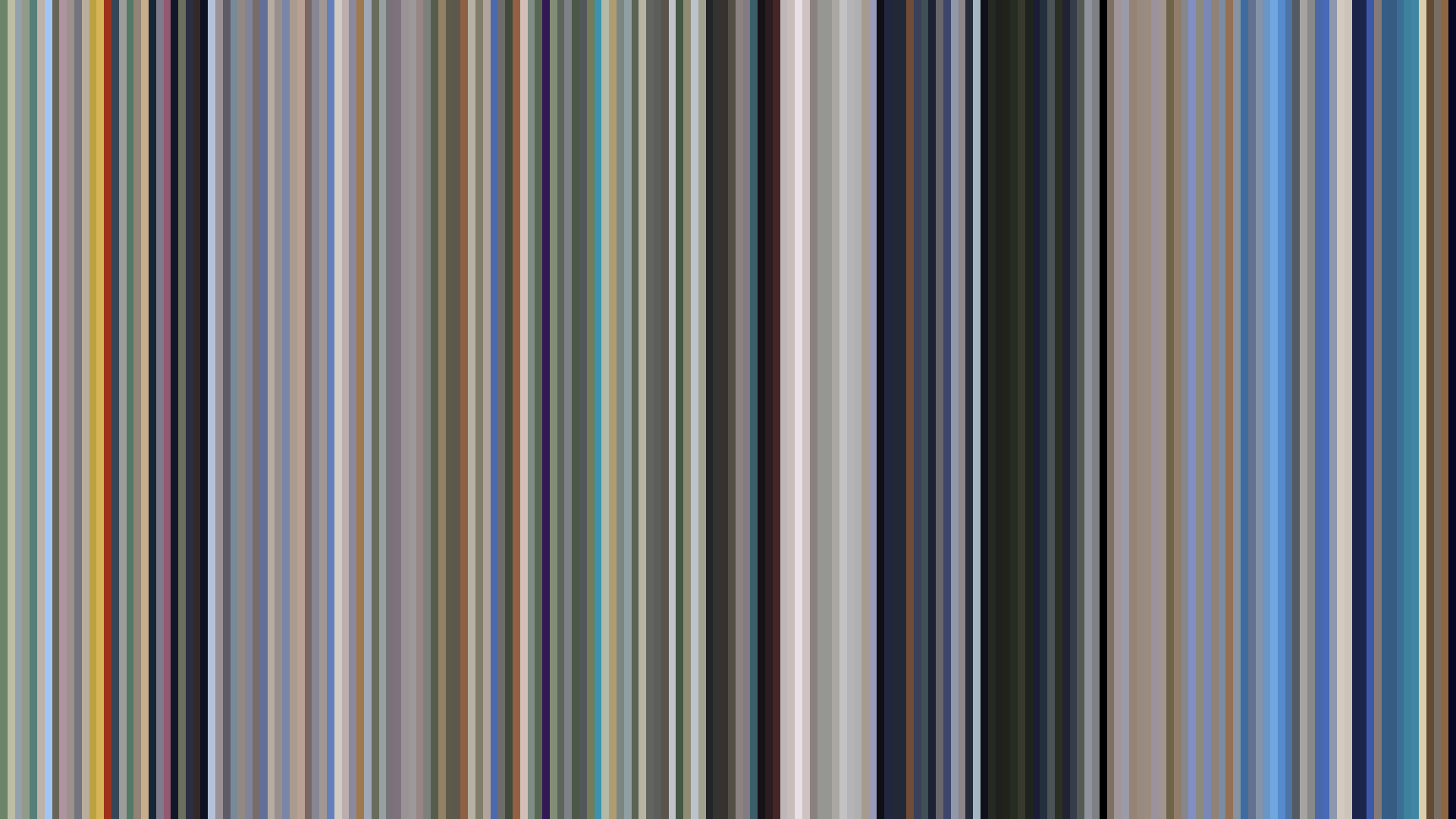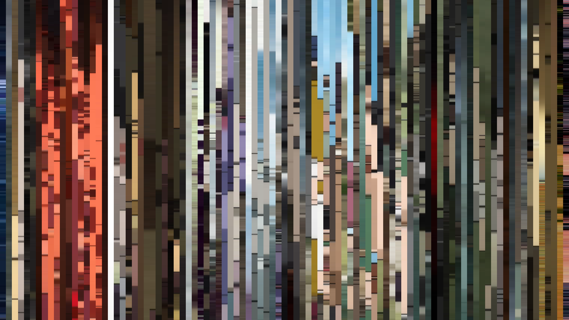


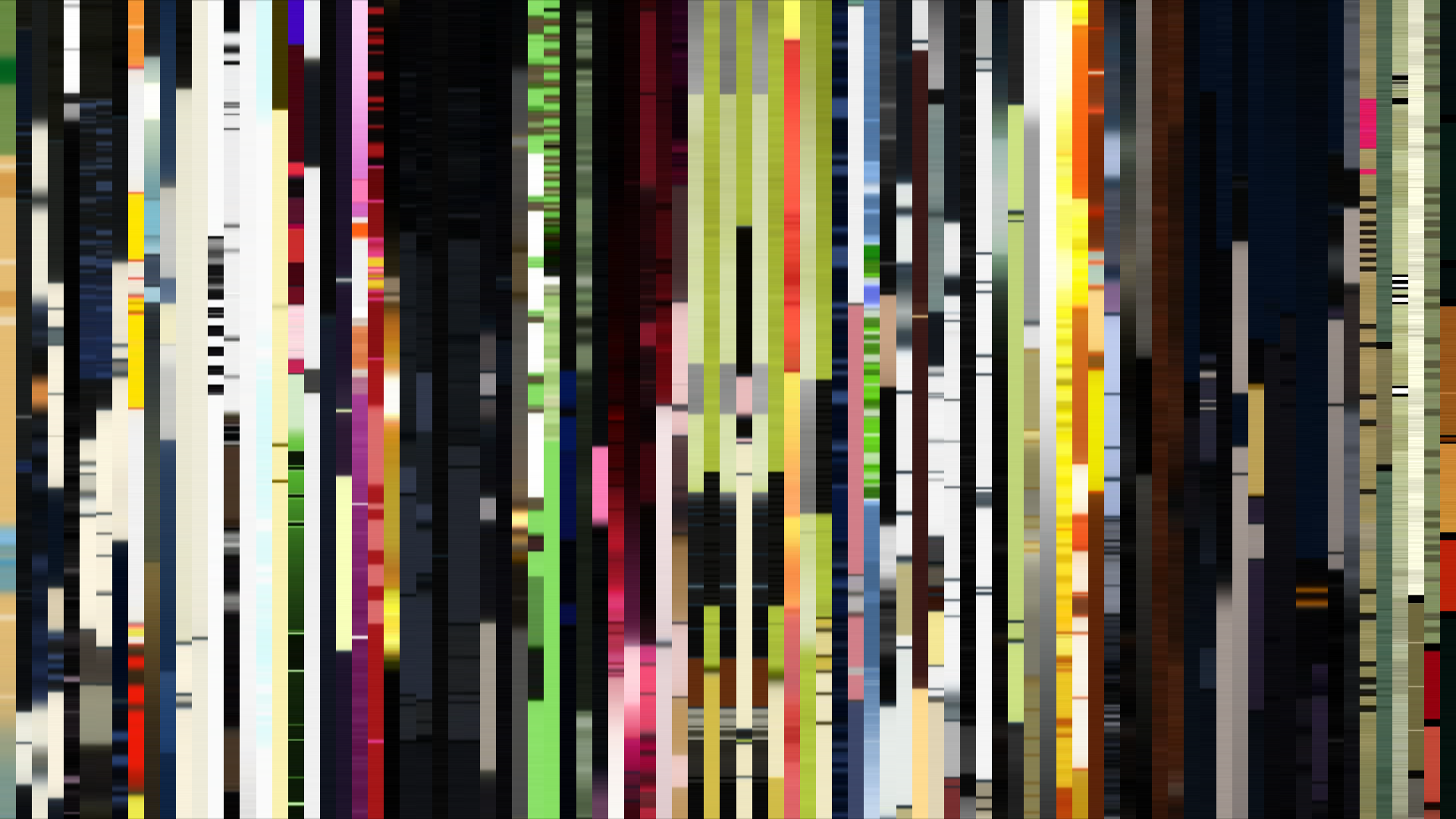
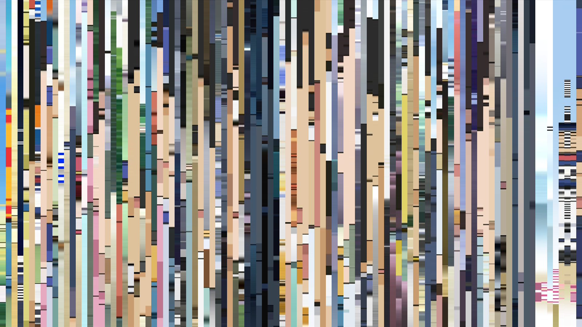
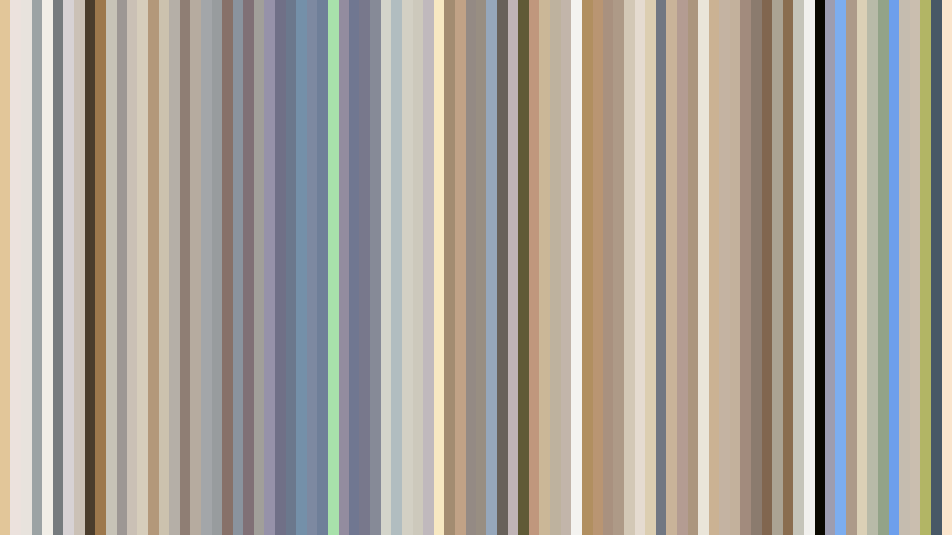
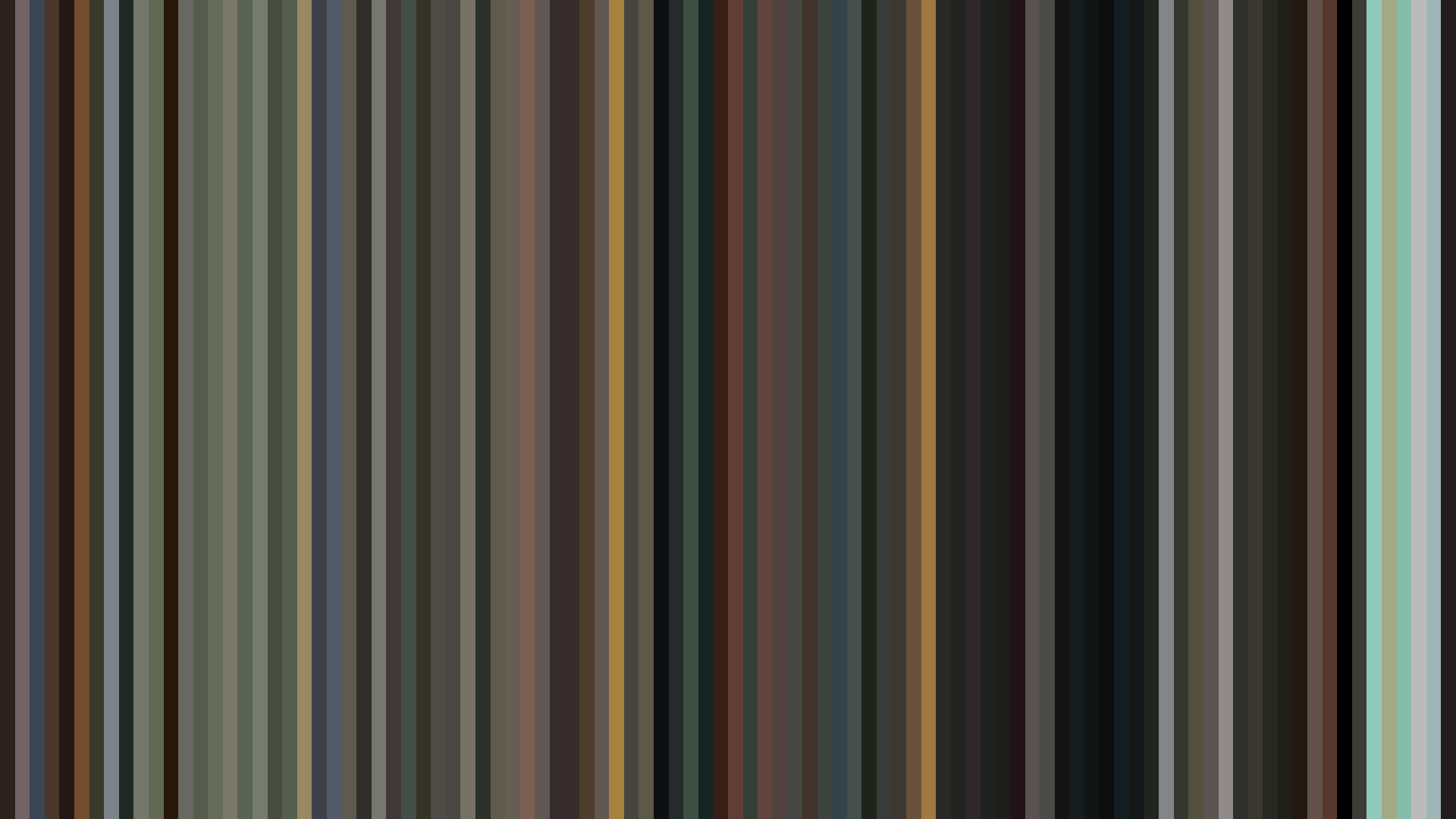
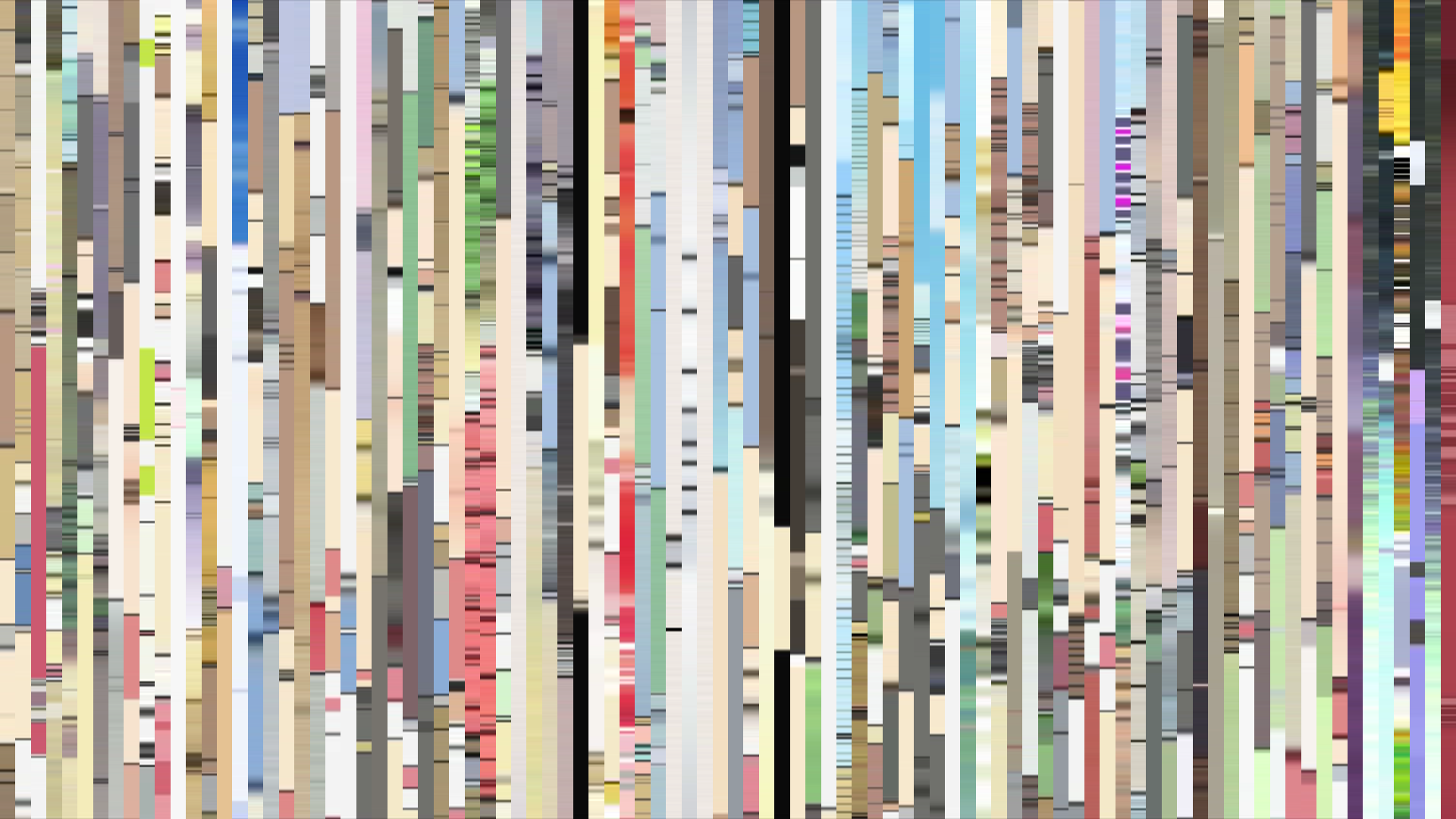
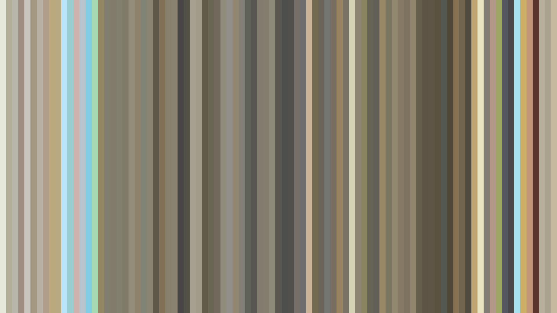
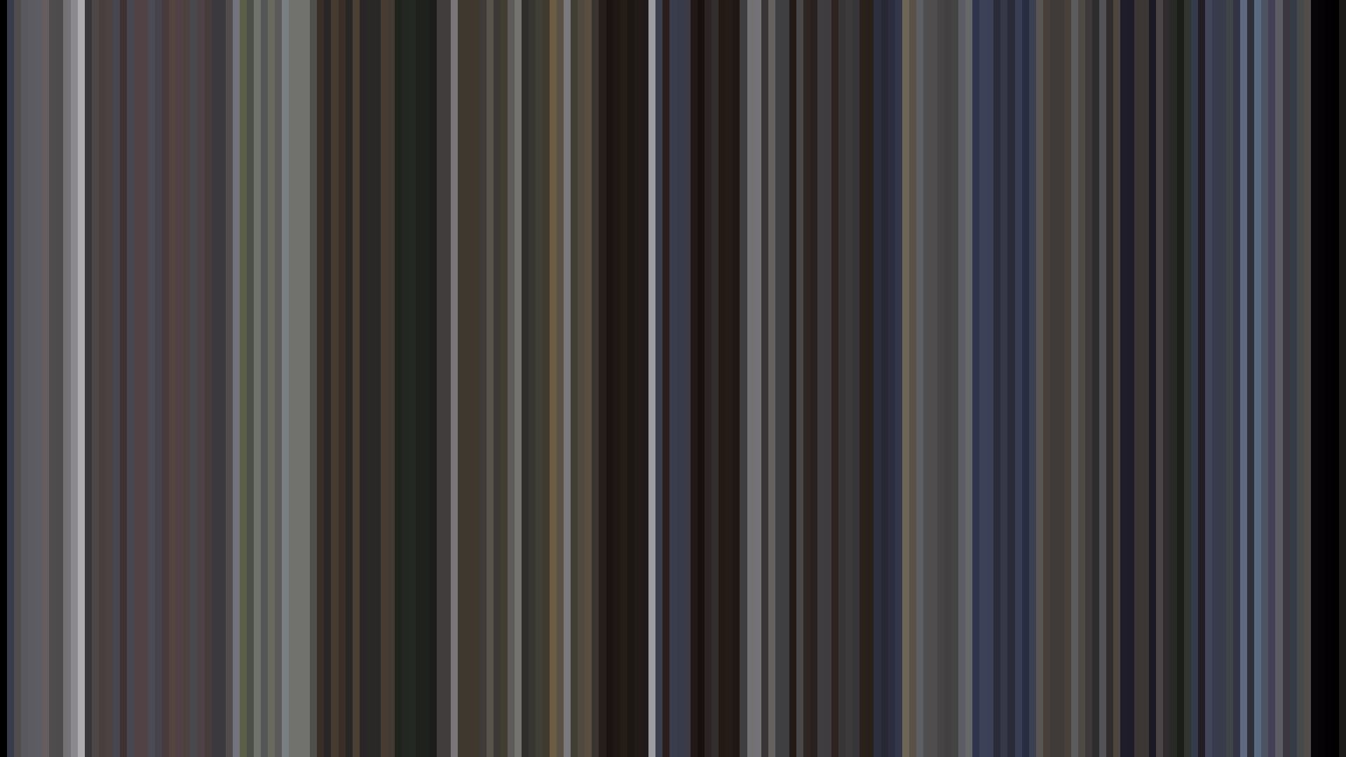
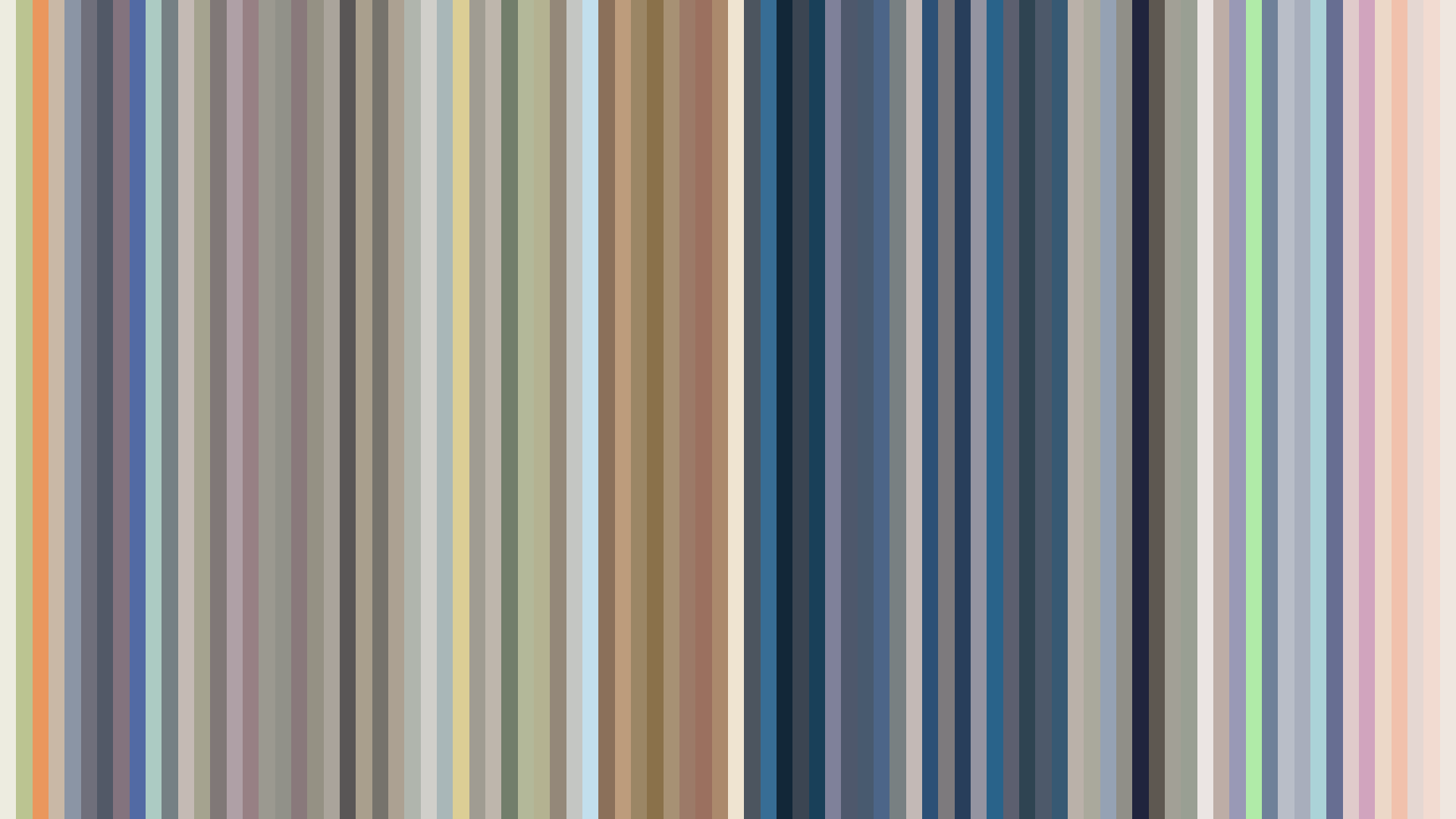
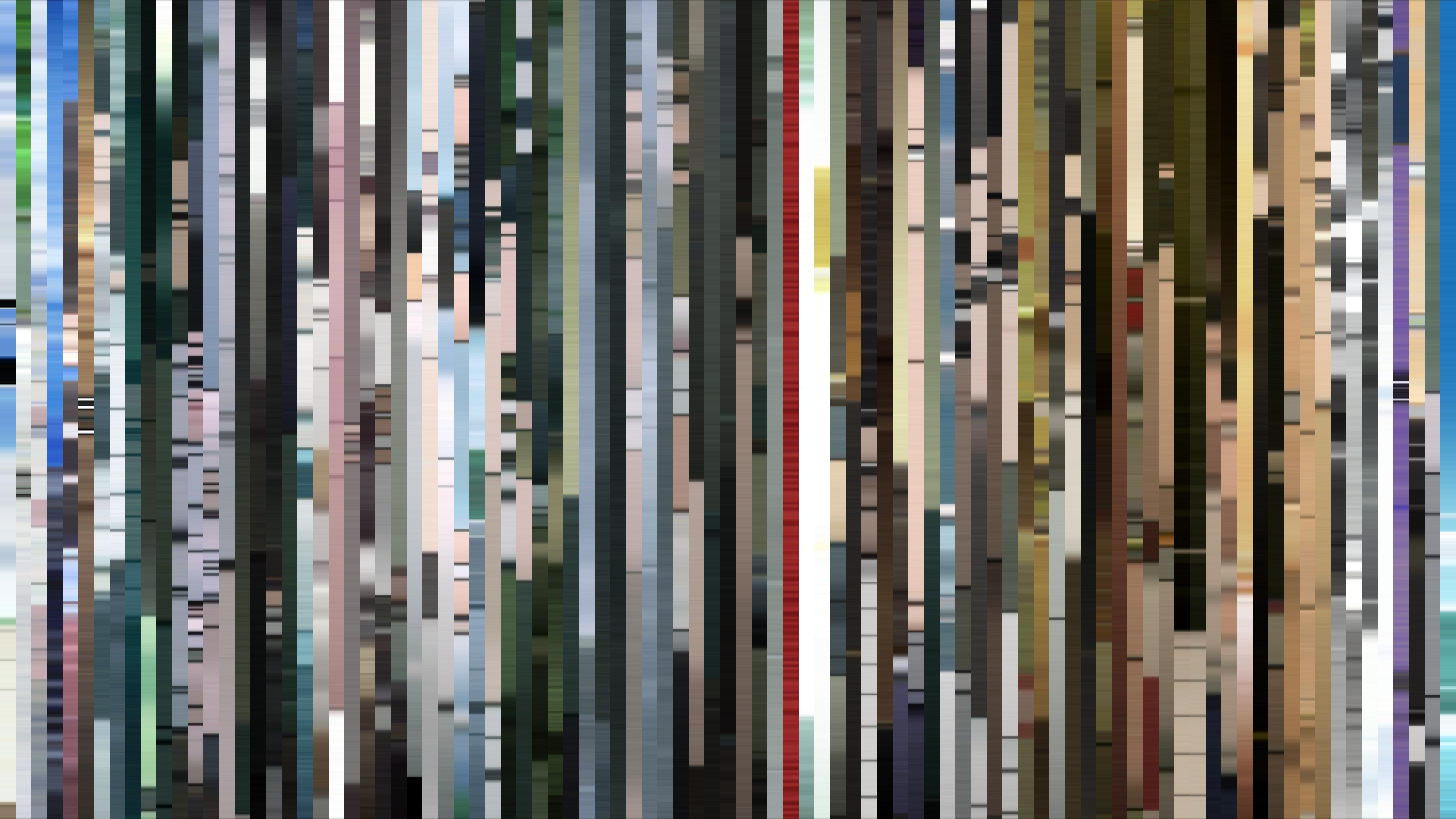
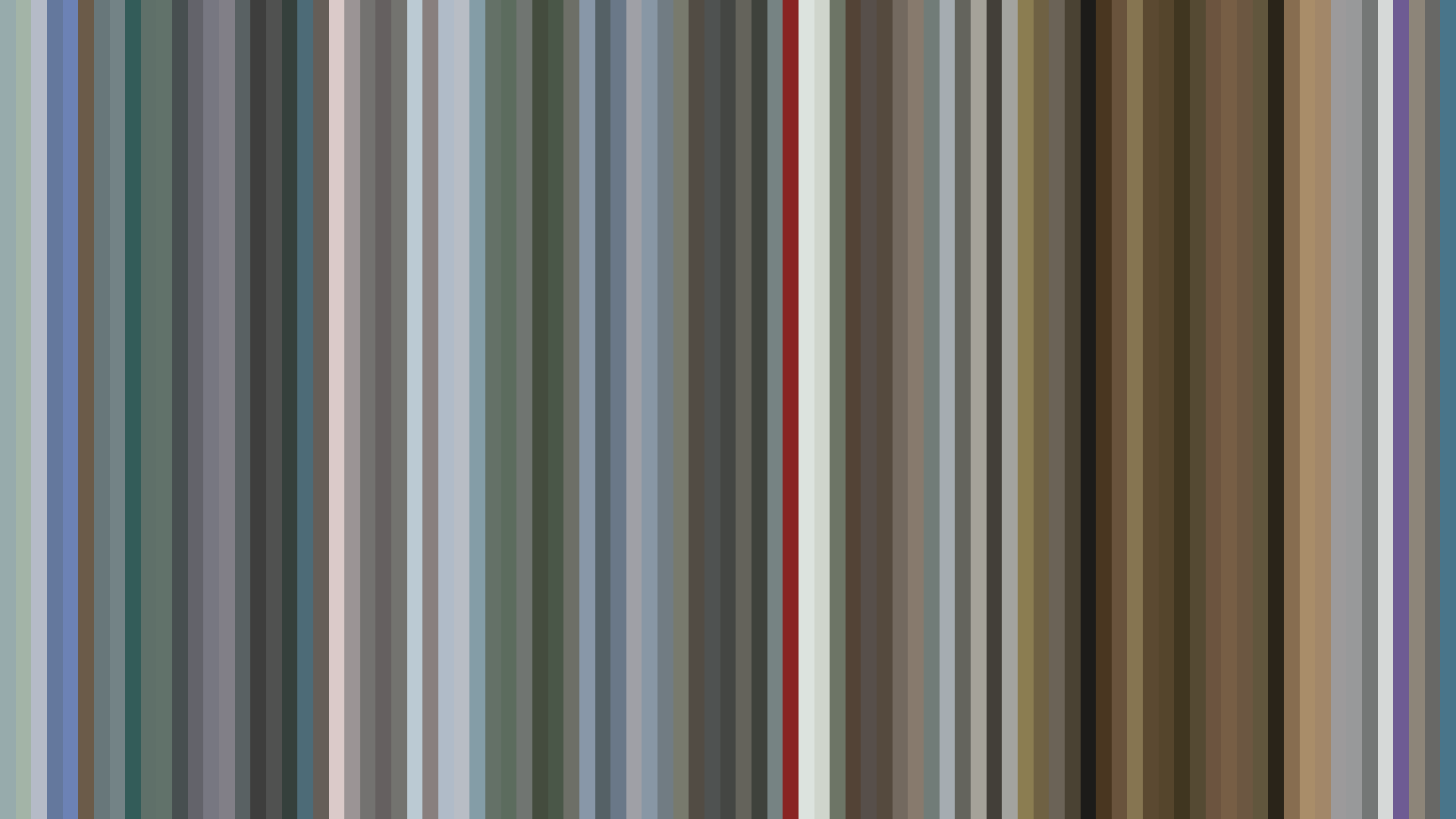
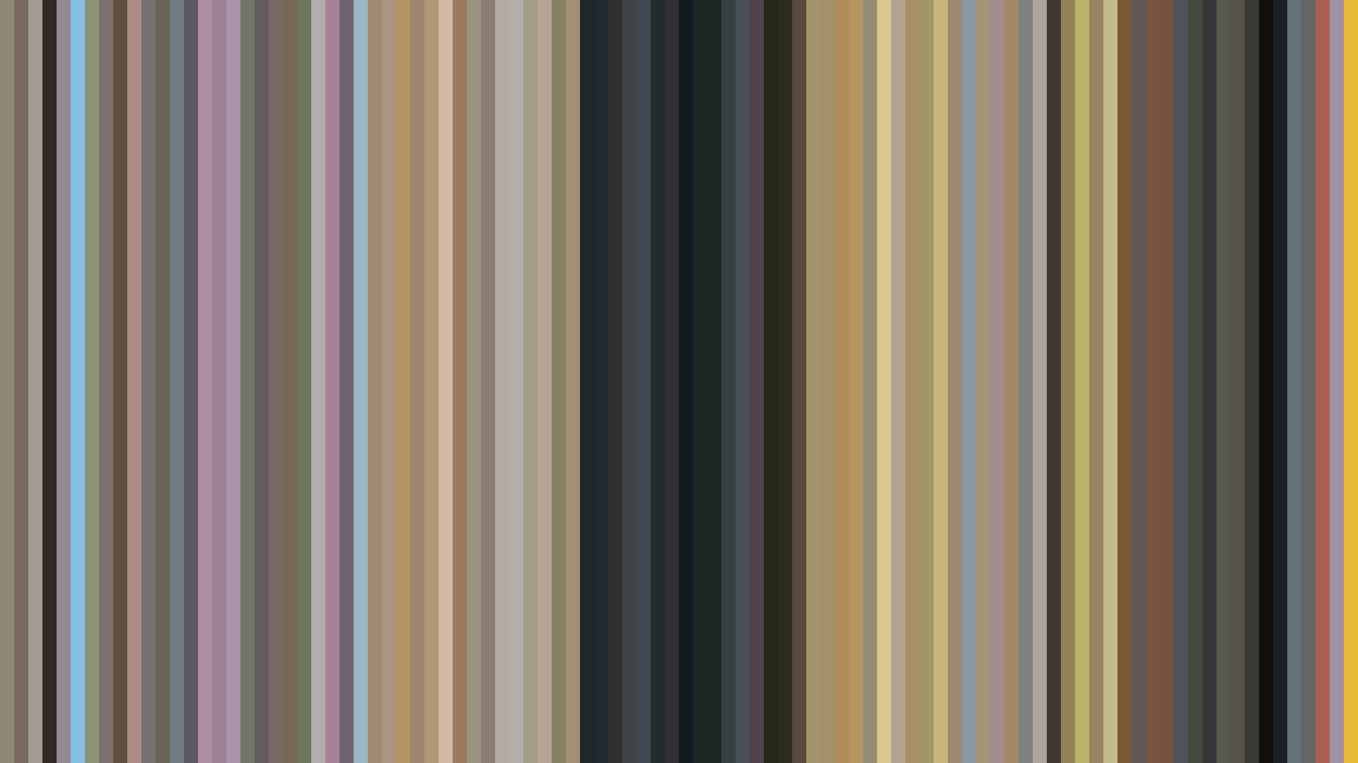
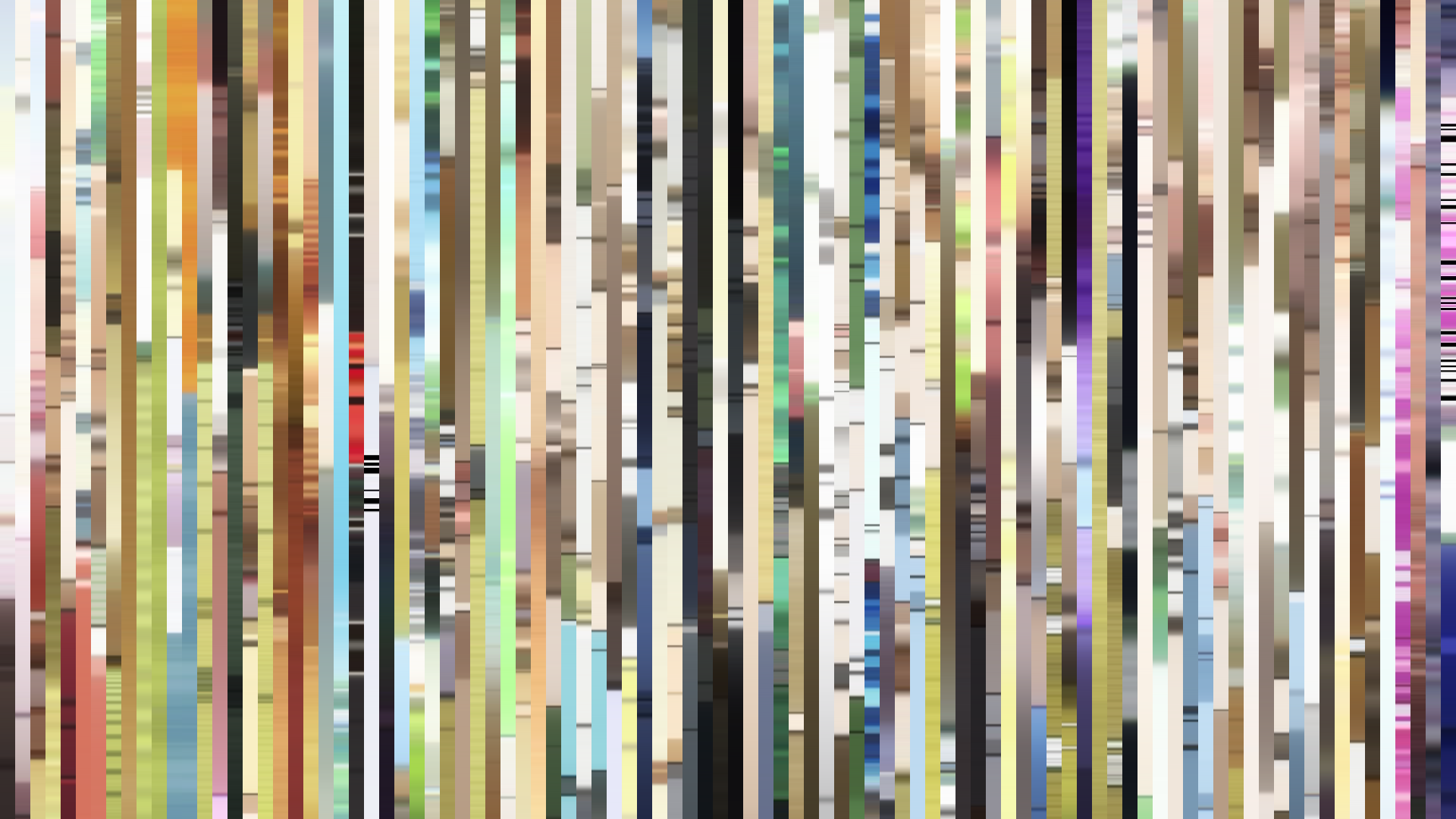
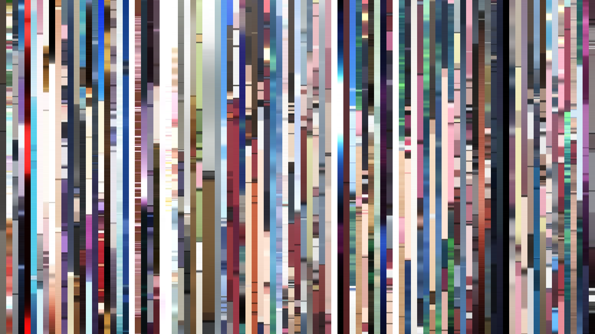
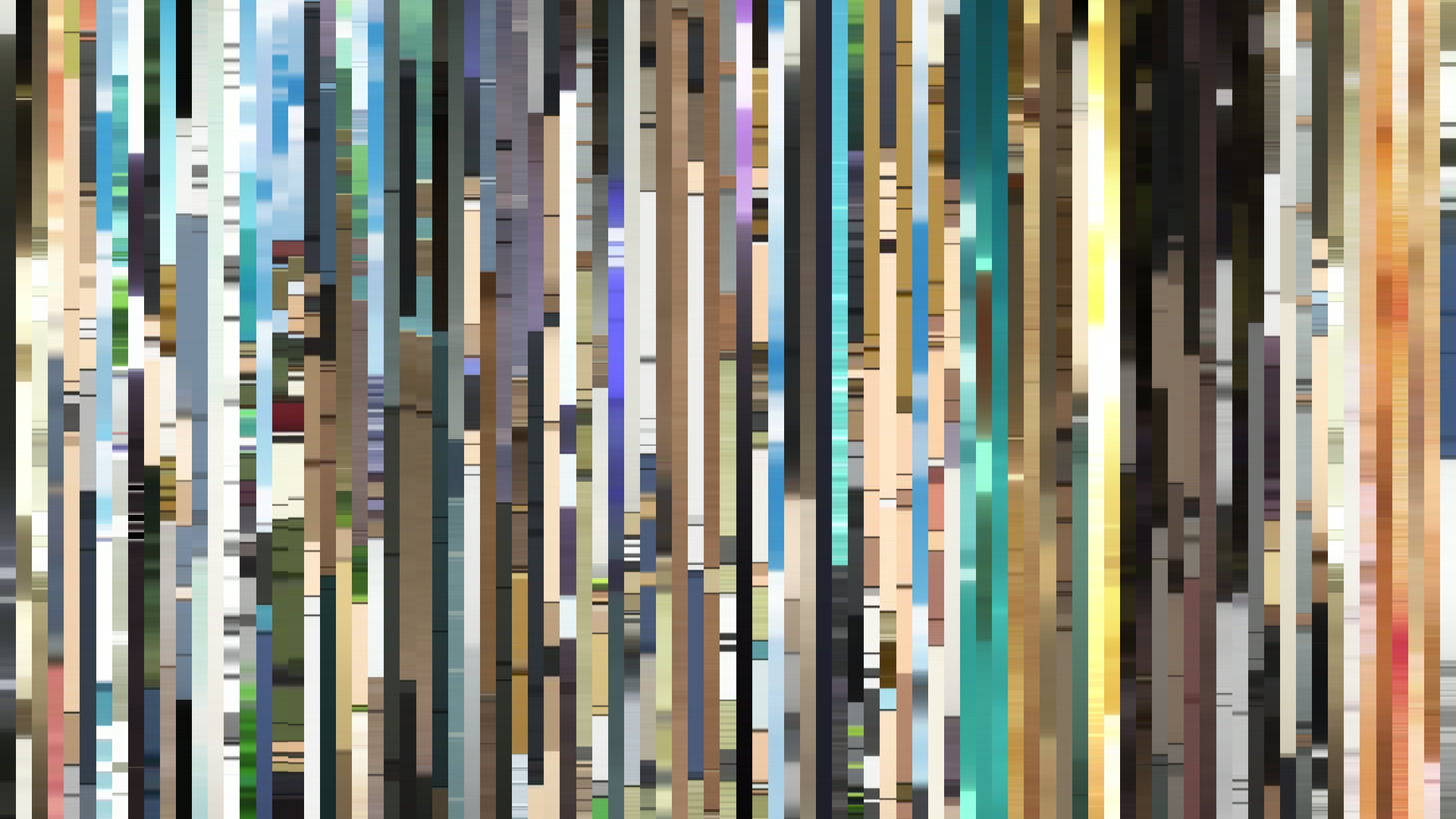
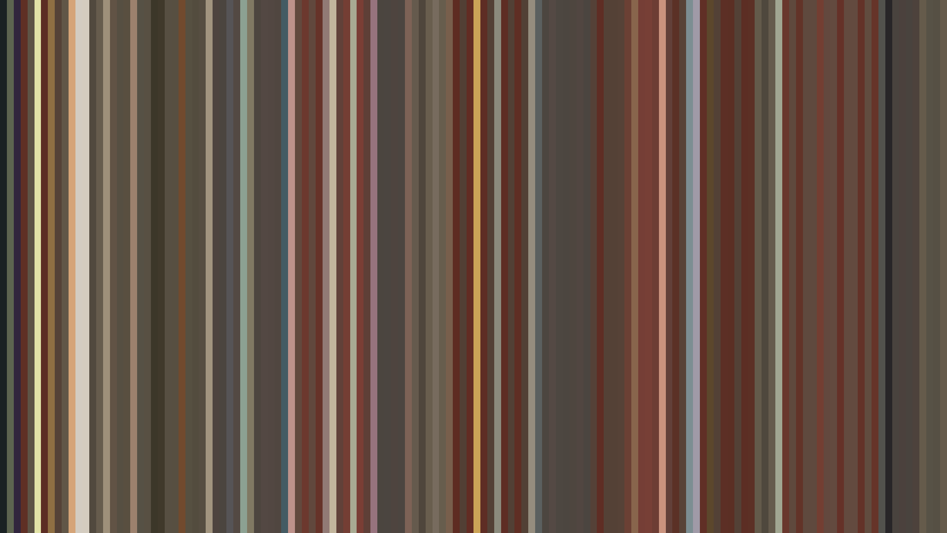
The 2010s is the decade the medium stopped being shy about its tools. Ninety-nine titles span this set, and almost half of them — forty-eight — return a Red-Orange dominant hue, with another thirty-nine reading plain Red. That leaves twelve outliers across an entire decade. The barcodes describe a wholly digital industry: more saturated than the cel era it had just left behind, but also more uniform, settling into a narrow corridor of warm browns, parchment whites, and the ochre that creeps into nearly every palette swatch above a 0.5 brightness floor. The decade's average brightness is 0.468 and its average saturation 0.245 — a middle-of-the-road, well-lit, mostly-cheerful aggregate that hides the fact that the highs and the lows are wider apart than they have ever been.
What changed in the 2010s is not the average. It is the standard deviation. By 2019 a viewer could watch Nichijou at 0.689 brightness and The Promised Neverland at 0.330 in the same season and recognize them, without summary, as belonging to two different genres of light.
Kyoto Animation's Painterly Decade
The KyoAni barcodes between 2010 and 2013 read like a single, sustained argument. K-ON! Season 2 (Kyoto Animation, 2010, brightness 0.499) opens the run with the studio's signature palette — #EDE9DF as the dominant light, #CBB2A3 for the warm midtones, and the soft pastel arc-up that places the show's emotional climax at its midpoint rather than its end. A year later, Nichijou (2011, brightness 0.689, saturation 0.142) hits the highest brightness reading of the decade with a flat arc — meaning the show never lets the light off. Its palette is almost monastic in its commitment to warmth: #EAE7DE, #DDD4B0, #D1AA99, no black anchor below #686461. The studio under Tatsuya Ishihara made the decision, mathematically visible in the dataset, to refuse contrast as a structural device. Most anime achieve drama through tonal collapse — the barcode darkens in the second act. Nichijou simply does not. The flat arc is the philosophy.
In an industry where brightness correlates with optimism, Nichijou is the decade's most unabashedly joyful artifact, and it is no accident that the Kyoto Animation studio that produced it would, by 2018, be making Violet Evergarden — a show whose 0.499 brightness and falling arc reads as the same painter's hand applied to grief.
By Sound! Euphonium 2 (2016, brightness 0.511, dark opening) and Violet Evergarden (2018, brightness 0.499, falling arc) the studio has internalized that its pastels can do funeral work as well as picnic work. The KyoAni palette of late decade is still warm — every dominant hue stays Red or Red-Orange — but the arcs have curdled. Where Nichijou was flat by conviction, Violet Evergarden falls deliberately, the saturation dropping to 0.184 and the dominant tones shifting from cream to the bruised #483A34 that closes its palette. Naoko Yamada's directorial generation learned to grieve in the same colors they had once celebrated.
Shaft, White Fox, and the Look of the Digital Era
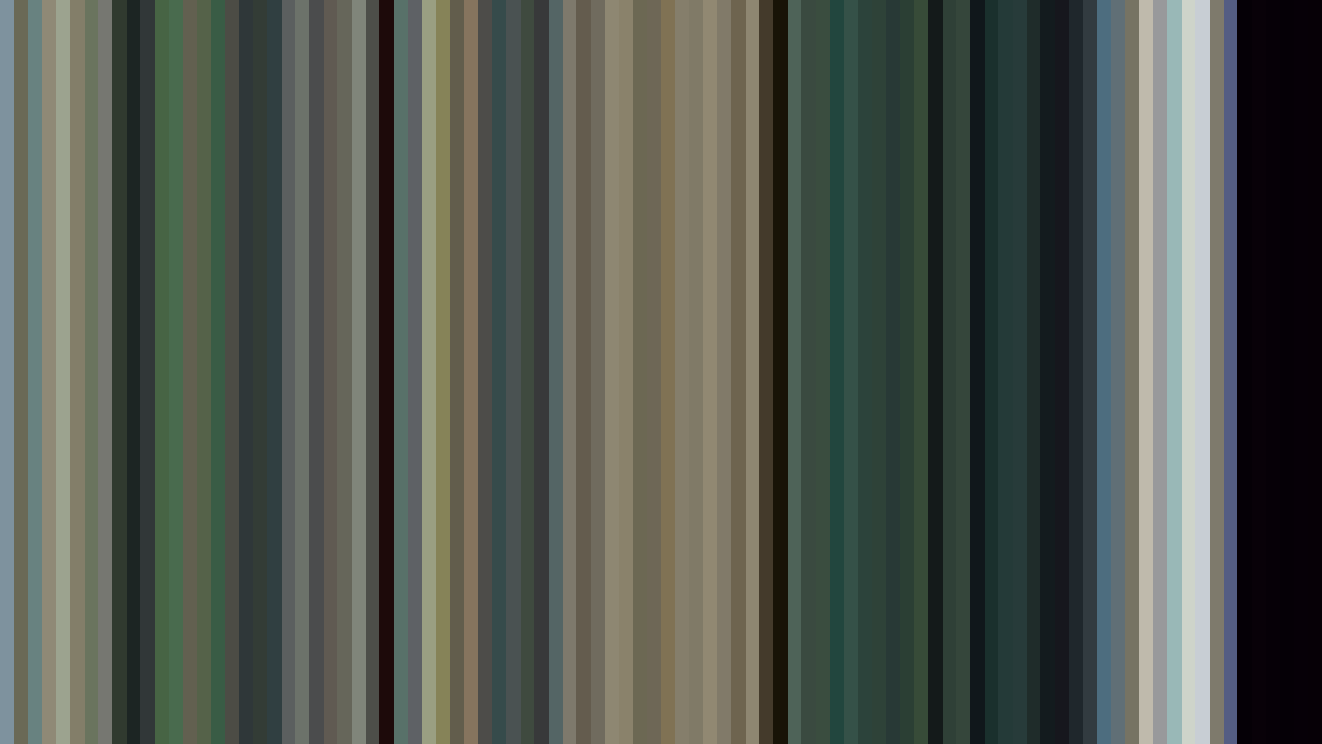
If KyoAni was the painterly center of the decade, Shaft was its experimental wing. Akiyuki Shinbo's studio shows up five times in the set, and four of those entries — Nisemonogatari, Monogatari Series: Second Season, Owarimonogatari, and Hidamari Sketch x Honeycomb — share a palette grammar that looks, in the data, like nothing else from the decade. Monogatari Series: Second Season (2013) returns a saturation of 0.461. Owarimonogatari (2015) goes higher: 0.490. These are the highest saturation readings in the entire decade. The Monogatari palette — #190E0A, #582614, #9E5823, #EED7A5 — is the visual signature of late-period Shaft: deep oxblood, terracotta, candle-yellow. No realism. The barcode of these shows looks less like animation than like enamel.
Set against that, Hidamari Sketch x Honeycomb (2012, brightness 0.727, the highest in the decade) demonstrates that Shaft's chromatic instincts also worked in the opposite direction. The same studio that drowned its supernatural mysteries in oxblood could produce a slice-of-life palette anchored on #E8E7E1 and #B1D2E1 — the only Shaft entry where a sky-blue creeps into the top six swatches. Shinbo's Puella Magi Madoka Magica (2011, brightness 0.570, bright opening) sits at the median of those extremes. Its palette is unexpectedly light — #ECEAE1 dominant, #DCD3B1 for highlights — which is the show's whole trick: the barcode lies, and the lie is the point.
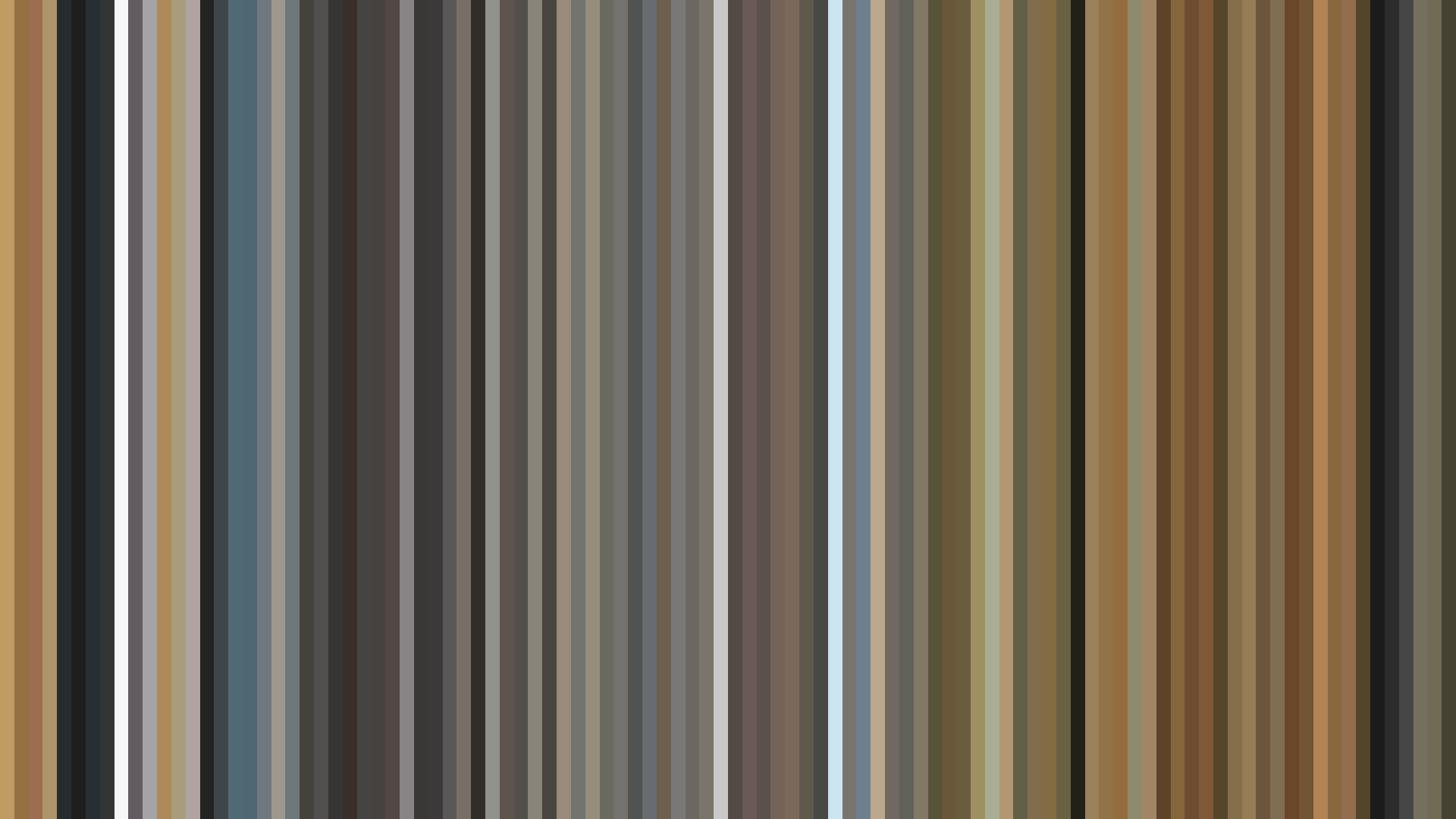
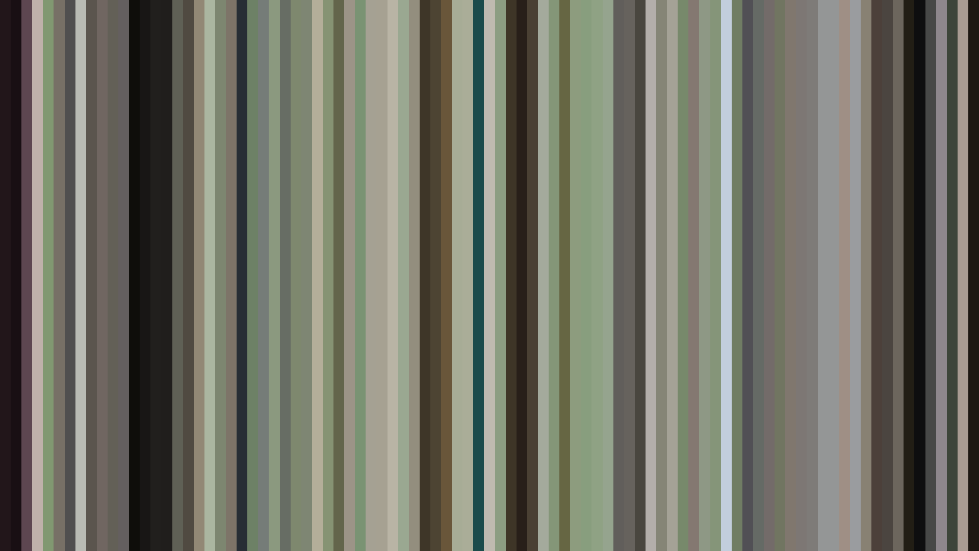
White Fox built a quieter house style across the decade. Steins;Gate (2011, brightness 0.423, saturation 0.122 — the lowest saturation reading in the entire 2010s set), Steins;Gate 0 (2018, 0.375), and Re:ZERO (2016, 0.336) form a triptych of desaturated, slightly cold palettes — Hiroshi Hamasaki's Steins;Gate in particular reads as Green-dominant with cold blue-grey midtones (#2C3647, #39474A) that no other show in the decade quite reproduces. White Fox's contribution to the decade was the establishment of a specifically flat digital register: nothing pops, nothing glows, the contrast is held back. It is the visual grammar of the laboratory and the parallel world, and it became the default palette for a certain kind of psychological sci-fi for the rest of the decade.
ufotable and the Industrial Sublime
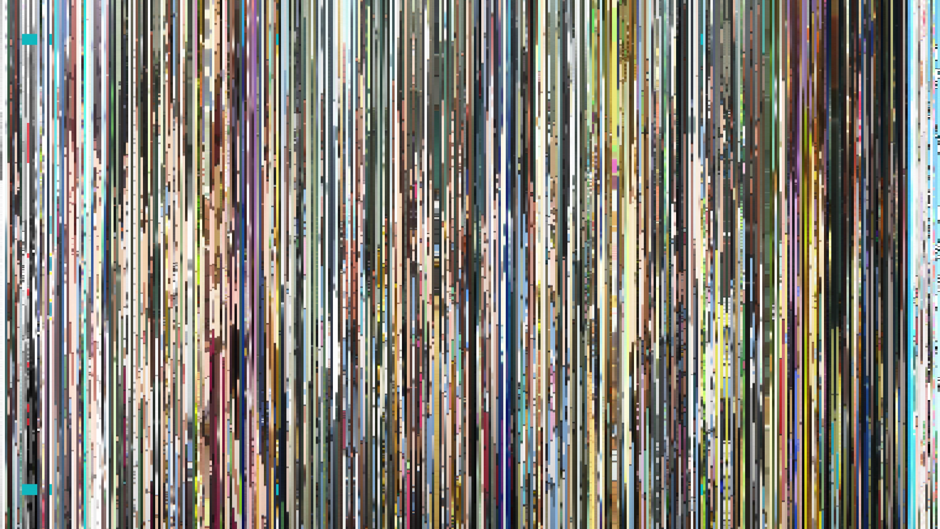
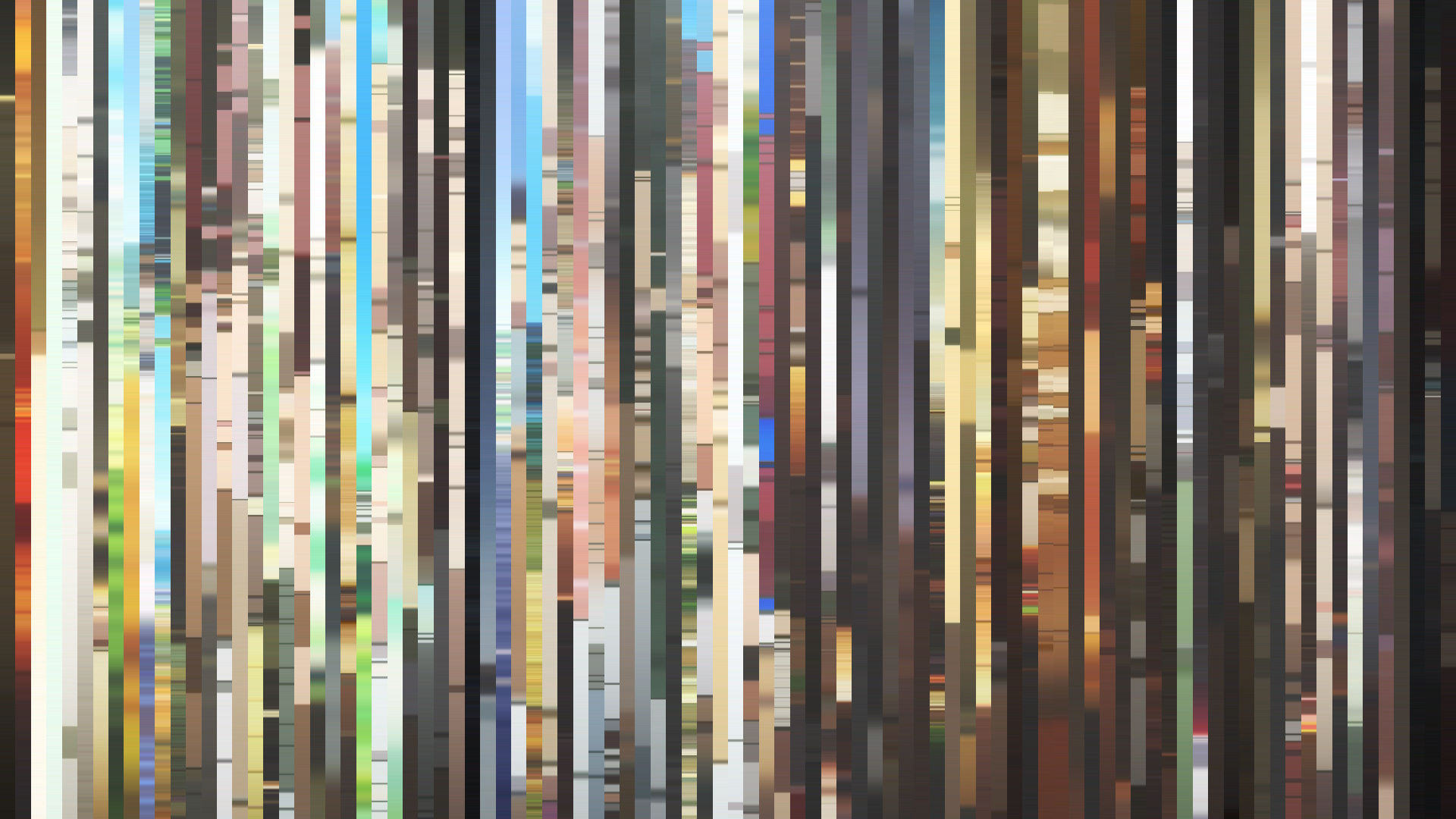
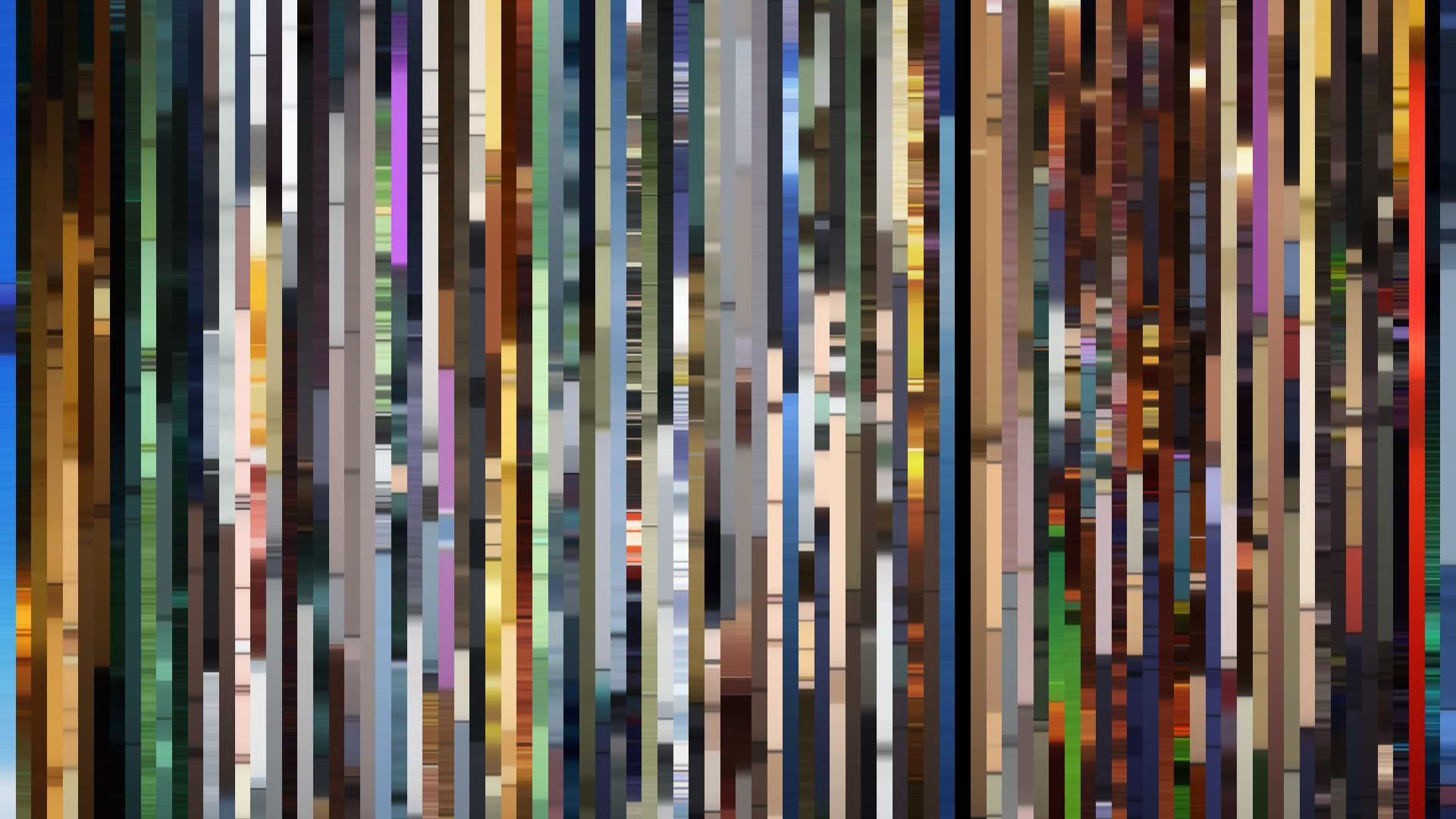
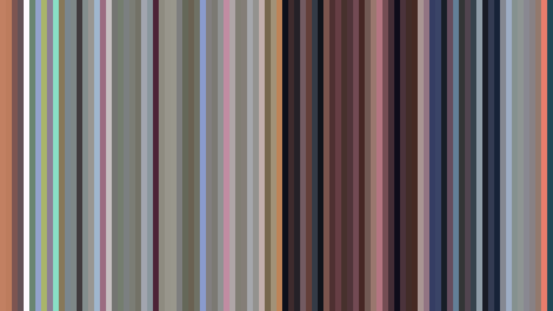
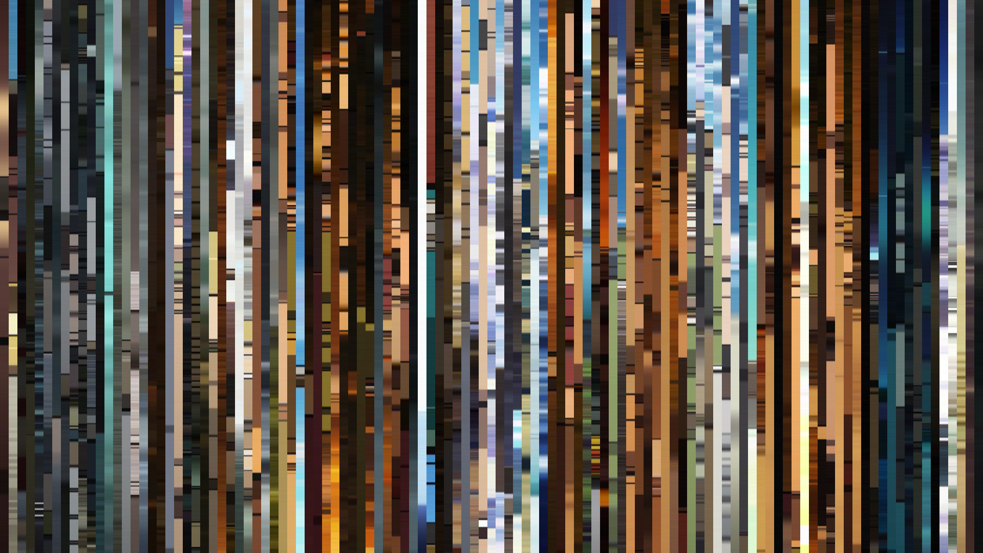
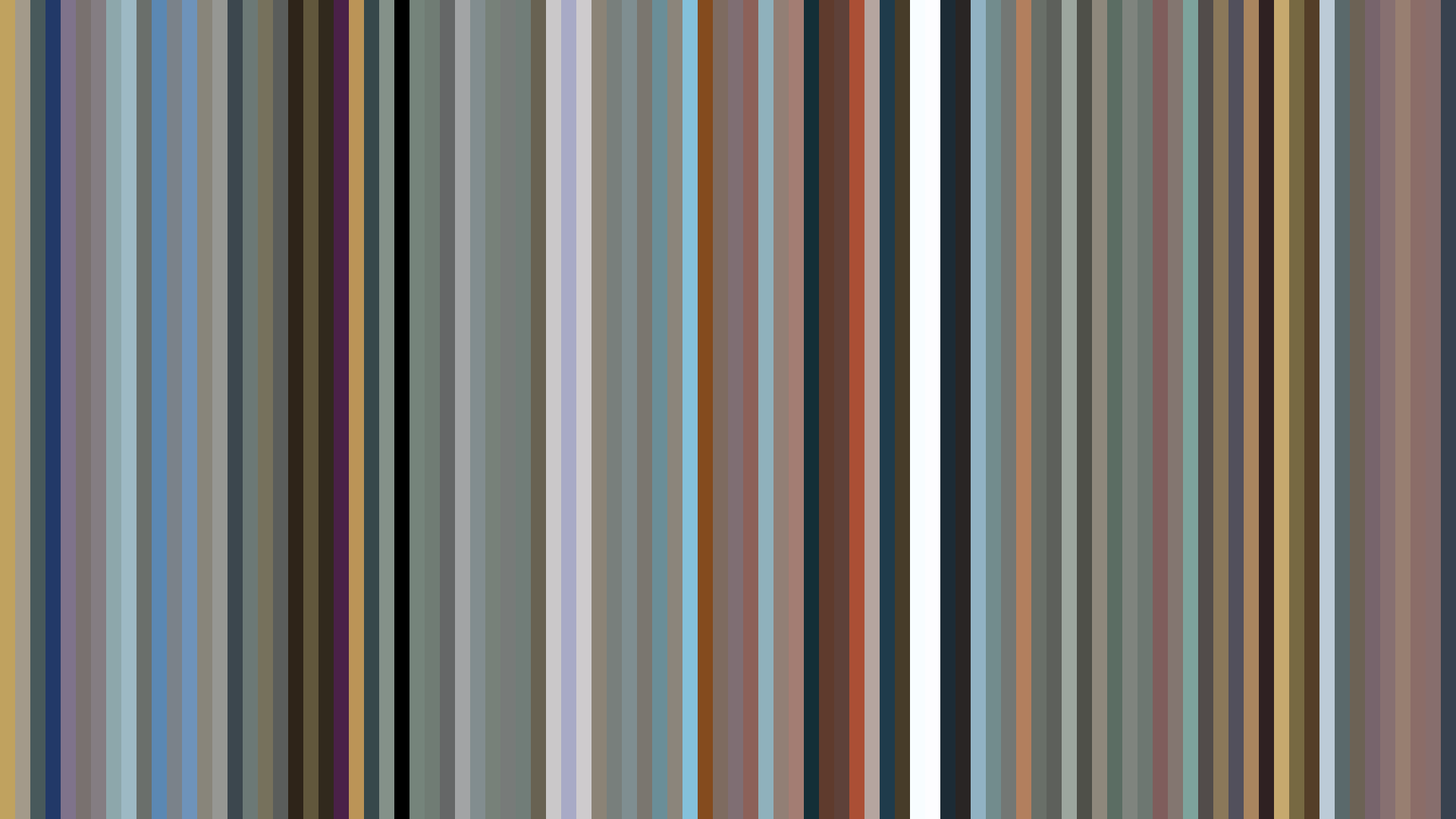
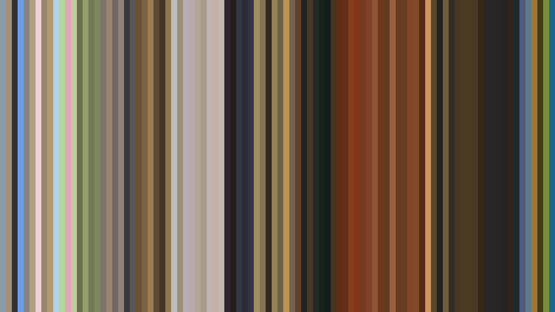
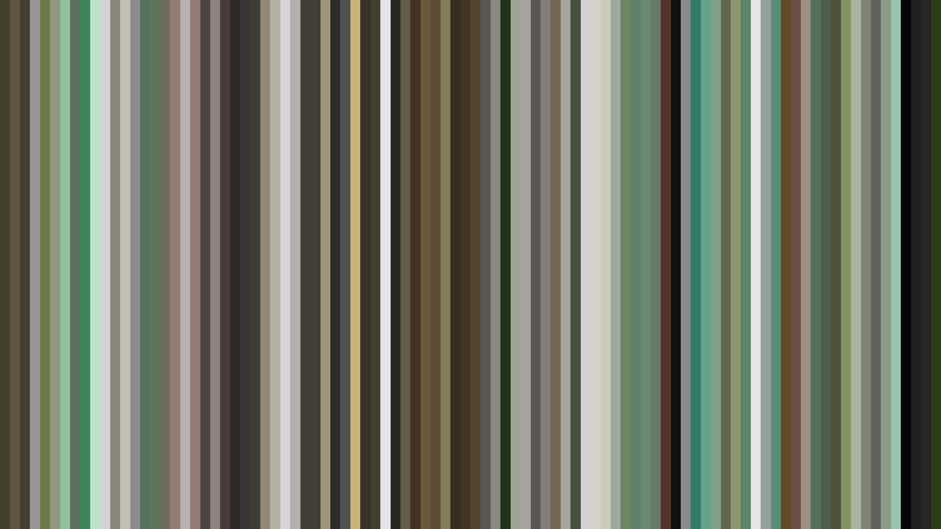
Fate/Zero (ufotable, 2011, brightness 0.262, saturation 0.154) is the decade's first major statement on what high-budget digital anime would actually look like at the dark end. The palette — #252224, #5C5A5A, #939396, #453733, #343747 — is almost monochromatic. Five swatches of charcoal and one of muddy purple-brown. The arc opens dark and stays there. This is not the soot-and-candlelight chiaroscuro of Berserk; it is something cleaner, post-production-graded, the digital equivalent of a film noir shot on a RED camera. Fate/Zero Season 2 (2012) repeats the readings precisely. Fate/stay night [Unlimited Blade Works] (2014) shifts toward Blue-Green dominance with a saturation of 0.395 — ufotable's first real use of color as theatre rather than mood.
Then, in the decade's last year, the same studio produces Demon Slayer: Kimetsu no Yaiba (2019, brightness 0.420, saturation 0.170, dark ending). The palette has become less industrial — #DDE0DF whites are restored, the blacks (#1D1C1F) are softer — but the arc has hardened. Demon Slayer's dark ending is the structural inverse of the flat Nichijou arc. Where the early decade's slice-of-life ethos produced shows that simply refused to darken, the late decade's prestige action ethos produced shows that darkened on schedule.
The Prestige Pivot: Land of the Lustrous, Made in Abyss, Vinland Saga
The 2010s did not really have an art-house wing until 2017, and when it arrived it arrived in three productions whose barcodes have to be read as a generational statement. Land of the Lustrous (Orange, 2017, brightness 0.519, saturation 0.396) is the rare 2010s entry whose palette reaches into a true cobalt: #235BD7, the only fully saturated blue swatch among the decade's major productions. Akihiko Kobayashi's CG-led production used 3D not as cost-cutting but as a chromatic tool — the gem characters are not painted but lit, and the barcode picks up the difference as a saturation spike against an otherwise pearl-white field of #ECEBE5 and #E5D8A7.
Made in Abyss (Kinema Citrus, 2017, brightness 0.365, saturation 0.198, dark ending) does the opposite work in the same year. Its palette of #19201E, #5D625A, #A09E93, and the bruised teal #32504C is the decade's most precise rendition of a daylight world that is structurally hostile. The bright opening of the surface gives way to the dark ending of the descent: a barcode that visually stages the show's whole premise without a single word of plot.
Vinland Saga (Wit Studio, 2019, brightness 0.347, saturation 0.355, flat arc) closes the decade with the most emotionally honest dark palette in the set. #221D1A, #5C5C59, #52311D — peat, iron, dried blood. The flat arc means the show never relents, the inverse of Nichijou's flat-bright argument. By 2019 a slow-burn historical drama could occupy roughly the same brightness register as Berserk had a generation earlier, and no one needed to explain why. The visual grammar of the prestige adult anime had been established.
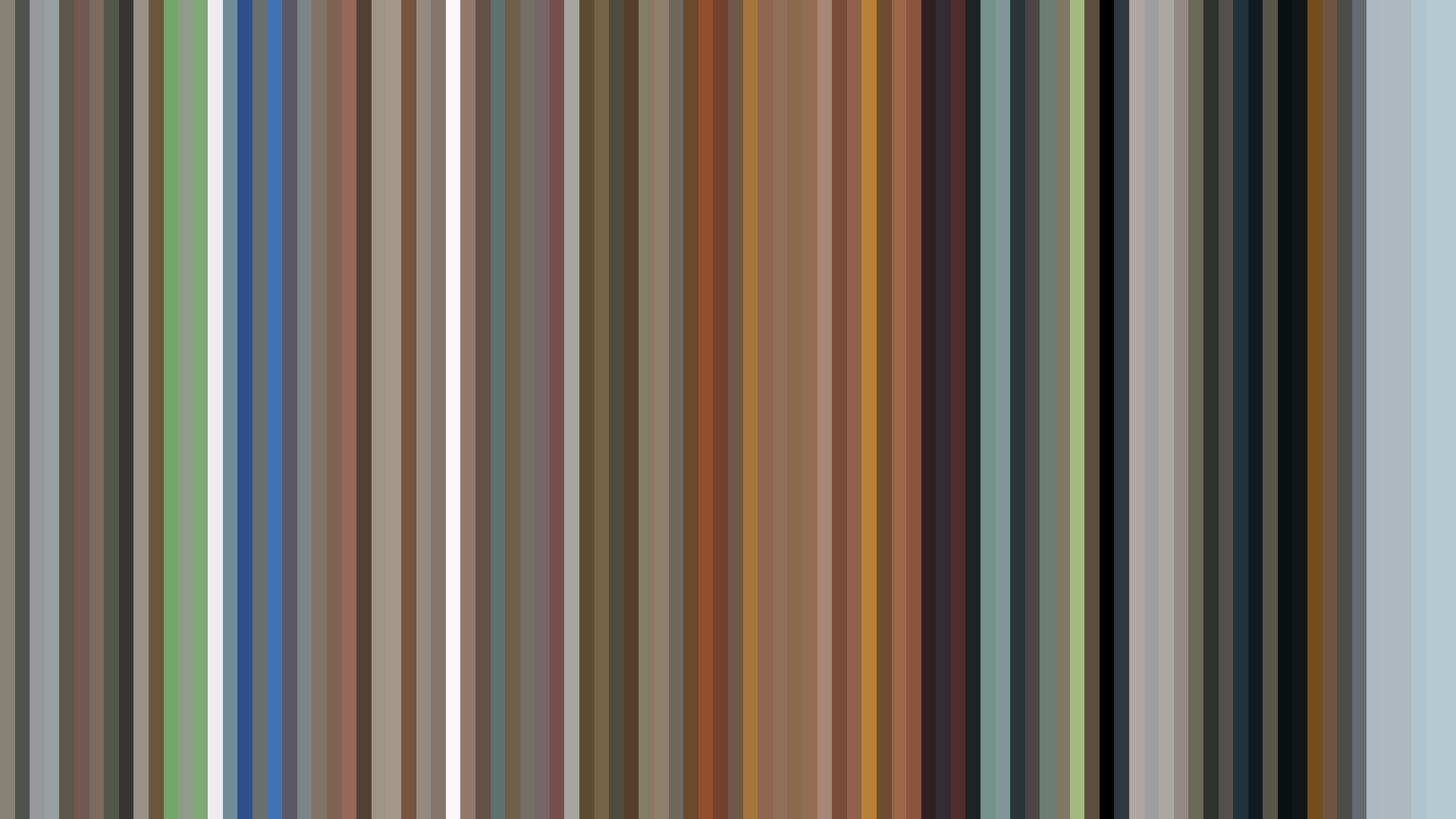
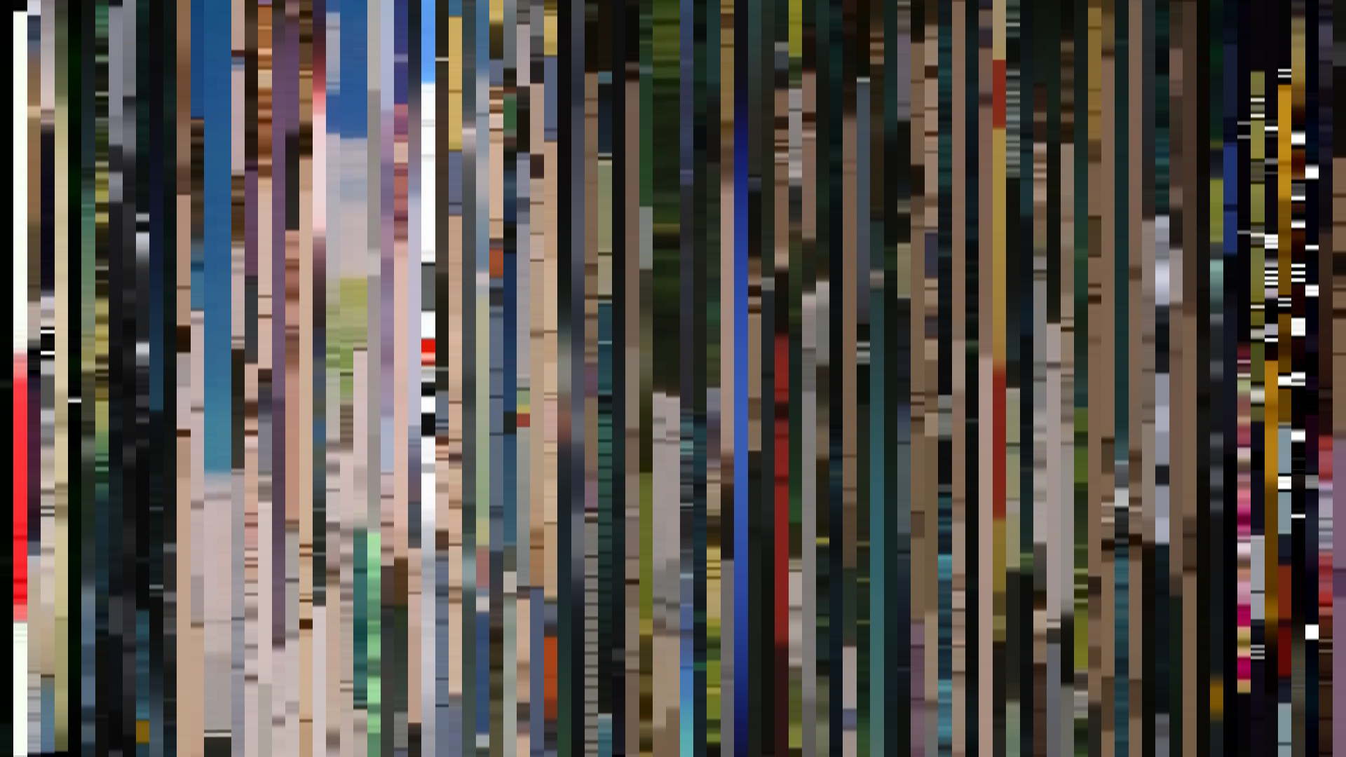
MAPPA shows up three times, and each appearance is a coordinate along the decade's pivot toward darker, cooler institutional palettes. Kids on the Slope (Tezuka Productions, MAPPA, 2012, brightness 0.442) is still in the warm ledger — its palette is essentially Watanabe-period jazz brown. Banana Fish (MAPPA, 2018, brightness 0.376, saturation 0.299, bright opening) shifts toward a harder, more reflective register: #221E1E, #5E5D59, with #512E20 doing the violence. Dororo (Tezuka Productions, MAPPA, 2019, brightness 0.367, saturation 0.268, arc-up) settles the studio's emerging house style — dark, warm-leaning Red-Orange, with a midpoint brightness lift that registers as an actual structural choice rather than an animator's reflex. By the end of the decade MAPPA had built, almost without anyone declaring it, the visual grammar that the 2020s would inherit: not Wit Studio's grey-brown realism (Attack on Titan's #604C33 / #A38E68 palette repeats verbatim across four entries from 2013 to 2019), but something colder, more glassy, more willing to leave the swatches unsaturated.
The Bright Floor and the Dark Ceiling
What the decade quietly accomplished was the establishment of two endpoints that earlier eras did not allow. On one side, the slice-of-life shows pushed brightness into territory that 1990s cel animation could not physically reach: Hidamari Sketch x Honeycomb at 0.727, Nichijou at 0.689, Grand Blue Dreaming at 0.688, Nodame Cantabile Finale at 0.650, Ping Pong the Animation at 0.653, Chihayafuru 2 at 0.639, The Disastrous Life of Saiki K. at 0.634. None of these would have been achievable in cel — the digital pipeline made the bright floor possible.
On the other side, a new kind of dark ceiling arrived. Psycho-Pass at 0.241 brightness with a falling arc, Fate/Zero at 0.262, Golden Kamuy Season 2 at 0.315, Initial D Final Stage at 0.322, The Promised Neverland at 0.330. These are brightness readings that earlier digital anime simply did not produce because the audience hadn't been trained to accept them. The 2010s trained the audience. By 2019 a viewer could pick a season's prestige show by its barcode alone — the cooler, the darker, the more desaturated, the more serious it was meant to be taken.
The aggregate hue numbers tell a smaller, related story. Forty-eight Red-Orange dominants, thirty-nine Red, seven Blue-Green, five Green. Of those twelve cool-dominant entries, the majority cluster in the back half of the decade: Girls' Last Tour (2017, Blue-Green, brightness 0.375), My Hero Academia Season 2 (2017, Blue-Green), Golden Kamuy Season 2 (2018, Blue-Green), My Hero Academia Season 3 (2018, Blue-Green), Demon Slayer (2019, Green), Kono Oto Tomare! (2019, Blue-Green). The shift away from warm-dominance is small in absolute numbers but unmistakable in trajectory. The 2010s opened with an almost monochromatic warm-amber industry and closed with a small but visible art-house contingent willing to push into cool registers as a marker of seriousness.
The decade's defining barcode is therefore not a single show but a pair of them, viewed together: Nichijou's 0.689-brightness flat arc on one wall, Vinland Saga's 0.347-brightness peat-and-iron on the other. The same eight years produced both. The same digital pipeline rendered both. The 2010s is the decade anime stopped having to be one thing — and the barcodes are the receipt.
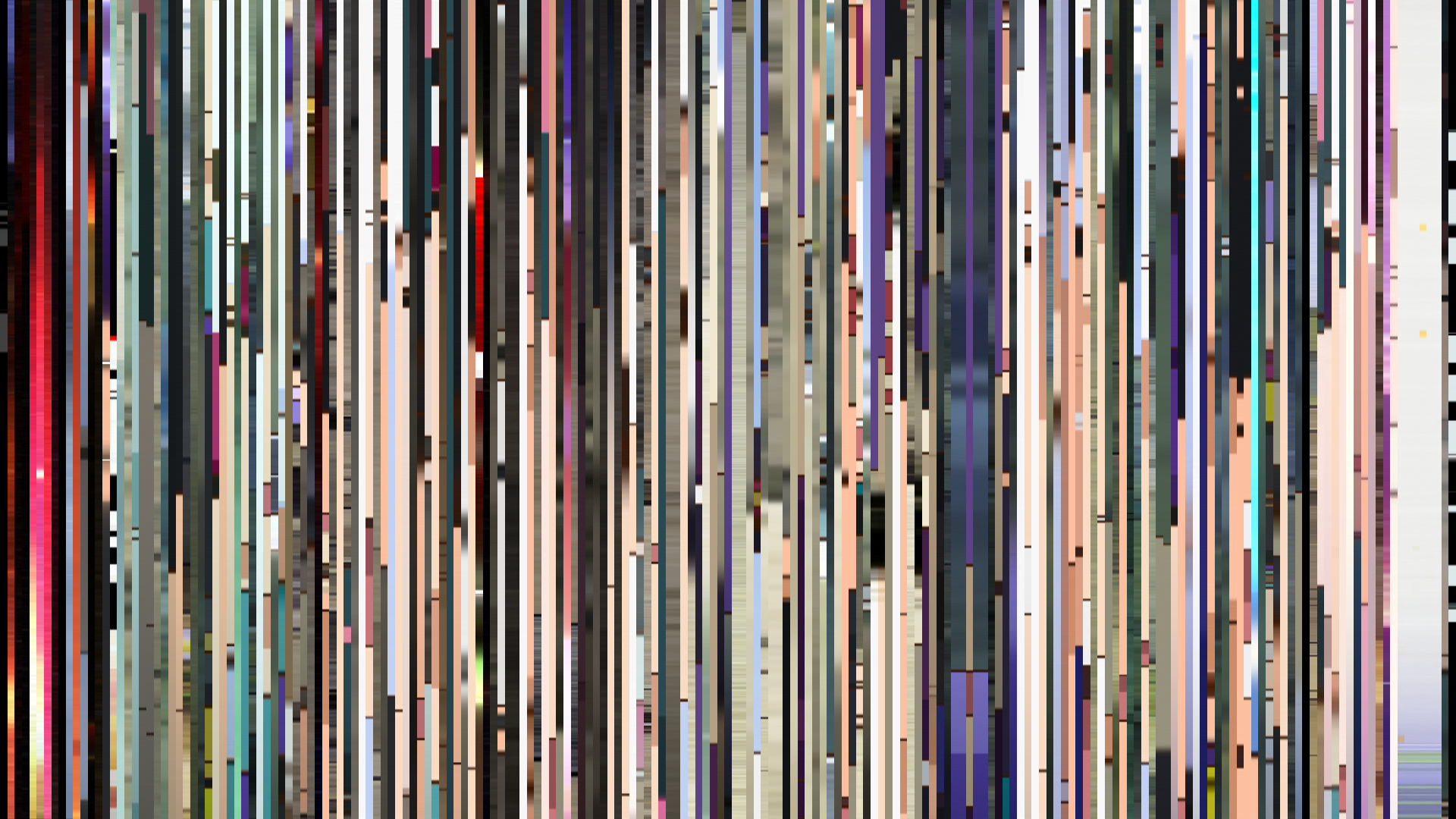

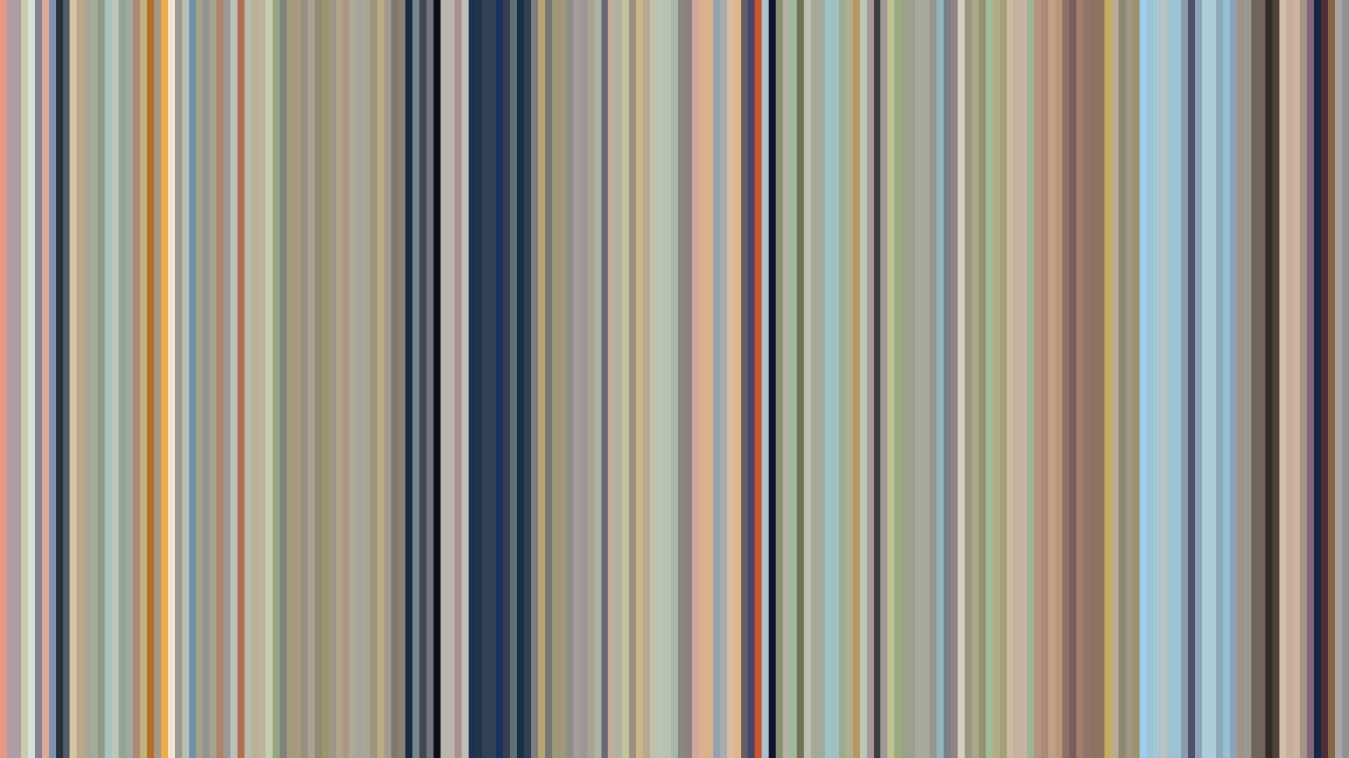

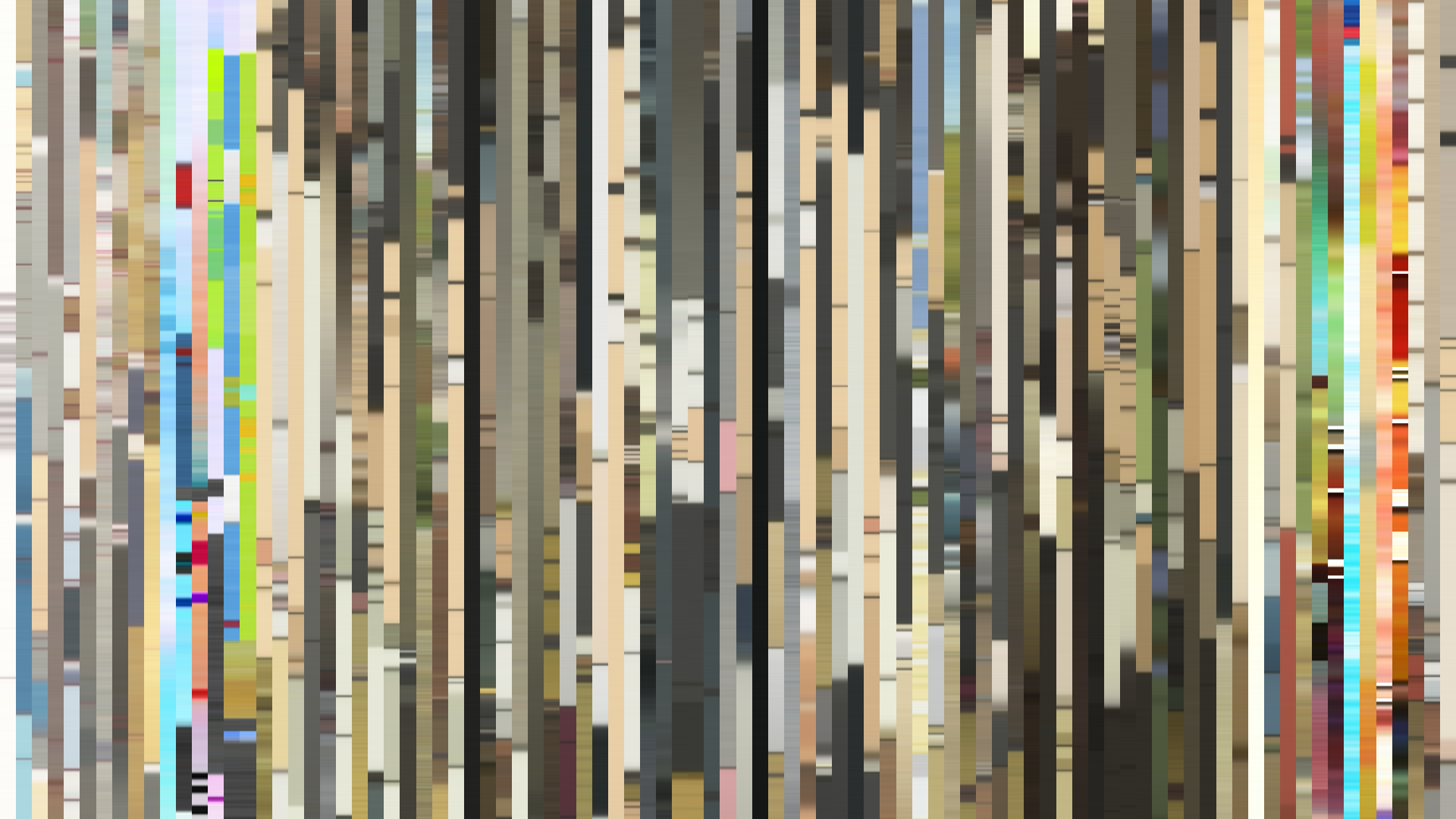


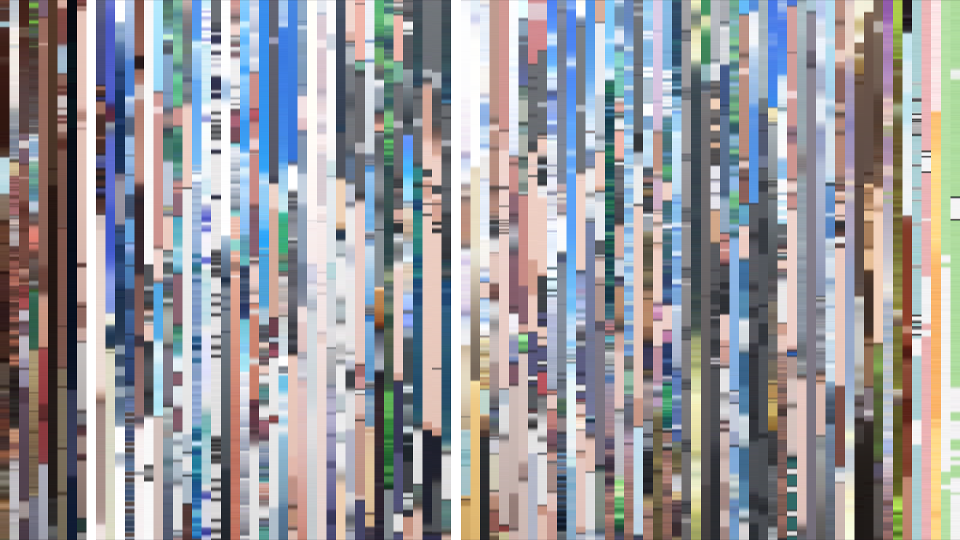


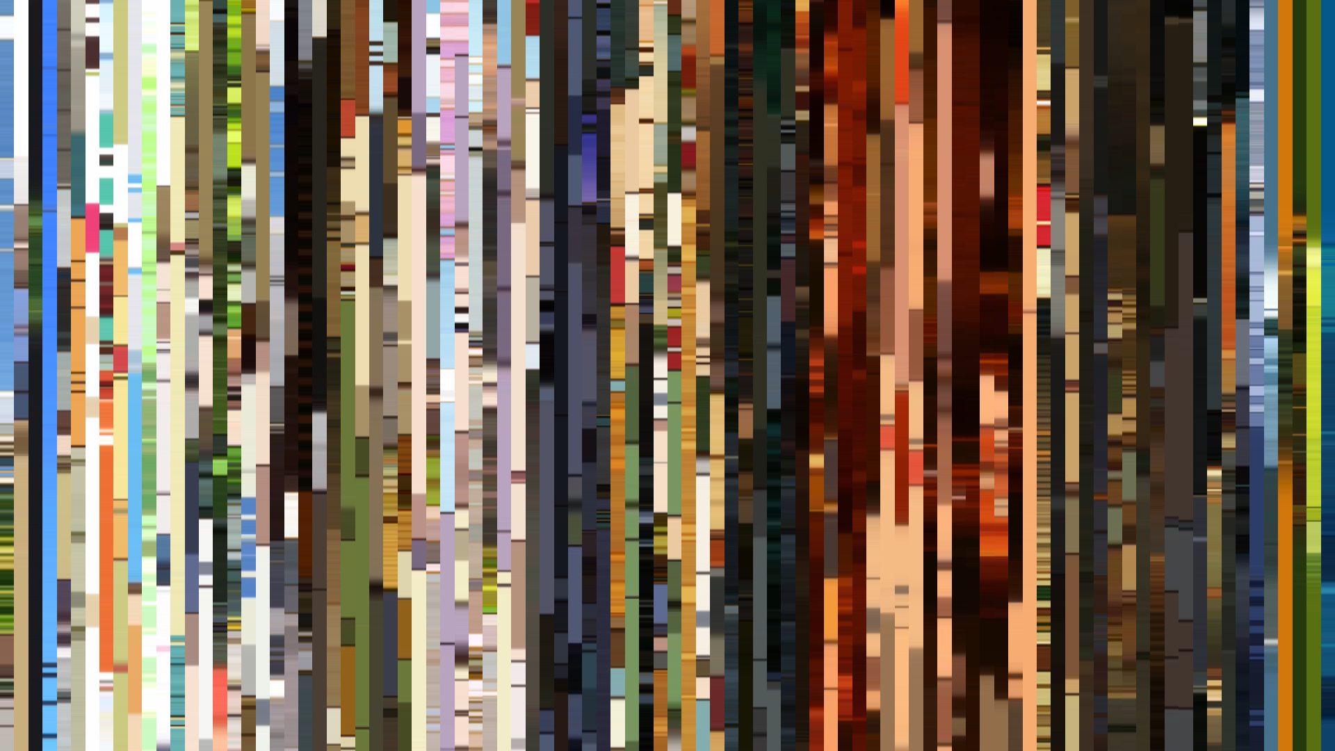


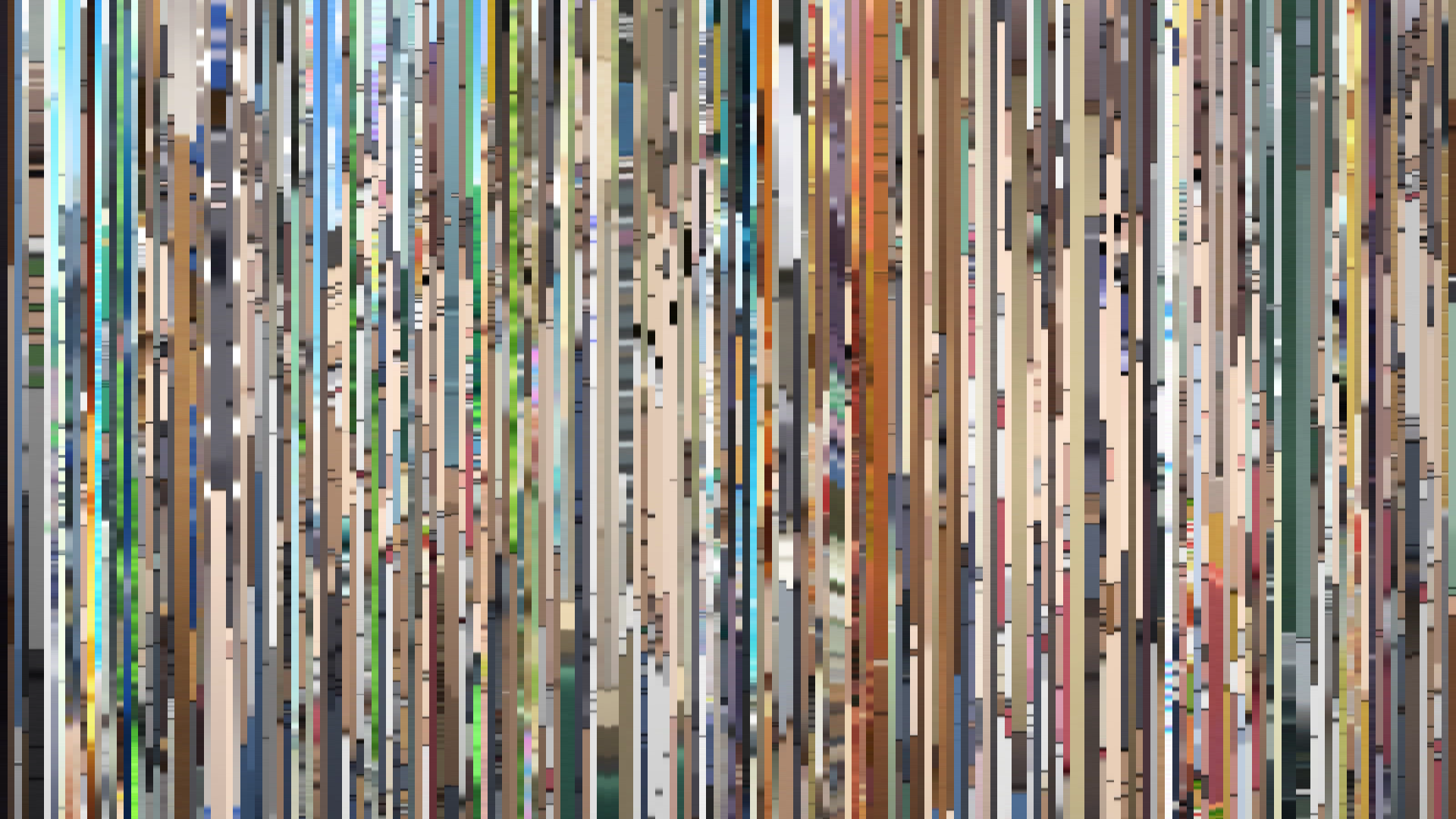
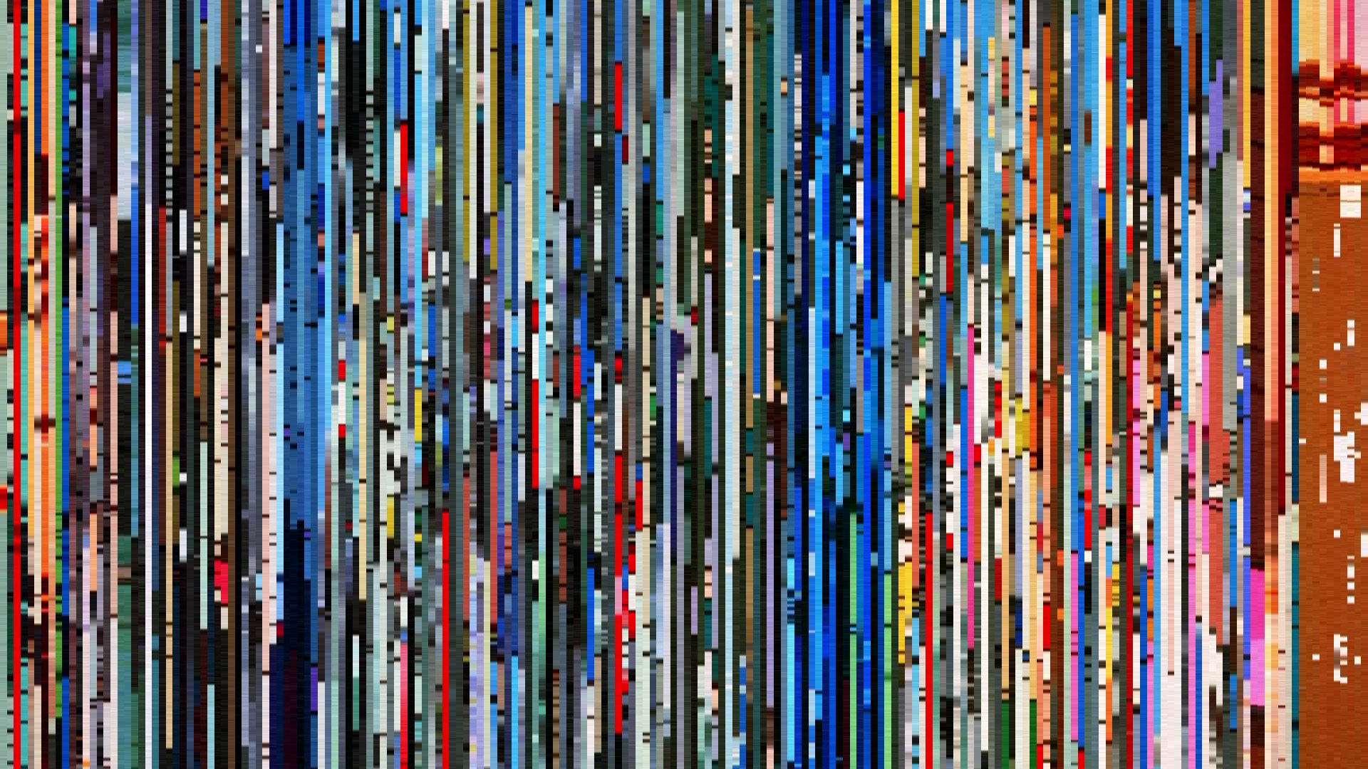
![Fate/stay night [Unlimited Blade Works]](../barcodes/2014/fatestay-night-unlimited-blade-works/barcode_slice.png)


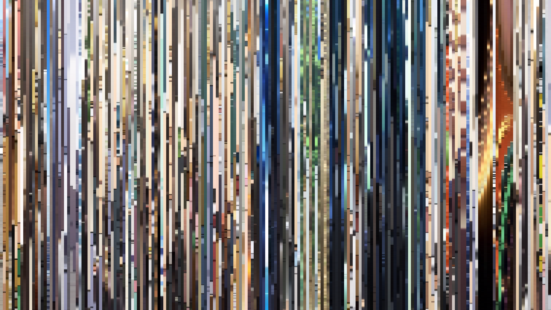
![Fate/stay night [Unlimited Blade Works] Season 2](../barcodes/2015/fatestay-night-unlimited-blade-works-season-2/barcode_slice.png)