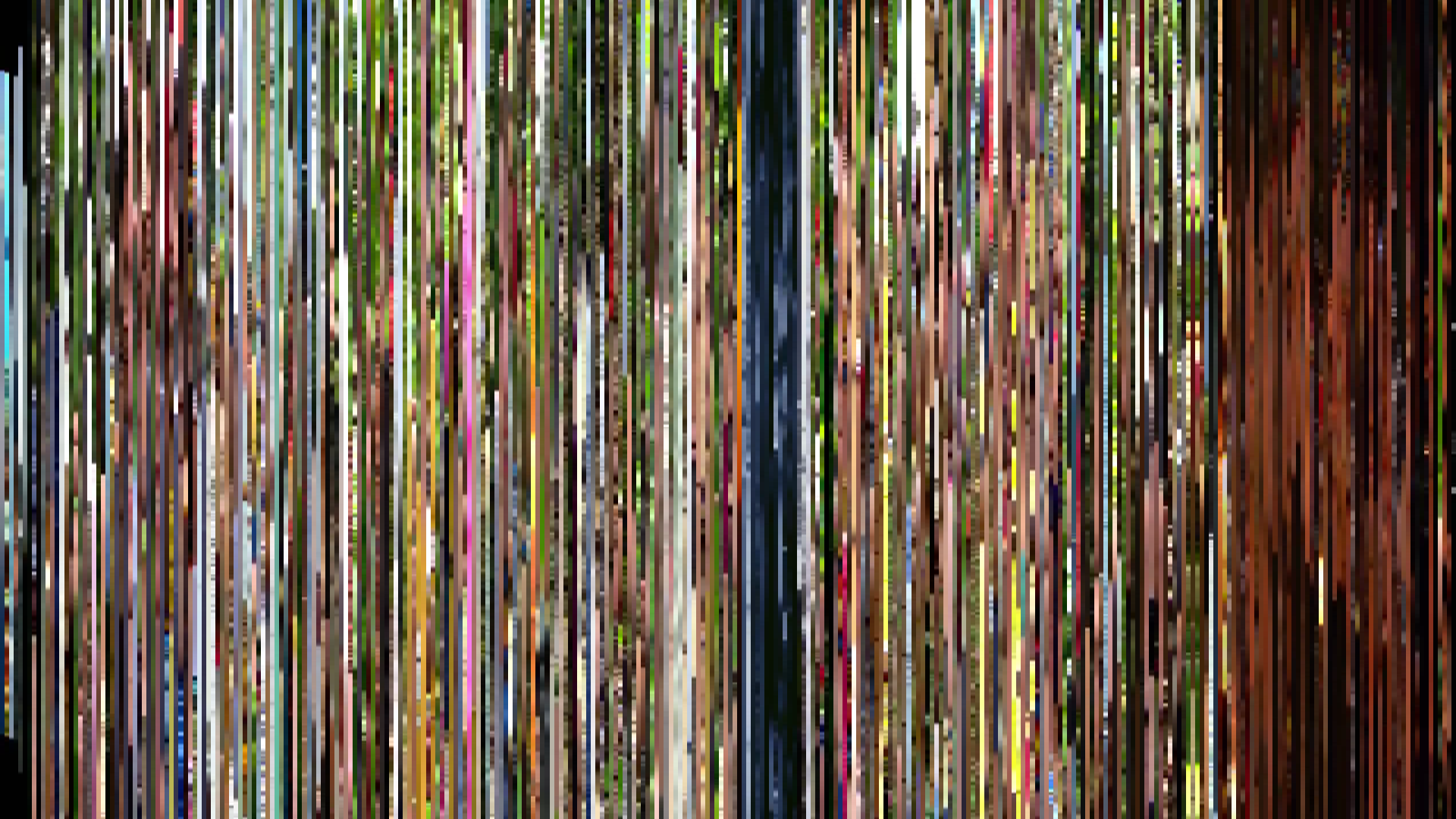
Pixel Slice — 1px center crop per frame
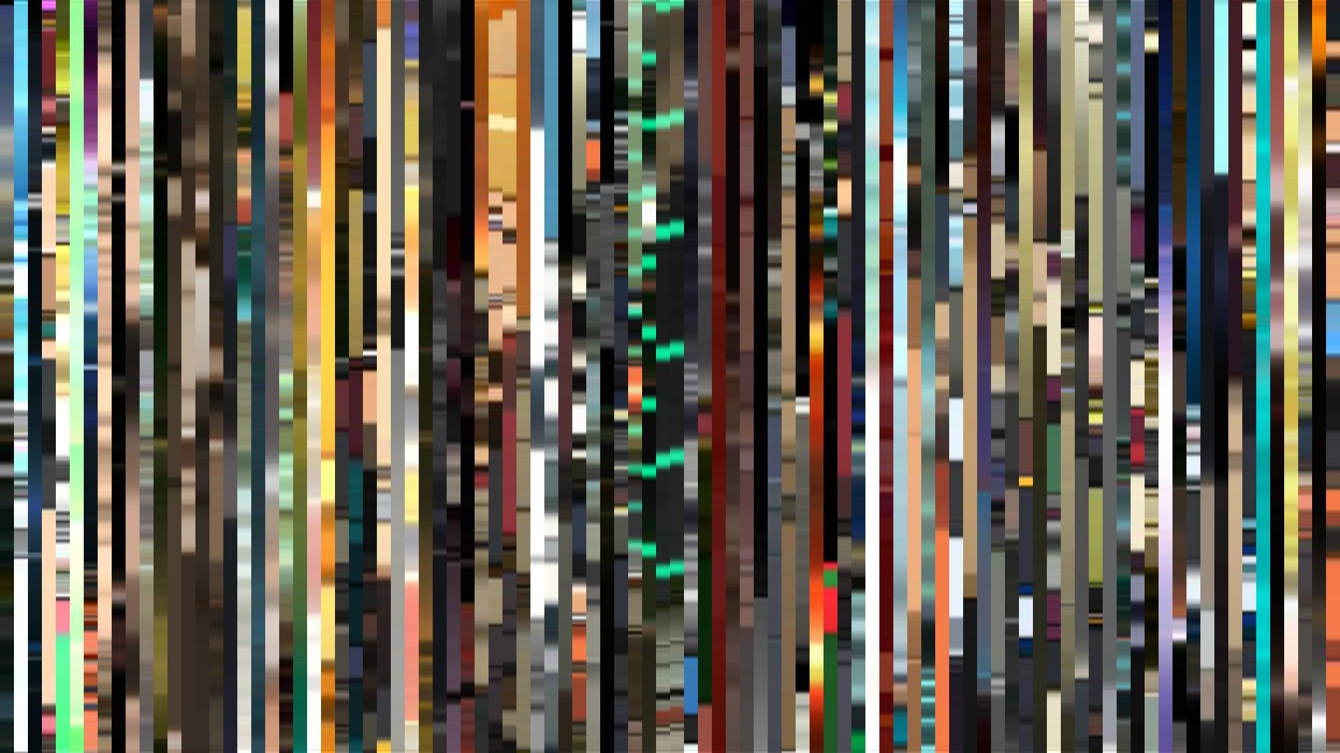
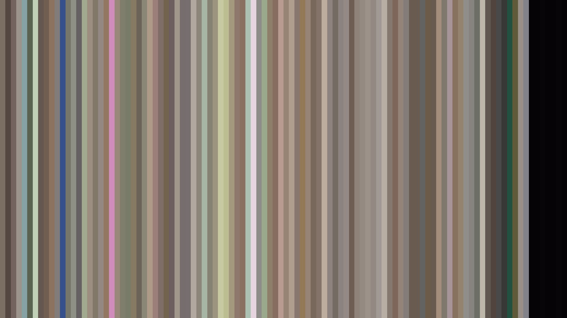
Smooth Average — mean color per frame

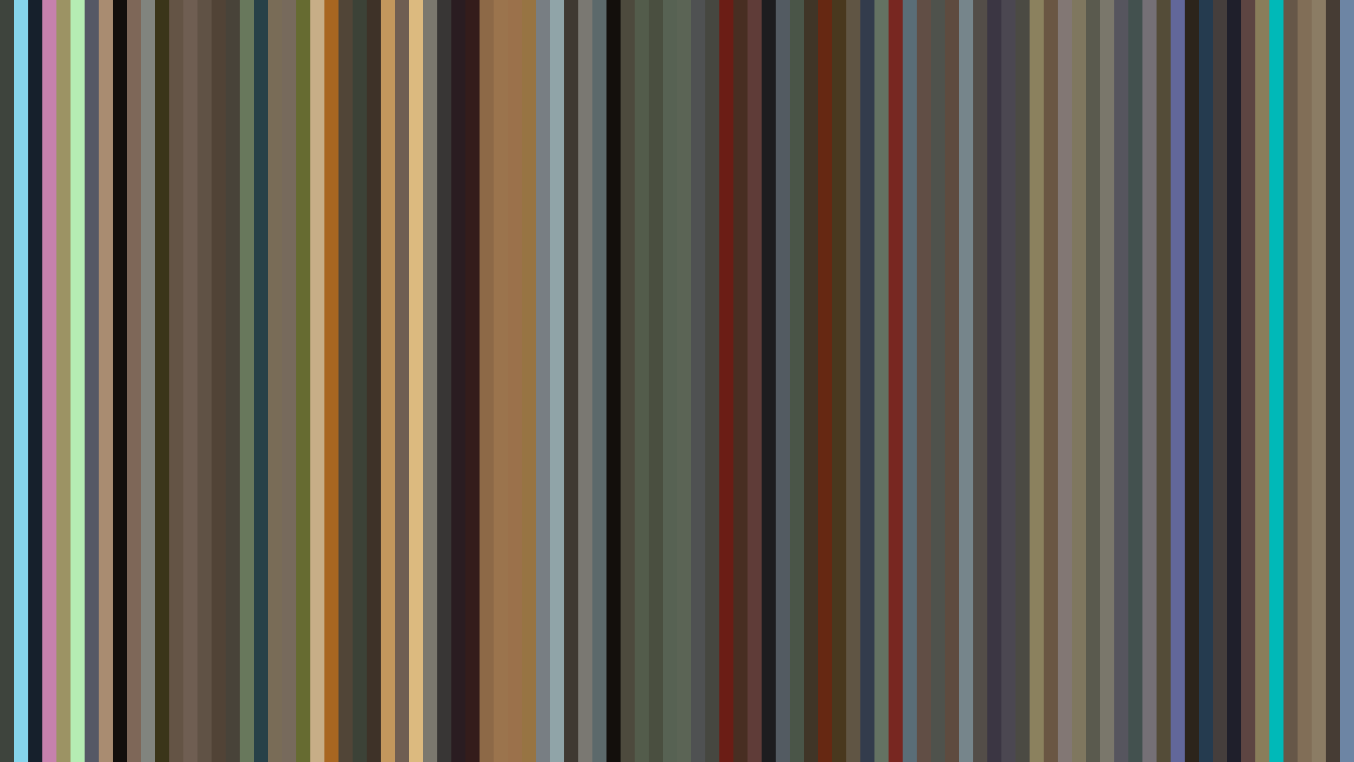
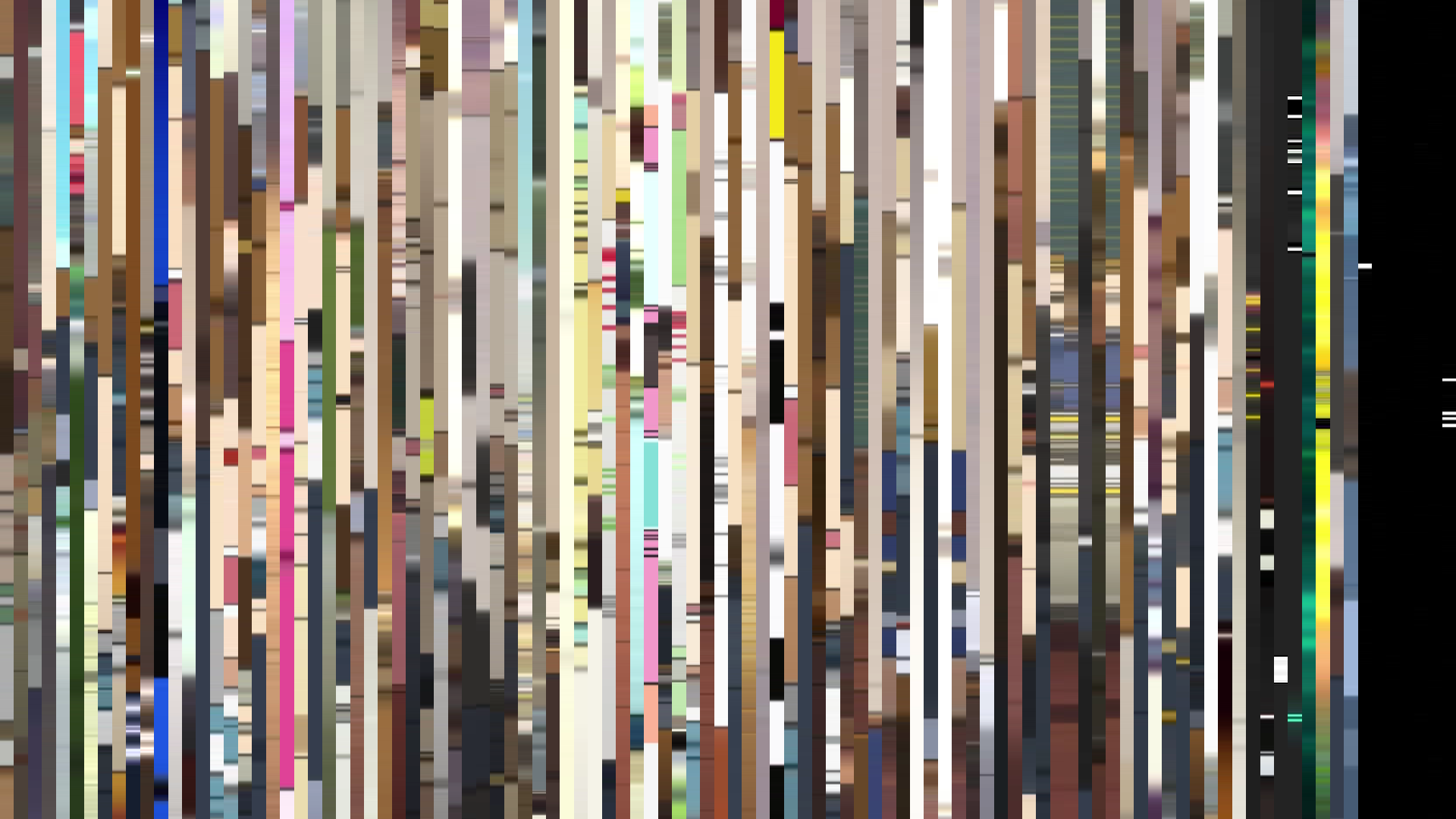
Rank Mosaic — columns sorted by luminance
Circle / Radial — polar transform
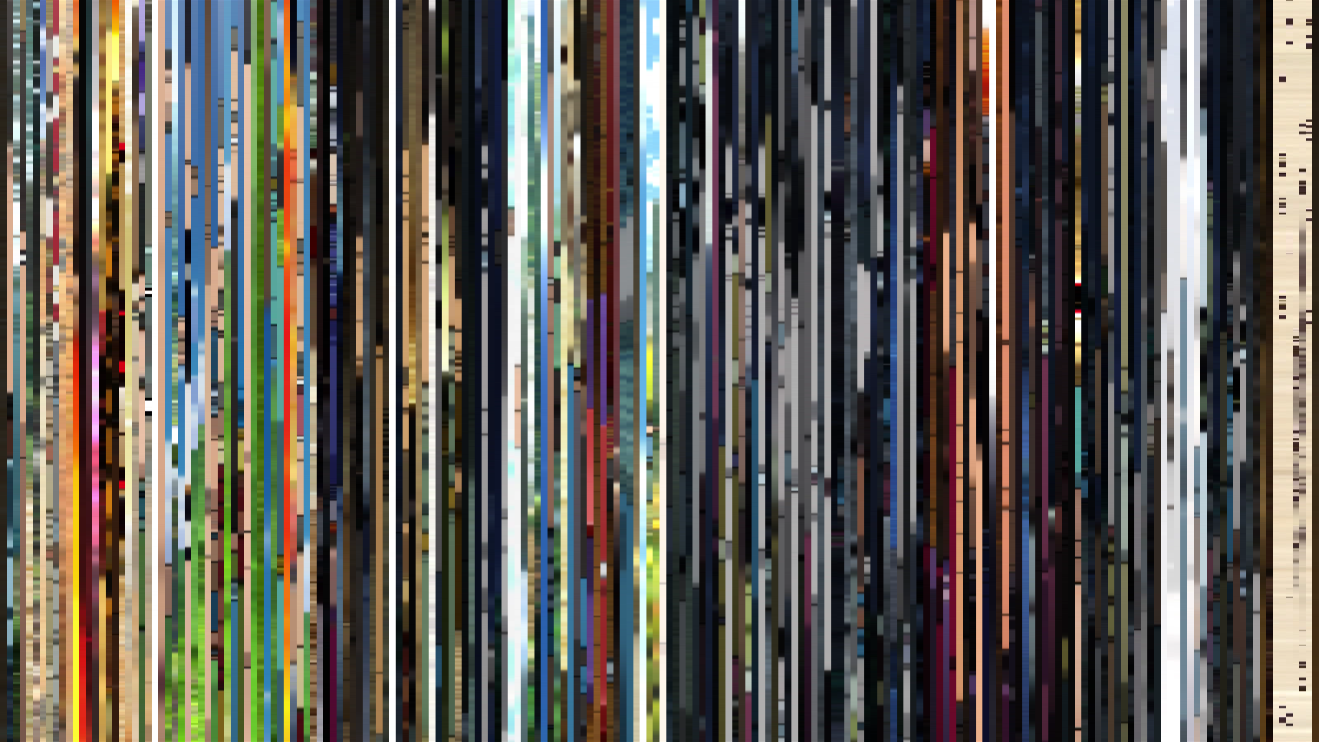
Edit Pace — frame-to-frame color delta (bright = fast cuts)
Color Temperature — warm (gold) vs cool (teal) per frame


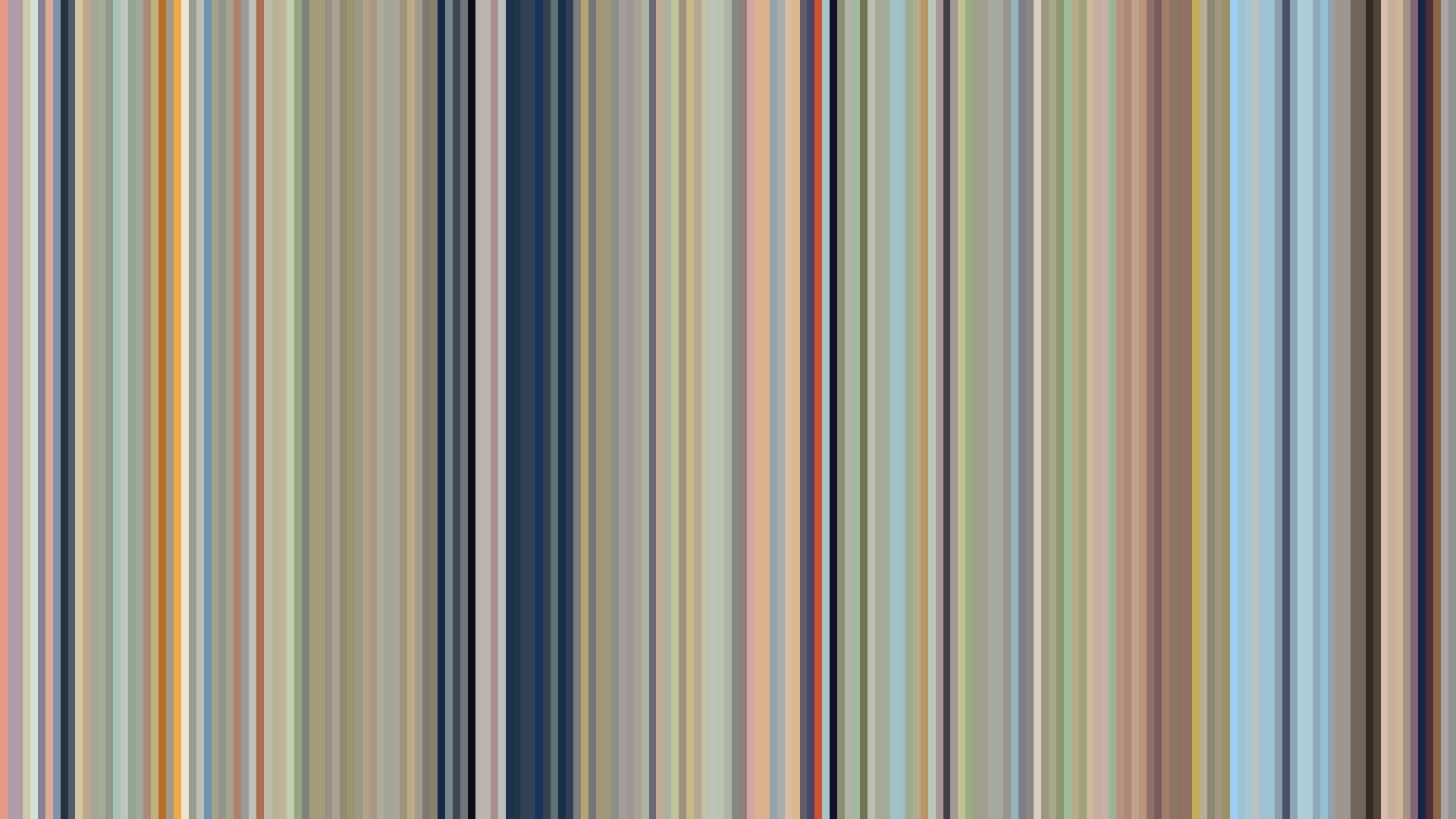
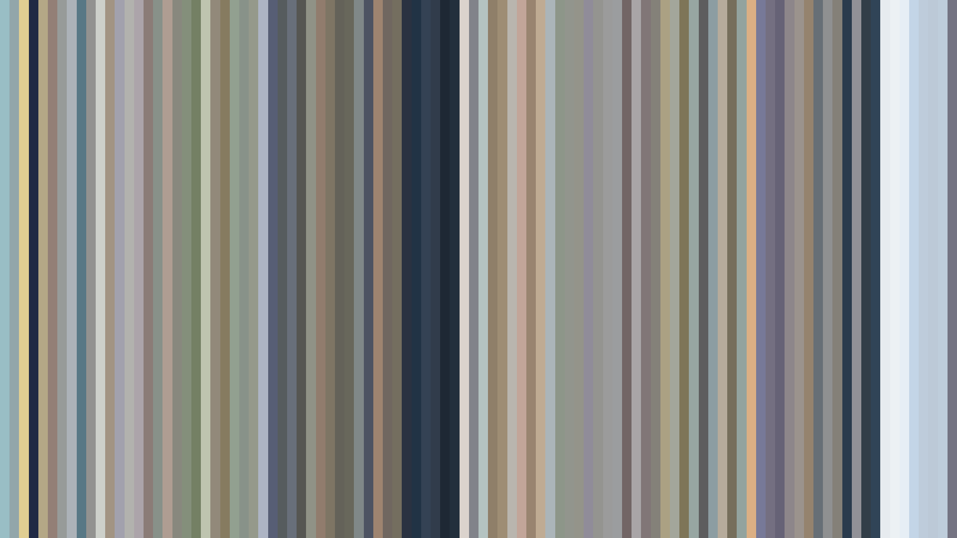
*Durarara!!* opens not with a bang but with a deliberate dimming. The dataset’s dark-opening arc is a structural gamble that pays off: the series begins in Ikebukuro’s neon-smeared twilight, a visual signature from director Takahiro Omori and art director Akira Ito that immediately confuses expectation. While most of 2010’s anime strive for a bright, accessible first impression, *Durarara!!* sinks into its shadows, letting the Red-Orange dominance—29% of the palette—emerge from streetlight haze rather than sunlight. The middle act’s slight brightening toward 0.380 is not optimism but escalation: the color of headlights and crushed glass as the Dollars’ chaos mounts. By the closing act, brightness drops to 0.336, the darkest point of the run, a calculated visual fade that mirrors the narrative’s refusal to resolve cleanly. Brain’s Base understood that Ikebukuro is not a setting to be illuminated but a labyrinth to be navigated by its own dim glow. The palette’s muddled earth tones and muted reds—#5C5230, #522C23—are the colors of asphalt and dried blood, not spectacle. This is a show that trusts its shadows to tell the story.