Edit Pace — frame-to-frame color delta (bright = fast cuts)
Color Temperature — warm (gold) vs cool (teal) per frame
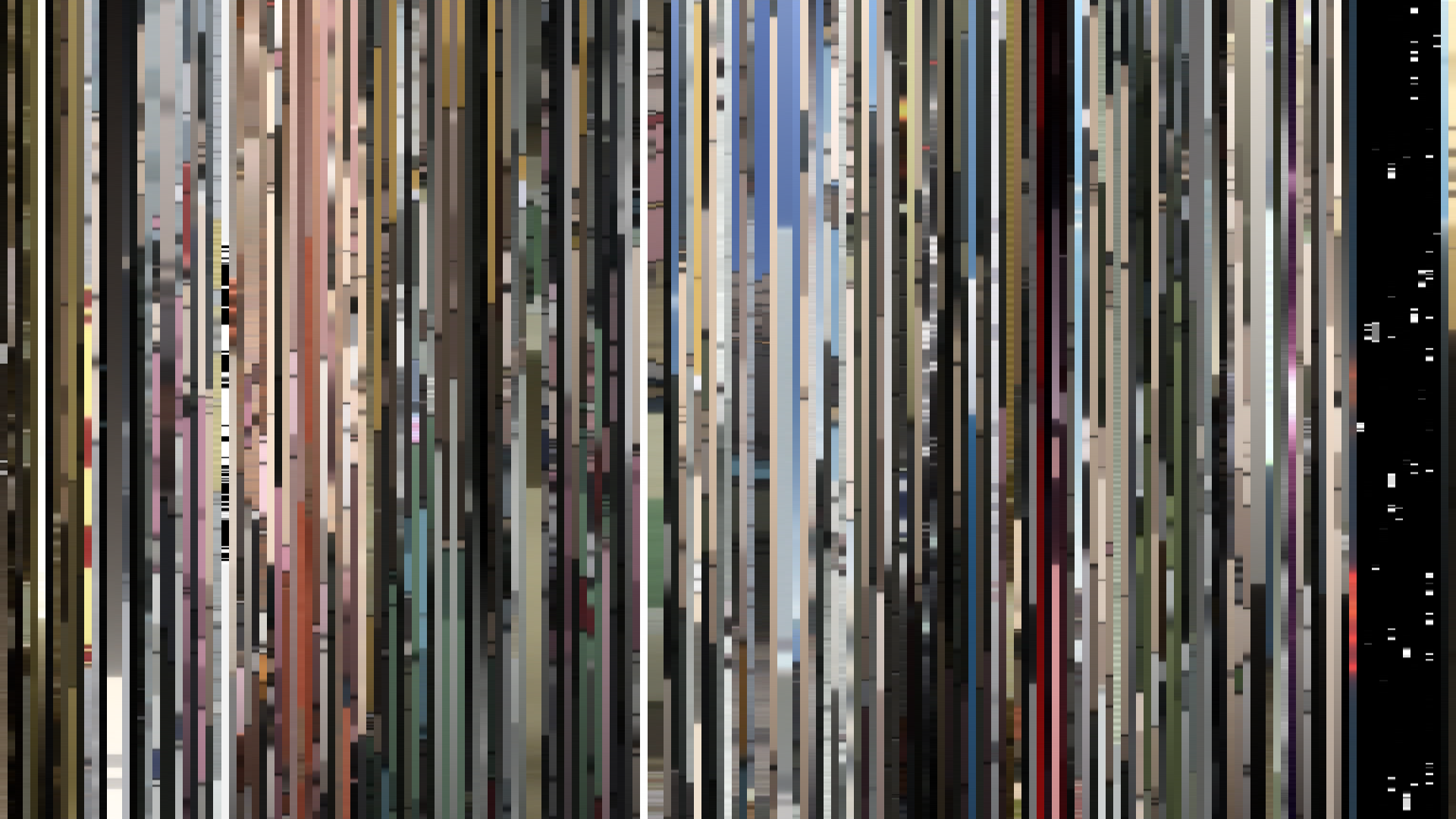
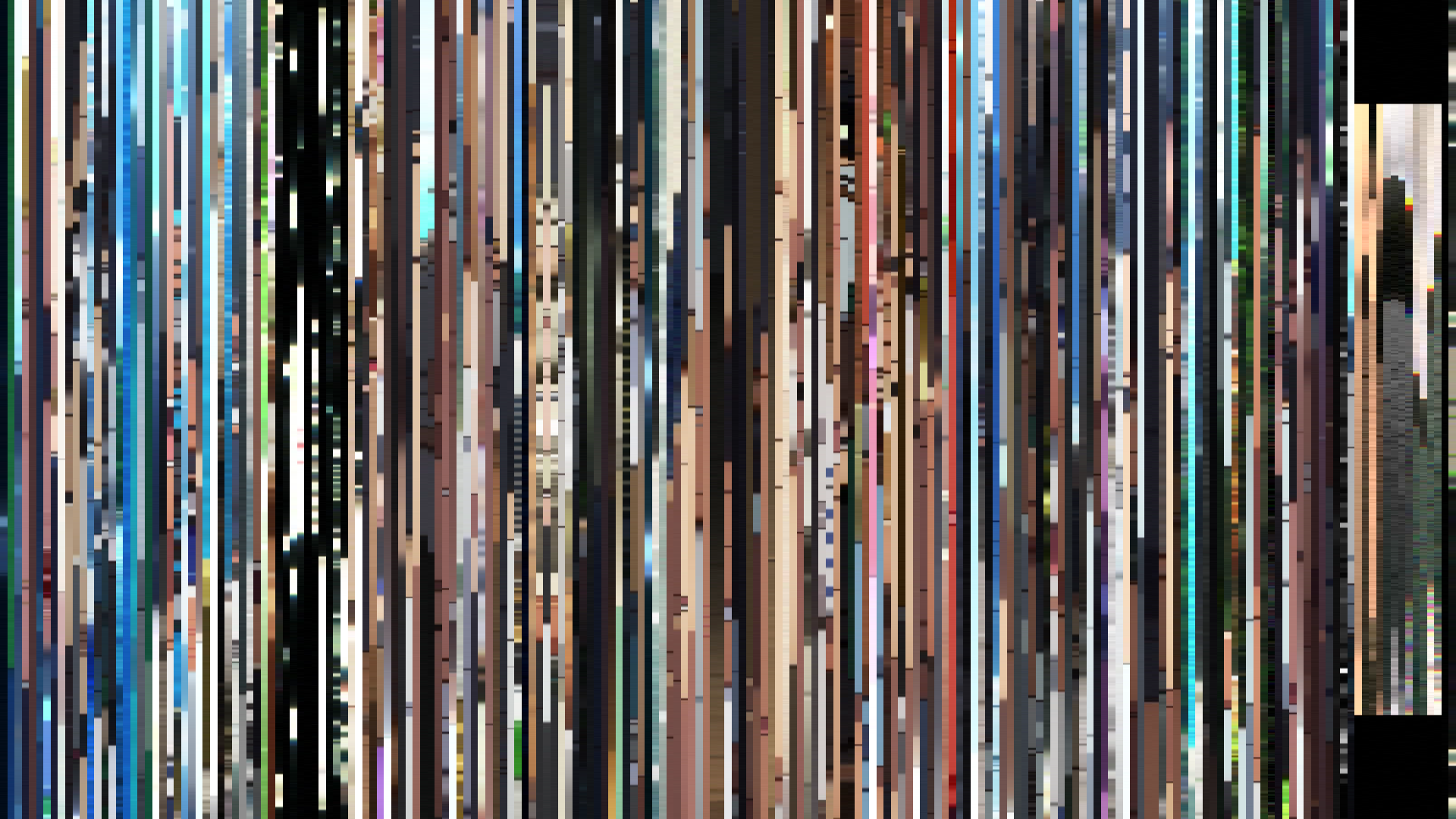
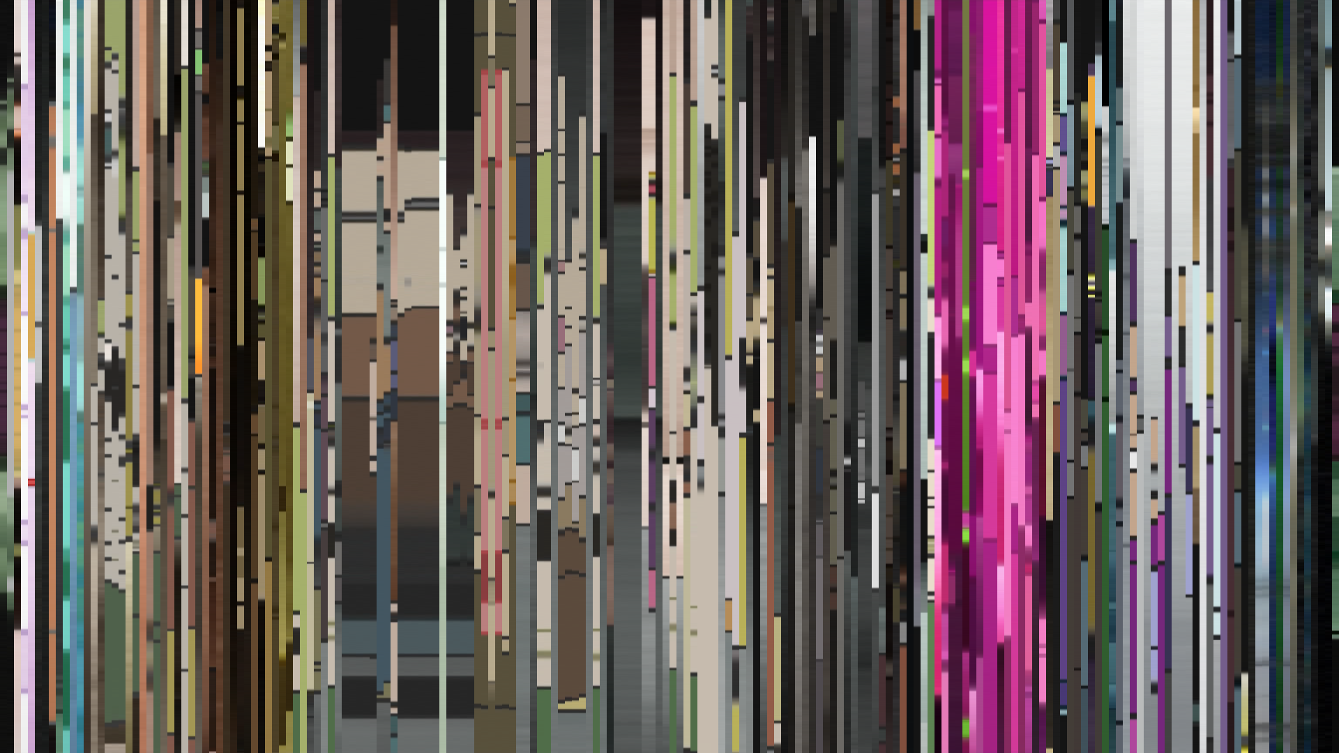
Frame Density Comparison — every 2nd vs every 4th frame
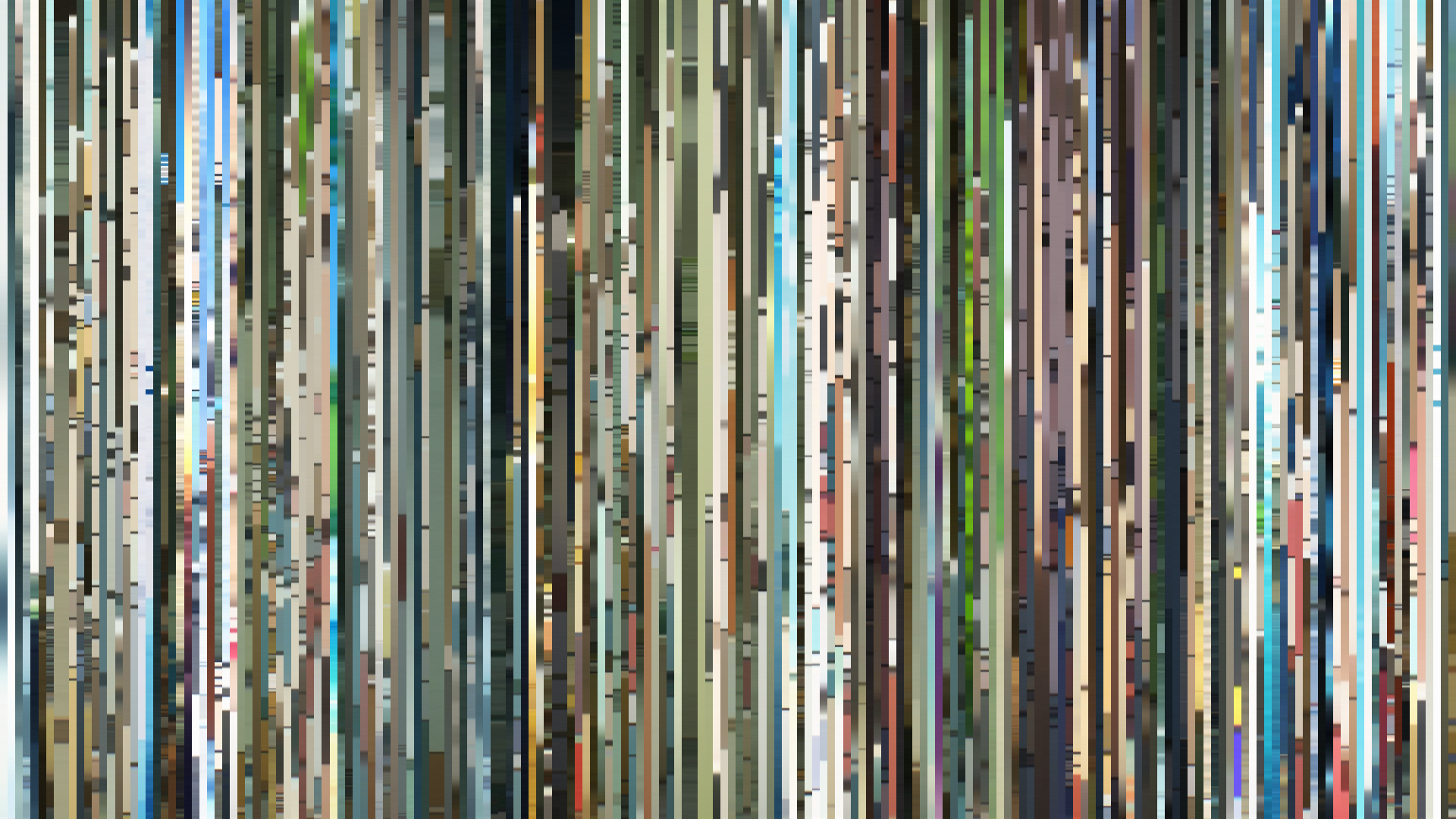
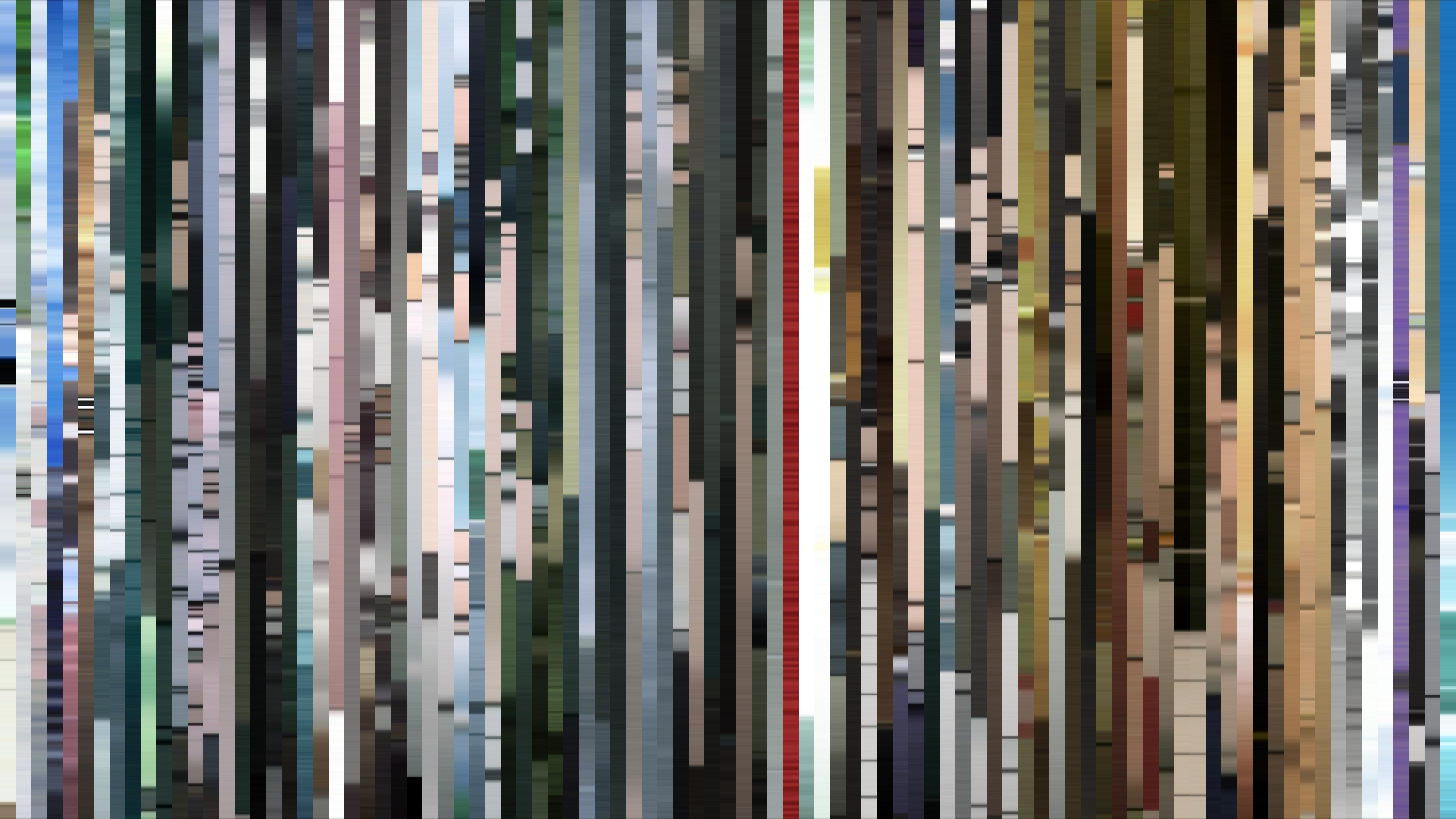
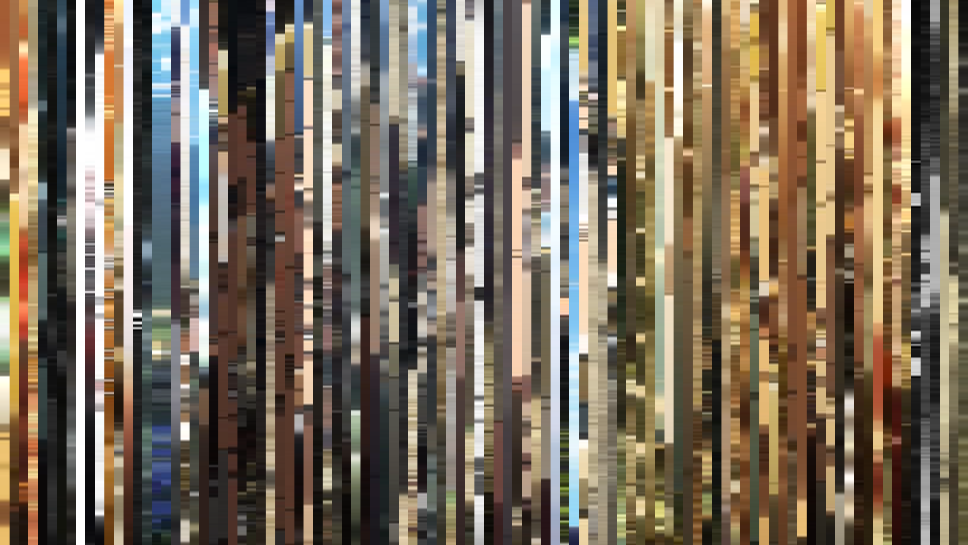
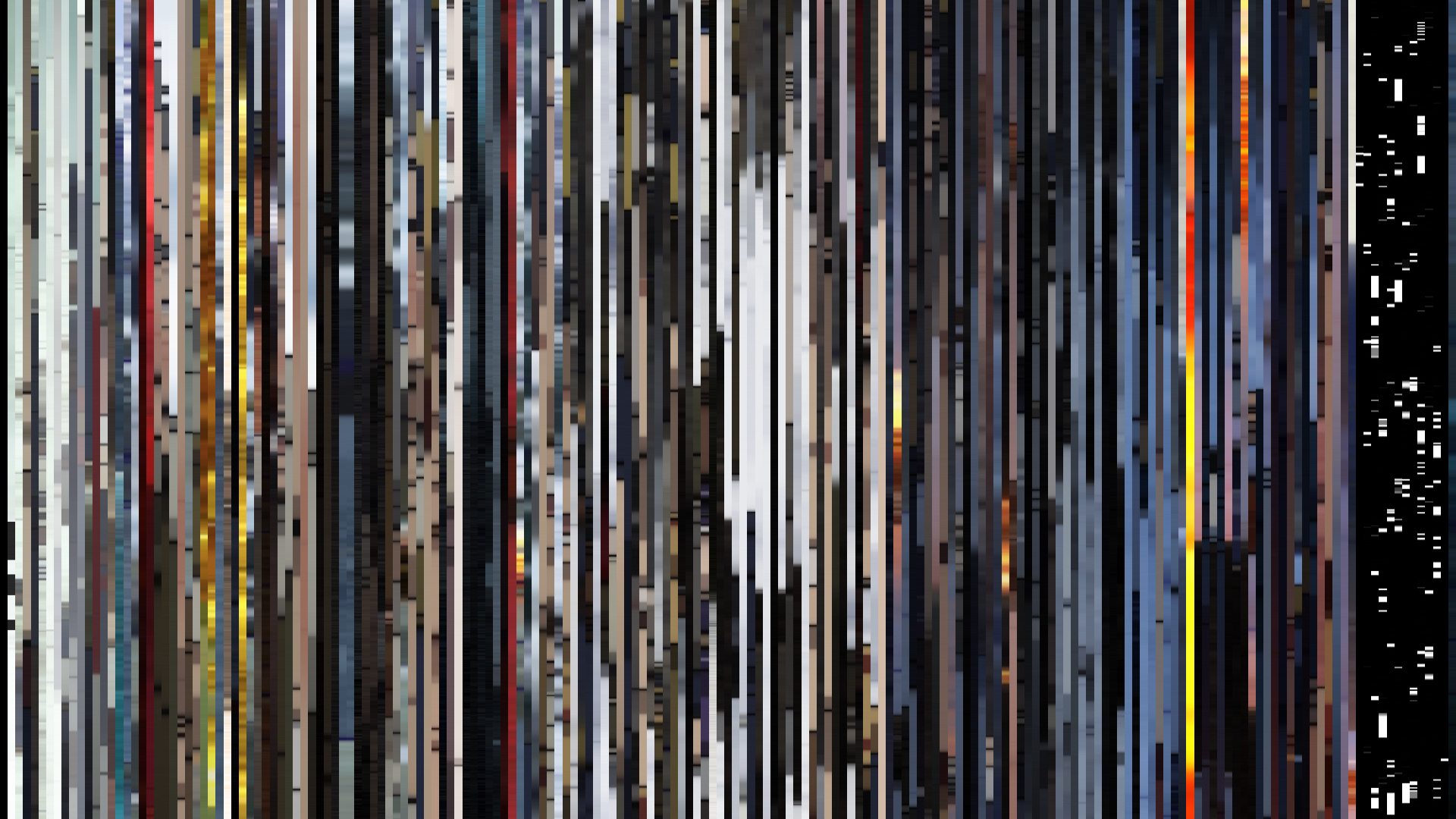
Slice · 15s
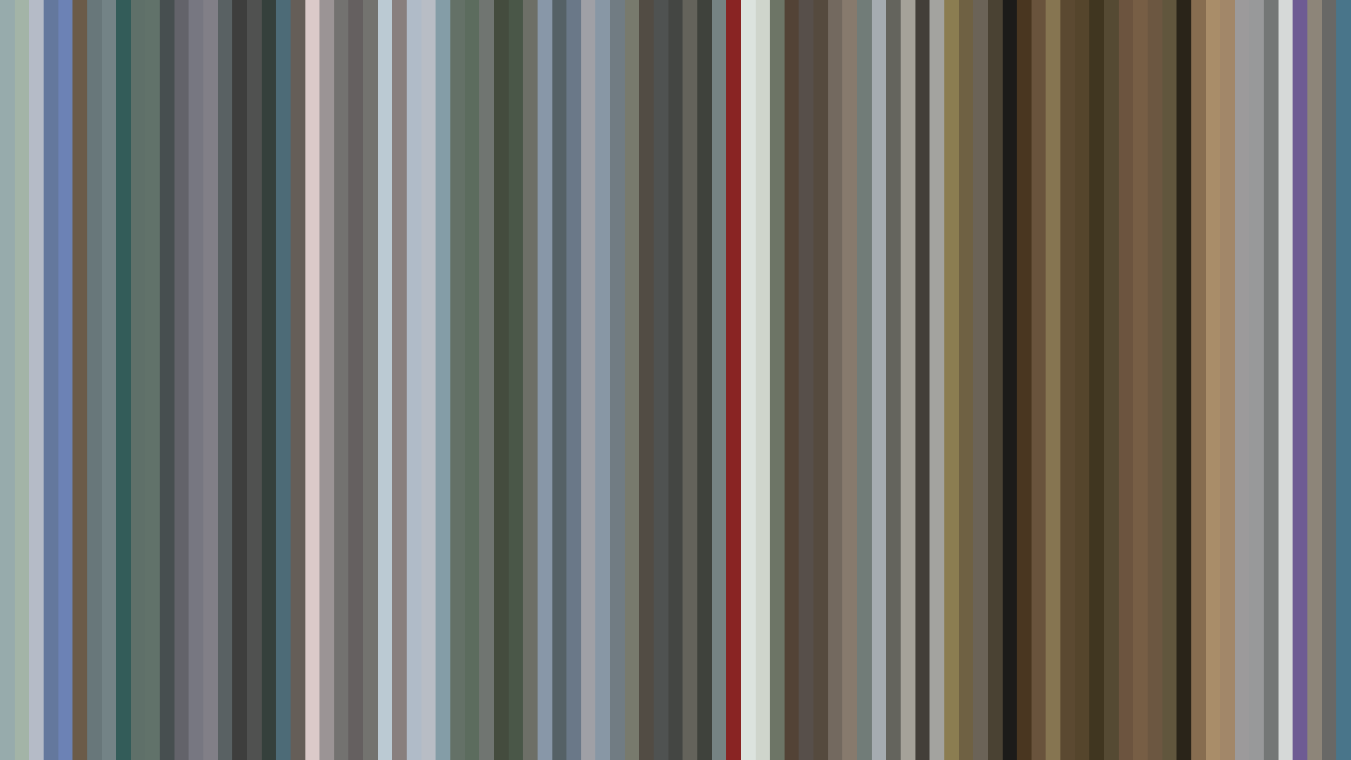
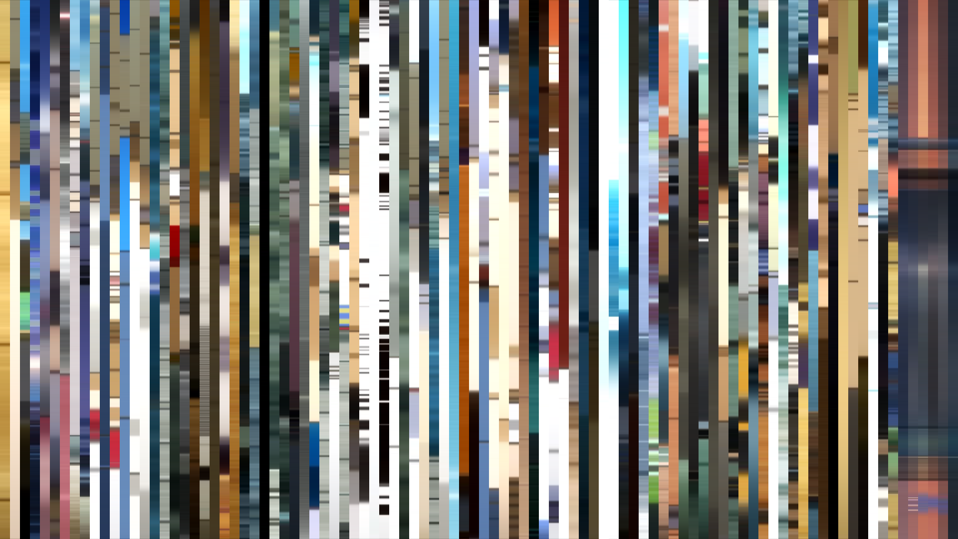
Avg · 15s
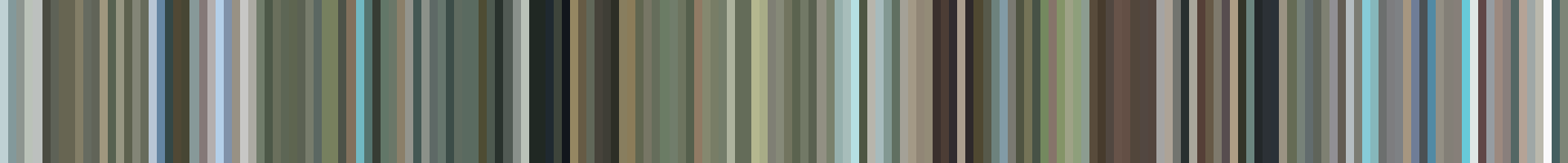
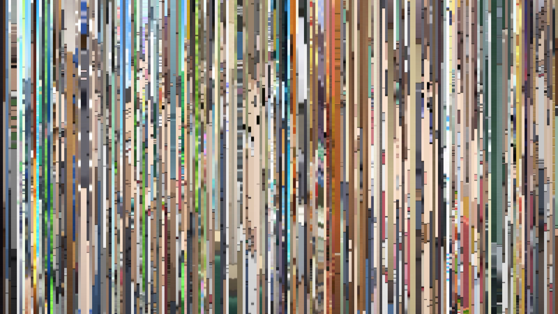
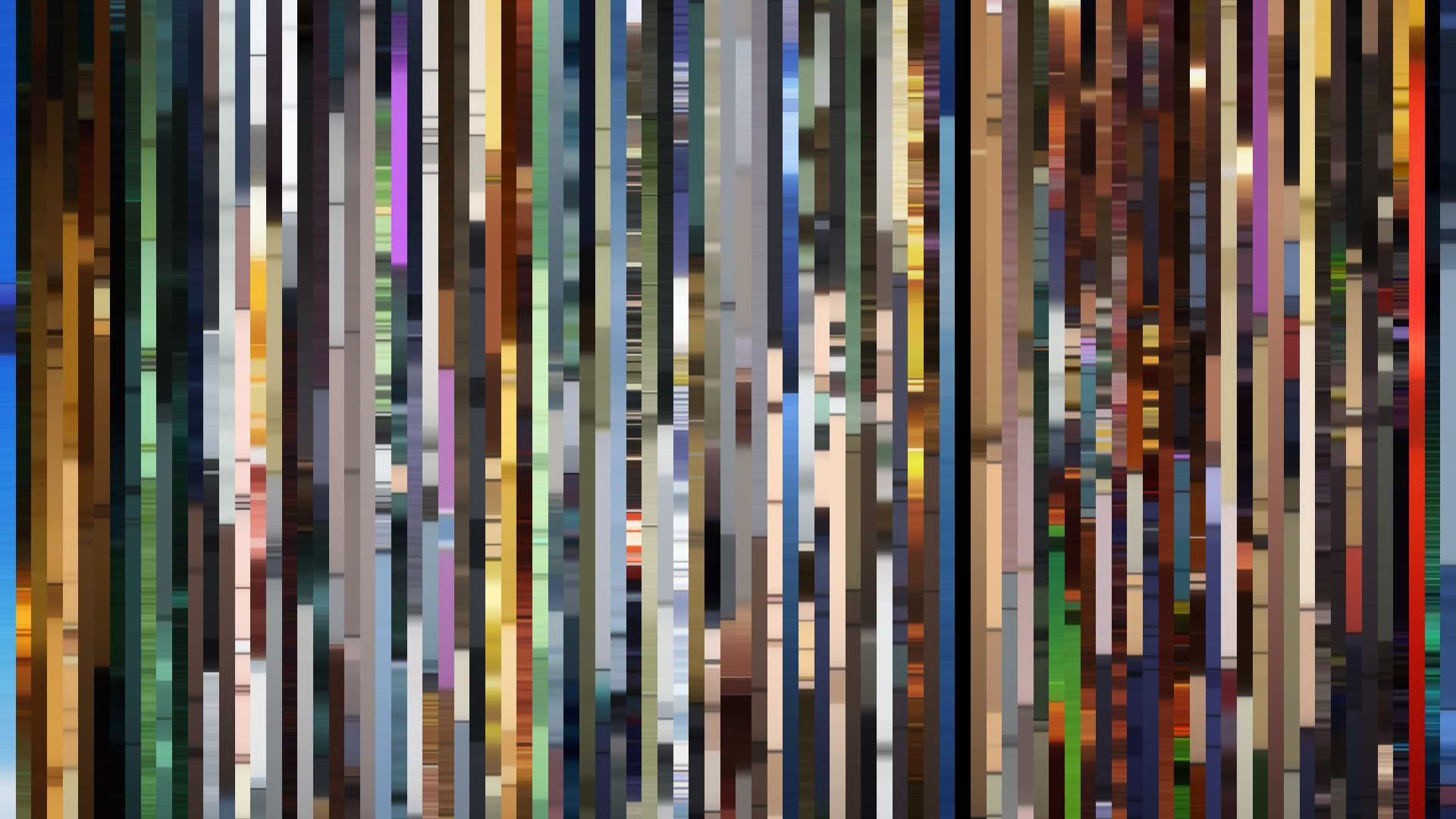
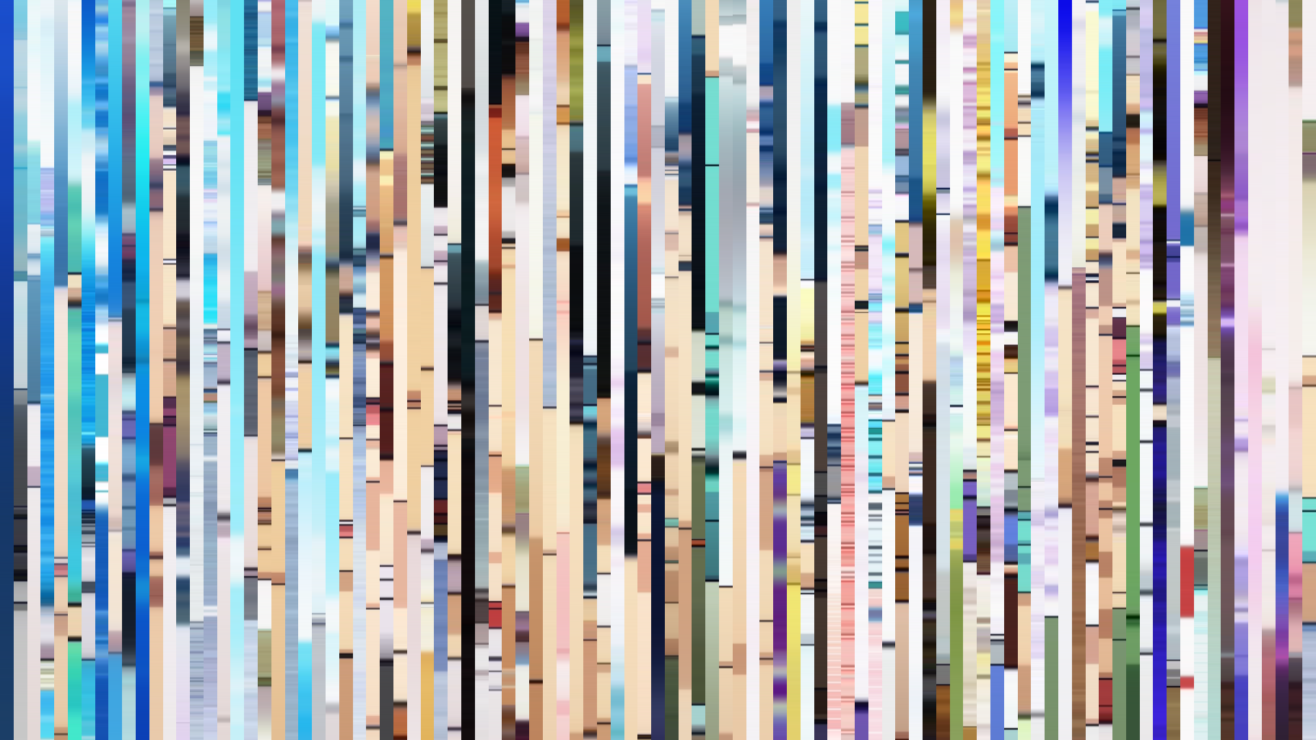
Slice · 30s
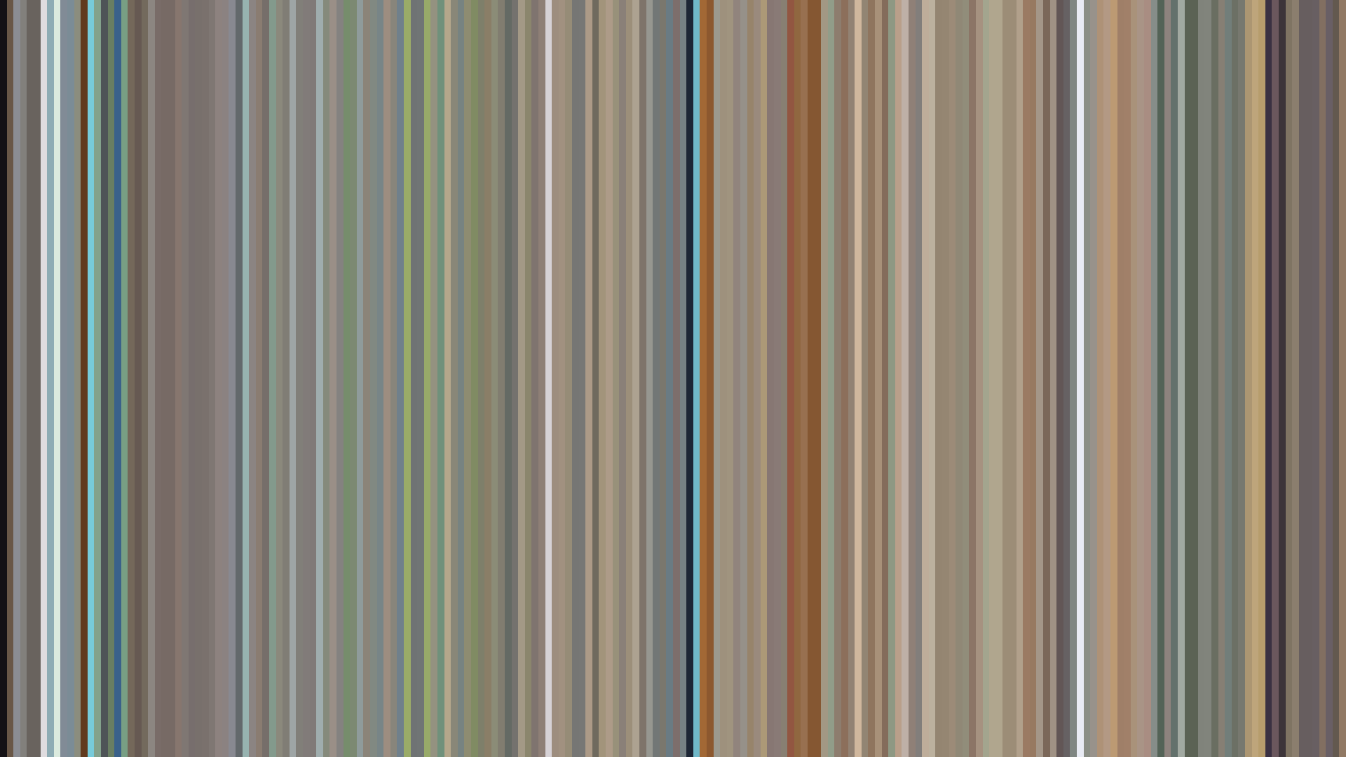
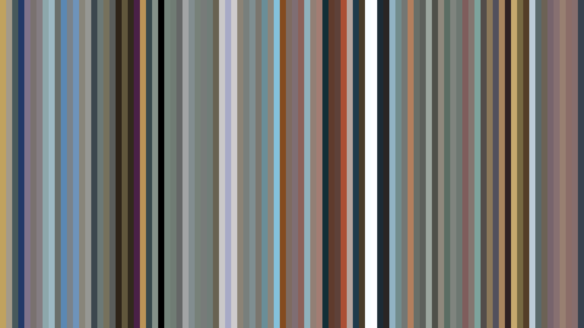
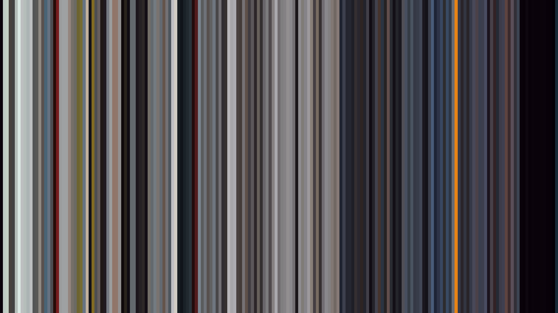
Avg · 30s
The data tells a story of an adventure that refuses to inflate itself. *A Place Further Than The Universe*’s muted palette—dominated by dusty olives and greys rather than the crisp blues of ice—is the first clue that director Atsuko Ishizuka and Madhouse are after something more grounded than a travel poster. The dark opening arc is a deliberate refusal of the expected bright start: the show begins with Mari’s depressive inertia, the world already drained of spectacle. That middle-act dip to 0.424 brightness isn’t the darkness of menace but of exhaustion—the physical and emotional weight of the Antarctic crossing. And the closing’s failure to return to even the opening’s levels proves this isn’t a triumphant return; it’s a quiet arrival, somber and earned. The Red-Orange dominance reads less as warmth and more as the worn, rusted tones of survival gear and fading sunlight. Ishizuka has made an adventure whose colors stay stubbornly realistic, a visual refusal of the genre’s
Brightness Arc (episode progression)
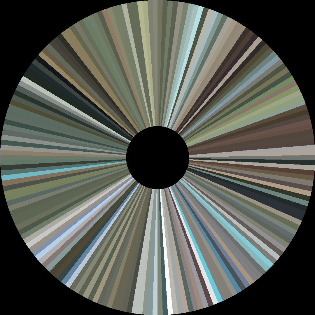
Hue Distribution
Act Breakdown
Opening
0.484
Middle
0.424
Closing
0.434
Avg Brightness
0.499
Avg Saturation
0.185
Warmth
0.539
Color Palette
#60635A
#A2A498
#292B28
#E0E3DE
#958D72
#514D35
#8D7262
#D2CAAF
3-Act Color Story
Opening
Middle
Closing
Color Twins
Perceptually nearest palettes — measured in OKLab space, not RGB


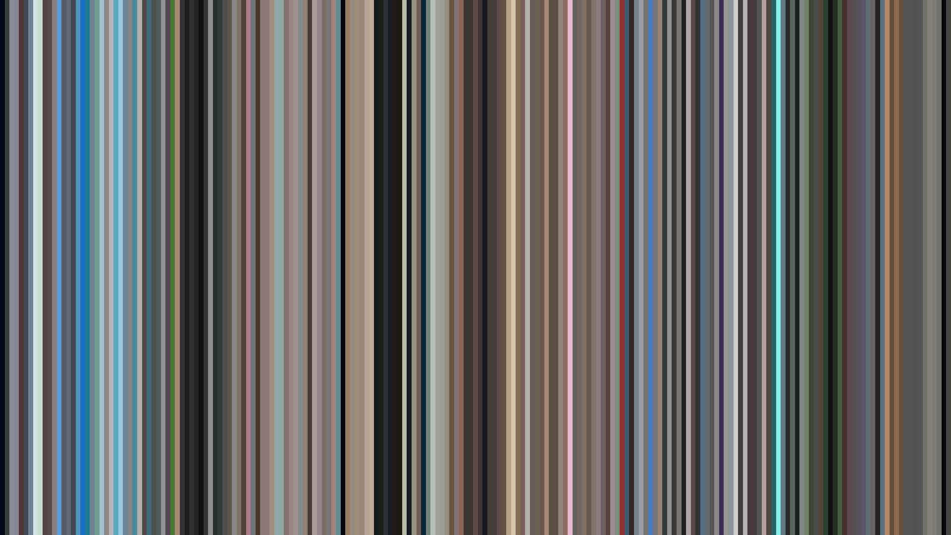
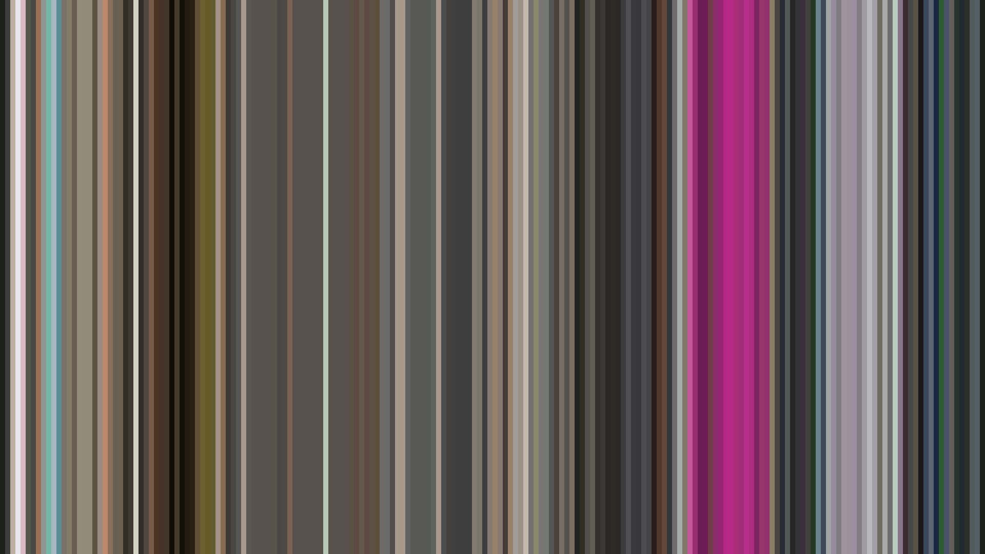


The data tells a story of an adventure that refuses to inflate itself. *A Place Further Than The Universe*’s muted palette—dominated by dusty olives and greys rather than the crisp blues of ice—is the first clue that director Atsuko Ishizuka and Madhouse are after something more grounded than a travel poster. The dark opening arc is a deliberate refusal of the expected bright start: the show begins with Mari’s depressive inertia, the world already drained of spectacle. That middle-act dip to 0.424 brightness isn’t the darkness of menace but of exhaustion—the physical and emotional weight of the Antarctic crossing. And the closing’s failure to return to even the opening’s levels proves this isn’t a triumphant return; it’s a quiet arrival, somber and earned. The Red-Orange dominance reads less as warmth and more as the worn, rusted tones of survival gear and fading sunlight. Ishizuka has made an adventure whose colors stay stubbornly realistic, a visual refusal of the genre’s