Edit Pace — frame-to-frame color delta (bright = fast cuts)
Color Temperature — warm (gold) vs cool (teal) per frame
Frame Density Comparison — every 2nd vs every 4th frame
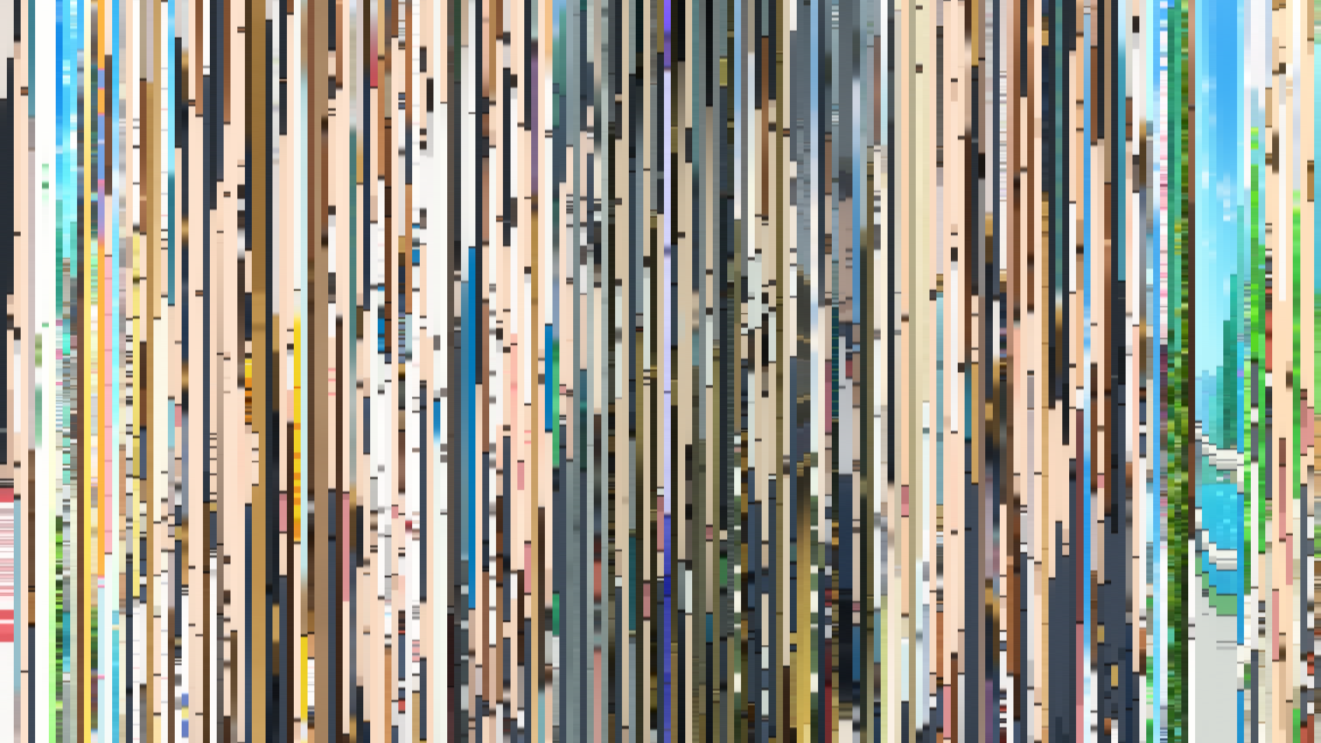
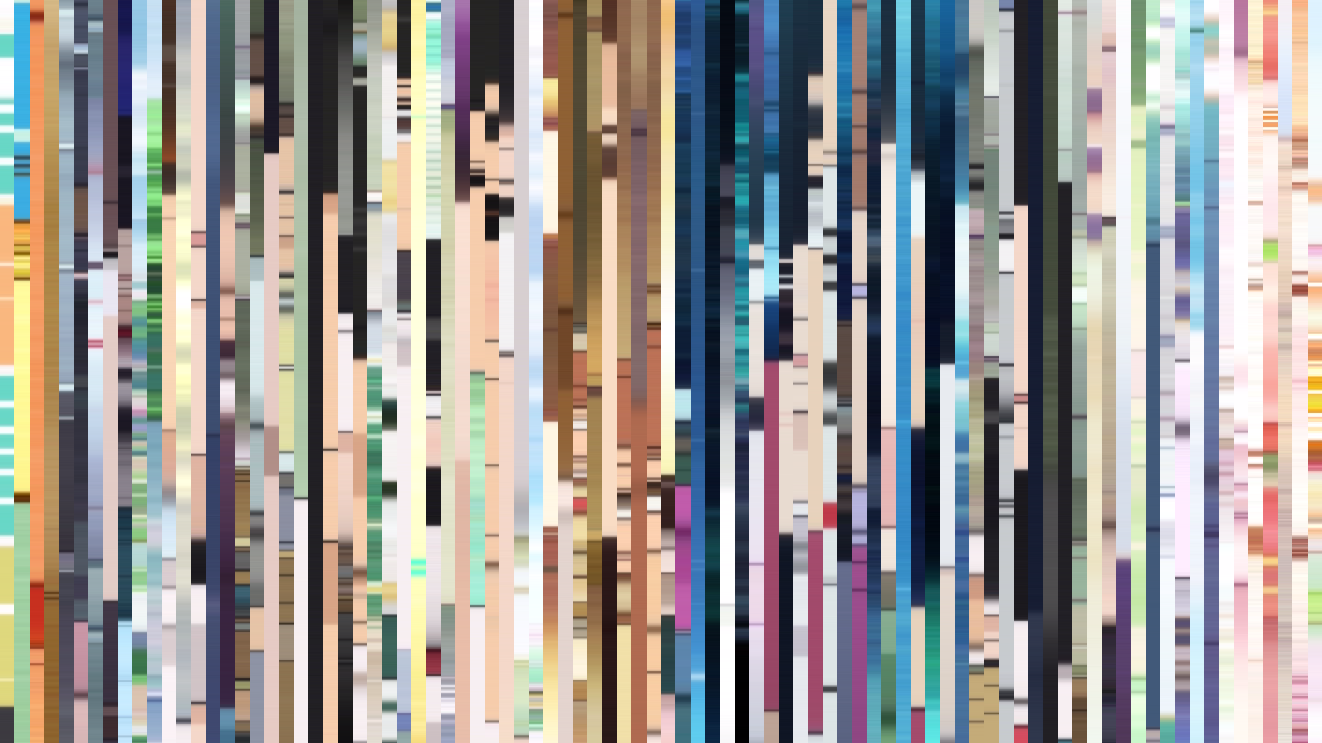
Slice · 15s
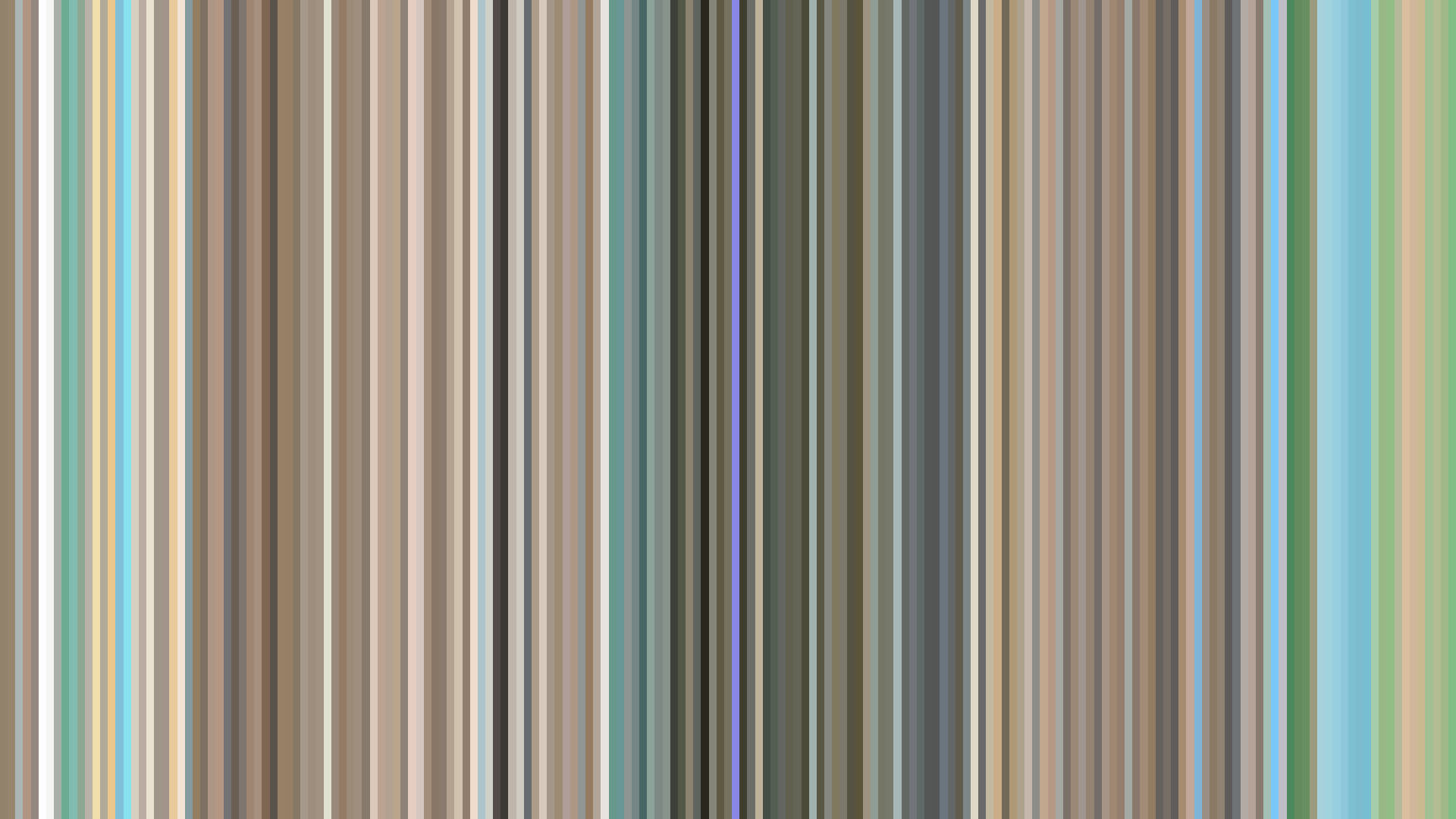
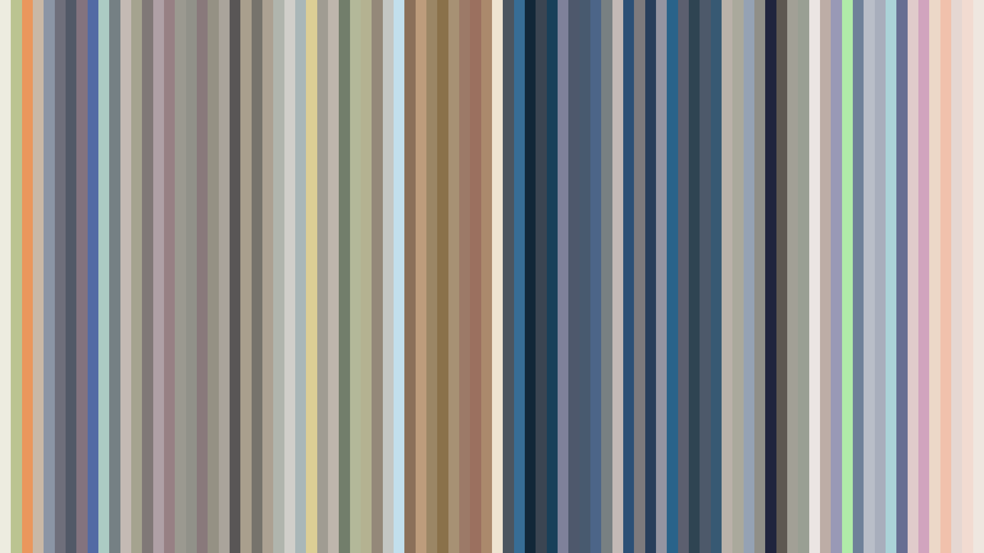
Avg · 15s
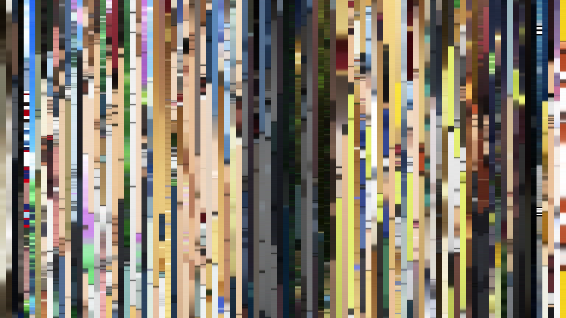
Slice · 30s
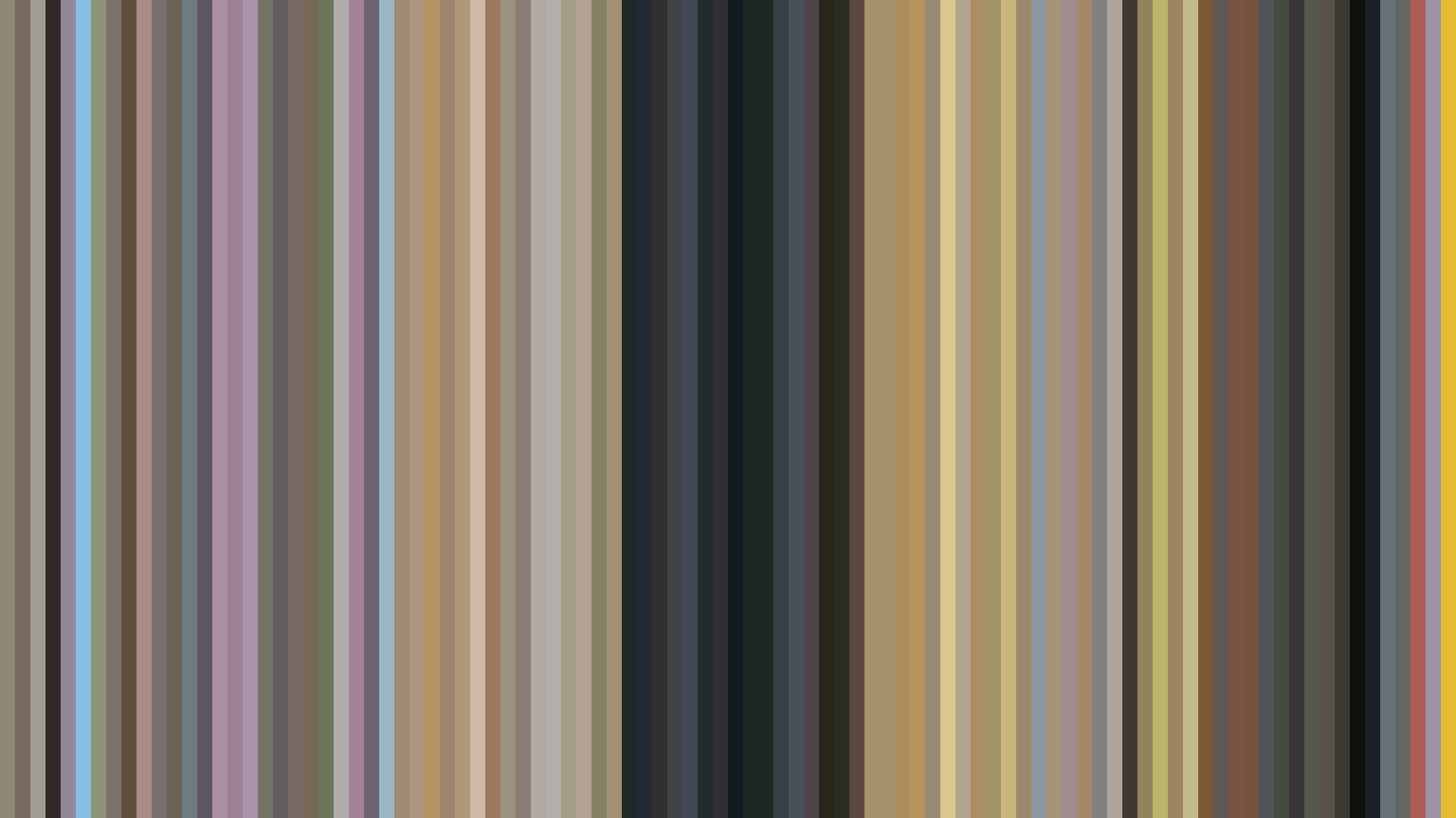
Avg · 30s
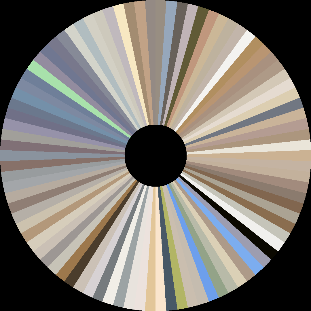
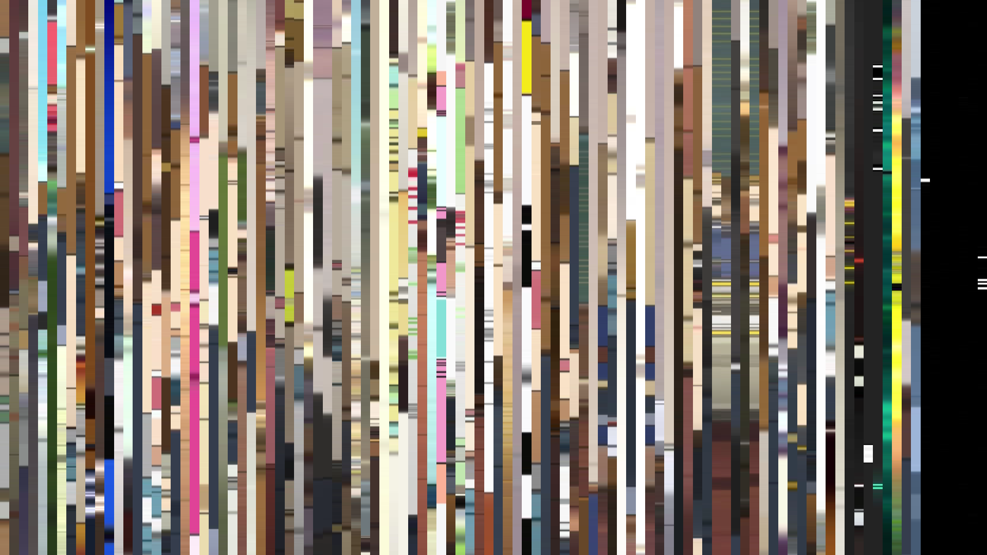
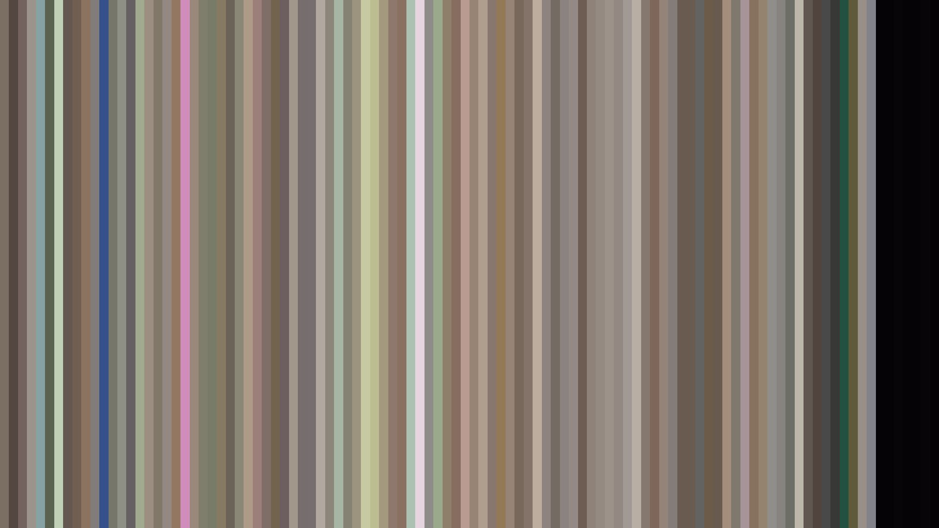
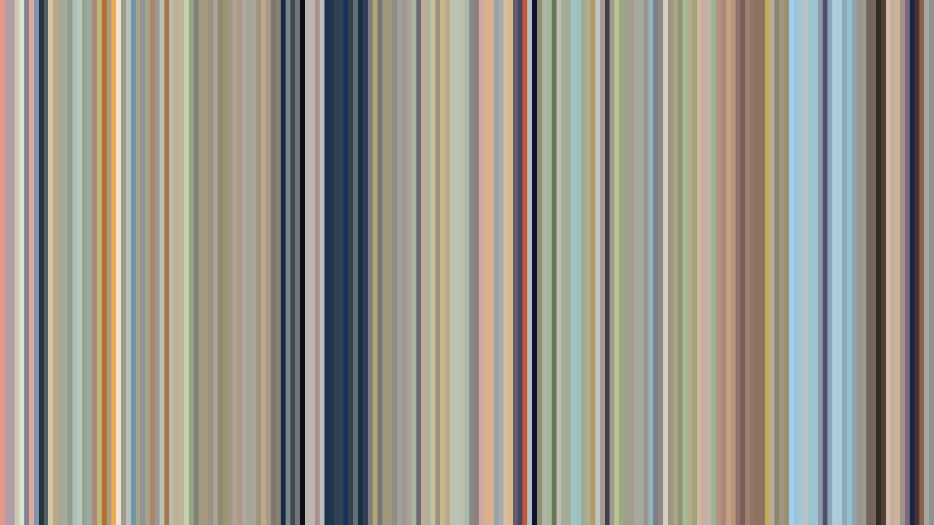
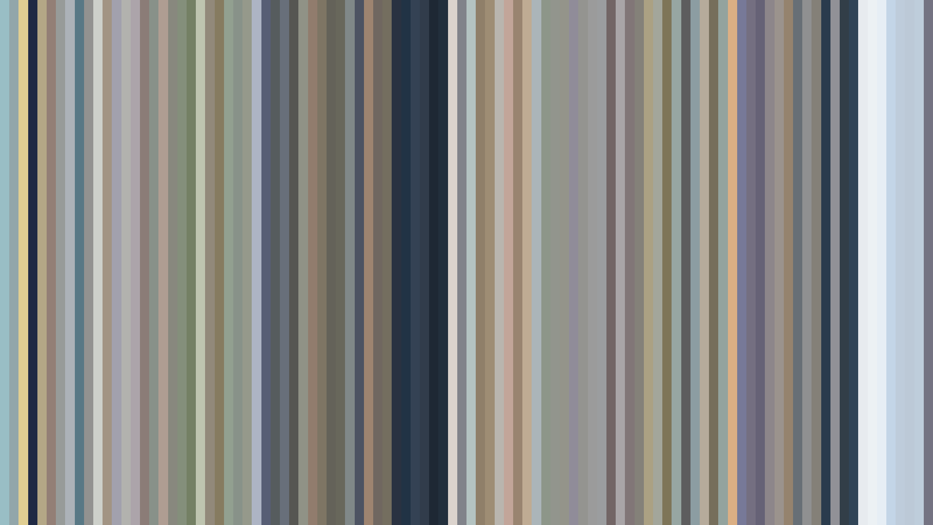
Nodame Cantabile Finale’s barcode is a study in refusal—refusal to build drama through light. The brightness arc is flat to the point of stasis: opening at 0.597, middle 0.622, closing 0.621. Director Ken’ichi Kasai and the J.C.Staff color team understand that the third season of a romance doesn’t need a fall arc or a bright-ending crescendo. Chiaki and Nodame are already together; the conflict is internal, professional, measured. The palette, dominated by Red-Orange (39 percent) and Red (32 percent), bleeds warmth, but the low average saturation (0.202) mutes it into something closer to parchment than passion. Those blues and grays—#EFE7DB cream, #A1A0A1 neutral, #615D59 slate—are the colors of rehearsal rooms and conservatory walls. This is not the fire of first love but the steady glow of two artists learning to coexist. The Blue-Green minority (12 percent) sneaks in as the cool counterpoint: the competitive edge, the jealousy, the silence between notes. Finale’s visual language treats maturity as a soft, even light—no shadows to conquer, no spikes in intensity.
Brightness Arc (episode progression)
Hue Distribution
Act Breakdown
Opening
0.597
Middle
0.622
Closing
0.621
Avg Brightness
0.650
Avg Saturation
0.202
Warmth
0.563
Color Palette
#EFE7DB
#615D59
#A1A0A1
#ECD2B2
#CFB2A1
#242420
#A98E6C
#957158
3-Act Color Story
Opening
Middle
Closing
Color Twins
Perceptually nearest palettes — measured in OKLab space, not RGB


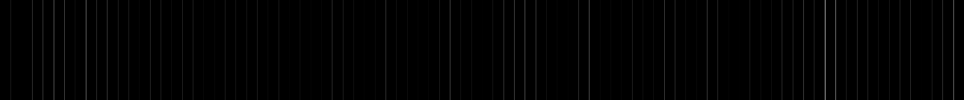


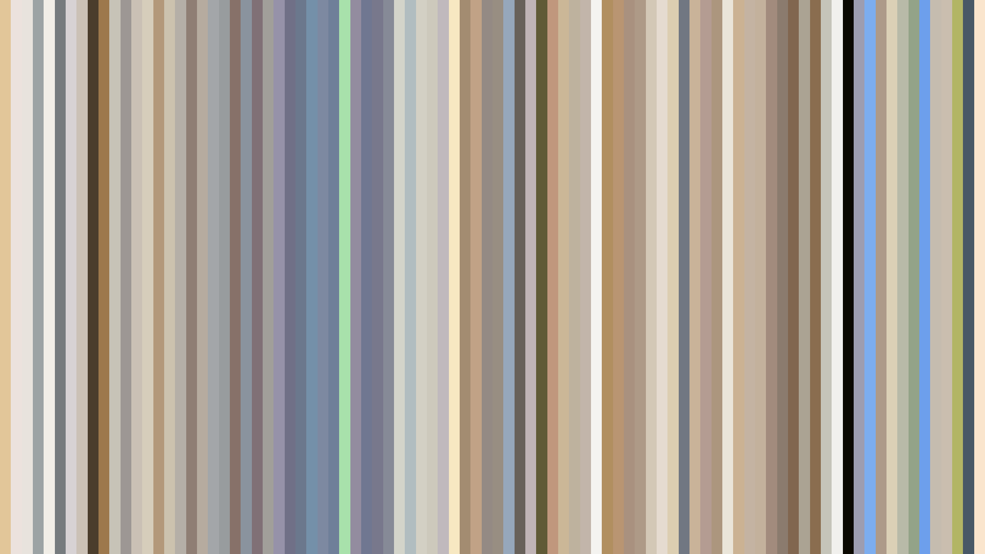

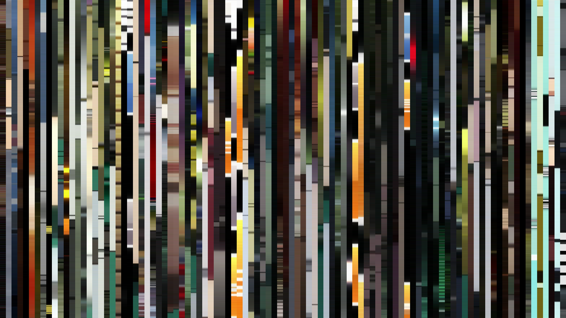
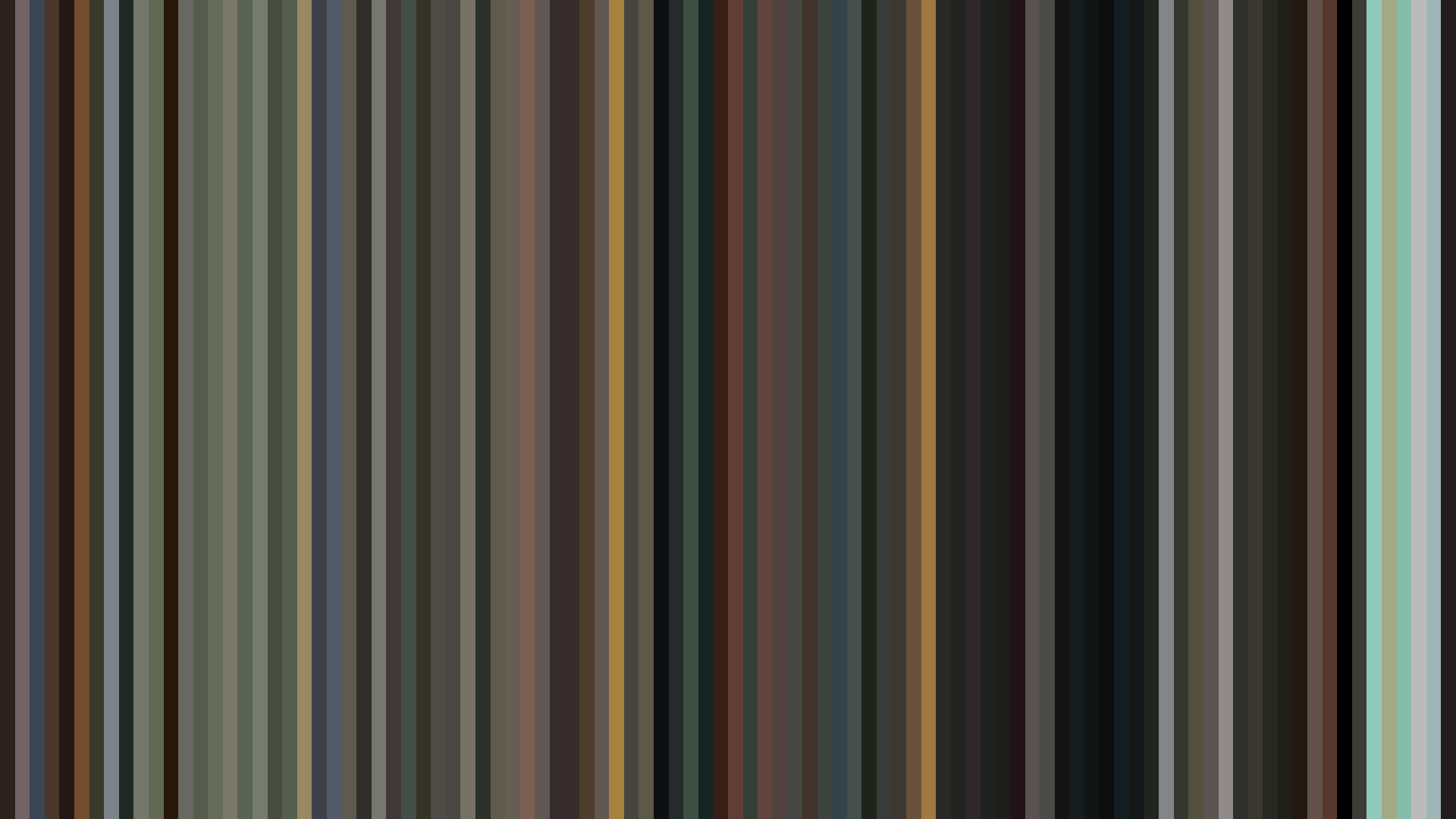

Nodame Cantabile Finale’s barcode is a study in refusal—refusal to build drama through light. The brightness arc is flat to the point of stasis: opening at 0.597, middle 0.622, closing 0.621. Director Ken’ichi Kasai and the J.C.Staff color team understand that the third season of a romance doesn’t need a fall arc or a bright-ending crescendo. Chiaki and Nodame are already together; the conflict is internal, professional, measured. The palette, dominated by Red-Orange (39 percent) and Red (32 percent), bleeds warmth, but the low average saturation (0.202) mutes it into something closer to parchment than passion. Those blues and grays—#EFE7DB cream, #A1A0A1 neutral, #615D59 slate—are the colors of rehearsal rooms and conservatory walls. This is not the fire of first love but the steady glow of two artists learning to coexist. The Blue-Green minority (12 percent) sneaks in as the cool counterpoint: the competitive edge, the jealousy, the silence between notes. Finale’s visual language treats maturity as a soft, even light—no shadows to conquer, no spikes in intensity.