Edit Pace — frame-to-frame color delta (bright = fast cuts)
Color Temperature — warm (gold) vs cool (teal) per frame
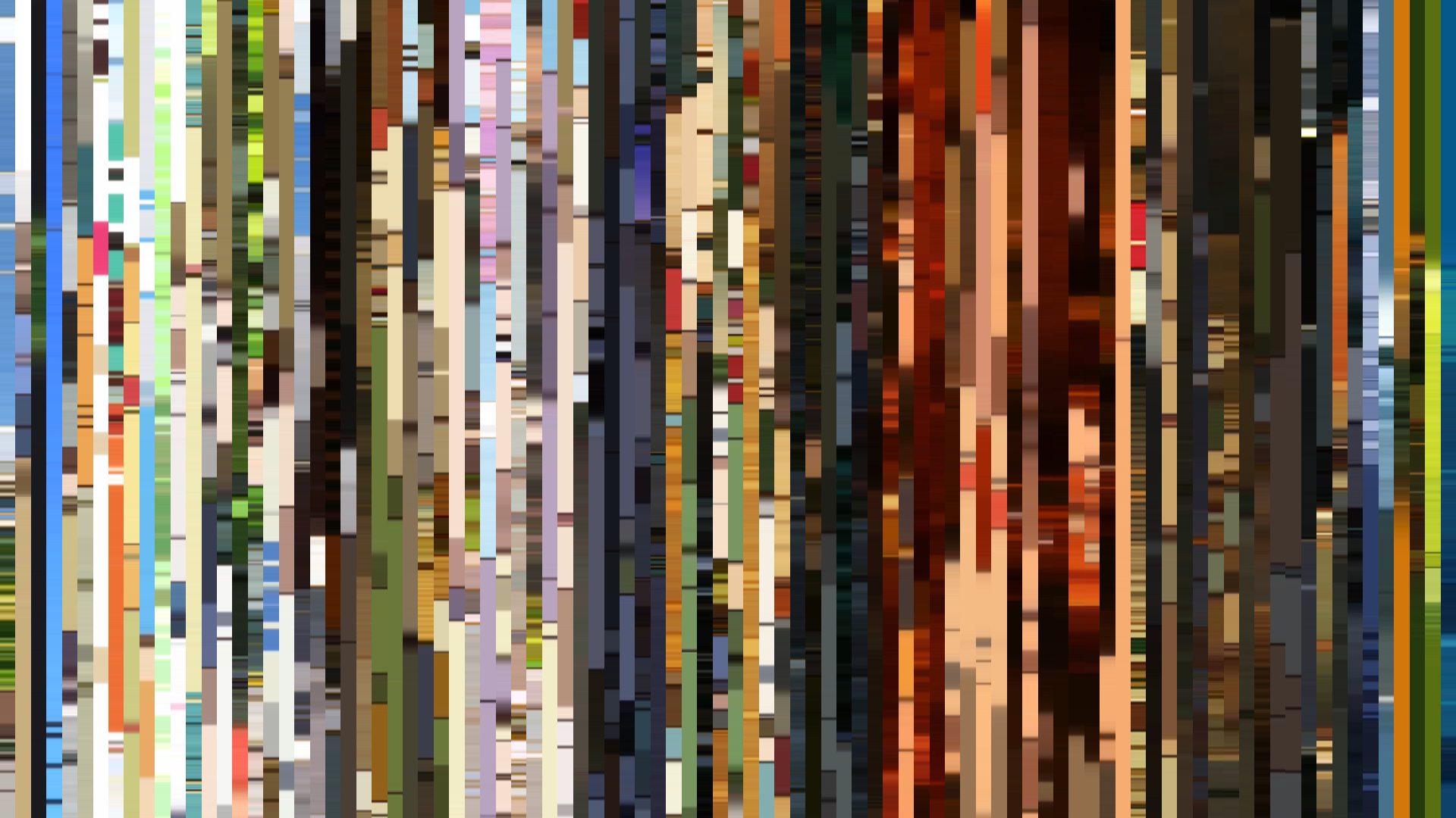
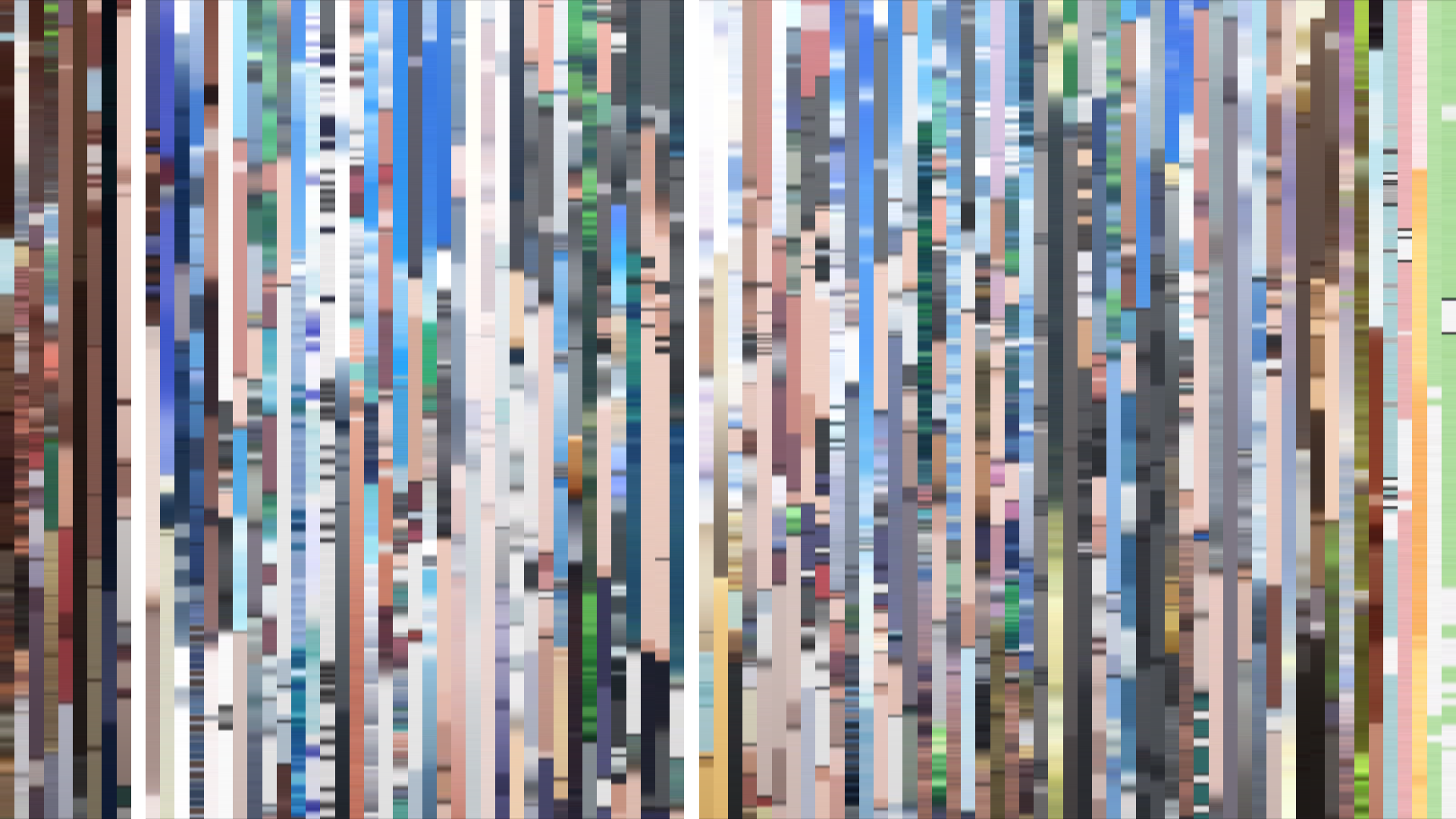
Frame Density Comparison — every 2nd vs every 4th frame
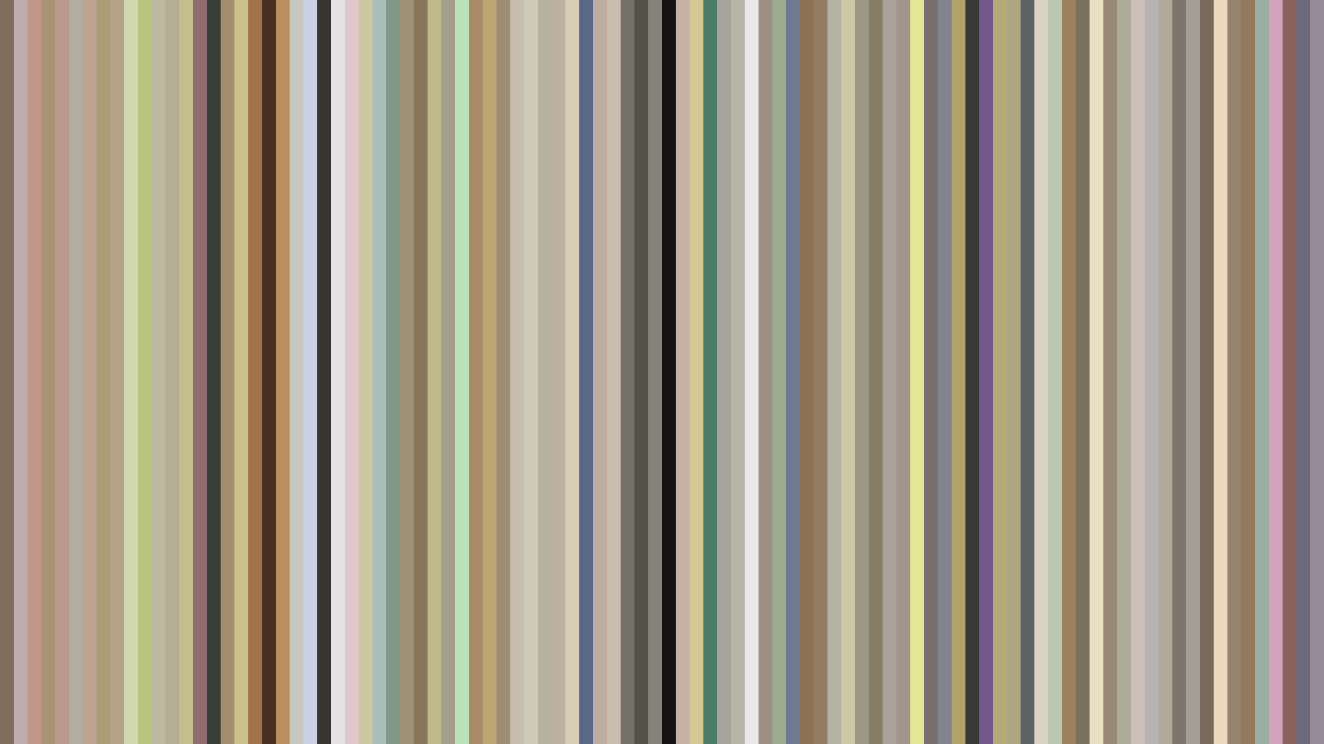
Slice · 15s
Avg · 15s
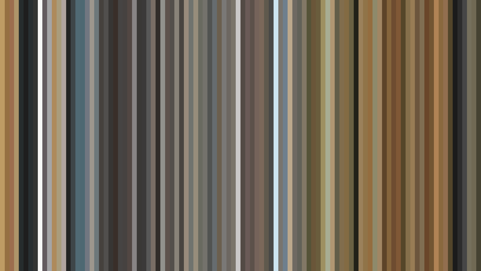
Slice · 30s
Avg · 30s
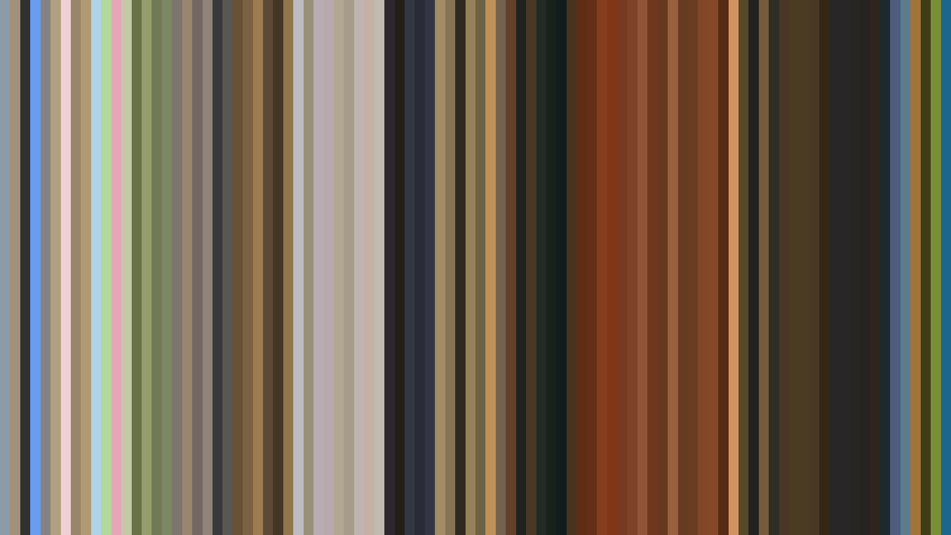
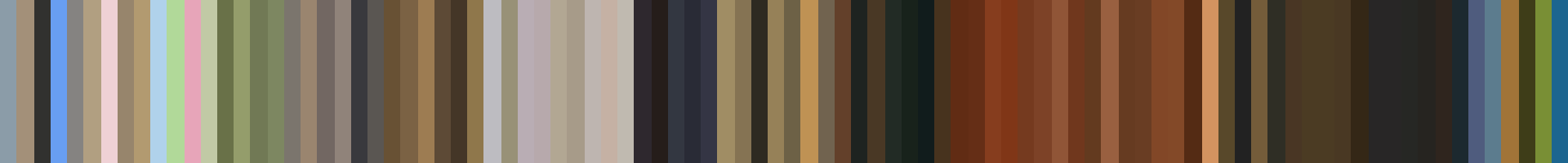
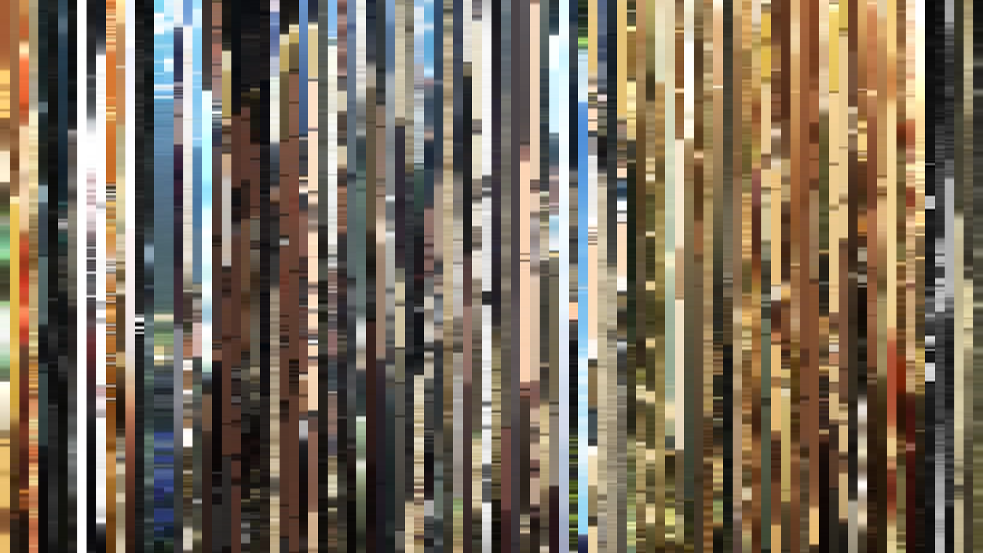
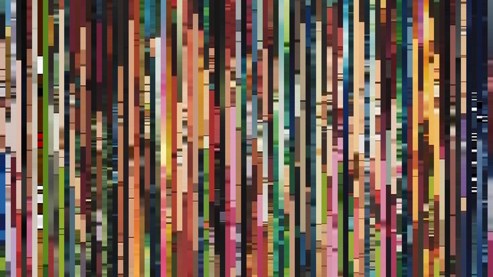
The barcode tells a story of erosion, not adventure. *The Eccentric Family* begins in the warm glow of Kyoto’s autumn light—opening act brightness at 0.582, a palette of cream (#ECE9E0) and sunlit green (#5E542D) that suggests a whimsical folk tale. But the *falling arc* is ruthless: middle act sinks to 0.342, closing act to 0.258, a literal descent into shadow. This is P.A. Works at its most painterly, but also its most deliberate. The Red-Orange dominance (40%) and the deep browns from the palette (#231D17, #542816) are not just the colors of tanuki fur and temple wood—they are the colors of a world being drained of warmth. Director Masayuki Yoshihara and art director Katsushi Aoki are not merely showing a family’s struggle; they are showing the slow death of magic under the weight of human reality. The *warm opening* is a seduction, a lie that the tanuki themselves believe in. By the end, the sky is gone, the palette clings to the cold earth tones (#5C5B58), and the brightness bottoms out. This is not a fall from grace—it is a fall *into* grace, into the necessary darkness of grown-up consequence. The barcode is a pulse flatlining.
Brightness Arc (episode progression)
Hue Distribution
Act Breakdown
Opening
0.582
Middle
0.342
Closing
0.258
Avg Brightness
0.405
Avg Saturation
0.386
Warmth
0.567
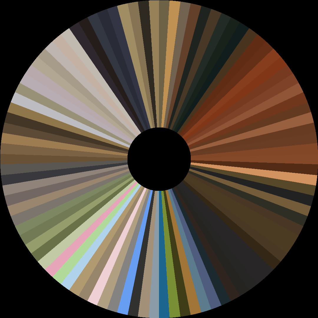
Color Palette
#231D17
#542816
#ECE9E0
#5E542D
#5C5B58
#A7A29E
#E0D3A7
#937051
3-Act Color Story
Opening
Middle
Closing
Color Twins
Perceptually nearest palettes — measured in OKLab space, not RGB


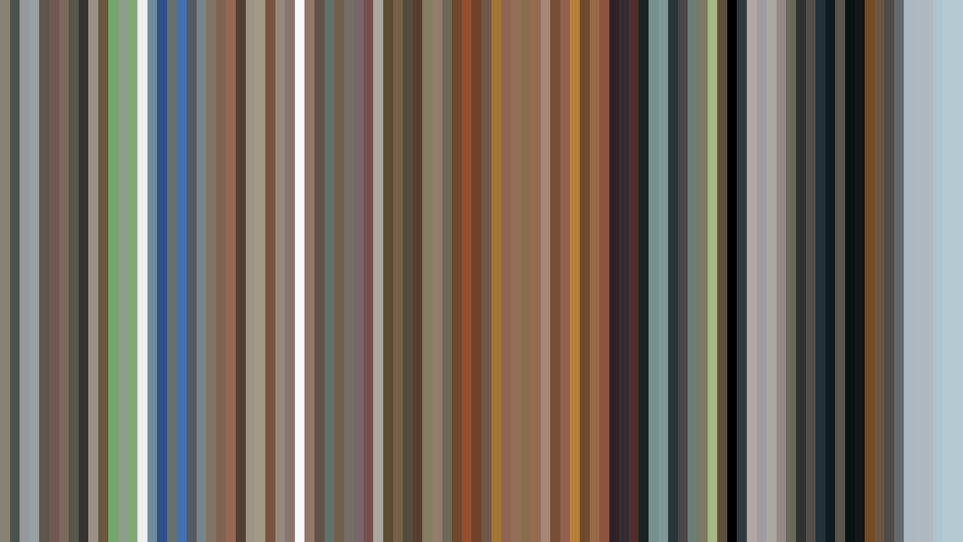

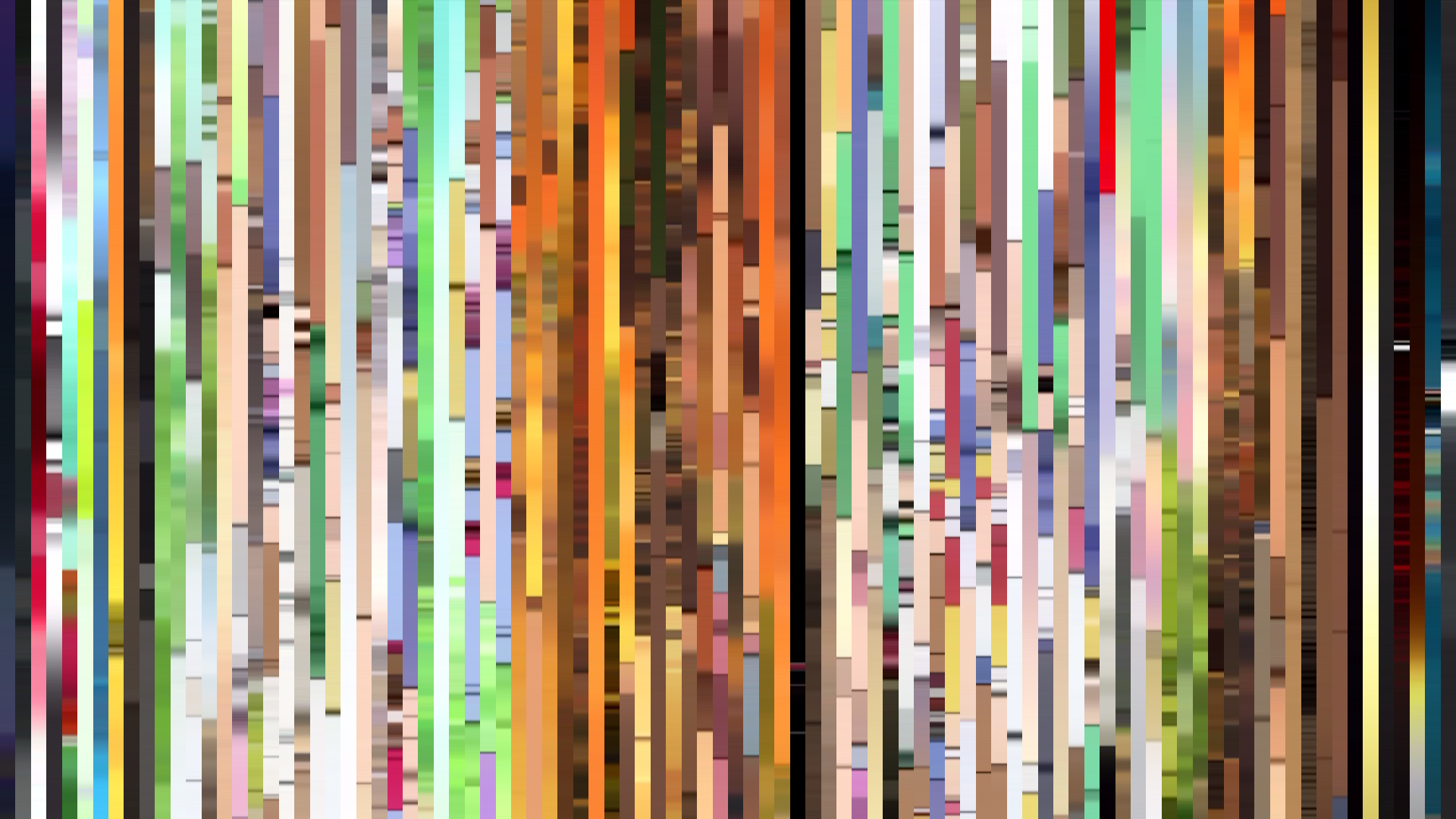
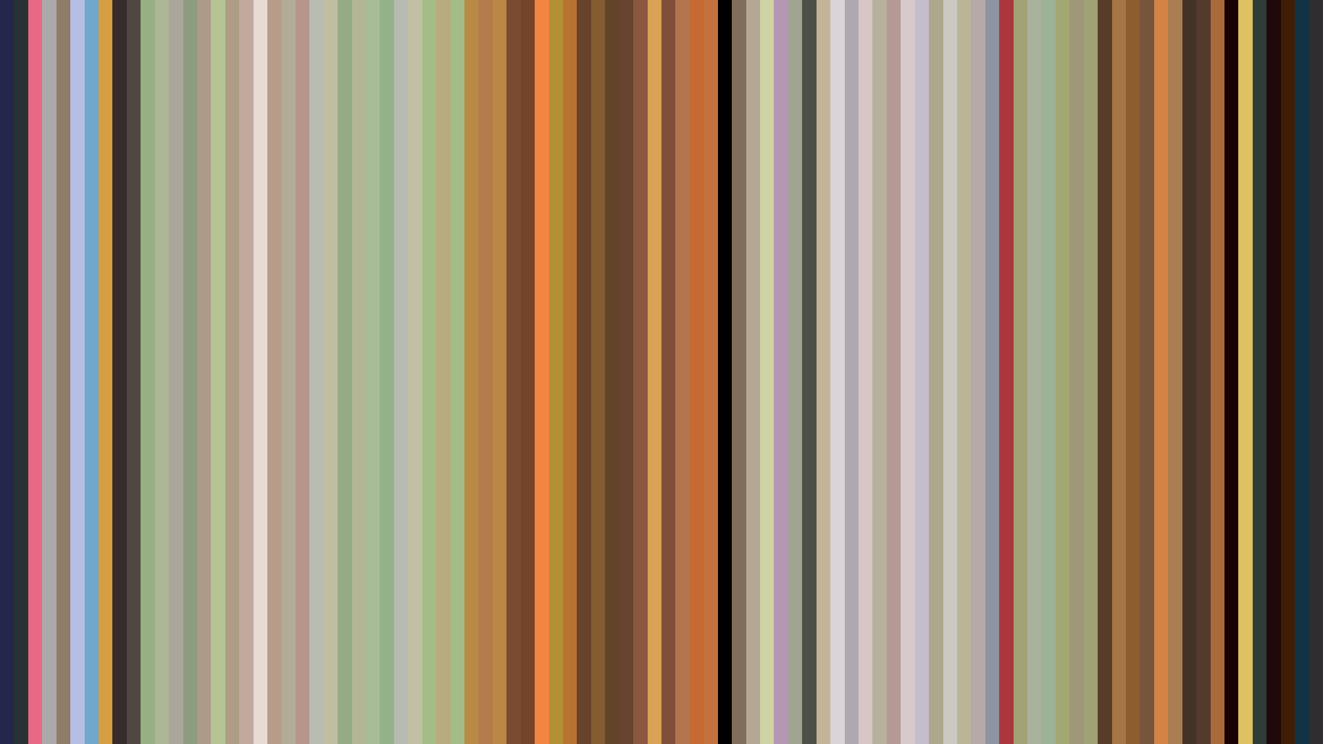


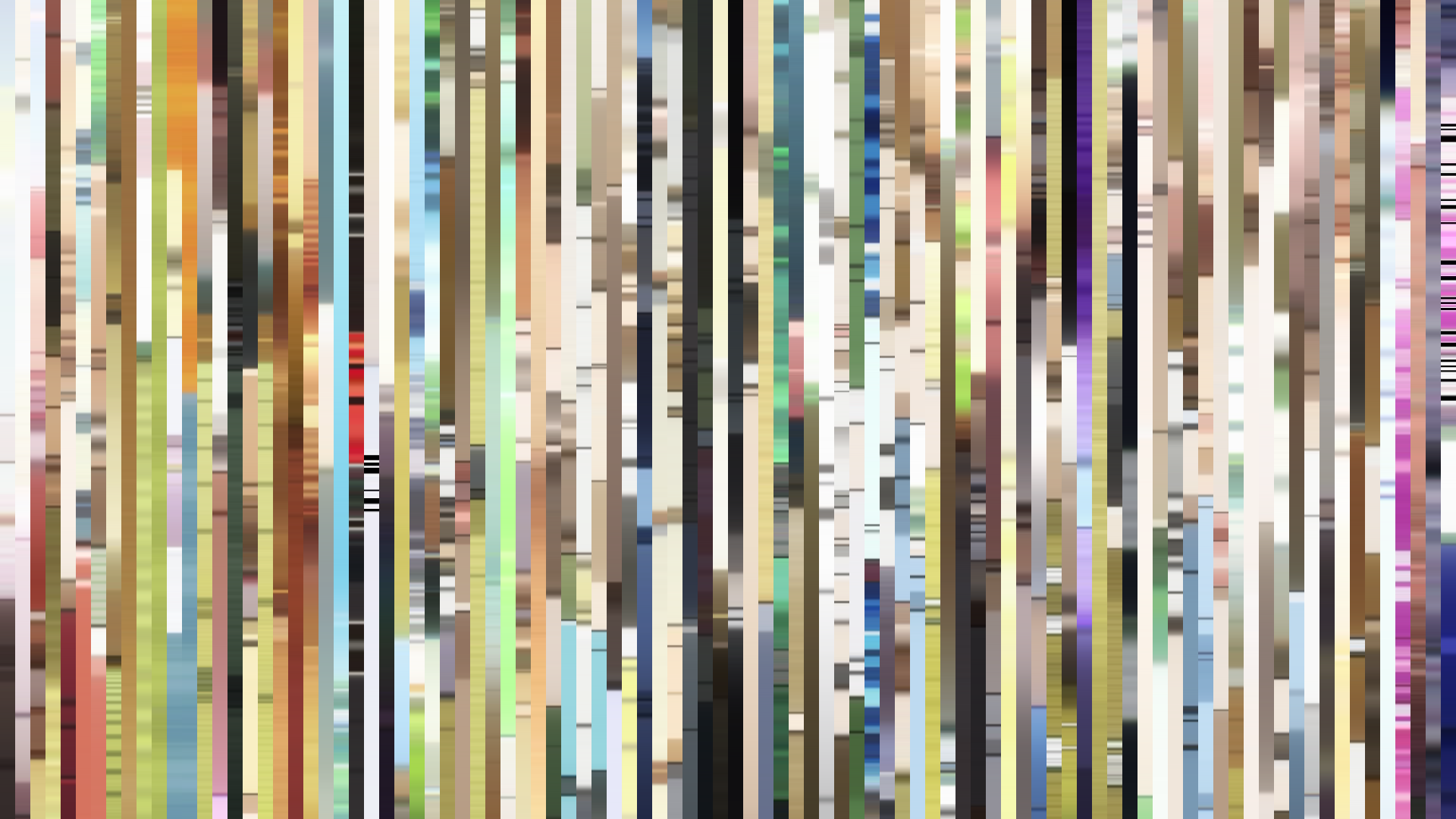

The barcode tells a story of erosion, not adventure. *The Eccentric Family* begins in the warm glow of Kyoto’s autumn light—opening act brightness at 0.582, a palette of cream (#ECE9E0) and sunlit green (#5E542D) that suggests a whimsical folk tale. But the *falling arc* is ruthless: middle act sinks to 0.342, closing act to 0.258, a literal descent into shadow. This is P.A. Works at its most painterly, but also its most deliberate. The Red-Orange dominance (40%) and the deep browns from the palette (#231D17, #542816) are not just the colors of tanuki fur and temple wood—they are the colors of a world being drained of warmth. Director Masayuki Yoshihara and art director Katsushi Aoki are not merely showing a family’s struggle; they are showing the slow death of magic under the weight of human reality. The *warm opening* is a seduction, a lie that the tanuki themselves believe in. By the end, the sky is gone, the palette clings to the cold earth tones (#5C5B58), and the brightness bottoms out. This is not a fall from grace—it is a fall *into* grace, into the necessary darkness of grown-up consequence. The barcode is a pulse flatlining.