Edit Pace — frame-to-frame color delta (bright = fast cuts)
Color Temperature — warm (gold) vs cool (teal) per frame
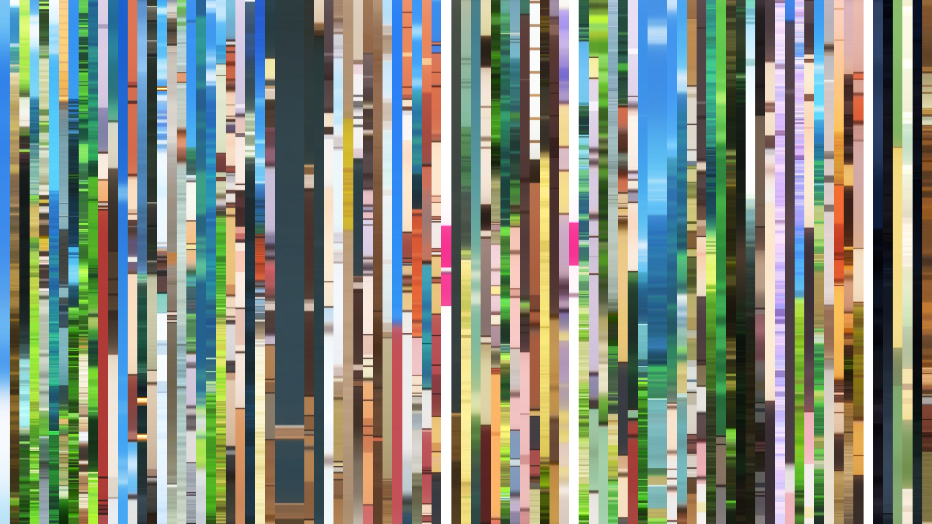
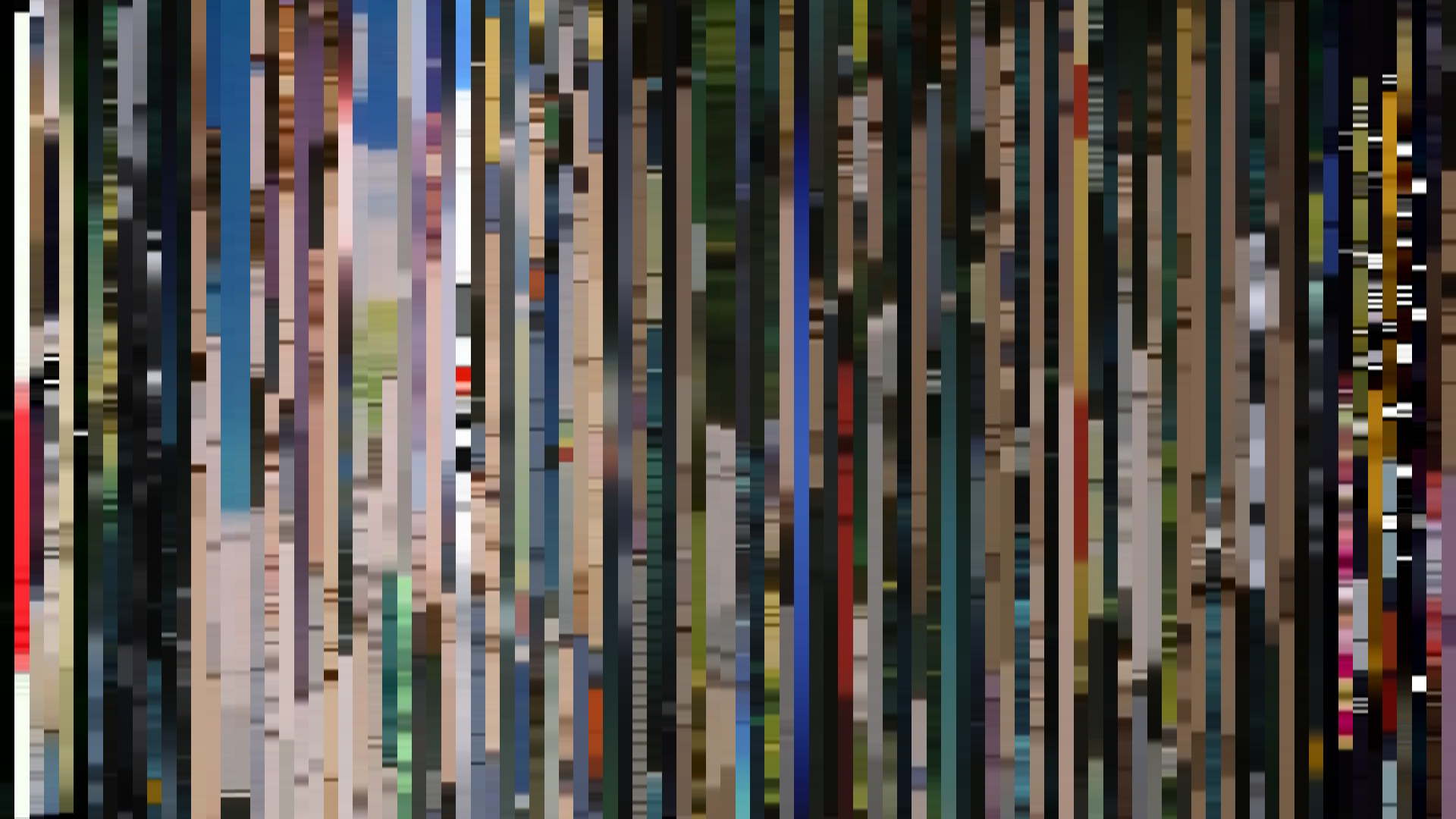
Frame Density Comparison — every 2nd vs every 4th frame
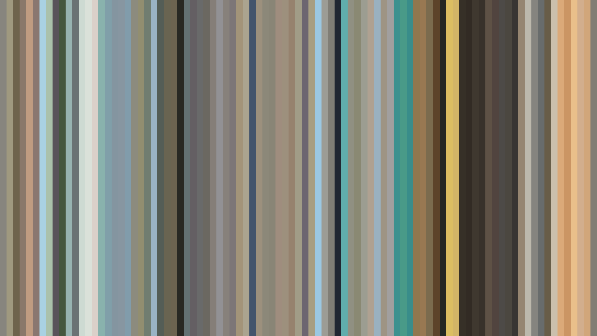
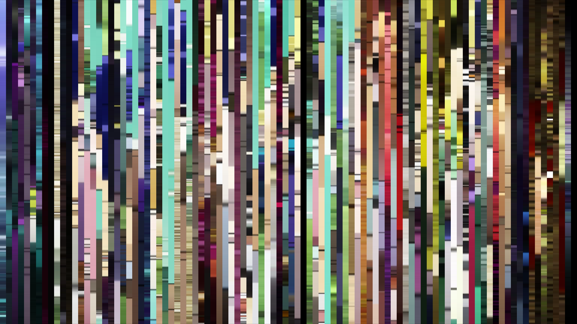
Slice · 15s
Avg · 15s
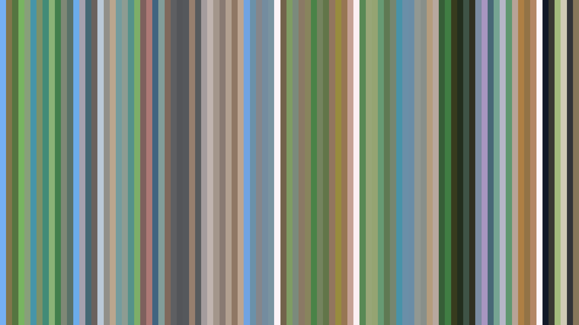
Slice · 30s
Avg · 30s
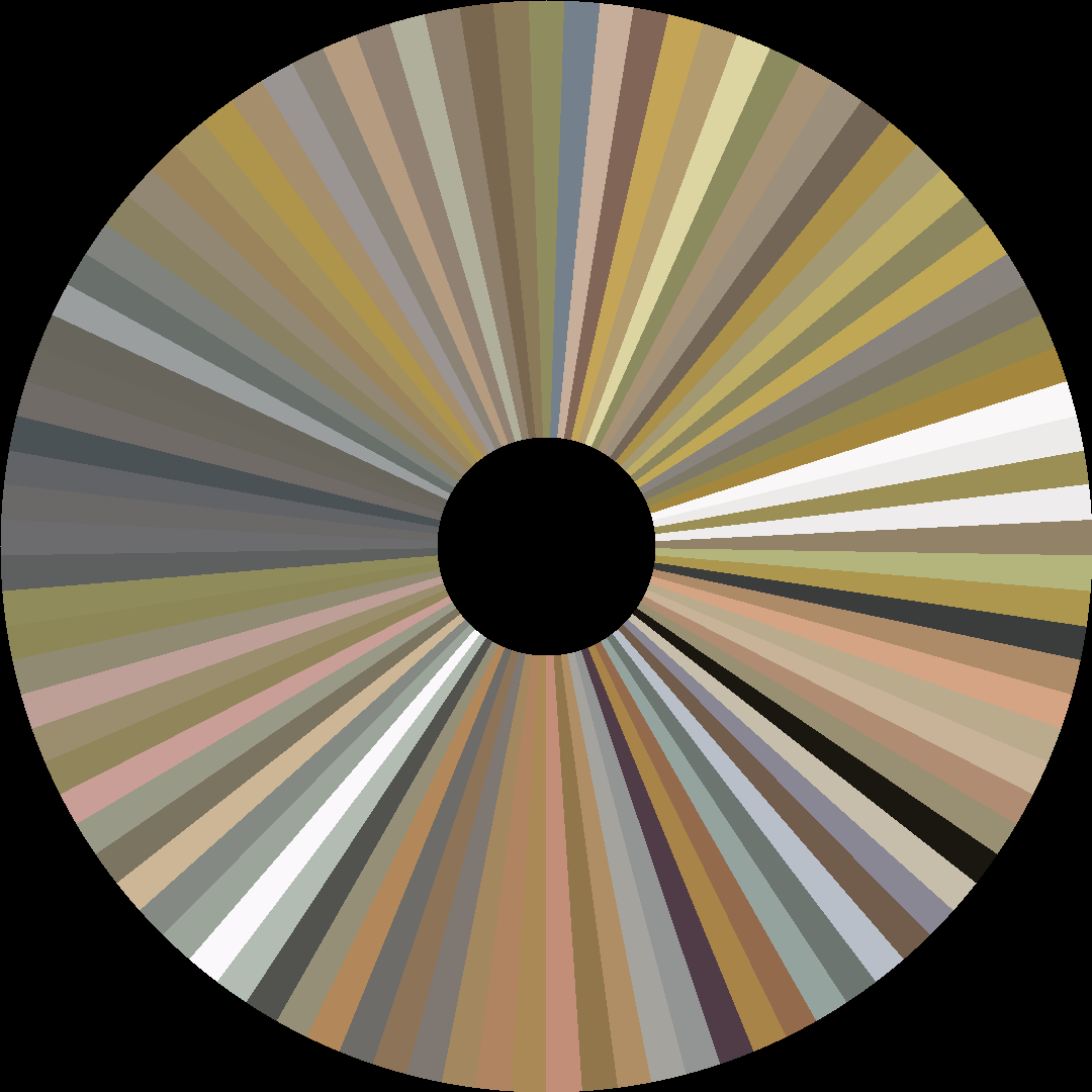
The data tells us what every viewer already *feels*: *Haikyuu!!* is a story of ascent told in Red-Orange. Production I.G’s 2014 sports series doesn’t just spike; it burns. The palette’s triadic structure—muted grays and warm ochres clashing against a 68% Red-Orange dominance—mirrors the show’s central tension: the grimy, sweat-slicked reality of a high school gymnasium versus the fiery will to leap higher. The *bright-opening* arc is no accident. Director Susumu Mitsunaka and art director Yuka Hirama front-load the series with the blinding fluorescence of tournament lights and polished wooden floors, a visual optimism that *overcorrects* into the middle act’s brighter peak, only to sag slightly in the closing as fatigue and stakes set in. The average saturation of 0.270 is tellingly low for such a loud premise; the show refuses to cartoonize. The rust-brown of the gym floor, the pale beige of uniforms, the washed-out sky—these are colors that feel *physical*, worn down by daily practice. The Red-Orange isn’t spectacle; it is *effort* made visible.
Brightness Arc (episode progression)
Hue Distribution
Act Breakdown
Opening
0.484
Middle
0.572
Closing
0.512
Avg Brightness
0.562
Avg Saturation
0.270
Warmth
0.577
Color Palette
#64625B
#A3A29A
#E8E5DC
#A39566
#E2CFAE
#262422
#CDA061
#947158
3-Act Color Story
Opening
Middle
Closing
Color Twins
Perceptually nearest palettes — measured in OKLab space, not RGB


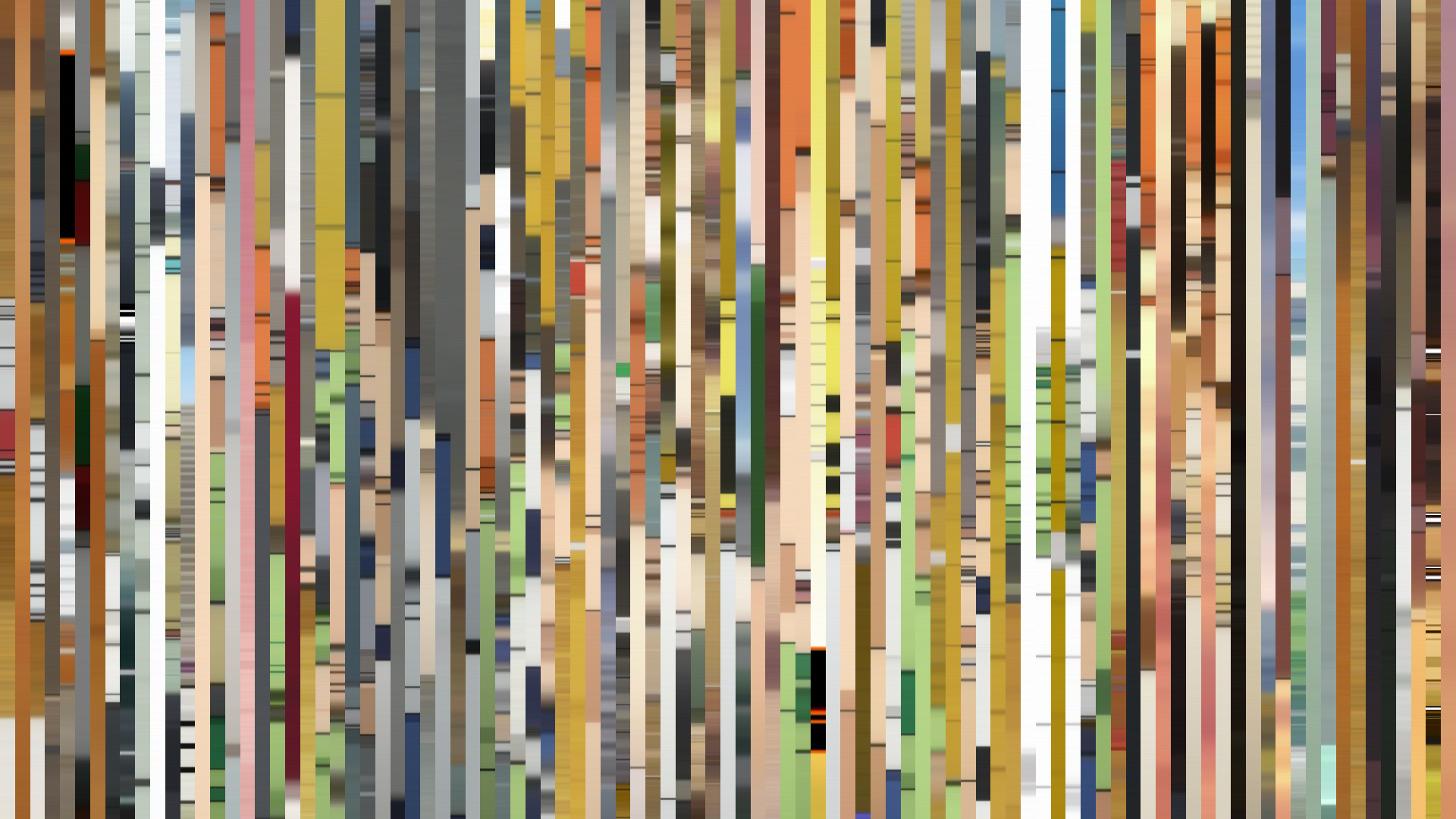


![Fate/stay night [Unlimited Blade Works]](../../../barcodes/2014/fatestay-night-unlimited-blade-works/barcode_slice.png)


The data tells us what every viewer already *feels*: *Haikyuu!!* is a story of ascent told in Red-Orange. Production I.G’s 2014 sports series doesn’t just spike; it burns. The palette’s triadic structure—muted grays and warm ochres clashing against a 68% Red-Orange dominance—mirrors the show’s central tension: the grimy, sweat-slicked reality of a high school gymnasium versus the fiery will to leap higher. The *bright-opening* arc is no accident. Director Susumu Mitsunaka and art director Yuka Hirama front-load the series with the blinding fluorescence of tournament lights and polished wooden floors, a visual optimism that *overcorrects* into the middle act’s brighter peak, only to sag slightly in the closing as fatigue and stakes set in. The average saturation of 0.270 is tellingly low for such a loud premise; the show refuses to cartoonize. The rust-brown of the gym floor, the pale beige of uniforms, the washed-out sky—these are colors that feel *physical*, worn down by daily practice. The Red-Orange isn’t spectacle; it is *effort* made visible.