Edit Pace — frame-to-frame color delta (bright = fast cuts)
Color Temperature — warm (gold) vs cool (teal) per frame
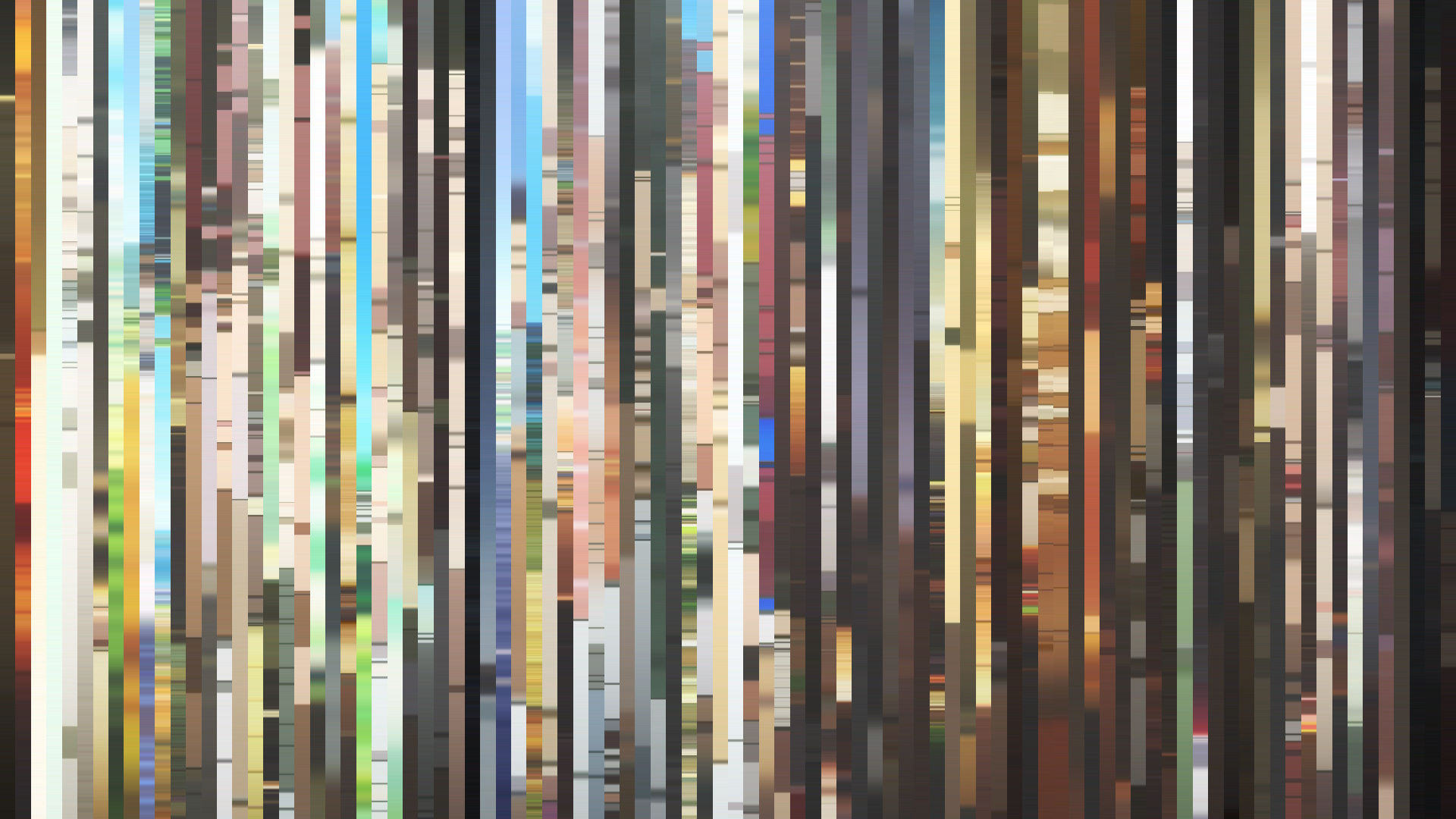
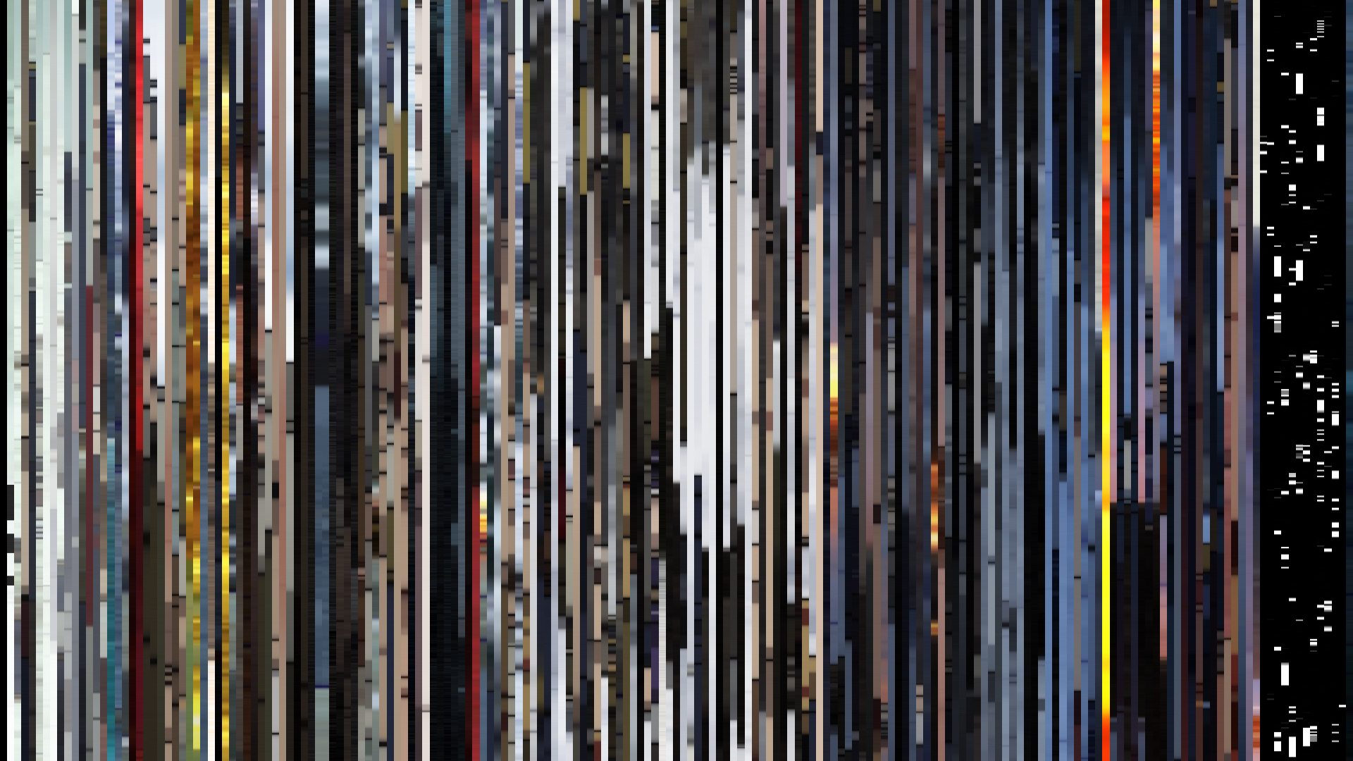
Frame Density Comparison — every 2nd vs every 4th frame
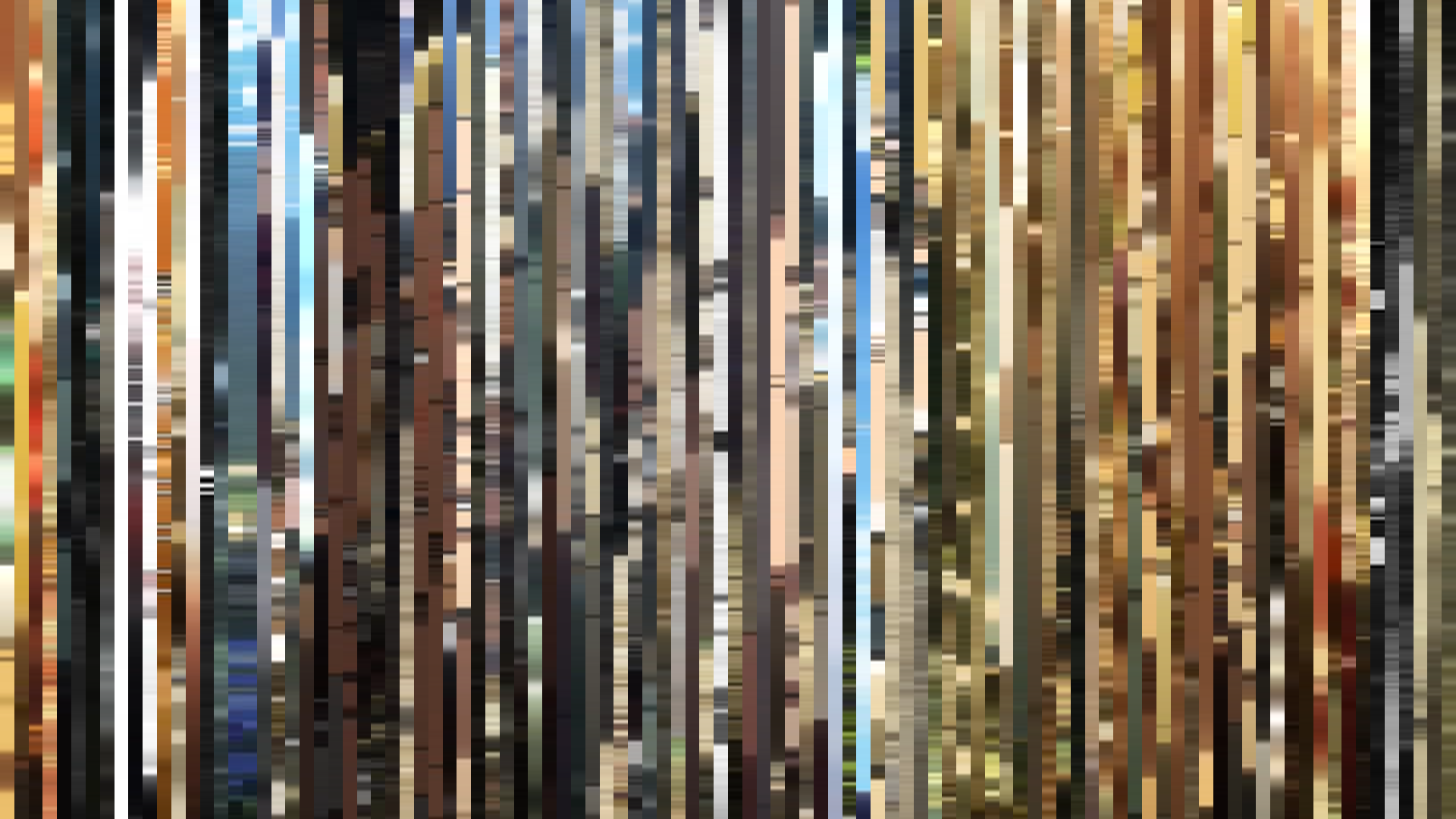
Slice · 15s
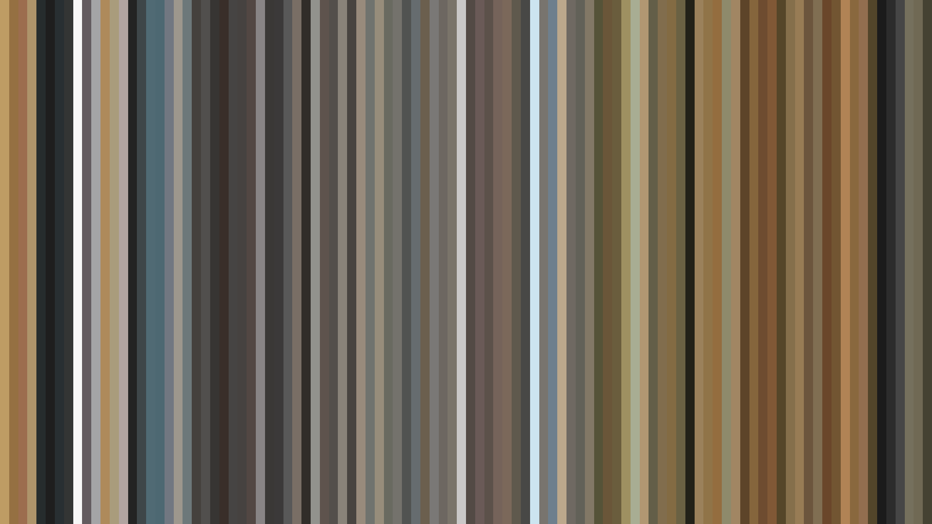
Avg · 15s
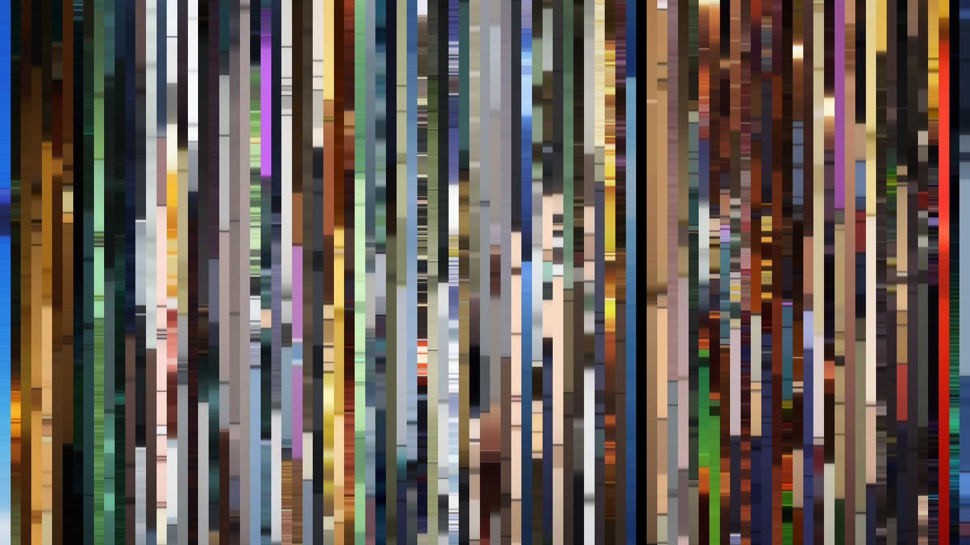
Slice · 30s
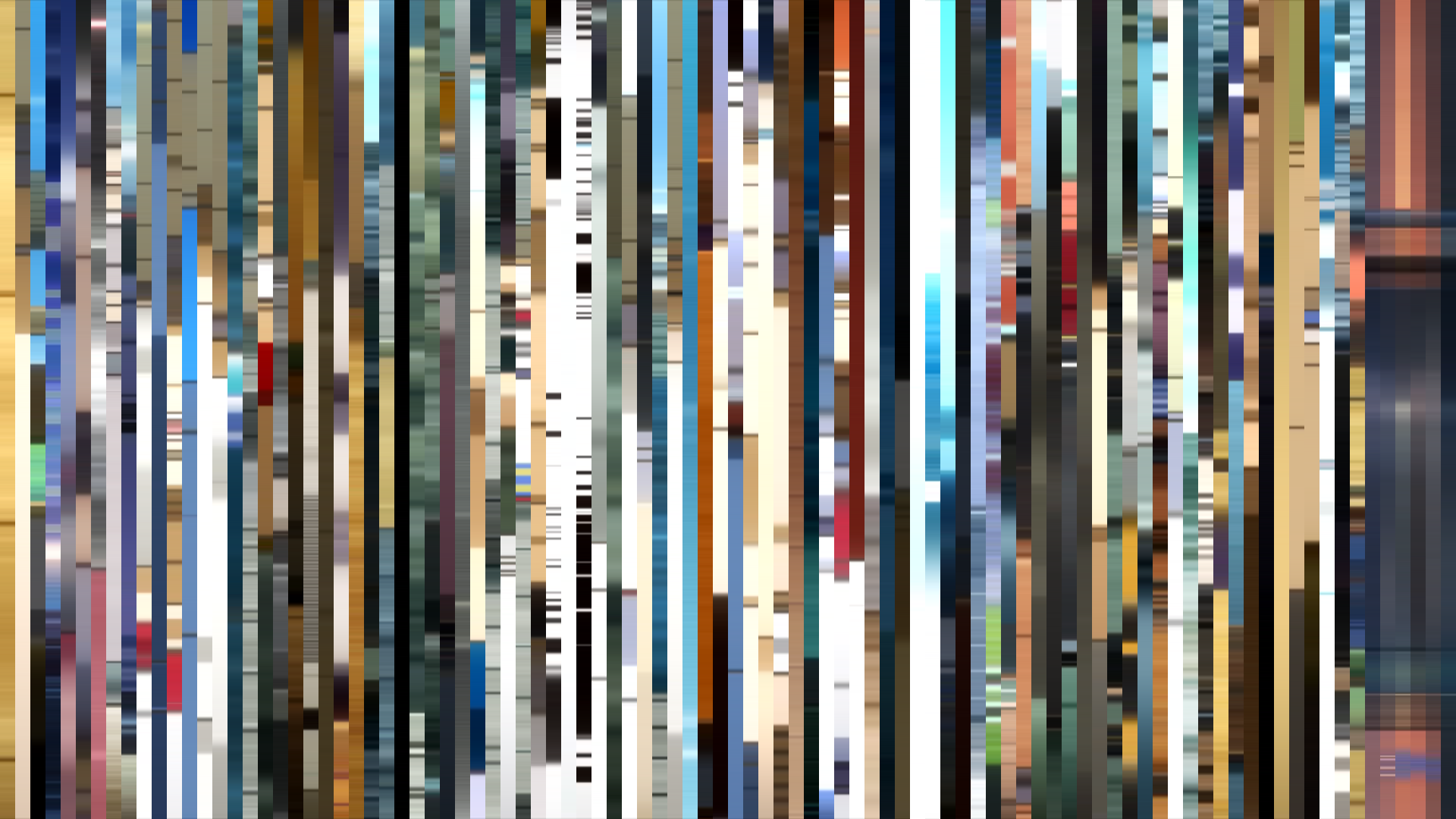
Avg · 30s
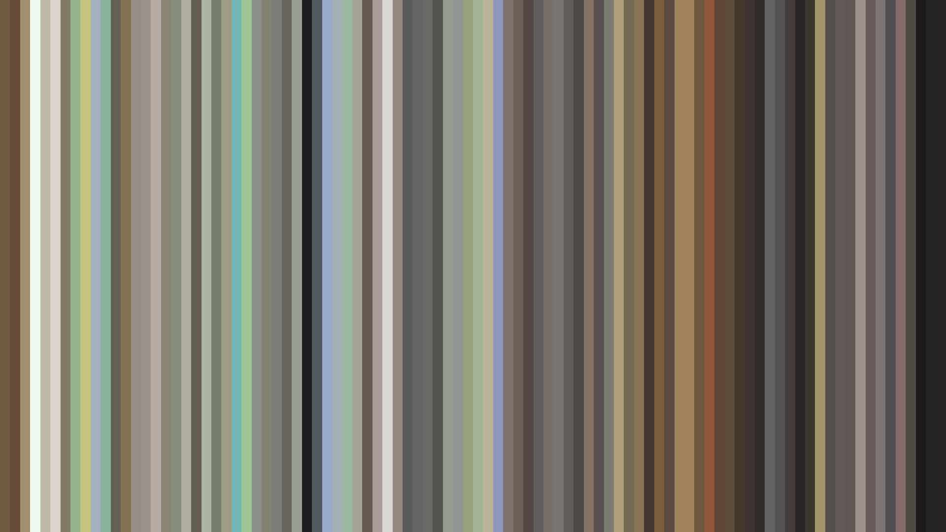
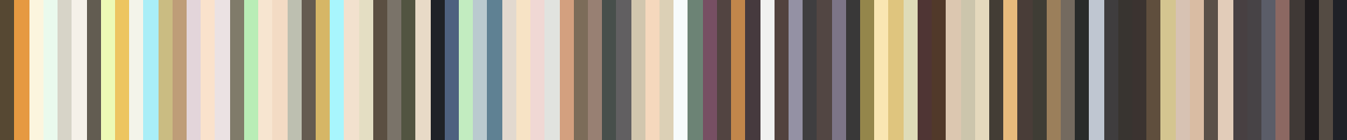
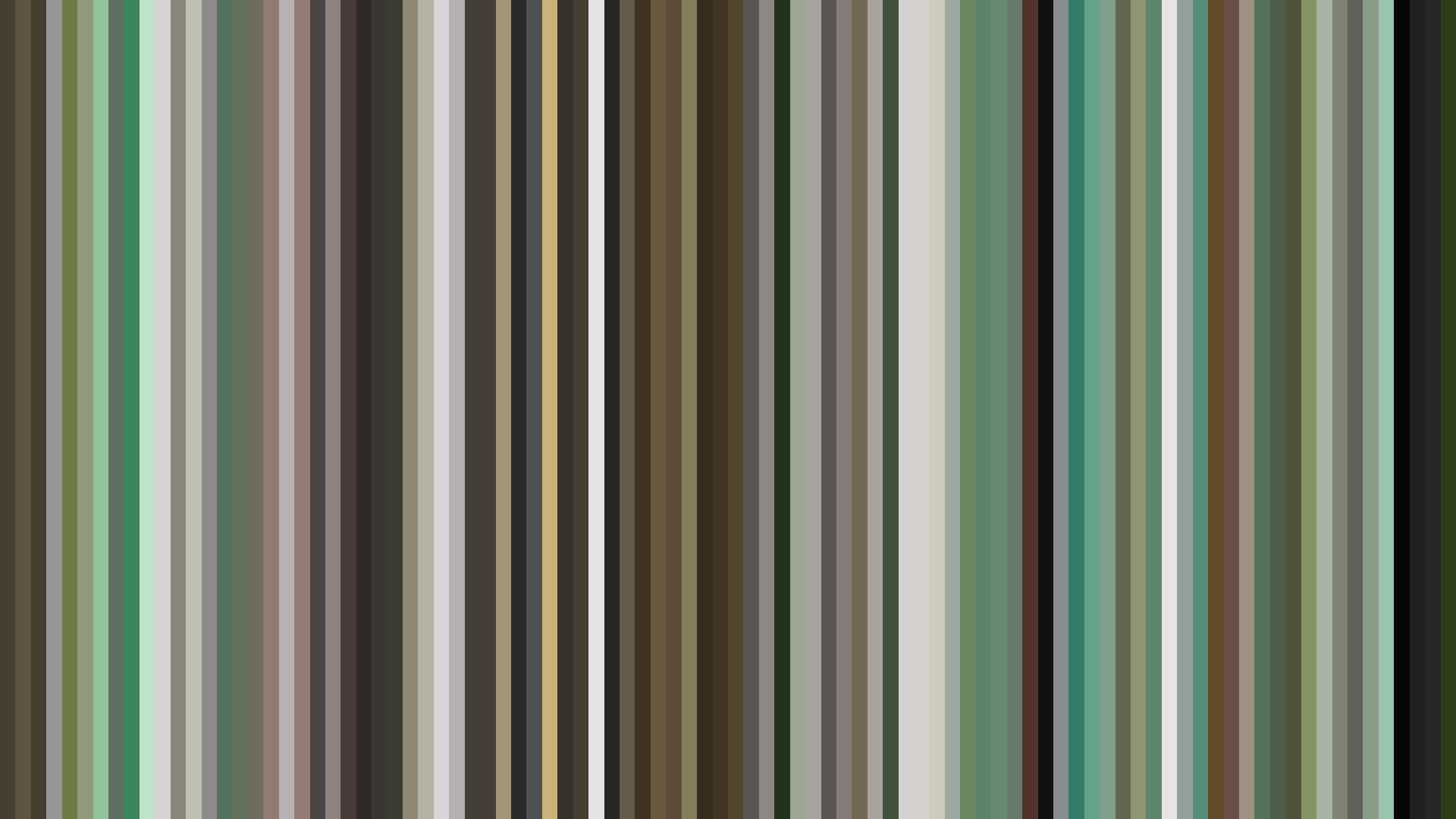
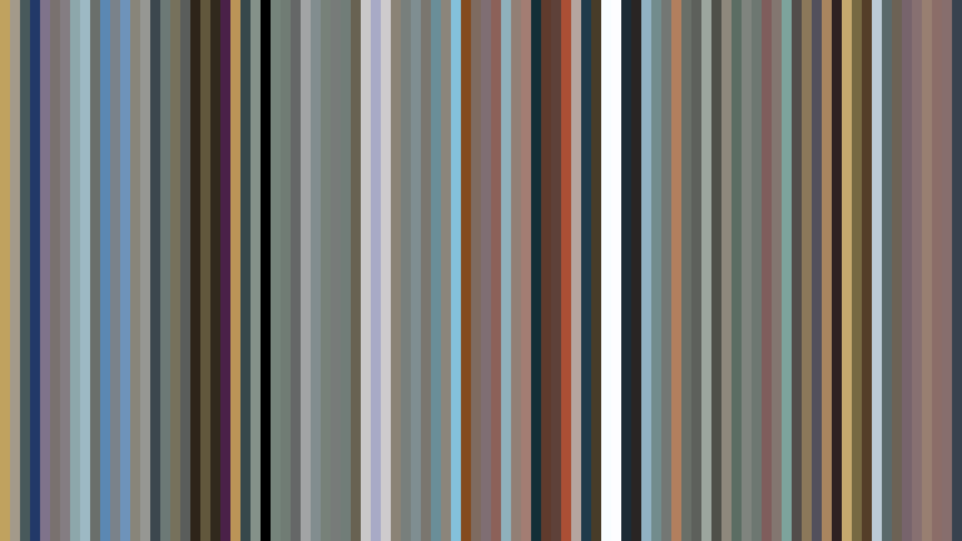
Violet Evergarden's falling arc doesn't chart a tragedy—it charts an *emotional withdrawal*. The brightness plunges from a sunlit 0.593 in the opening act to a near-black 0.295 by the close, but this is not despair: it's the color of ink bleeding into paper, of memory settling into permanence. Kyoto Animation and director Taichi Ishidate build a world where the Red-dominant palette—46% red, another 35% red-orange—evokes not passion but the warm, aching undertones of nostalgia. The characters exist in a perpetual autumn, where the golds and pale creams of the palette (#DED1AC, #E8E8DE) feel like the last light before dusk. What makes the falling arc so precise is its refusal to sentimentalize: the middle act hovers at 0.485, a gray-brown limbo where the protagonist grapples with her own humanity, before the final act sinks into the deep browns (#605A55, #483A34) of the letter-writing studio. This is not a story that brightens with resolution. The arcs drop *intentionally*, because Violet's growth is inward—each letter she writes costs a small piece of her light, but the trade is meaning.
Brightness Arc (episode progression)
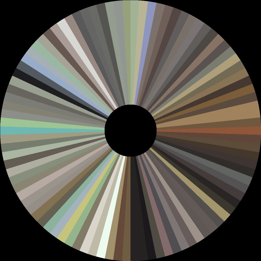
Hue Distribution
Act Breakdown
Opening
0.593
Middle
0.485
Closing
0.295
Avg Brightness
0.499
Avg Saturation
0.184
Warmth
0.547
Color Palette
#605A55
#302D2C
#E8E8DE
#A39E96
#DED1AC
#483A34
#93705D
#584639
3-Act Color Story
Opening
Middle
Closing
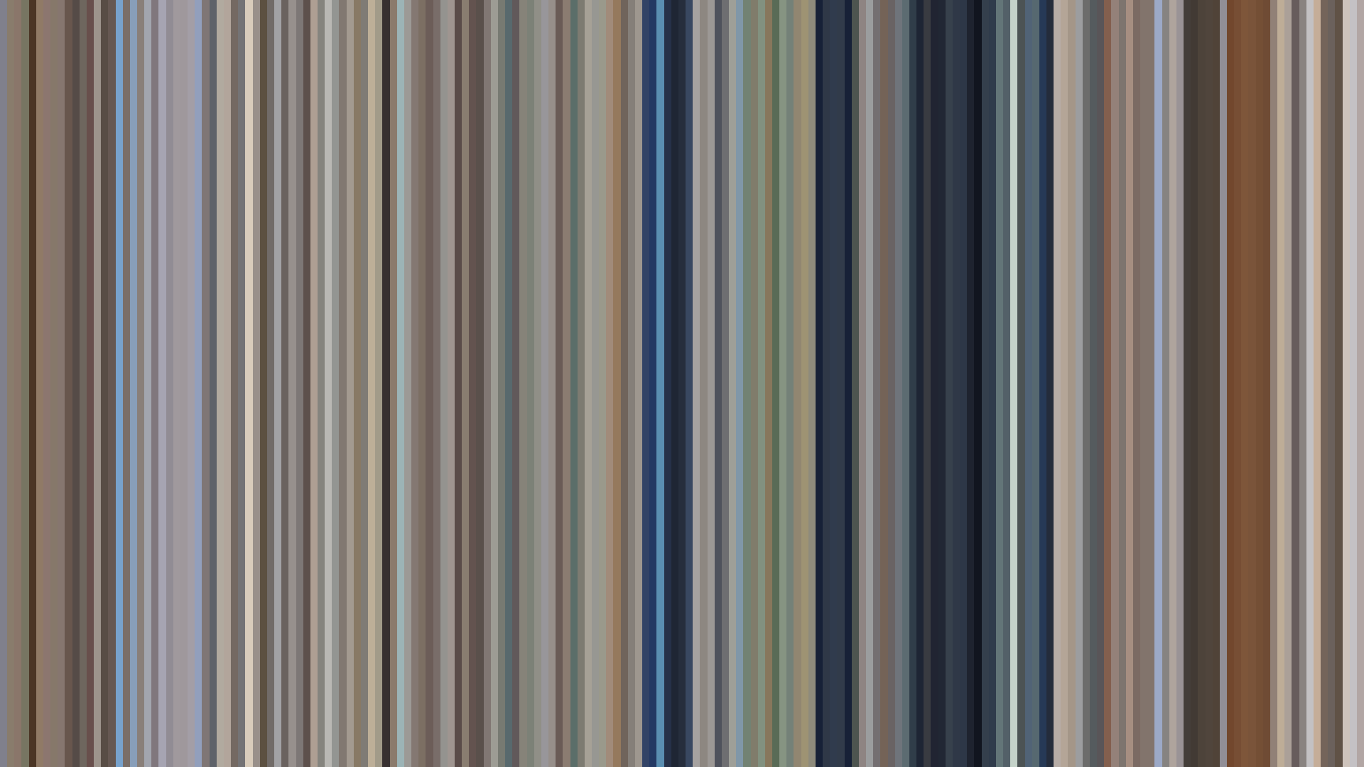
Color Twins
Perceptually nearest palettes — measured in OKLab space, not RGB


Violet Evergarden's falling arc doesn't chart a tragedy—it charts an *emotional withdrawal*. The brightness plunges from a sunlit 0.593 in the opening act to a near-black 0.295 by the close, but this is not despair: it's the color of ink bleeding into paper, of memory settling into permanence. Kyoto Animation and director Taichi Ishidate build a world where the Red-dominant palette—46% red, another 35% red-orange—evokes not passion but the warm, aching undertones of nostalgia. The characters exist in a perpetual autumn, where the golds and pale creams of the palette (#DED1AC, #E8E8DE) feel like the last light before dusk. What makes the falling arc so precise is its refusal to sentimentalize: the middle act hovers at 0.485, a gray-brown limbo where the protagonist grapples with her own humanity, before the final act sinks into the deep browns (#605A55, #483A34) of the letter-writing studio. This is not a story that brightens with resolution. The arcs drop *intentionally*, because Violet's growth is inward—each letter she writes costs a small piece of her light, but the trade is meaning.