Edit Pace — frame-to-frame color delta (bright = fast cuts)
Color Temperature — warm (gold) vs cool (teal) per frame
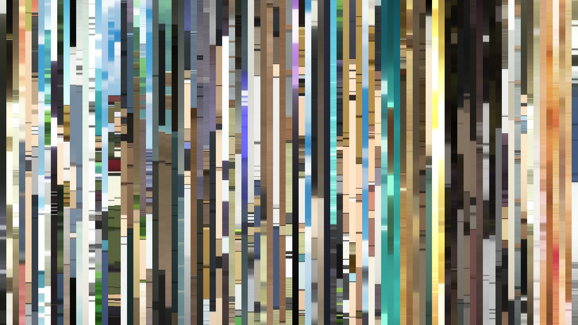
Frame Density Comparison — every 2nd vs every 4th frame
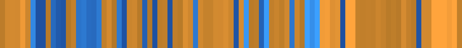
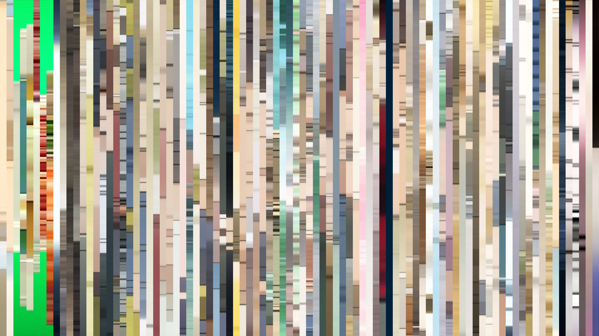
Slice · 15s
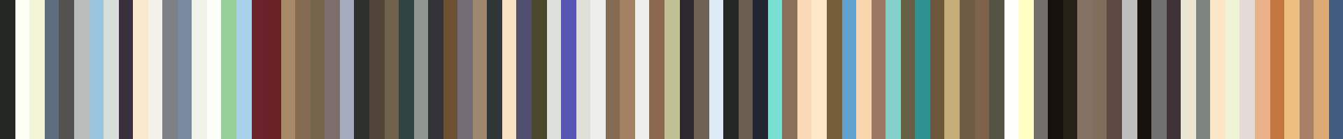
Avg · 15s
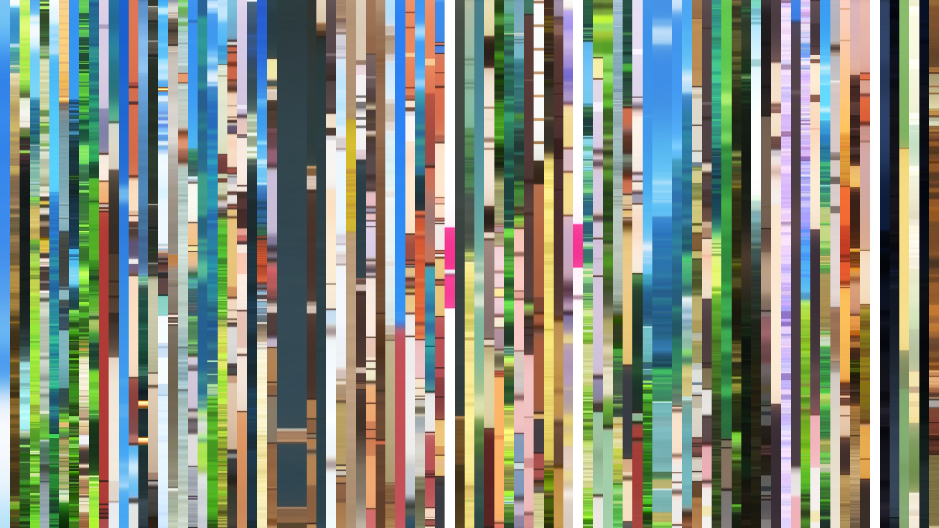
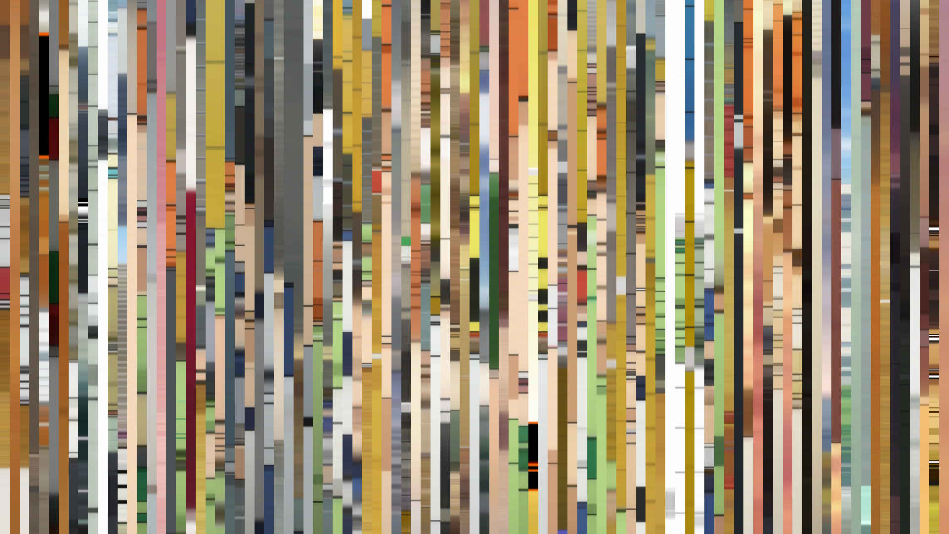
Slice · 30s
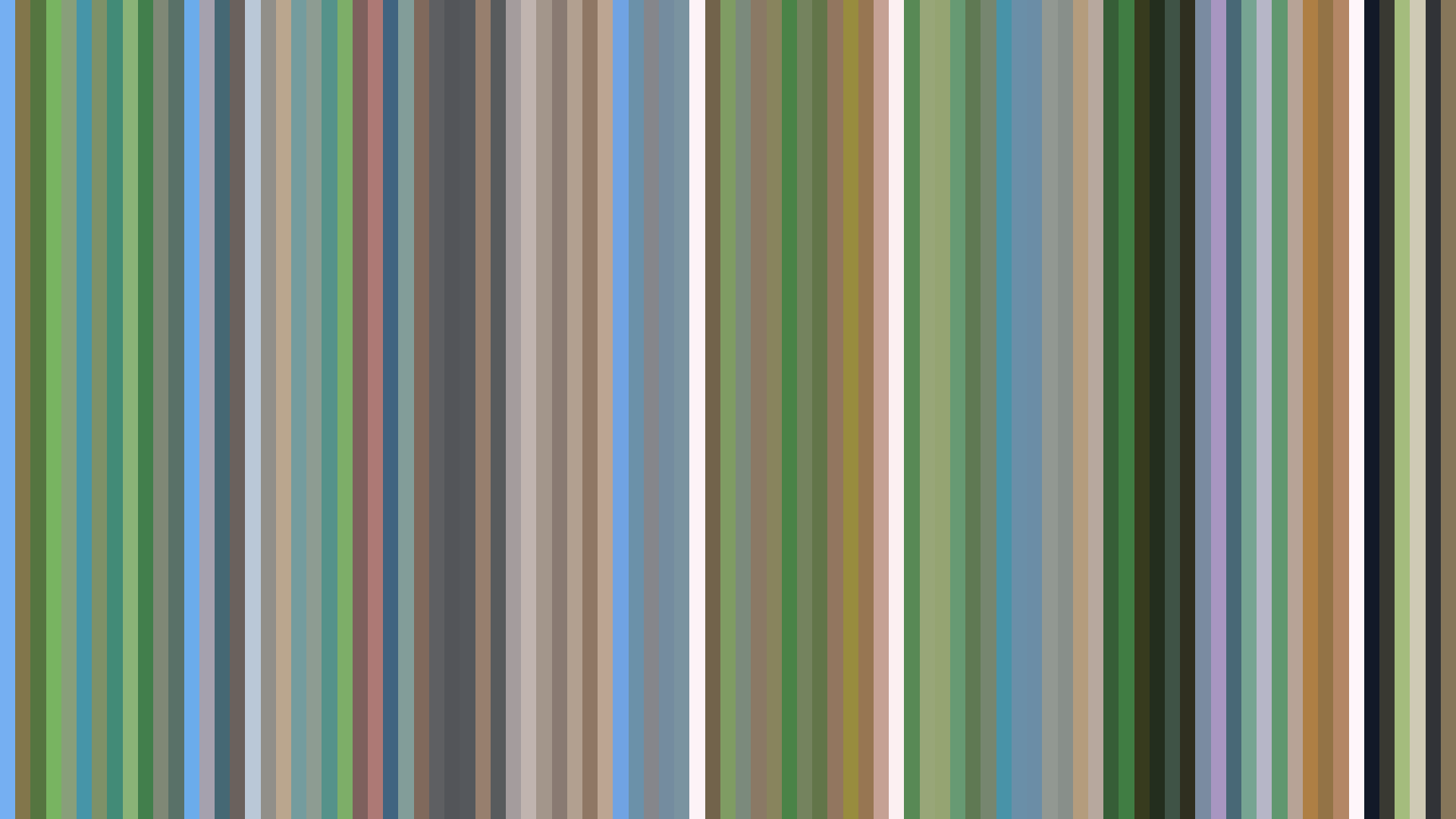
Avg · 30s
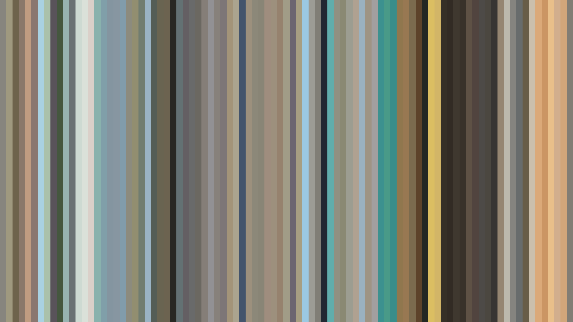
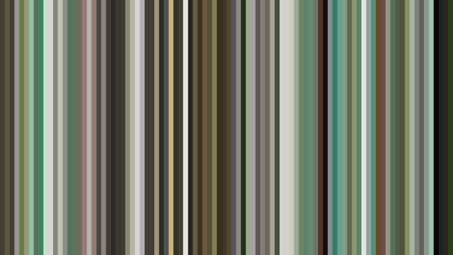
Barakamon’s palette reads not as a color story but as a texture study: four warm earth tones, two off-whites, one near-black, and almost no saturation to speak of. The Red-Orange dominance is barely a blush — these are sun-warmed stones, not fire. Kinema Citrus and director Masaki Tachibana built a visual world that refuses dramatic inflection; the brightness arc is functionally flat, dipping a mere 0.05 from opening to close, which is practically a straight line. This is a deliberate rejection of televisual tension. Where most series sculpt moods through lighting, Barakamon flattens its light into a constant, forgiving afternoon — the visual equivalent of a deep exhale. The absence of a bright arc or dark midpoint is itself the statement: this show does not believe in crisis arcs or emotional peaks. Handa’s calligraphy, the island’s slow rhythms, the children’s unscripted chaos — none of it requires contrast to feel real. The palette holds steady because the world holds steady. Even the closing act’s slight dimming is barely perceptible, a decision by art director (or color designer?) to let the series end on a note of gentle containment rather than resolution. Barakamon’s visual data doesn’t tell a story; it refuses to tell one, and that refusal is its entire aesthetic.
Brightness Arc (episode progression)
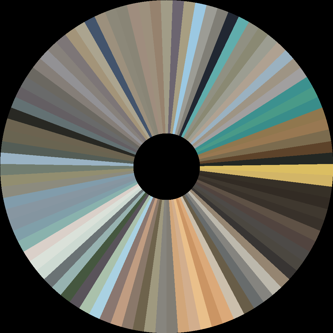
Hue Distribution
Act Breakdown
Opening
0.524
Middle
0.509
Closing
0.470
Avg Brightness
0.537
Avg Saturation
0.211
Warmth
0.557
Color Palette
#625F59
#E9EAE0
#252523
#A2A59E
#A69066
#E3D2AB
#8F7257
#594E38
3-Act Color Story
Opening
Middle
Closing
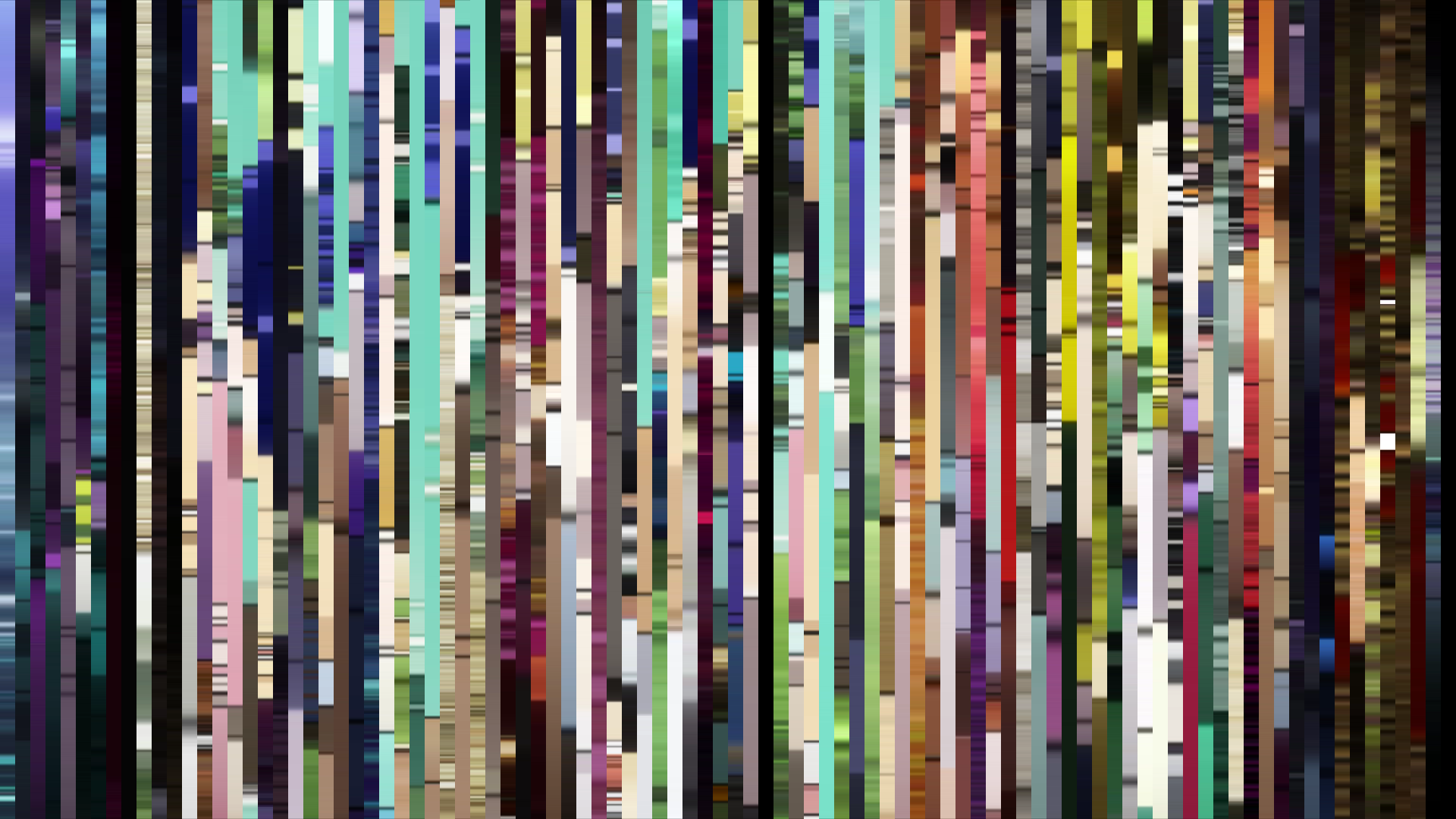
Color Twins
Perceptually nearest palettes — measured in OKLab space, not RGB


![Fate/stay night [Unlimited Blade Works]](../../../barcodes/2014/fatestay-night-unlimited-blade-works/barcode_slice.png)


Barakamon’s palette reads not as a color story but as a texture study: four warm earth tones, two off-whites, one near-black, and almost no saturation to speak of. The Red-Orange dominance is barely a blush — these are sun-warmed stones, not fire. Kinema Citrus and director Masaki Tachibana built a visual world that refuses dramatic inflection; the brightness arc is functionally flat, dipping a mere 0.05 from opening to close, which is practically a straight line. This is a deliberate rejection of televisual tension. Where most series sculpt moods through lighting, Barakamon flattens its light into a constant, forgiving afternoon — the visual equivalent of a deep exhale. The absence of a bright arc or dark midpoint is itself the statement: this show does not believe in crisis arcs or emotional peaks. Handa’s calligraphy, the island’s slow rhythms, the children’s unscripted chaos — none of it requires contrast to feel real. The palette holds steady because the world holds steady. Even the closing act’s slight dimming is barely perceptible, a decision by art director (or color designer?) to let the series end on a note of gentle containment rather than resolution. Barakamon’s visual data doesn’t tell a story; it refuses to tell one, and that refusal is its entire aesthetic.