Home›2019›Kono Oto Tomare!: Sounds of Life Season 2
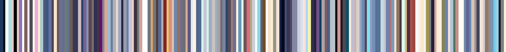
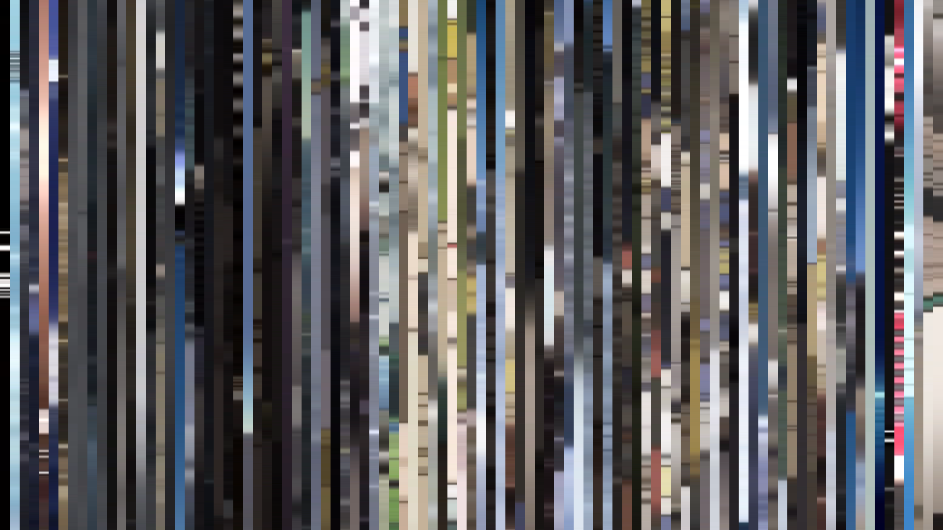
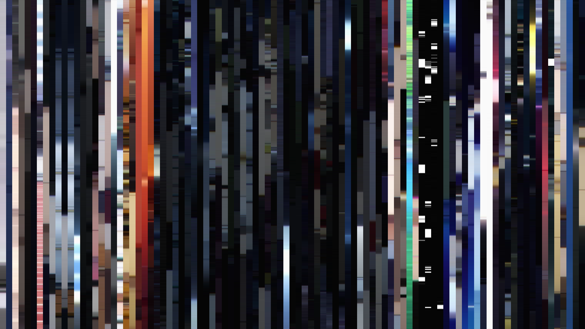
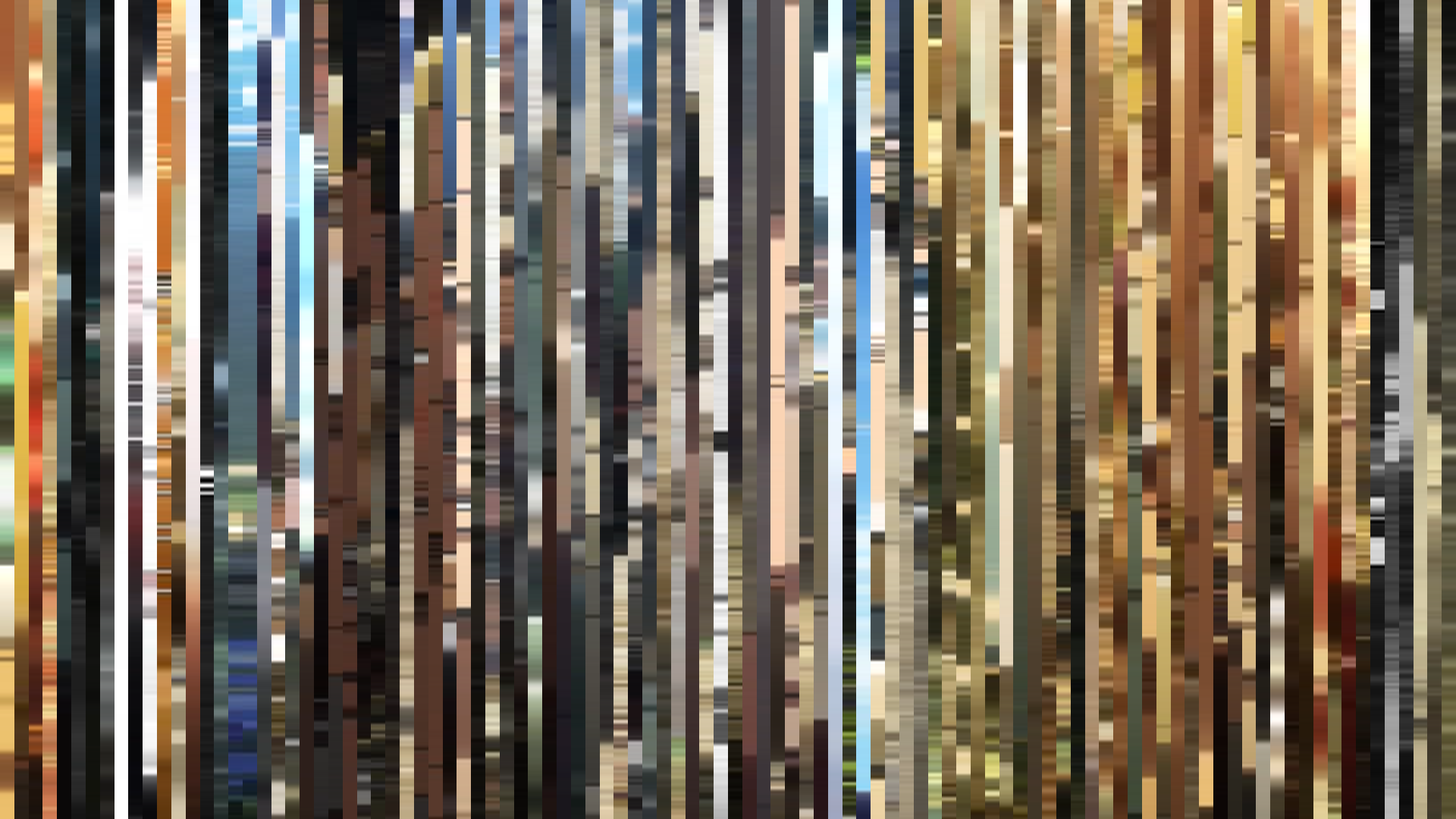
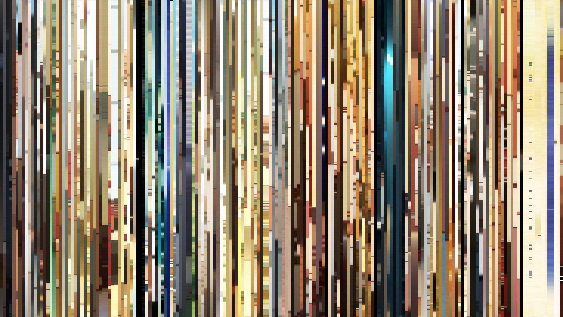
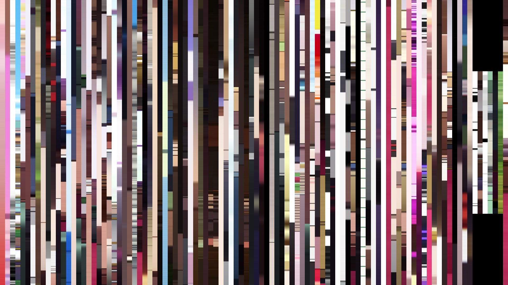
Pixel Slice — 1px center crop per frame
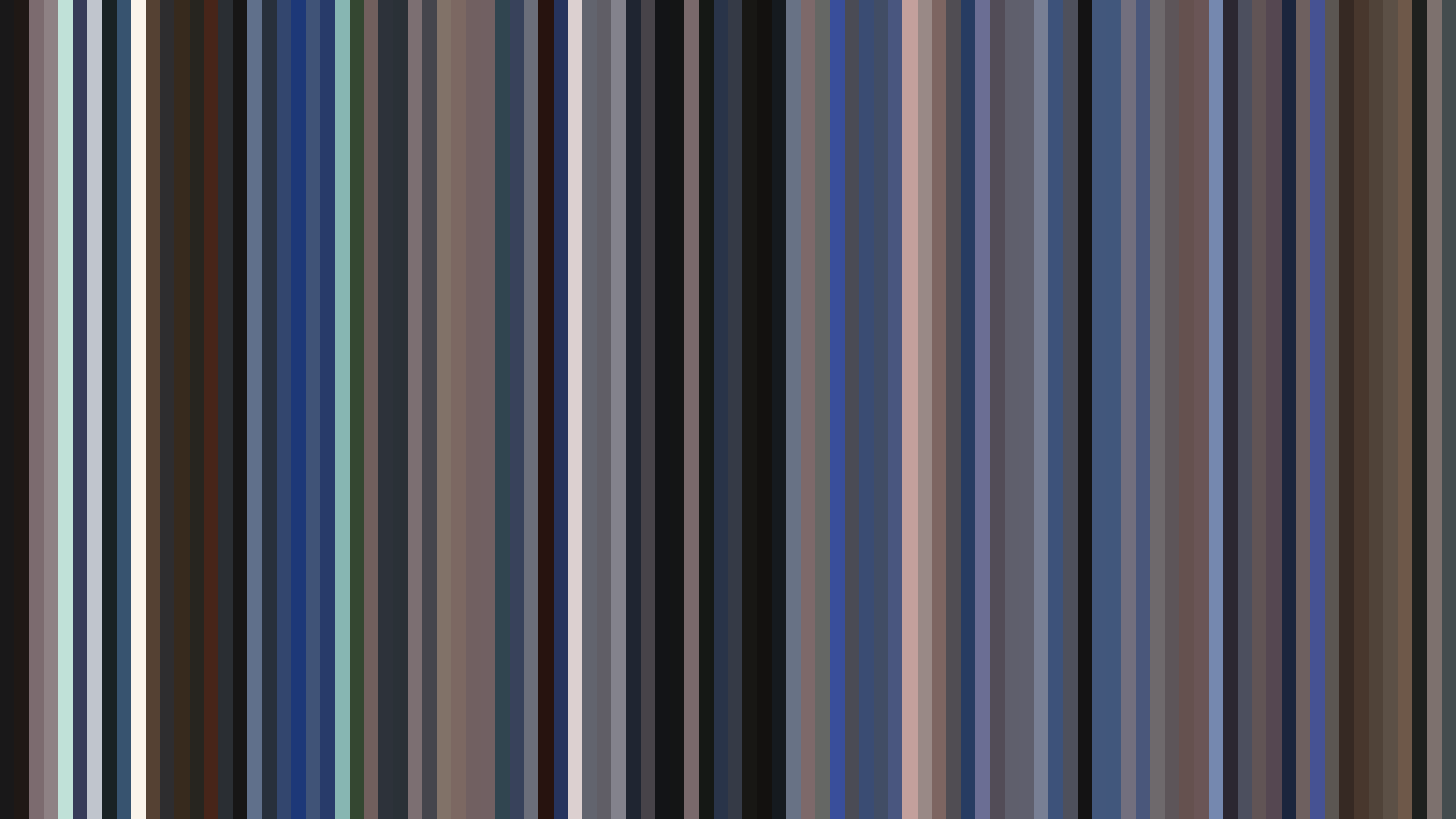
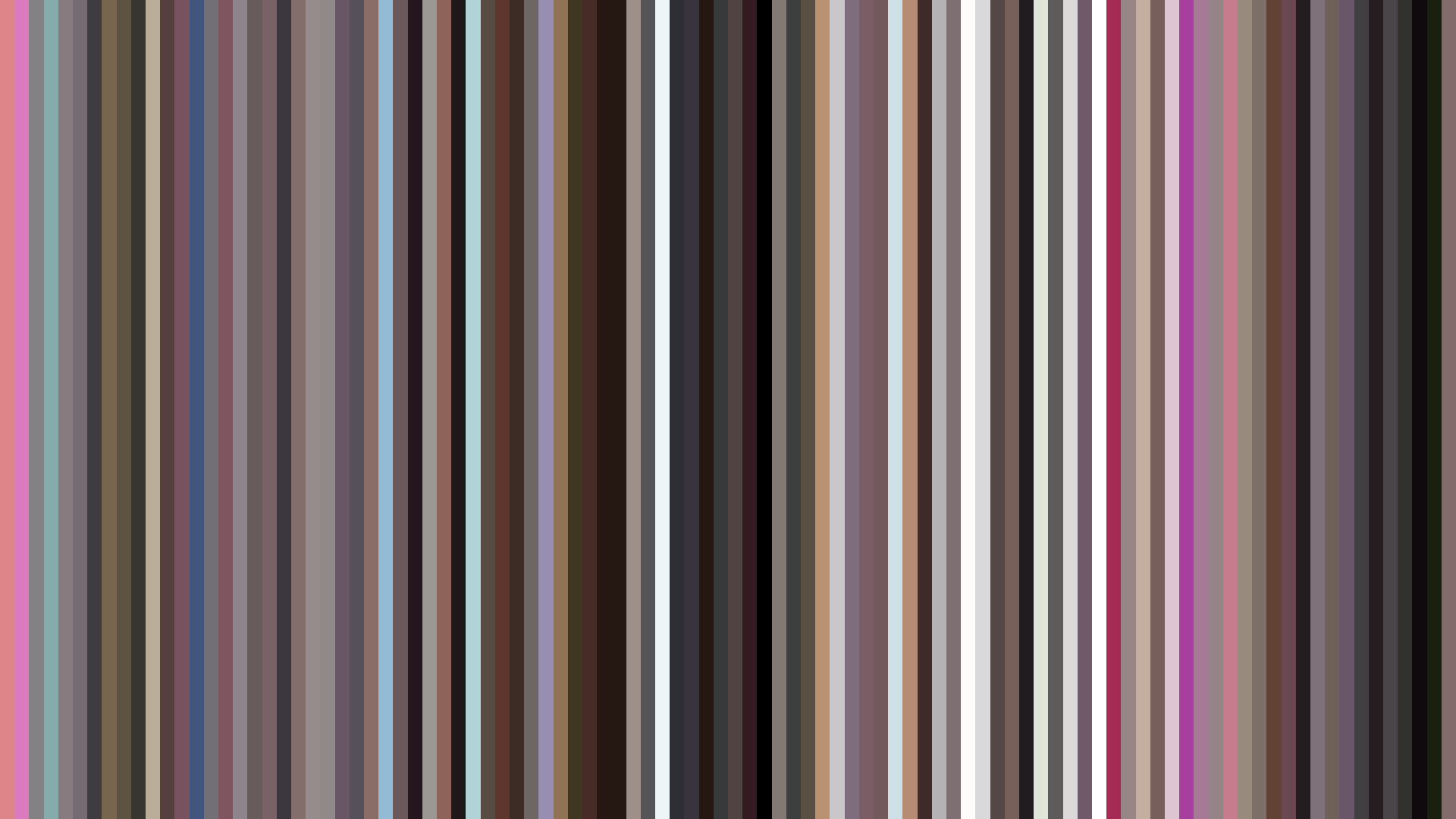
Smooth Average — mean color per frame
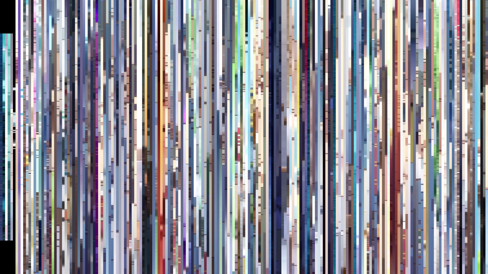
Rank Mosaic — columns sorted by luminance
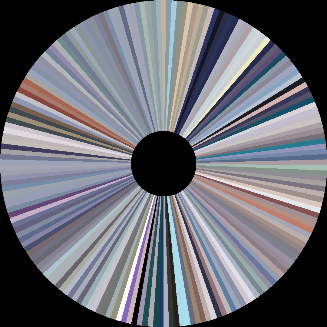
Circle / Radial — polar transform
Edit Pace — frame-to-frame color delta (bright = fast cuts)
Color Temperature — warm (gold) vs cool (teal) per frame
Frame Density Comparison — every 2nd vs every 4th frame
Slice · 15s
Avg · 15s
Slice · 30s
Avg · 30s
The palette reads Blue-Green at 38%, but with a crushing desaturation—average saturation barely 0.199—that feels less like color and more like the holding of breath. *Kono Oto Tomare!*’s second season opts for the cool, muted tones of a koto’s freshly strung silk: restrained, deliberate, almost monastic. Where a music anime might lean into the warmth of performance, this show’s visuals stay in the *bright opening* arc, a gradual climb from an already modest average brightness of 0.492 to a closing 0.568. That arc is the quiet triumph of discipline over display. The characters don’t erupt into color; they simply let a little more light in. The Red presence (18%) is sparse—a blush of school banners, a plucked string’s afterimage—never overwhelming the dominant Blue-Green. This is the visual grammar of an ensemble finding their harmony not through explosive passion but through the slow, patient tuning of their emotional pitch. The show’s art direction (studio Platinum Vision) understands that for these students, the *closing act* isn’t a fireworks finale; it’s the moment the note fades into an expectant silence, holding the room.
Brightness Arc (episode progression)
Hue Distribution
Act Breakdown
Opening
0.492
Middle
0.545
Closing
0.568
Avg Brightness
0.553
Avg Saturation
0.199
Warmth
0.456
Color Palette
#9E9CA2
#E0DFDE
#5F5B66
#646E90
#718DA5
#A6AFC8
#1E1C26
#2E3351
3-Act Color Story
Opening
Middle
Closing
Color Twins
Perceptually nearest palettes — measured in OKLab space, not RGB


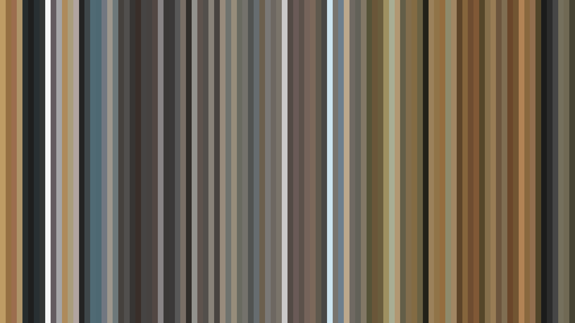
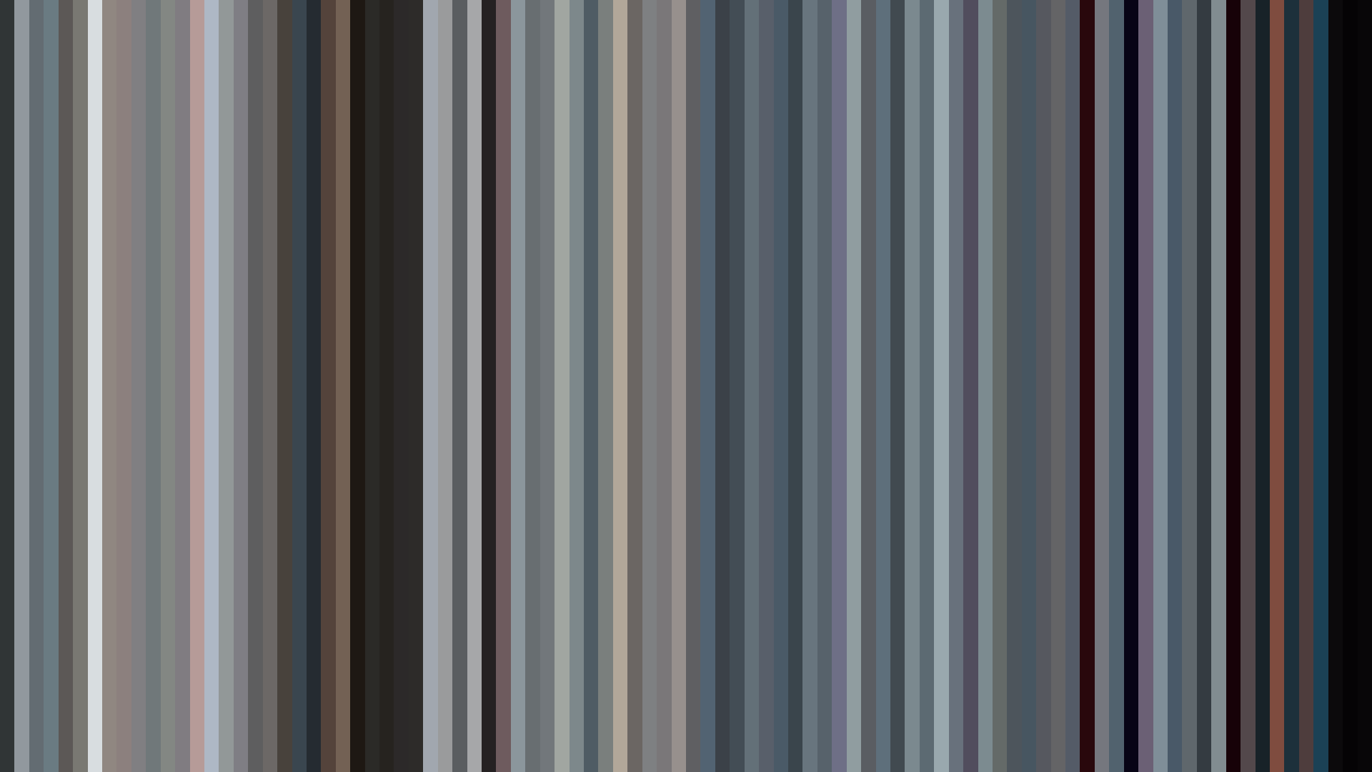


The palette reads Blue-Green at 38%, but with a crushing desaturation—average saturation barely 0.199—that feels less like color and more like the holding of breath. *Kono Oto Tomare!*’s second season opts for the cool, muted tones of a koto’s freshly strung silk: restrained, deliberate, almost monastic. Where a music anime might lean into the warmth of performance, this show’s visuals stay in the *bright opening* arc, a gradual climb from an already modest average brightness of 0.492 to a closing 0.568. That arc is the quiet triumph of discipline over display. The characters don’t erupt into color; they simply let a little more light in. The Red presence (18%) is sparse—a blush of school banners, a plucked string’s afterimage—never overwhelming the dominant Blue-Green. This is the visual grammar of an ensemble finding their harmony not through explosive passion but through the slow, patient tuning of their emotional pitch. The show’s art direction (studio Platinum Vision) understands that for these students, the *closing act* isn’t a fireworks finale; it’s the moment the note fades into an expectant silence, holding the room.