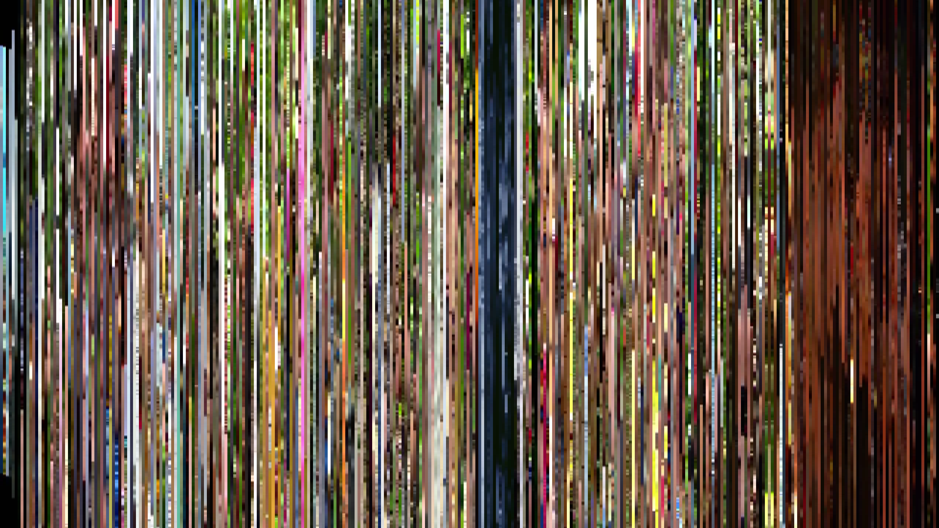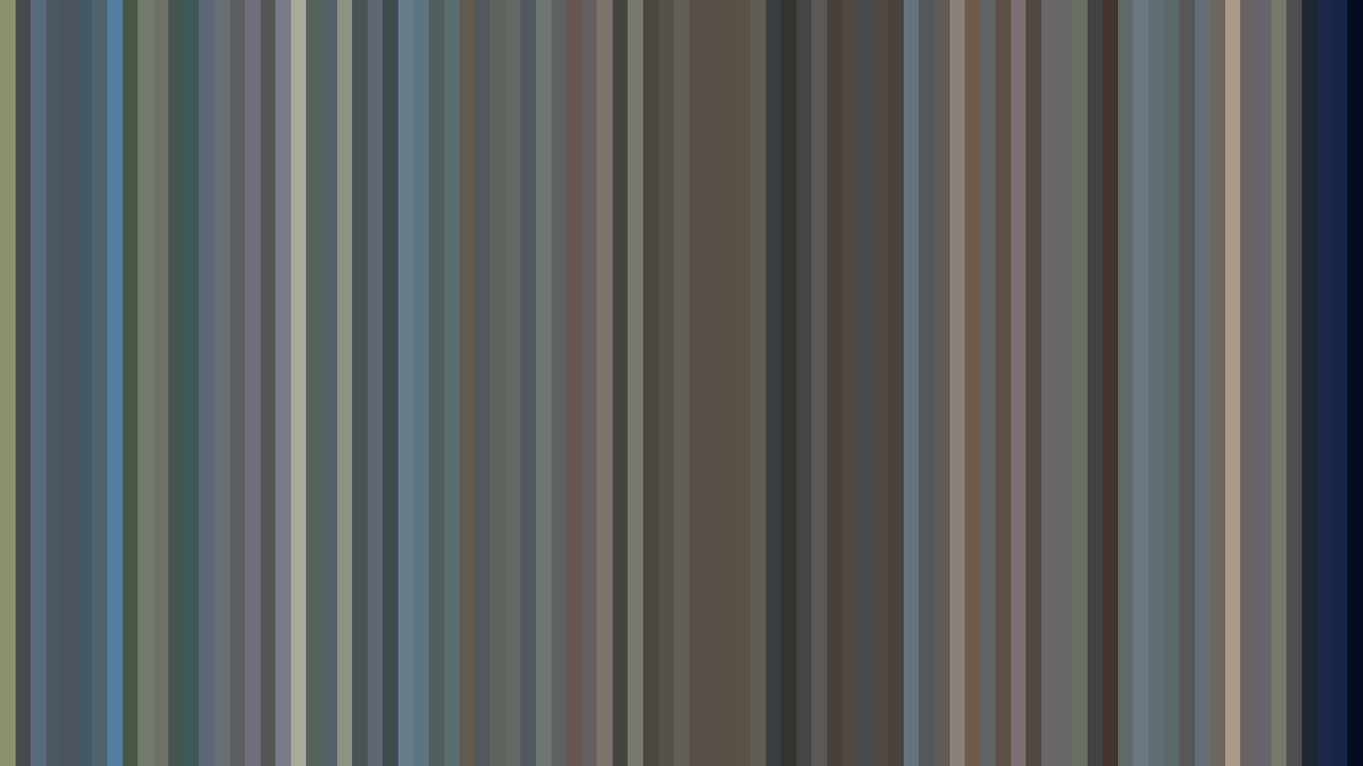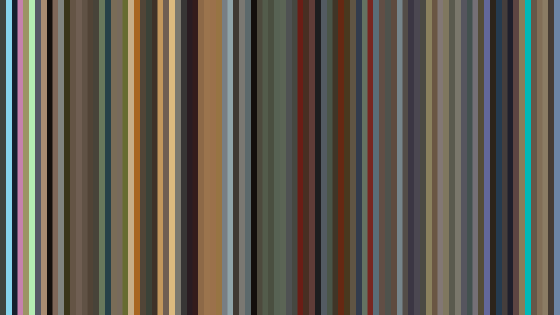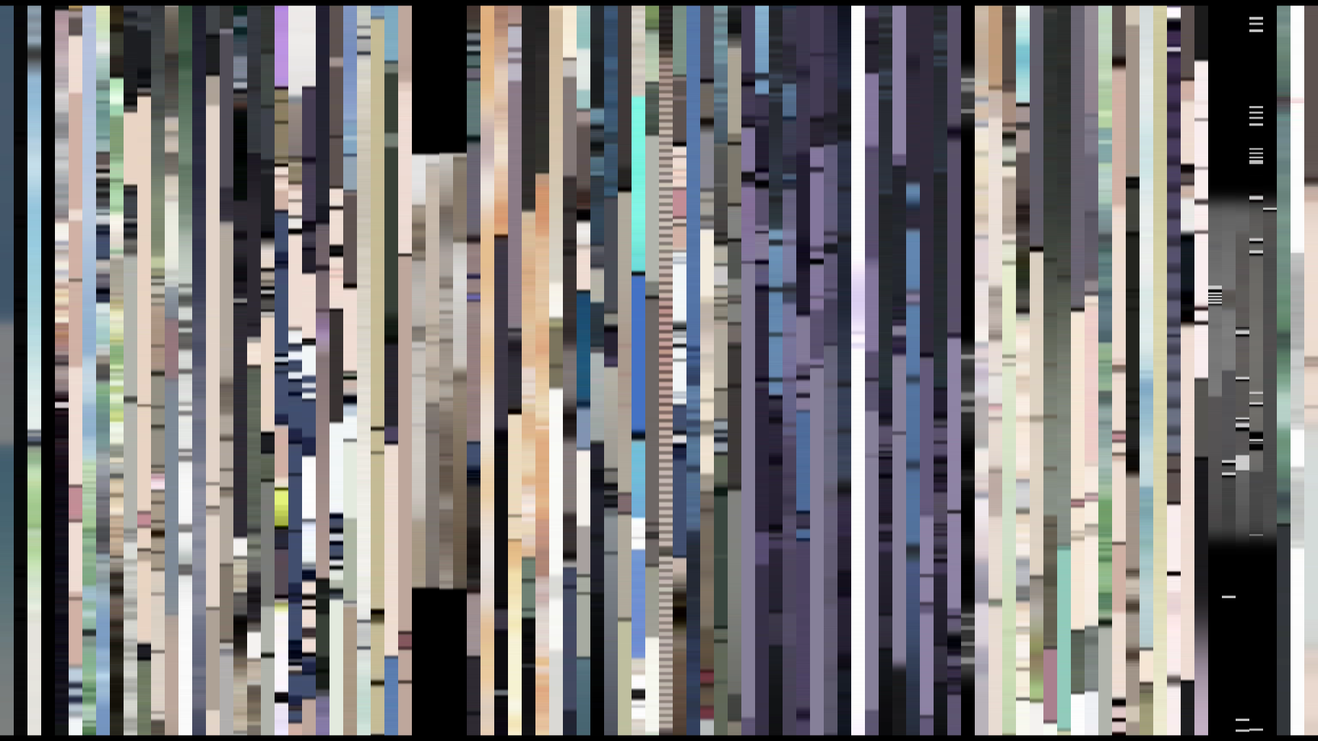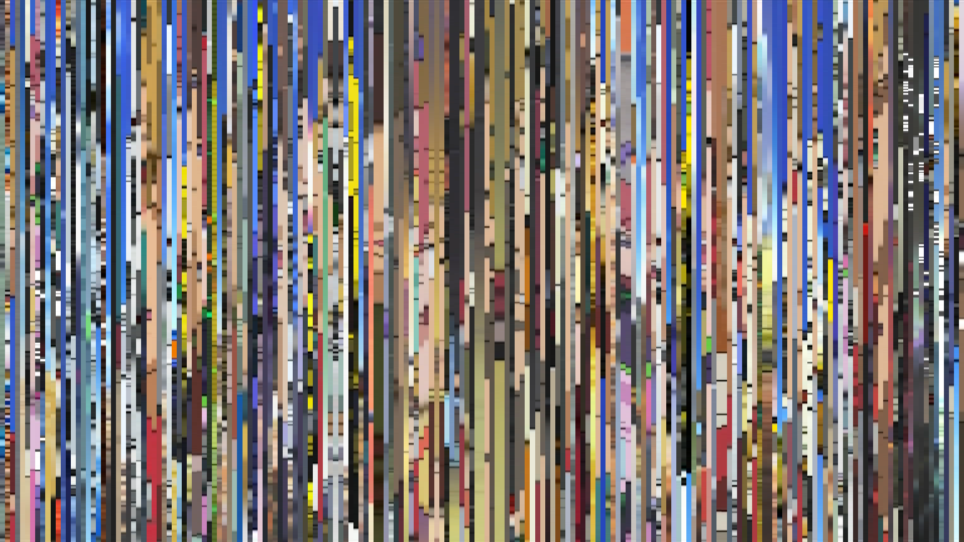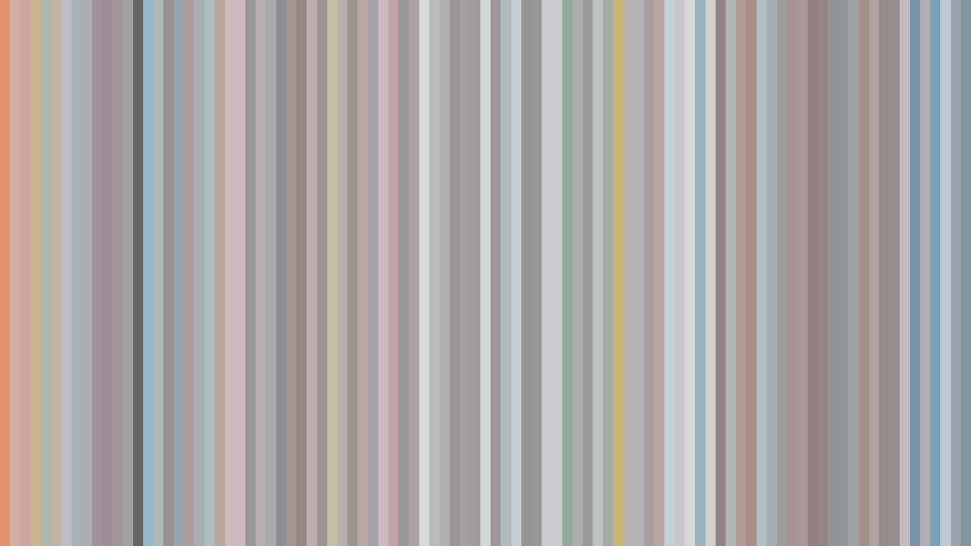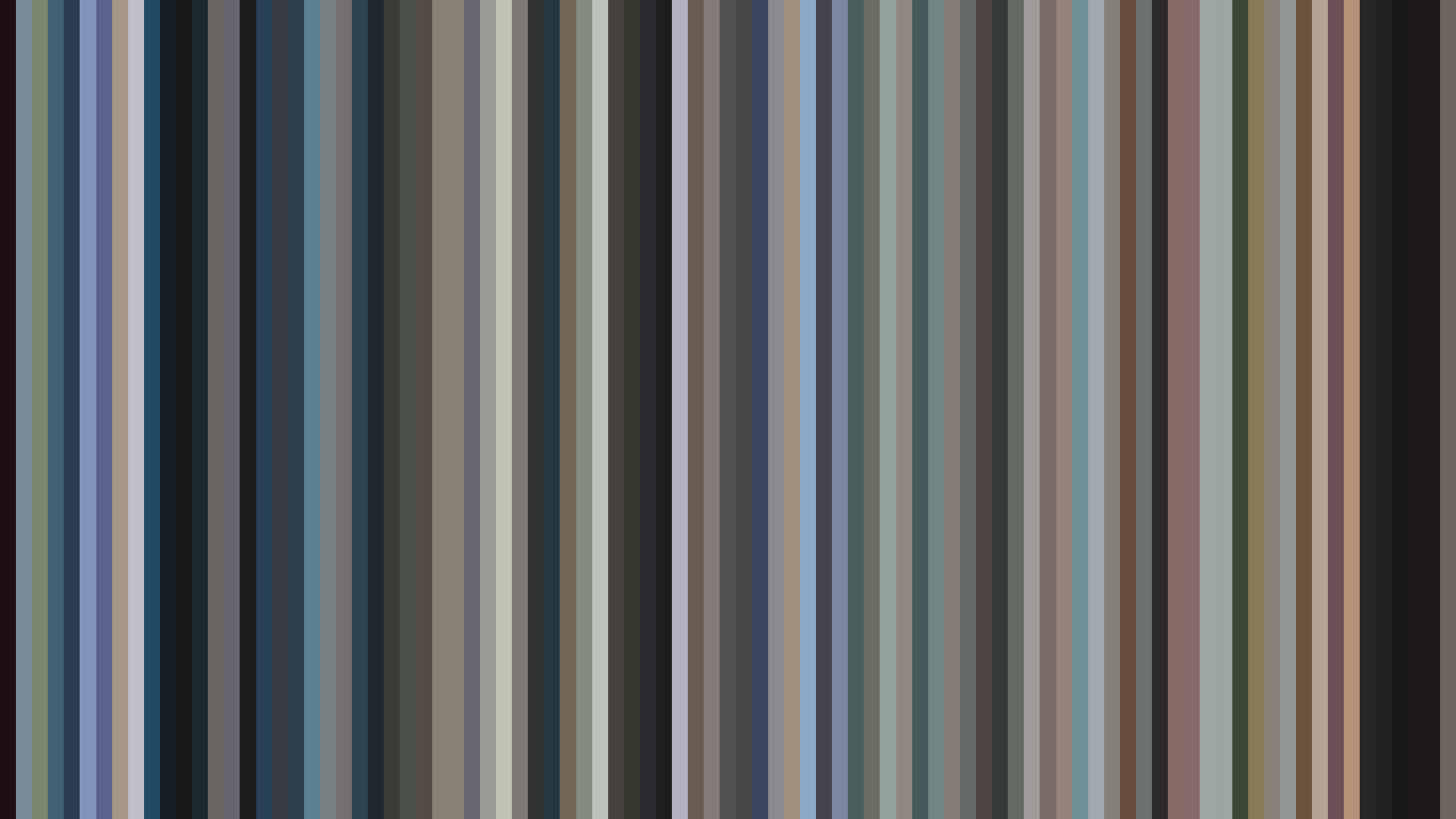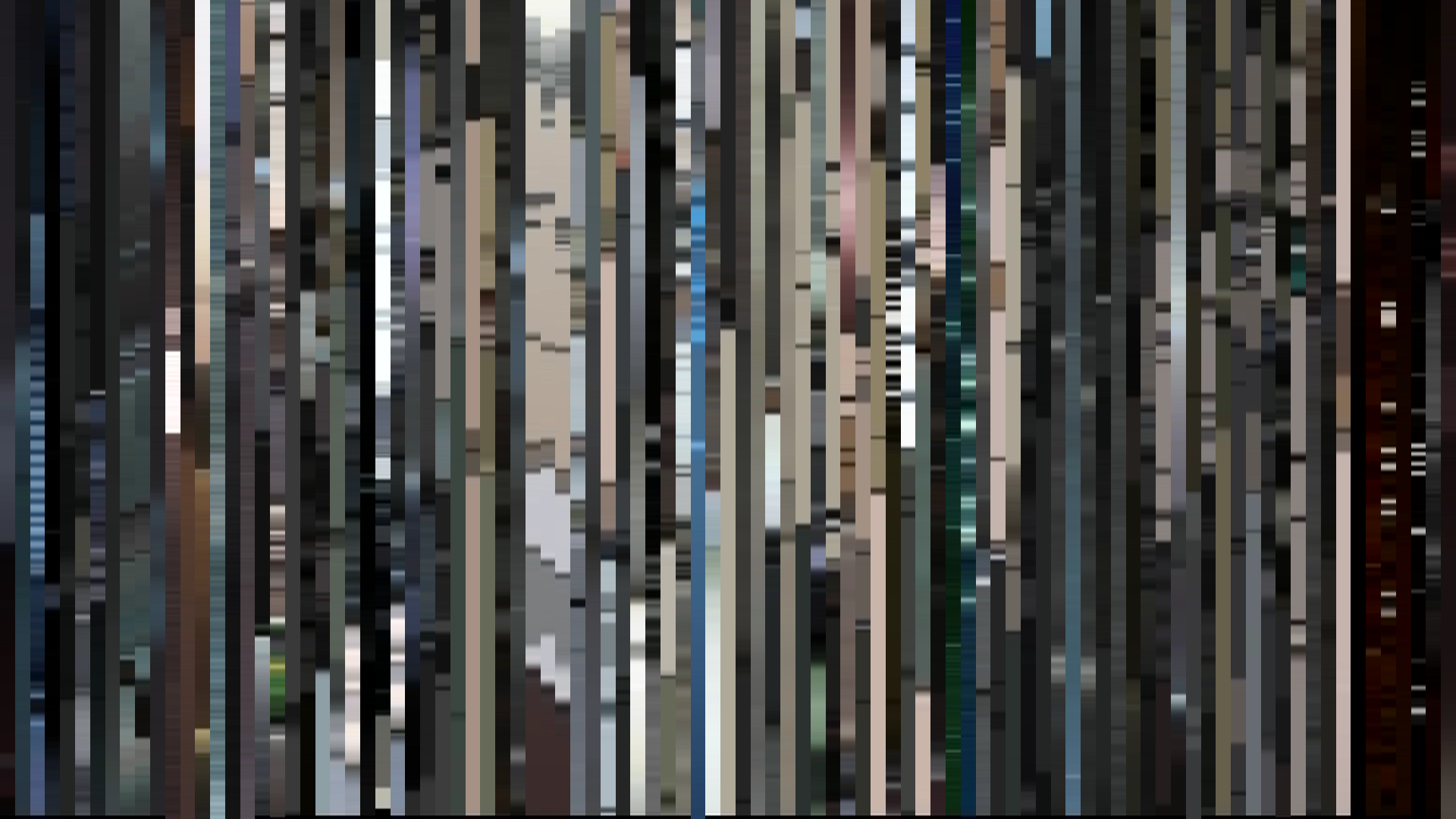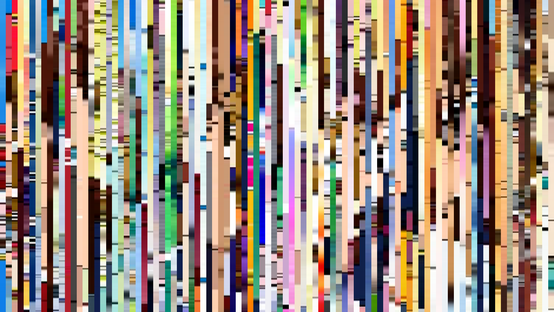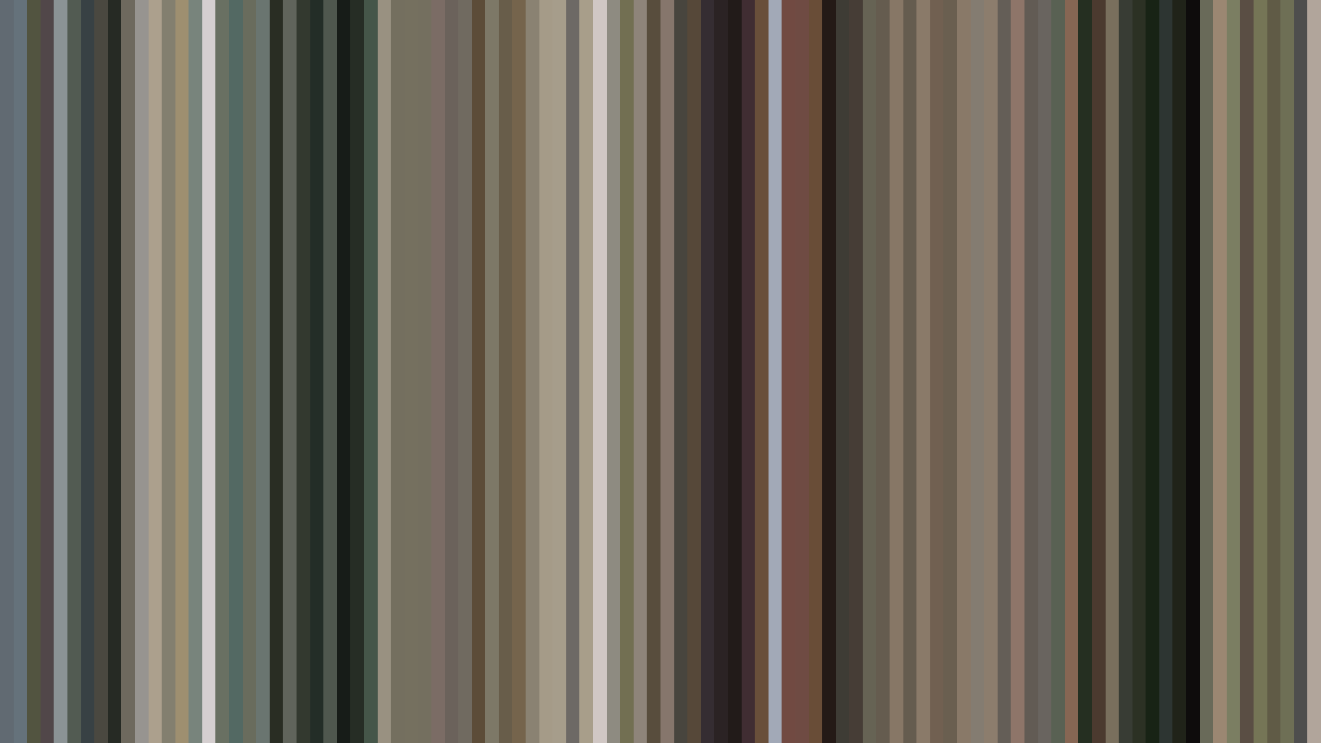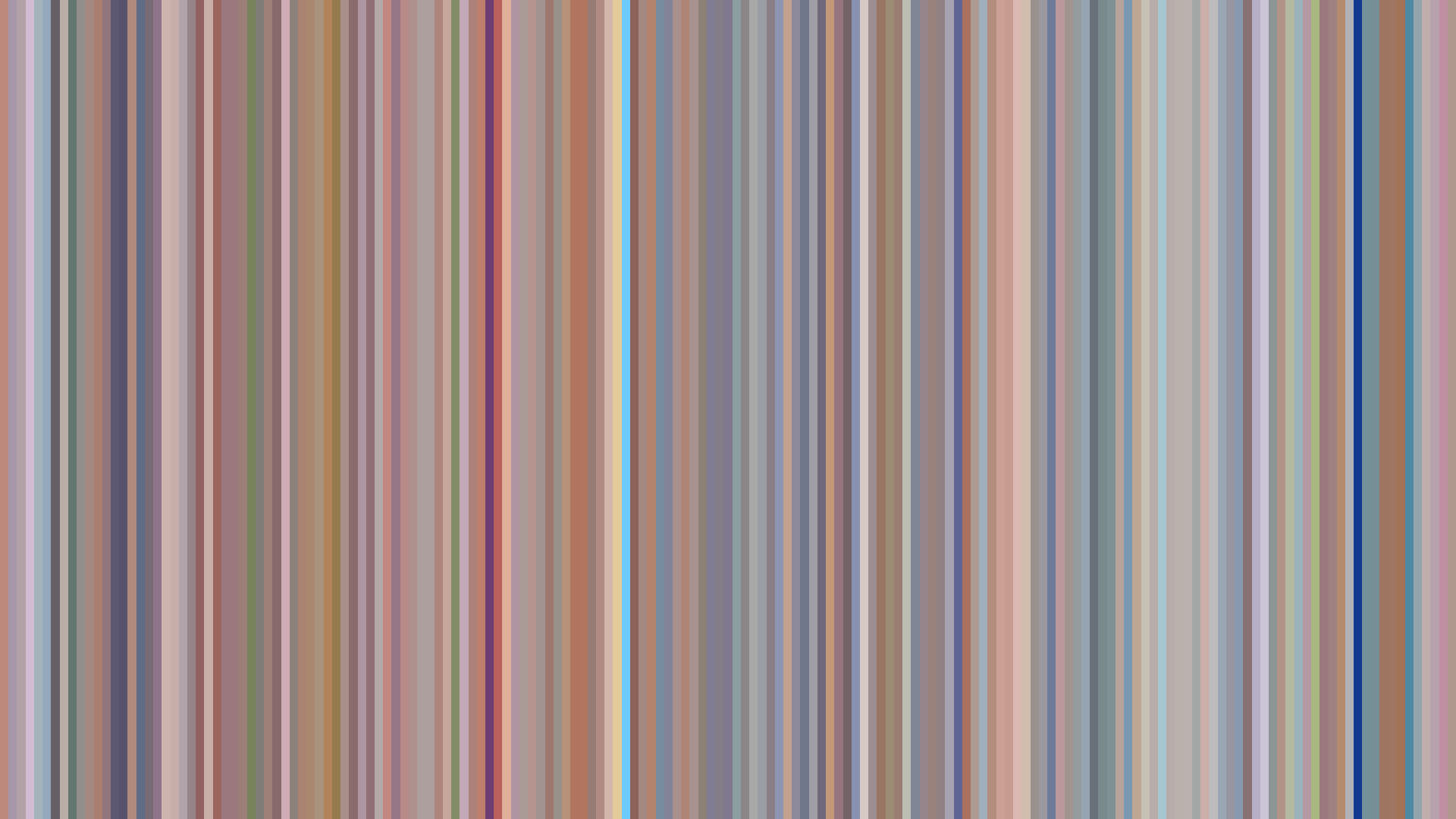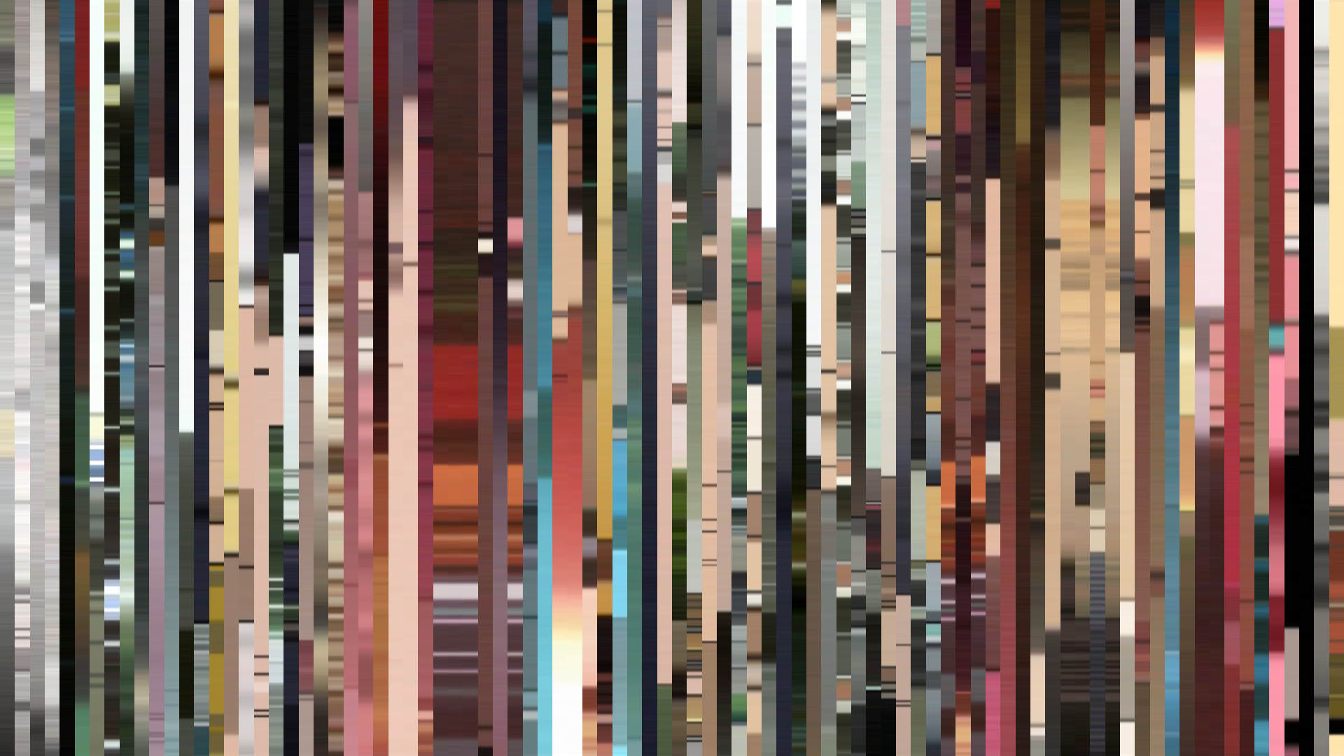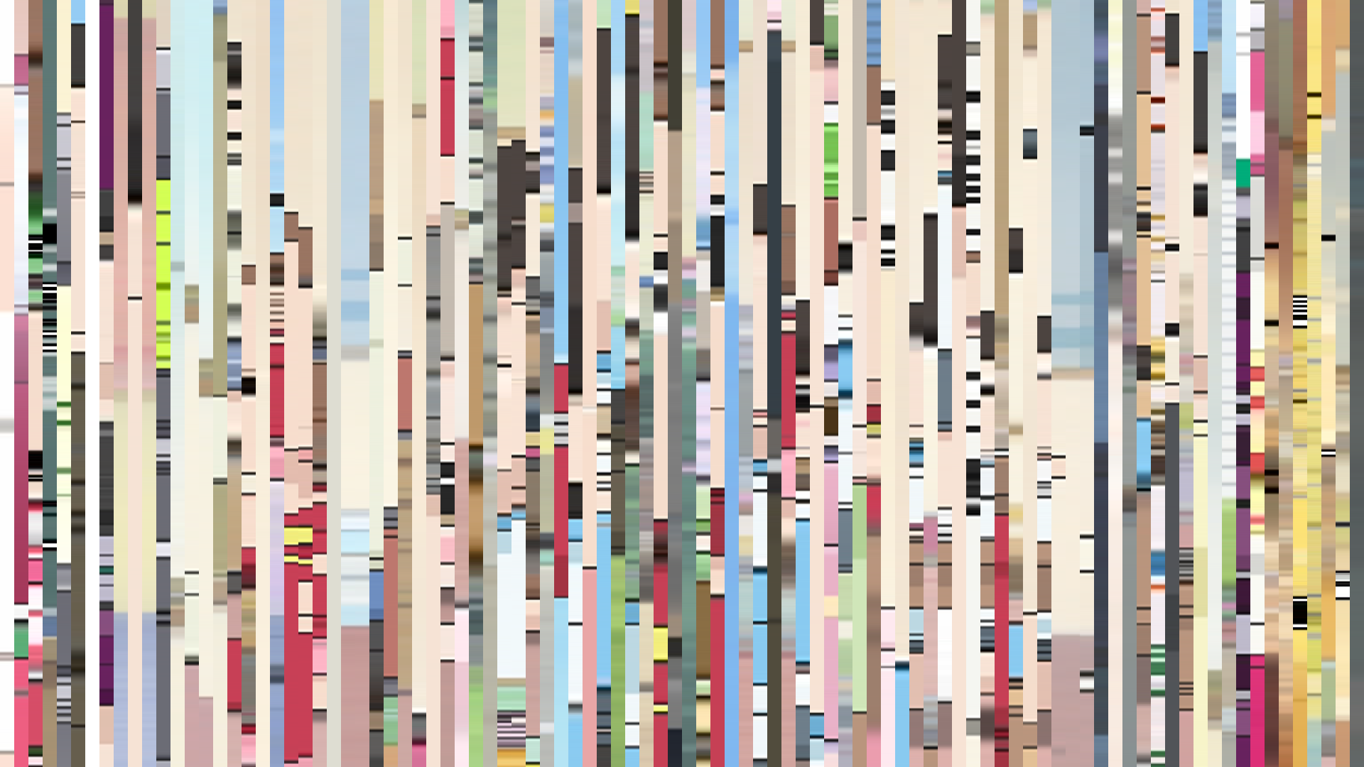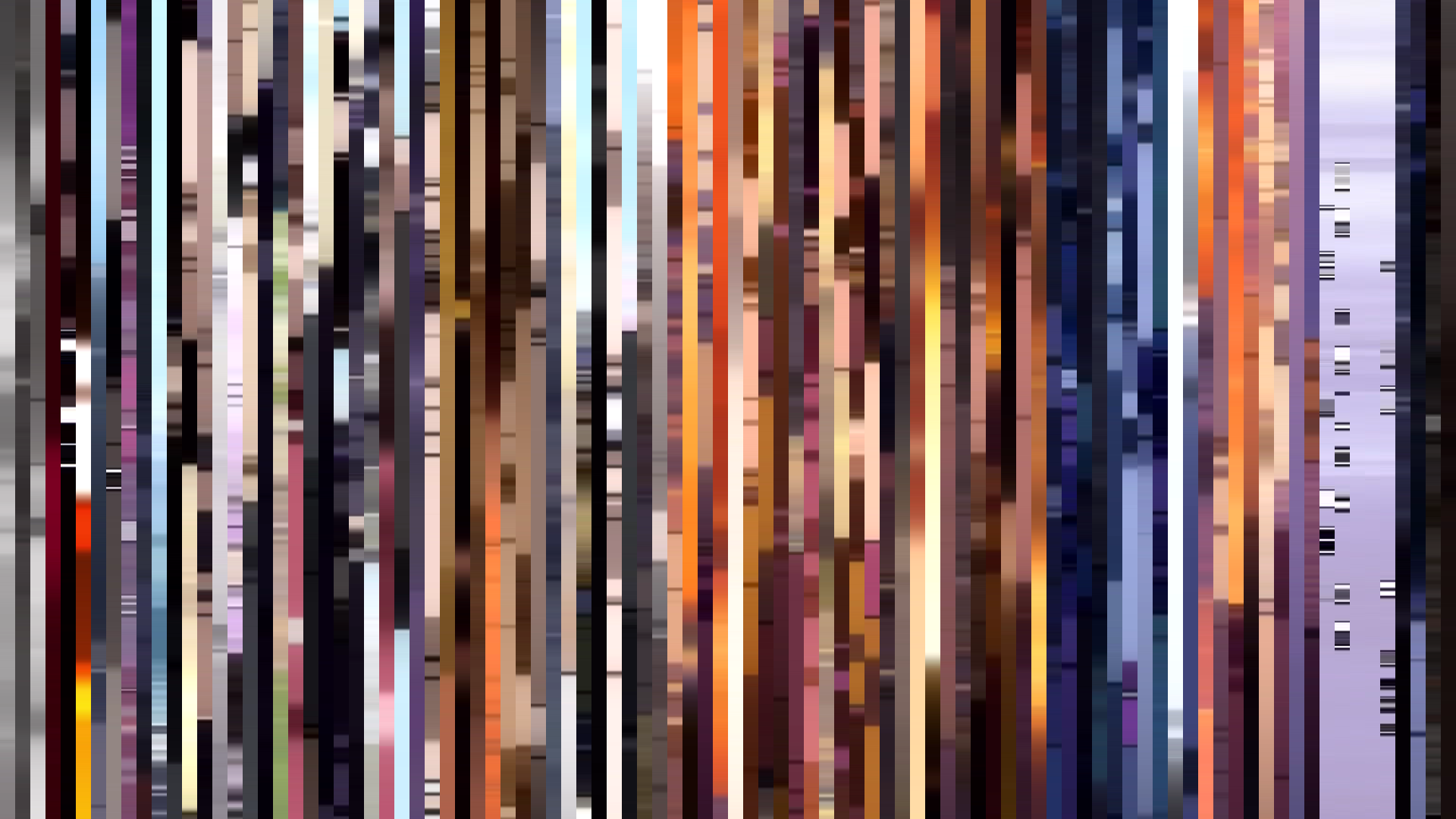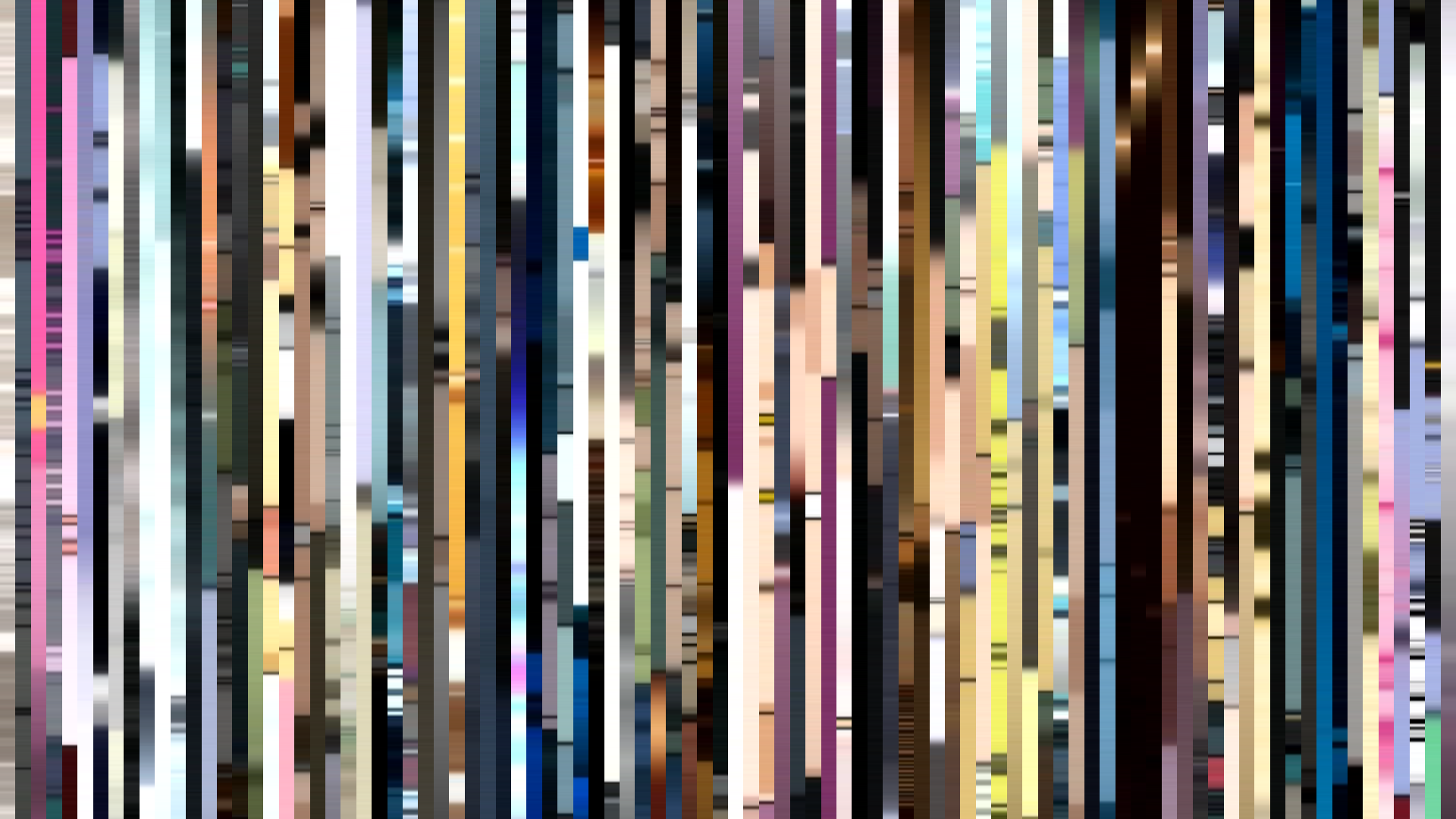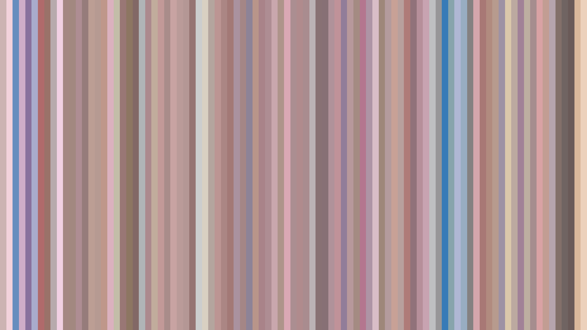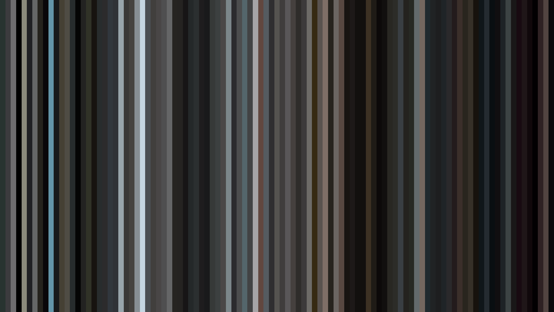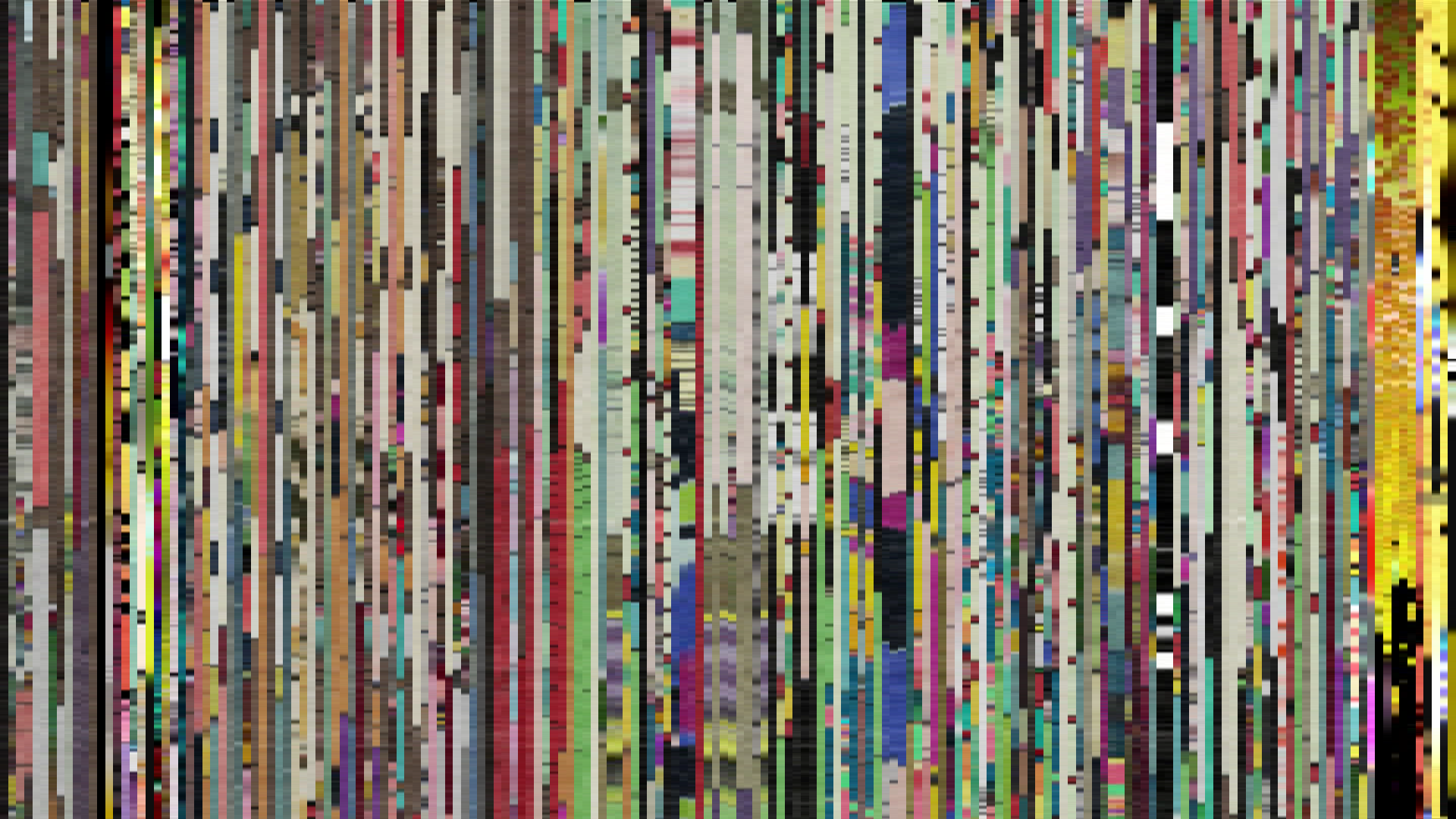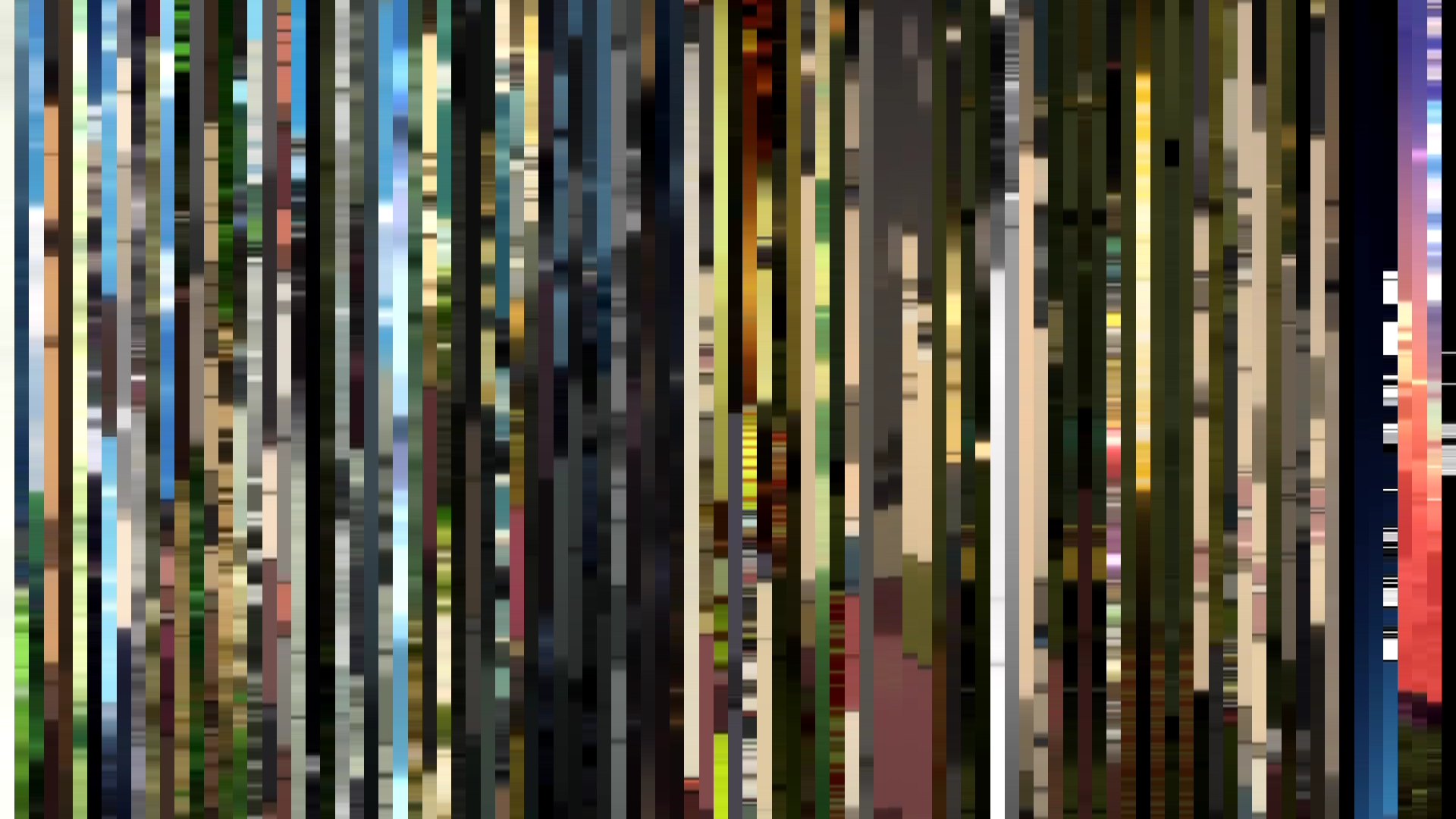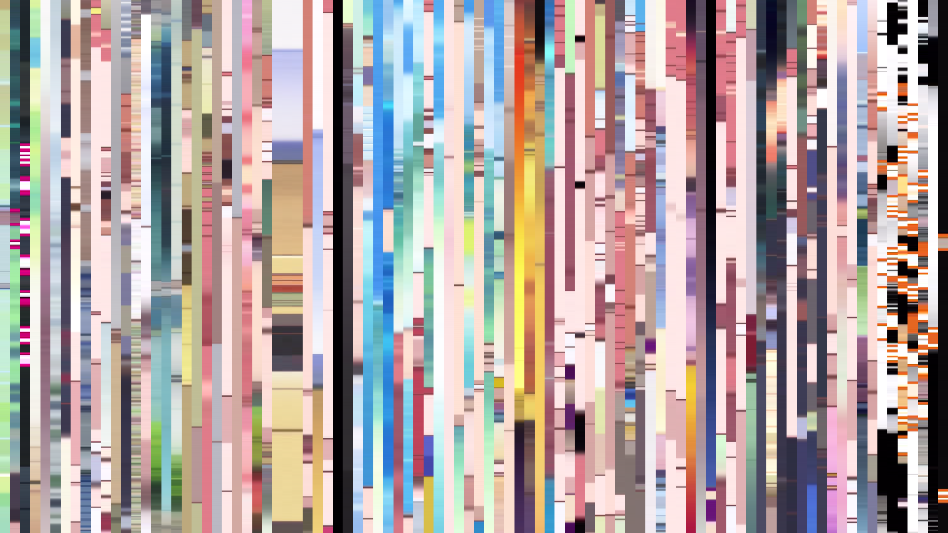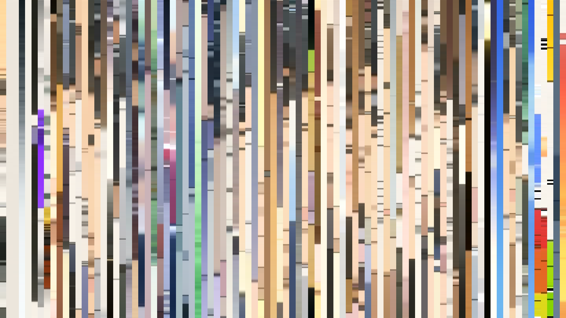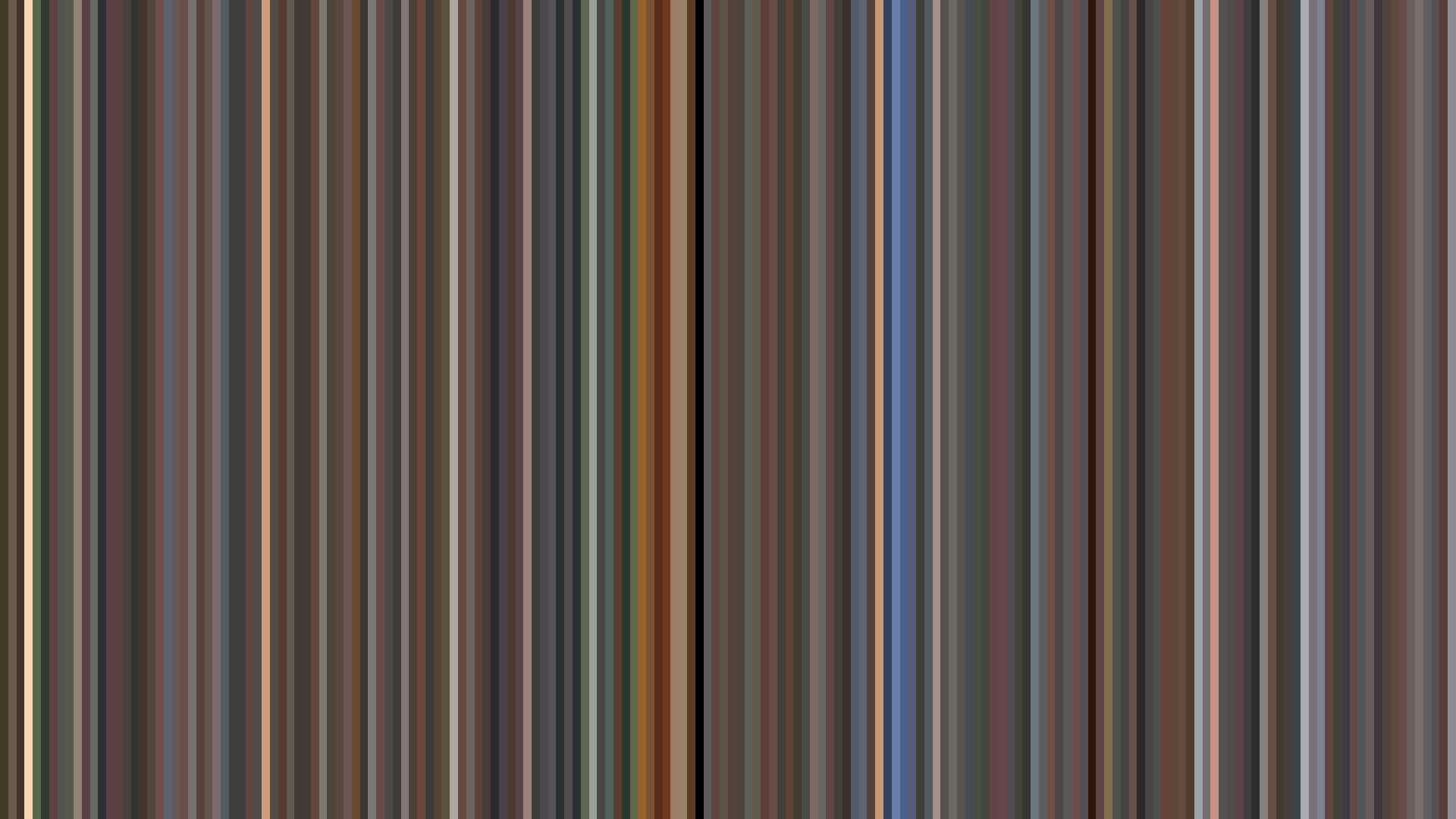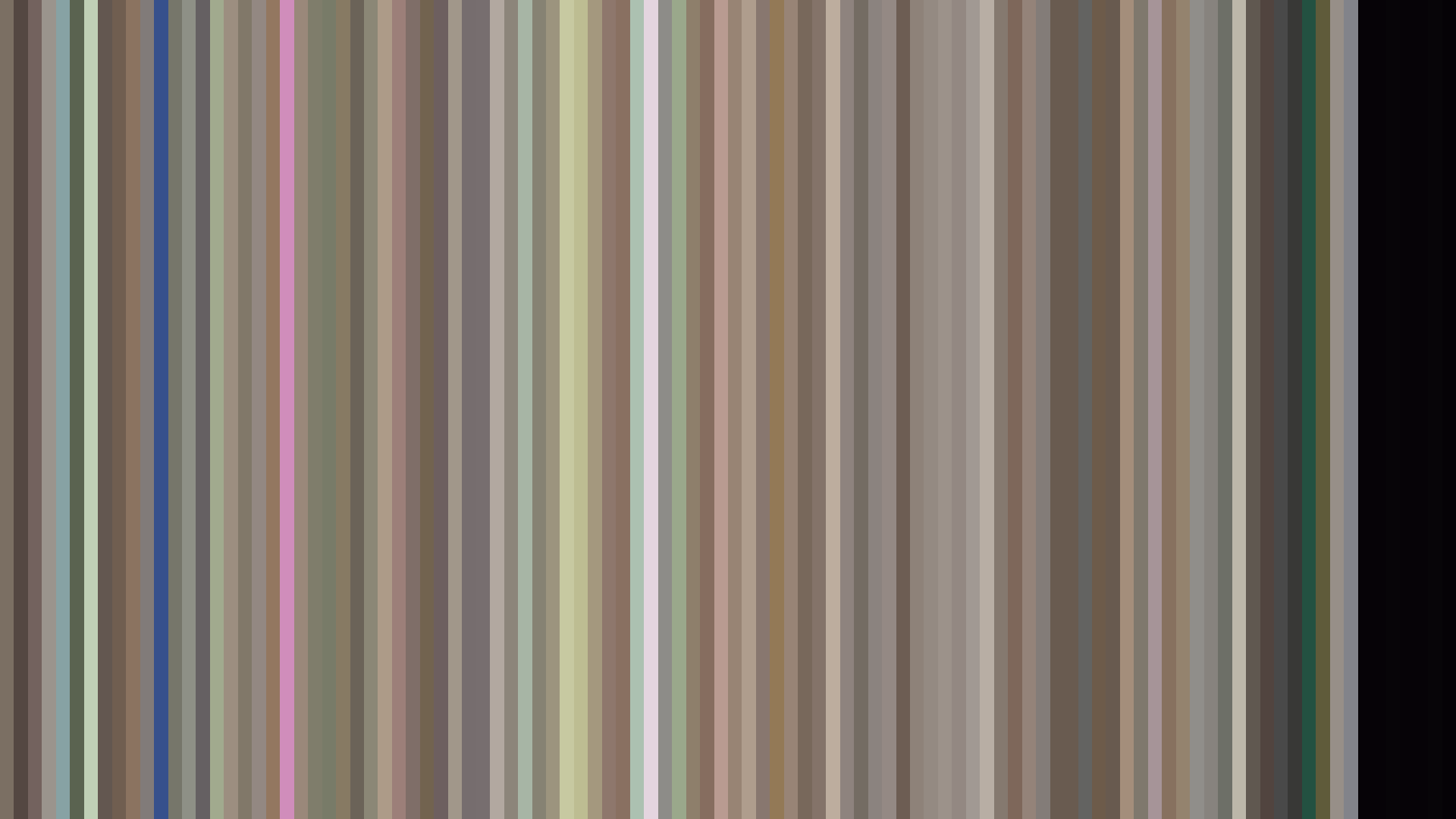


The 2000s is the decade in which anime stopped being painted and started being composited. Cels surrendered to digital ink-and-paint somewhere between 2000 and 2003, and the dataset registers the changeover not as a sudden break but as a slow expansion of what brightness and saturation could mean. The aggregate brightness across these 76 series is 0.453 — almost mathematically the middle — but that average conceals a decade in which the dynamic range stretched in both directions at once. The brightest pole climbs to Strawberry Marshmallow's 0.709 (Daume, 2005) and Azumanga Daioh's 0.669 (J.C. Staff, 2002); the darkest sinks to Ergo Proxy's 0.249 (Manglobe, 2006) and Texhnolyze's 0.280 (Madhouse, 2003). Cel-era holdovers like Inuyasha (0.368) and Noir (0.362) sit politely in the middle, doing what film stock had always done. The new tools were used, almost immediately, to leave that middle behind.
The Warm Default
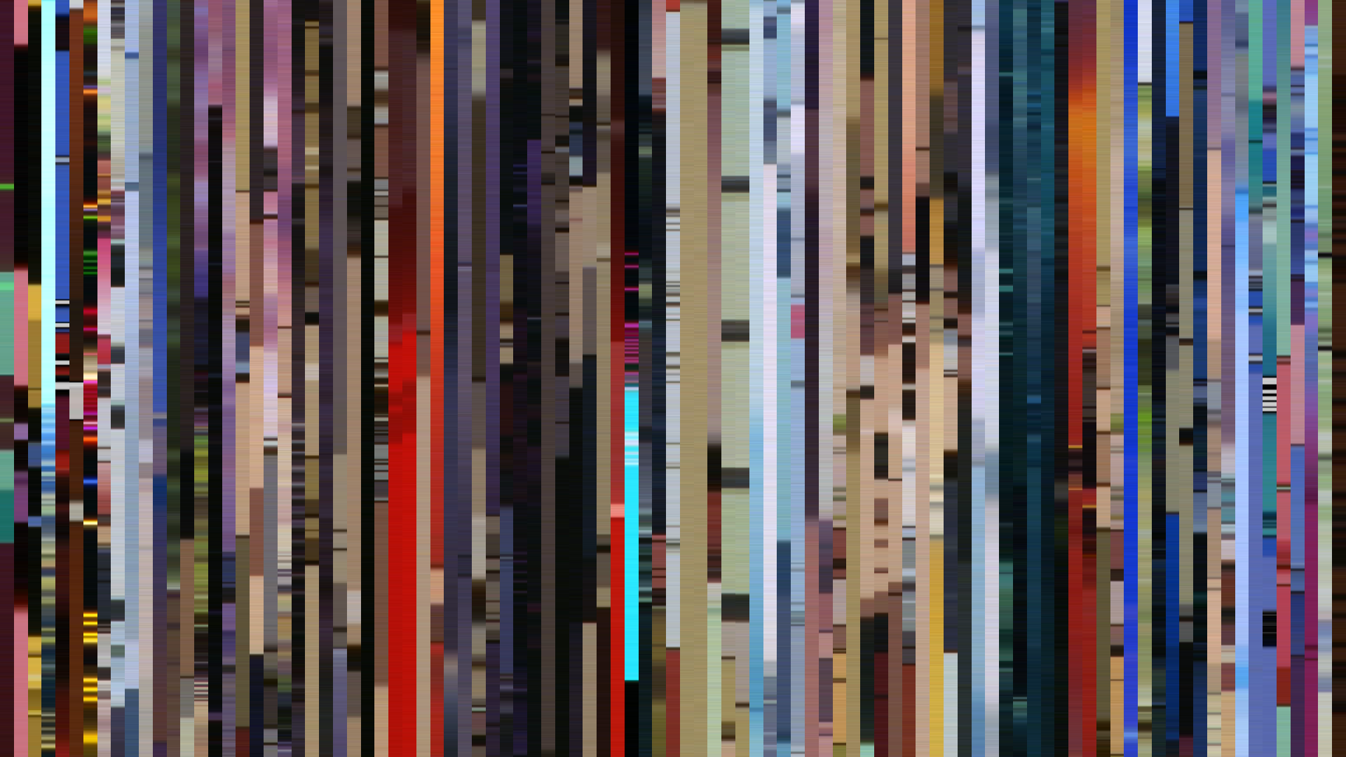
Eighty-two percent of the decade reads Red or Red-Orange. Of 76 entries, only seven register as Blue-Green, five as Green, one as Orange, and a single, almost embarrassed Red-Purple (Lovely Complex, 2007, where the palette is essentially the inside of a strawberry milkshake). This is the warm default the 1990s bequeathed to digital production: the amber haze of cel animation, the burned-orange of incandescent key lights, the assumption that human skin and warm wood and afternoon sun are what colors are for. The first half of the decade barely contests it. Look at Inuyasha's anchor palette — #231B14, #686055, #552E22 — and you are looking at a 1990s color script run on a 2000 production calendar: charcoal, mushroom, rust. Madhouse's Boogiepop Phantom from the same year tries to be sinister and lands at #202318, #636851, #909770 — a swamp, not a void. The cel grammar was sticky.
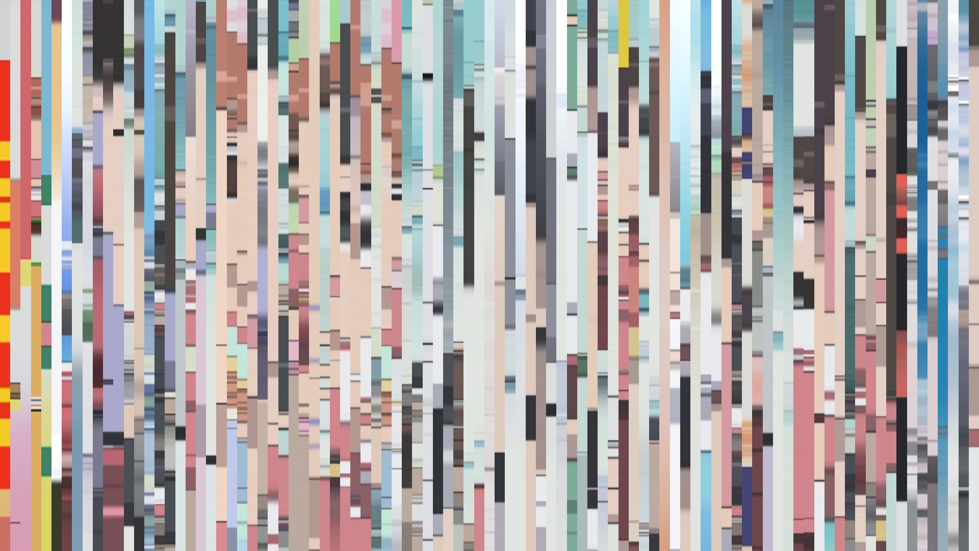
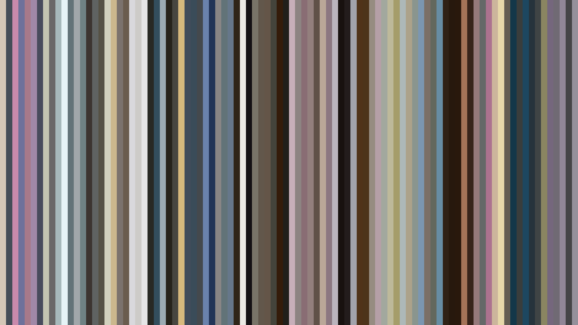
What digital made cheap was the high end. Strawberry Marshmallow's 0.709 brightness is not a stylistic choice you can make with cels in 2005 without bankrupting your studio; it requires the relentless white floor of digital compositing, the ability to push every frame toward overexposure without losing line integrity. Daume's anchor white at #EDE6DA is essentially the page underneath the show. Azumanga Daioh, three years earlier, had already sketched the template — pastels at #DCDBD9 and #CFA29F, a mint accent at #ACCDD3 — but it took the second half of the decade for the slice-of-life genre to fully cash in on what those numbers permitted. By the time Honey and Clover II closes at 0.651 brightness with a bright-ending arc and J.C. Staff's signature cream-and-clay palette (#EAE3DA, #DECEB0, #CBB29F), the genre has stopped pretending it has stakes. The barcode is a curtain made of sunlight.
Aria, or the Slice-of-Life as Color Lab
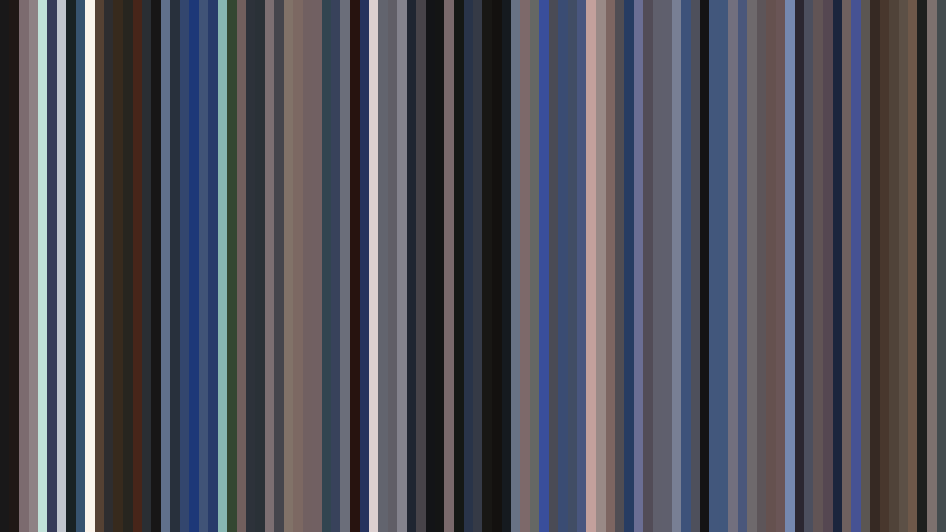
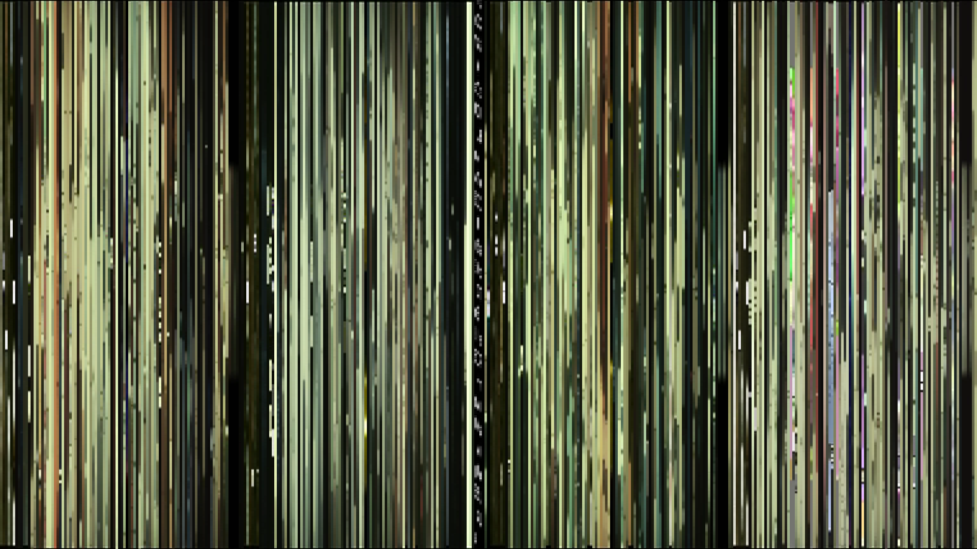
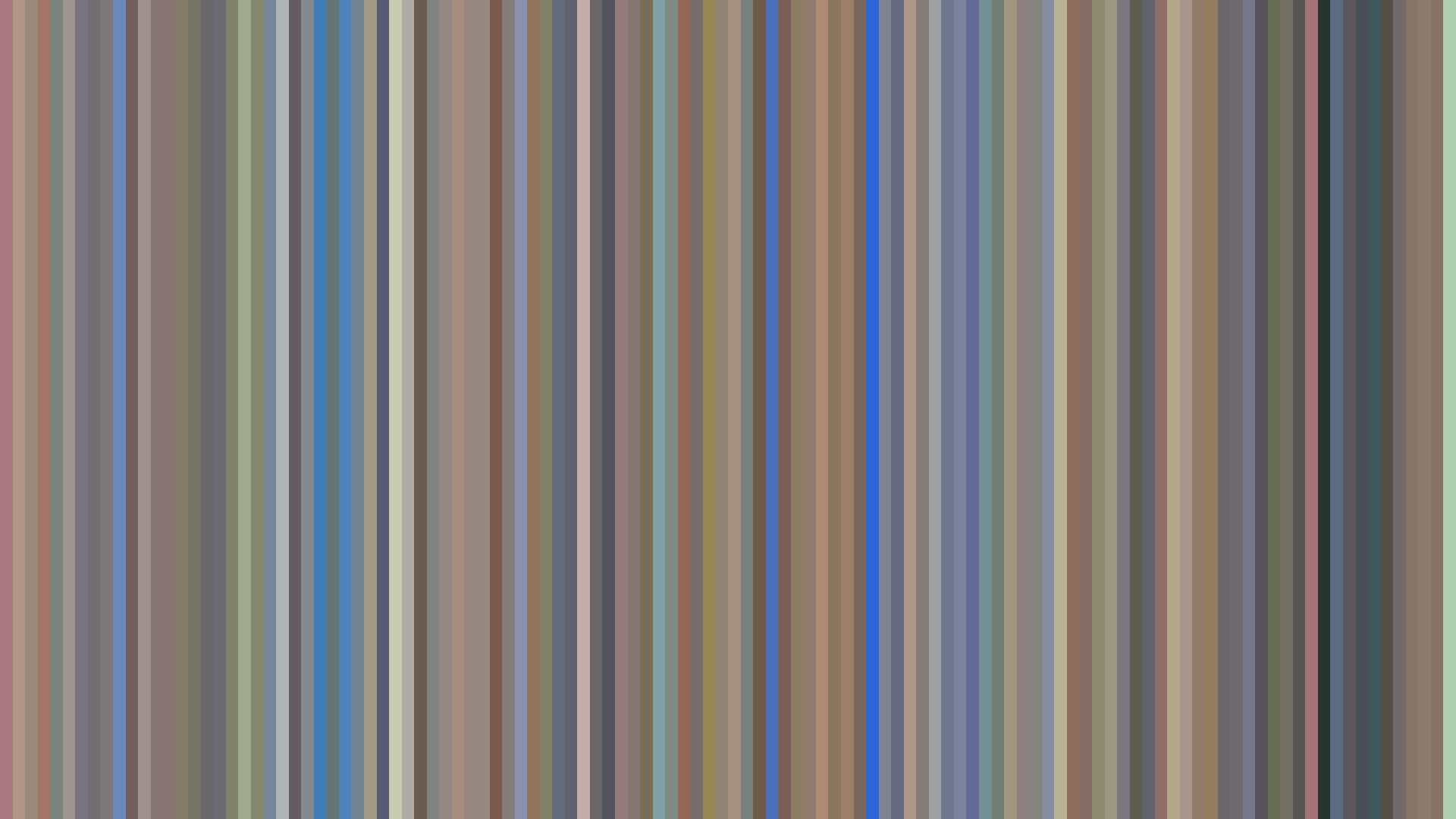
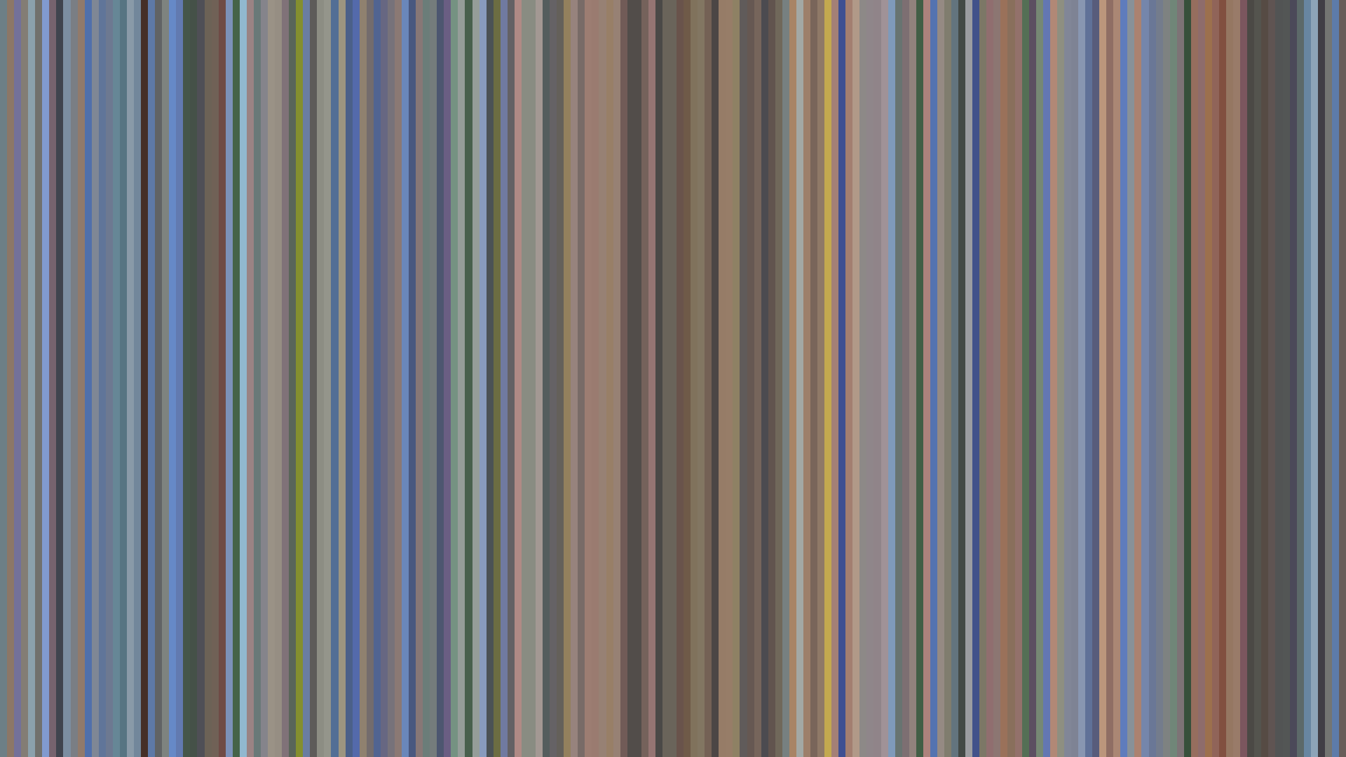
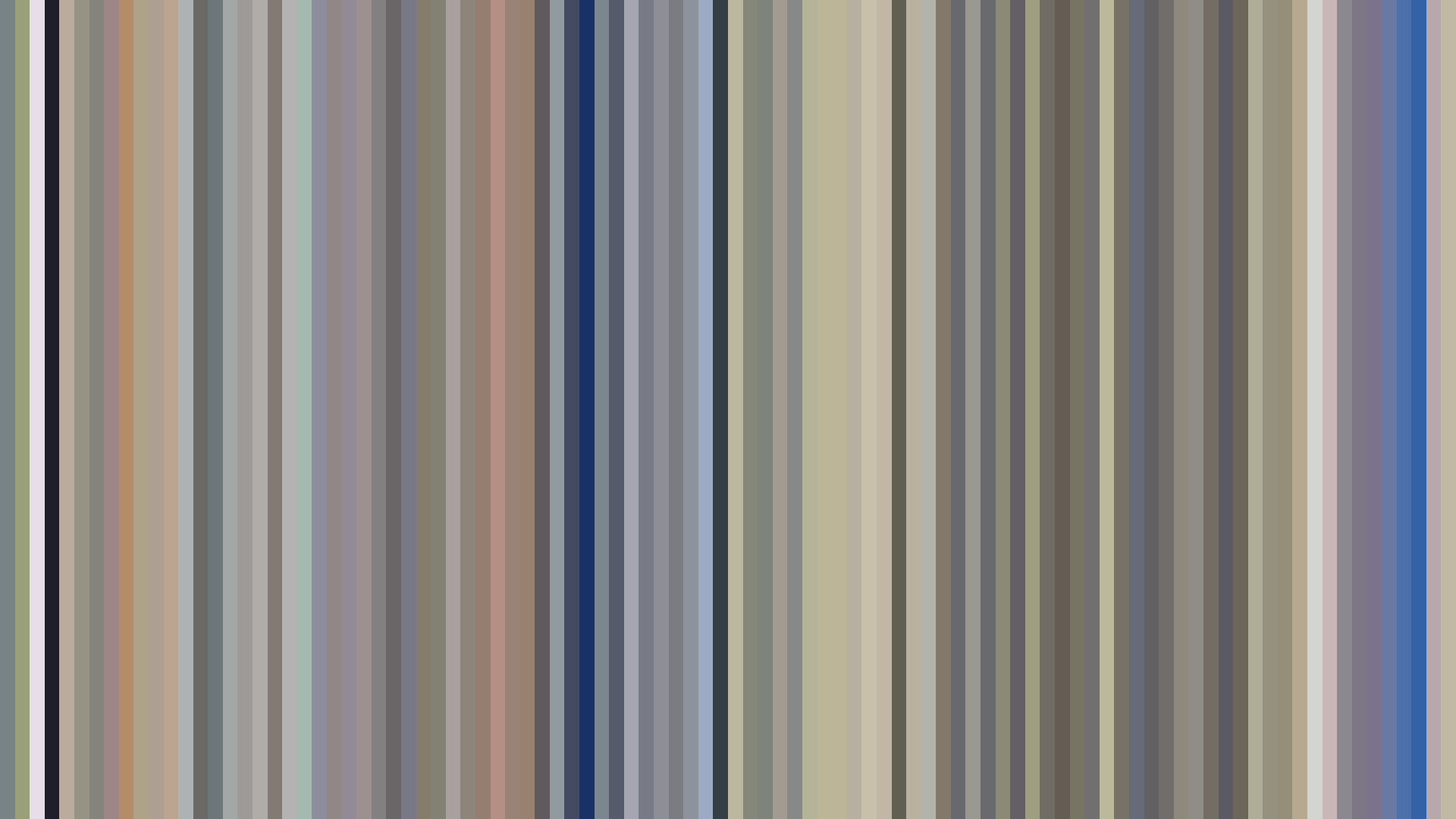
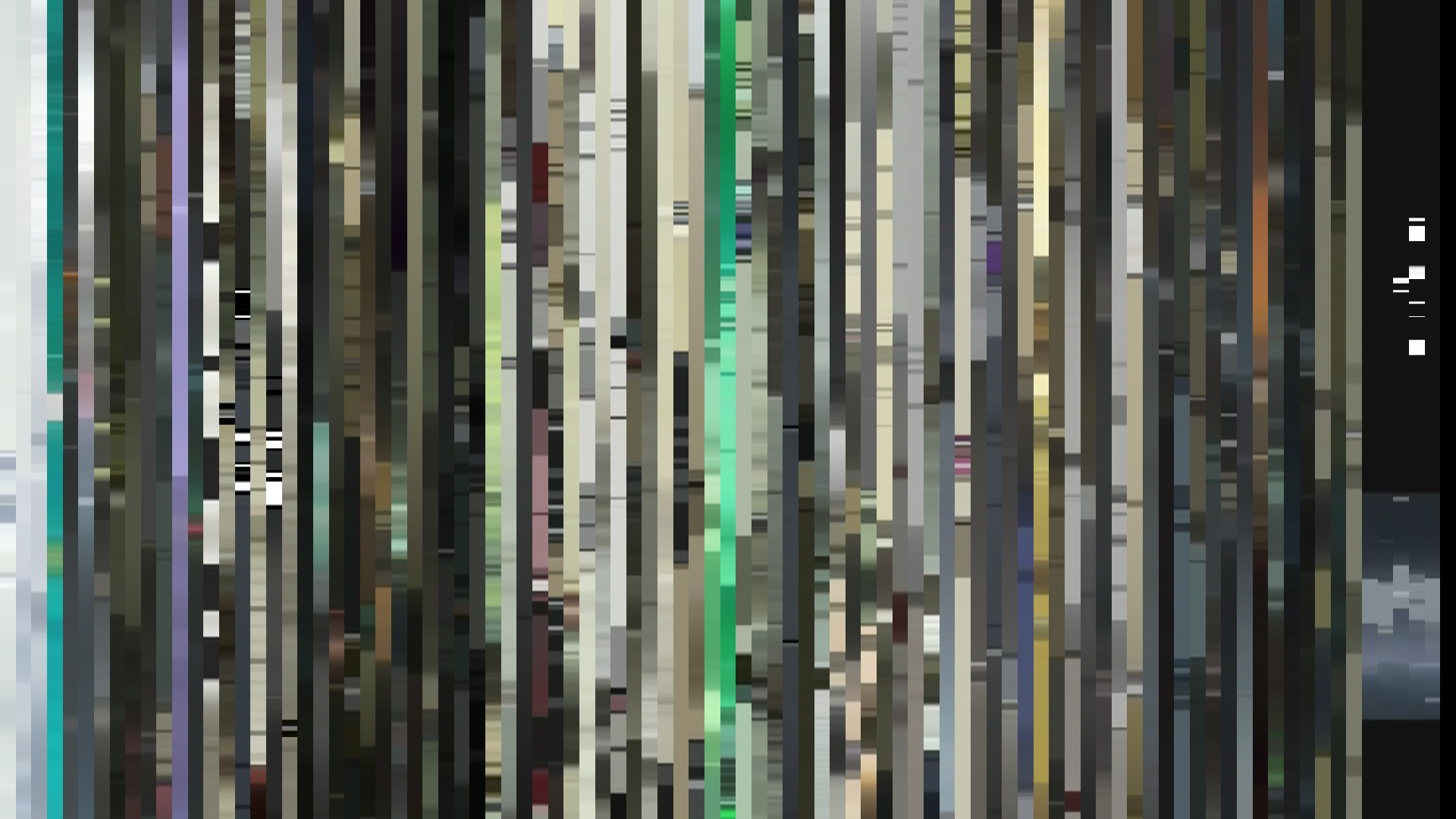
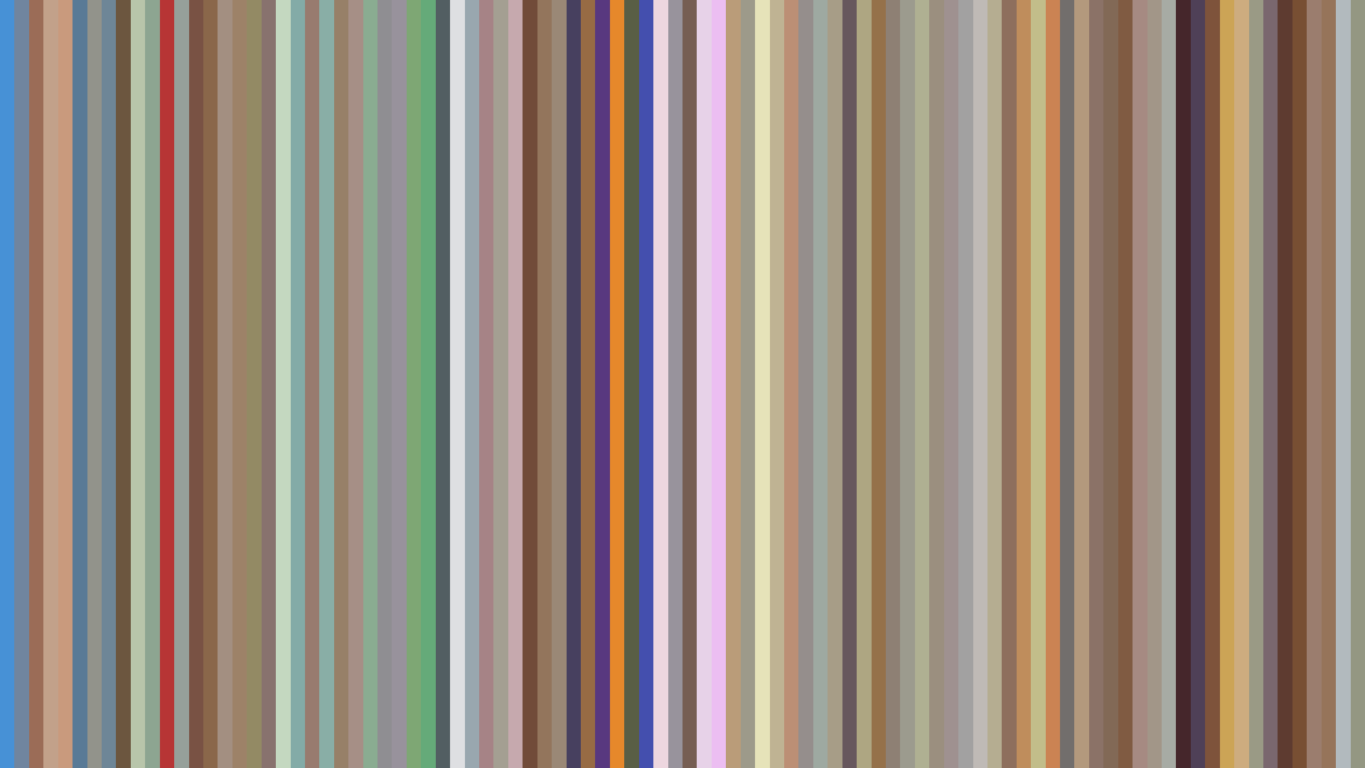
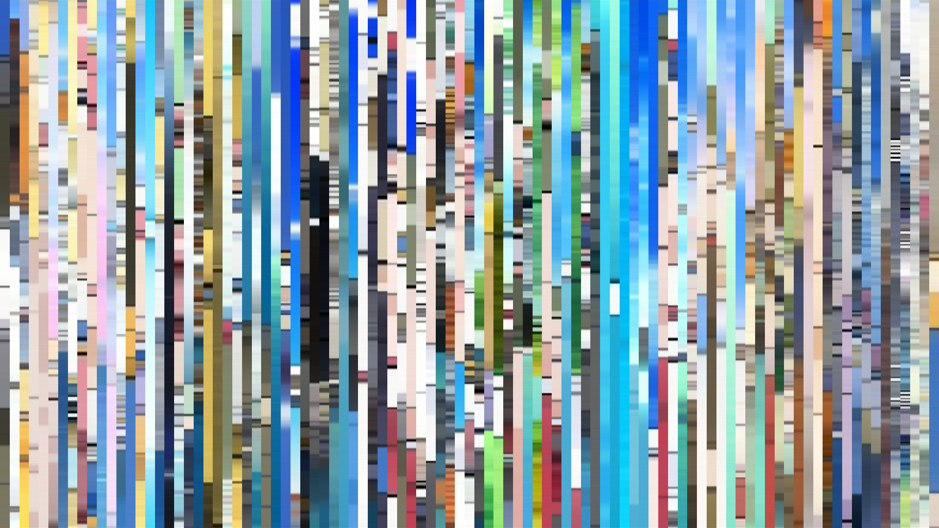
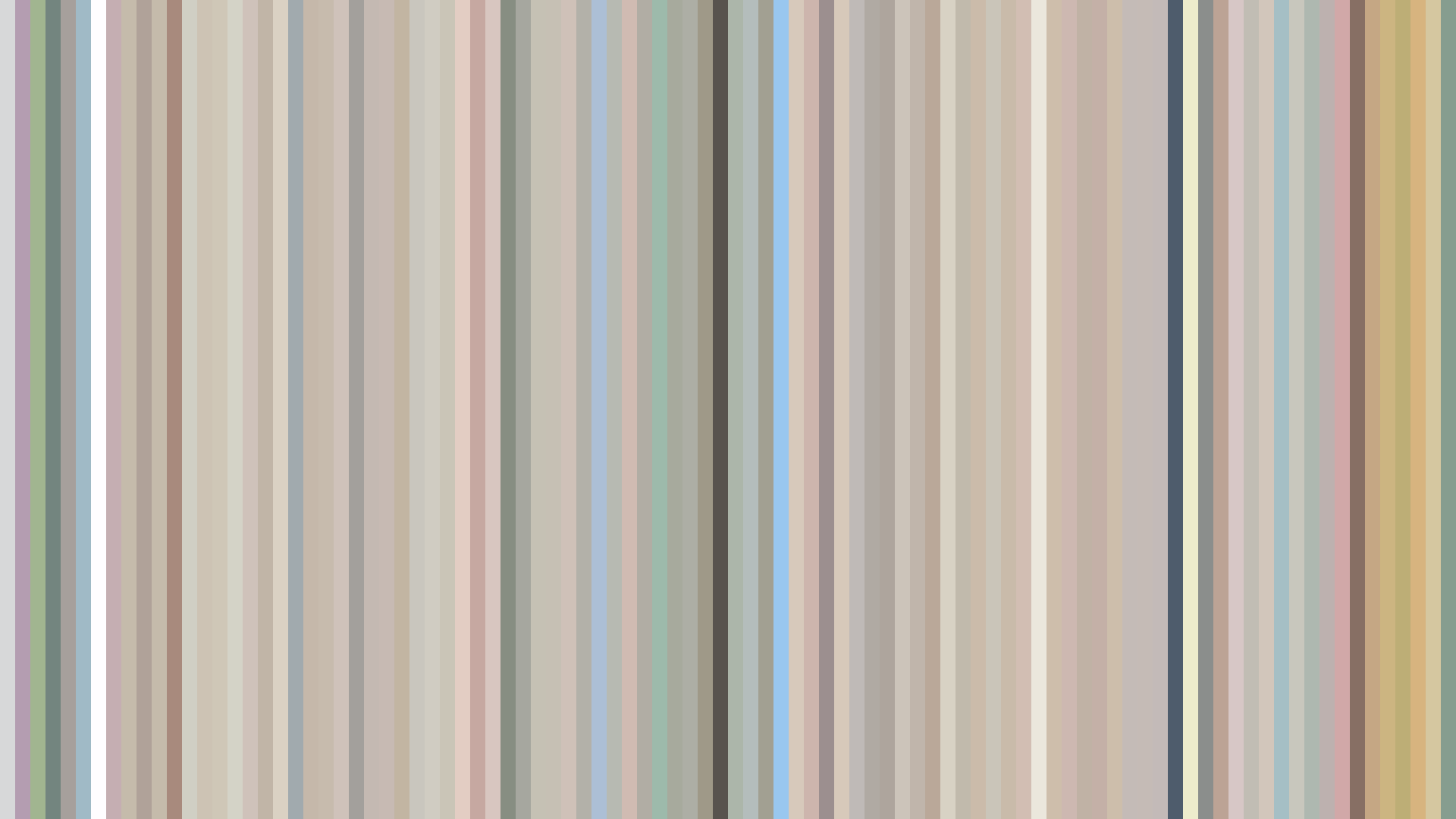
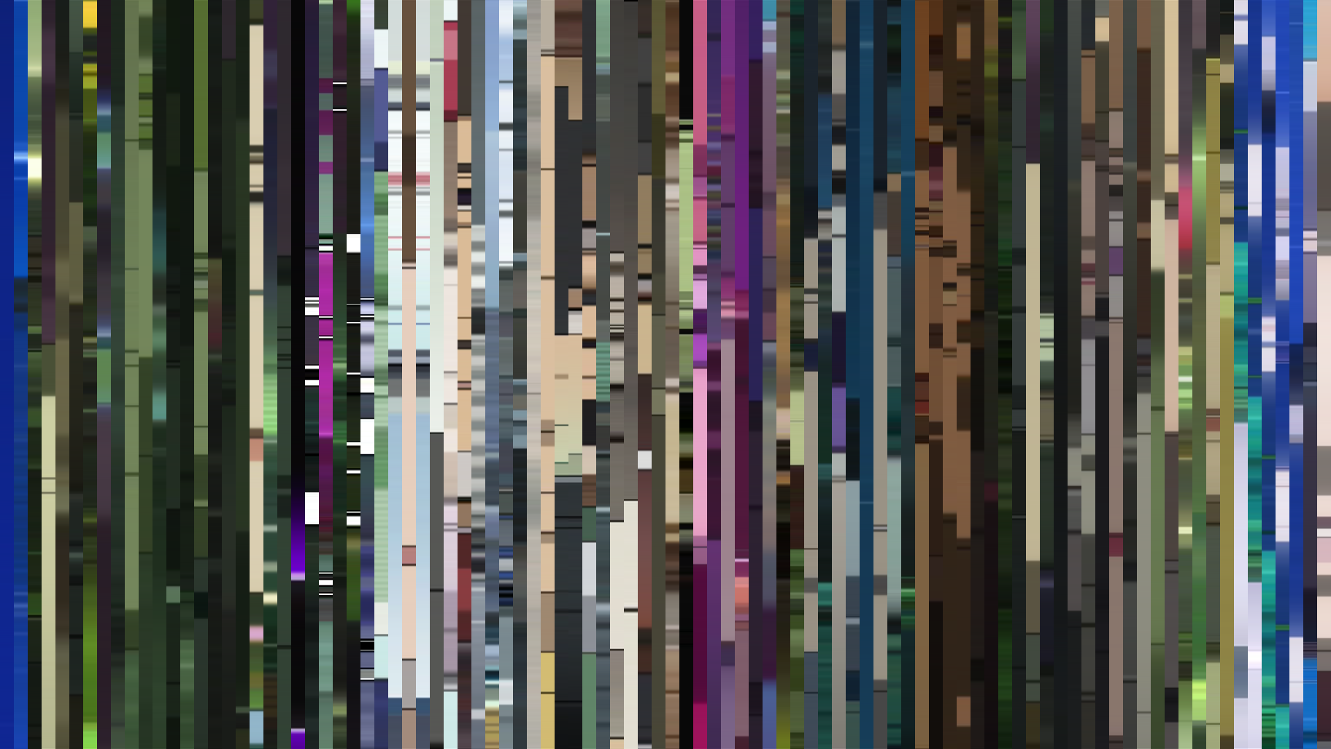
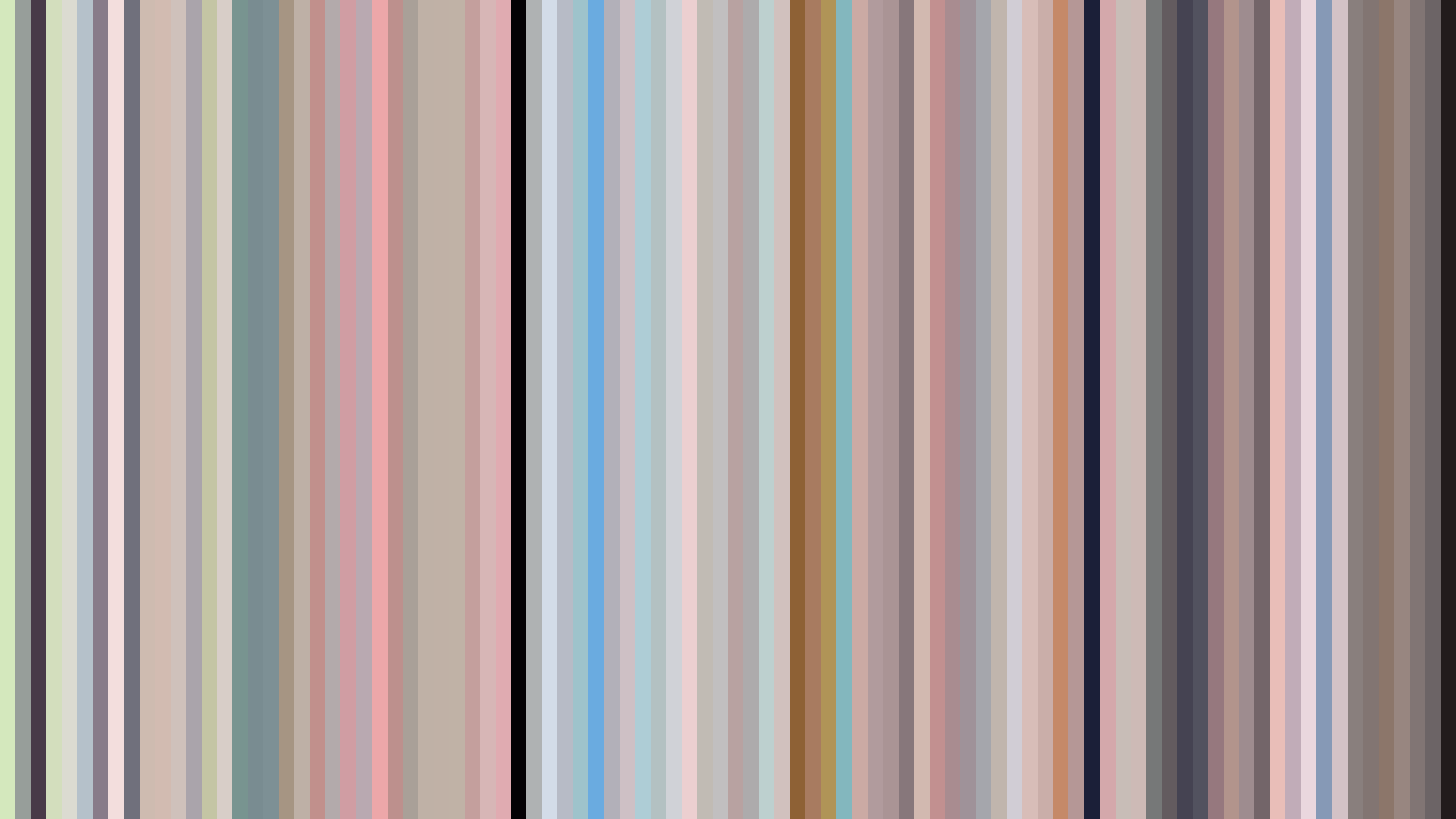
The single most useful artifact in the decade for understanding what digital animation became is the Aria trilogy. HAL Film Maker produced three series — The Animation (2005), The Natural (2006), The Origination (2008) — and the dataset returns nearly identical palettes for all three: #E7E6E3 / #A0A19F / #606060 as the neutral spine, then #A4D6E5 and #5DA6E0 as the two blues that the show actually is. All three register as Green-dominant (the canal water, read against the grey-white of Neo-Venezia stone, hue-shifts past cyan into the green range), brightness in the 0.620 band, saturation around 0.240. This is not a color palette so much as a fixed atmospheric condition the studio re-inhabited across three productions and four years.
The Aria palette is the decade's most disciplined argument that digital animation could behave like a place rather than a story — a set of standing weather conditions you returned to.
Nothing else in the dataset sustains a palette this stable across this many entries. Even the long-running shounen — Naruto (2002), Bleach (2004), Soul Eater (2008) — drift around their own anchors. Aria's consistency reads as a thesis about what the slice-of-life genre is doing in this decade: not telling stories but stabilizing rooms, making places you could re-enter. The flat brightness arc of The Origination (0.622 across its runtime) is the formal completion of that thesis. The show stopped having episodes, structurally; it had weather.
Bones, Bookends, and the Blue-Green Prestige Register
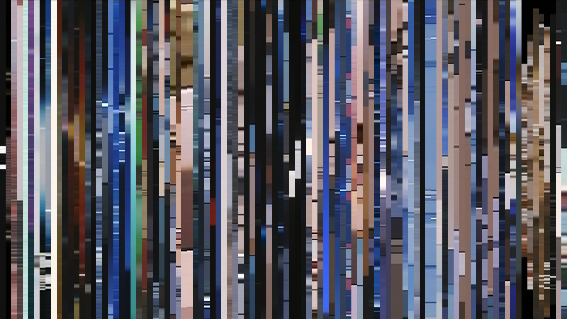
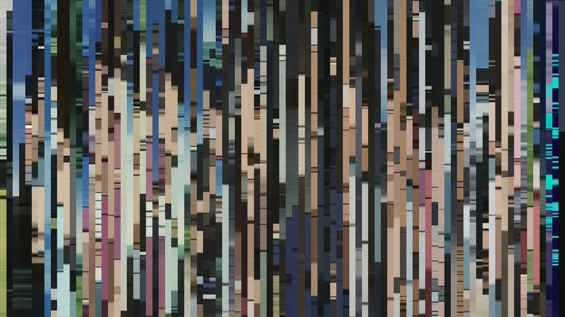
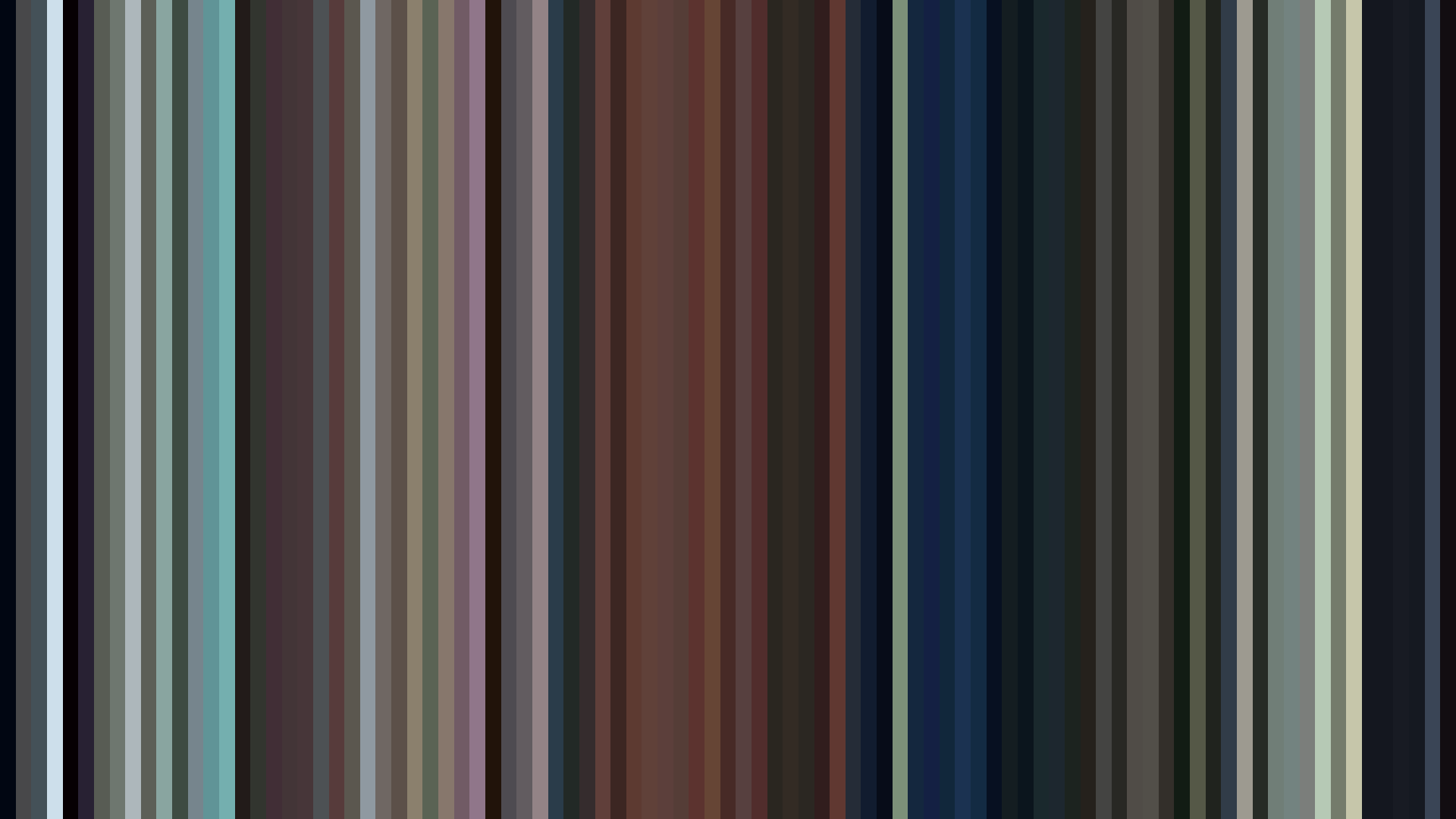
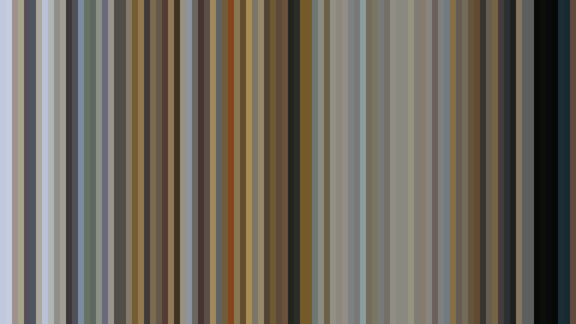
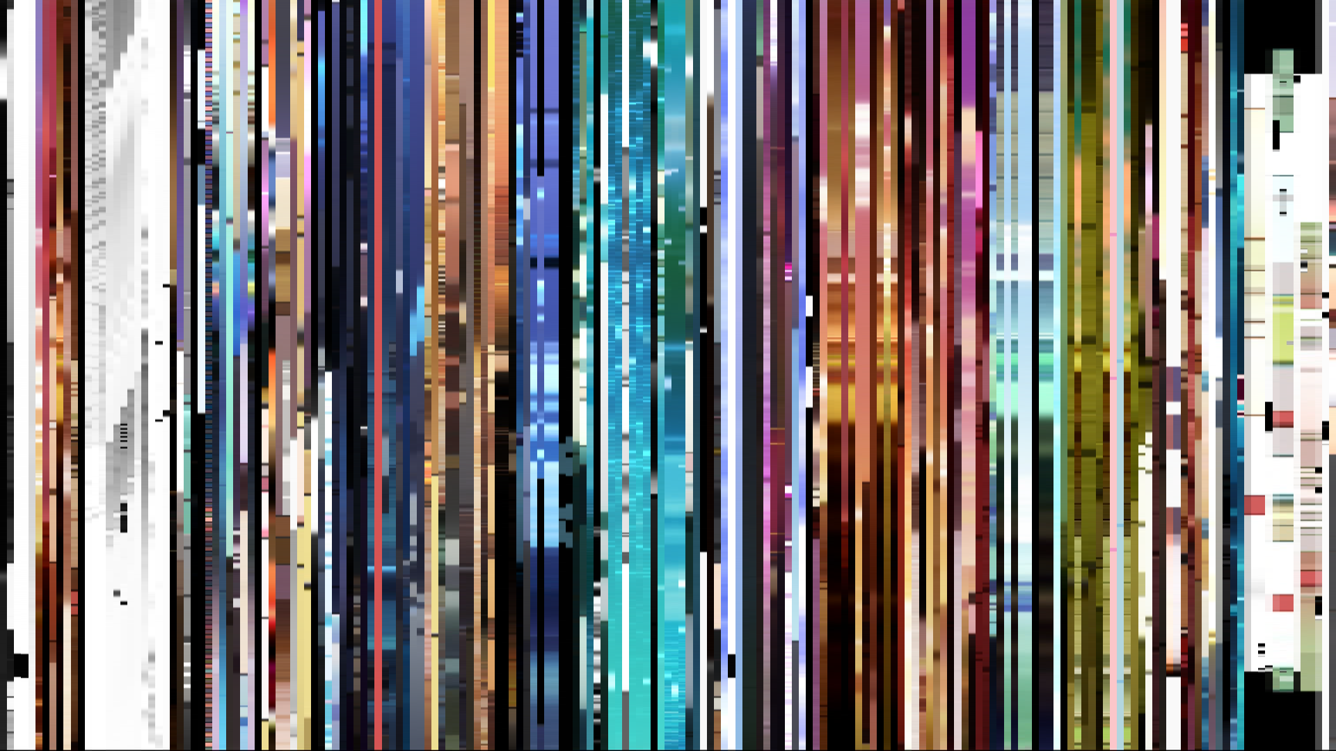
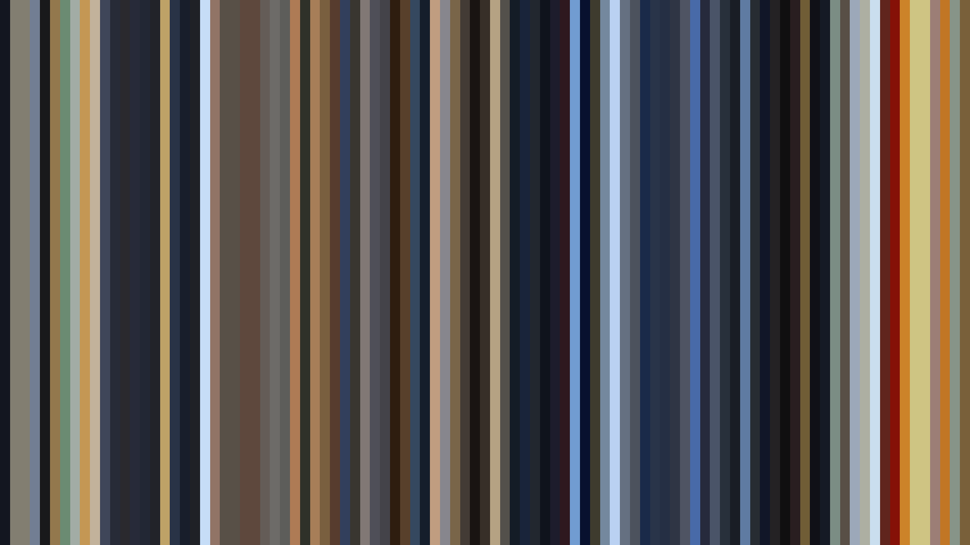
The most legible single argument the decade makes about its own evolution lives in two entries from the same studio adapting the same source material six years apart. Fullmetal Alchemist (Bones, 2003) returns Red-Orange dominance, a falling arc, brightness 0.456, with a palette led by #211E1A and #DDD4AA — the warm-amber-to-burnt-ochre register of pre-digital fantasy. Fullmetal Alchemist: Brotherhood (Bones, 2009) returns Blue-Green dominance, a dark-opening arc, brightness 0.377, with #24324E sitting third in the palette as a deep cool-navy that the 2003 production simply does not contain. Same studio. Same alchemy. Same brothers. The palette has been inverted across the seam of the decade.
This is not an accident, and it is not just Yasuhiro Irie's preferences. The Blue-Green prestige register — the cool, desaturated, slightly clinical palette that signals this is a serious production — emerges across the decade's most ambitious work. Last Exile (Gonzo, 2003) sits at #64738F / #2A344C, a cool-blue anchor unusual for its year. Banner of the Stars (Sunrise, 2000–2001) carries #273455 like a stripe down the middle of its palette, a navy that registers as Blue-Green at the dataset's hue resolution. Spice and Wolf (2008) and its sequel both come in Blue-Green with brightness 0.441. And the towering example: Code Geass: Lelouch of the Rebellion (Sunrise/TMS, 2006), Blue-Green, falling arc, palette anchored at #2D364B and #65728F — the cool grey-blue of Britannian uniforms, of Lelouch's mask, of the show's entire ideological architecture.
Code Geass has the highest score in the dataset until R2 arrives two years later (8.71 → 8.92), and the second season's palette tightens further — #4C2F33, a near-black wine red, joins the cool spine as the only true warmth in the show's anchor swatches. The decade's prestige drama, by 2008, had taught itself to stage emotional violence in cool tones and reserve red for blood and uniforms. FMA Brotherhood's 2009 arrival is the synthesis: a show that had been Red-Orange in its first adaptation returns in the Blue-Green register because that is now what an ambitious adaptation looks like. The aesthetic argument has been won.
Gurren Lagann and the Counter-Reading
The dataset's most useful provocation is that Gurren Lagann (Gainax, 2007) registers as Green-dominant. This will read wrong to anyone who has watched it; the show's reputation is a wall of saturated red and yellow, the visual grammar Hiroyuki Imaishi would carry into the next decade. But the anchor palette tells a more careful story: #15181D, #5E605F, #28515B, #532C25, #9EA29C, #1C344B. The first frames of Gurren Lagann are a hole in the ground. Simon's underground village is grey-stone and lichen-blue; the explosive Red-Orange that defines the show in memory is what it becomes, not what it opens with. The flat brightness arc (0.353) confirms it: the show does not obey the bright-opening or arc-up structures you would predict from its reputation. It opens dark, and the dataset's anchor frames sample it before the surface.
This is the kind of finding a frame-level analysis exists to surface. The reputation of a show is a function of its peaks; the dataset records its baseline. Gurren Lagann's baseline is subterranean. The 0.399 saturation is the second-highest in the 2007 cohort — the saturation is real, but it lives inside a darker frame than the trailers remember.
The Quiet Center: Haibane Renmei
If the decade has a moral center, it is Haibane Renmei (Radix, 2002): brightness 0.486, saturation 0.176, flat arc, palette led by #616559, #2A2E26, #A6A999, #DBDDCE. Yoshitoshi ABe's color script gave Tomokazu Tokoro's direction the muted, sun-bleached register of a town that exists somewhere just adjacent to memory. The numbers are unremarkable on first read — middle brightness, low saturation, no dramatic arc — and that is exactly the achievement. Haibane Renmei is the dataset's argument that the decade's new tools could be used to render quiet, and that quiet is harder than spectacle. The palette has no spike. There is no signature color. The show is what happens when digital production stops trying to do something the old tools couldn't and instead does something they couldn't quite do this well: hold a single grey light steady for thirteen episodes.
Compare it to Kino's Journey (A.C.G.T., 2003), which the dataset places at saturation 0.395 — the highest in the 2003 cohort — with an arc-down structure and a palette anchored on #1E1717 and #533025. Where Haibane Renmei went neutral, Kino went earthen; where Haibane stayed flat, Kino dipped into a dark midpoint and recovered. Two adjacent visions of the same impulse: the digital tools used for restraint rather than for spectacle. Both register, in retrospect, as the decade's quiet conscience.
The Studios That Actually Show Up
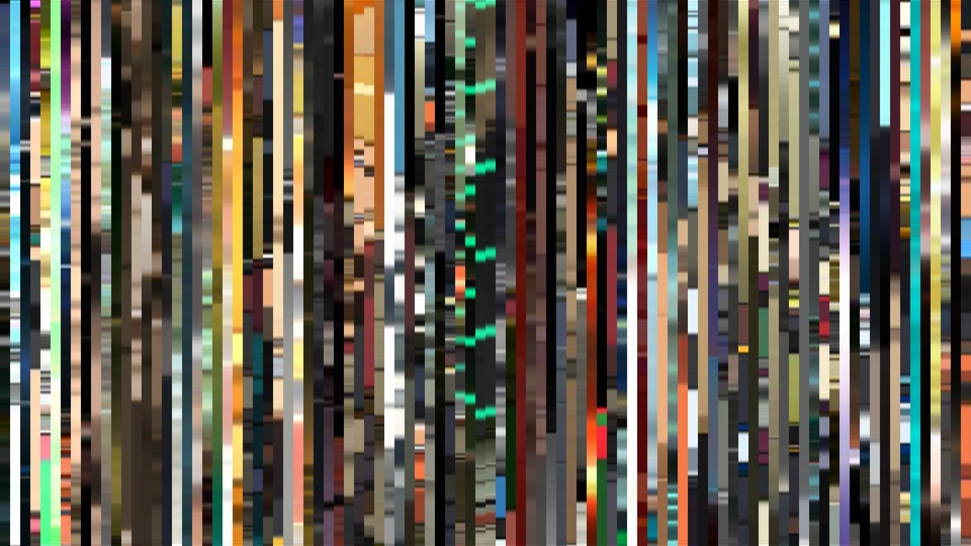
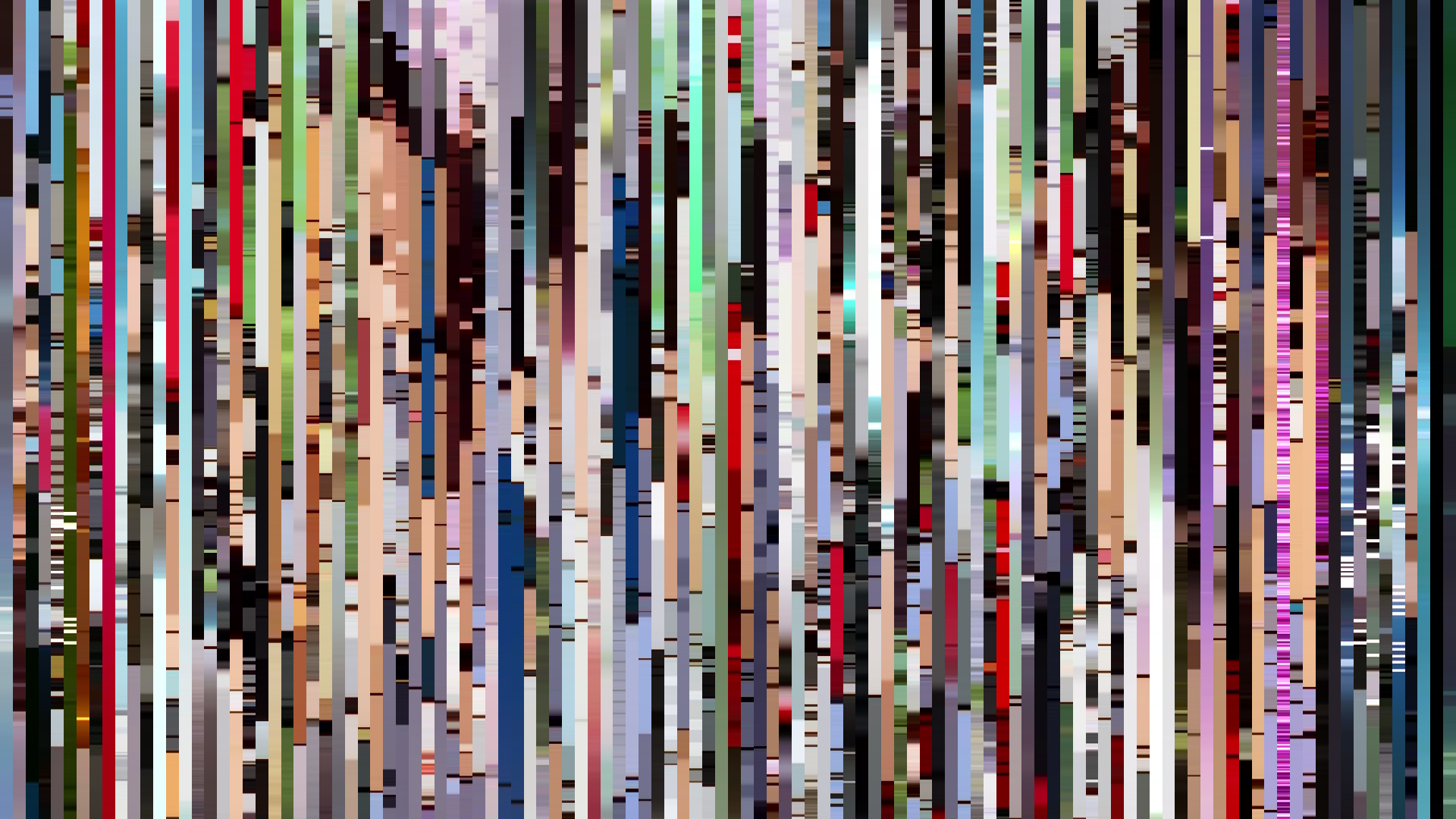
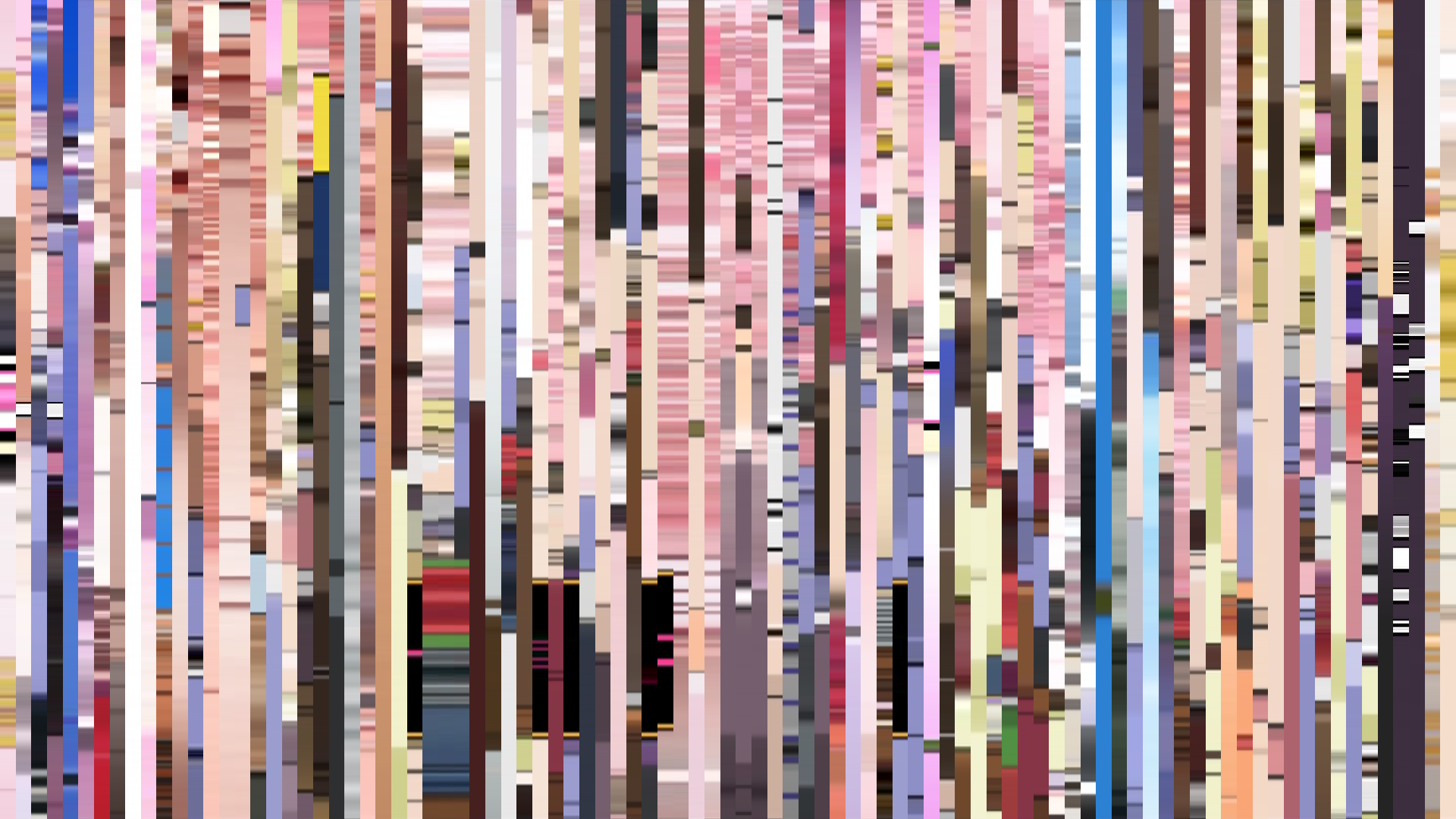
The studio distribution surprises. Madhouse leads with eleven entries — Paranoia Agent, Texhnolyze, Black Lagoon, Kaiba, Paradise Kiss, Chobits, on and on. Bones takes seven, including both FMAs and Wolf's Rain and Darker than Black. Gonzo posts six (Last Exile, Welcome to the N.H.K., Basilisk) before its late-decade collapse. Sunrise lands five. Kyoto Animation, the studio whose aesthetic is most associated with the decade in cultural memory, registers only three entries in this dataset — Full Metal Panic? Fumoffu (2003), The Second Raid (2005), and K-ON! (2009) — and all three return the same anchor palette (#1A1C1E, #5C5A59, #9D9E9E, #E7E7E6, #926F5D, #2F4E5F) for the FMP entries, with K-ON! diverging into the cream-and-rose register that would define their next decade. The studio's house style at this stage is still being negotiated; the perfectionist pastel palette popular memory associates with KyoAni belongs more properly to the 2010s.
The dataset's insistence on Madhouse and Bones over KyoAni is not a contradiction of received wisdom; it is a corrective. The 2000s in raw production volume belonged to the older studios still adapting the older grammars. The younger studios were learning what their tools could do. By 2009, with FMA Brotherhood's cool palette and K-ON!'s cream pastels both in the same year, the negotiation was effectively complete. The next decade would inherit a settled vocabulary: warm for slice-of-life, cool for prestige, Green-dominant for atmospheric experiment, saturation pushed into the 0.30s only when something is actually on fire.
What the Decade Decided
Read the aggregate against the aggregates of adjacent decades and the 2000s reveal themselves as the period in which anime diversified its baseline. The 1990s ran narrower; the 2010s ran brighter on average; the 2000s ran wide. Hue distribution: 37 Red, 25 Red-Orange, 7 Blue-Green, 5 Green, and the lonely 1 Red-Purple of Lovely Complex. Arc distribution scattered evenly across bright openings (15), flat (13), dark openings (13), bright endings (11). No single structural pattern dominates. The tools had become flexible enough that nothing was forced.
The decade's accomplishment, viewed through the data, is that it taught digital production to stop signaling its own newness. The early entries — Vandread, Last Exile, even RahXephon — wear their compositing on their sleeve; the late entries do not. FMA Brotherhood's palette does not announce that it is digital. It just is. The barcodes from 2009 look like nothing the cel era produced and also nothing that the cel era would have refused. They look like a medium that has settled into itself. That settlement is what the next decade was built on; what it costs, and what it cost to lose, is a question for a different essay.