Edit Pace — frame-to-frame color delta (bright = fast cuts)
Color Temperature — warm (gold) vs cool (teal) per frame
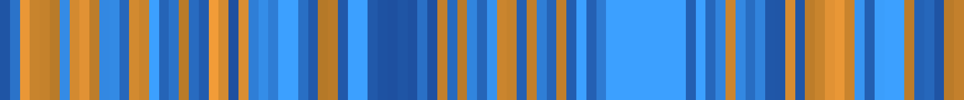
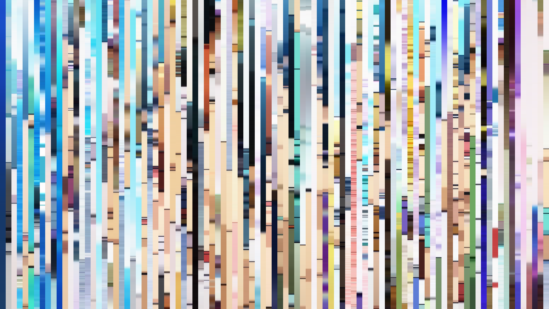
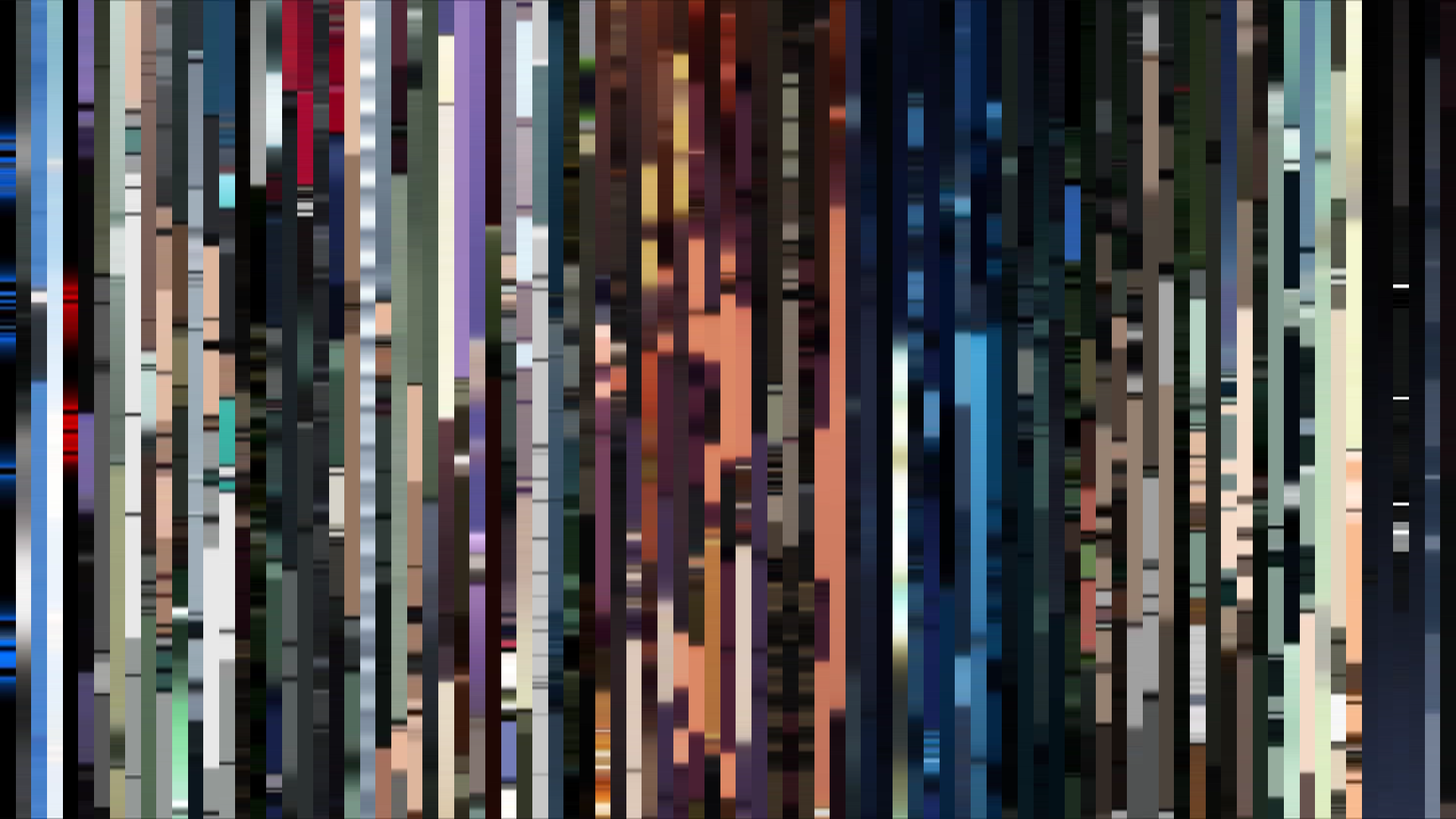
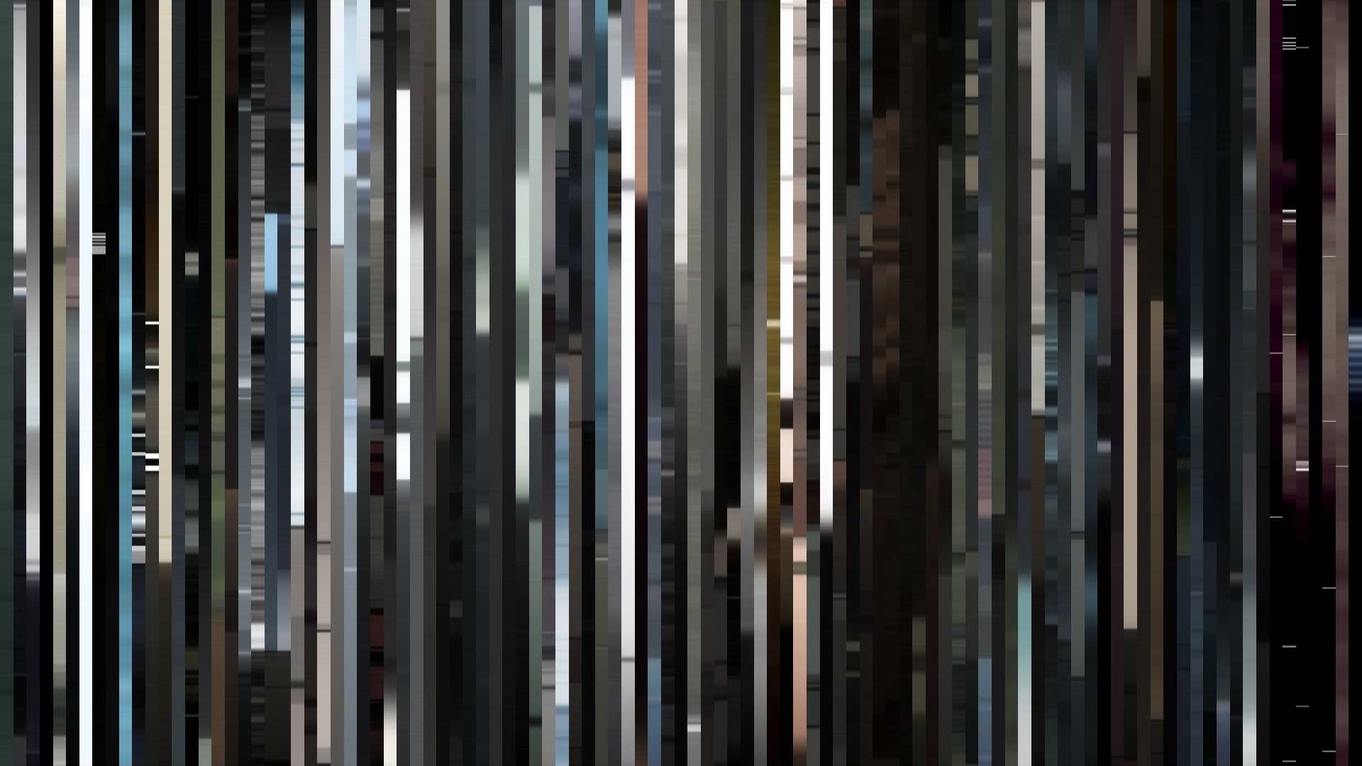
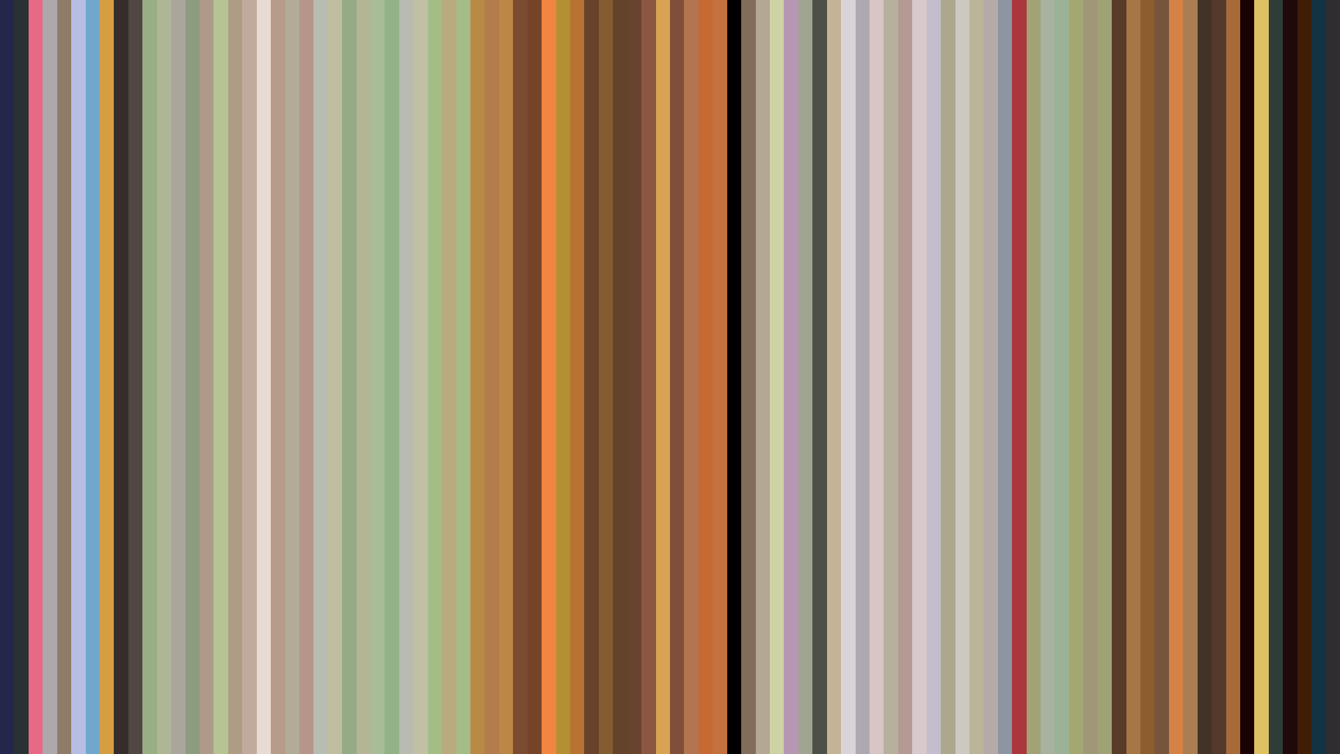
Frame Density Comparison — every 2nd vs every 4th frame
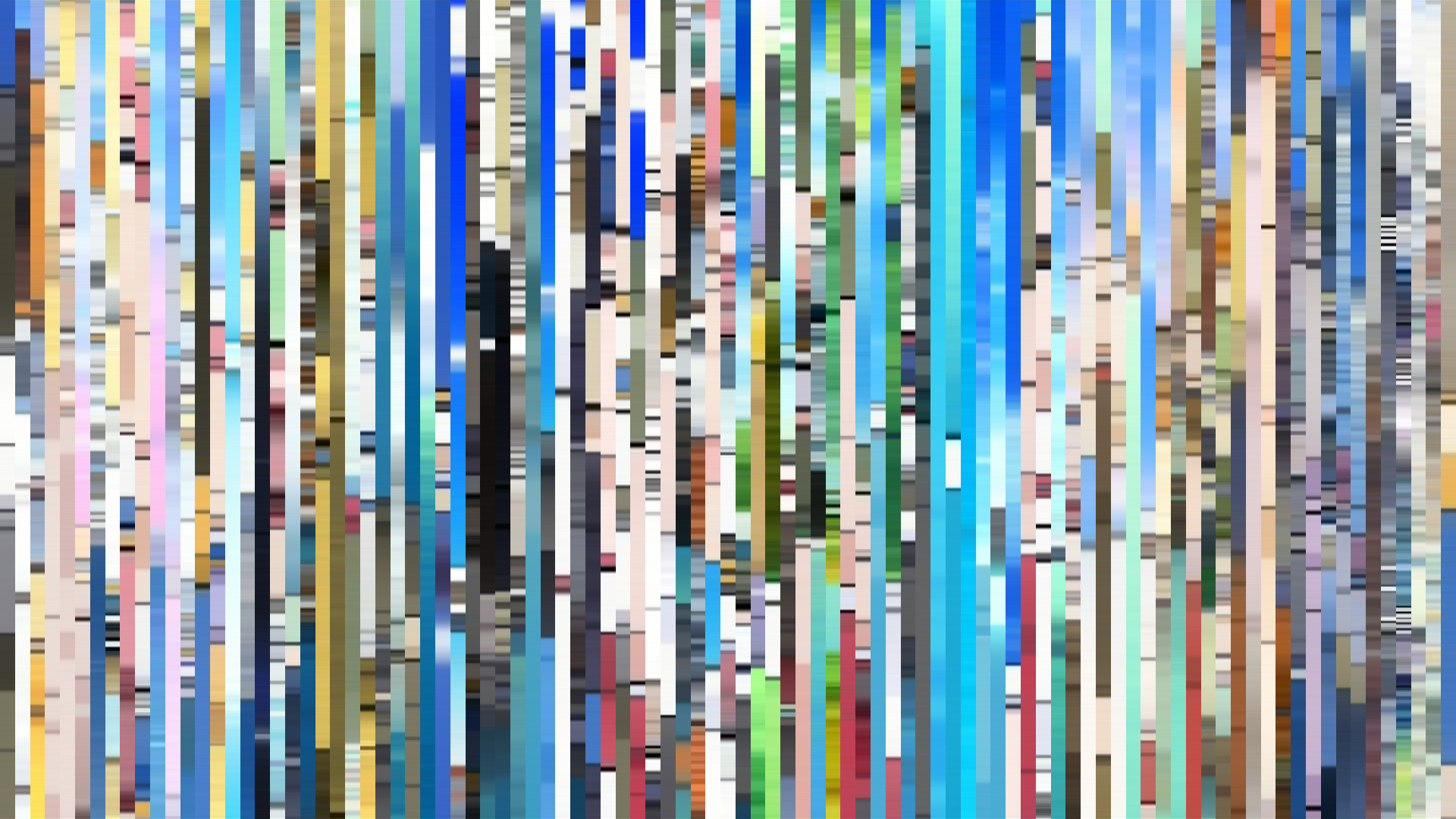
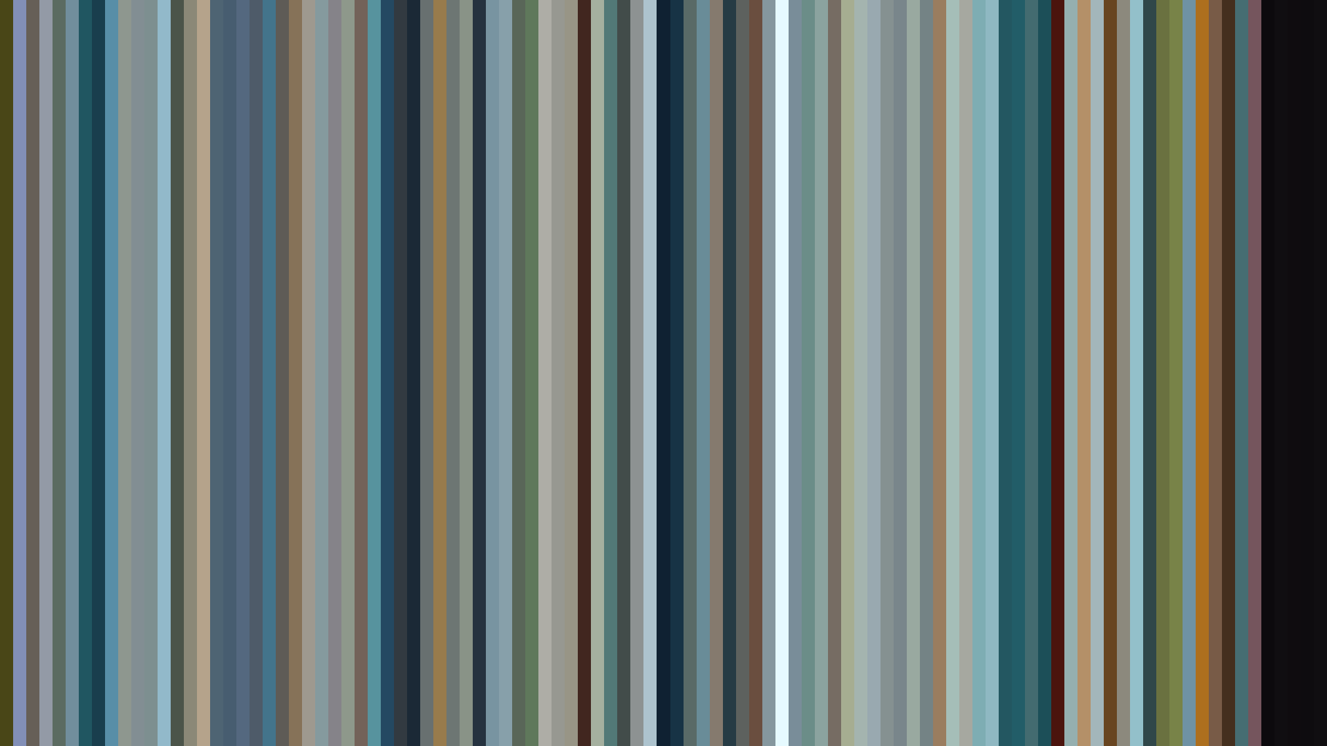
Slice · 15s
Avg · 15s
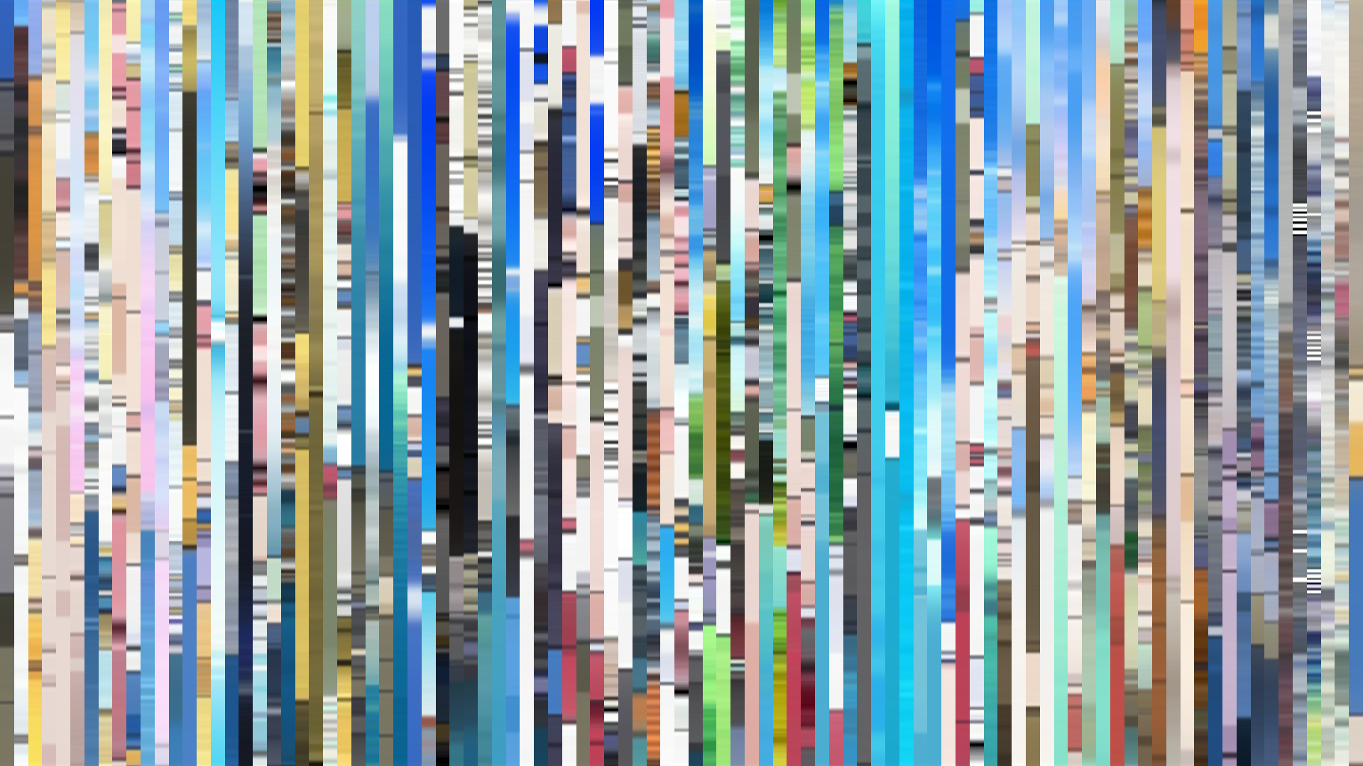
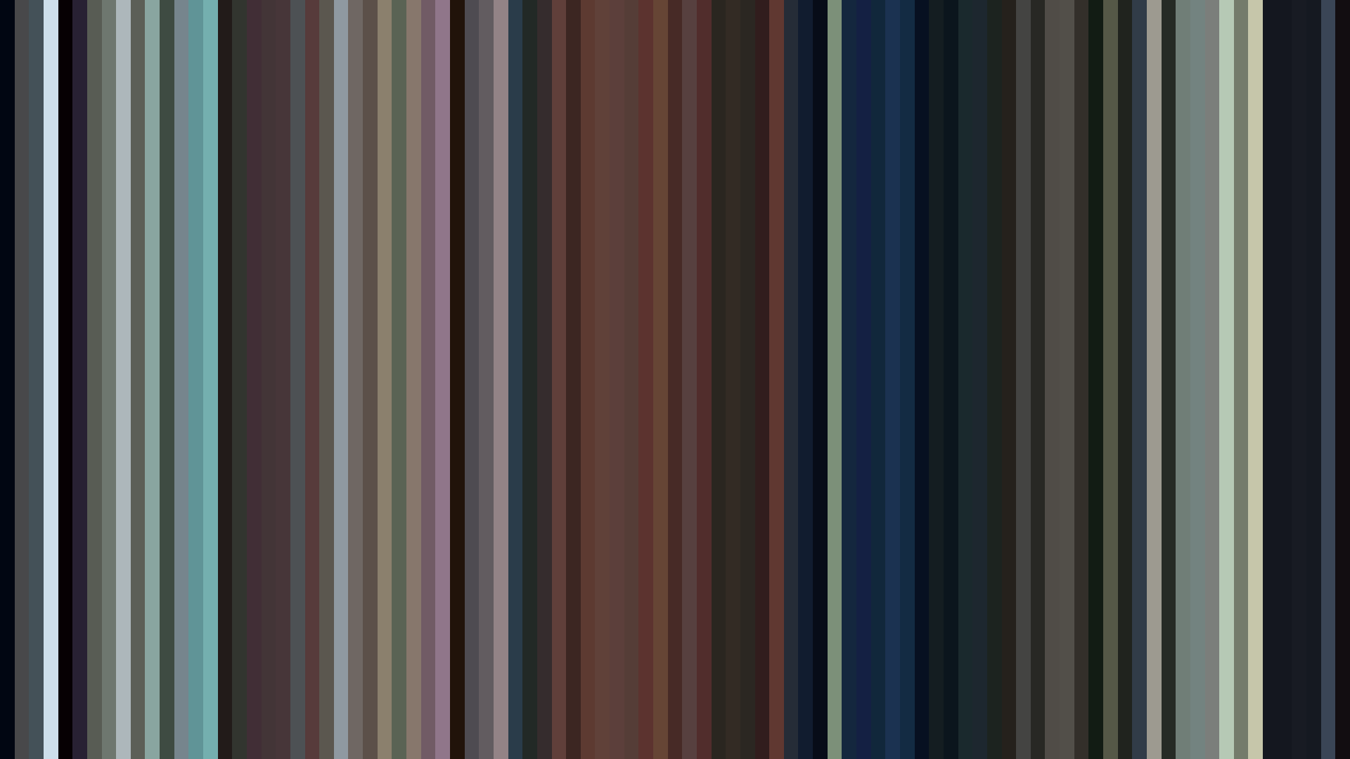
Slice · 30s
Avg · 30s
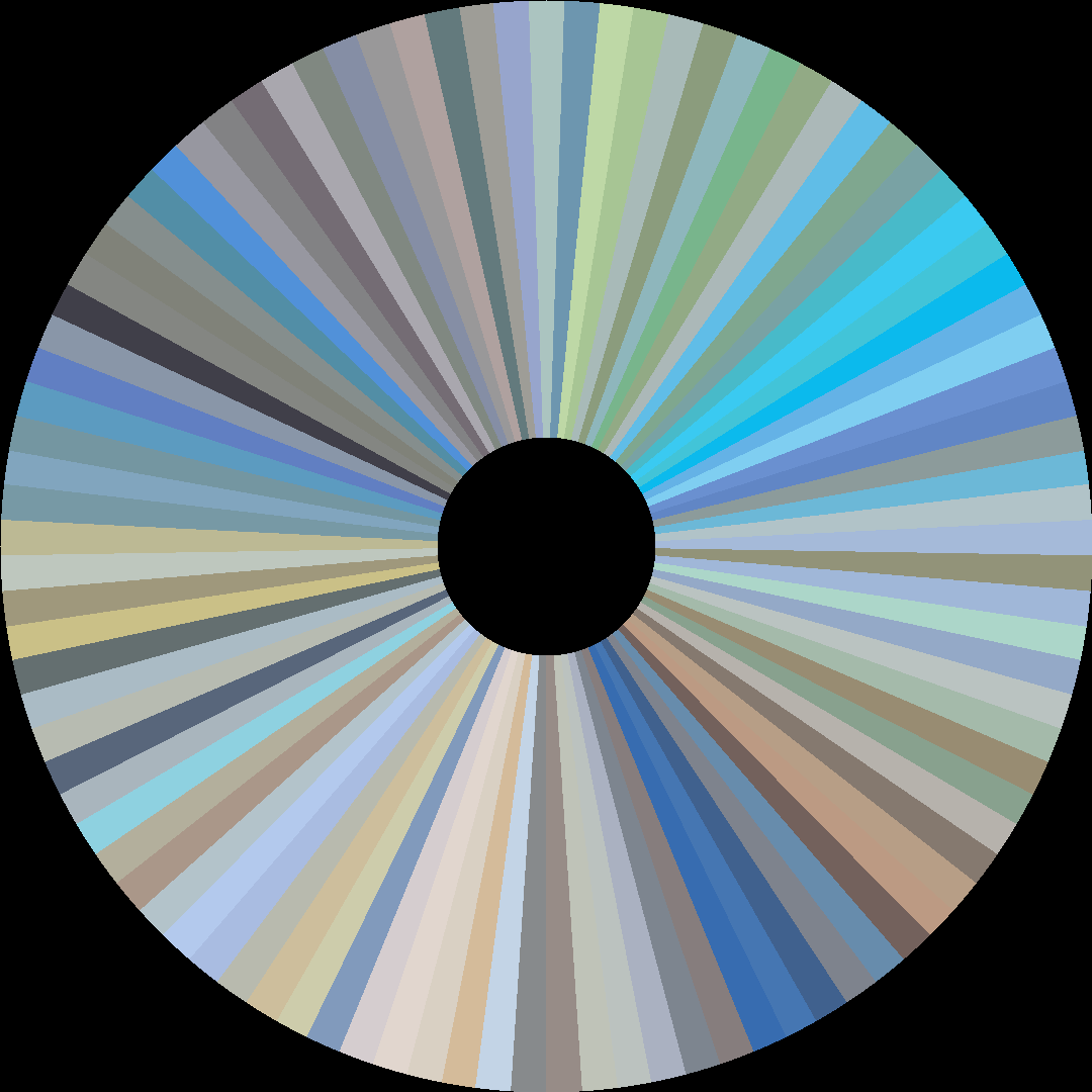
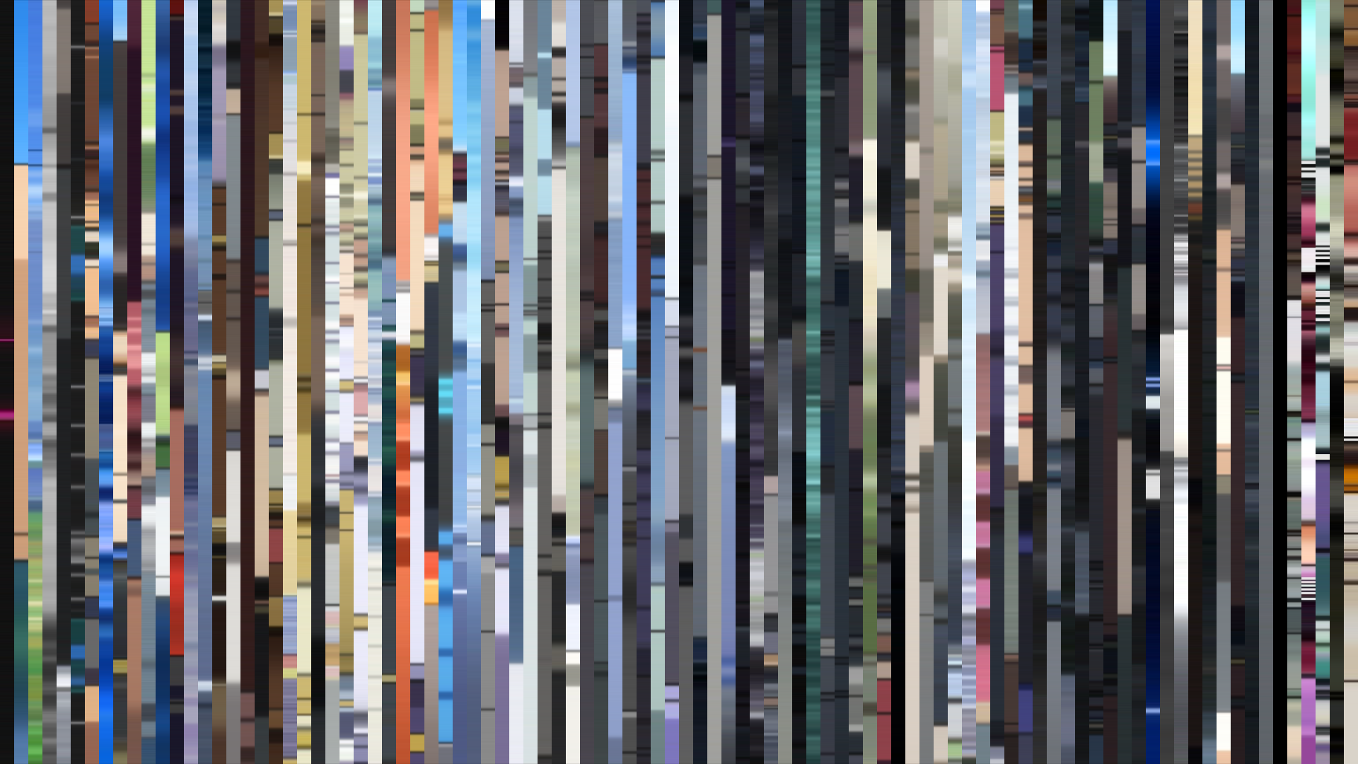
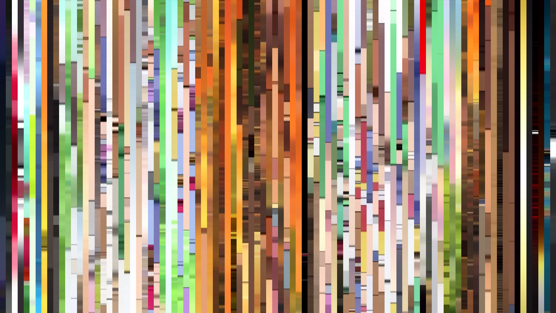
Green dominance in a medium that so often leans warm or cold is itself a statement of intent. Aria the Natural’s palette reads as a watercolor wash of #A4D6E5 and #5DA6E0 sky tones over soft neutrals, the saturation dialed so low (0.244) that every frame feels breathable, almost aqueous. This is not accident: director Junichi Sato and art director Seiki Tamura built Neo-Venezia as a place where color is not decoration but atmosphere — canal light diffusing through canalside buildings, the rust of gondolas, the pale beige of stone. The bright-ending arc is subtle but real: the opening act’s brightness (0.535) dips in the middle (0.482), then recovers to 0.532 — not a dramatic surge, but a deliberate structural cue. The middle third is where the show’s quiet melancholy settles, the weight of time passing in a city frozen in its replica of Earth’s past. The closing brightening is not triumph; it’s acceptance, a warmth earned. Green and Blue-Green together account for 60% of the frame, making this one of the most chromatically restrained series of its decade. Where most 2006 anime blared reds and oranges for energy, Aria the Natural chose to be the color of moss on a canal wall — and trusted that stillness could be enough.
Brightness Arc (episode progression)
Hue Distribution
Act Breakdown
Opening
0.535
Middle
0.482
Closing
0.532
Avg Brightness
0.620
Avg Saturation
0.244
Warmth
0.450
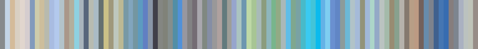
Color Palette
#E7E6E3
#A0A19F
#606060
#A4D6E5
#6593A3
#5DA6E0
#DED1AB
#222427
3-Act Color Story
Opening
Middle
Closing
Color Twins
Perceptually nearest palettes — measured in OKLab space, not RGB


Green dominance in a medium that so often leans warm or cold is itself a statement of intent. Aria the Natural’s palette reads as a watercolor wash of #A4D6E5 and #5DA6E0 sky tones over soft neutrals, the saturation dialed so low (0.244) that every frame feels breathable, almost aqueous. This is not accident: director Junichi Sato and art director Seiki Tamura built Neo-Venezia as a place where color is not decoration but atmosphere — canal light diffusing through canalside buildings, the rust of gondolas, the pale beige of stone. The bright-ending arc is subtle but real: the opening act’s brightness (0.535) dips in the middle (0.482), then recovers to 0.532 — not a dramatic surge, but a deliberate structural cue. The middle third is where the show’s quiet melancholy settles, the weight of time passing in a city frozen in its replica of Earth’s past. The closing brightening is not triumph; it’s acceptance, a warmth earned. Green and Blue-Green together account for 60% of the frame, making this one of the most chromatically restrained series of its decade. Where most 2006 anime blared reds and oranges for energy, Aria the Natural chose to be the color of moss on a canal wall — and trusted that stillness could be enough.