Edit Pace — frame-to-frame color delta (bright = fast cuts)
Color Temperature — warm (gold) vs cool (teal) per frame
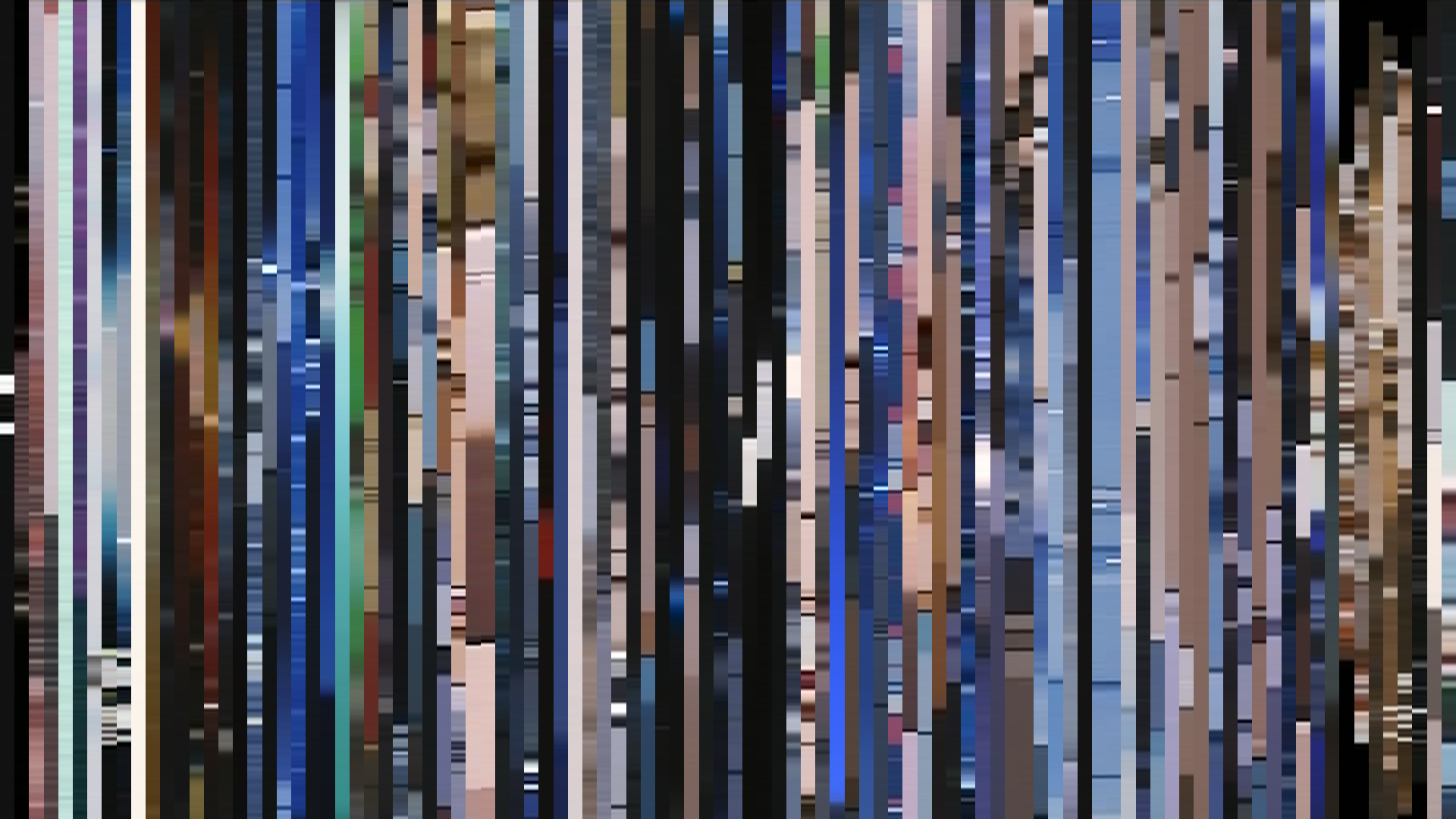
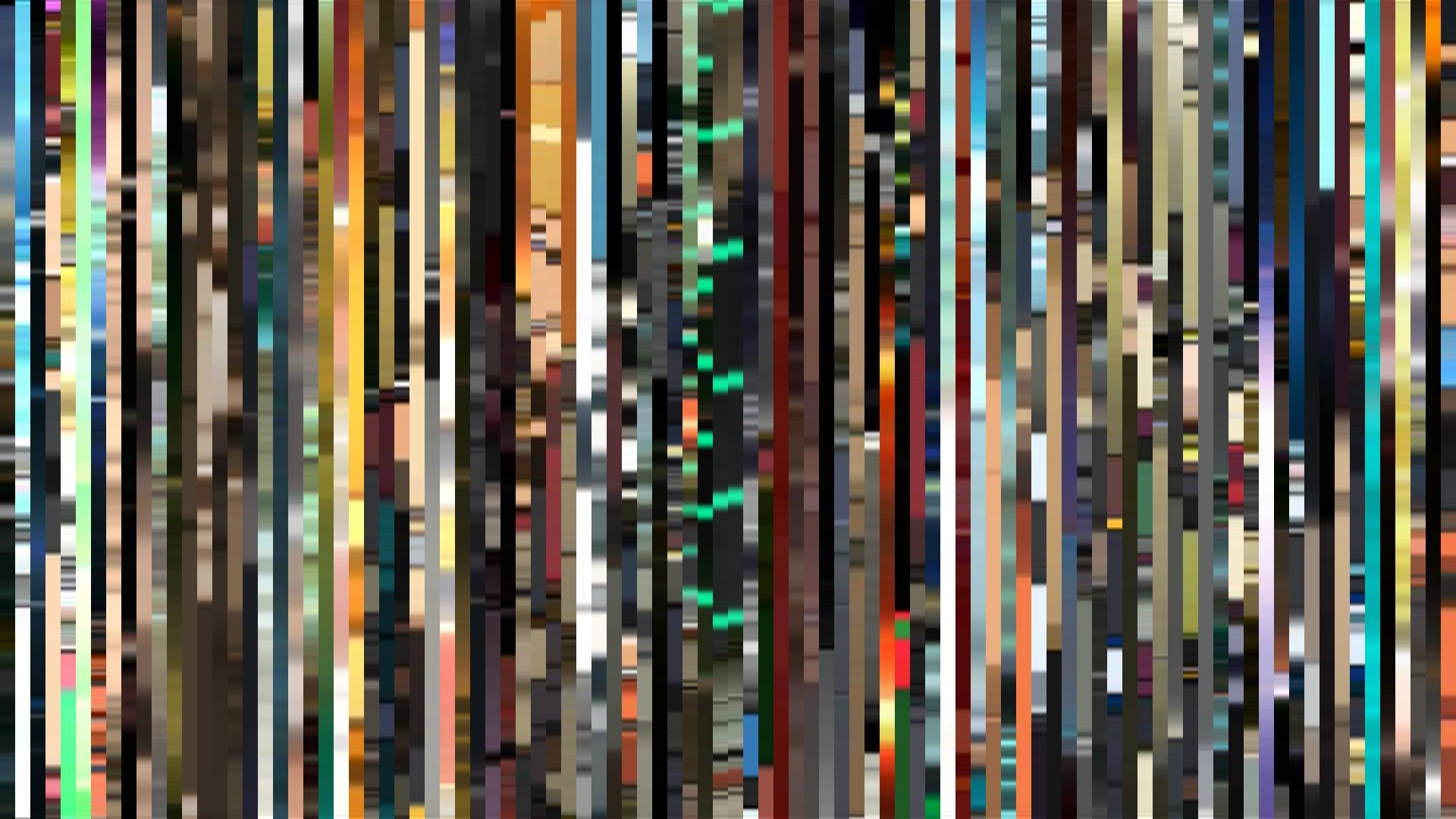
Frame Density Comparison — every 2nd vs every 4th frame
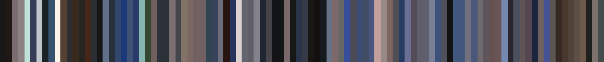
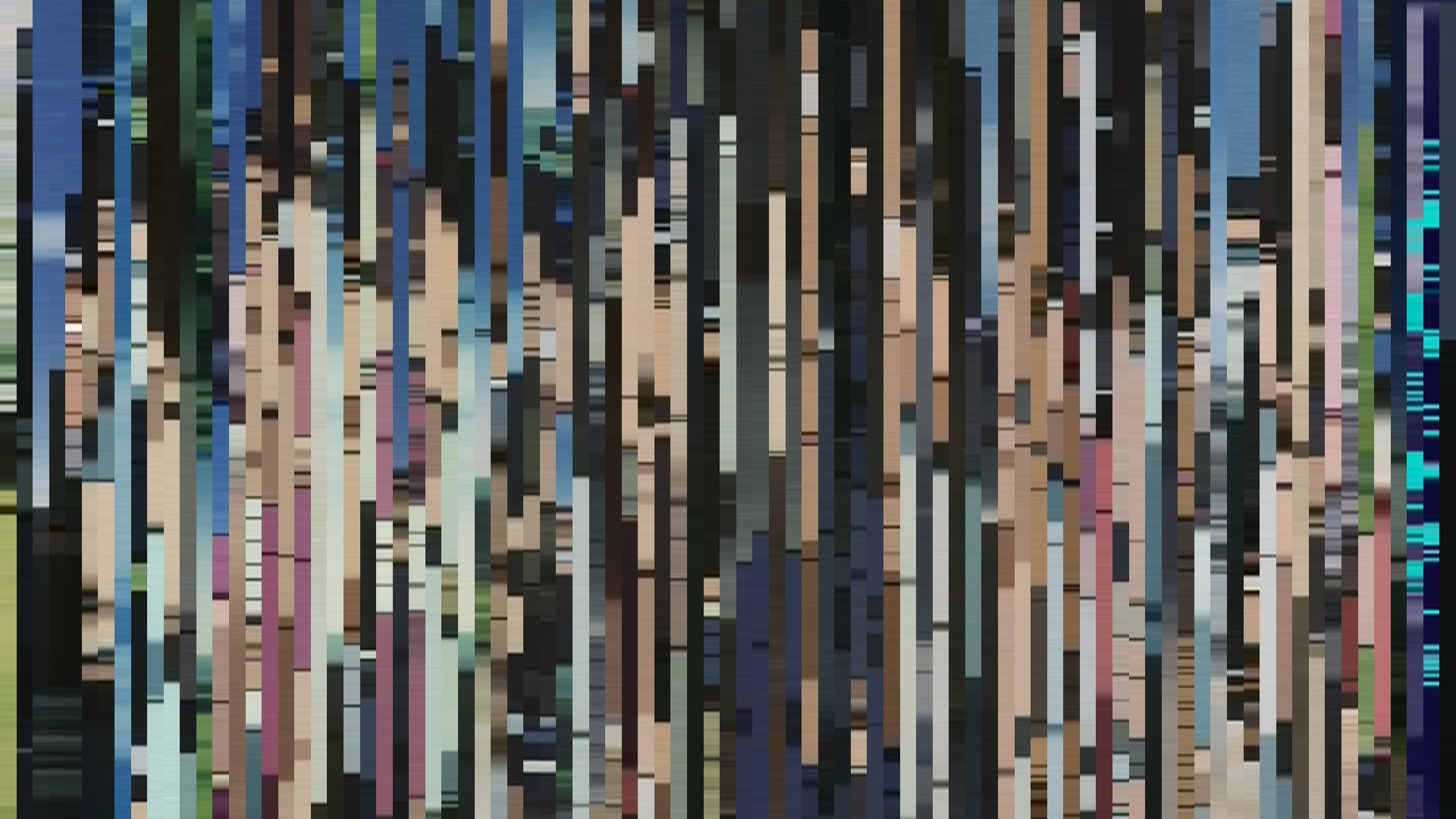
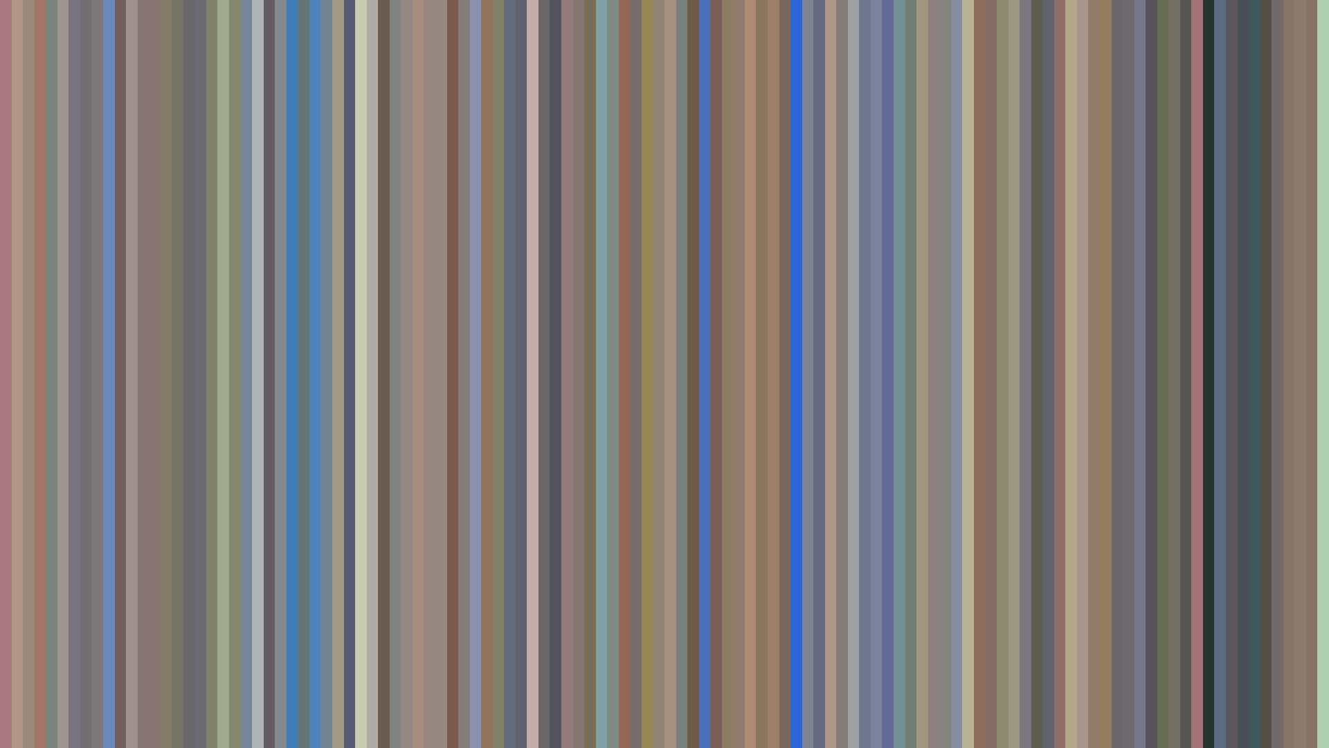
Slice · 15s
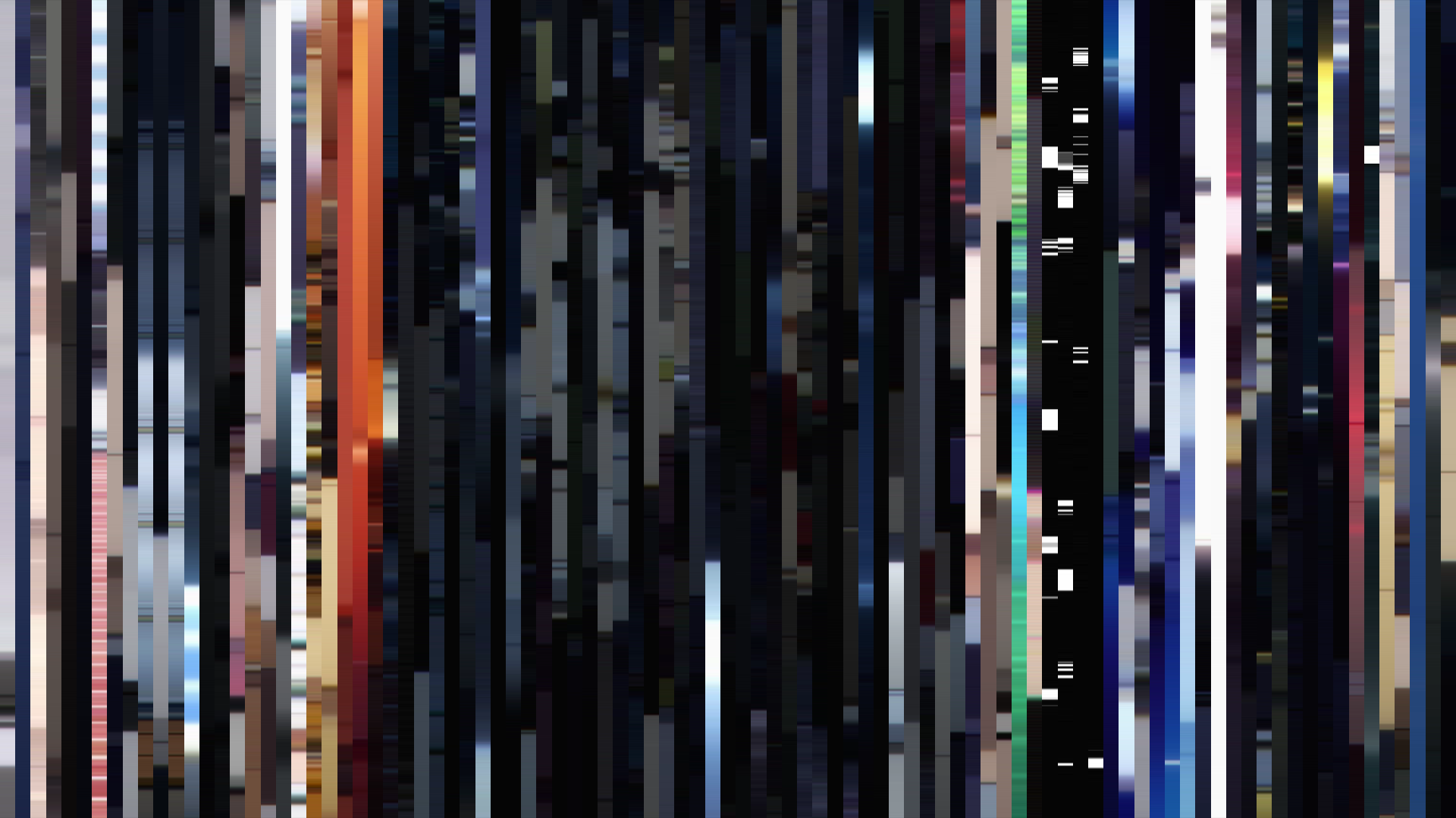
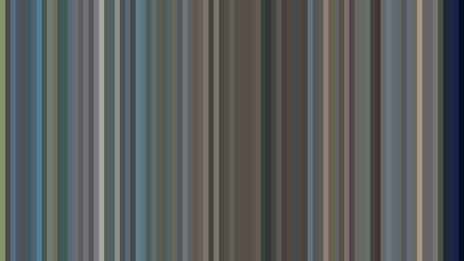
Avg · 15s
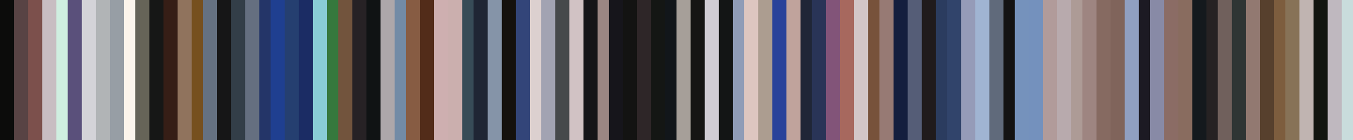
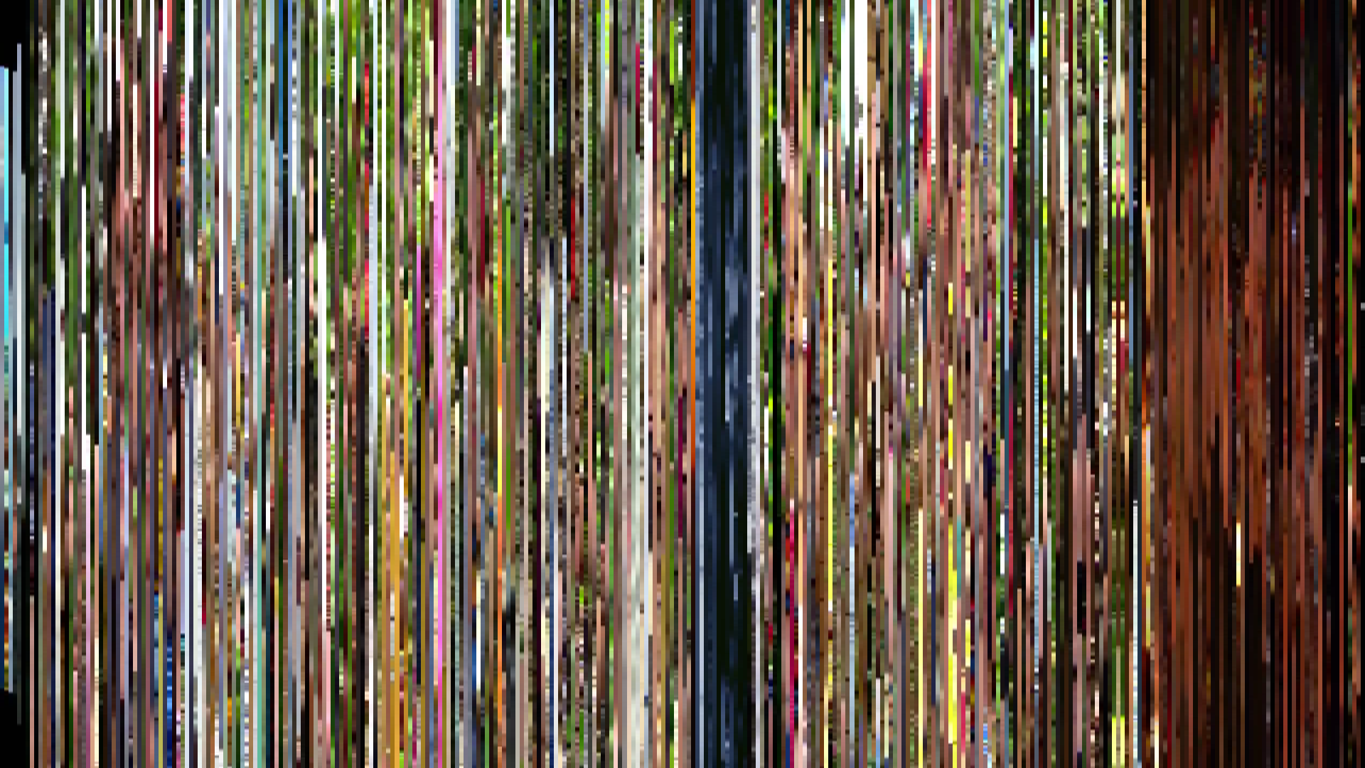
Slice · 30s
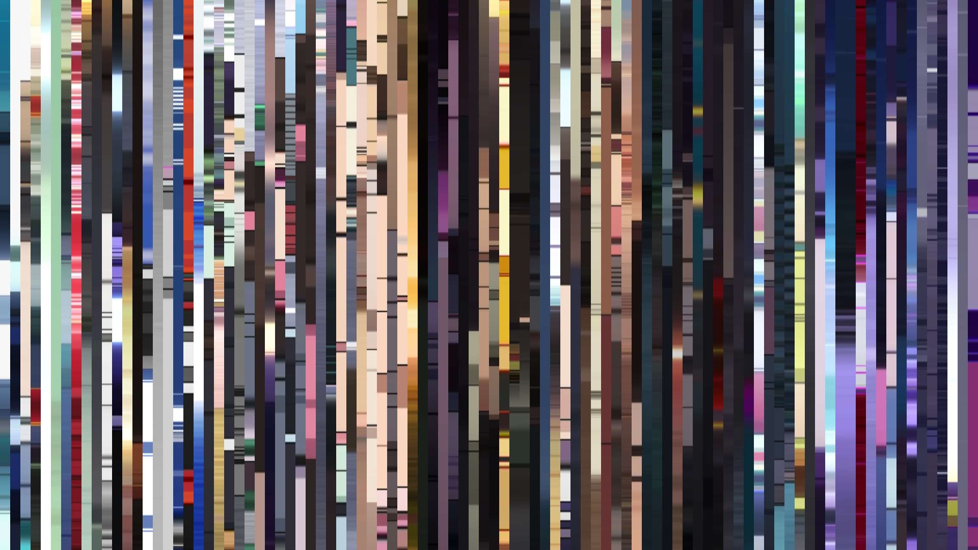
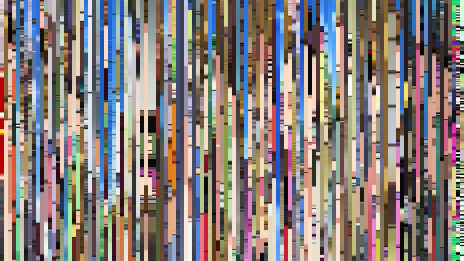
Avg · 30s
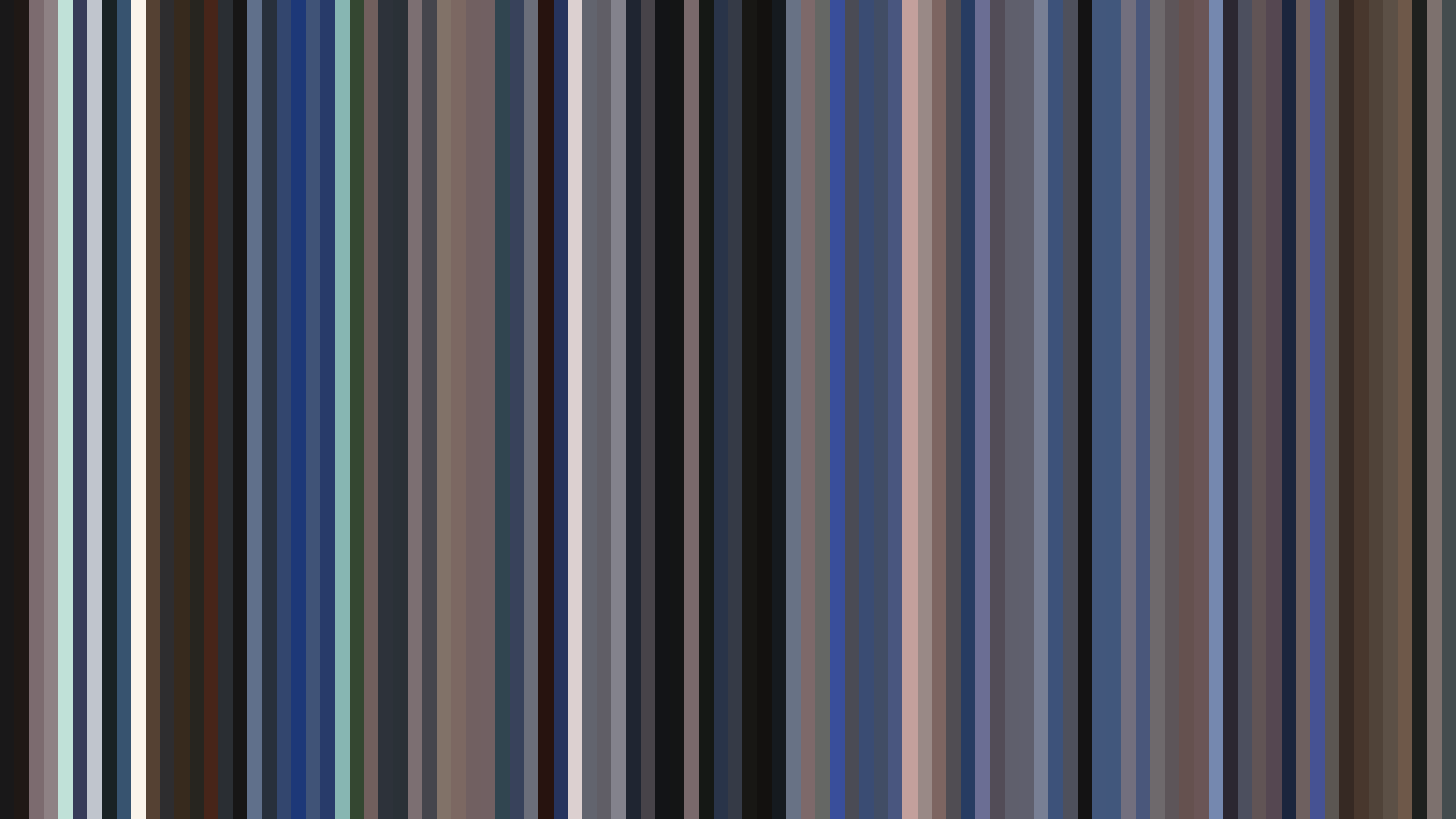
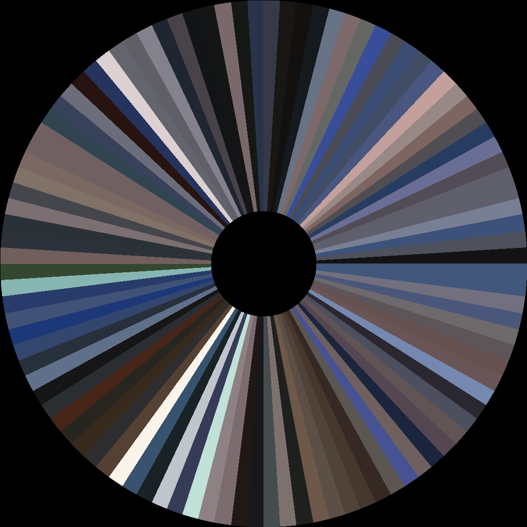
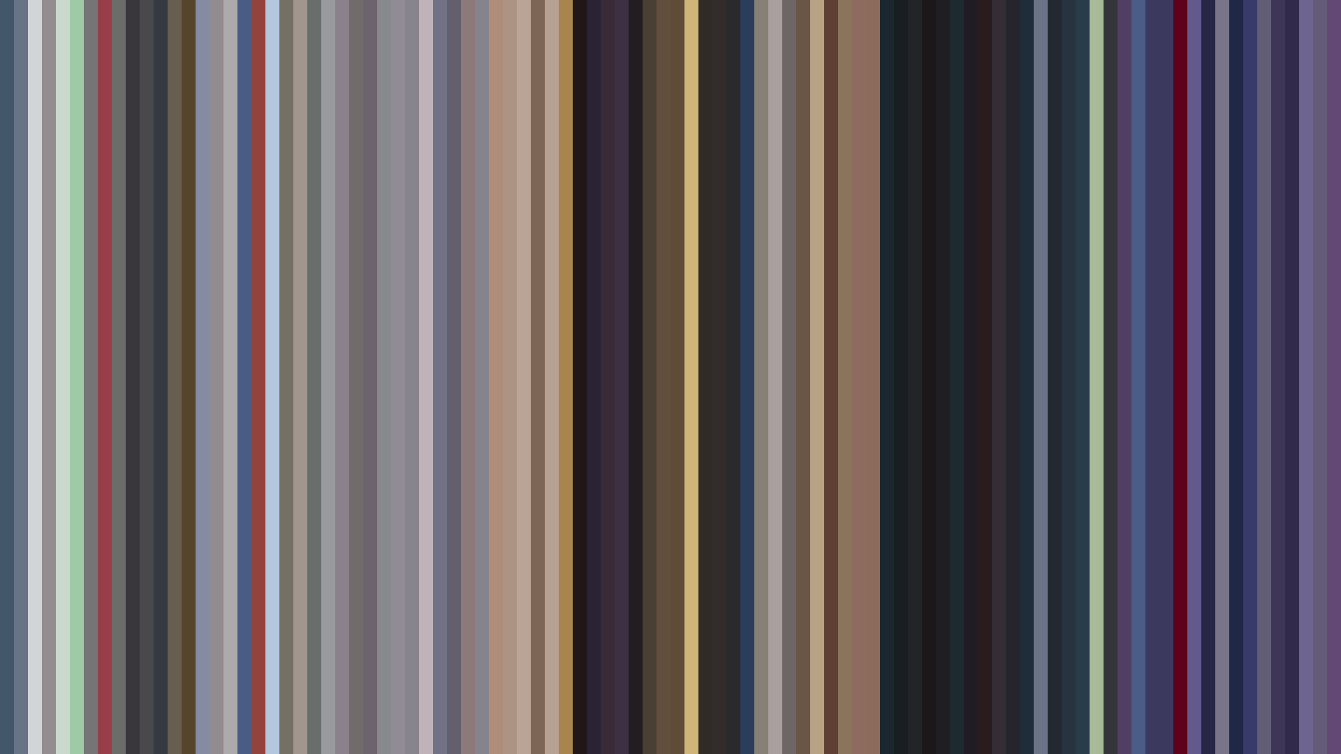
Blue-Green dominates the palette of *Banner of the Stars* (44% of all frames), a cold, metallic hue that places this space opera far from the warmer, more saturated sci-fi of its era. Director Noboru Ishiguro and Sunrise have built a universe of bureaucratic corridors and interstellar void, where even the *bright-ending* arc—opening at 0.322, dipping to 0.288 in the middle, then climbing to 0.346—reads less as emotional uplift than as a slow emergence from shadow into signal light. The palette colors, anchored in near-black (#1C1C1E) and muted grays (#5A565E, #A49BA2), resist the temptation to romanticize space. That 29% Red presence isn't warmth; it's the cold burn of thruster fire and the flash on a uniform insignia. The closing rise isn't triumph—it's the realization that this cold, blue-green world is all there is, and that's enough. For a sequel to *Crest of the Stars*, the barcode shows a show less interested in epic contrast than in the stubborn, desaturated reality of political and personal duty played out under the same unblinking stars.
Brightness Arc (episode progression)
Hue Distribution
Act Breakdown
Opening
0.322
Middle
0.288
Closing
0.346
Avg Brightness
0.353
Avg Saturation
0.251
Warmth
0.475
Color Palette
#1C1C1E
#5A565E
#A49BA2
#273455
#8A6D63
#D7D3D3
#5F6D94
#364761
3-Act Color Story
Opening
Middle
Closing
Color Twins
Perceptually nearest palettes — measured in OKLab space, not RGB


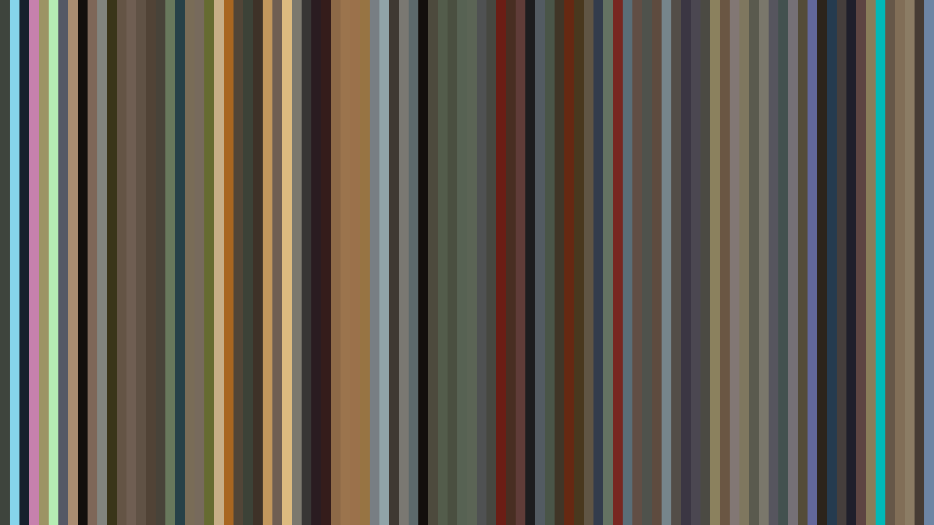
Blue-Green dominates the palette of *Banner of the Stars* (44% of all frames), a cold, metallic hue that places this space opera far from the warmer, more saturated sci-fi of its era. Director Noboru Ishiguro and Sunrise have built a universe of bureaucratic corridors and interstellar void, where even the *bright-ending* arc—opening at 0.322, dipping to 0.288 in the middle, then climbing to 0.346—reads less as emotional uplift than as a slow emergence from shadow into signal light. The palette colors, anchored in near-black (#1C1C1E) and muted grays (#5A565E, #A49BA2), resist the temptation to romanticize space. That 29% Red presence isn't warmth; it's the cold burn of thruster fire and the flash on a uniform insignia. The closing rise isn't triumph—it's the realization that this cold, blue-green world is all there is, and that's enough. For a sequel to *Crest of the Stars*, the barcode shows a show less interested in epic contrast than in the stubborn, desaturated reality of political and personal duty played out under the same unblinking stars.