Edit Pace — frame-to-frame color delta (bright = fast cuts)
Color Temperature — warm (gold) vs cool (teal) per frame
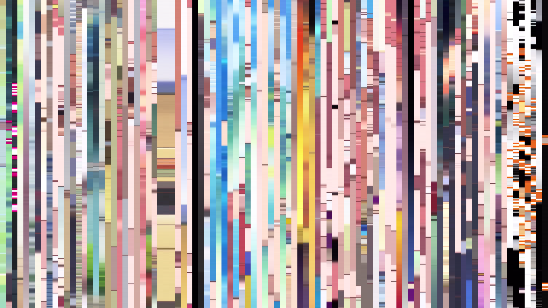
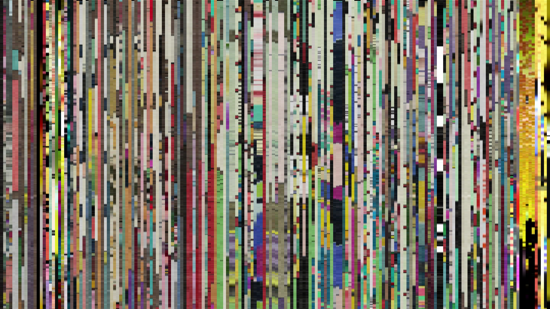
Frame Density Comparison — every 2nd vs every 4th frame
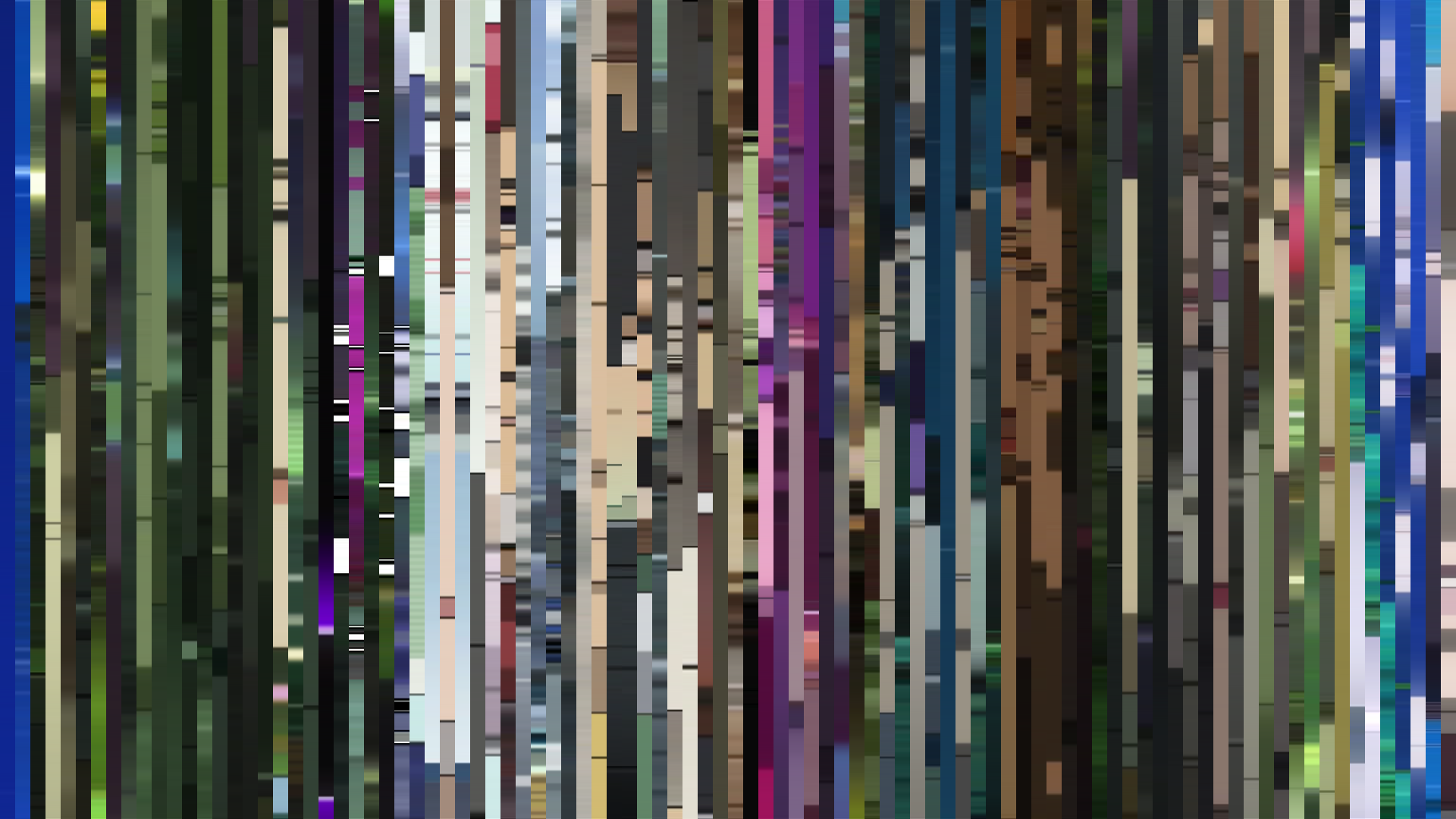
Slice · 15s
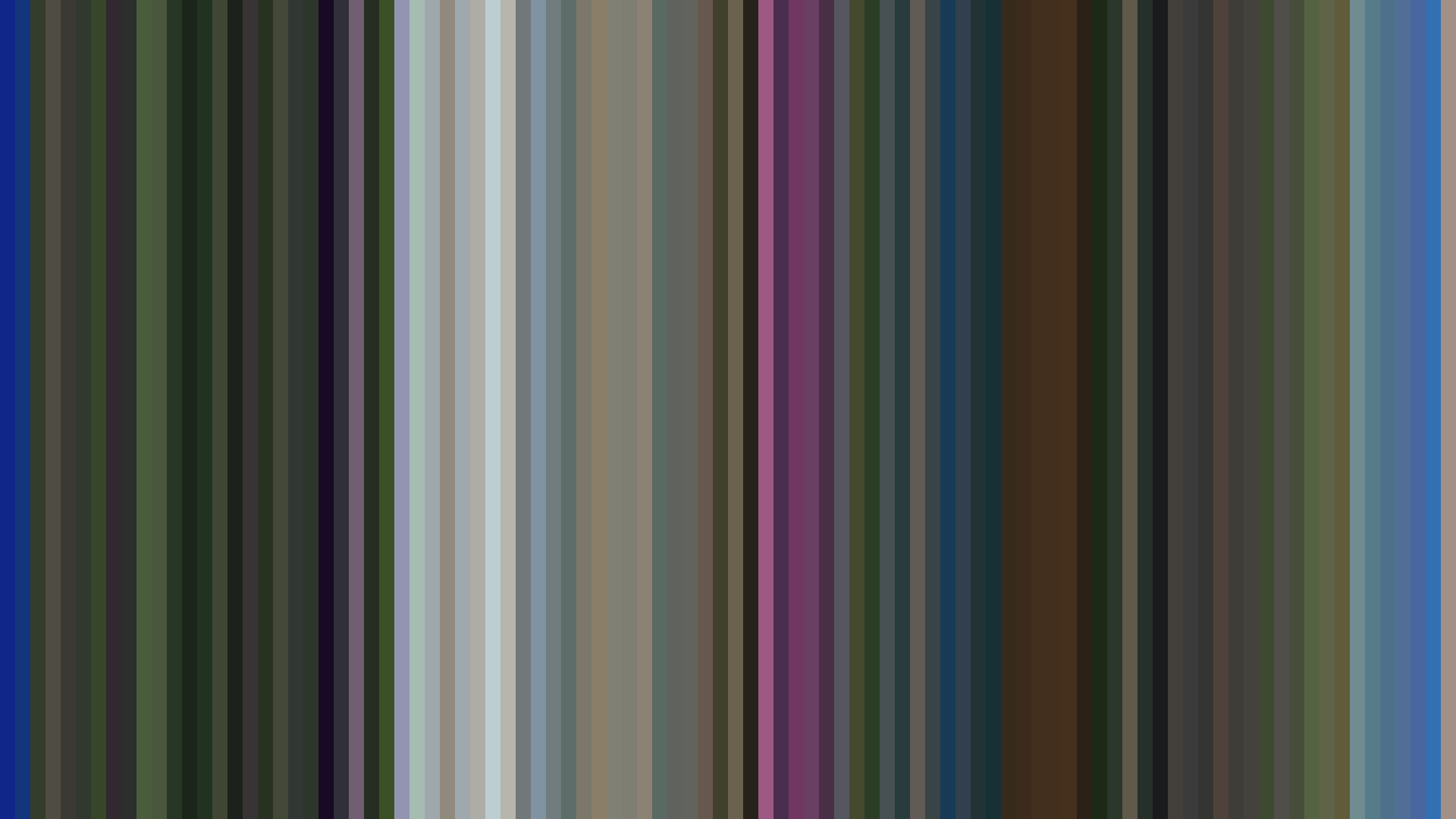
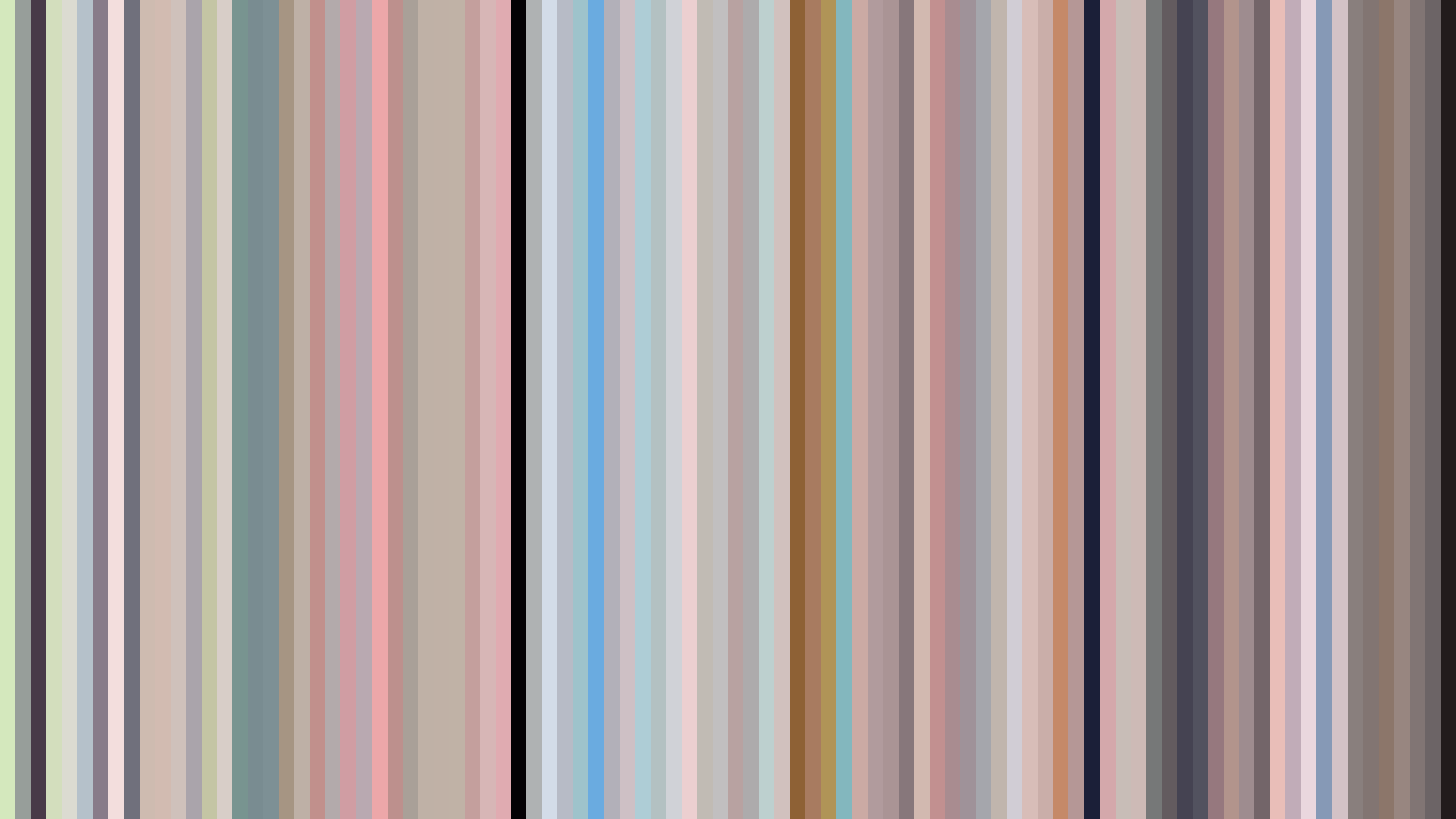
Avg · 15s
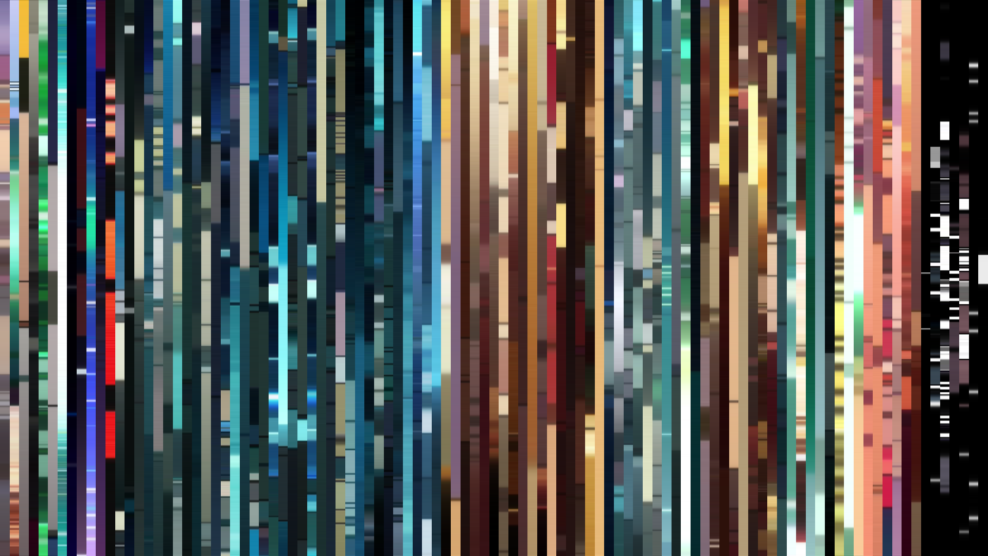
Slice · 30s
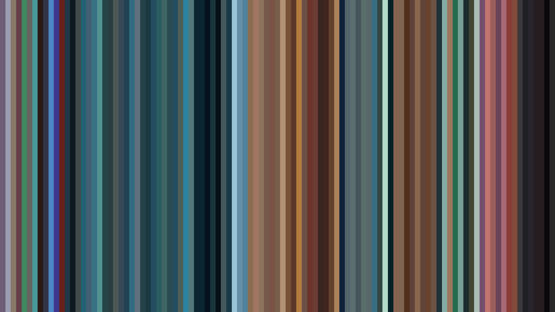
Avg · 30s
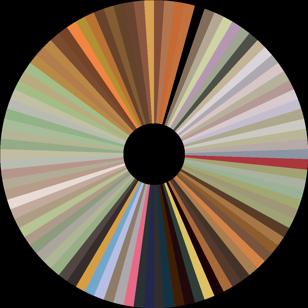
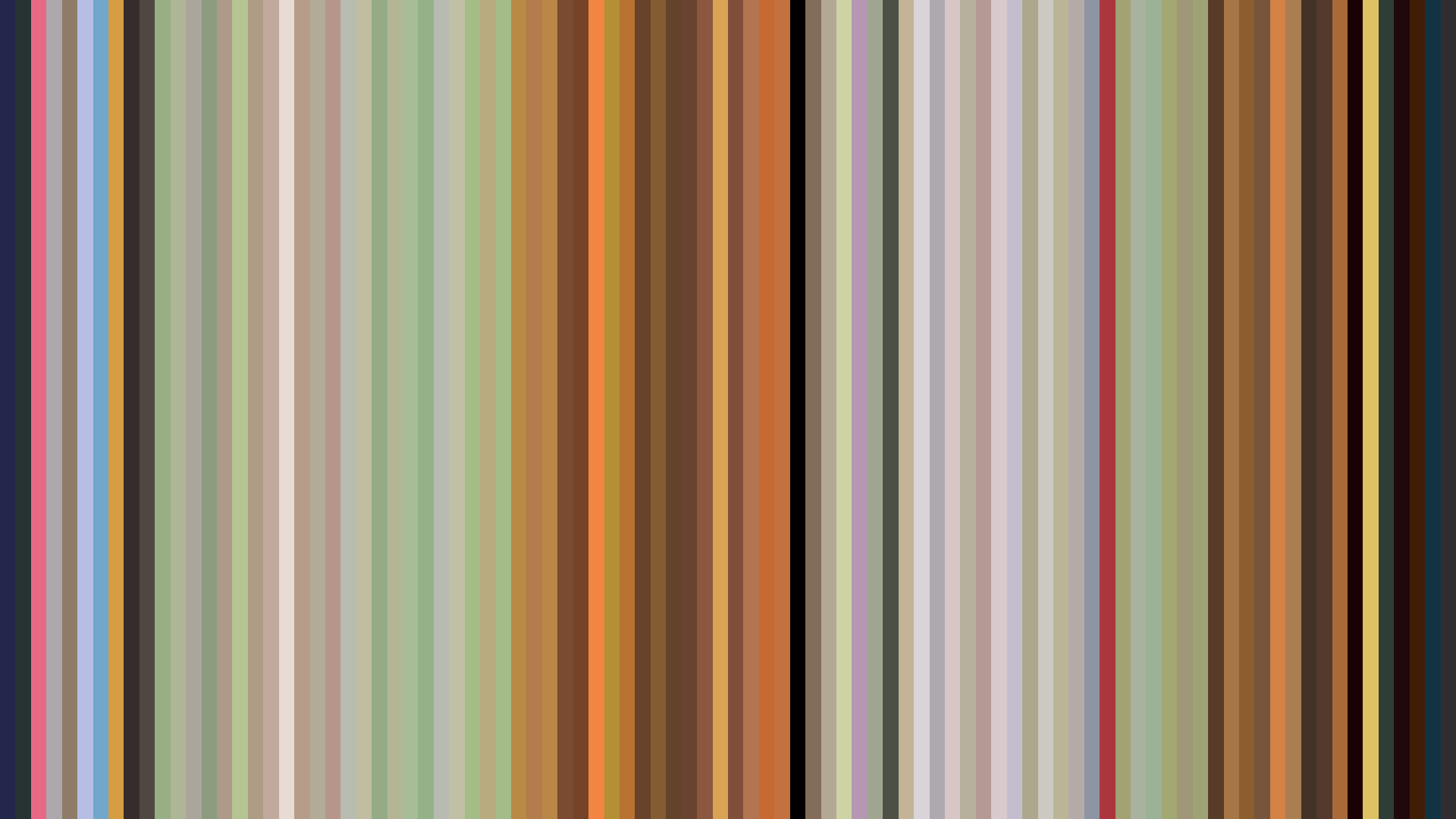
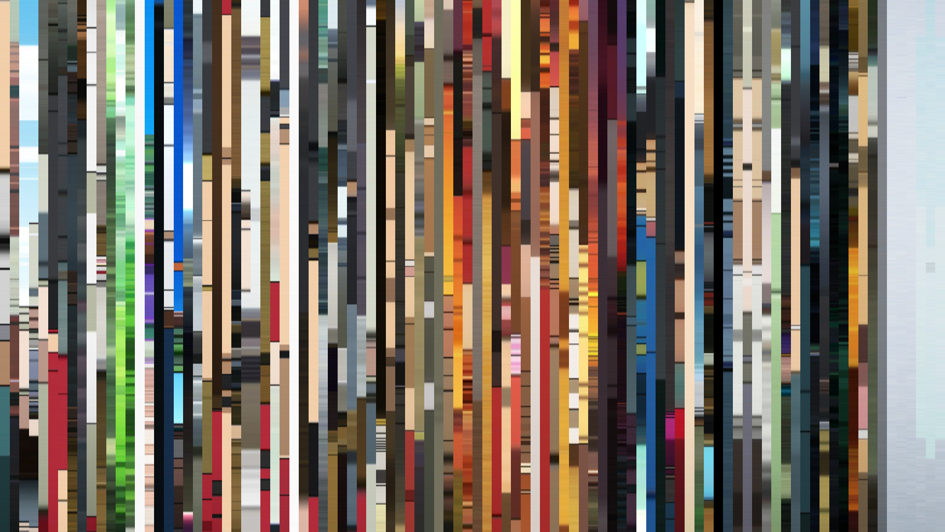
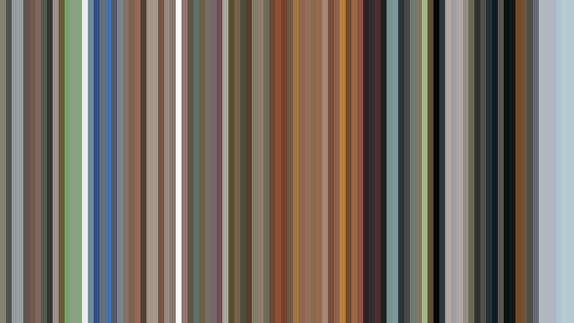
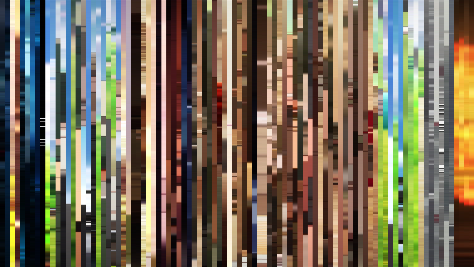
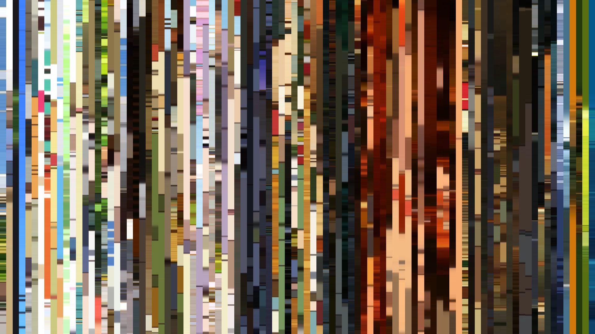
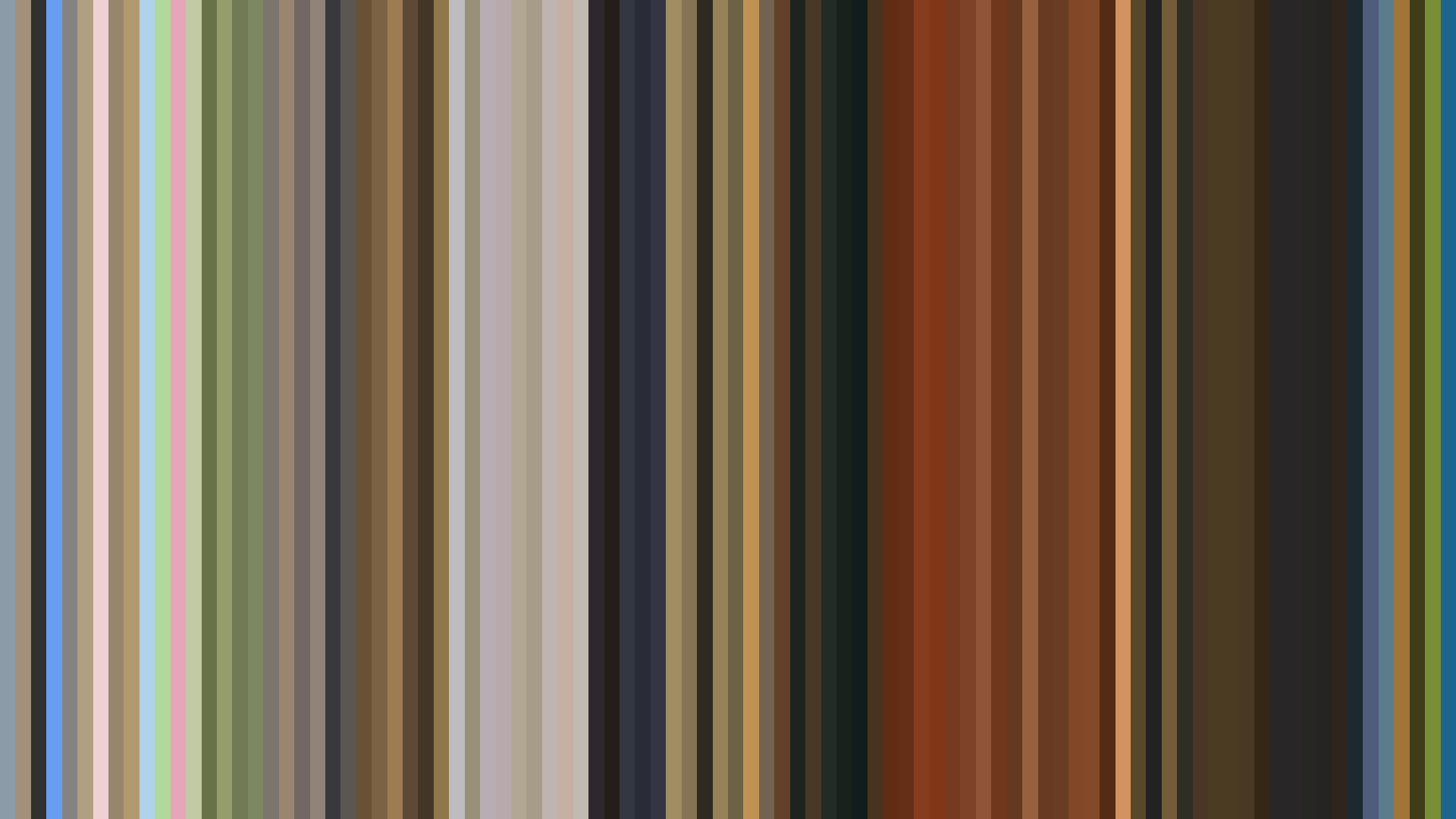
The dark-opening arc of *Higurashi: When They Cry – Kai* is a structural confession. Where the first season’s tragedy bloomed from sunlit normalcy, this sequel’s barcode is front-loaded with brightness—0.670 in the opening act—that decays linearly into 0.511 by the end, a visual admission that the hope of the first arc was always unsustainable. Studio Deen and director Toshifumi Kawase lock the palette into a Red-dominant 42% that is stubbornly earthbound: #986A57 and #6C4D31 are the colors of dried blood and trampled soil, not theatrical gore. The warm opening is a trap; the middle act’s desaturation to 0.539 is the series settling into its genuine register—a horror of long, hollow afternoons under overcast skies. The average saturation of 0.351 is low for a 2007 horror show, which usually leans into lurid reds and yellows. *Kai* refuses that spectacle. Its Red is not the flash of violence but the stain left after. The palette’s #201818 black and #563121 rust-brown are the only two colors that feel at home here. The show doesn’t get brighter as it approaches resolution; it gets quieter, darker, more resigned.
Brightness Arc (episode progression)
Hue Distribution
Act Breakdown
Opening
0.670
Middle
0.539
Closing
0.511
Avg Brightness
0.549
Avg Saturation
0.351
Warmth
0.590
Color Palette
#E9E5E1
#201818
#986A57
#6C4D31
#563121
#E5D4AB
#A3A19D
#9D5D2F
3-Act Color Story
Opening
Middle
Closing
Color Twins
Perceptually nearest palettes — measured in OKLab space, not RGB


The dark-opening arc of *Higurashi: When They Cry – Kai* is a structural confession. Where the first season’s tragedy bloomed from sunlit normalcy, this sequel’s barcode is front-loaded with brightness—0.670 in the opening act—that decays linearly into 0.511 by the end, a visual admission that the hope of the first arc was always unsustainable. Studio Deen and director Toshifumi Kawase lock the palette into a Red-dominant 42% that is stubbornly earthbound: #986A57 and #6C4D31 are the colors of dried blood and trampled soil, not theatrical gore. The warm opening is a trap; the middle act’s desaturation to 0.539 is the series settling into its genuine register—a horror of long, hollow afternoons under overcast skies. The average saturation of 0.351 is low for a 2007 horror show, which usually leans into lurid reds and yellows. *Kai* refuses that spectacle. Its Red is not the flash of violence but the stain left after. The palette’s #201818 black and #563121 rust-brown are the only two colors that feel at home here. The show doesn’t get brighter as it approaches resolution; it gets quieter, darker, more resigned.