Edit Pace — frame-to-frame color delta (bright = fast cuts)
Color Temperature — warm (gold) vs cool (teal) per frame
Frame Density Comparison — every 2nd vs every 4th frame
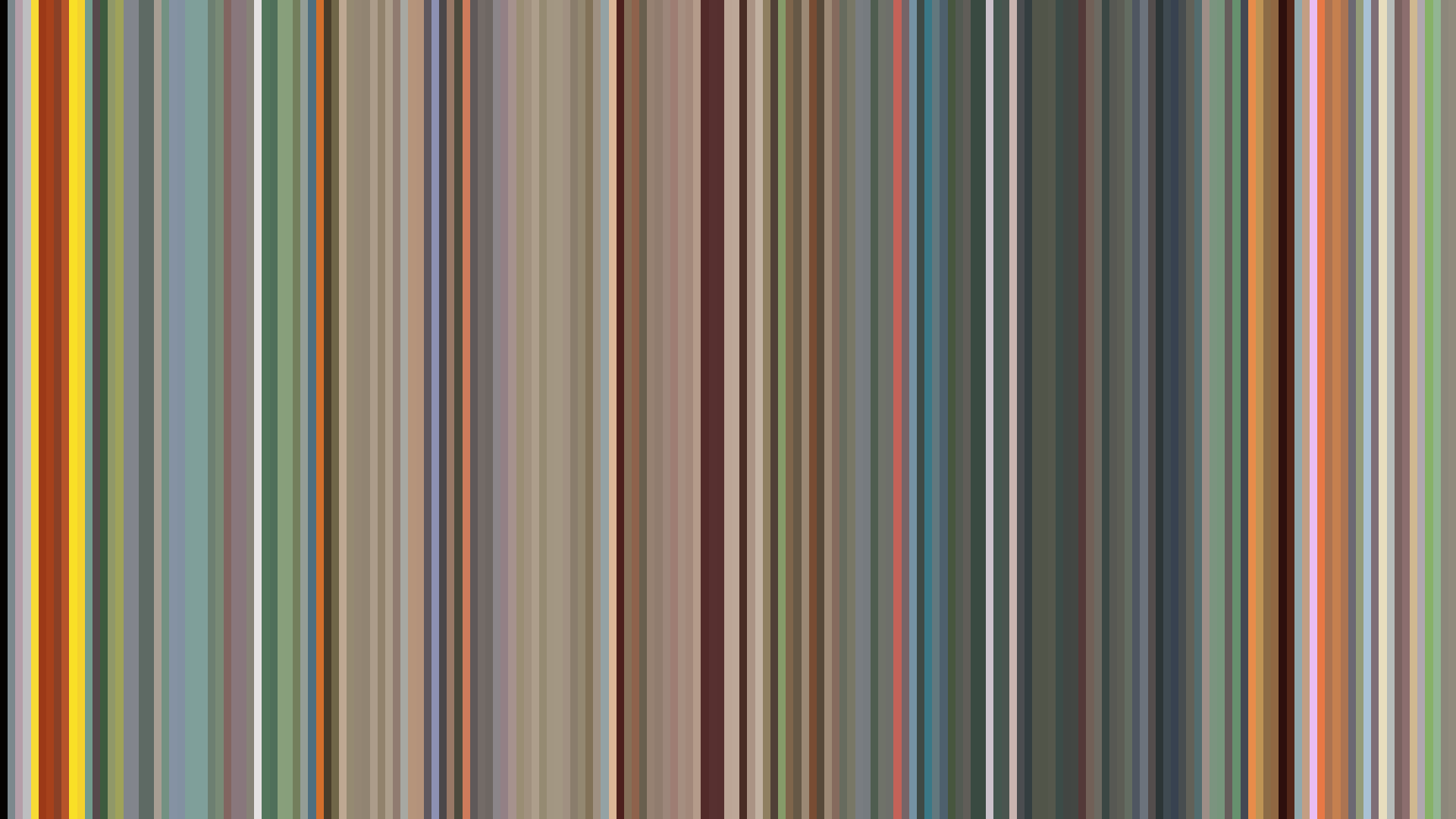
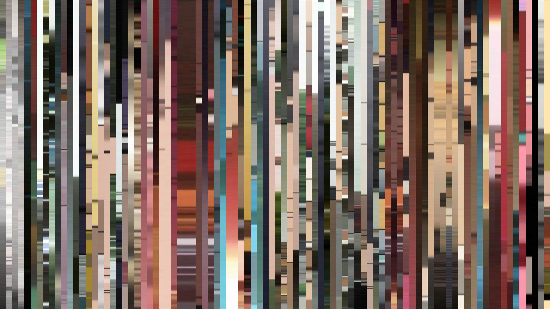
Slice · 15s
Avg · 15s
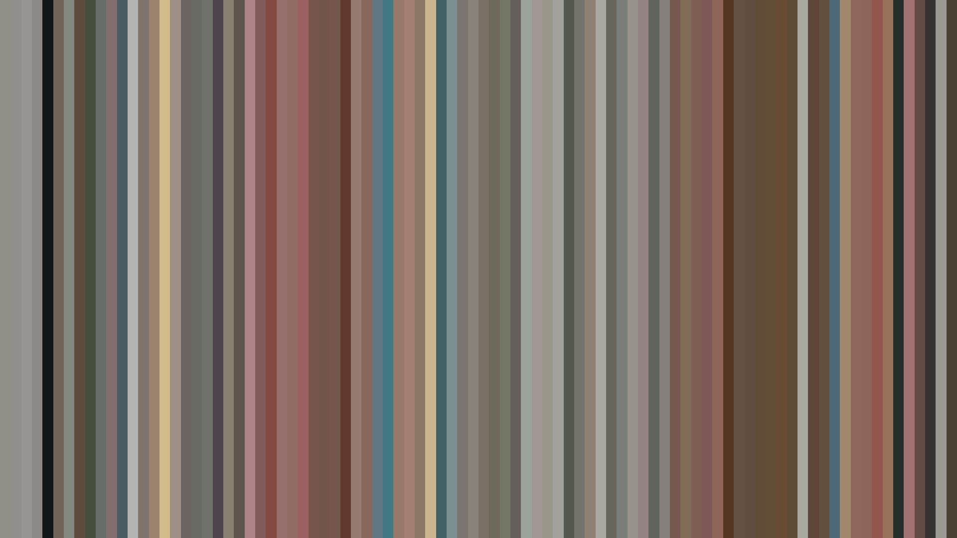
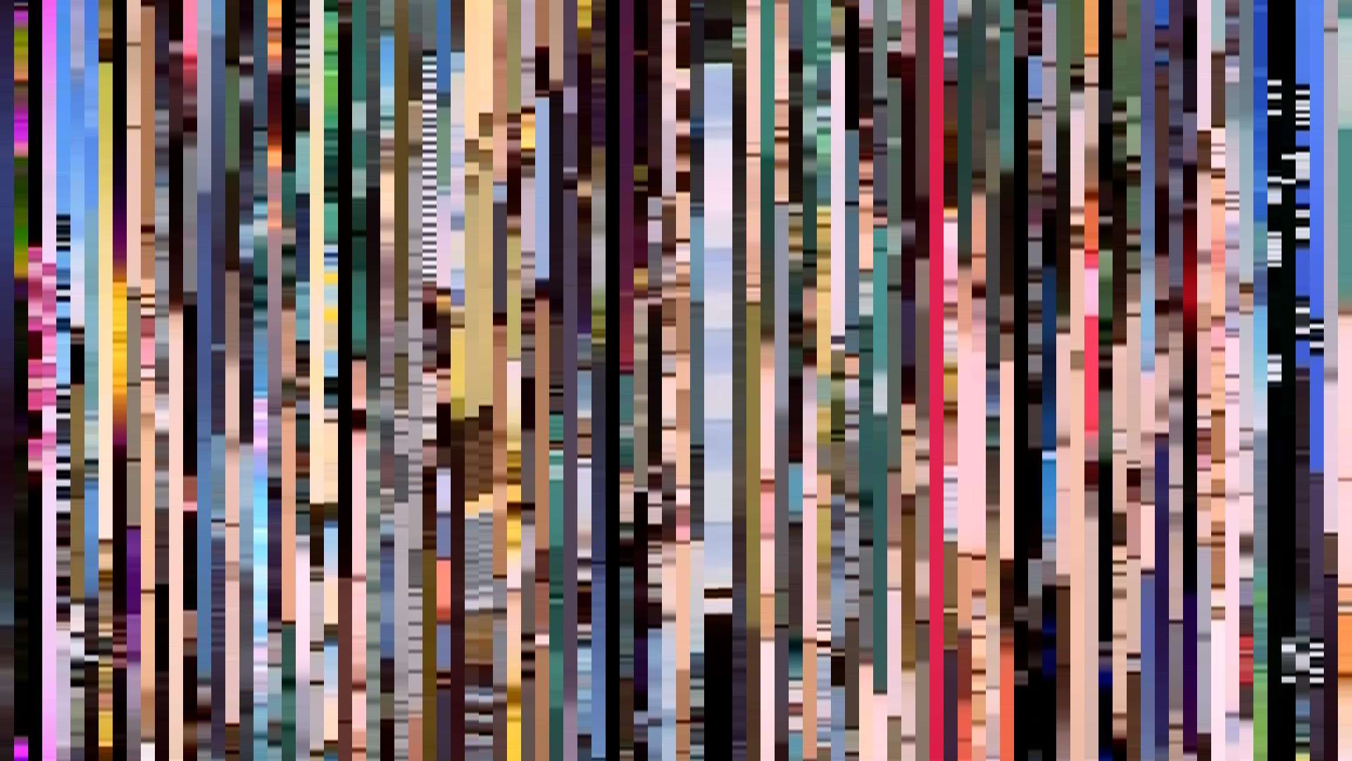
Slice · 30s
Avg · 30s
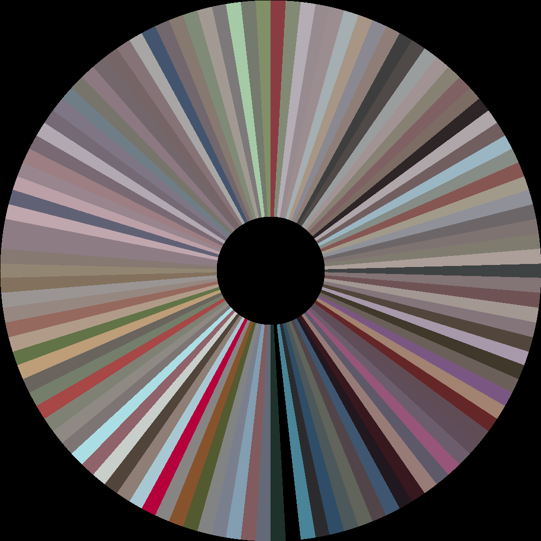
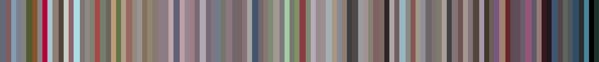
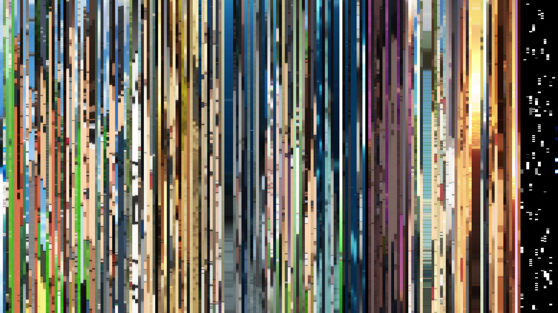
Red dominance at 31% might suggest a conventional action palette, but *You're Under Arrest: Fast & Furious* twists that expectation through its *dark ending* arc. Studio Deen’s 2001 series opens with a deceptively bright middle act—a peak brightness of 0.584 that feels like the sun-drenched optimism of a police procedural—only to let the closing sink to 0.487, as if the city’s neon lights are dimming under the weight of its own chase sequences. The palette’s muted reds (#D3AE9C, #986D61) and greys (#9F9B9F, #DDCDE) betray a warmth drained of saturation, averaging just 0.239. This isn’t the vibrant, saturated chaos of its contemporaries; it’s a world where even the reds are tired. Director Kazuhiro Furuhashi and art director Masami Saito built a Tokyo that feels lived-in and weathered, where the *warm opening* is a lie we tell ourselves about the job. The barcode doesn’t accelerate—it decelerates, echoing the series’ own tension between camaraderie and the unglamorous grind of traffic patrol. The reds are there, but they’re the color of brake lights, not roses.
Brightness Arc (episode progression)
Hue Distribution
Act Breakdown
Opening
0.558
Middle
0.584
Closing
0.487
Avg Brightness
0.456
Avg Saturation
0.239
Warmth
0.555
Color Palette
#1D1617
#625C5E
#9F9B9F
#DDDCDE
#D3AE9C
#986D61
#562721
#E1C8AC
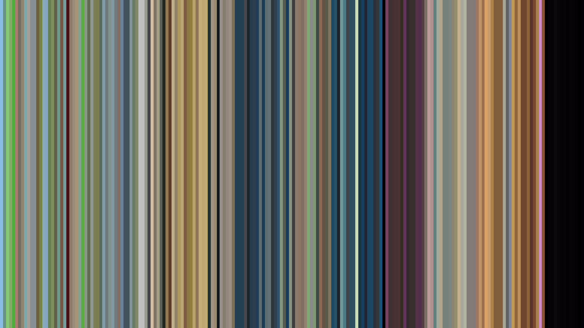
3-Act Color Story
Opening
Middle
Closing
Color Twins
Perceptually nearest palettes — measured in OKLab space, not RGB


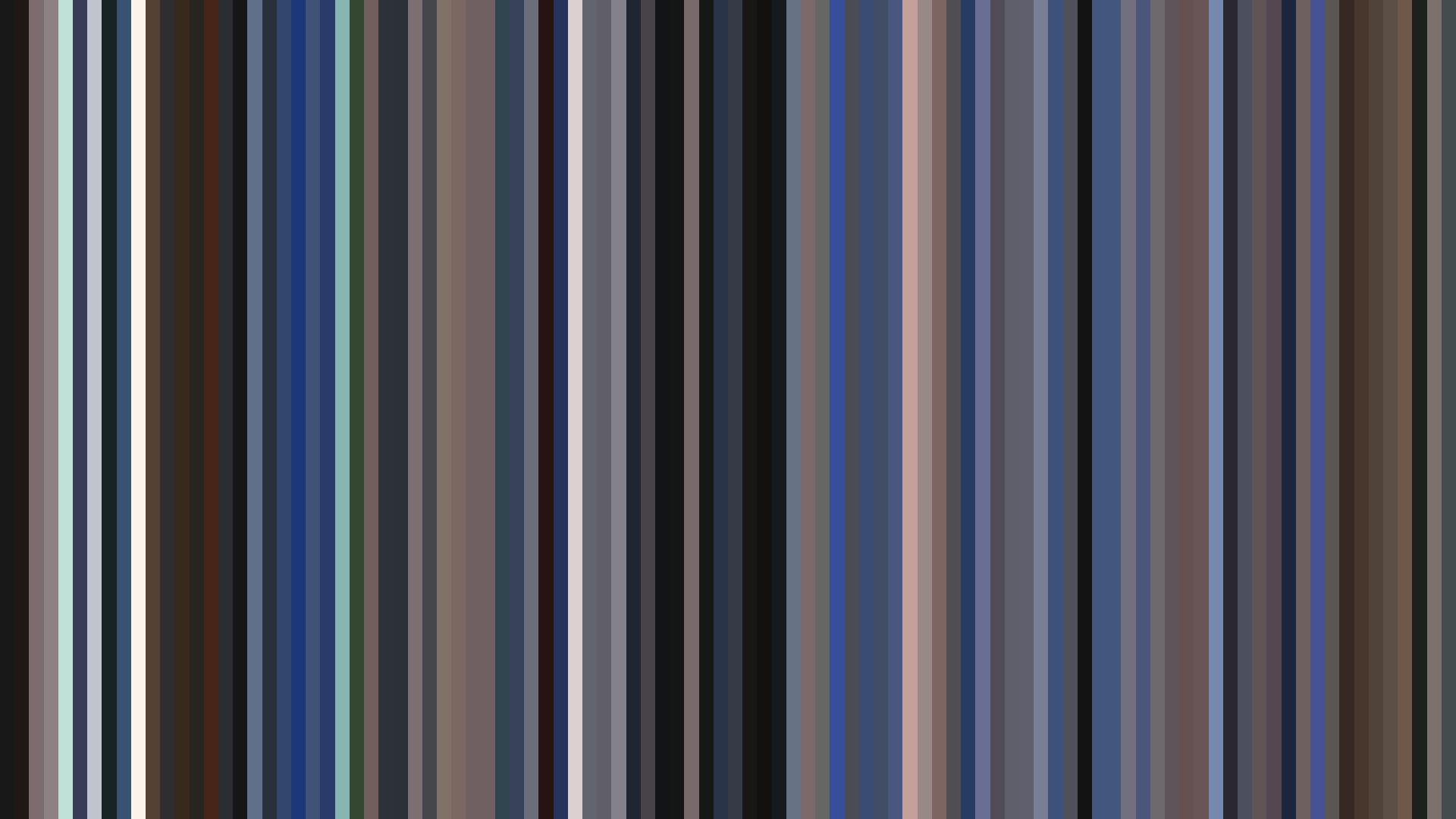


Red dominance at 31% might suggest a conventional action palette, but *You're Under Arrest: Fast & Furious* twists that expectation through its *dark ending* arc. Studio Deen’s 2001 series opens with a deceptively bright middle act—a peak brightness of 0.584 that feels like the sun-drenched optimism of a police procedural—only to let the closing sink to 0.487, as if the city’s neon lights are dimming under the weight of its own chase sequences. The palette’s muted reds (#D3AE9C, #986D61) and greys (#9F9B9F, #DDCDE) betray a warmth drained of saturation, averaging just 0.239. This isn’t the vibrant, saturated chaos of its contemporaries; it’s a world where even the reds are tired. Director Kazuhiro Furuhashi and art director Masami Saito built a Tokyo that feels lived-in and weathered, where the *warm opening* is a lie we tell ourselves about the job. The barcode doesn’t accelerate—it decelerates, echoing the series’ own tension between camaraderie and the unglamorous grind of traffic patrol. The reds are there, but they’re the color of brake lights, not roses.