Edit Pace — frame-to-frame color delta (bright = fast cuts)
Color Temperature — warm (gold) vs cool (teal) per frame
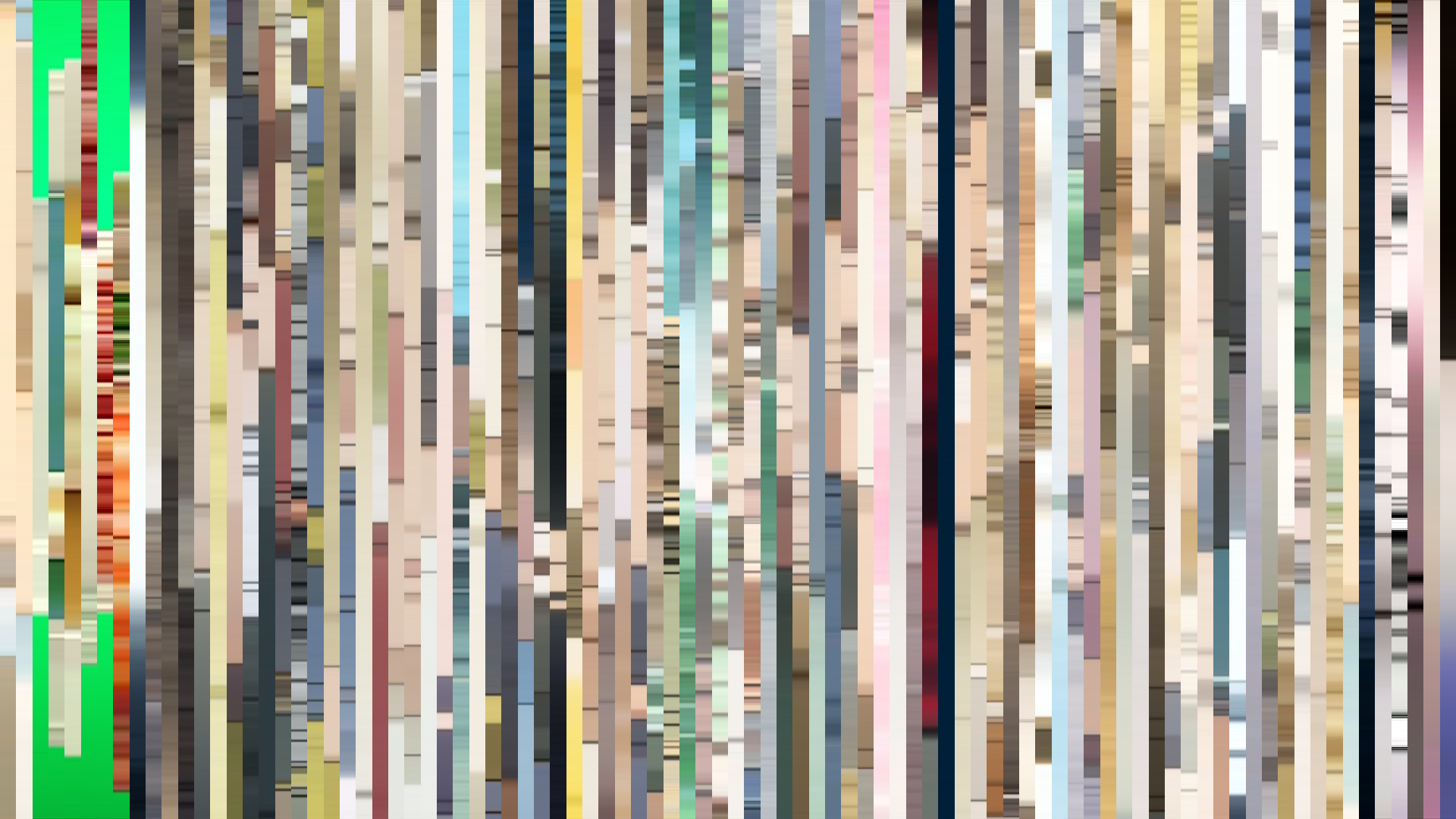
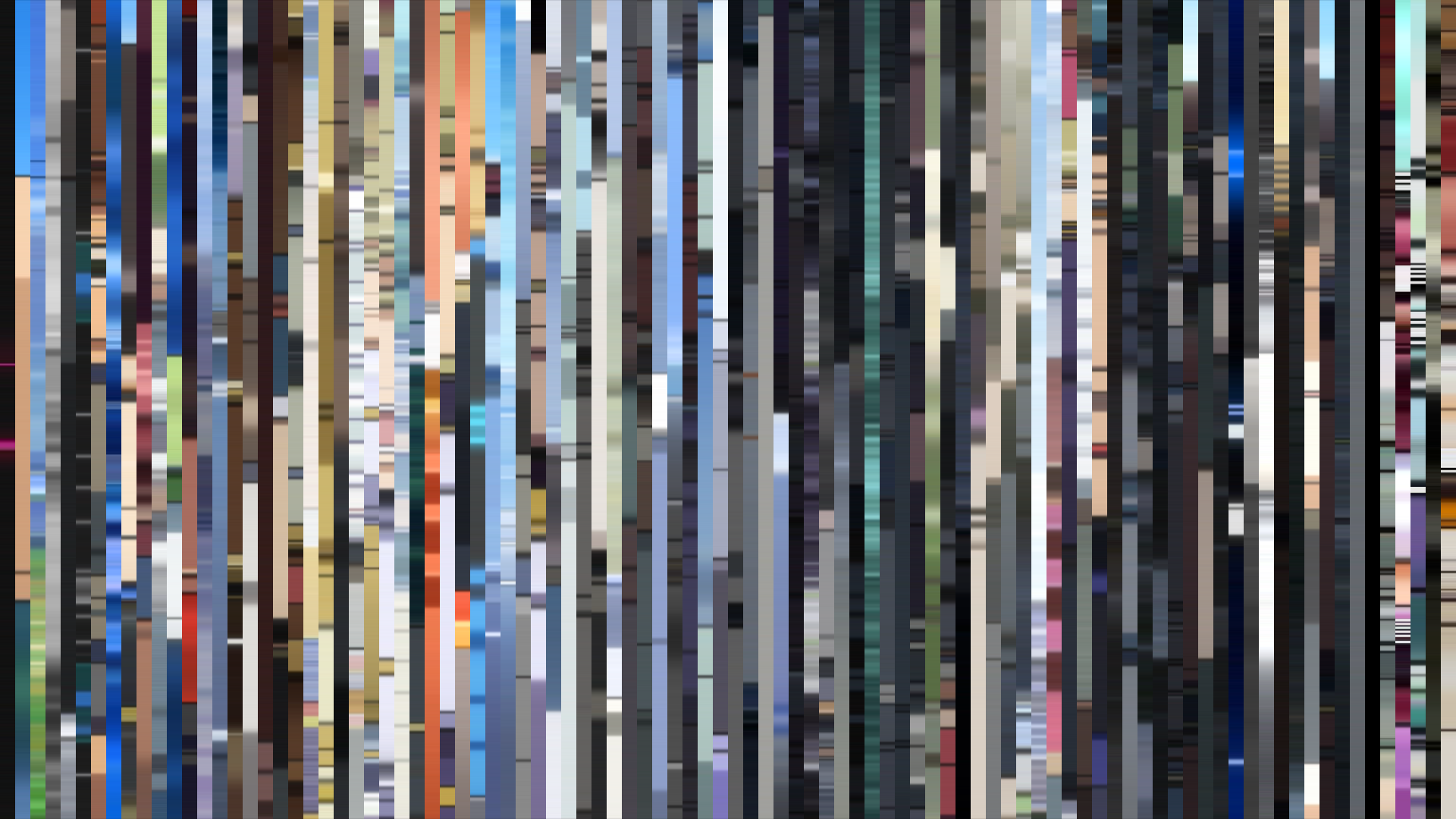
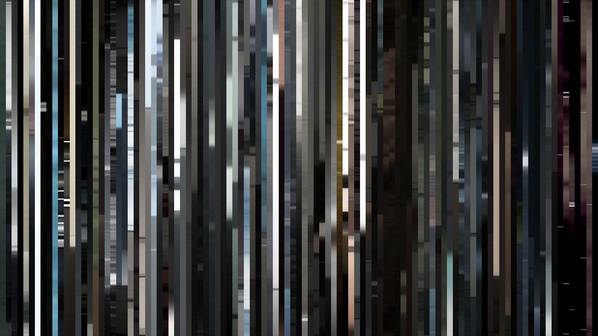
Frame Density Comparison — every 2nd vs every 4th frame
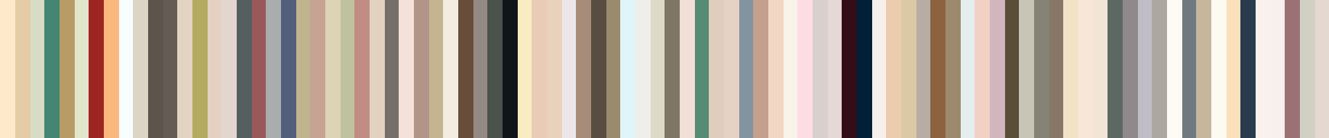
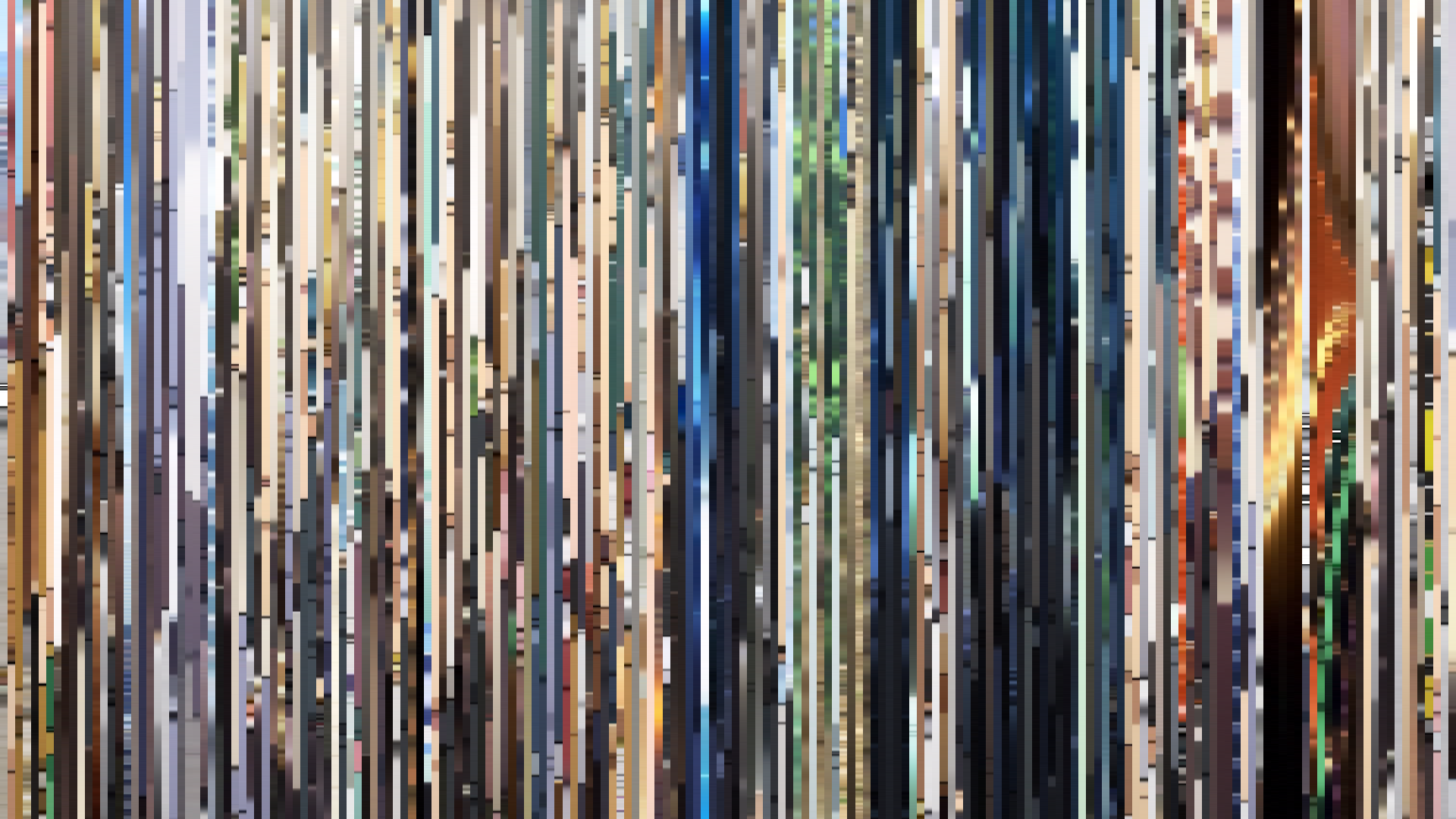
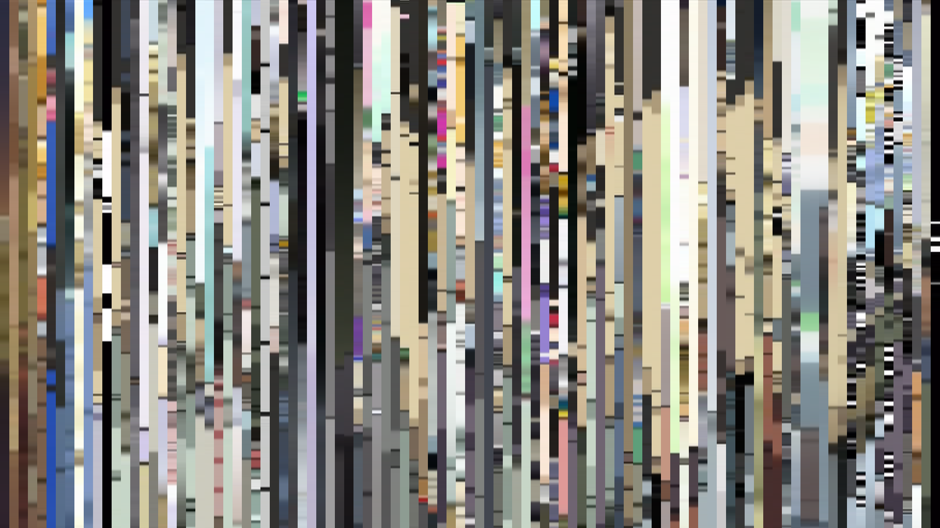
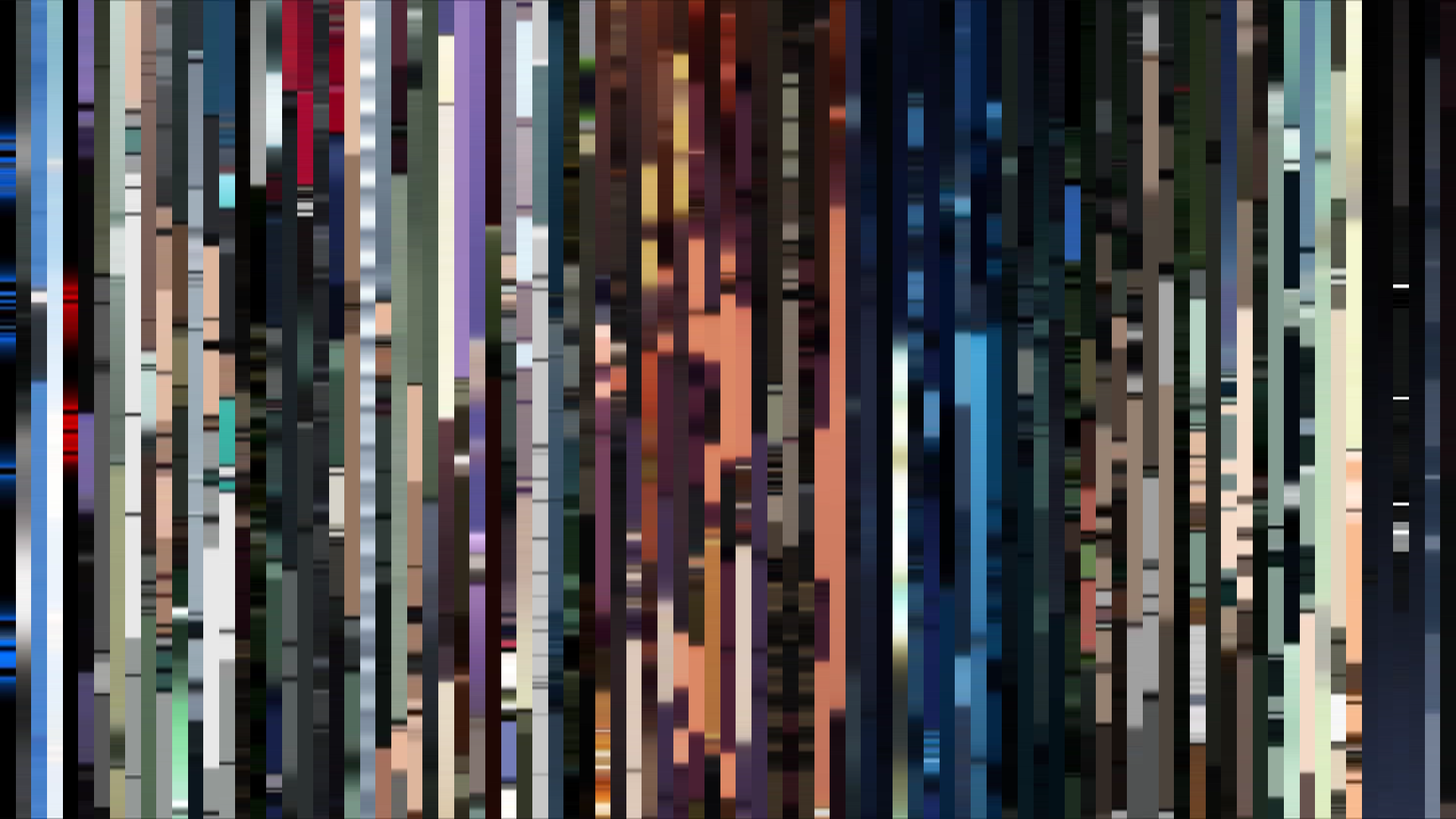
Slice · 15s
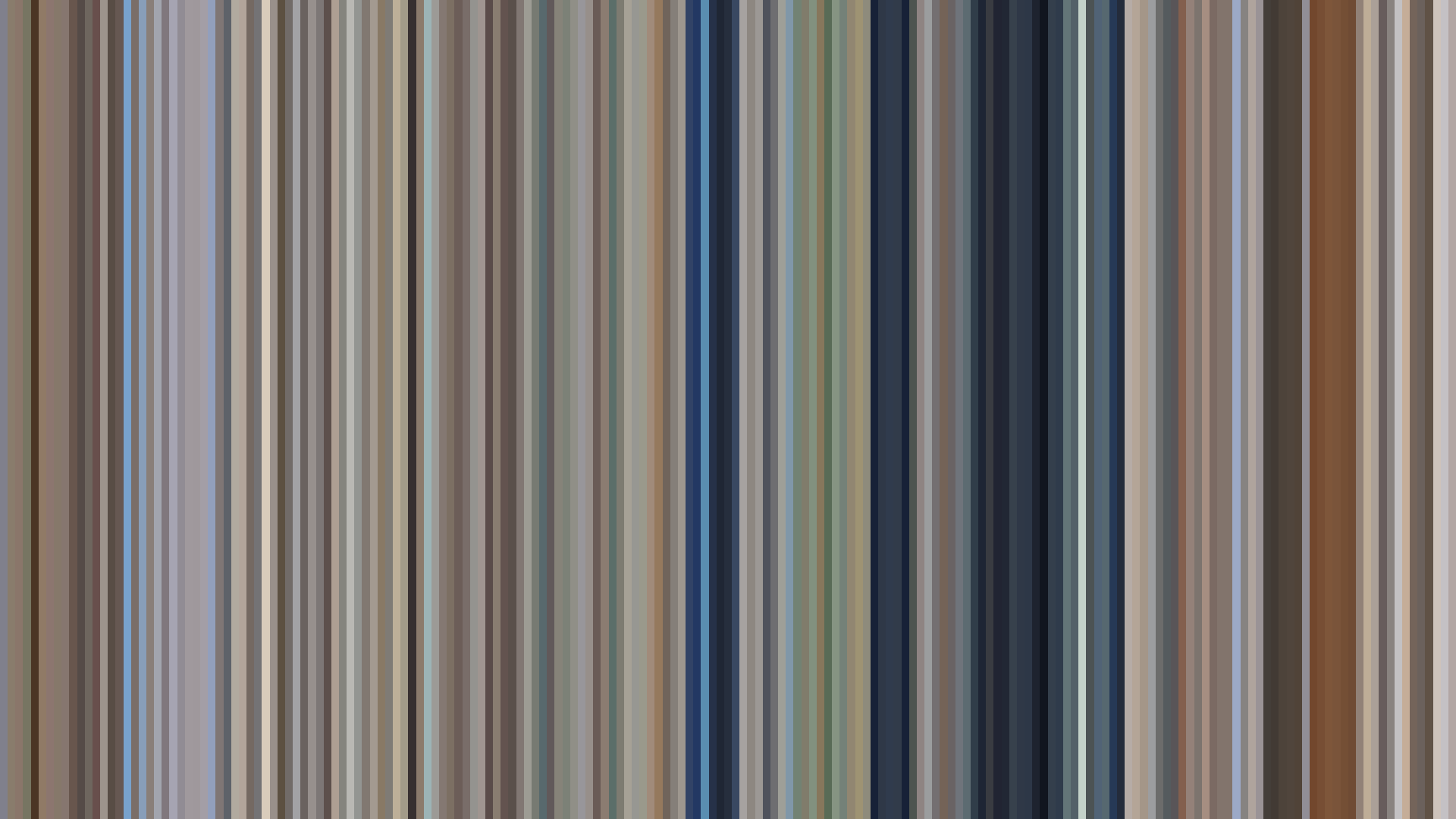
Avg · 15s
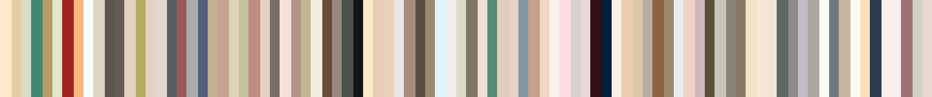
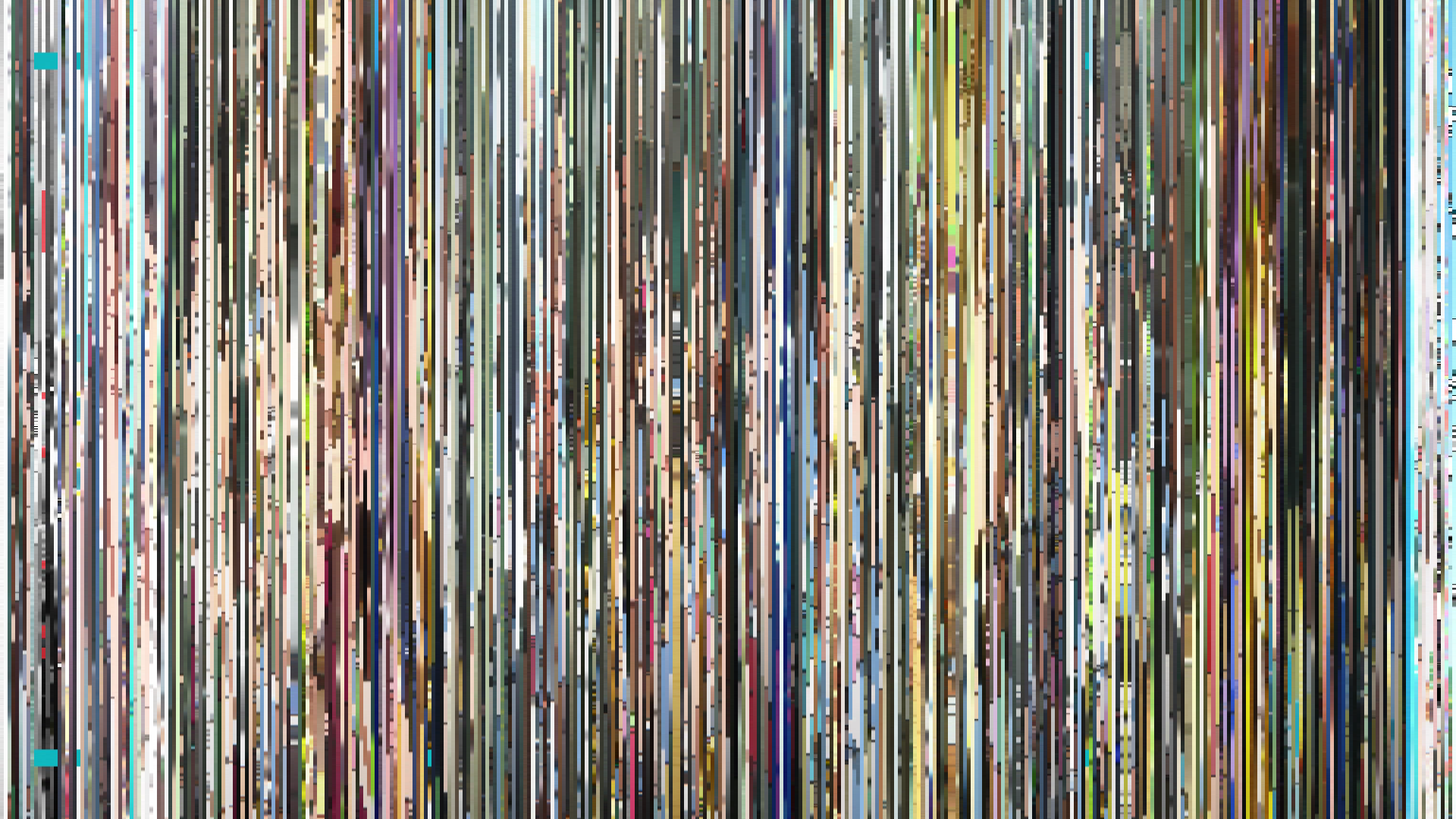
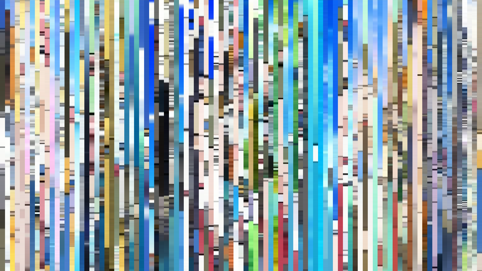
Slice · 30s
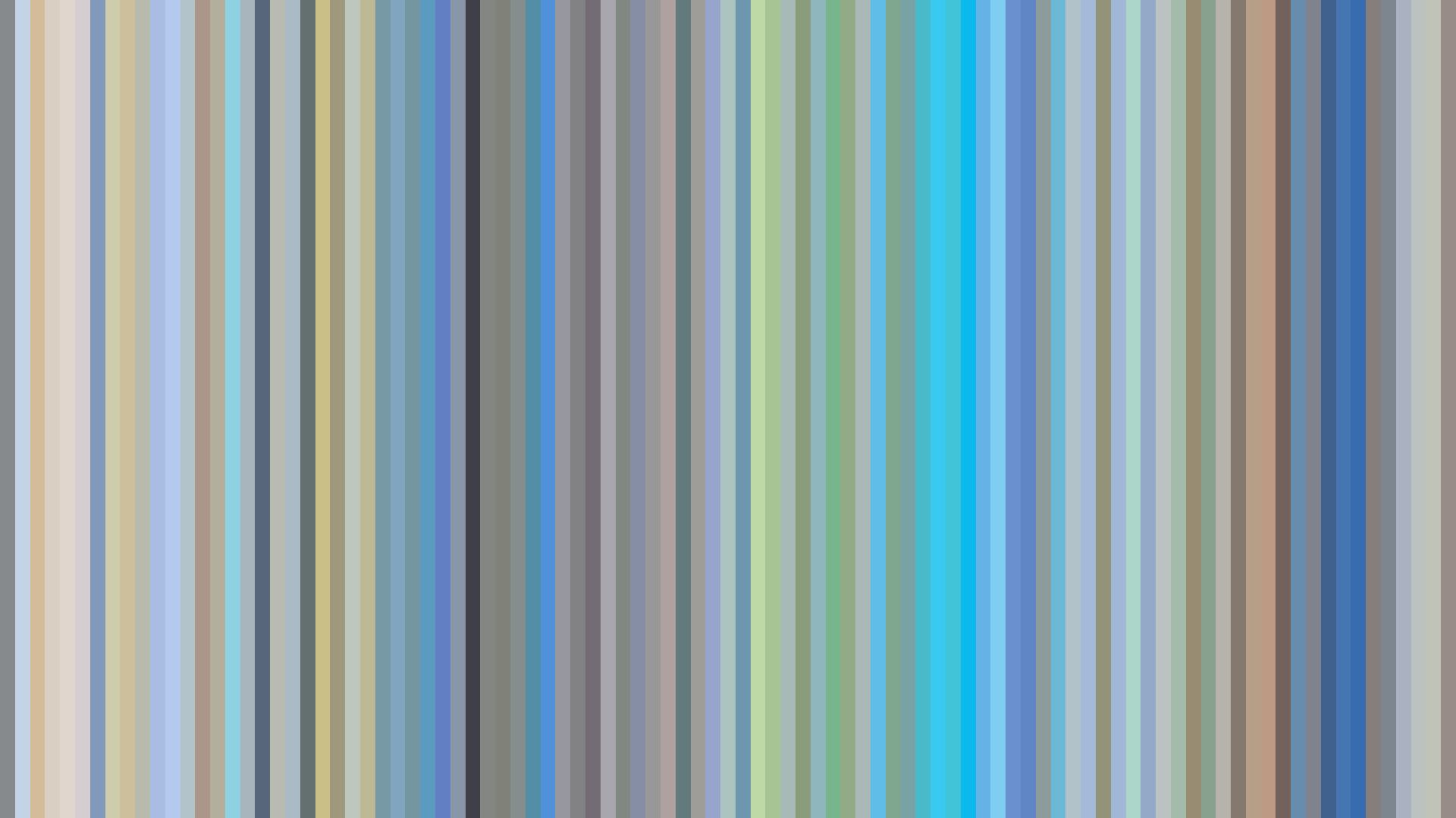
Avg · 30s
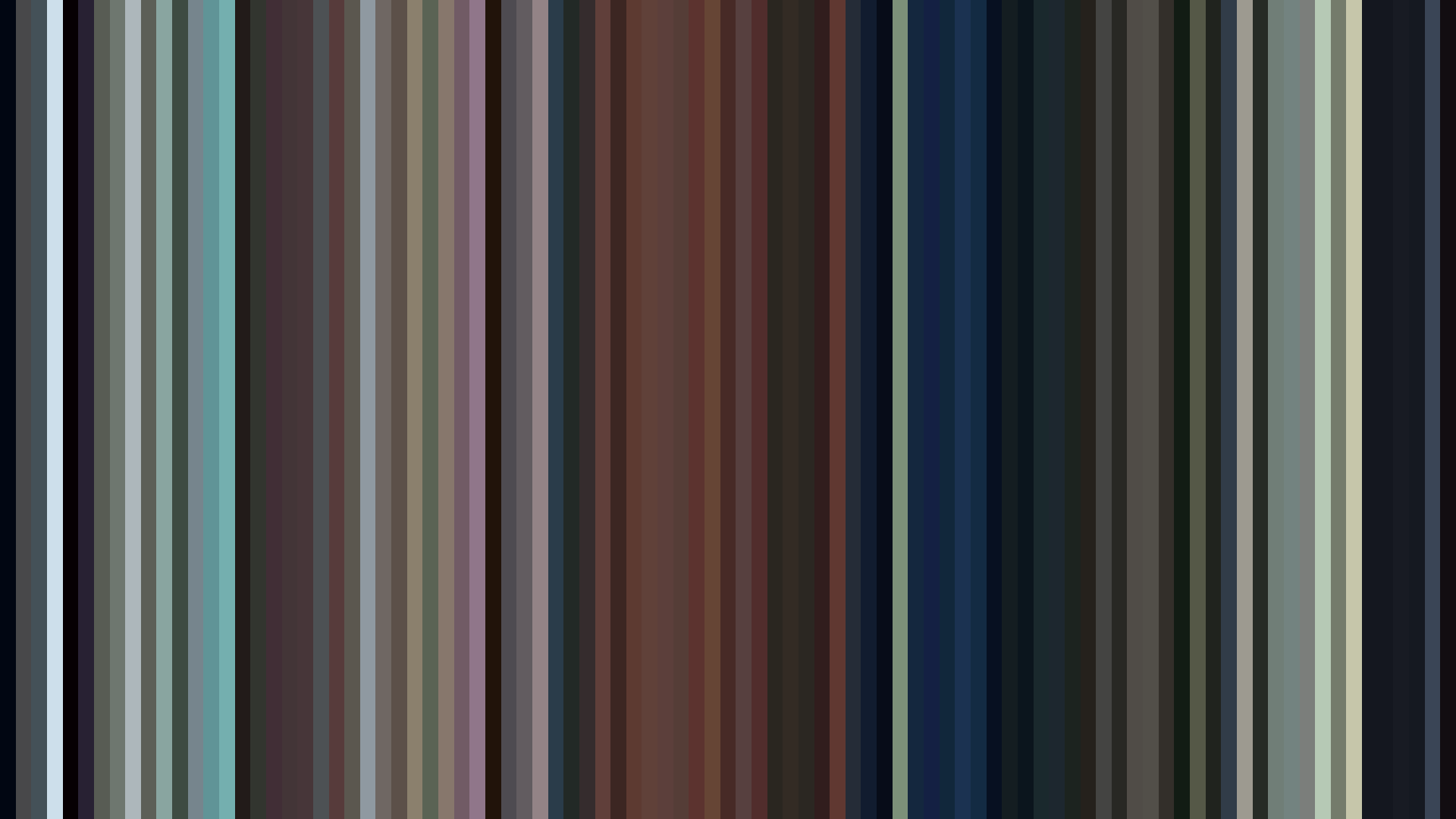
A desaturated warmth defines *Honey and Clover II*—its palette of aged paper and faded rose (#EAE3DA to #A09070) rarely breaches 0.18 saturation, yet the hue distribution pushes unwaveringly toward Red-Orange and Red. This is not the flushed heat of romance but the *subdued glow of memory*, the visual register of a story told after the fact. Director Kenichi Kasai and the J.C.Staff art team give us a world where emotions are felt through material texture: soft beige walls, weathered wood, the dusty blush of a clay studio. The bright-ending arc is an honest formal gesture. Opening at 0.687, dipping to a melancholic 0.648 in the middle act, then rising to 0.738—not a triumphant flare, but the quiet thaw of spring after a long winter. That final brightness does not erase the middle’s shadow; it simply permits the possibility of moving forward. The Red-Orange dominance isn't passion—it’s the color of twilight, of conversation that goes on too long, of cotton that holds the day’s last light. This is anime’s most tenderly desaturated love story, where the colors refuse to shout because the ache already speaks loud enough.
Brightness Arc (episode progression)
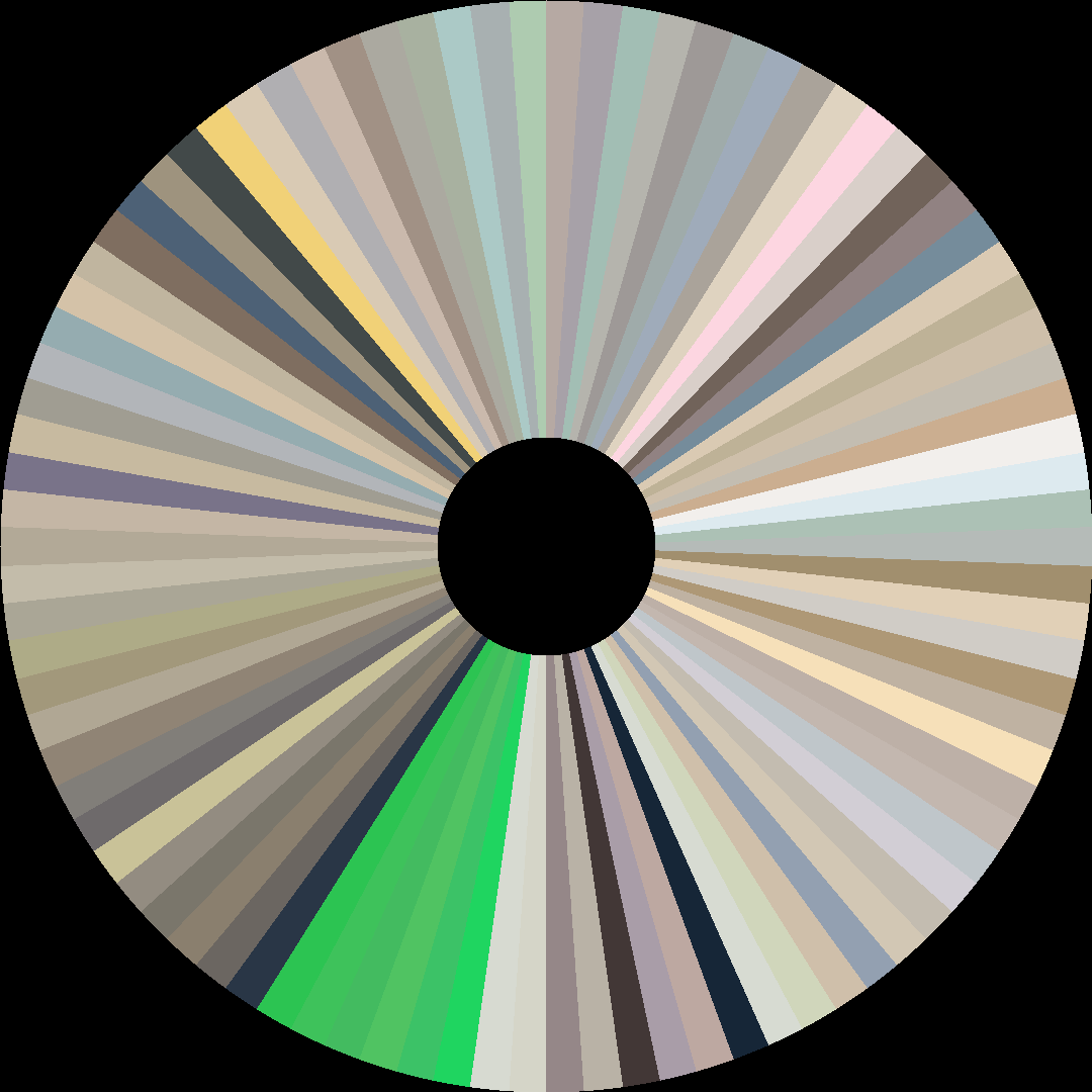
Hue Distribution
Act Breakdown
Opening
0.687
Middle
0.648
Closing
0.738
Avg Brightness
0.651
Avg Saturation
0.179
Warmth
0.548
Color Palette
#EAE3DA
#A4A09A
#625E5A
#DECEB0
#CBB29F
#A09070
#8E7063
#17202A
3-Act Color Story
Opening
Middle
Closing
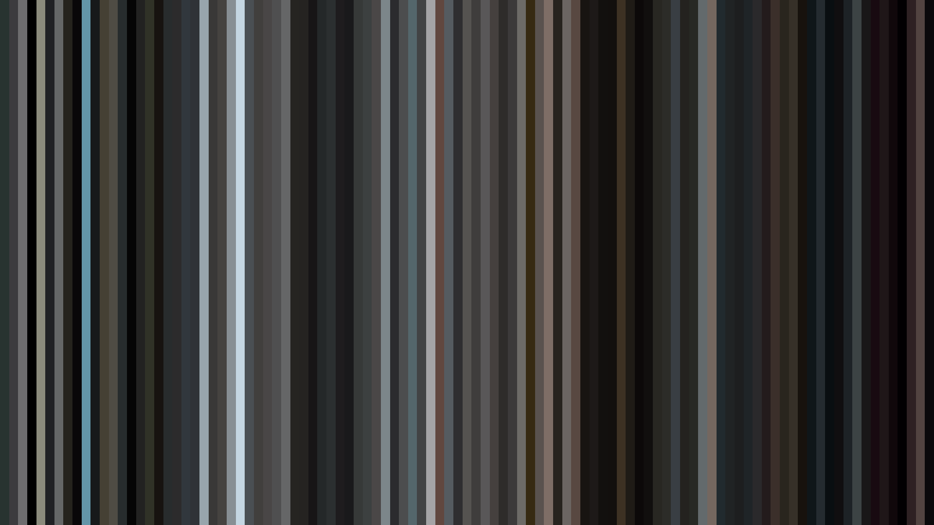
Color Twins
Perceptually nearest palettes — measured in OKLab space, not RGB


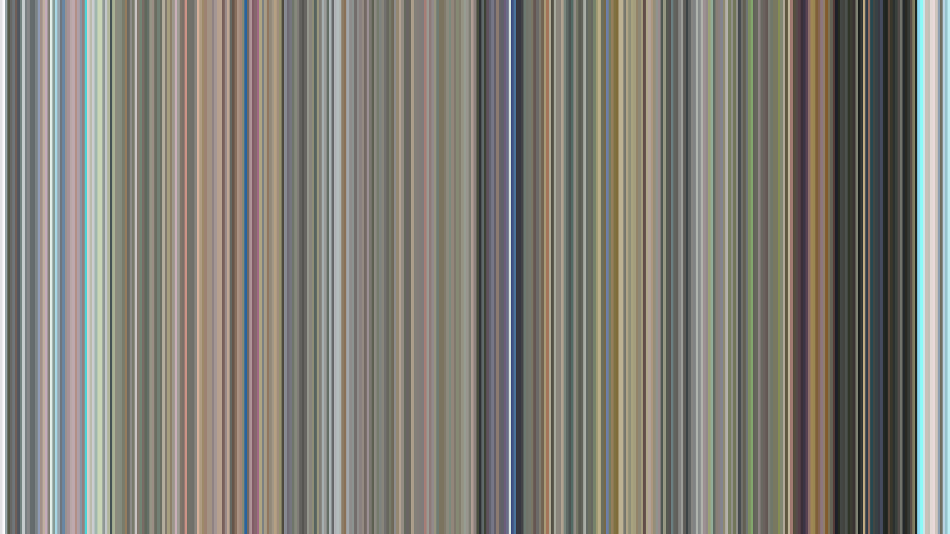


A desaturated warmth defines *Honey and Clover II*—its palette of aged paper and faded rose (#EAE3DA to #A09070) rarely breaches 0.18 saturation, yet the hue distribution pushes unwaveringly toward Red-Orange and Red. This is not the flushed heat of romance but the *subdued glow of memory*, the visual register of a story told after the fact. Director Kenichi Kasai and the J.C.Staff art team give us a world where emotions are felt through material texture: soft beige walls, weathered wood, the dusty blush of a clay studio. The bright-ending arc is an honest formal gesture. Opening at 0.687, dipping to a melancholic 0.648 in the middle act, then rising to 0.738—not a triumphant flare, but the quiet thaw of spring after a long winter. That final brightness does not erase the middle’s shadow; it simply permits the possibility of moving forward. The Red-Orange dominance isn't passion—it’s the color of twilight, of conversation that goes on too long, of cotton that holds the day’s last light. This is anime’s most tenderly desaturated love story, where the colors refuse to shout because the ache already speaks loud enough.