Edit Pace — frame-to-frame color delta (bright = fast cuts)
Color Temperature — warm (gold) vs cool (teal) per frame
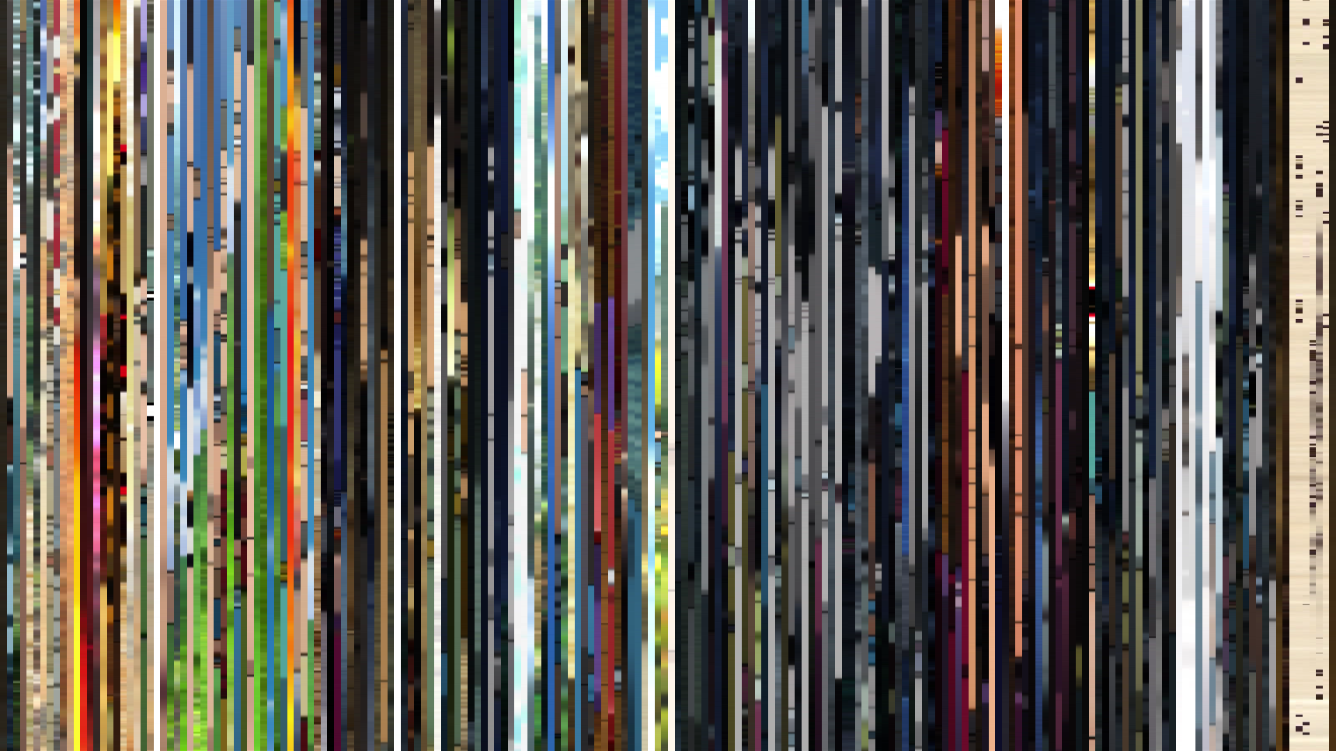
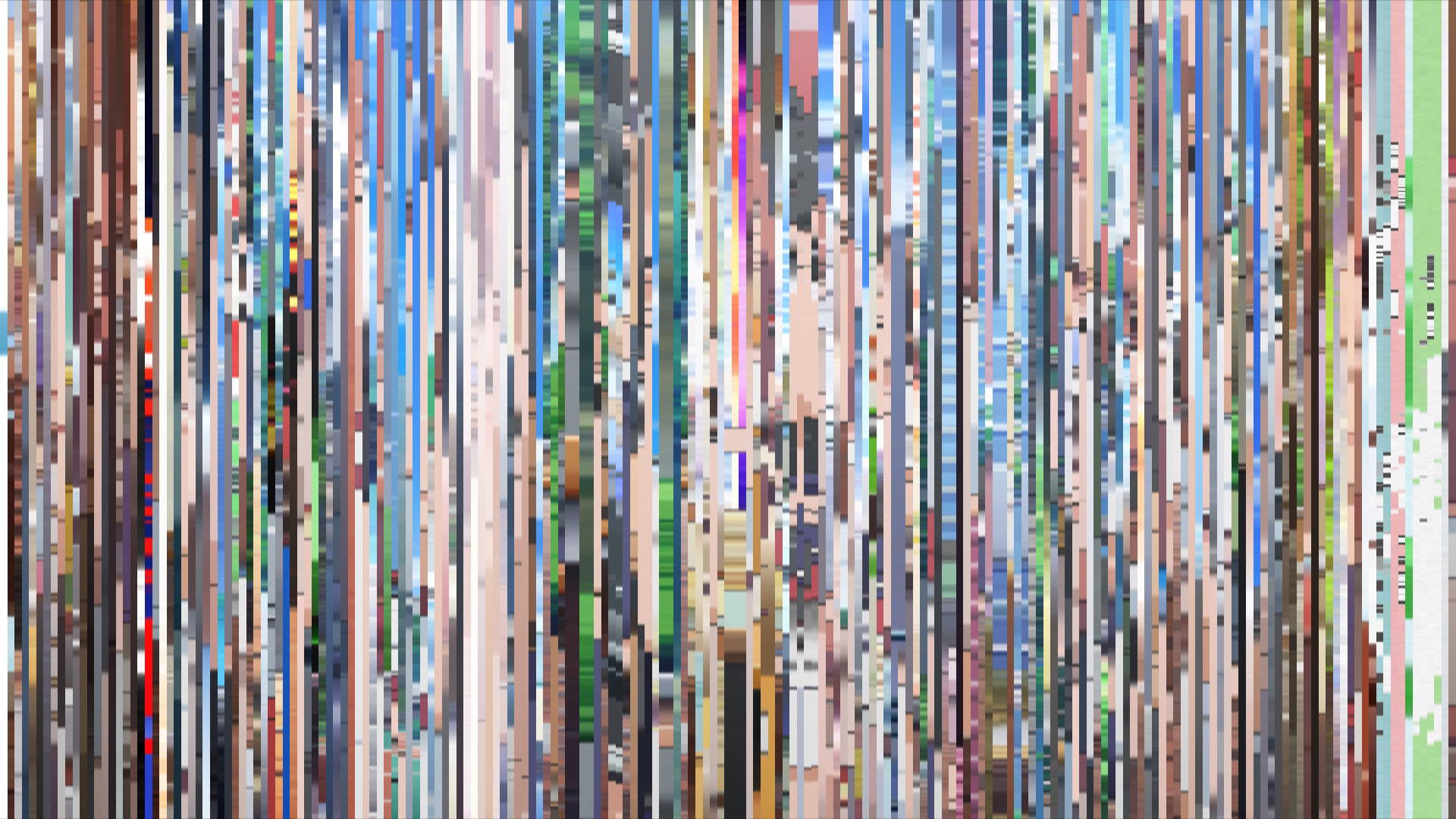
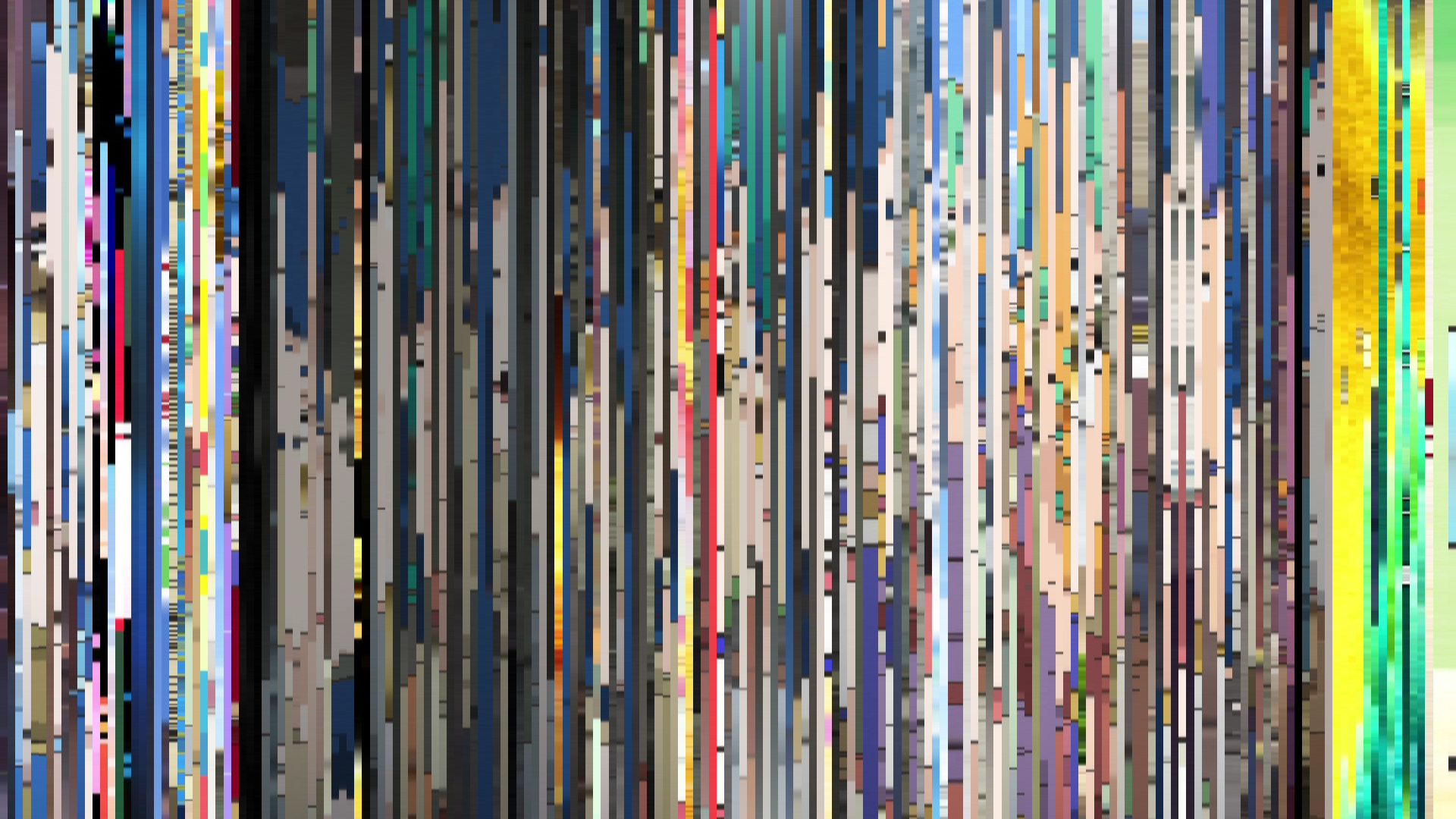
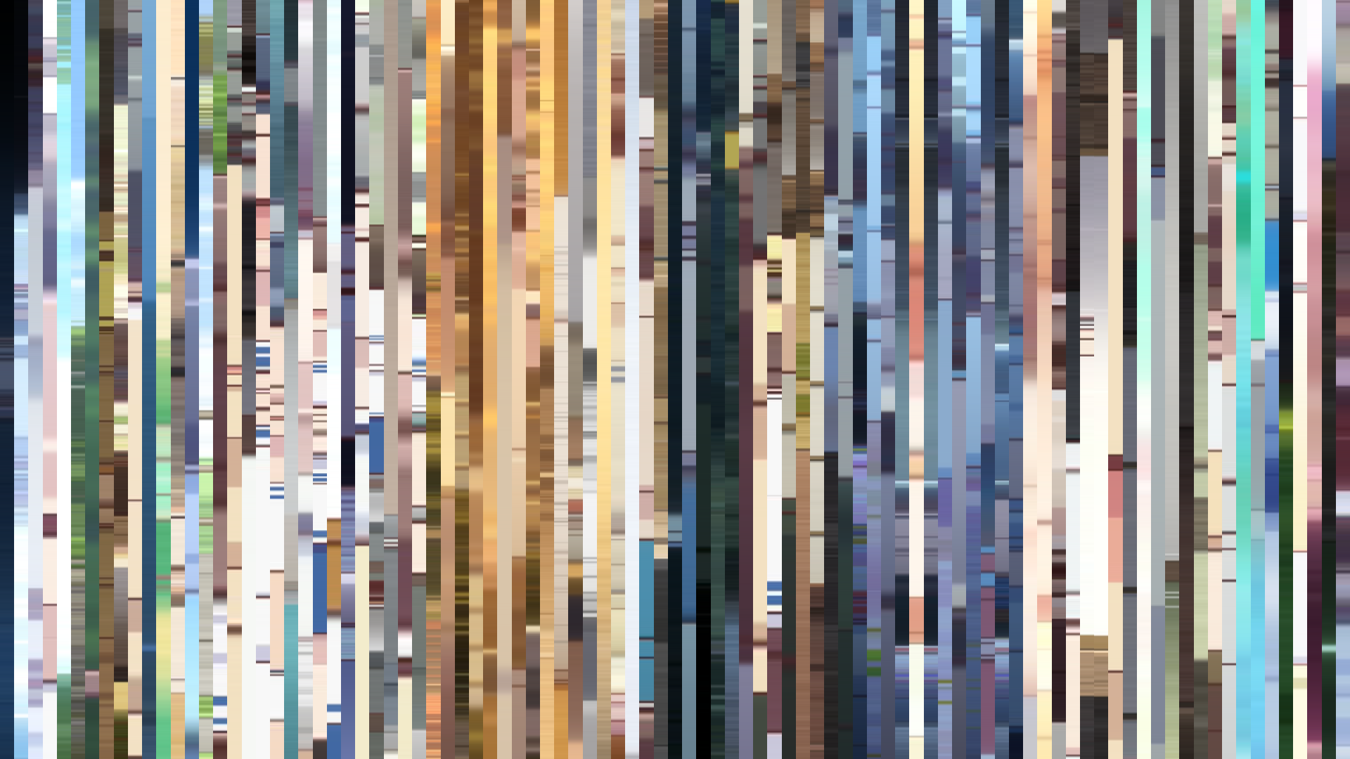
Frame Density Comparison — every 2nd vs every 4th frame
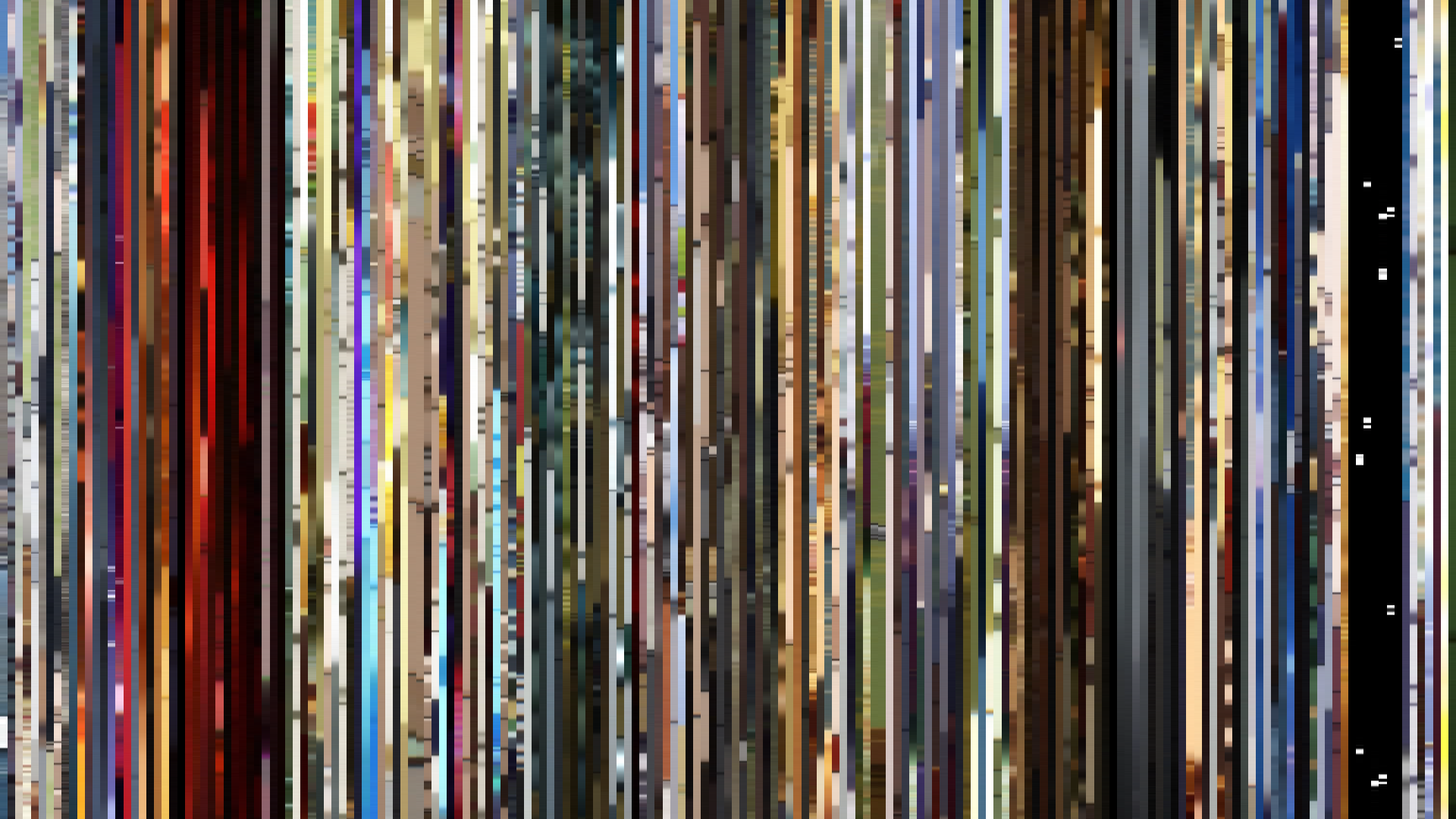
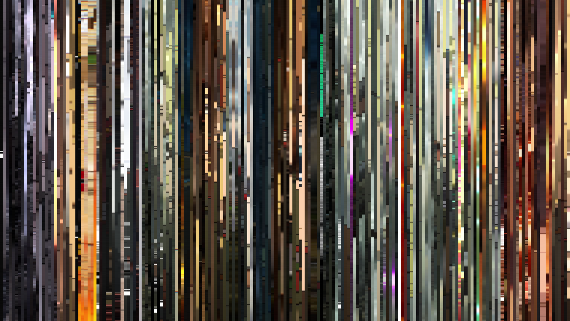
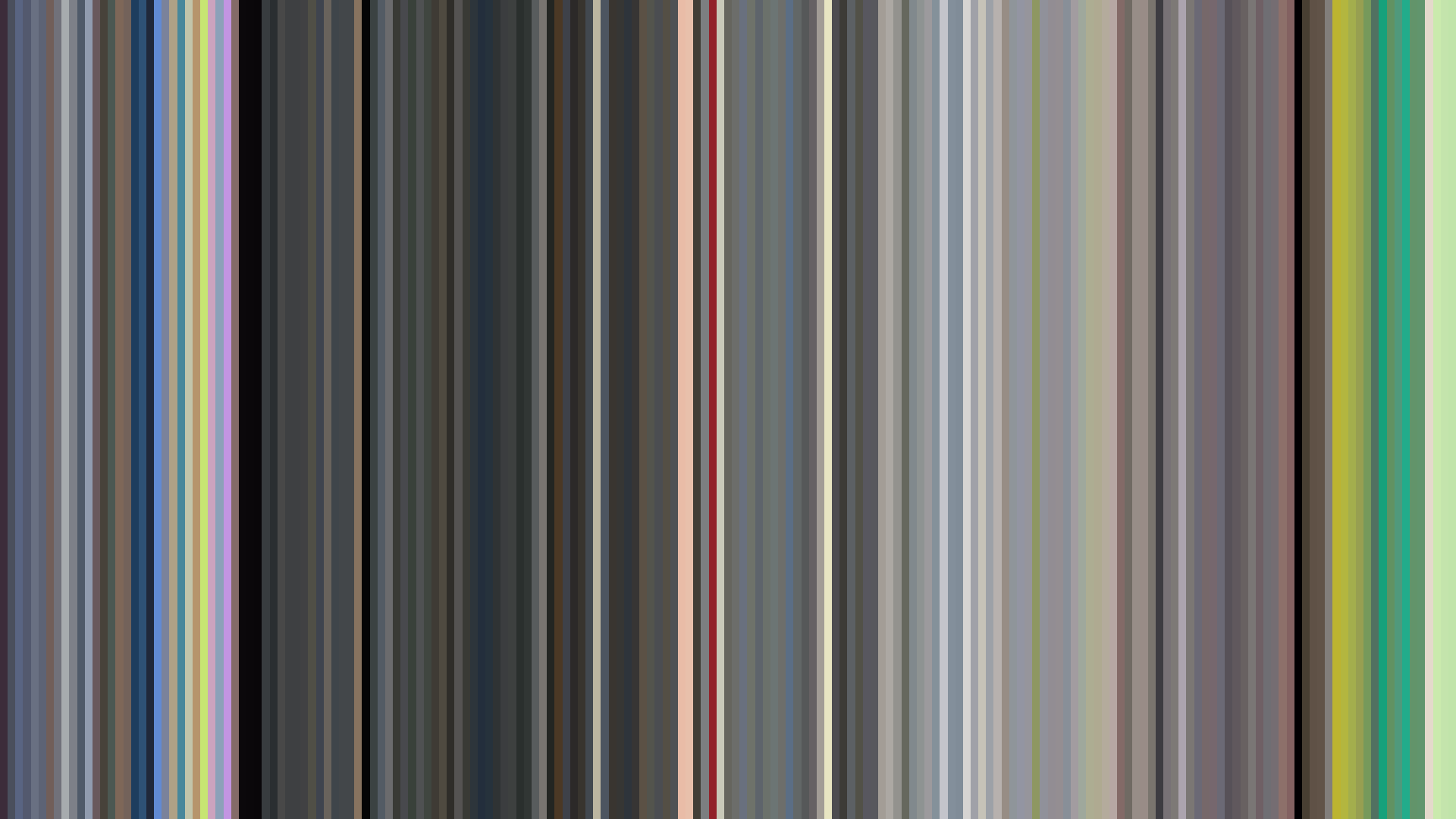
Slice · 15s
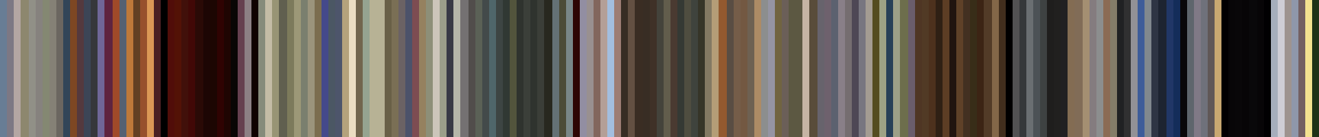
Avg · 15s
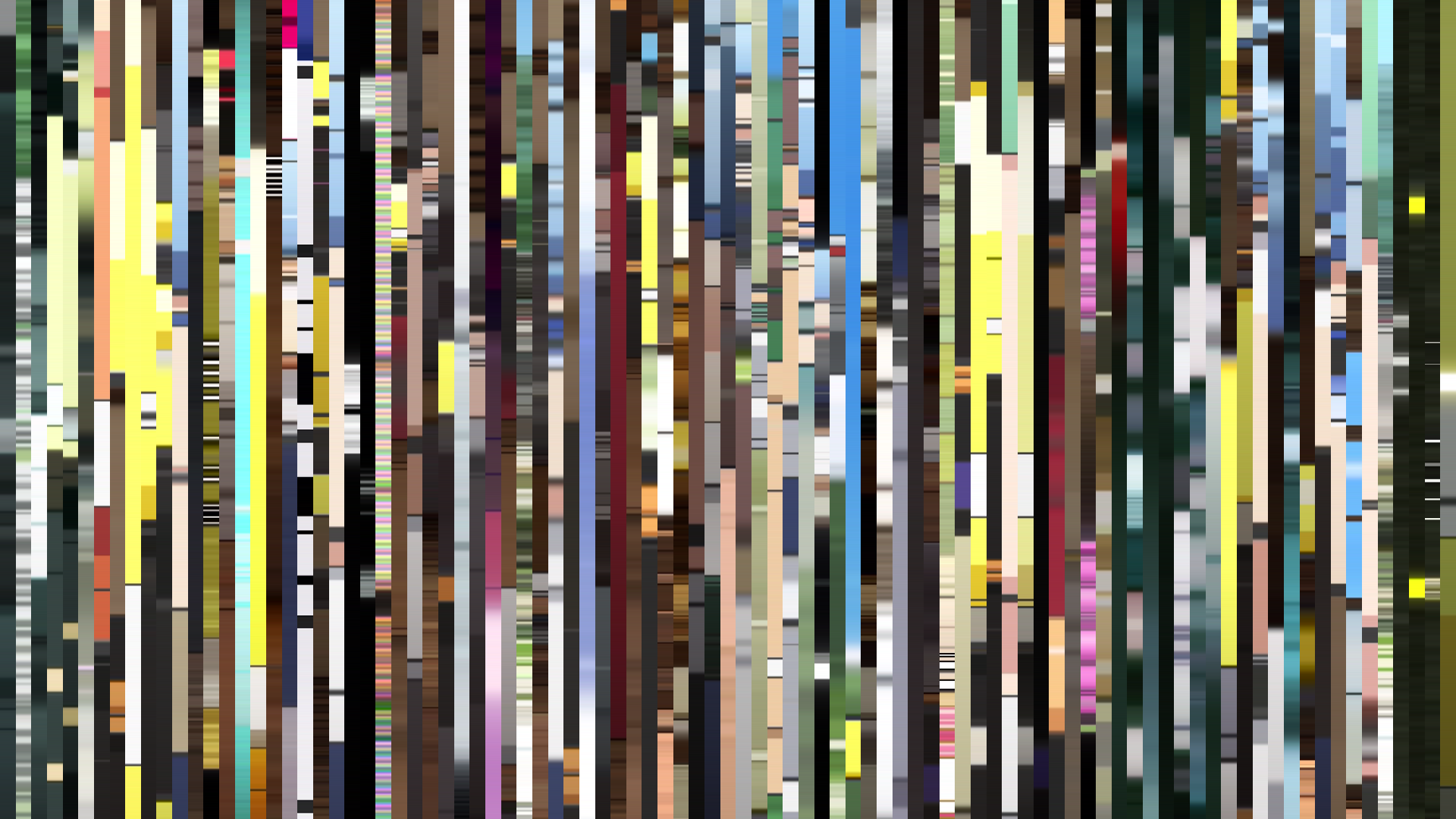
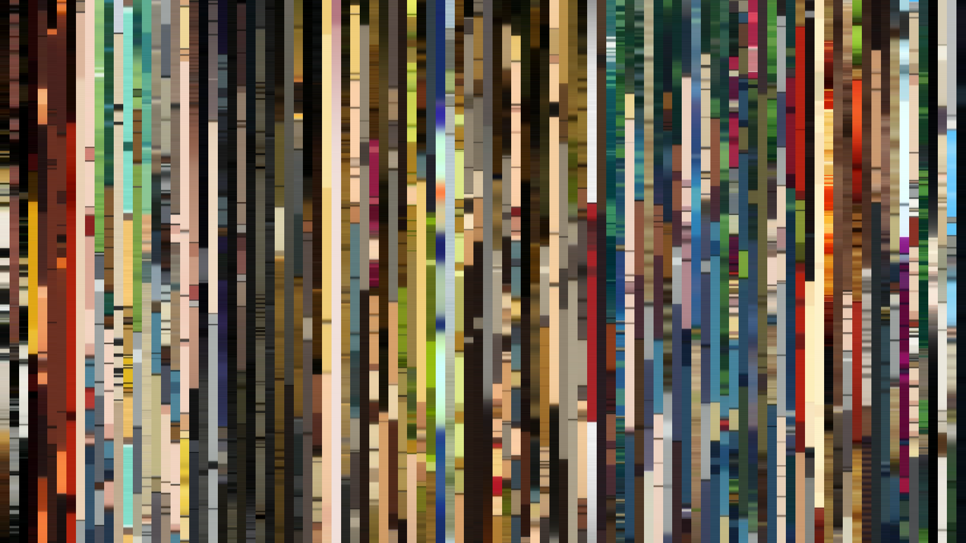
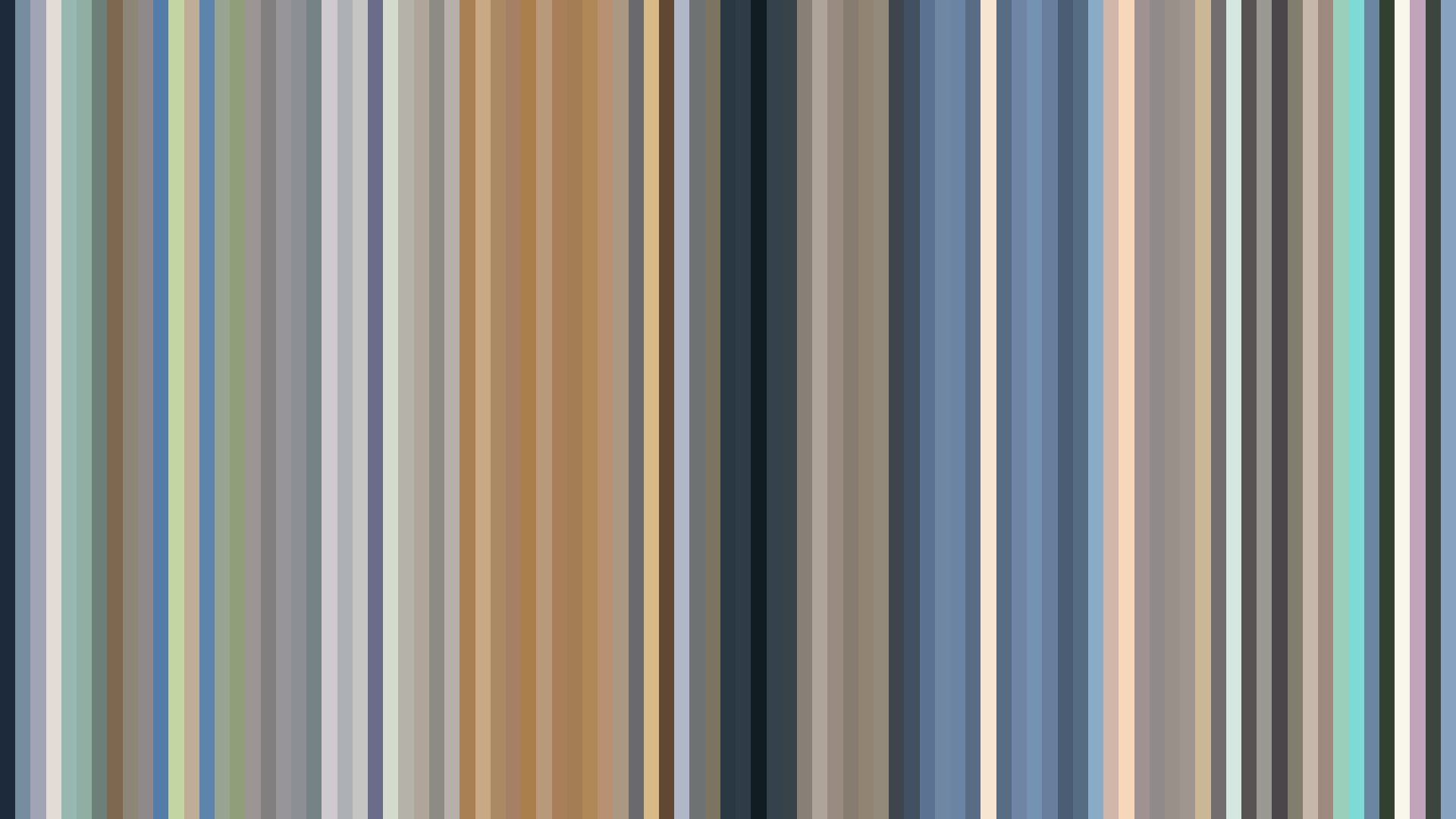
Slice · 30s
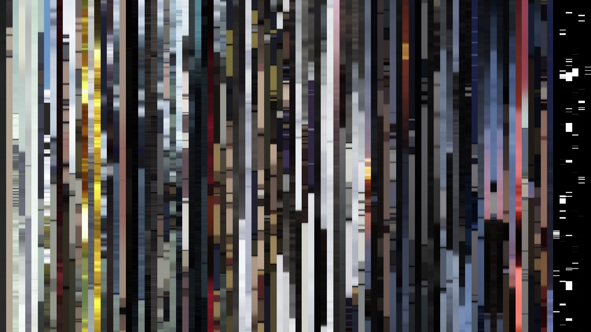
Avg · 30s
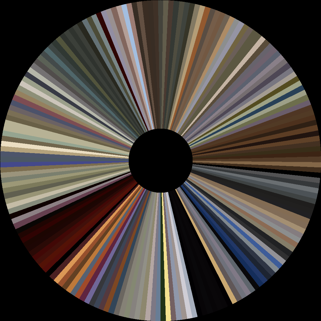
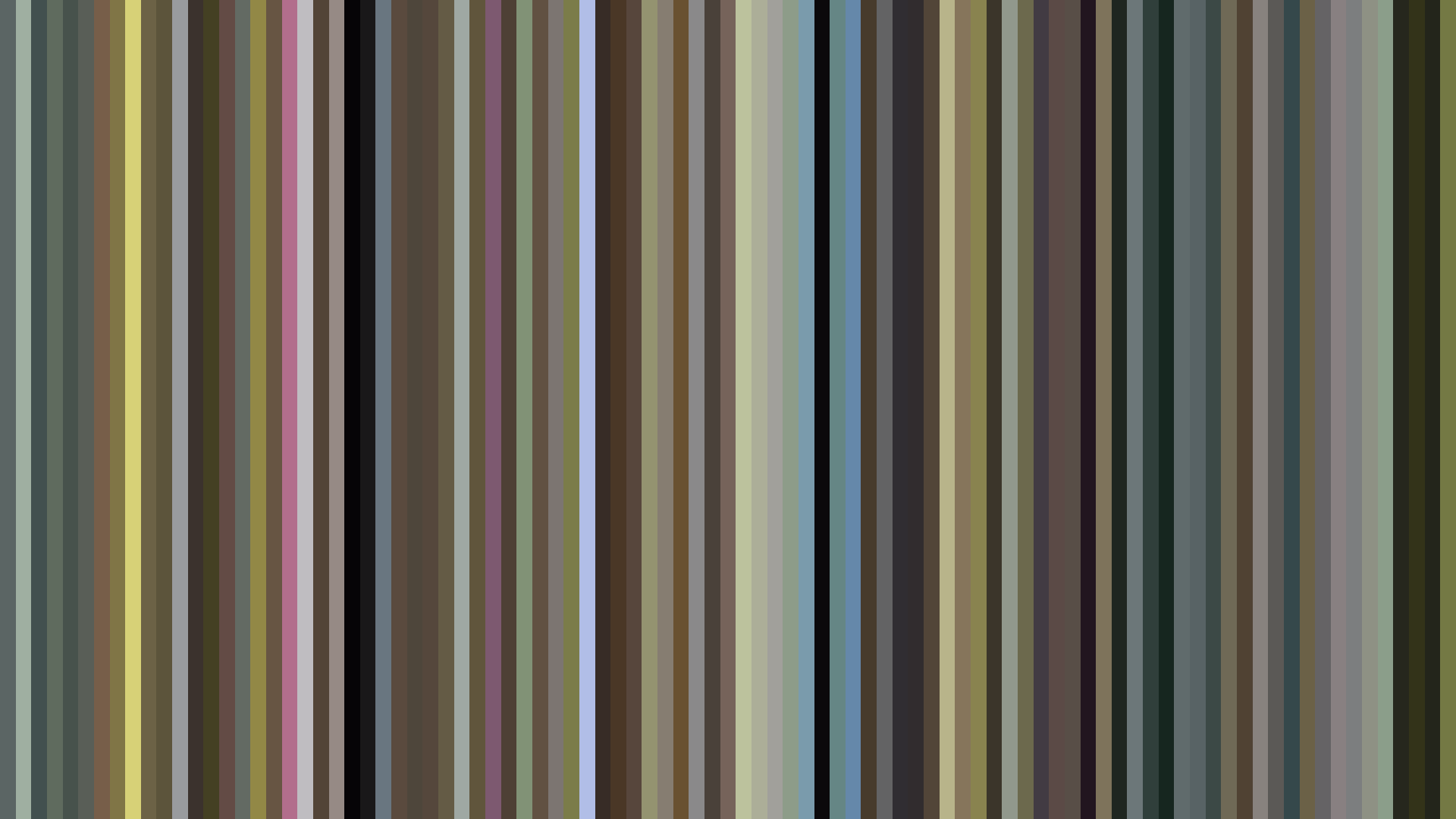
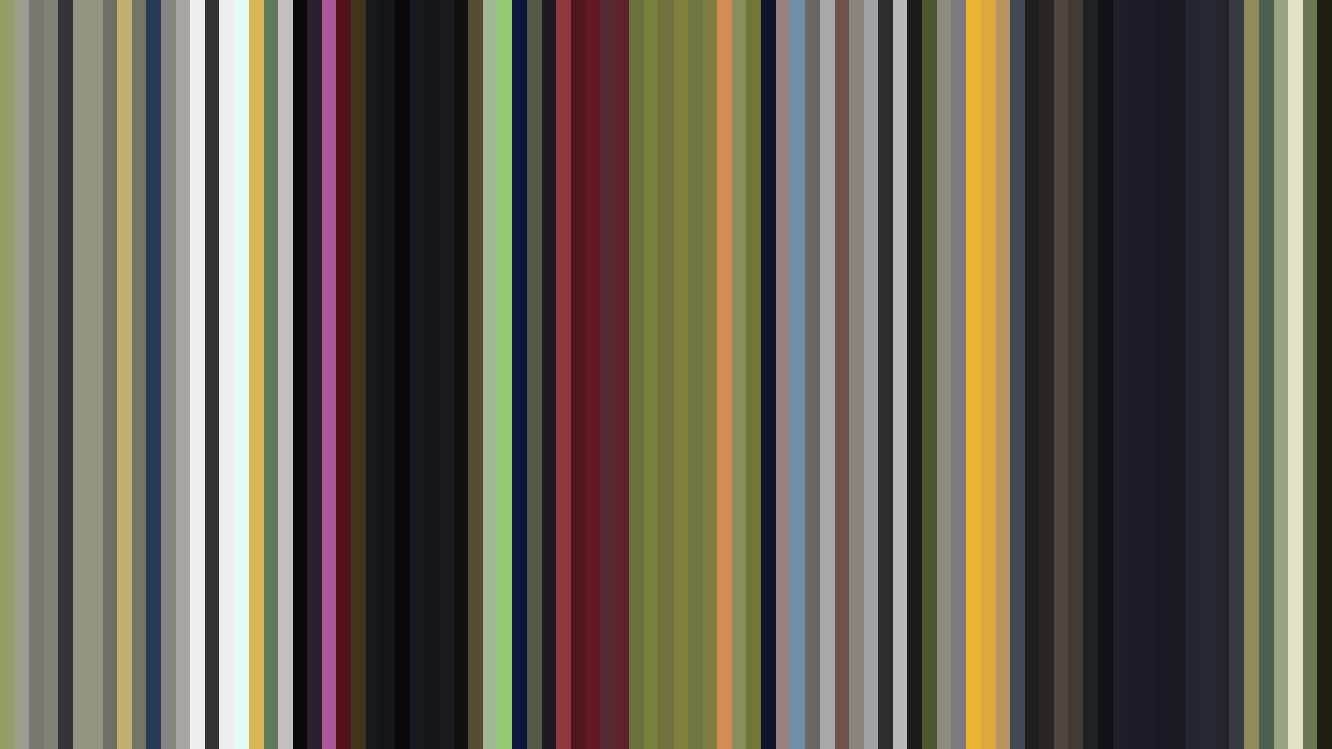
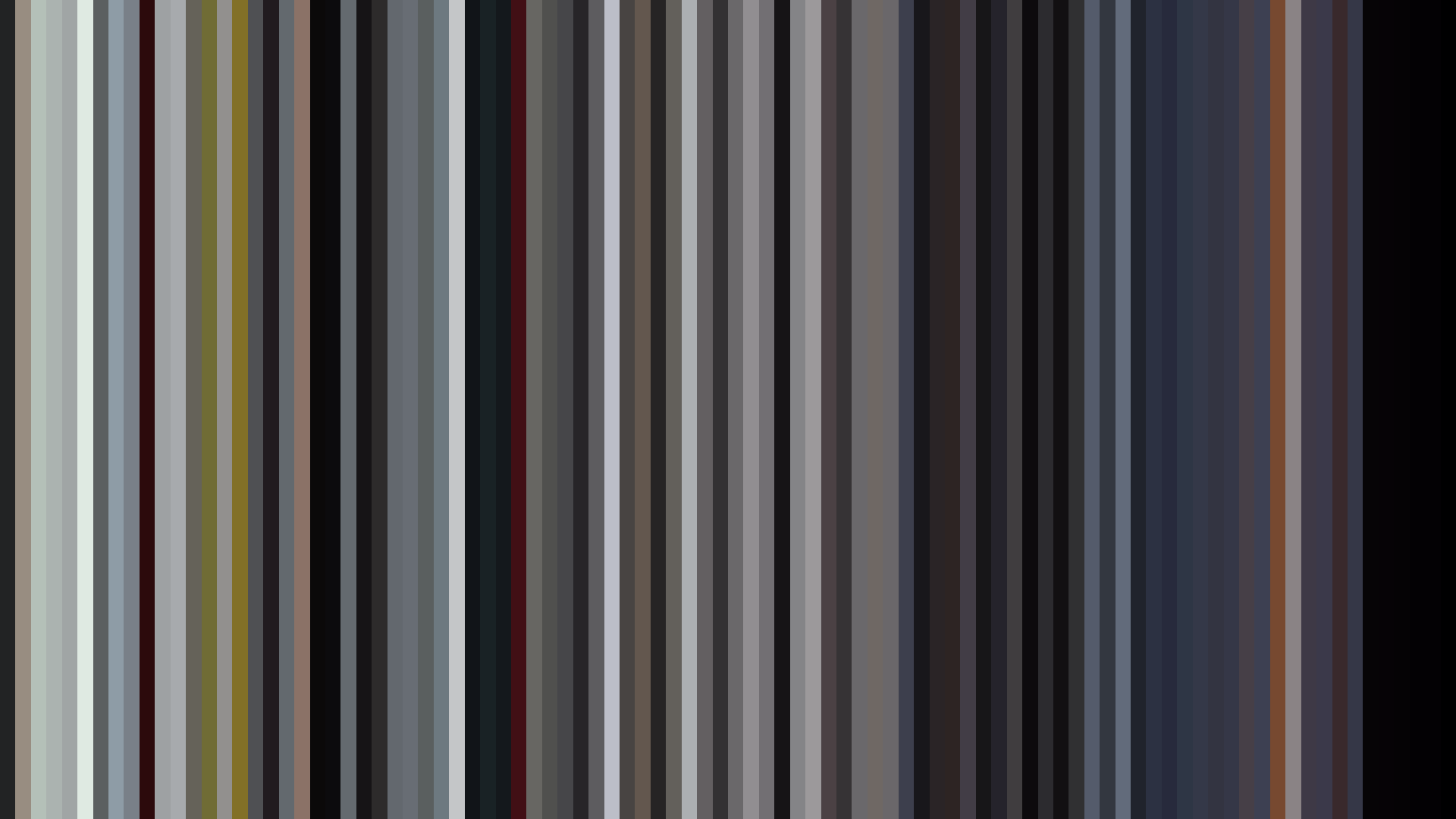
The color palette of *Moriarty the Patriot* reads like a crime scene photograph processed through a Victorian engraver’s lens. Dominated by Red-Orange at 33% and Red at 27%, the show’s hues are overwhelmingly the deep crimson of spilled wine in a gaslit study—but the dark ending arc betrays a more deliberate structure. Brightness collapses from a cautiously balanced opening and middle (0.403 and 0.406) to a decisive 0.340 in the final act, a visual contraction that mirrors the implosion of William James Moriarty’s grand plan. This is not a story that fades elegantly; it is a narrative that snuffs itself out. The dominant palette—#201917, #5F5D5A, #A29F9A, #522B22—is almost aggressively desaturated, with an average saturation of just 0.301, stripping the 19th-century London of any romanticism. Where other period pieces might lean into sepia nostalgia, the colors here are the unglamorous browns and greys of fog-choked alleyways and bloodstained floorboards. The Blue-Green at 14% is a faint, clinical interruption—the cold logic of Moriarty’s intellect staining the red of human passion. This is the visual signature of a show that trusts its audience to see the shadows first.
Brightness Arc (episode progression)
Hue Distribution
Act Breakdown
Opening
0.403
Middle
0.406
Closing
0.340
Avg Brightness
0.374
Avg Saturation
0.301
Warmth
0.553
Color Palette
#201917
#5F5D5A
#A29F9A
#522B22
#A0906E
#5A5033
#E0DED9
#DBCEA6
3-Act Color Story
Opening
Middle
Closing
Color Twins
Perceptually nearest palettes — measured in OKLab space, not RGB


The color palette of *Moriarty the Patriot* reads like a crime scene photograph processed through a Victorian engraver’s lens. Dominated by Red-Orange at 33% and Red at 27%, the show’s hues are overwhelmingly the deep crimson of spilled wine in a gaslit study—but the dark ending arc betrays a more deliberate structure. Brightness collapses from a cautiously balanced opening and middle (0.403 and 0.406) to a decisive 0.340 in the final act, a visual contraction that mirrors the implosion of William James Moriarty’s grand plan. This is not a story that fades elegantly; it is a narrative that snuffs itself out. The dominant palette—#201917, #5F5D5A, #A29F9A, #522B22—is almost aggressively desaturated, with an average saturation of just 0.301, stripping the 19th-century London of any romanticism. Where other period pieces might lean into sepia nostalgia, the colors here are the unglamorous browns and greys of fog-choked alleyways and bloodstained floorboards. The Blue-Green at 14% is a faint, clinical interruption—the cold logic of Moriarty’s intellect staining the red of human passion. This is the visual signature of a show that trusts its audience to see the shadows first.