Edit Pace — frame-to-frame color delta (bright = fast cuts)
Color Temperature — warm (gold) vs cool (teal) per frame
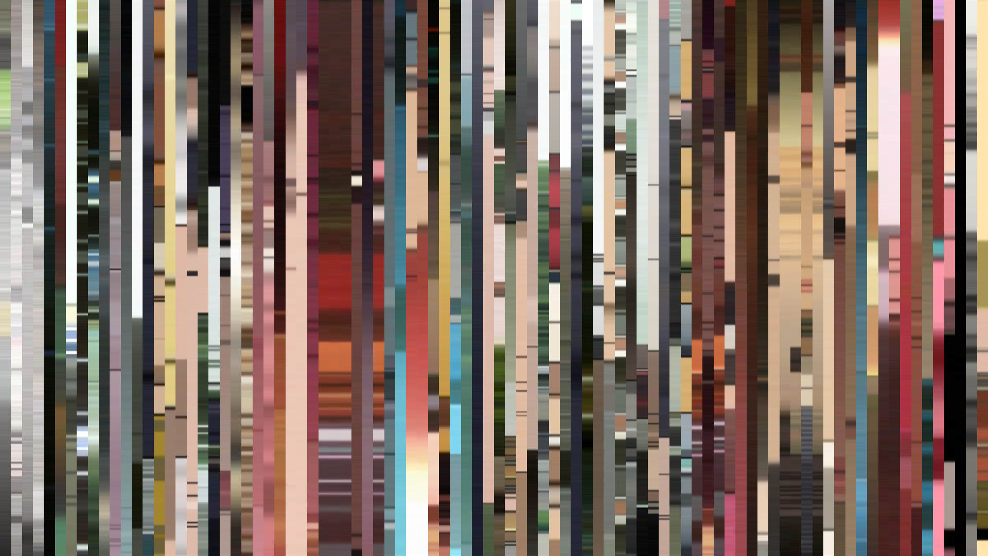
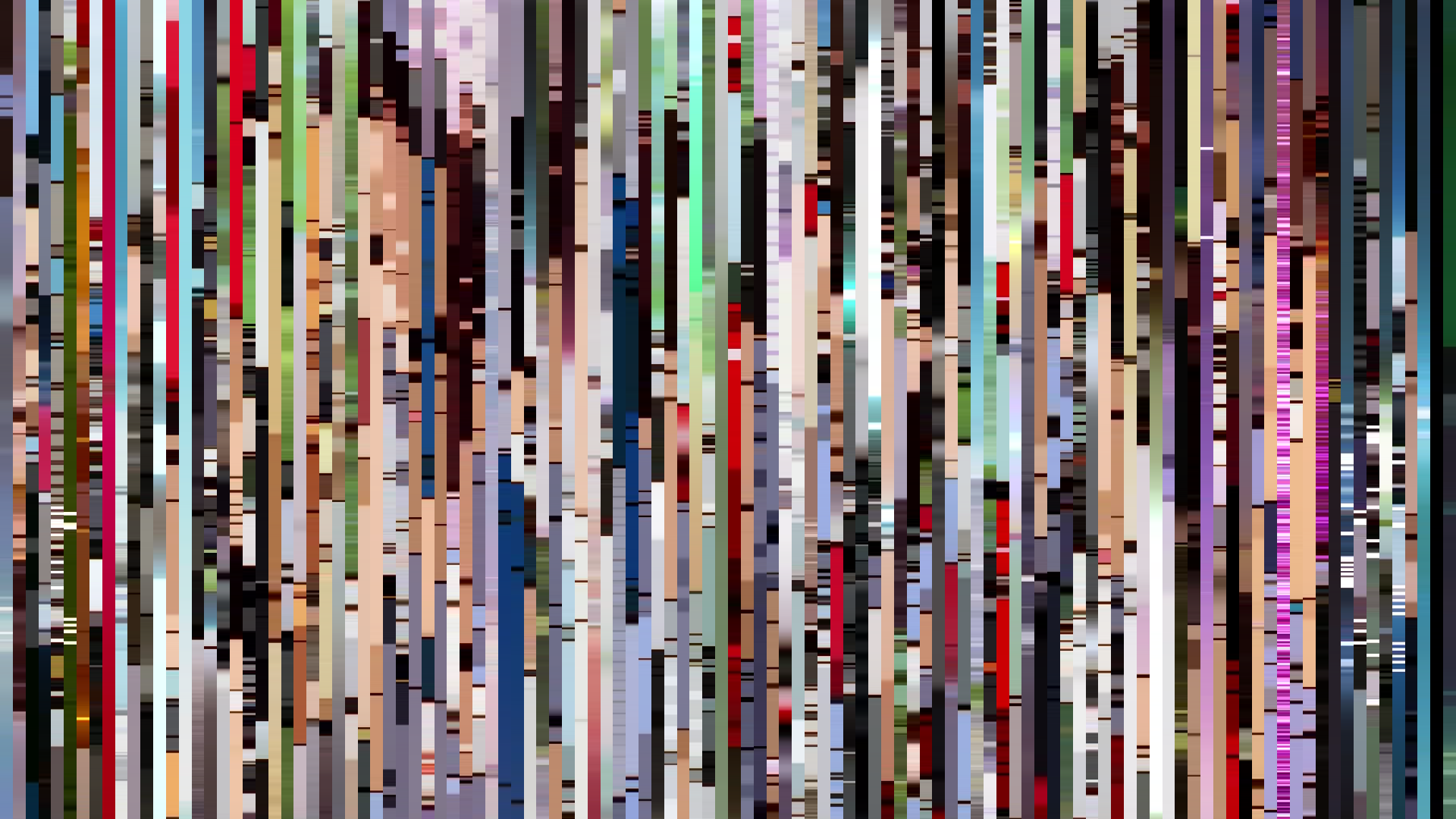
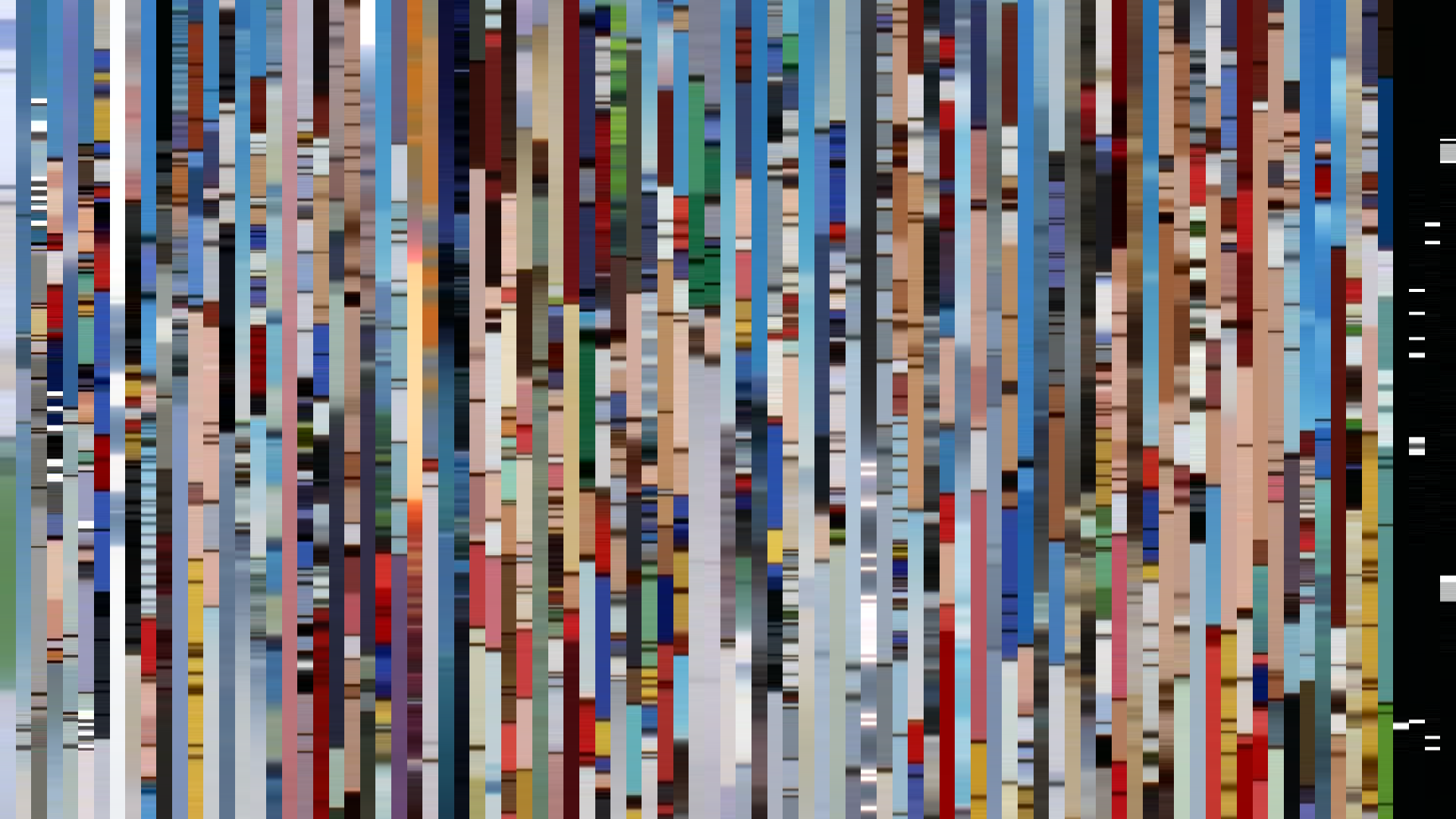
Frame Density Comparison — every 2nd vs every 4th frame
Slice · 15s
Avg · 15s
Slice · 30s
Avg · 30s
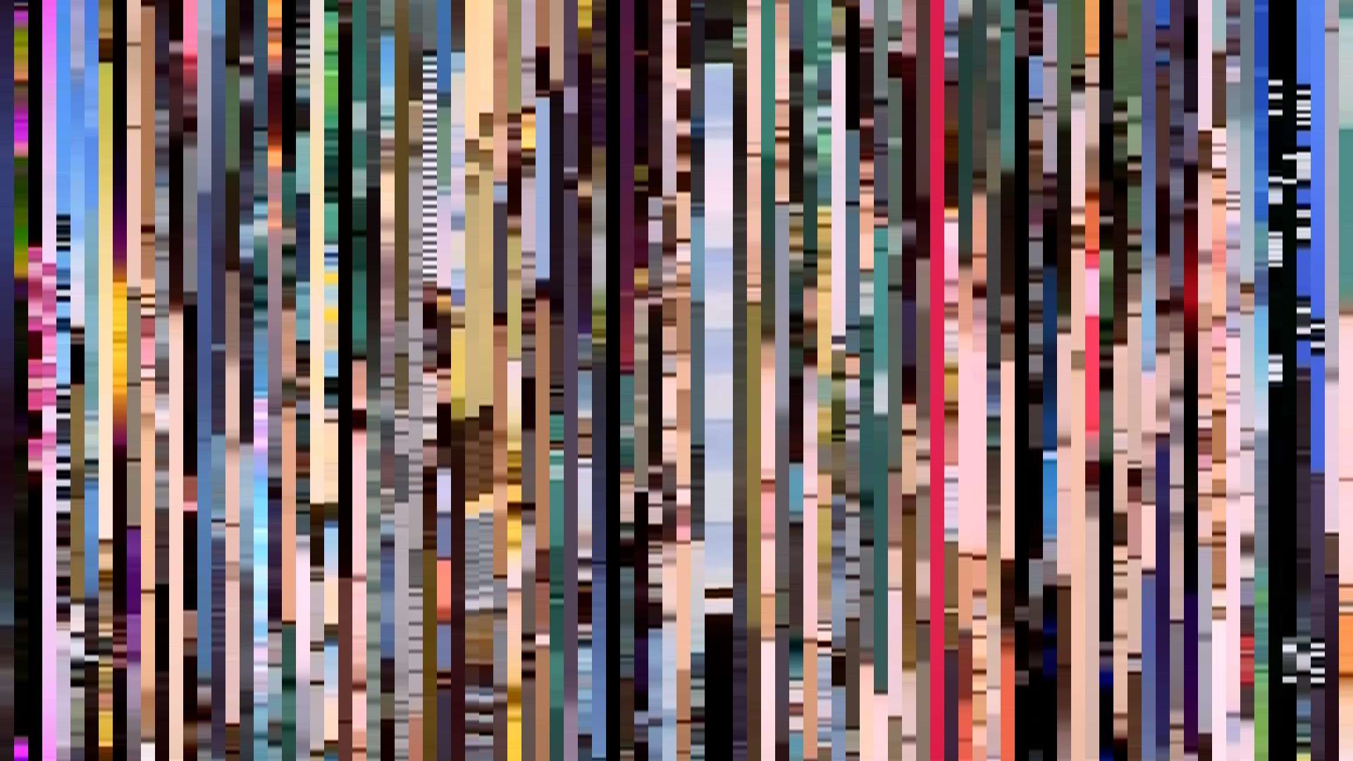
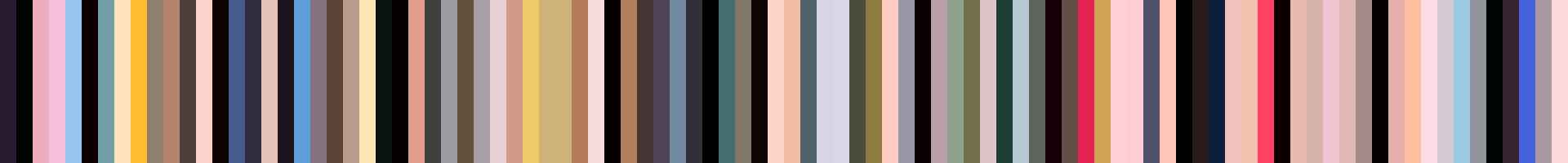
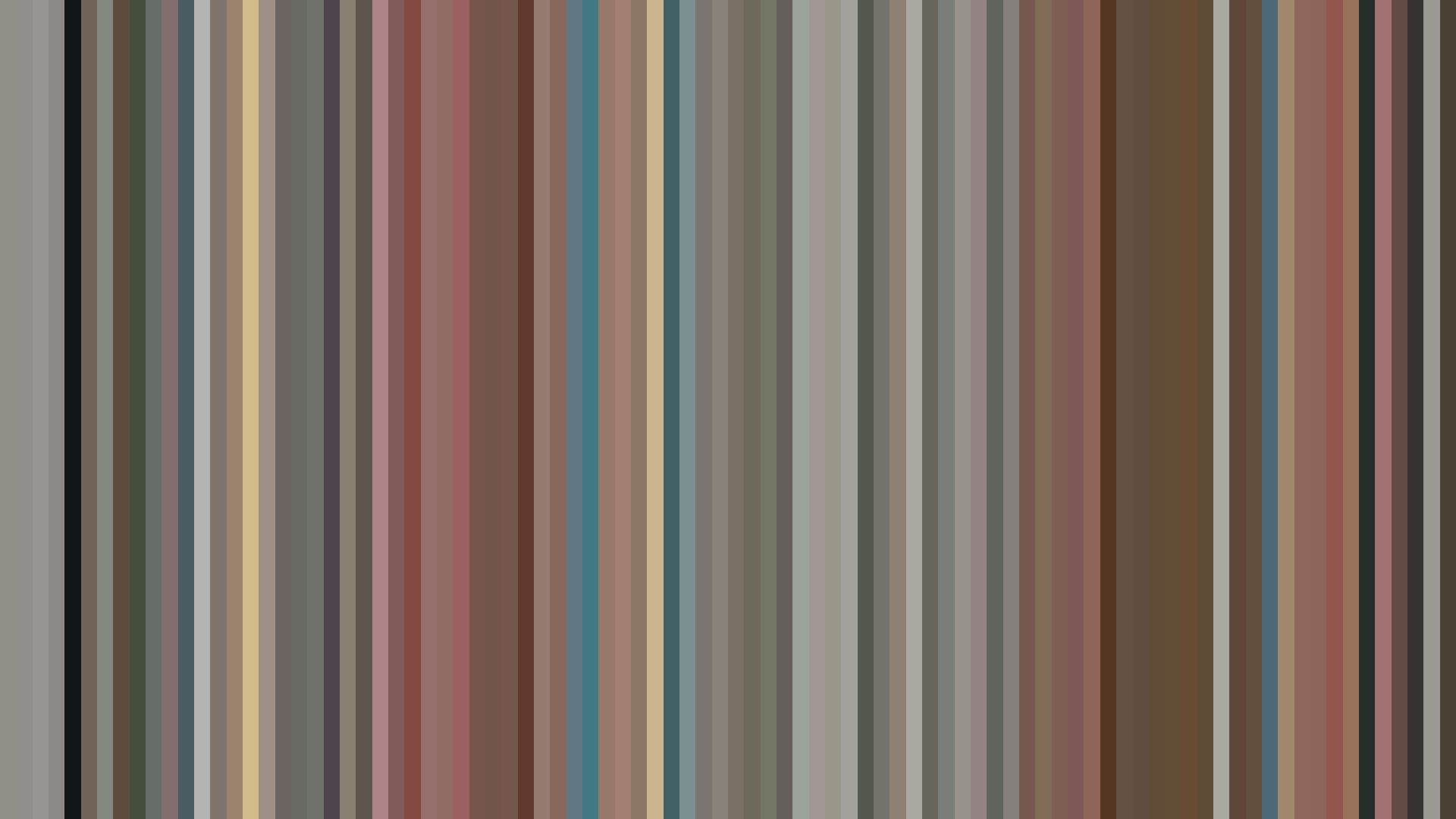
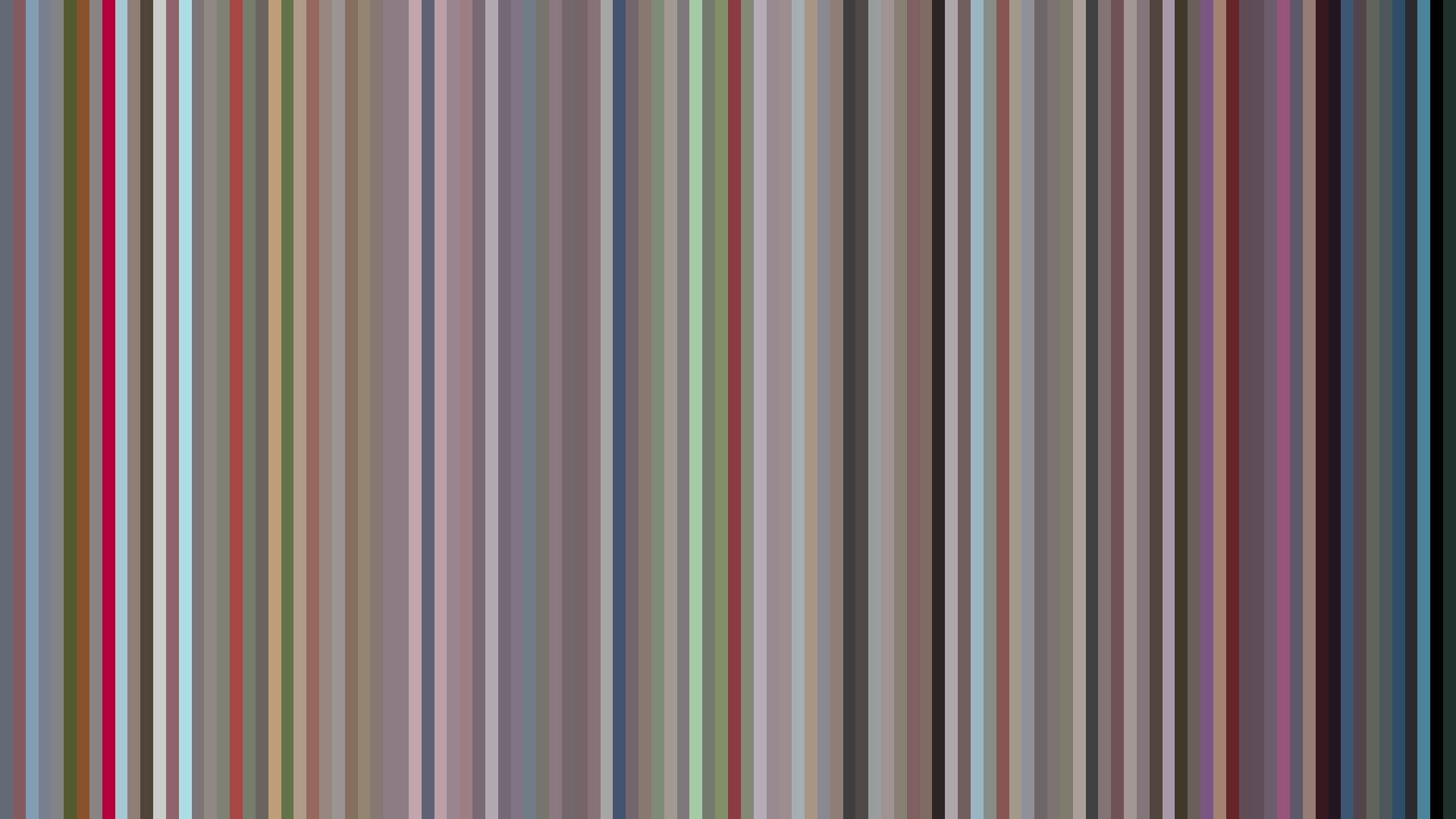
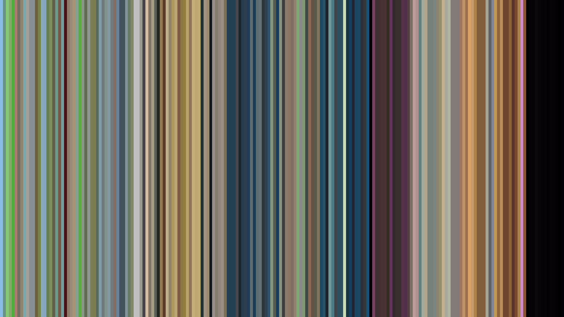
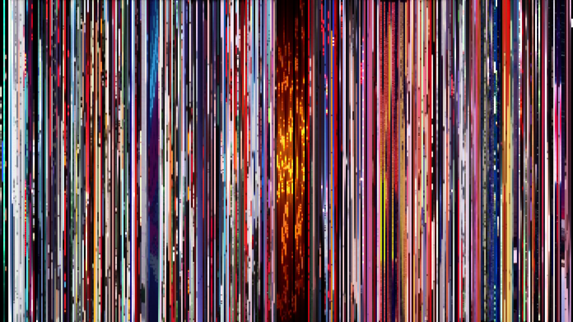
The flat-brightness arc of *Hyper Police* is almost aggressively uncooperative with narrative expectation. Where late-90s Studio Pierrot shows typically punctuated their action-comedy rhythms with a bright opening or dark midpoint, this series maintains a locked-average of 0.425 across all three acts—a visual stasis that reads less as restraint and more as indifference. The Red-dominant palette (43%) is tellingly desaturated, mixing rust-browns and dusty pinks (#DCAEA2, #996E5F) that never bloom into warmth. This is a color story that refuses to gesture toward the fantasy or romance in its billing; the world of Nergal City is uniformly muted, composed in the grayish-browns of dead office carpet and bruised sky. The Red-Purple secondaries (14%) suggest magical elements, but they’re swallowed by the overwhelming mid-tones. The flat arc isn't a flaw—it’s a statement. *Hyper Police* presents its genre mash of cops, monsters, and harem as a workaday reality, drained of the visual punctuation that would signal adventure or danger. The barcode doesn’t rise or fall; it simply exists, a steady pulse of beige and maroon that insists this is just another day on the beat.
Brightness Arc (episode progression)
Hue Distribution
Act Breakdown
Opening
0.567
Middle
0.570
Closing
0.542
Avg Brightness
0.425
Avg Saturation
0.260
Warmth
0.562
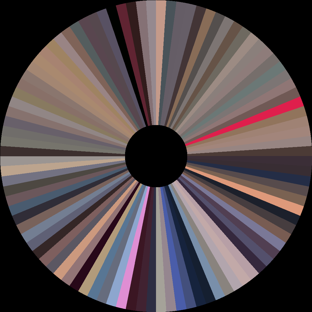
Color Palette
#1A1213
#5F5C5E
#A29AA1
#EDD3DA
#DCAEA2
#996E5F
#4F2F29
#F4CBAE
3-Act Color Story
Opening
Middle
Closing
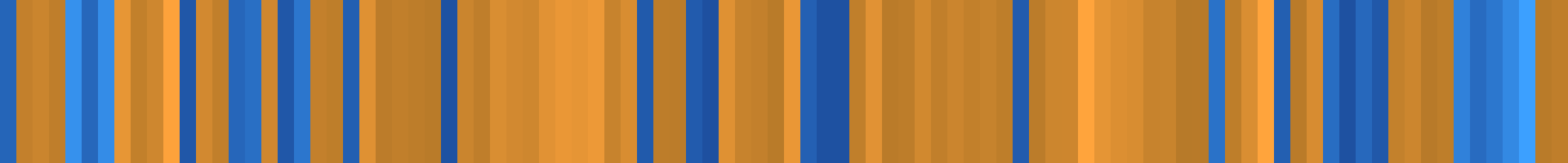
Color Twins
Perceptually nearest palettes — measured in OKLab space, not RGB


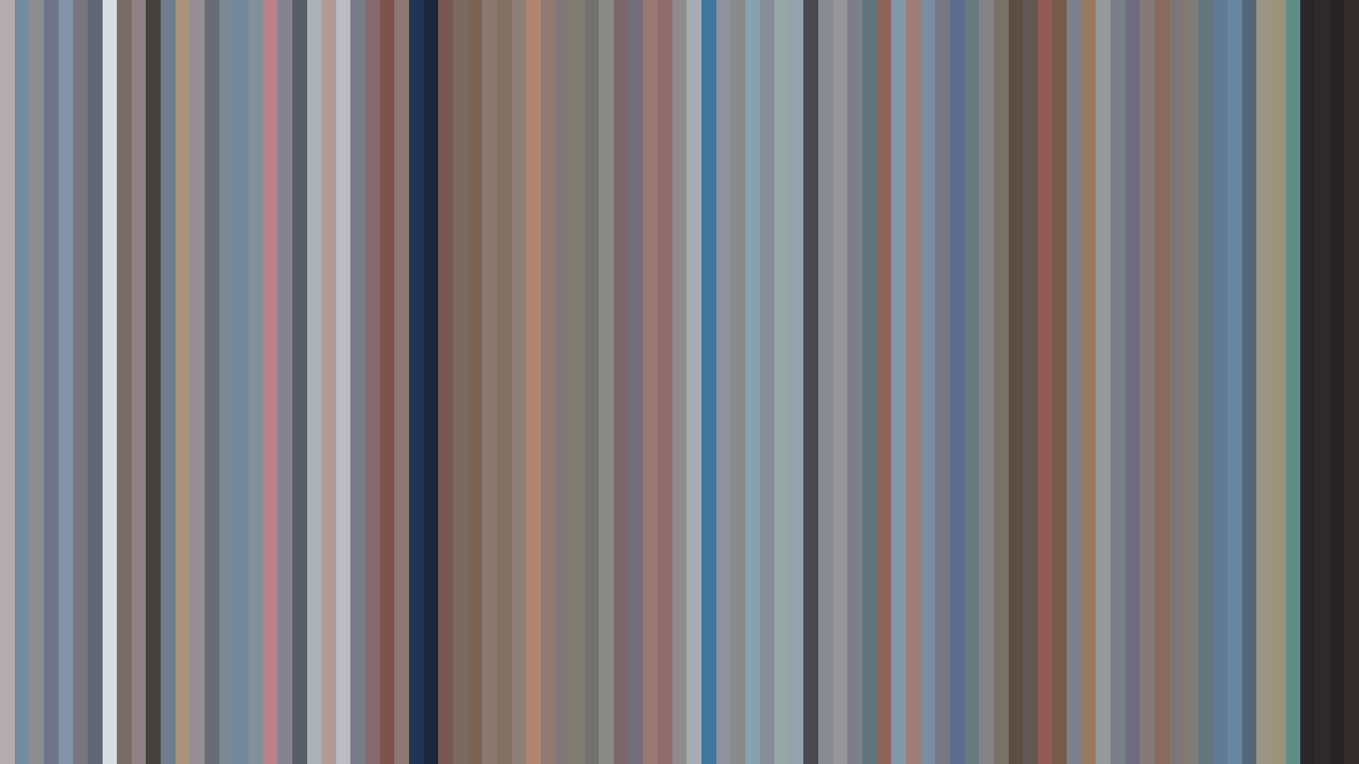


The flat-brightness arc of *Hyper Police* is almost aggressively uncooperative with narrative expectation. Where late-90s Studio Pierrot shows typically punctuated their action-comedy rhythms with a bright opening or dark midpoint, this series maintains a locked-average of 0.425 across all three acts—a visual stasis that reads less as restraint and more as indifference. The Red-dominant palette (43%) is tellingly desaturated, mixing rust-browns and dusty pinks (#DCAEA2, #996E5F) that never bloom into warmth. This is a color story that refuses to gesture toward the fantasy or romance in its billing; the world of Nergal City is uniformly muted, composed in the grayish-browns of dead office carpet and bruised sky. The Red-Purple secondaries (14%) suggest magical elements, but they’re swallowed by the overwhelming mid-tones. The flat arc isn't a flaw—it’s a statement. *Hyper Police* presents its genre mash of cops, monsters, and harem as a workaday reality, drained of the visual punctuation that would signal adventure or danger. The barcode doesn’t rise or fall; it simply exists, a steady pulse of beige and maroon that insists this is just another day on the beat.