Edit Pace — frame-to-frame color delta (bright = fast cuts)
Color Temperature — warm (gold) vs cool (teal) per frame
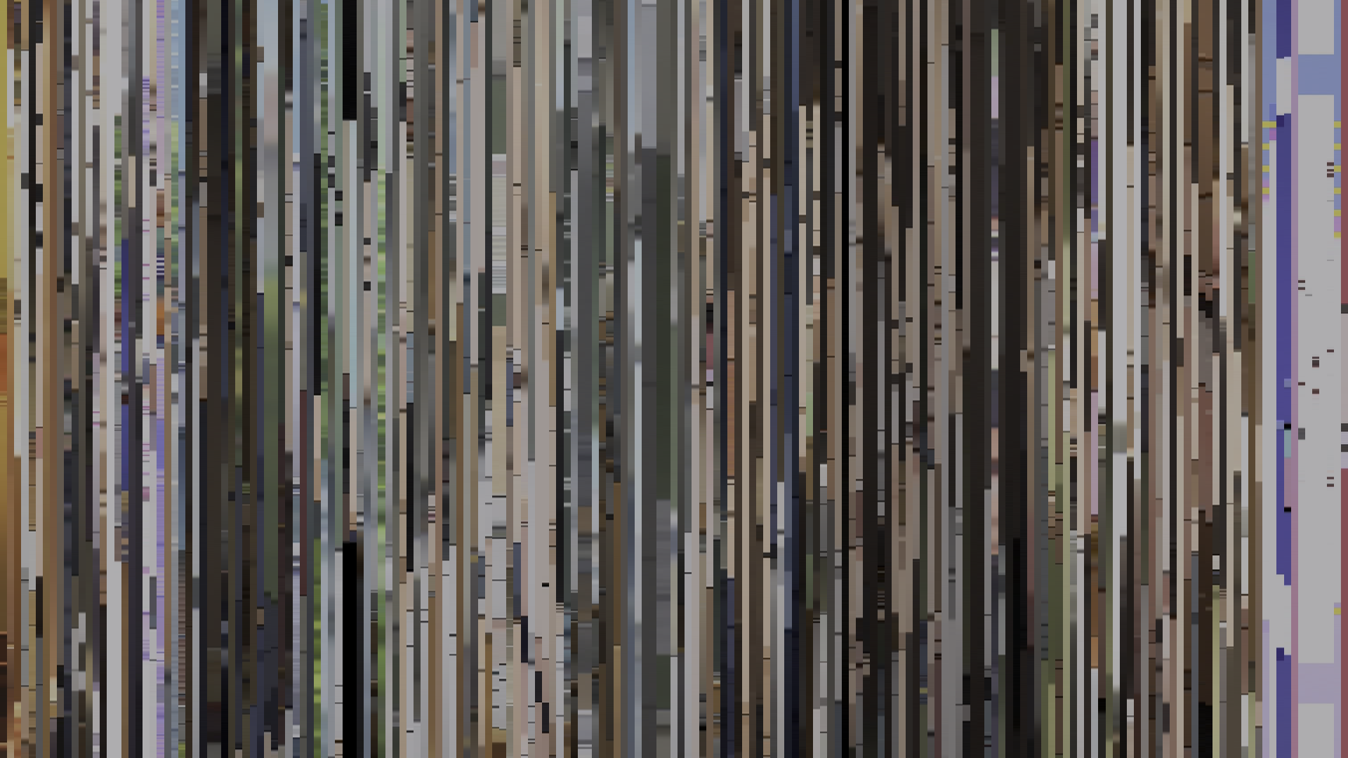
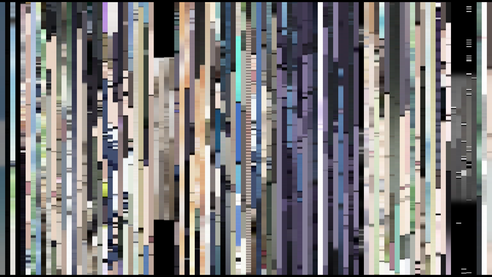
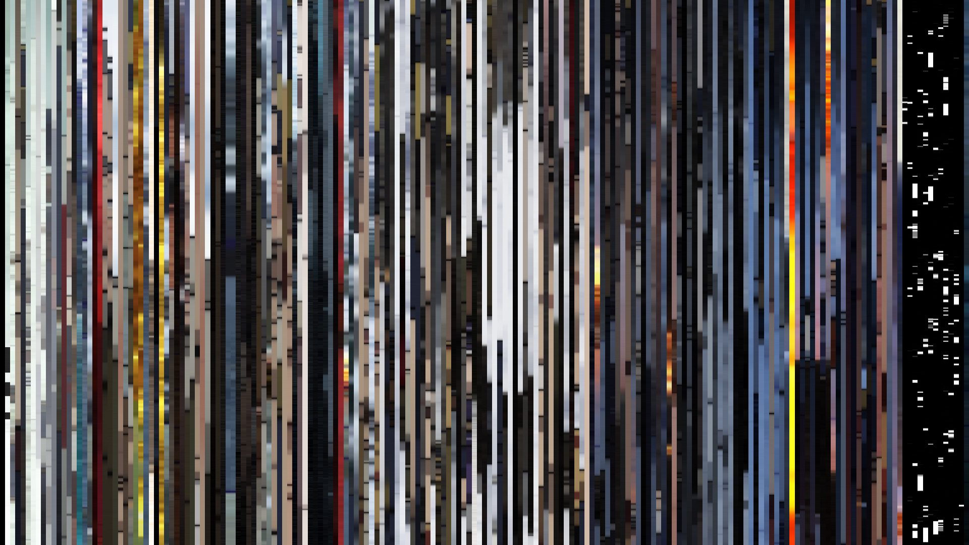
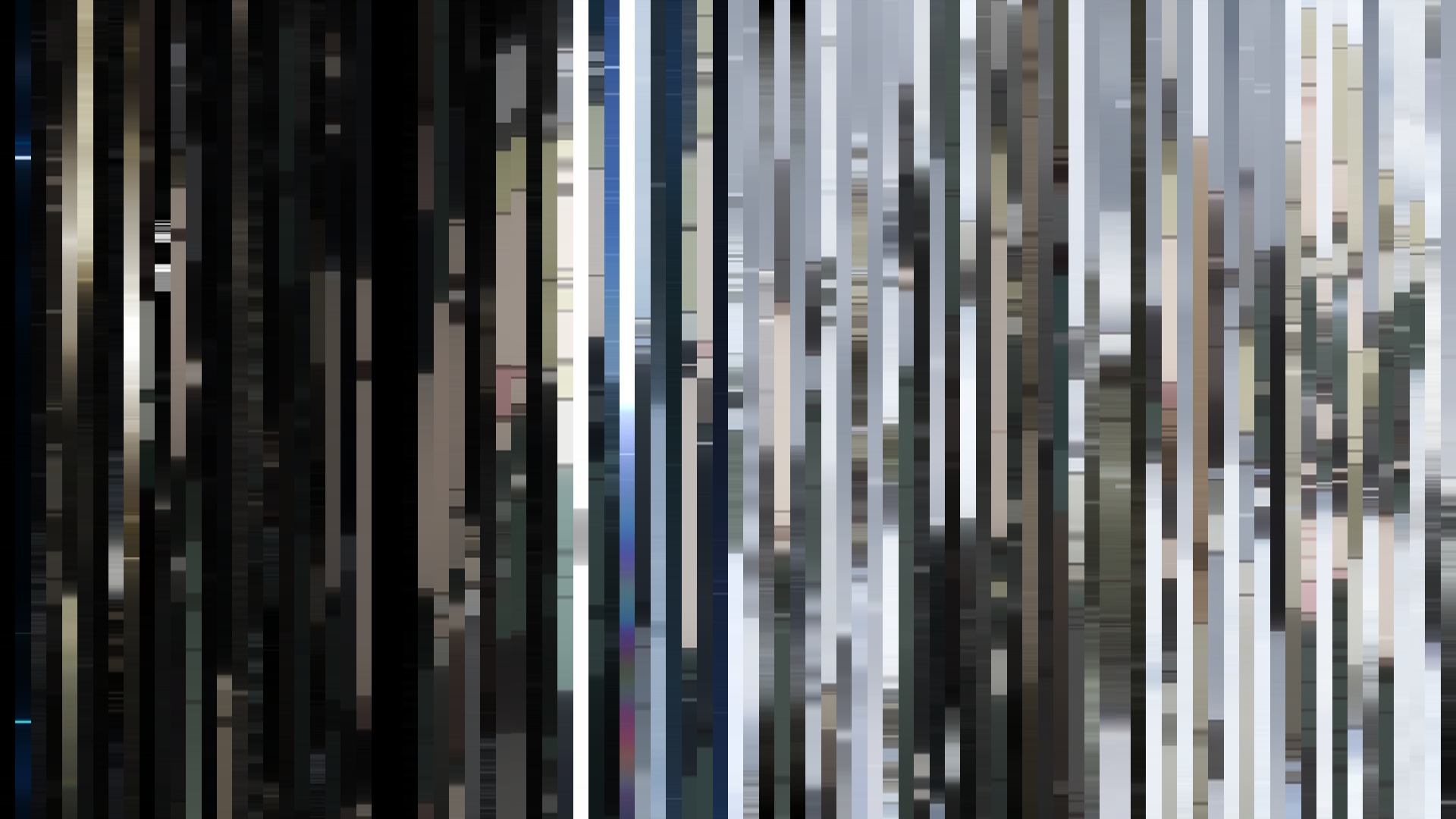
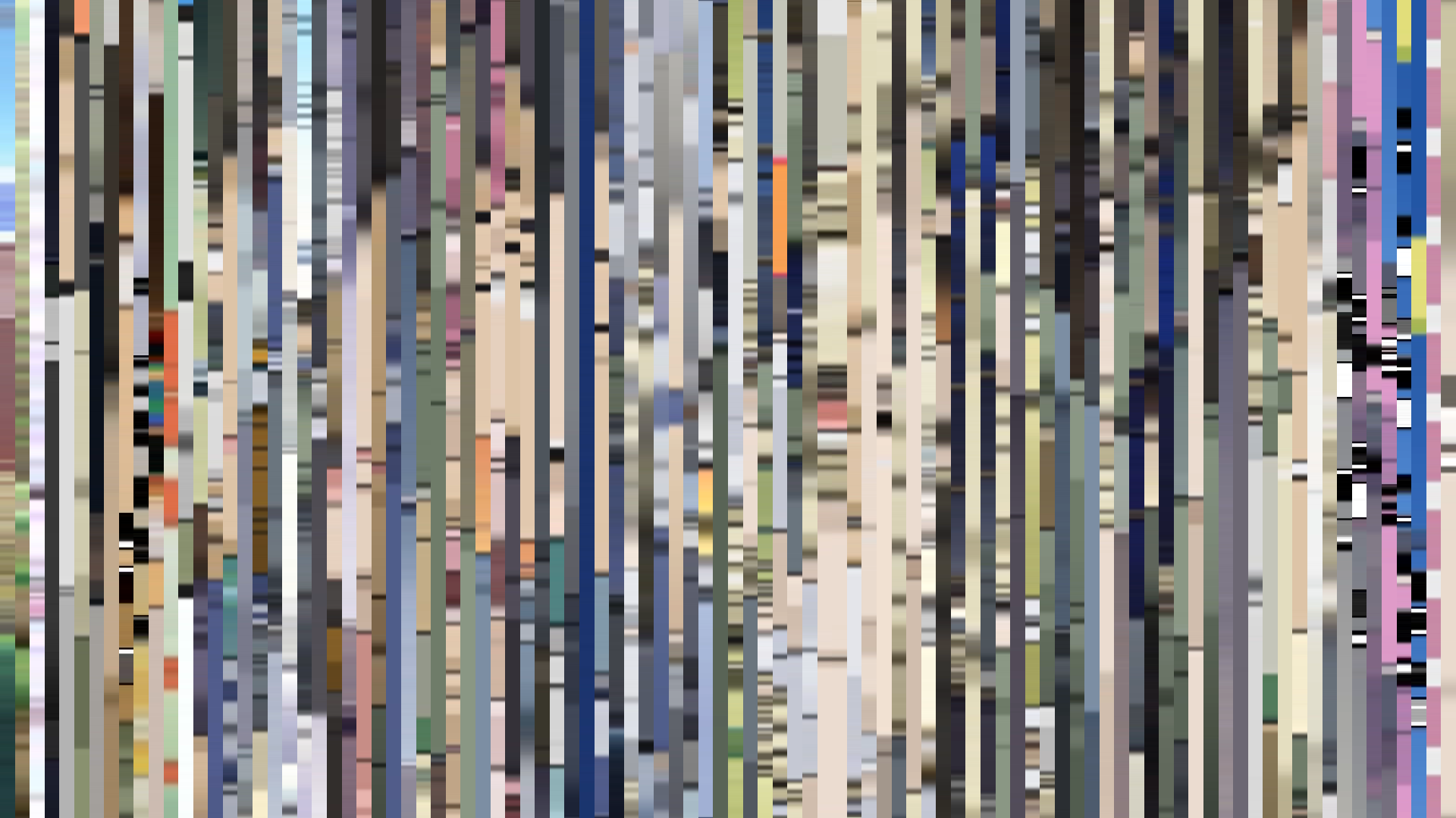
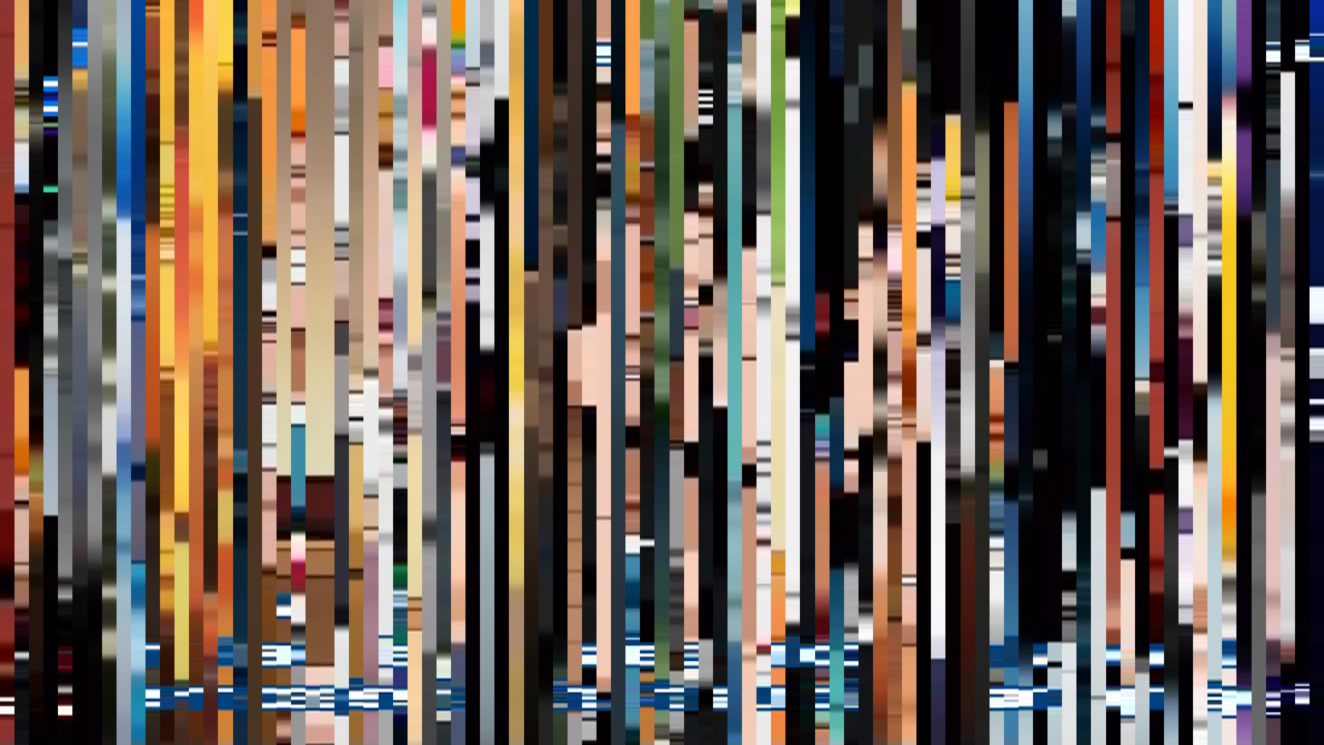
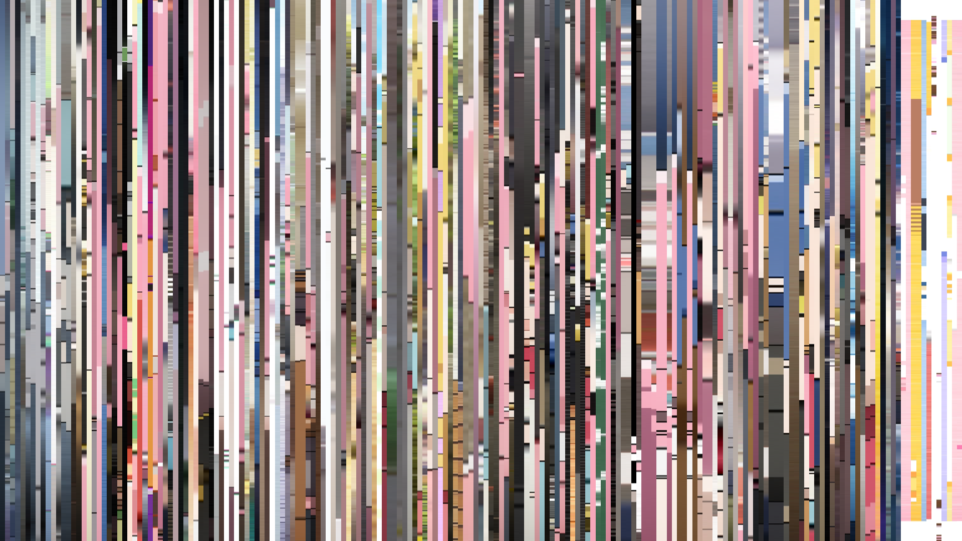
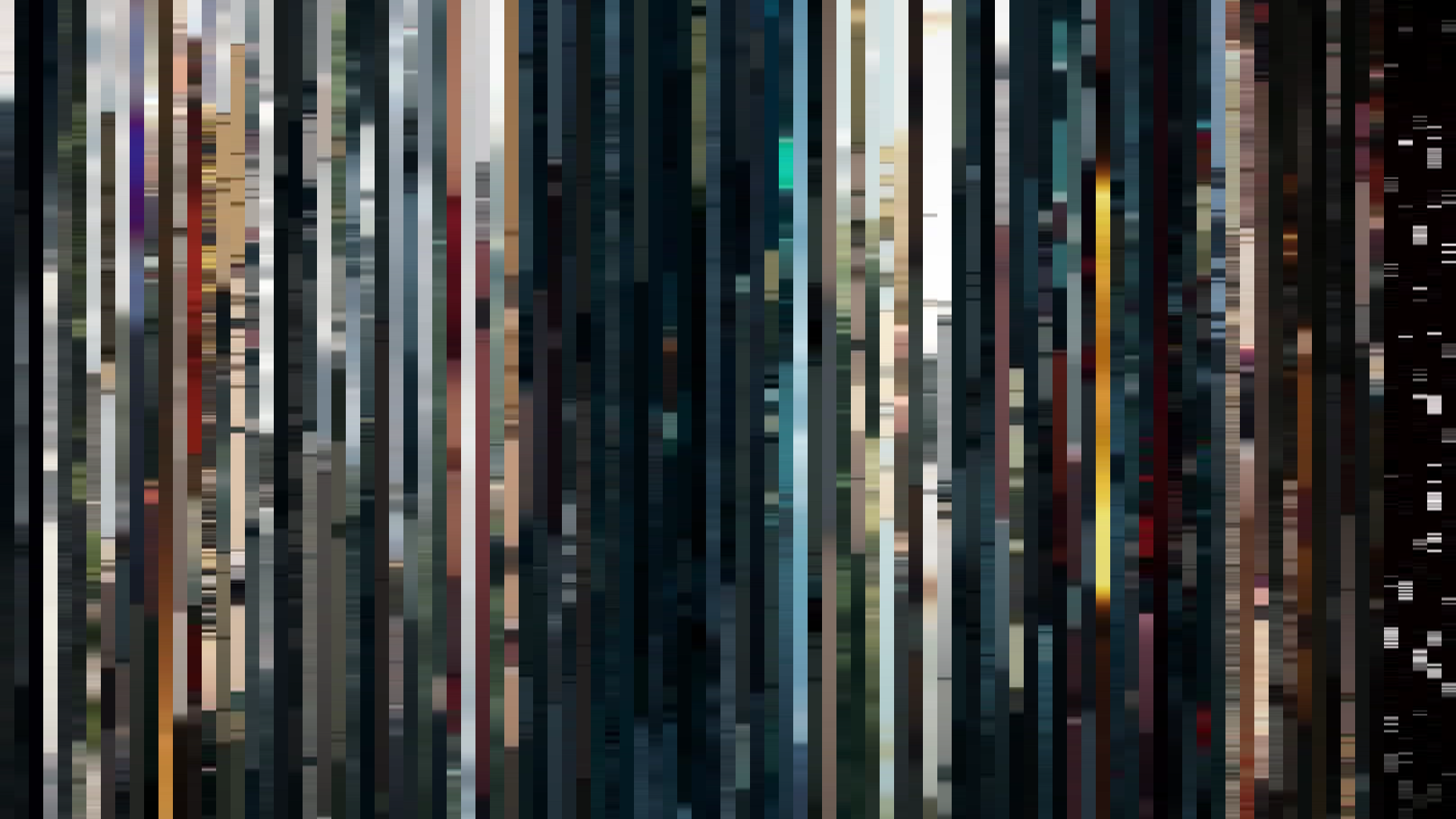
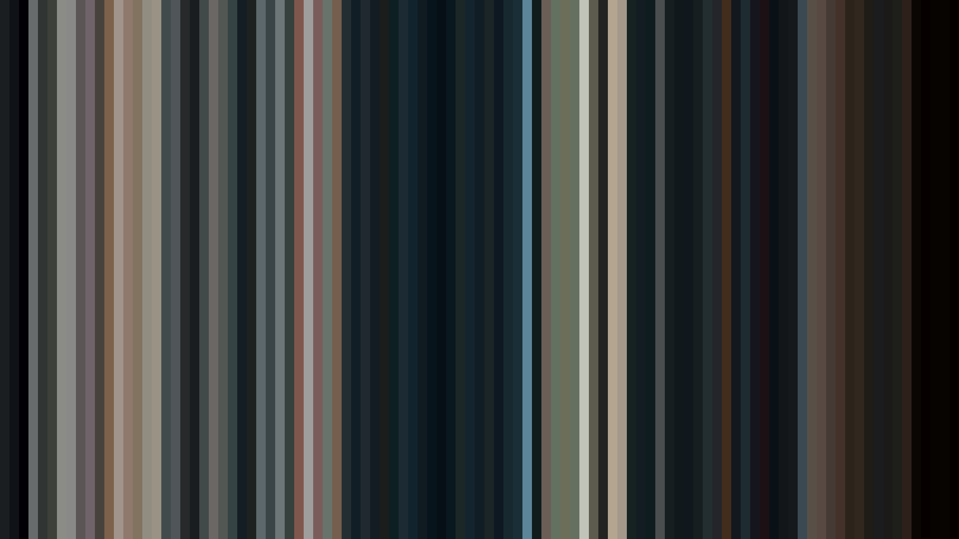
Frame Density Comparison — every 2nd vs every 4th frame
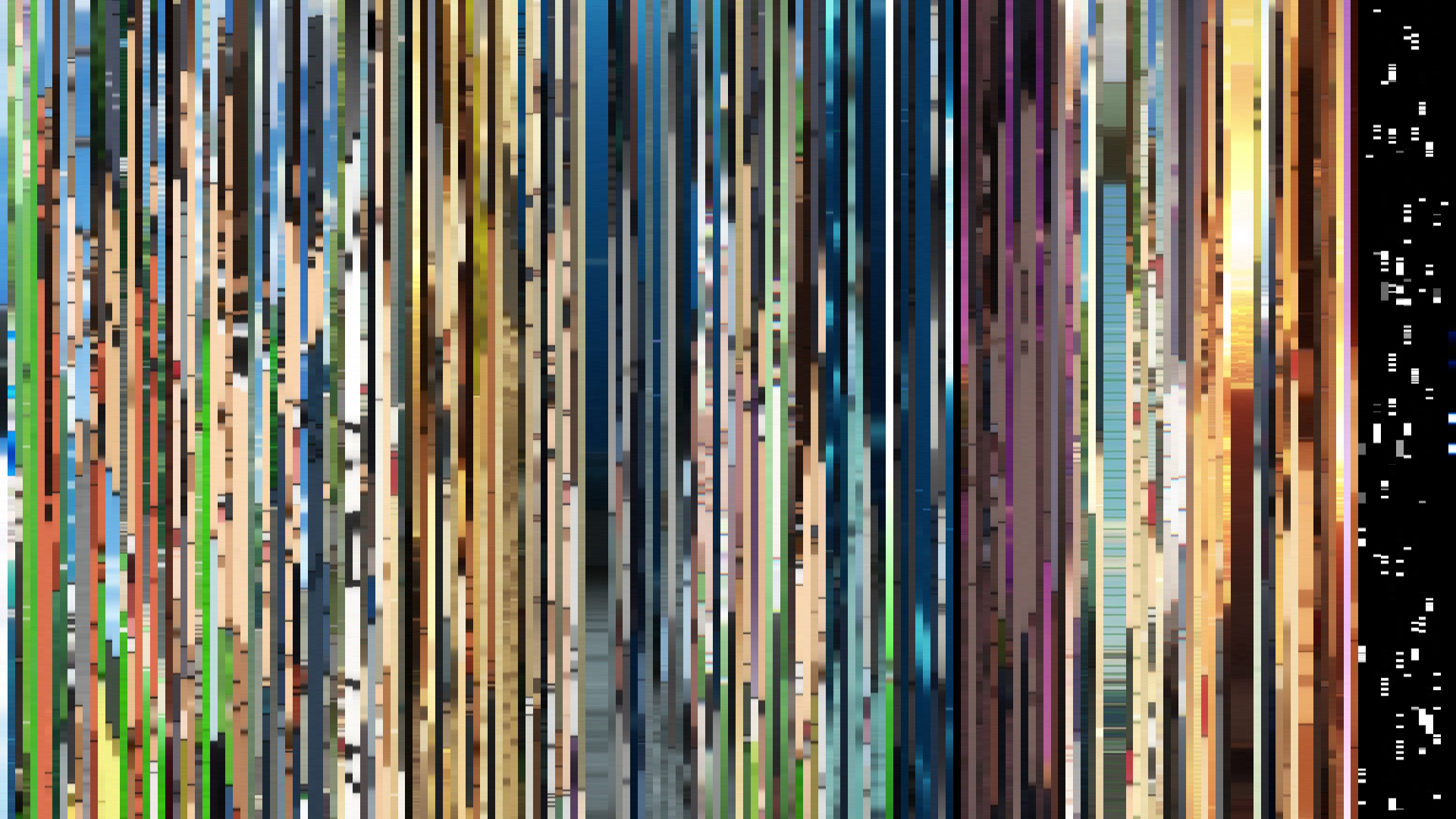
Slice · 15s
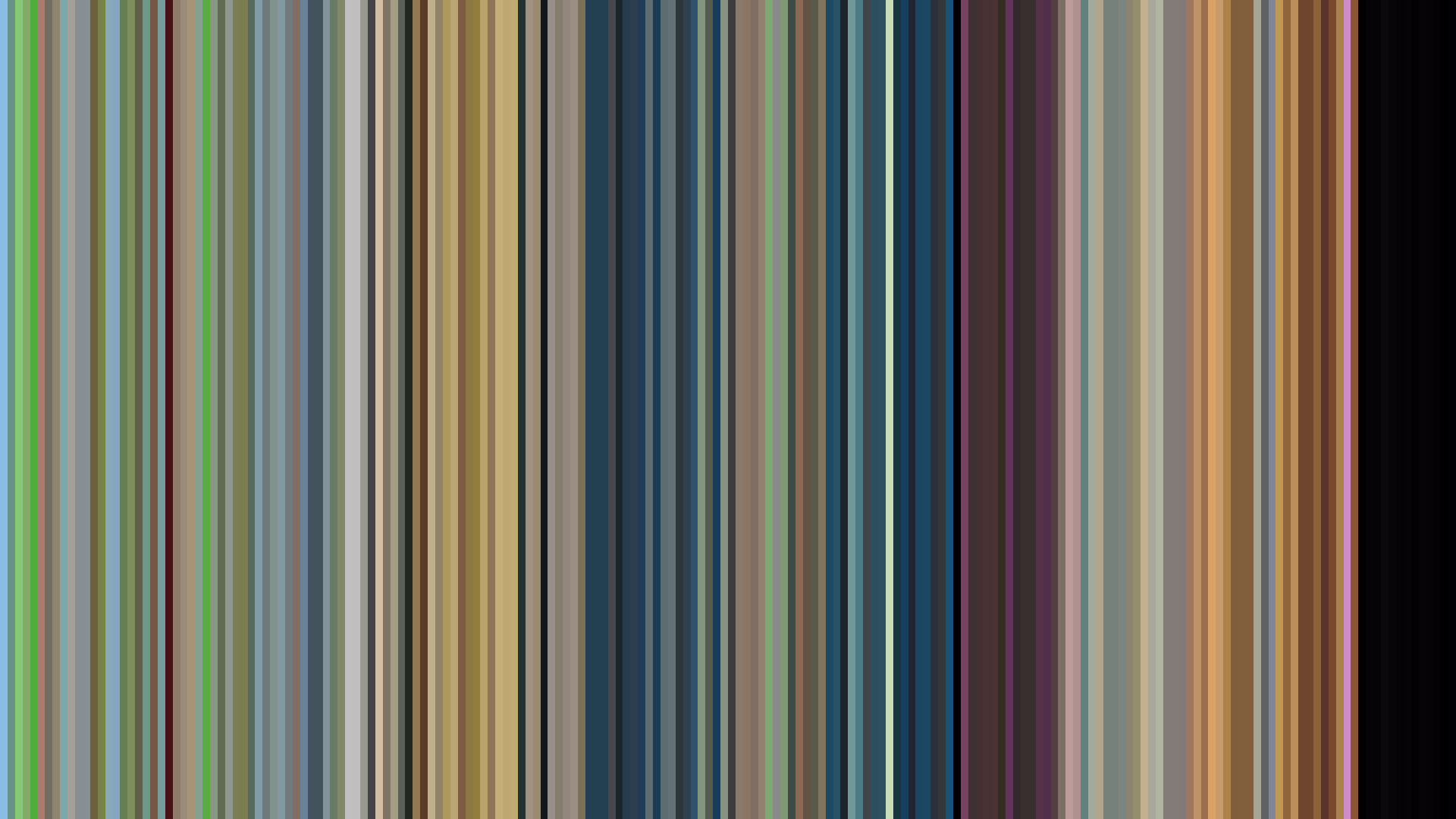
Avg · 15s
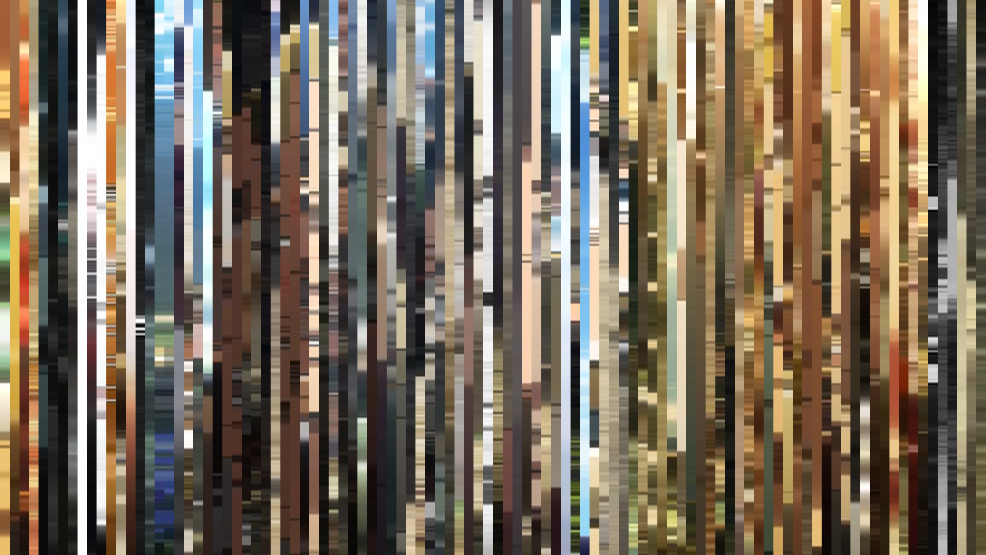
Slice · 30s
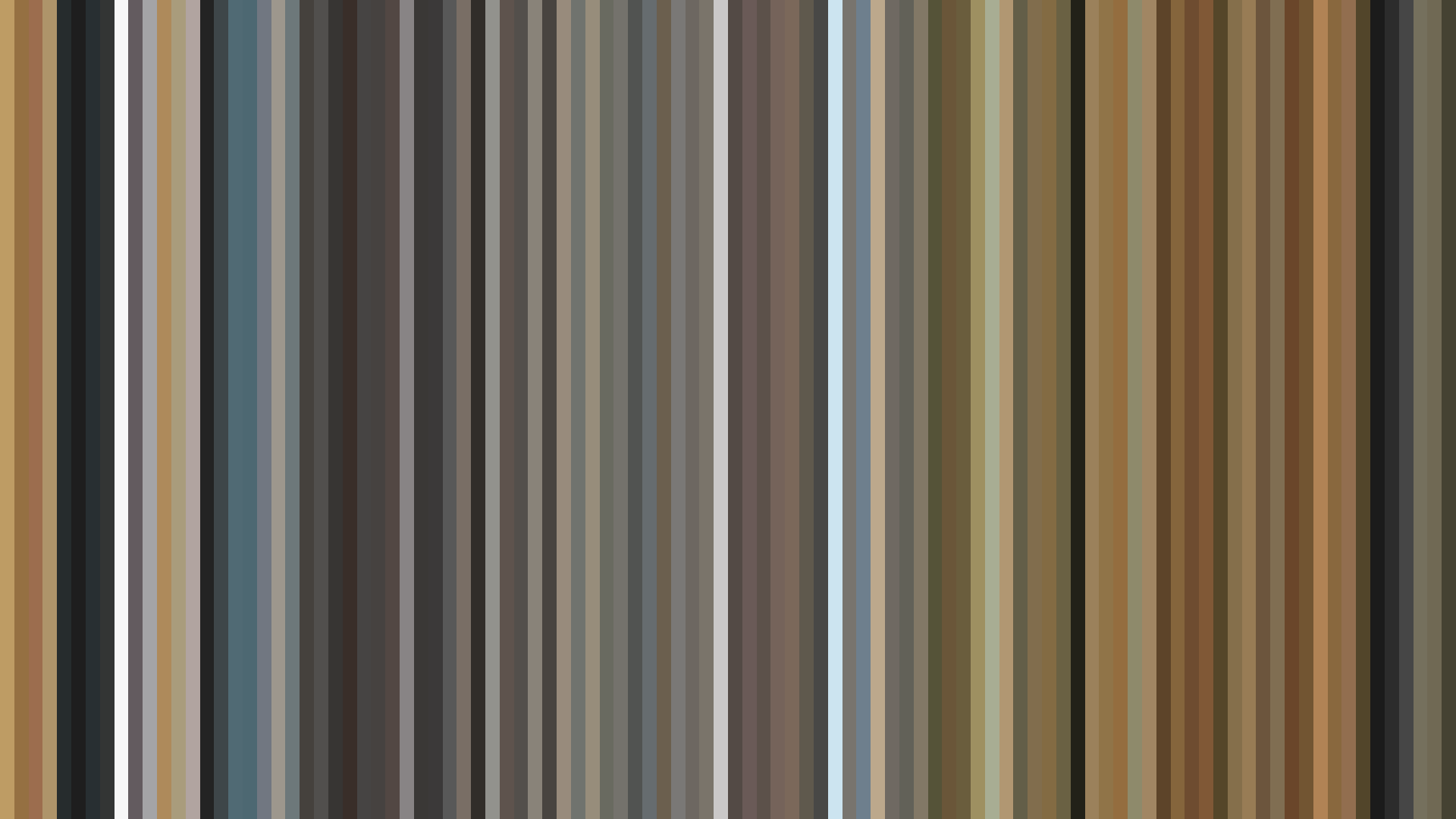
Avg · 30s
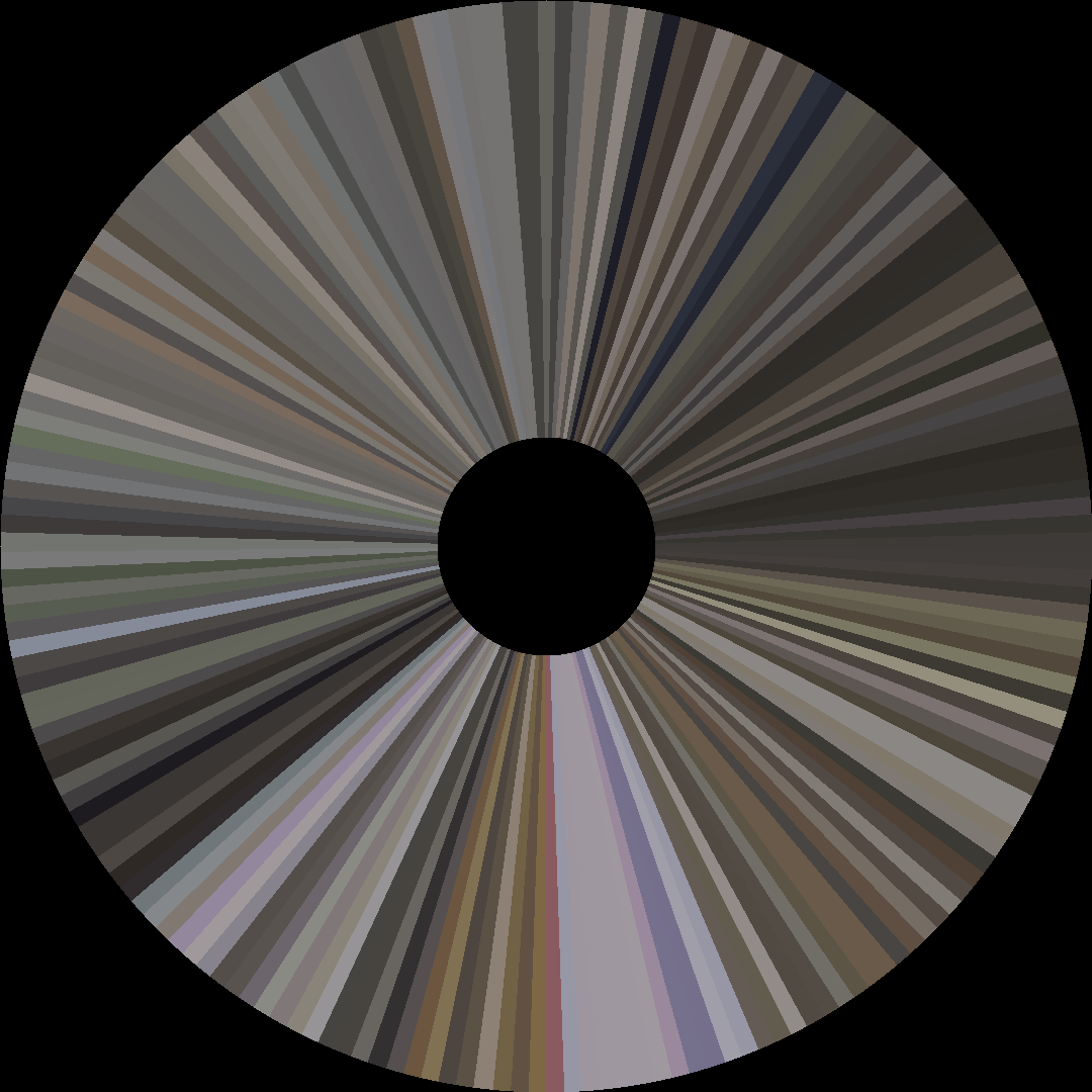
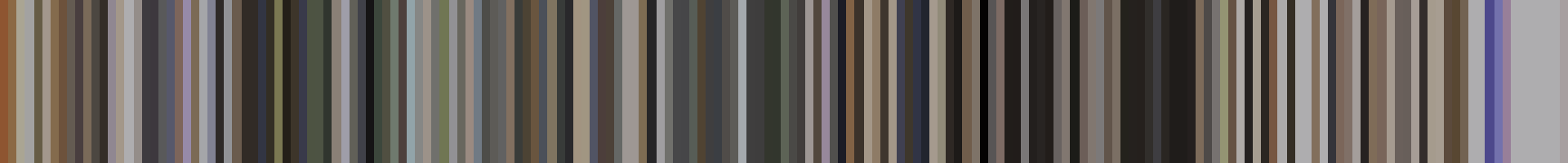
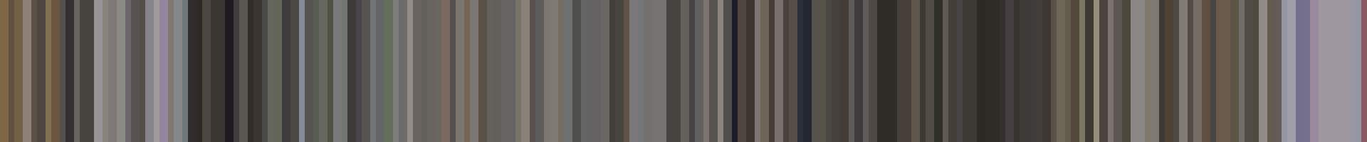
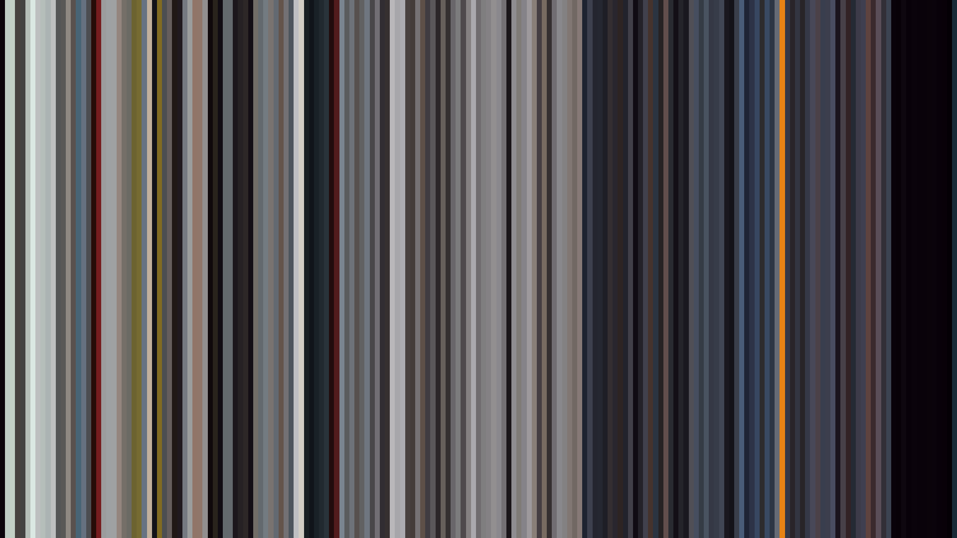
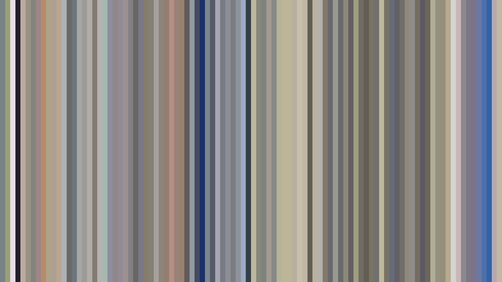
The palette is an exercise in weighted restraint: a Red-dominant core that barely pulses with life because it is mired in earth tones and low saturation. This is not the blazing red of passion or danger; it is the shy red of blushed cheeks against a muted background. The brightness arc is functionally *flat* — a deliberate visual decision by director Keisuke Shinohara and CloverWorks to ground the series in a safe, unchanging emotional temperature. There is no fall into darkness, no triumphant light flare. The opening, middle, and closing acts hover within a tight band of mid-grey, giving the show the feeling of a bubble that never pops. Even the cosplay creations, which could erupt in vibrant primaries, are absorbed into the show’s overall earthiness. The dominance of Red-Orange (38%) alongside the primary Red is telling: this is a color story of warmth without heat, of blush without fever. The *steady hum* of the brightness data perfectly mirrors a romance built on cautious sincerity rather than dramatic upheaval. Where another series would chase visual fireworks, *My Dress-Up Darling* stays in the comfortable glow of incandescent light — a romance that glows but never burns.
Brightness Arc (episode progression)
Hue Distribution
Act Breakdown
Opening
0.538
Middle
0.510
Closing
0.549
Avg Brightness
0.371
Avg Saturation
0.136
Warmth
0.521
Color Palette
#615C57
#2B2826
#9C9998
#514739
#857468
#918775
#443B34
#6D6A8C
3-Act Color Story
Opening
Middle
Closing
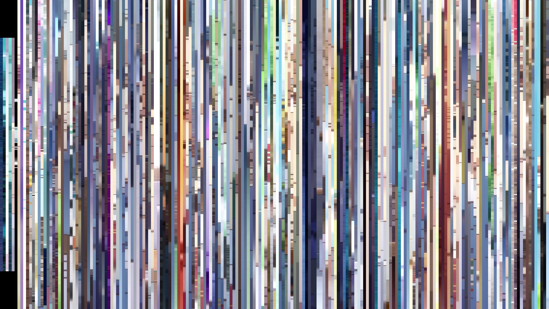
Color Twins
Perceptually nearest palettes — measured in OKLab space, not RGB


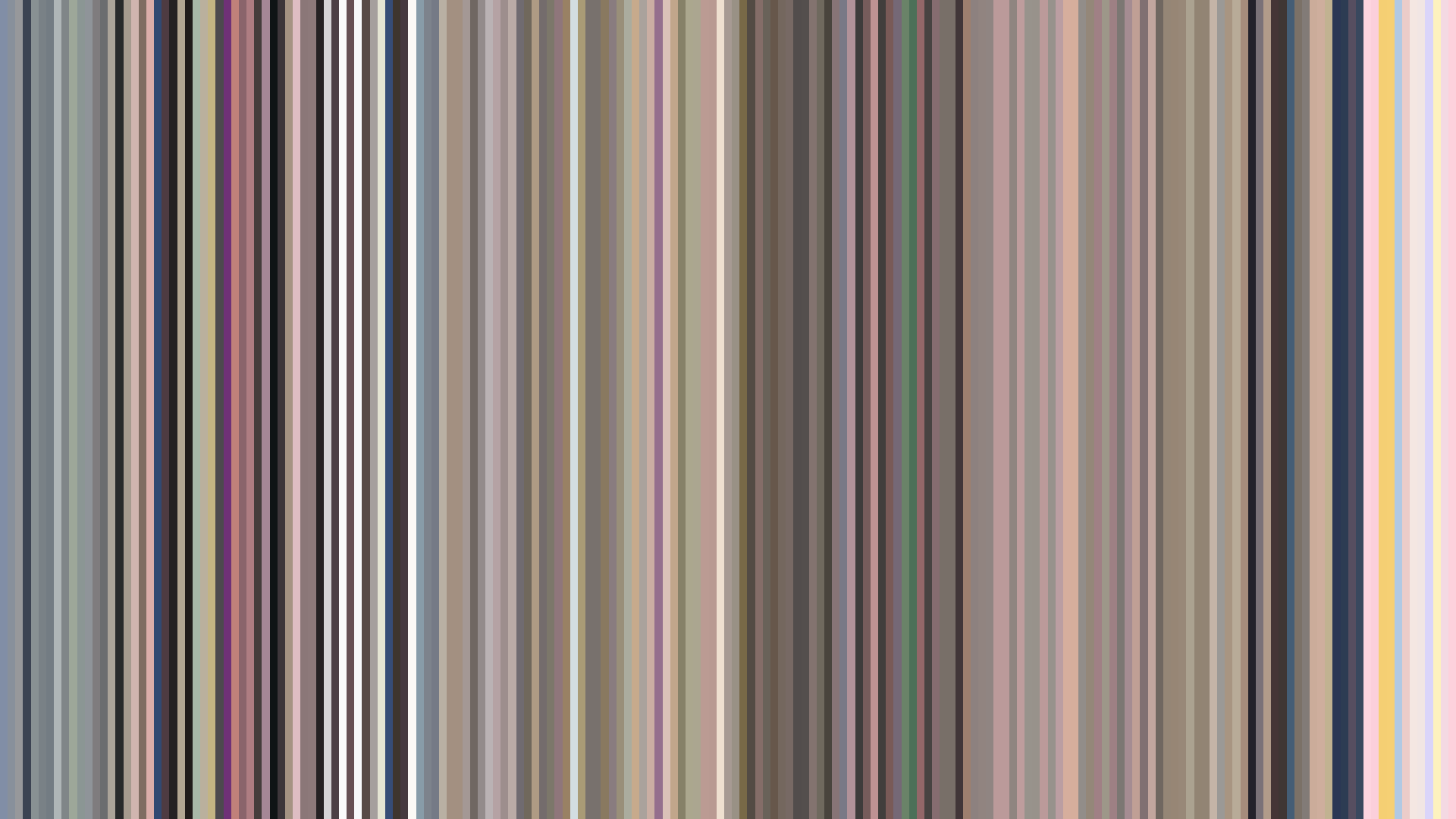
The palette is an exercise in weighted restraint: a Red-dominant core that barely pulses with life because it is mired in earth tones and low saturation. This is not the blazing red of passion or danger; it is the shy red of blushed cheeks against a muted background. The brightness arc is functionally *flat* — a deliberate visual decision by director Keisuke Shinohara and CloverWorks to ground the series in a safe, unchanging emotional temperature. There is no fall into darkness, no triumphant light flare. The opening, middle, and closing acts hover within a tight band of mid-grey, giving the show the feeling of a bubble that never pops. Even the cosplay creations, which could erupt in vibrant primaries, are absorbed into the show’s overall earthiness. The dominance of Red-Orange (38%) alongside the primary Red is telling: this is a color story of warmth without heat, of blush without fever. The *steady hum* of the brightness data perfectly mirrors a romance built on cautious sincerity rather than dramatic upheaval. Where another series would chase visual fireworks, *My Dress-Up Darling* stays in the comfortable glow of incandescent light — a romance that glows but never burns.