Edit Pace — frame-to-frame color delta (bright = fast cuts)
Color Temperature — warm (gold) vs cool (teal) per frame
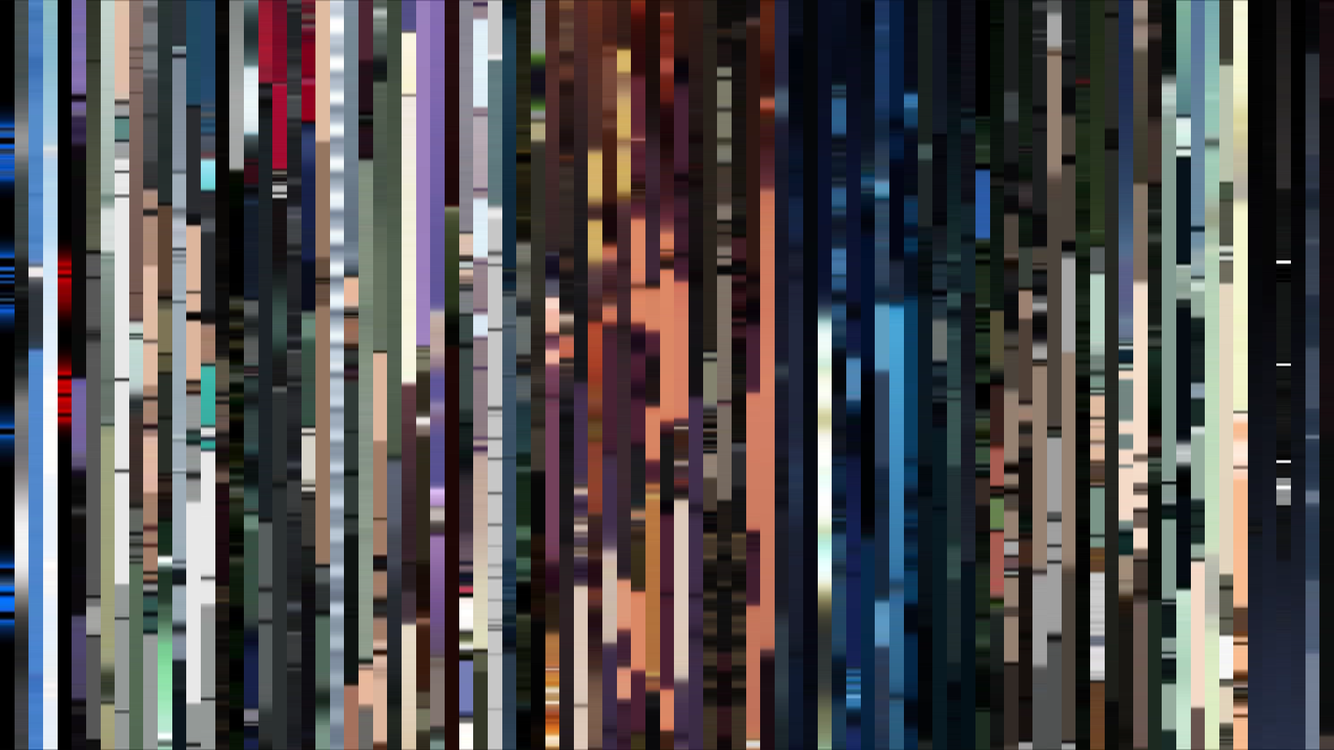
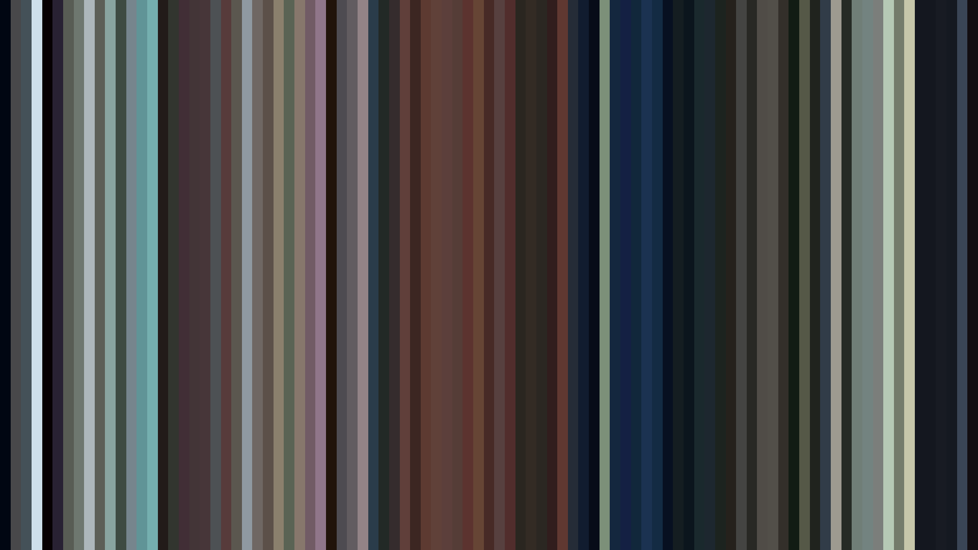
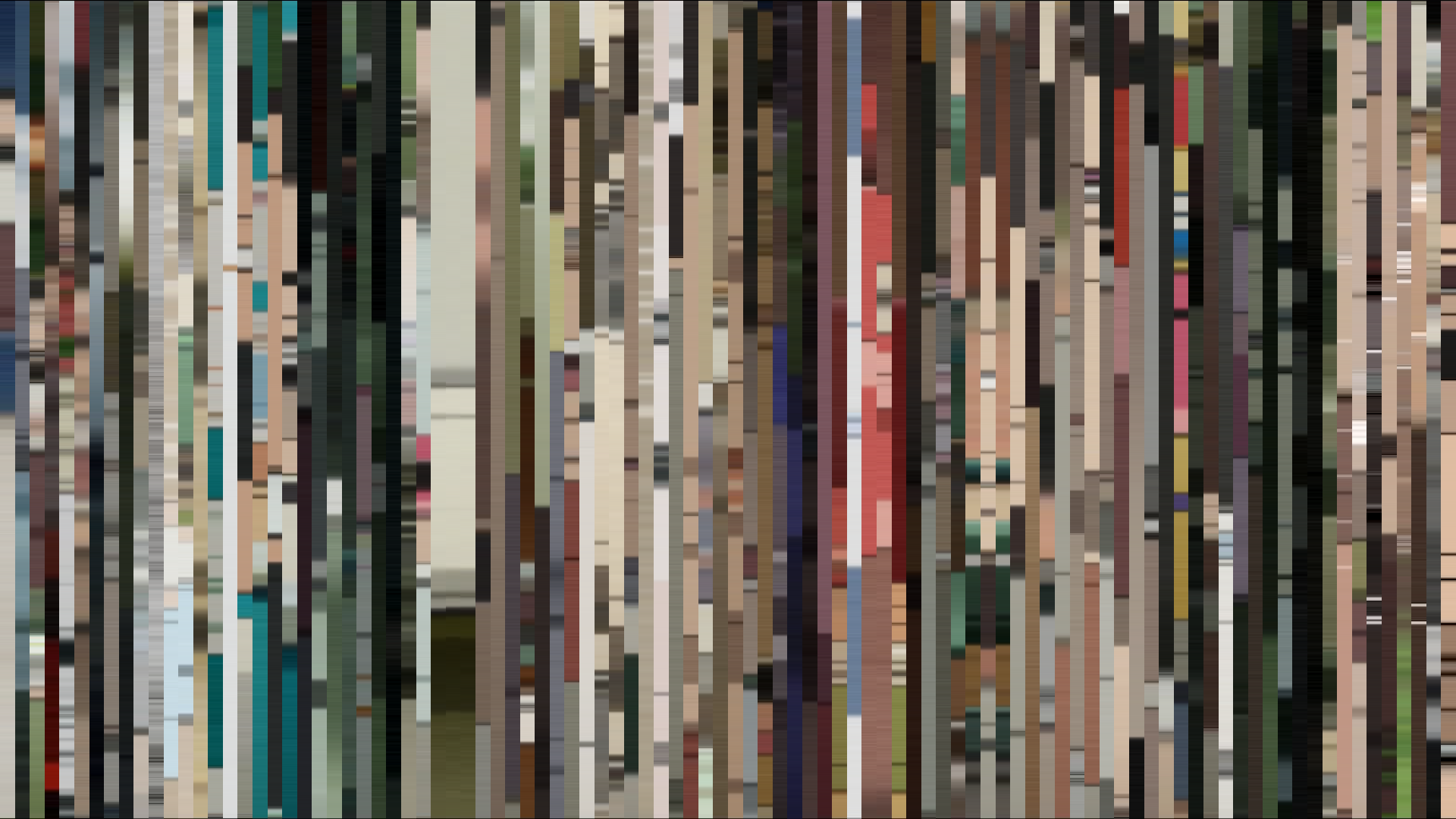
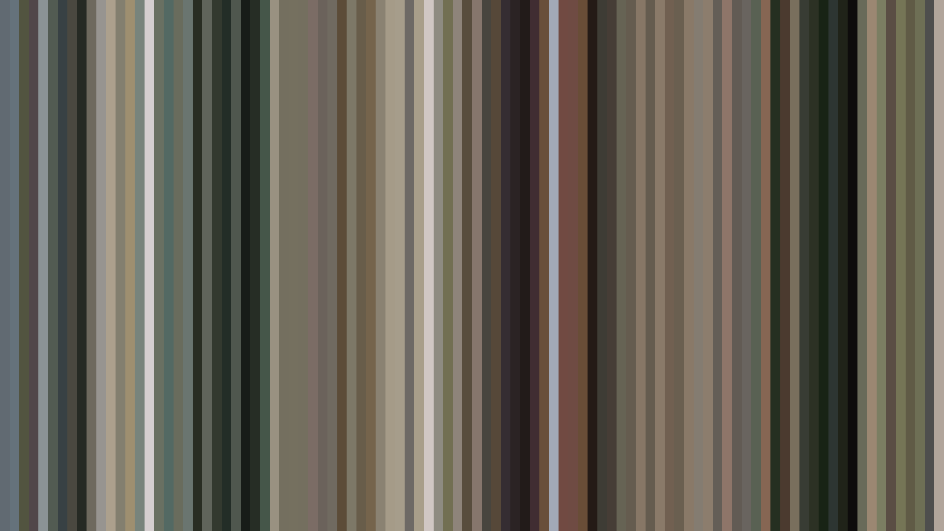
Frame Density Comparison — every 2nd vs every 4th frame
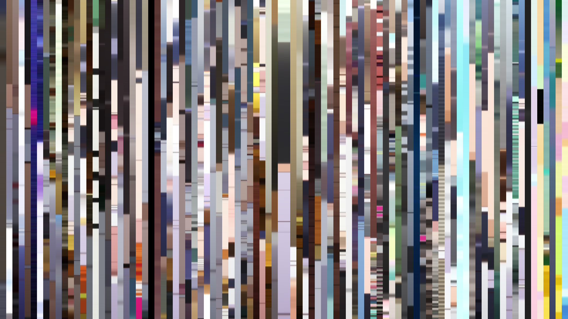
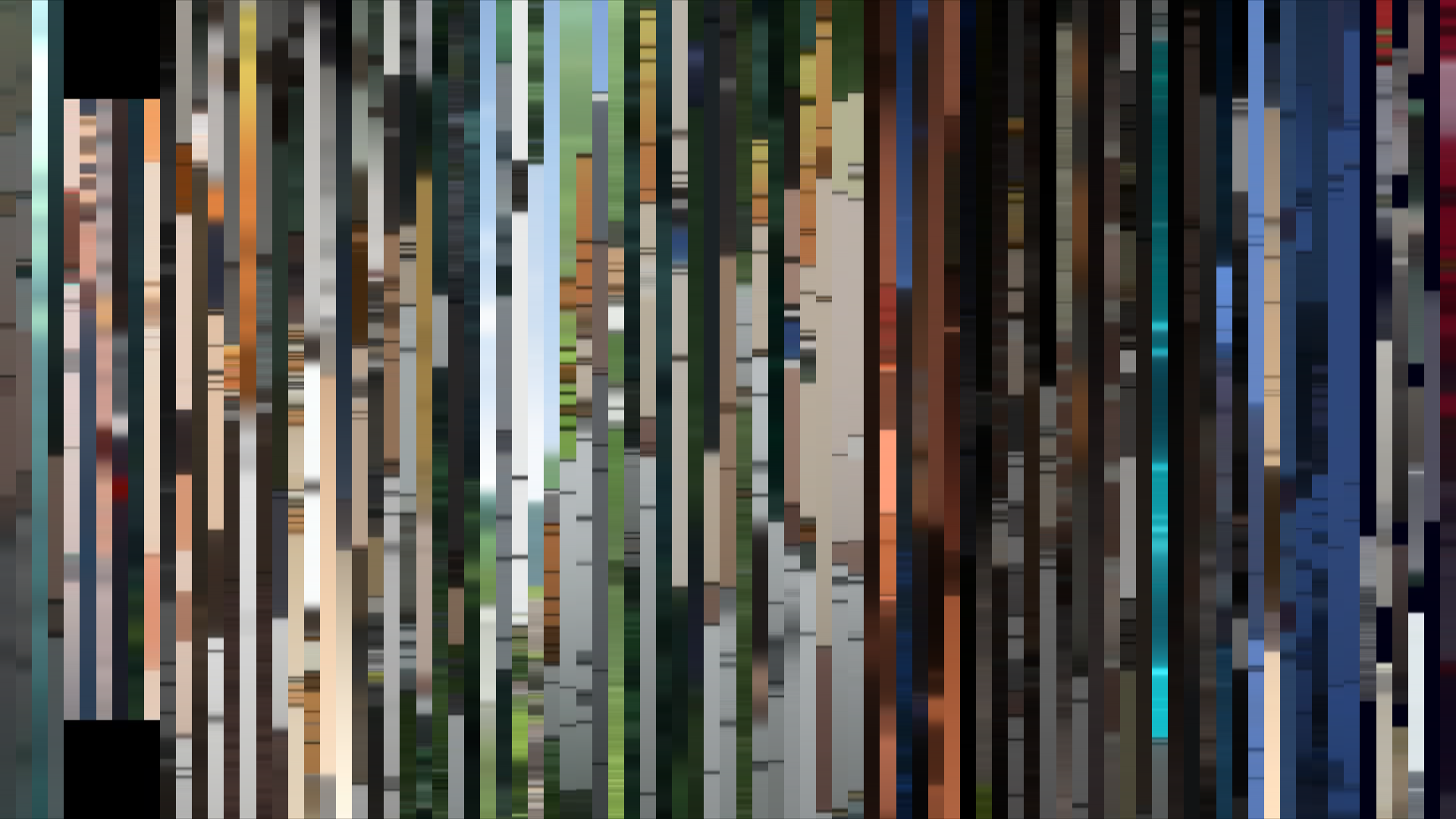
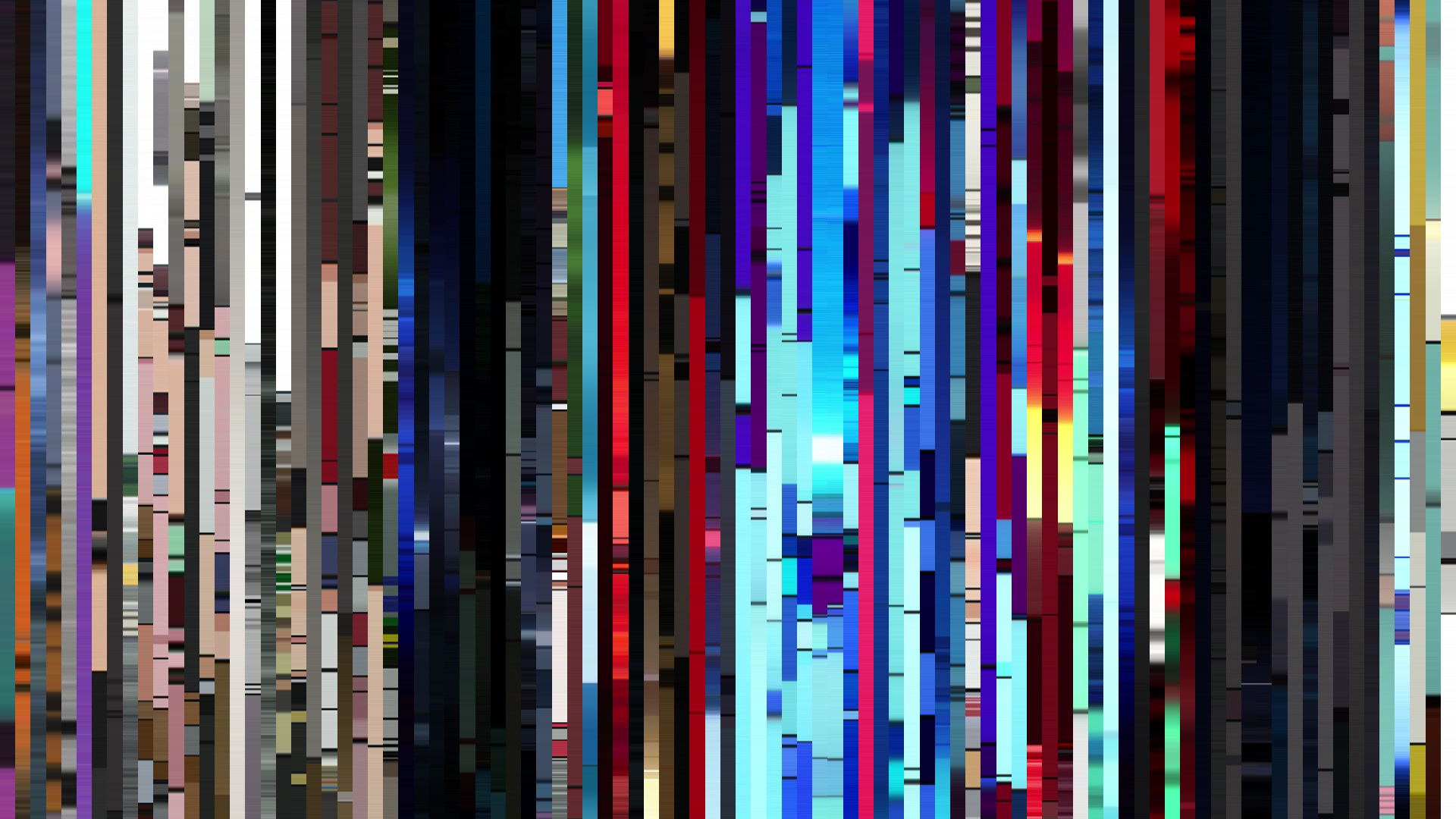
Slice · 15s
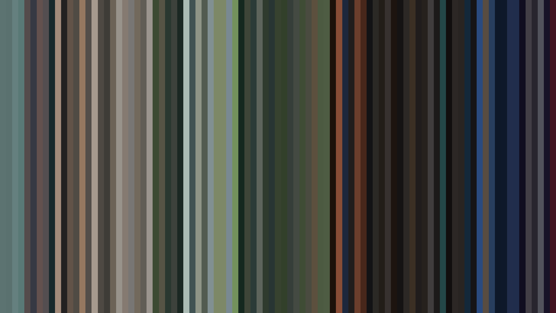
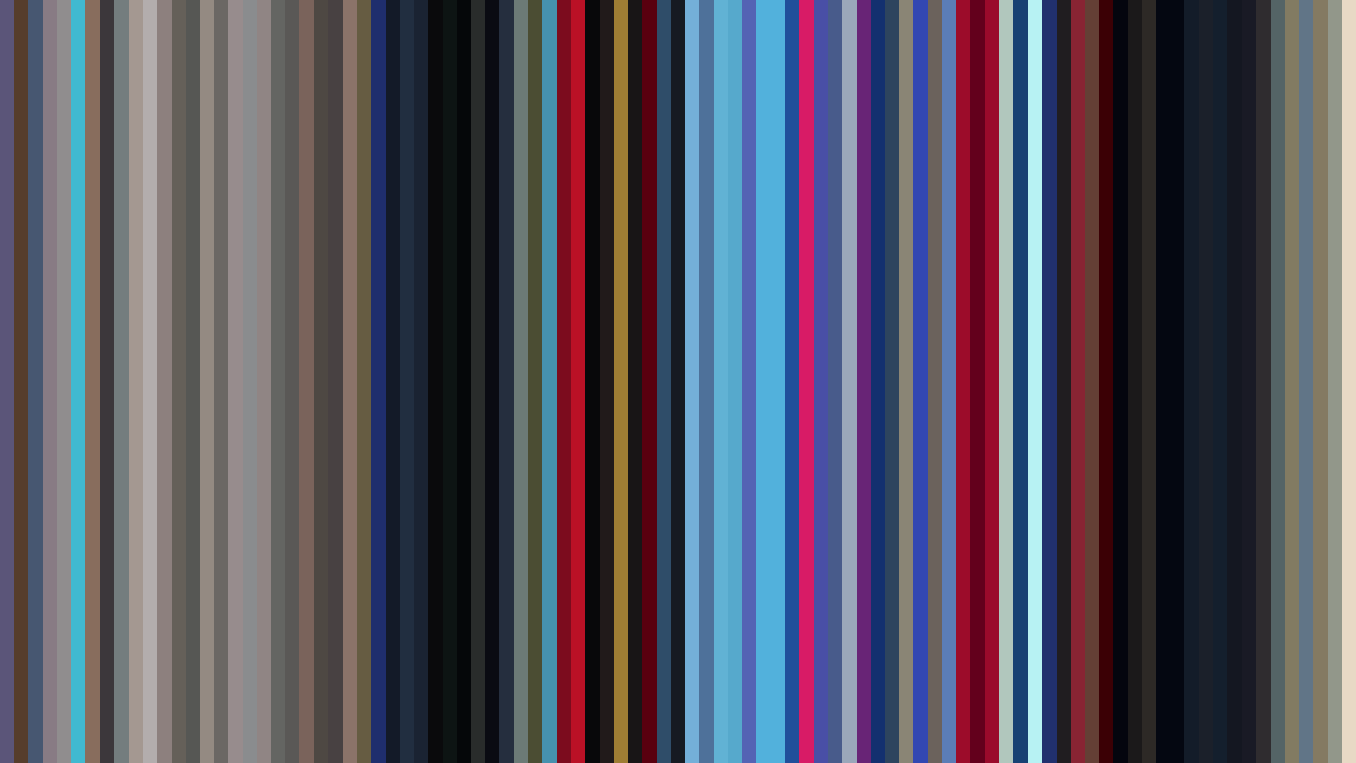
Avg · 15s
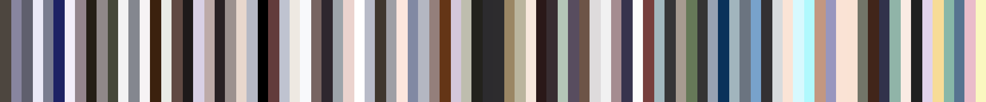
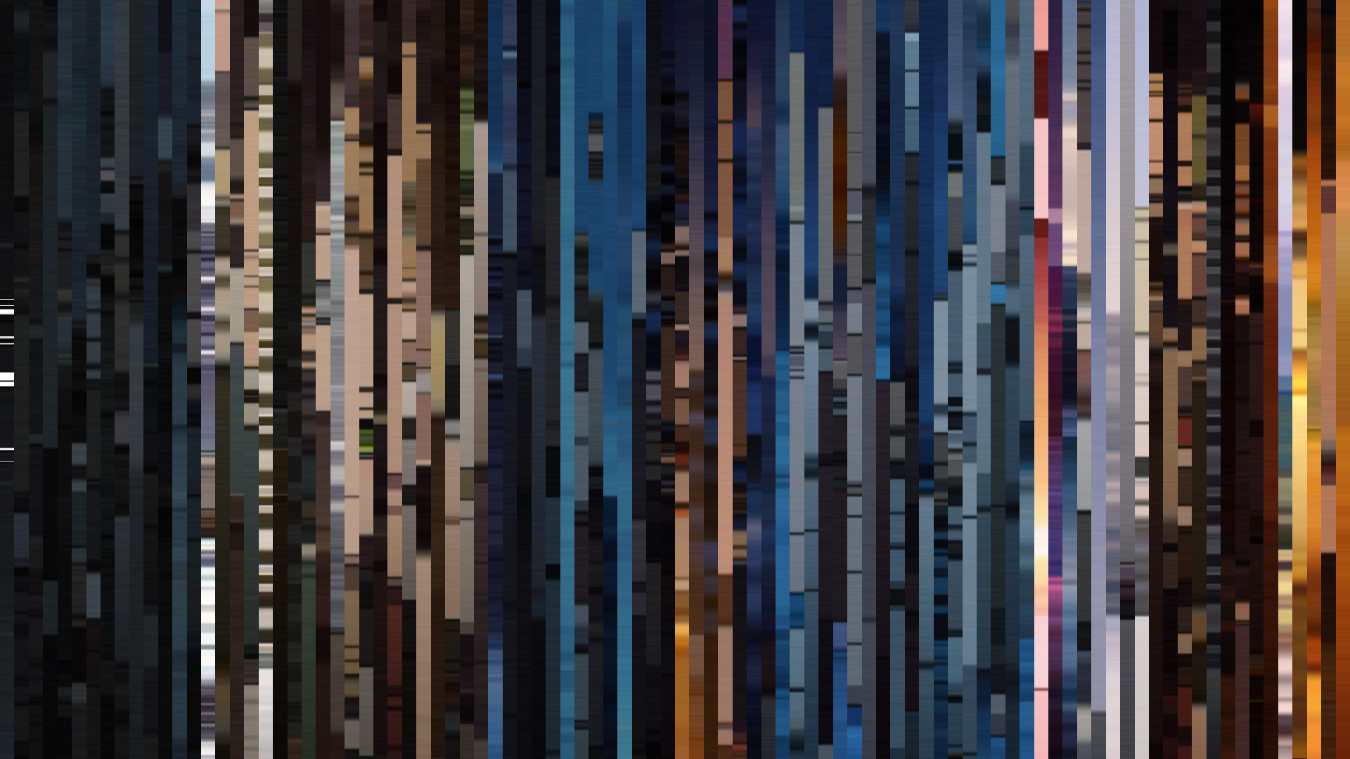
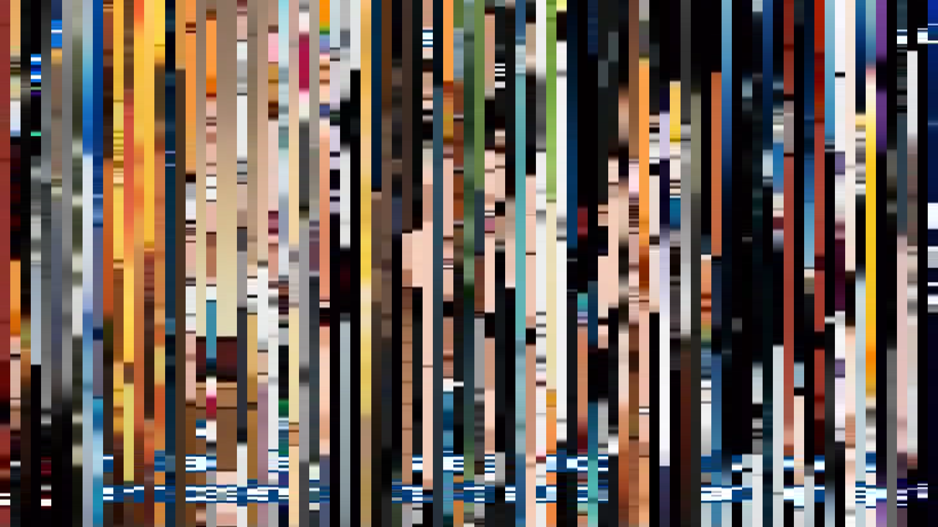
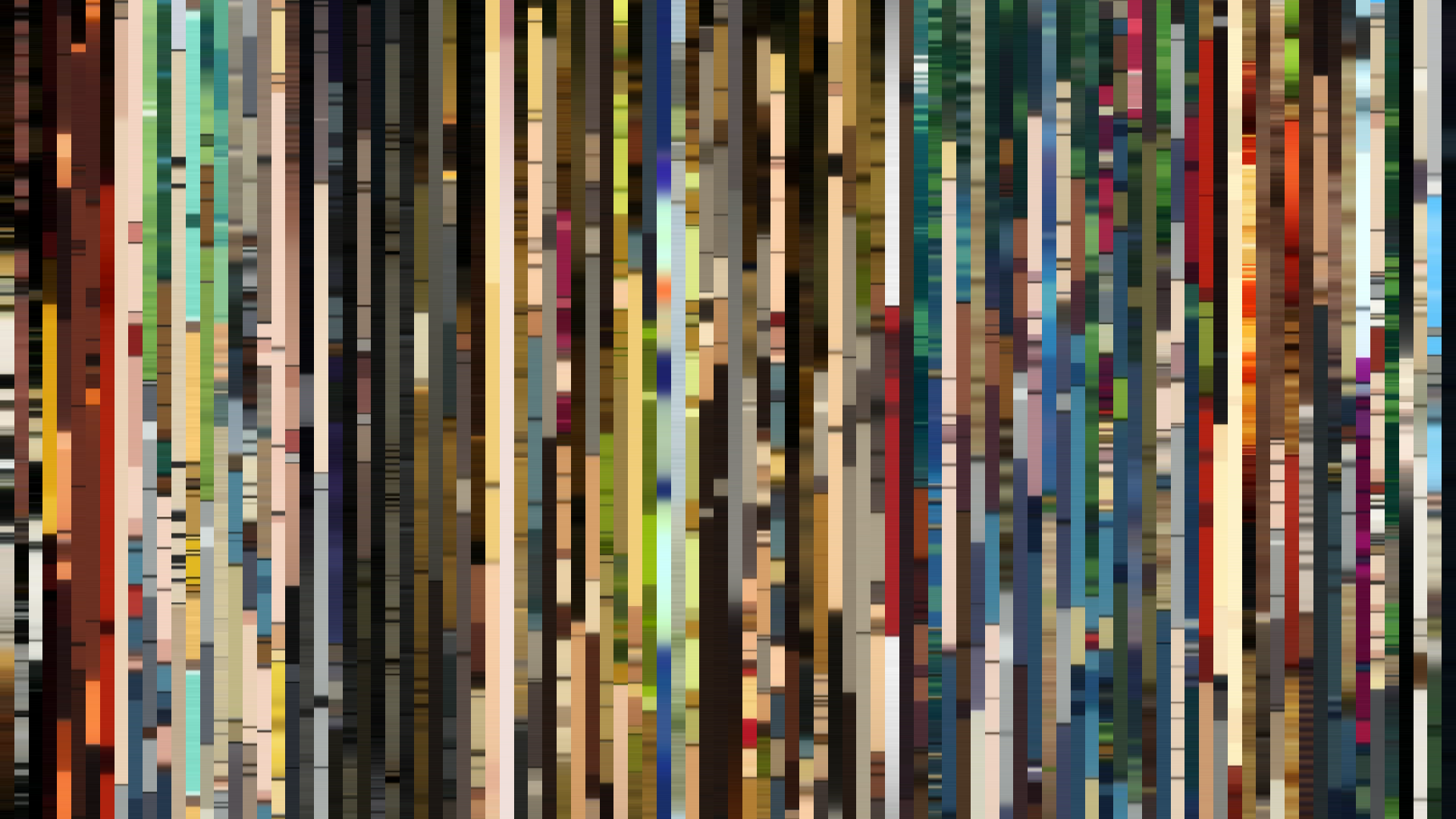
Slice · 30s
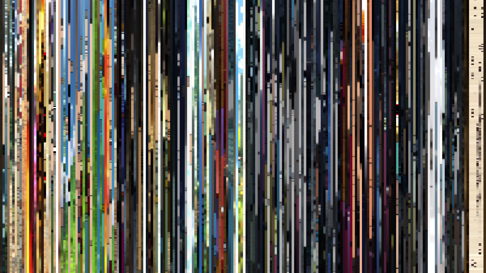
Avg · 30s
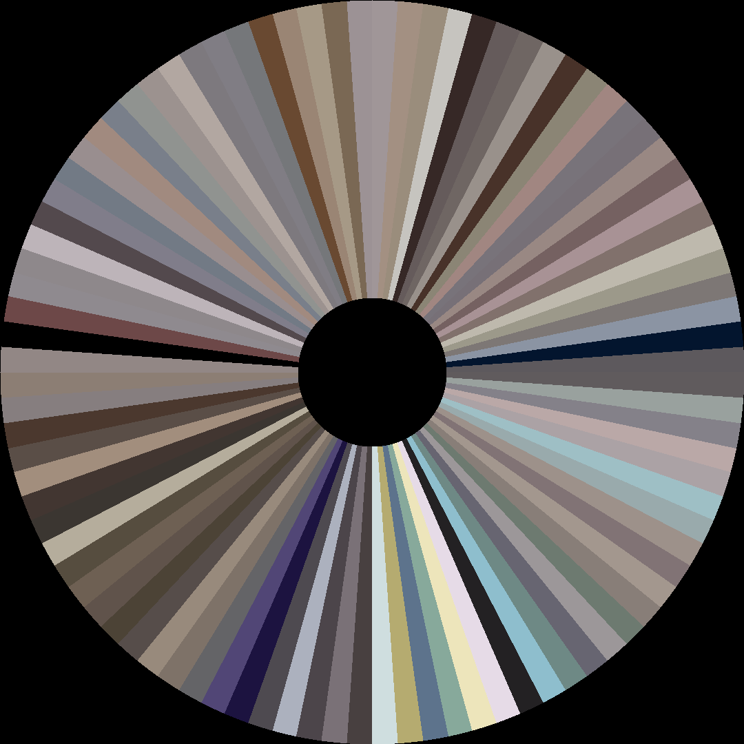
The Dangers in My Heart Season 2 unfolds along a *rising arc* so steady it feels less like narrative structure and more like atmospheric pressure equalizing. Where most romance anime overload the frame with cherry-blossom pinks and candy-store saturation, this series—produced by Shin-Ei Animation—keeps its Red dominance aggressively desaturated, barely above 0.15 saturation across all 13 episodes. That muted palette is the visual signature of anxiety: Kyotaro’s interior world rendered in ash tones and dusty rose, the kind of color that refuses to commit to warmth. But the brightness data tells the real story. The opening act hovers at 0.471, a murky interior-lit gloom that could be school hallways or the inside of a teenager’s skull. By the middle act, that number climbs to 0.561, and by the closing act it hits 0.619—a *bright-ending* that is not a triumphant floodlight but a slow, earned dawn. The shift from #262122 to #E6E3E2 across the season traces not just a relationship, but a permission to be seen. The colors never get loud; they just get real.
Brightness Arc (episode progression)
Hue Distribution
Act Breakdown
Opening
0.471
Middle
0.561
Closing
0.619
Avg Brightness
0.514
Avg Saturation
0.154
Warmth
0.504
Color Palette
#E6E3E2
#5F5A5E
#A09C9F
#262122
#8D6D63
#50332A
#6B718A
#2A2E52
3-Act Color Story
Opening
Middle
Closing
Color Twins
Perceptually nearest palettes — measured in OKLab space, not RGB


The Dangers in My Heart Season 2 unfolds along a *rising arc* so steady it feels less like narrative structure and more like atmospheric pressure equalizing. Where most romance anime overload the frame with cherry-blossom pinks and candy-store saturation, this series—produced by Shin-Ei Animation—keeps its Red dominance aggressively desaturated, barely above 0.15 saturation across all 13 episodes. That muted palette is the visual signature of anxiety: Kyotaro’s interior world rendered in ash tones and dusty rose, the kind of color that refuses to commit to warmth. But the brightness data tells the real story. The opening act hovers at 0.471, a murky interior-lit gloom that could be school hallways or the inside of a teenager’s skull. By the middle act, that number climbs to 0.561, and by the closing act it hits 0.619—a *bright-ending* that is not a triumphant floodlight but a slow, earned dawn. The shift from #262122 to #E6E3E2 across the season traces not just a relationship, but a permission to be seen. The colors never get loud; they just get real.