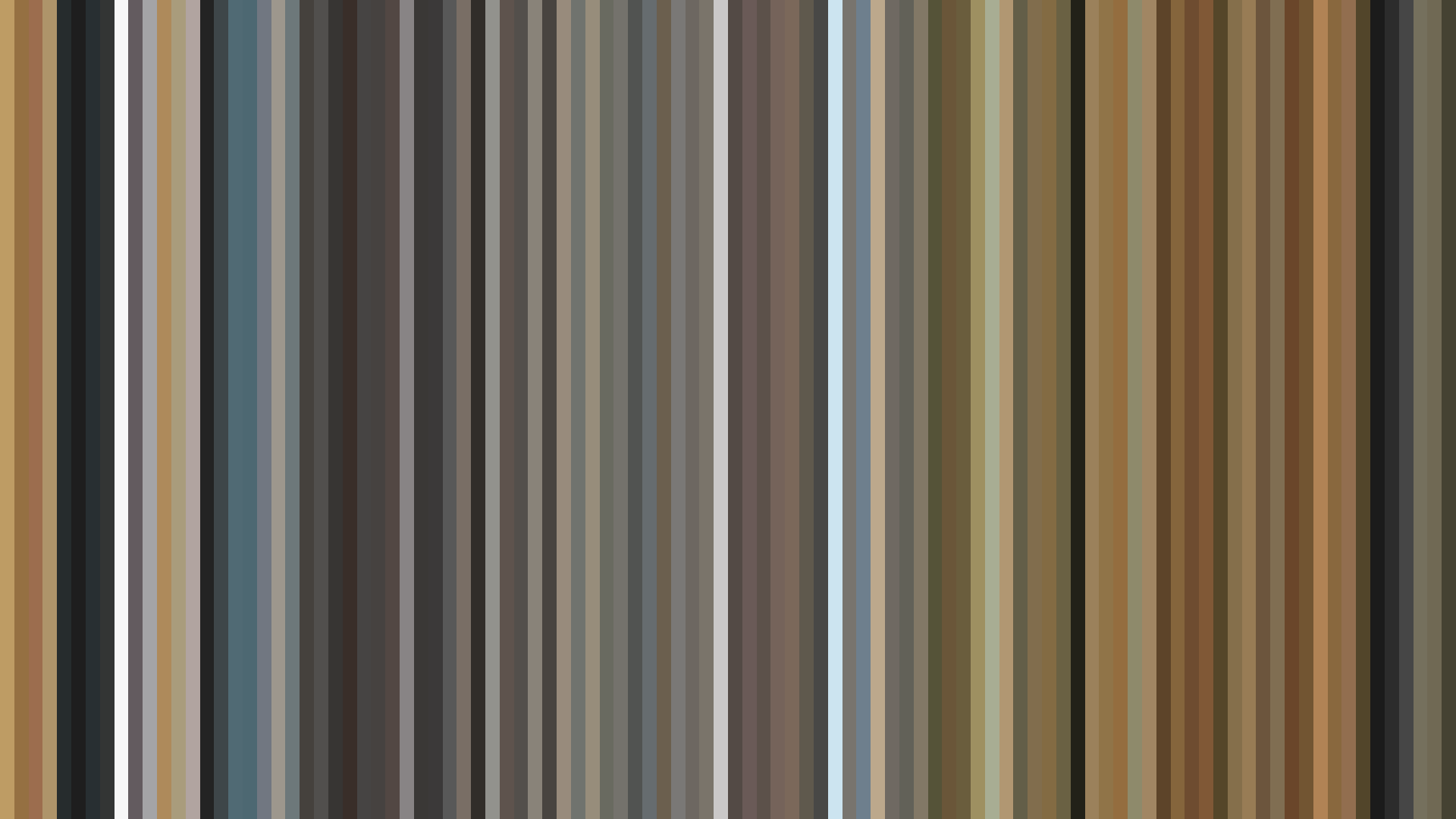
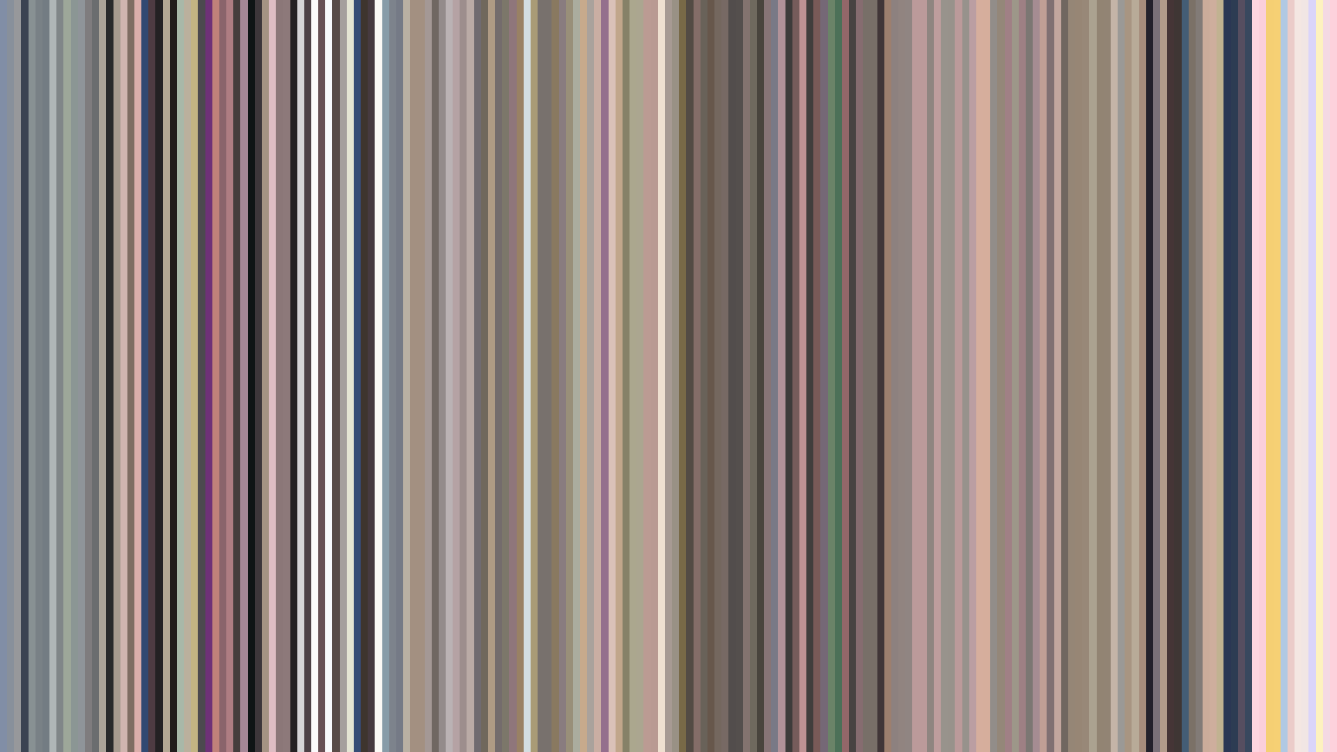
Edit Pace — frame-to-frame color delta (bright = fast cuts)
Color Temperature — warm (gold) vs cool (teal) per frame
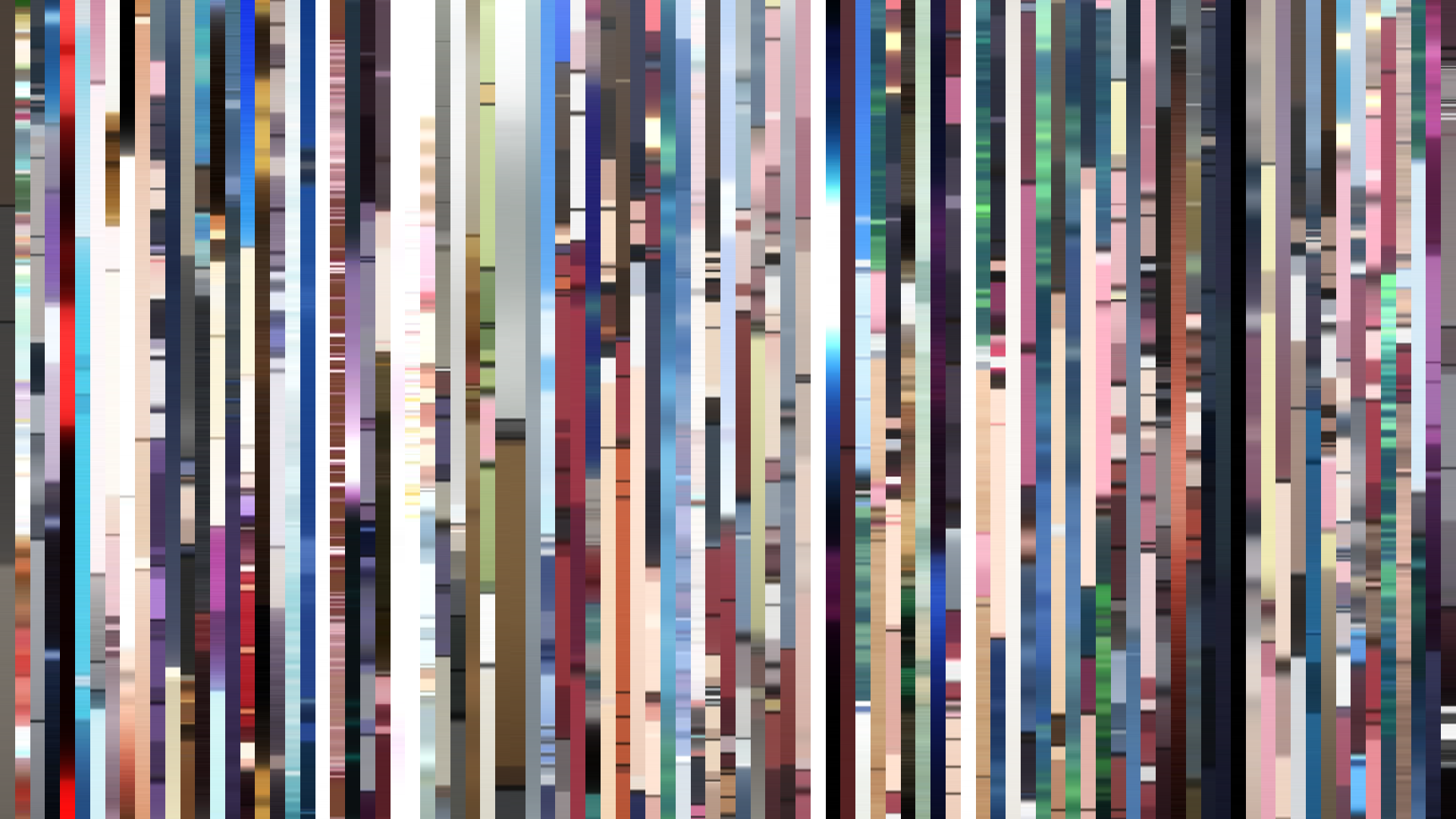
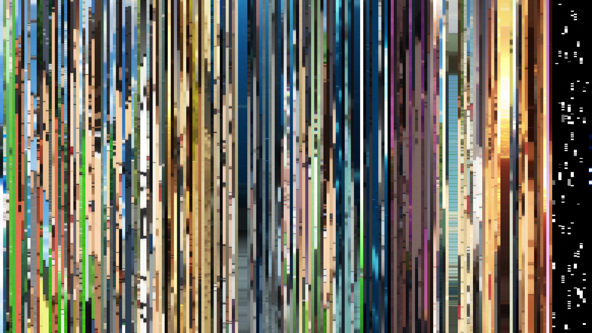
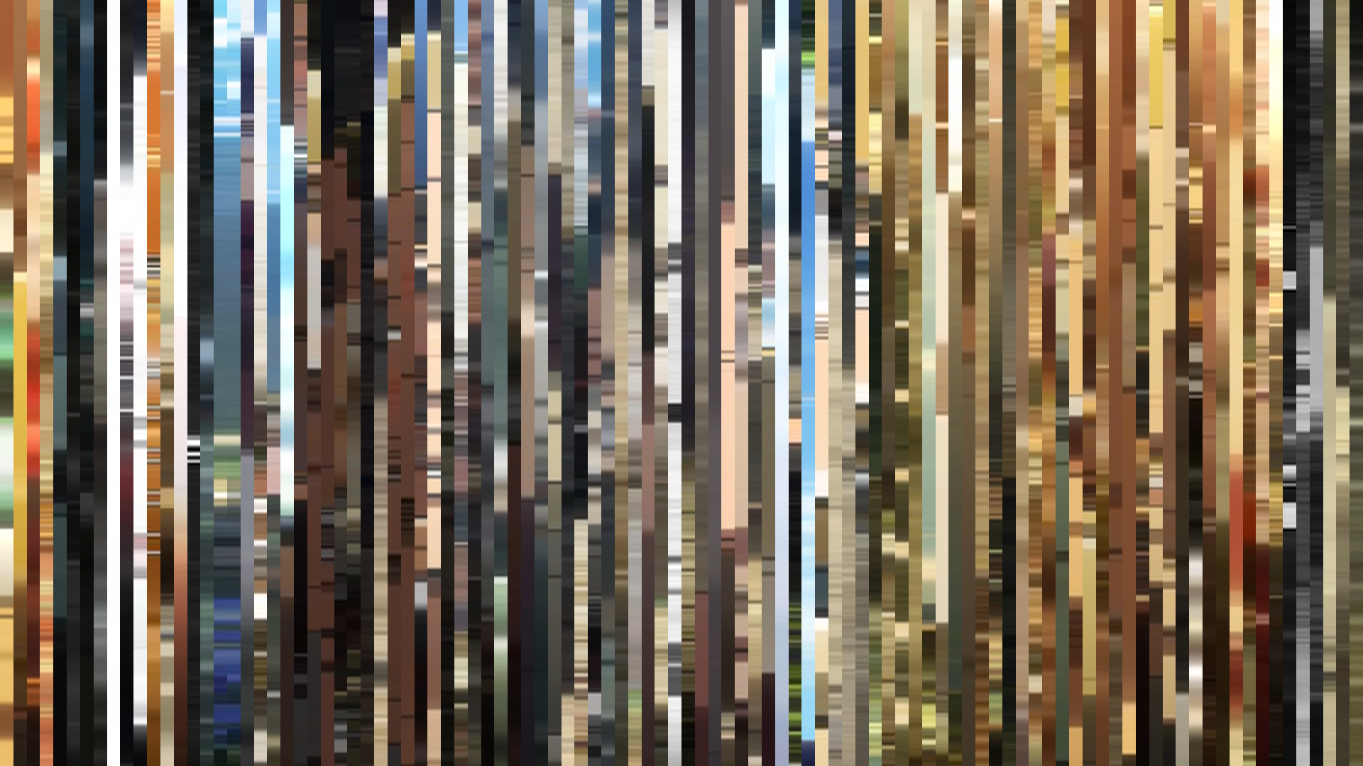
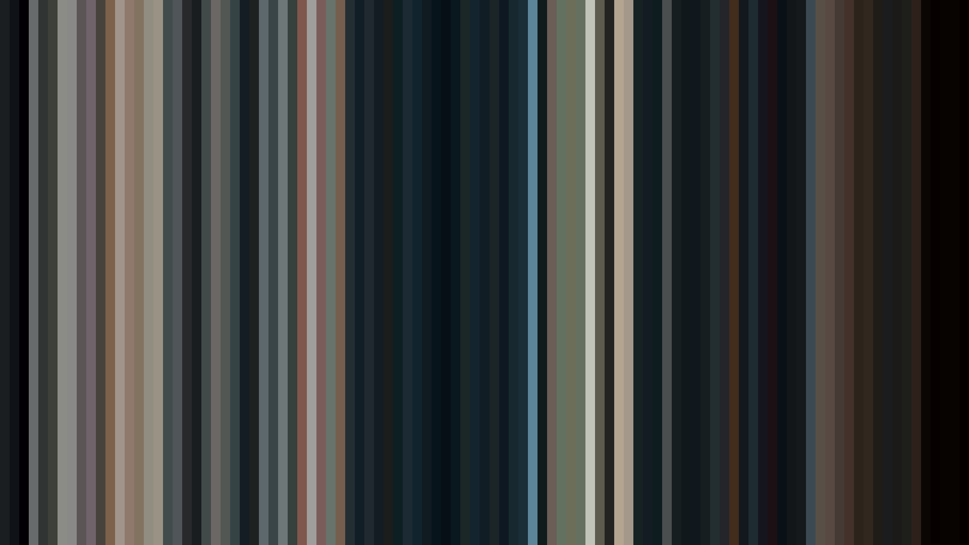
Frame Density Comparison — every 2nd vs every 4th frame
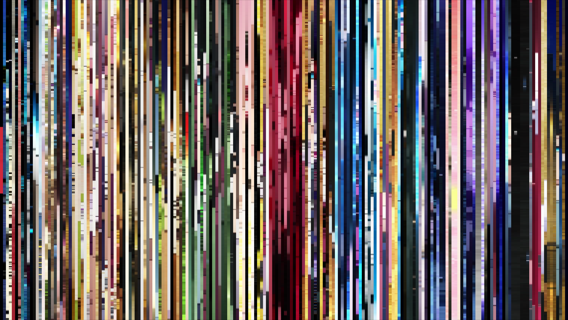
Slice · 15s
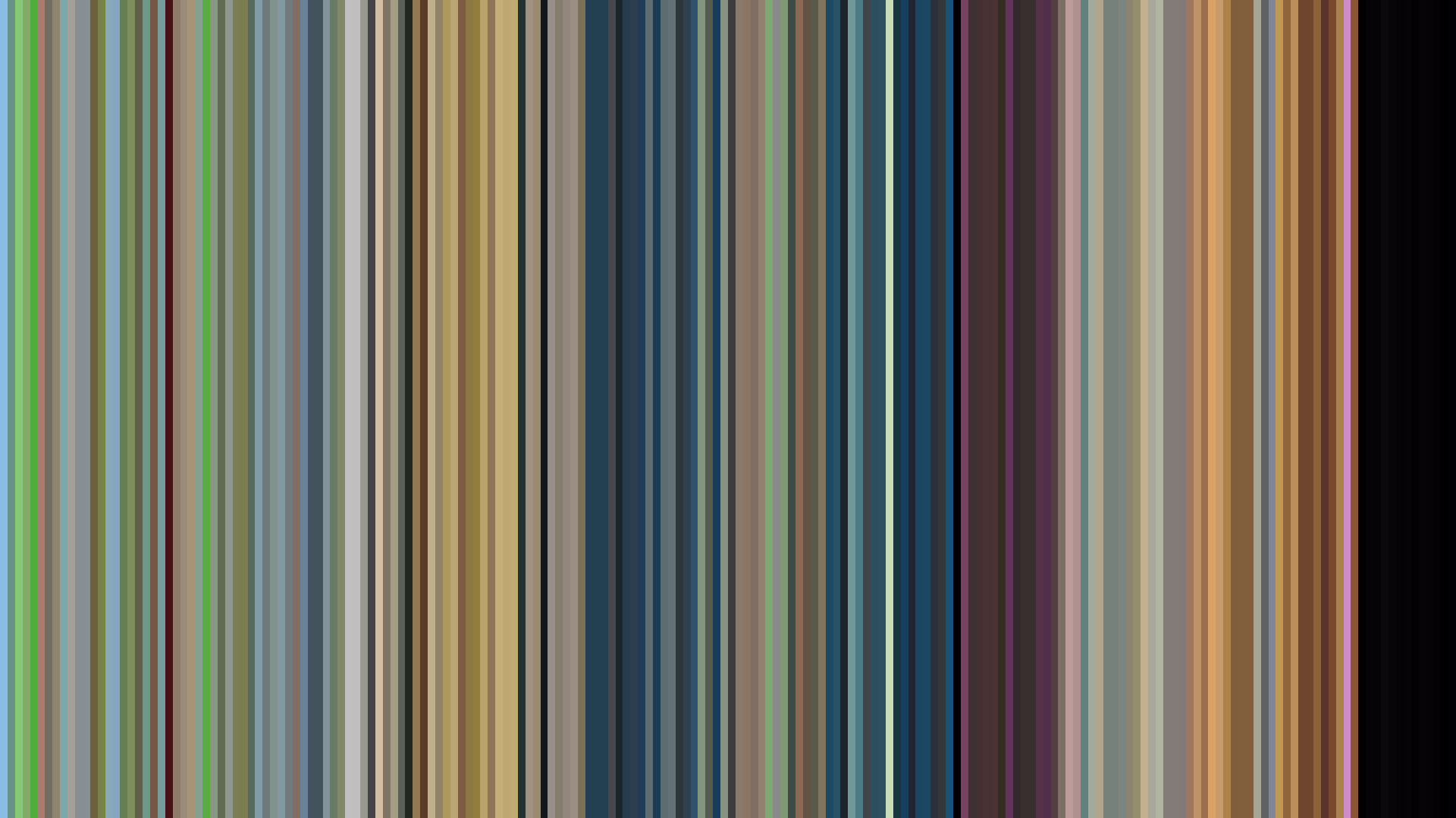
Avg · 15s
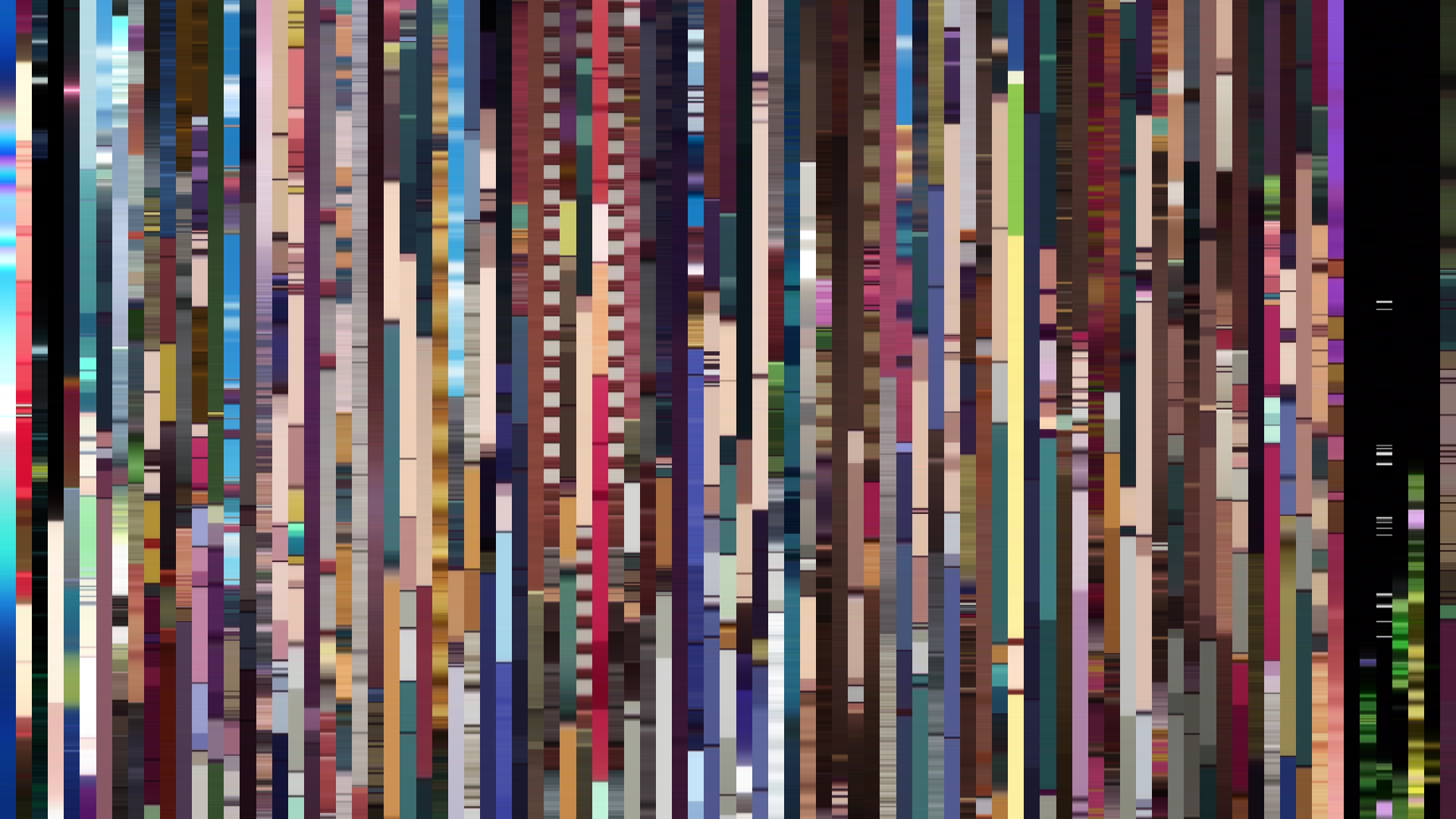
Slice · 30s
Avg · 30s
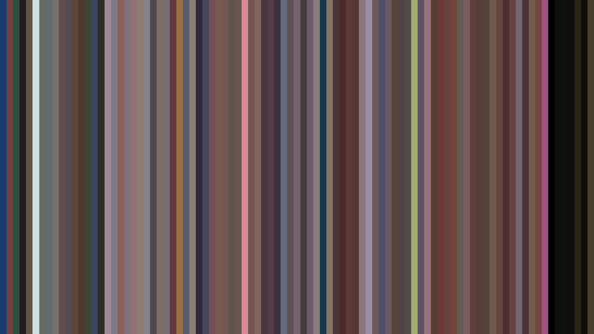
The dark opening brightness arc of *The Case Study of Vanitas Part 2* is a quiet betrayal of expectations set by its predecessor. Where Part 1’s vampire Paris shimmered in silver and champagne intrigue, this second season’s palette—#19171C anchoring a predominantly Red-Orange scheme—drains the light from each frame with methodical purpose. The numbers betray a descent: opening act at 0.510 brightness, middle at 0.419, closing at 0.378. That’s not a narrative arc; it’s a slow eclipse. The dominant Red-Orange (22%) and Red (19%) hues, punctuated by the rich crimson of #542425, suggest blood and flame, but the overall desaturation—0.353 average—mutes their warmth into something clinical. This is no gothic romance; it’s the autopsy of one. Director Tomoyuki Itamura, inheriting the vampire steampunk from the late Jun Mochizuki’s manga, seems more interested in the corrosion of intimacy than its blossom. The closing act’s dimmest frames aren’t darkness—they’re the weight of characters retreating into their own shadows. The color data doesn’t just chart brightness; it charts how hope gets quietly extinguished.
Brightness Arc (episode progression)
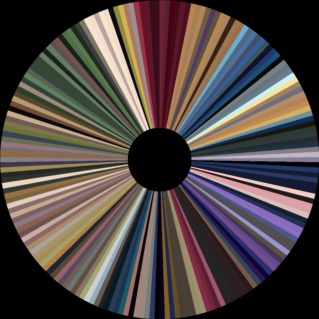
Hue Distribution
Act Breakdown
Opening
0.510
Middle
0.419
Closing
0.378
Avg Brightness
0.400
Avg Saturation
0.353
Warmth
0.530
Color Palette
#19171C
#625D5C
#E4DCD6
#9F9B99
#542425
#95675D
#202753
#D3ABA2
3-Act Color Story
Opening
Middle
Closing
Color Twins
Perceptually nearest palettes — measured in OKLab space, not RGB


The dark opening brightness arc of *The Case Study of Vanitas Part 2* is a quiet betrayal of expectations set by its predecessor. Where Part 1’s vampire Paris shimmered in silver and champagne intrigue, this second season’s palette—#19171C anchoring a predominantly Red-Orange scheme—drains the light from each frame with methodical purpose. The numbers betray a descent: opening act at 0.510 brightness, middle at 0.419, closing at 0.378. That’s not a narrative arc; it’s a slow eclipse. The dominant Red-Orange (22%) and Red (19%) hues, punctuated by the rich crimson of #542425, suggest blood and flame, but the overall desaturation—0.353 average—mutes their warmth into something clinical. This is no gothic romance; it’s the autopsy of one. Director Tomoyuki Itamura, inheriting the vampire steampunk from the late Jun Mochizuki’s manga, seems more interested in the corrosion of intimacy than its blossom. The closing act’s dimmest frames aren’t darkness—they’re the weight of characters retreating into their own shadows. The color data doesn’t just chart brightness; it charts how hope gets quietly extinguished.