Edit Pace — frame-to-frame color delta (bright = fast cuts)
Color Temperature — warm (gold) vs cool (teal) per frame
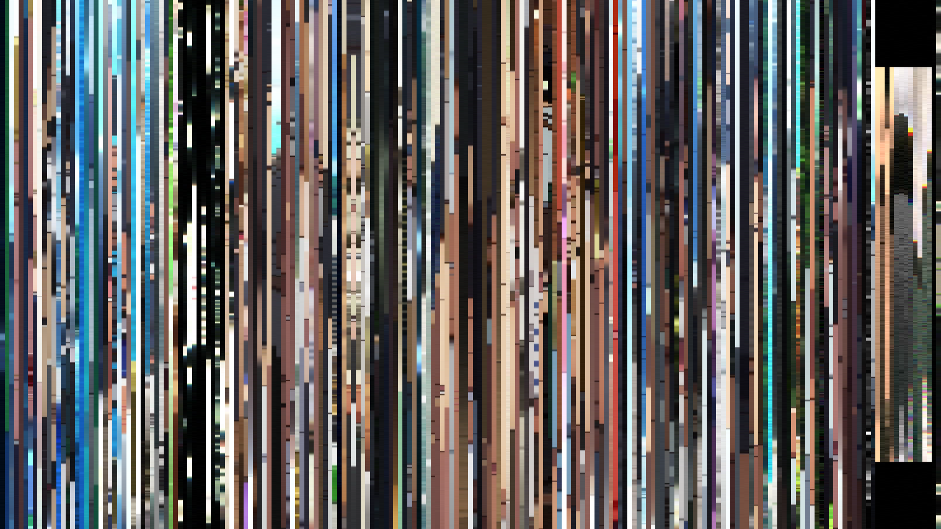
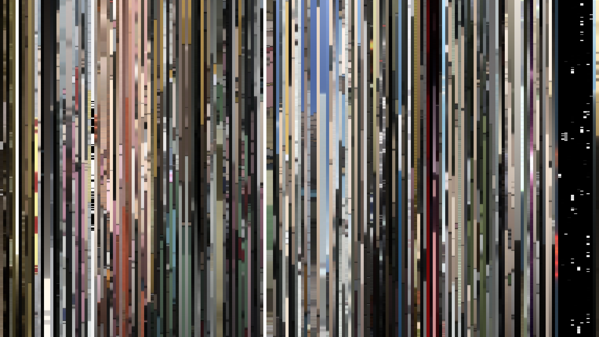
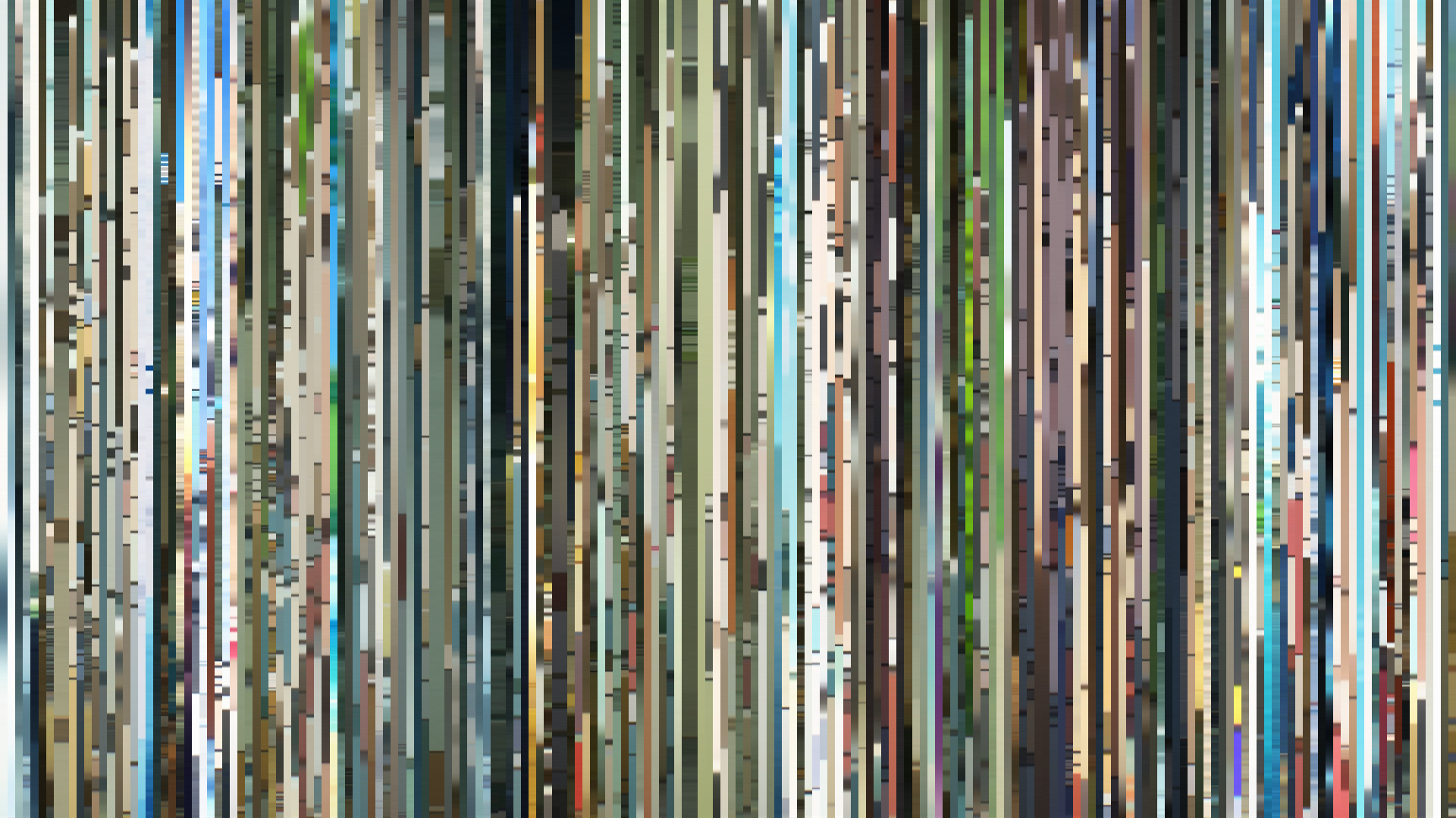
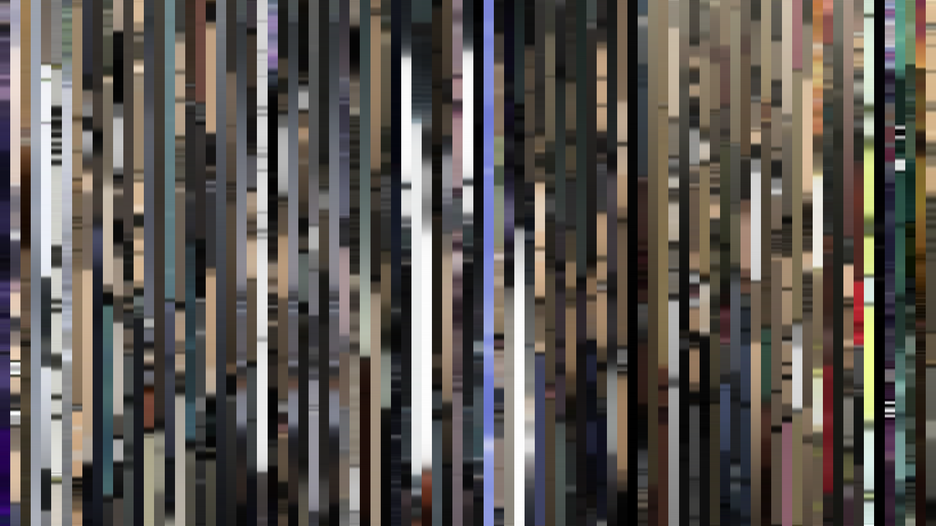
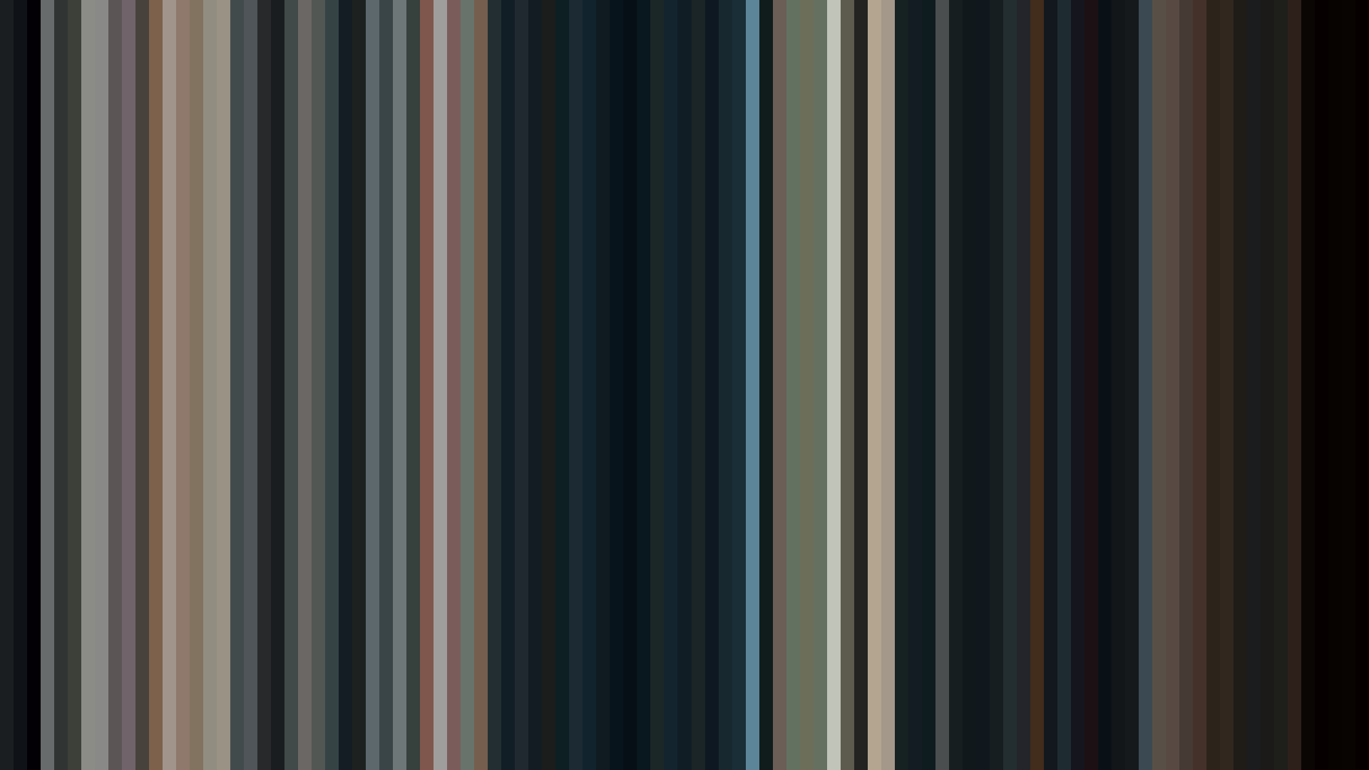
Frame Density Comparison — every 2nd vs every 4th frame
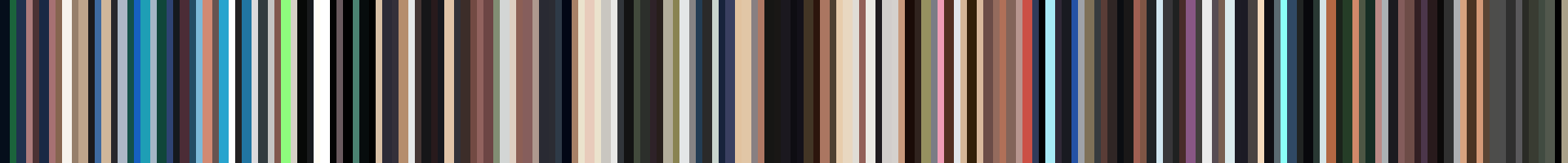
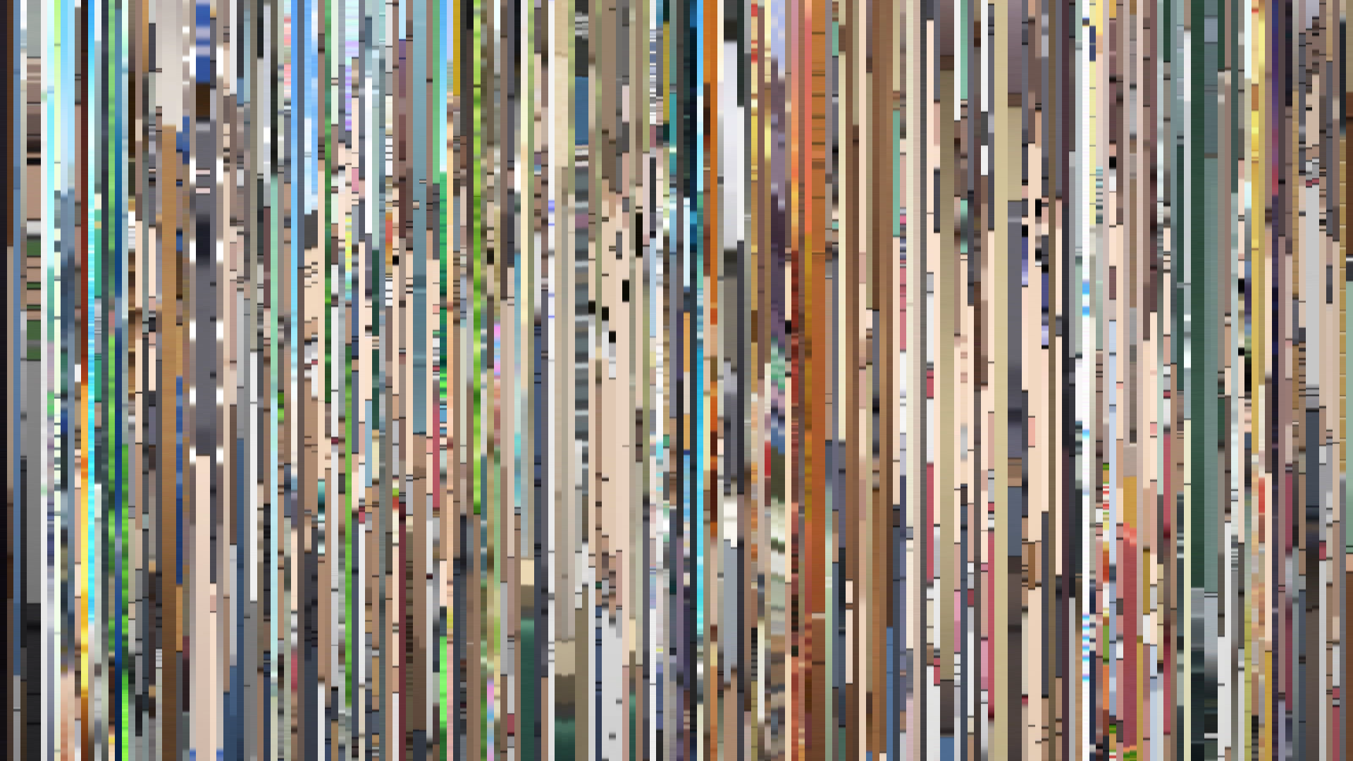
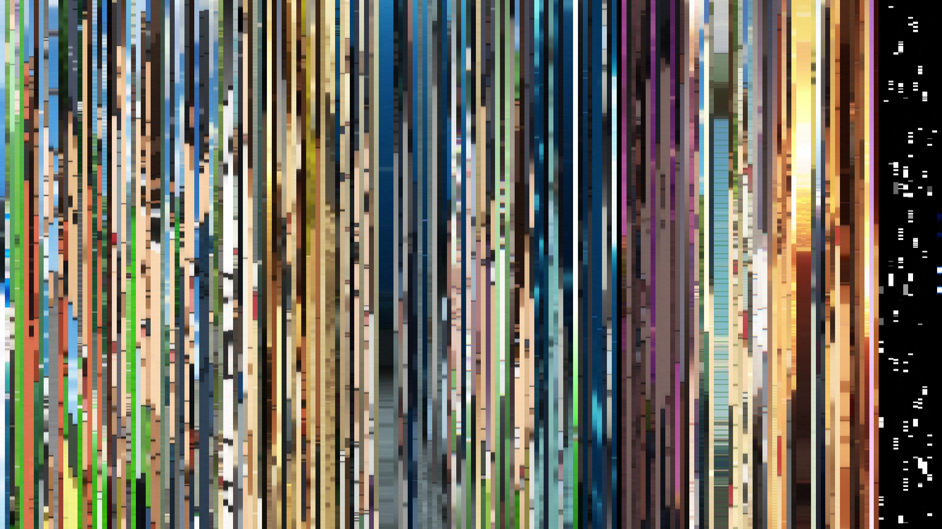
Slice · 15s
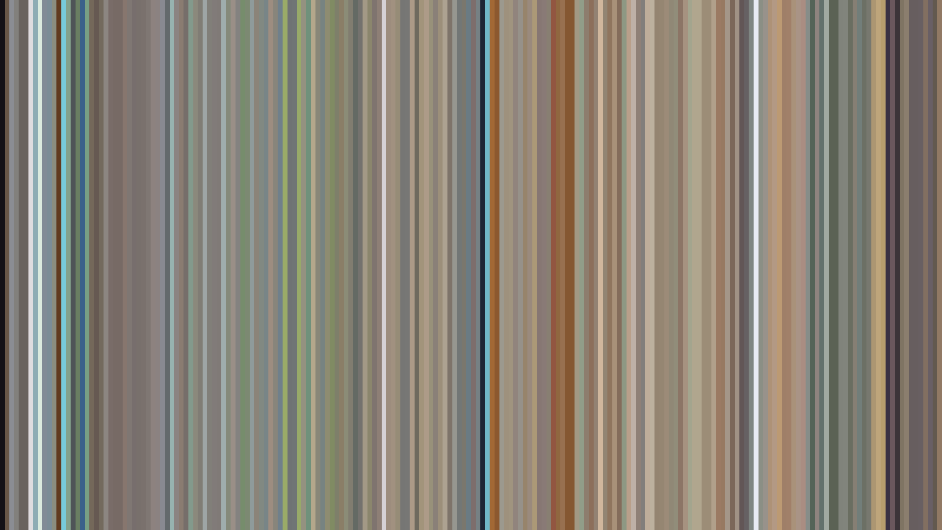
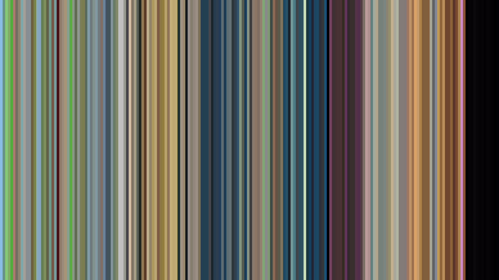
Avg · 15s
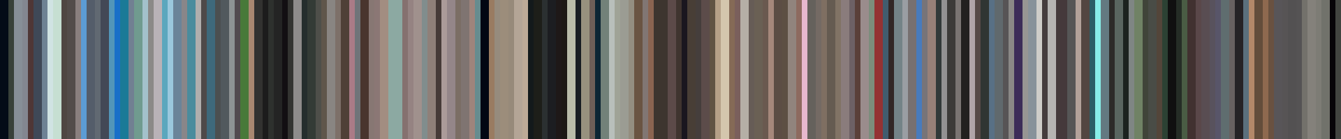
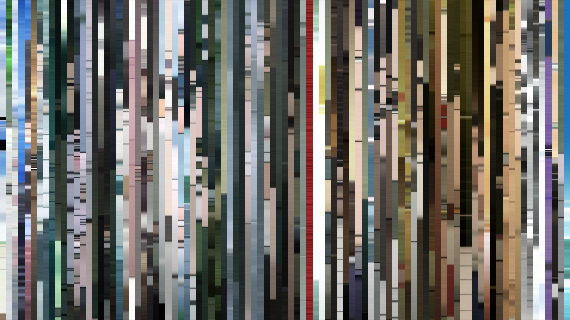
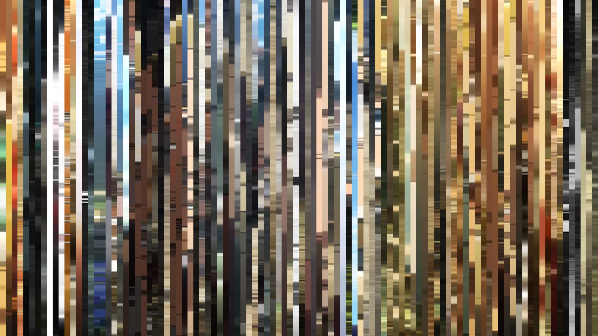
Slice · 30s
Avg · 30s
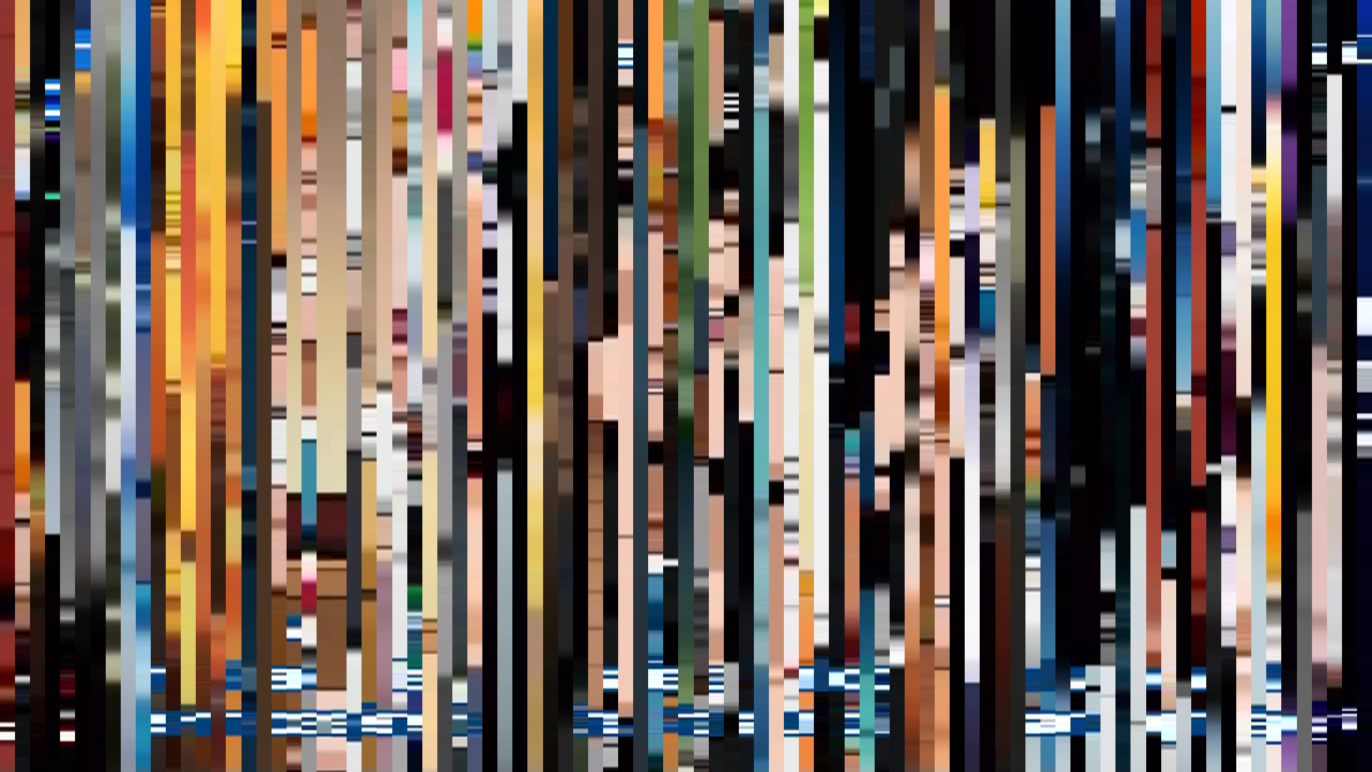
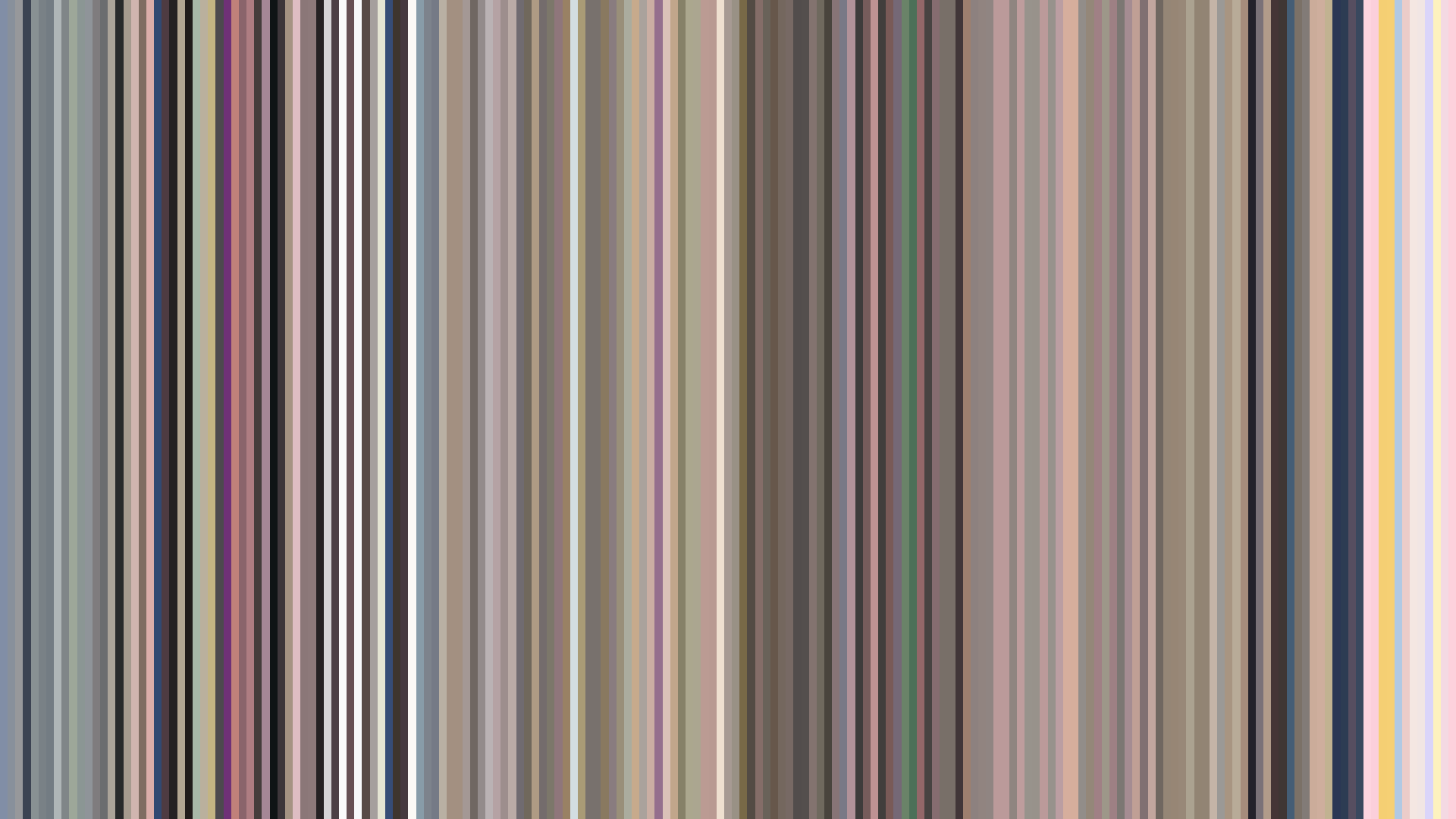
Summer Time Rendering’s barcode is a study in controlled tension: a flat brightness arc that barely flinches, average saturation under 0.23, and a palette of near-black, muddy browns, and off-whites. The Red dominance — 43% of all hue samples — isn’t warm; it’s the desaturated rust of dried blood on concrete, the flush of a sunburn under gray skies. This is a show that refuses the dramatic brightness swing of a typical thriller. Instead, the flat arc mirrors the story’s relentless temporal loop: every cycle drags the image toward a slightly darker closing (0.387 from 0.469), as if the act of repeating the same days is literally leaching light from the frame. The palette’s muted, low-contrast range — no pure white, no saturated red — traps the viewer in Hitogashima’s humid, inescapable summer. The visual architects chose not to telegraph emotional beats with color shifts; they keep the image dead-level, forcing us to read the dread in small variations of shadow and texture. It’s a barcode that doesn’t scream — it suffocates.
Brightness Arc (episode progression)
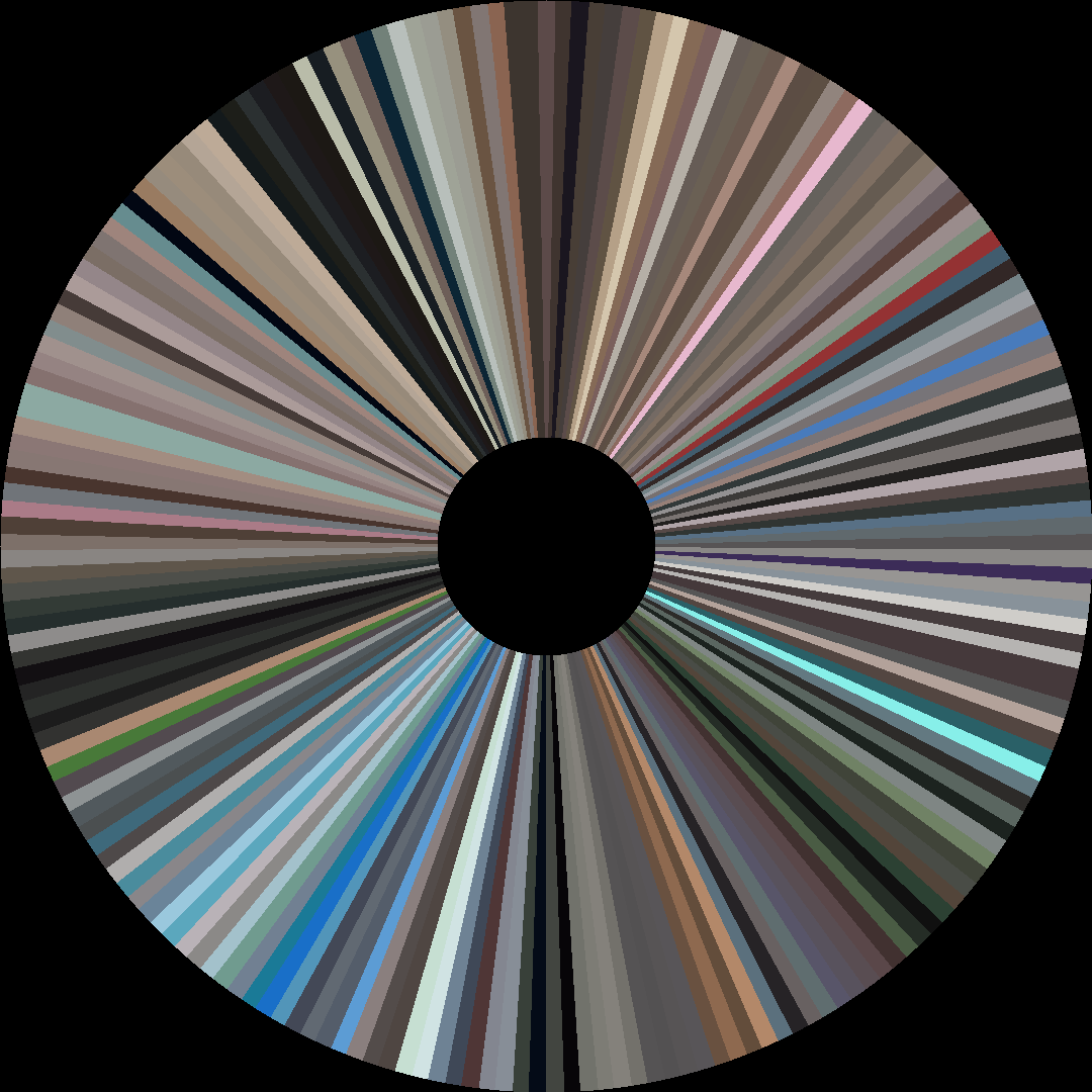
Hue Distribution
Act Breakdown
Opening
0.469
Middle
0.429
Closing
0.387
Avg Brightness
0.389
Avg Saturation
0.227
Warmth
0.545
Color Palette
#1D1C1E
#5F5958
#A29F9C
#926D5F
#DDDCD7
#4D3531
#5E4838
#A48A73
3-Act Color Story
Opening
Middle
Closing
Color Twins
Perceptually nearest palettes — measured in OKLab space, not RGB


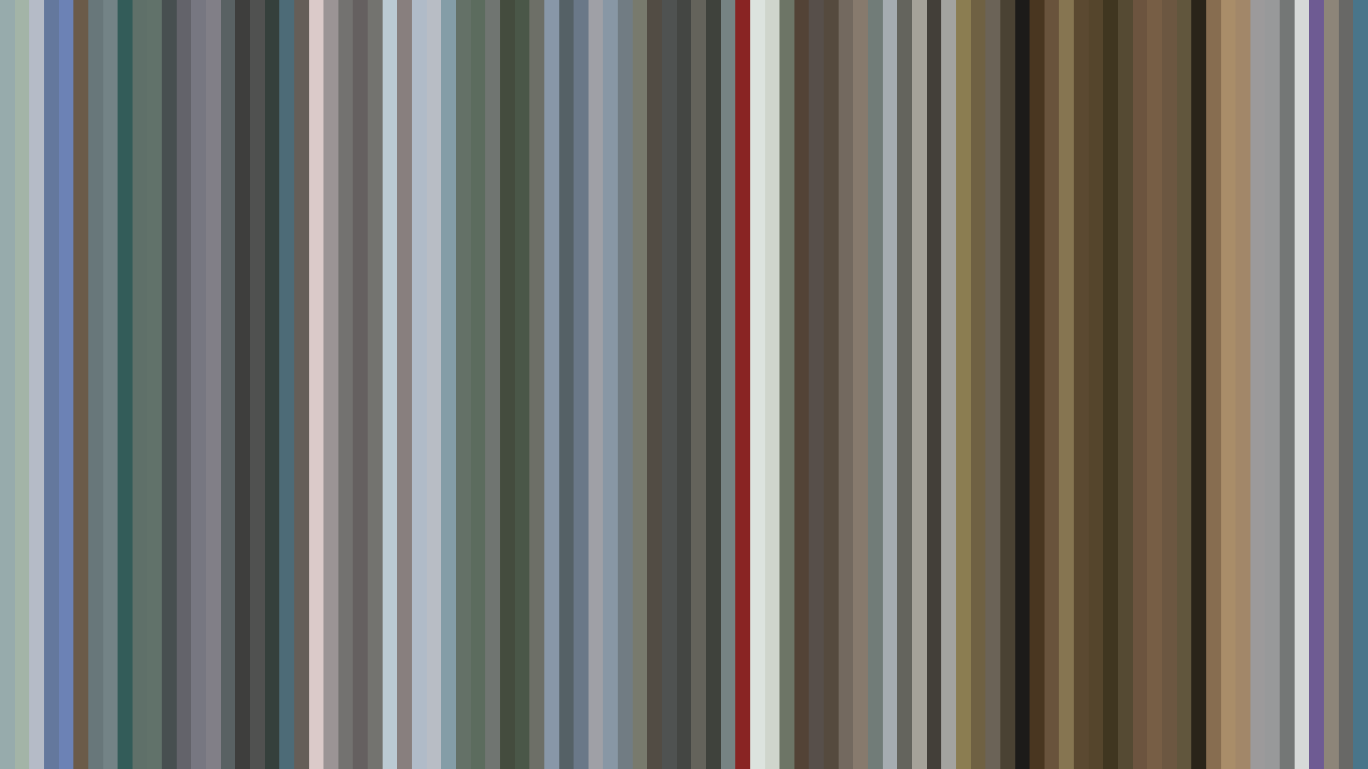


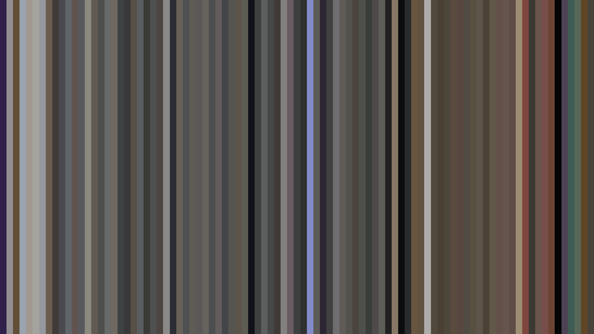
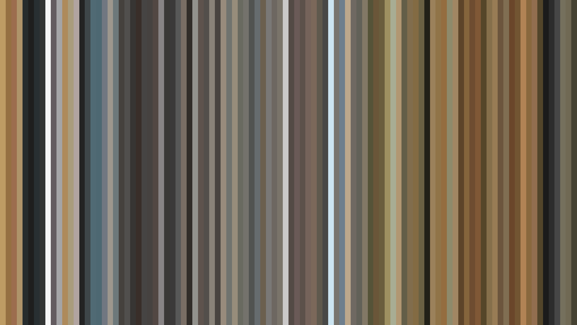

Summer Time Rendering’s barcode is a study in controlled tension: a flat brightness arc that barely flinches, average saturation under 0.23, and a palette of near-black, muddy browns, and off-whites. The Red dominance — 43% of all hue samples — isn’t warm; it’s the desaturated rust of dried blood on concrete, the flush of a sunburn under gray skies. This is a show that refuses the dramatic brightness swing of a typical thriller. Instead, the flat arc mirrors the story’s relentless temporal loop: every cycle drags the image toward a slightly darker closing (0.387 from 0.469), as if the act of repeating the same days is literally leaching light from the frame. The palette’s muted, low-contrast range — no pure white, no saturated red — traps the viewer in Hitogashima’s humid, inescapable summer. The visual architects chose not to telegraph emotional beats with color shifts; they keep the image dead-level, forcing us to read the dread in small variations of shadow and texture. It’s a barcode that doesn’t scream — it suffocates.