Home›2022›Kaguya-sama: Love is War -Ultra Romantic-
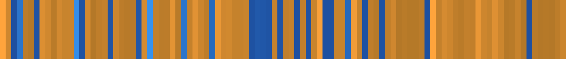
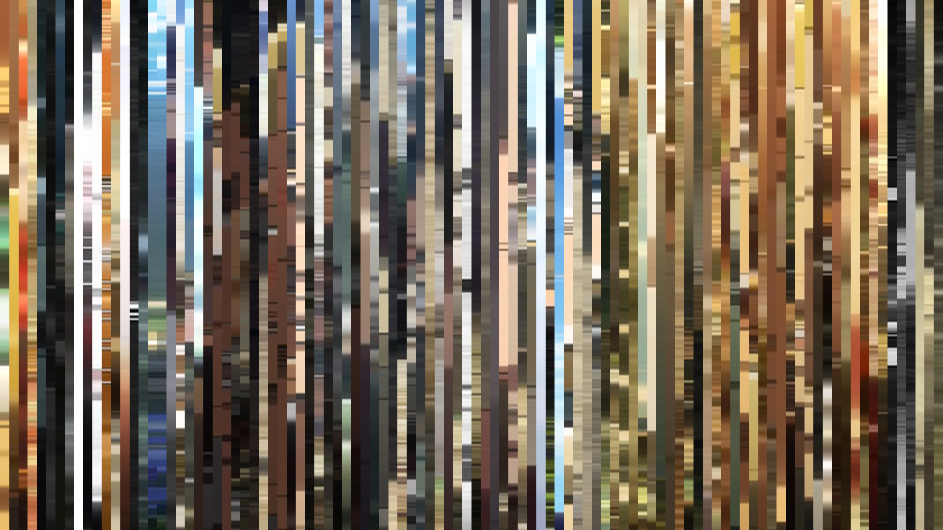
Pixel Slice — 1px center crop per frame
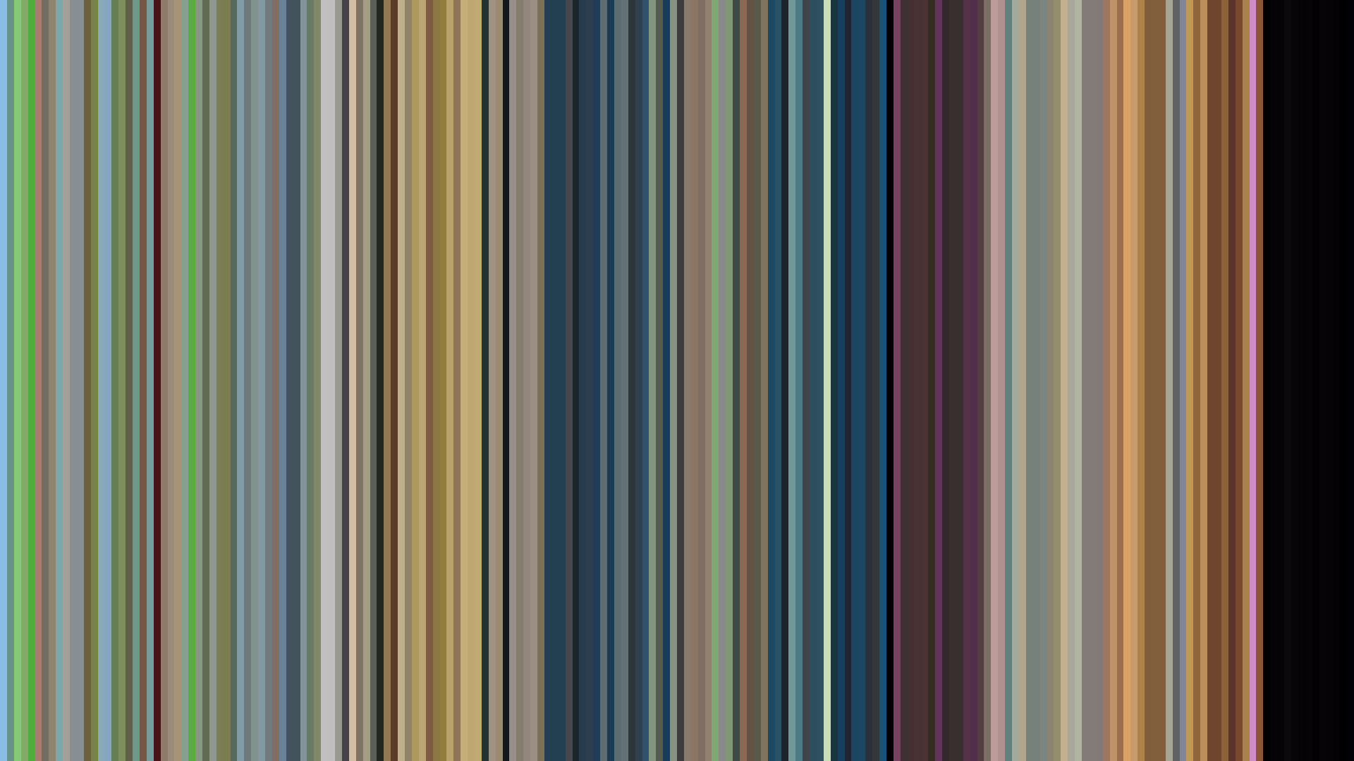
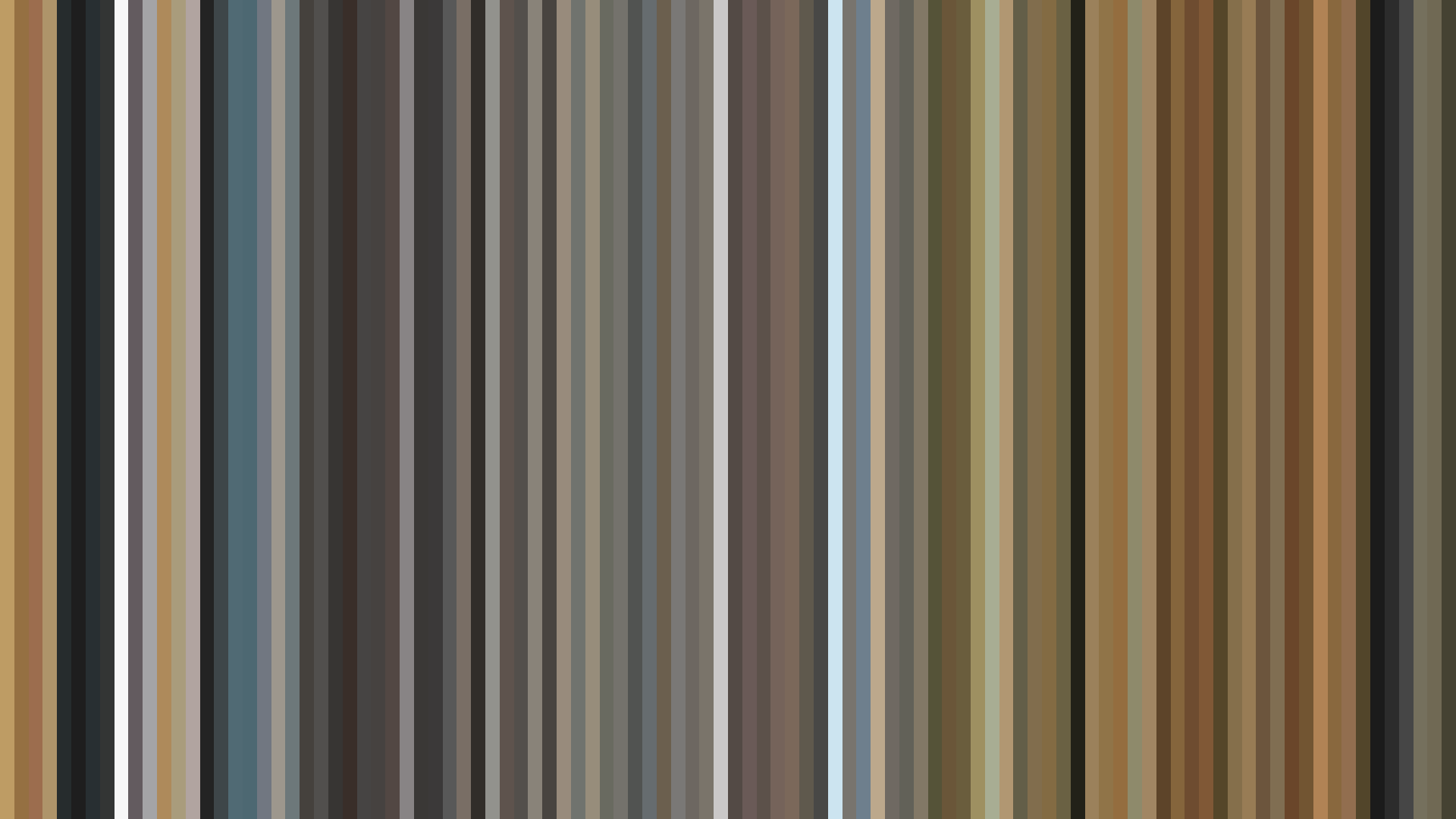
Smooth Average — mean color per frame
Rank Mosaic — columns sorted by luminance
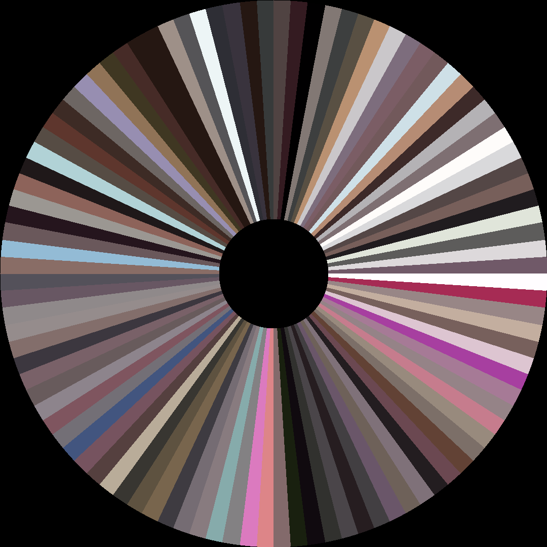
Circle / Radial — polar transform
Edit Pace — frame-to-frame color delta (bright = fast cuts)
Color Temperature — warm (gold) vs cool (teal) per frame
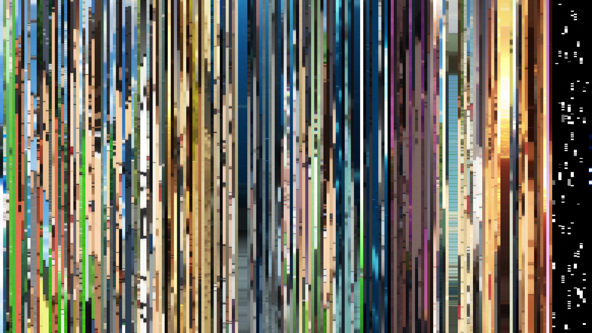
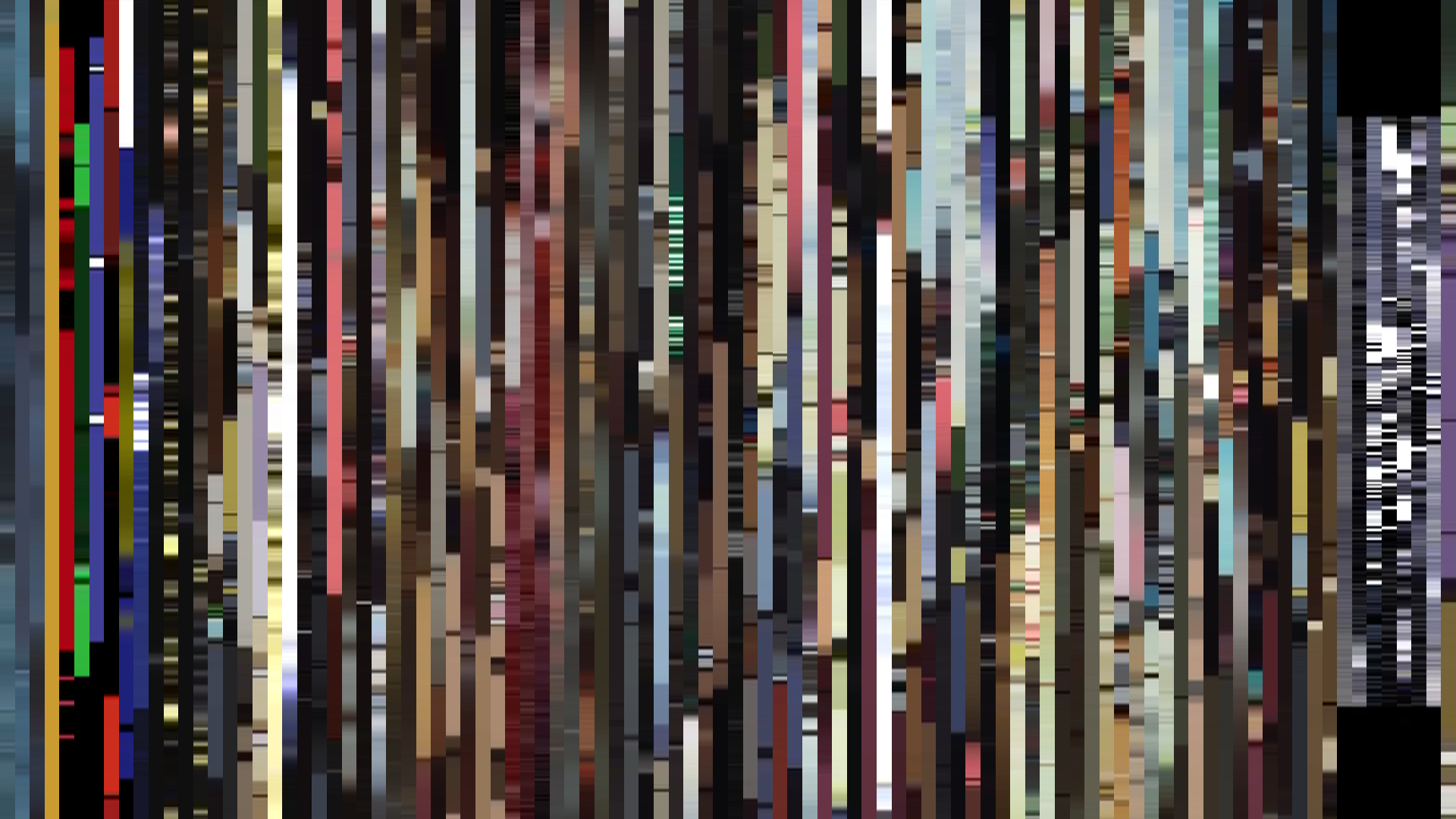
Frame Density Comparison — every 2nd vs every 4th frame
Slice · 15s
Avg · 15s
Slice · 30s
Avg · 30s
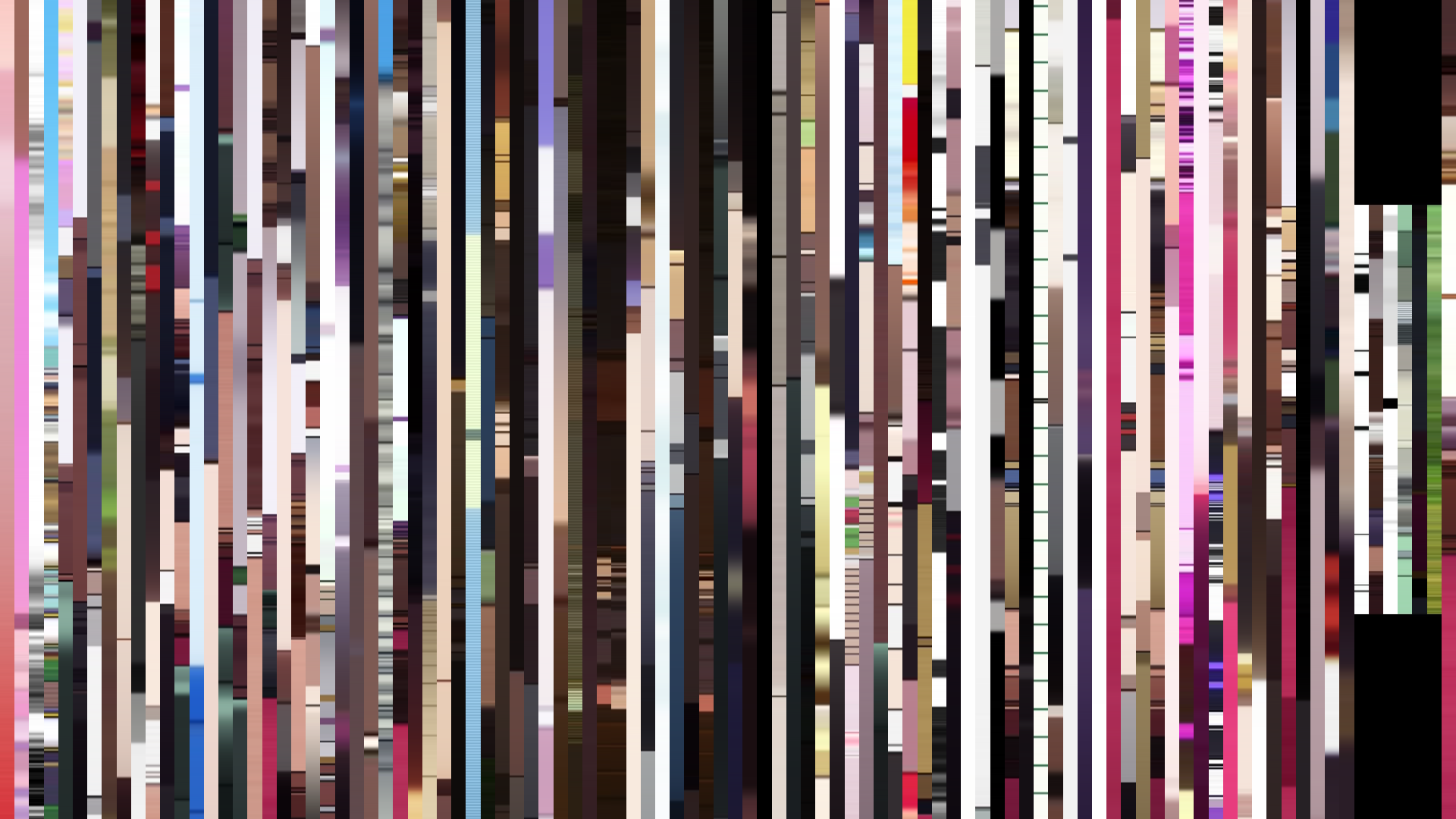
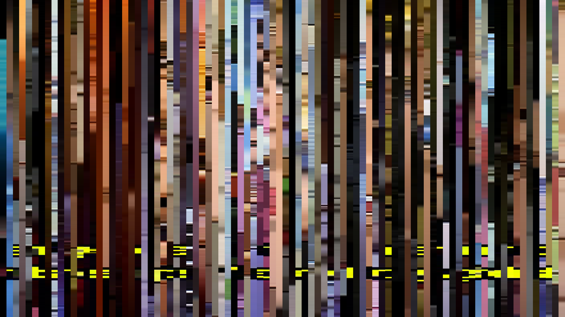
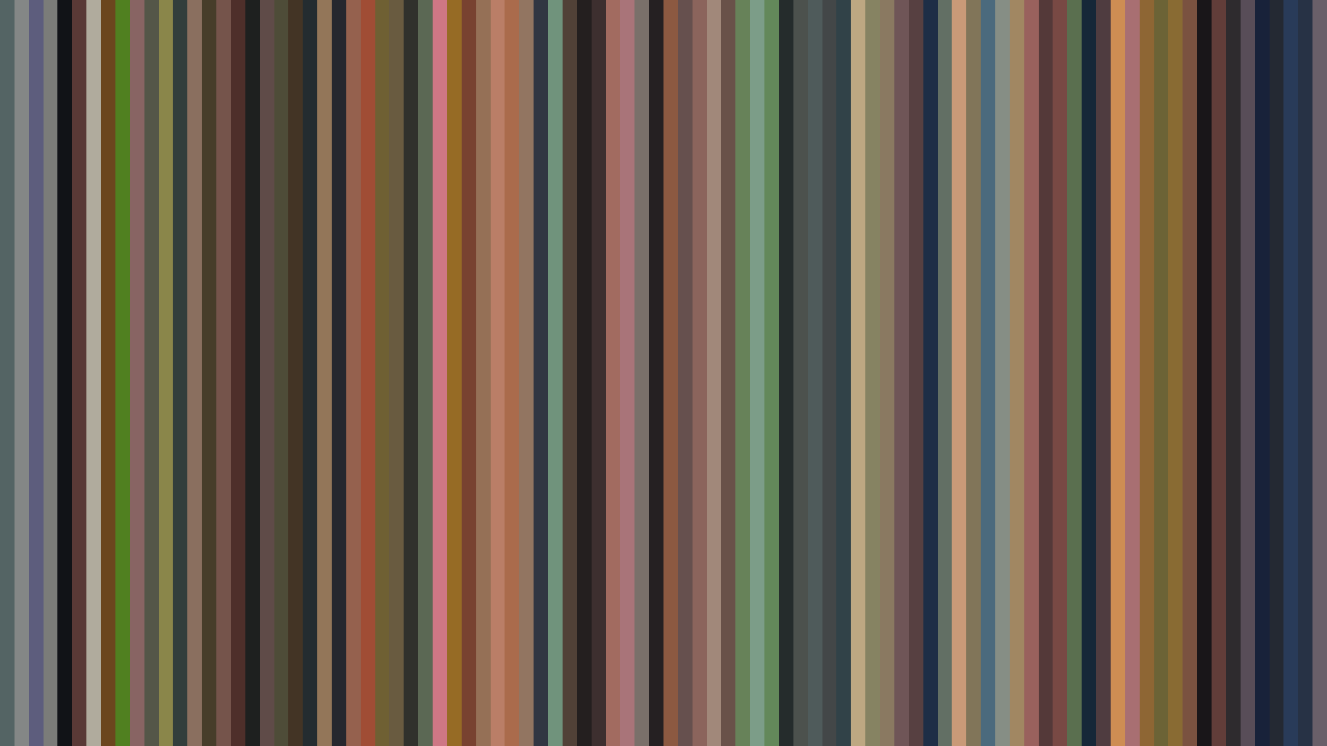
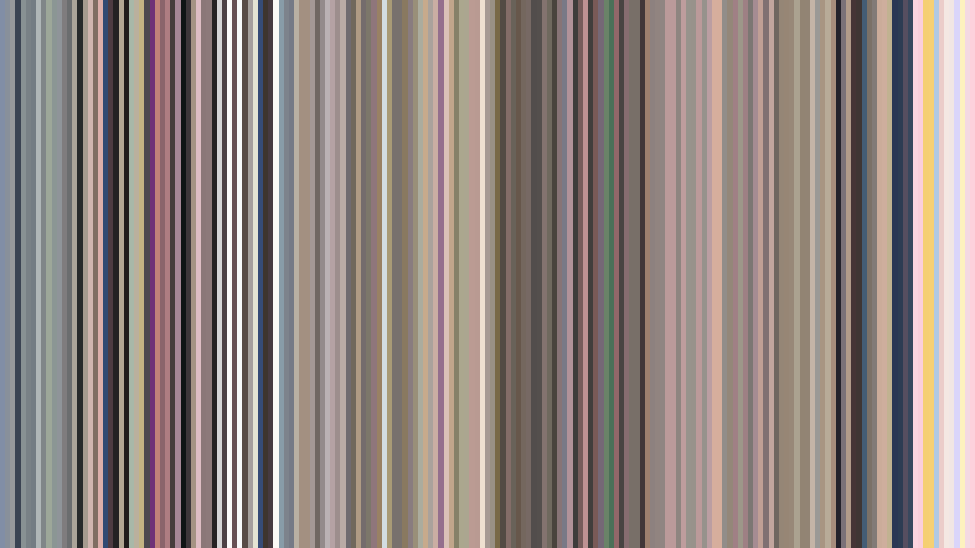
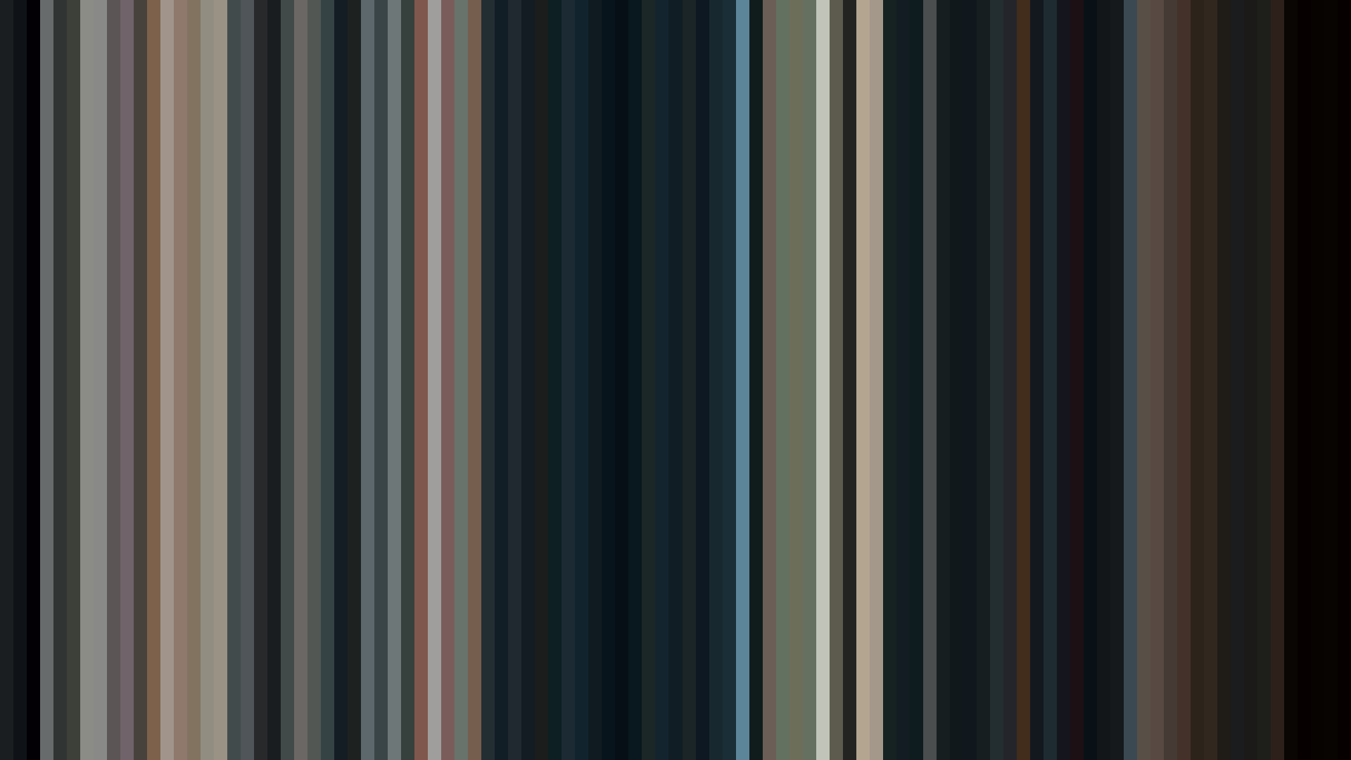
A *dark midpoint* of this severity should be structurally impossible in a romantic comedy about high school students who can't admit their feelings. Yet *Ultra Romantic*'s arc-down is the barcode's most revealing truth: this is not a comedy that forgets to be serious, but a romance that earns its shadows. Director Mamoru Hatakeyama and color designer Yukiko Kakita build the first act in the warm, desaturated reds of Shuchiin Academy's corridors—the 0.504 brightness of *the warm opening* is a deliberate stage set for a play about confession. Then the middle act collapses to 0.385, and the palette's dominant #502D2F and #1F191B take over. This is the visual grammar of characters confronting what they actually want, not what they perform. The closing recovers to 0.485, but never returns to the opening's lightness—because Kaguya and Miyuki have been changed by the darkness between them. The red dominance (44%) isn't passion; it's the color of withheld truth, of faces flushed with unspoken feeling. A-1 Pictures understood that the funniest love stories are the ones that admit how terrifying love actually is.
Brightness Arc (episode progression)
Hue Distribution
Act Breakdown
Opening
0.504
Middle
0.385
Closing
0.485
Avg Brightness
0.457
Avg Saturation
0.201
Warmth
0.555
Color Palette
#1F191B
#ECE6E5
#645456
#A79C9C
#502D2F
#D0A69D
#916B61
#A68E6C
3-Act Color Story
Opening
Middle
Closing
Color Twins
Perceptually nearest palettes — measured in OKLab space, not RGB


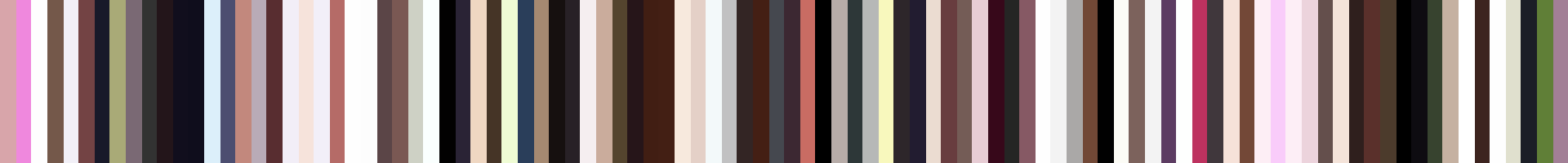


A *dark midpoint* of this severity should be structurally impossible in a romantic comedy about high school students who can't admit their feelings. Yet *Ultra Romantic*'s arc-down is the barcode's most revealing truth: this is not a comedy that forgets to be serious, but a romance that earns its shadows. Director Mamoru Hatakeyama and color designer Yukiko Kakita build the first act in the warm, desaturated reds of Shuchiin Academy's corridors—the 0.504 brightness of *the warm opening* is a deliberate stage set for a play about confession. Then the middle act collapses to 0.385, and the palette's dominant #502D2F and #1F191B take over. This is the visual grammar of characters confronting what they actually want, not what they perform. The closing recovers to 0.485, but never returns to the opening's lightness—because Kaguya and Miyuki have been changed by the darkness between them. The red dominance (44%) isn't passion; it's the color of withheld truth, of faces flushed with unspoken feeling. A-1 Pictures understood that the funniest love stories are the ones that admit how terrifying love actually is.