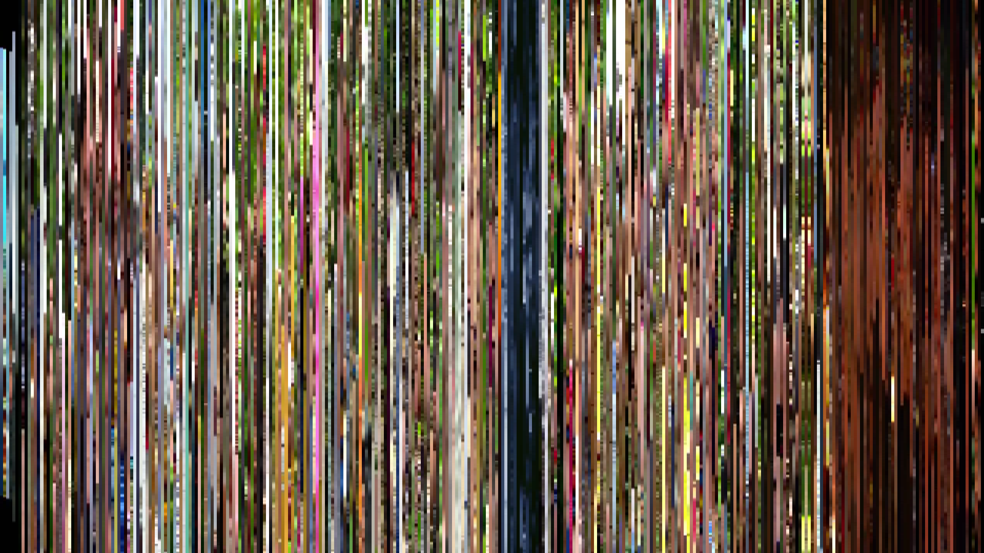
Pixel Slice — 1px center crop per frame

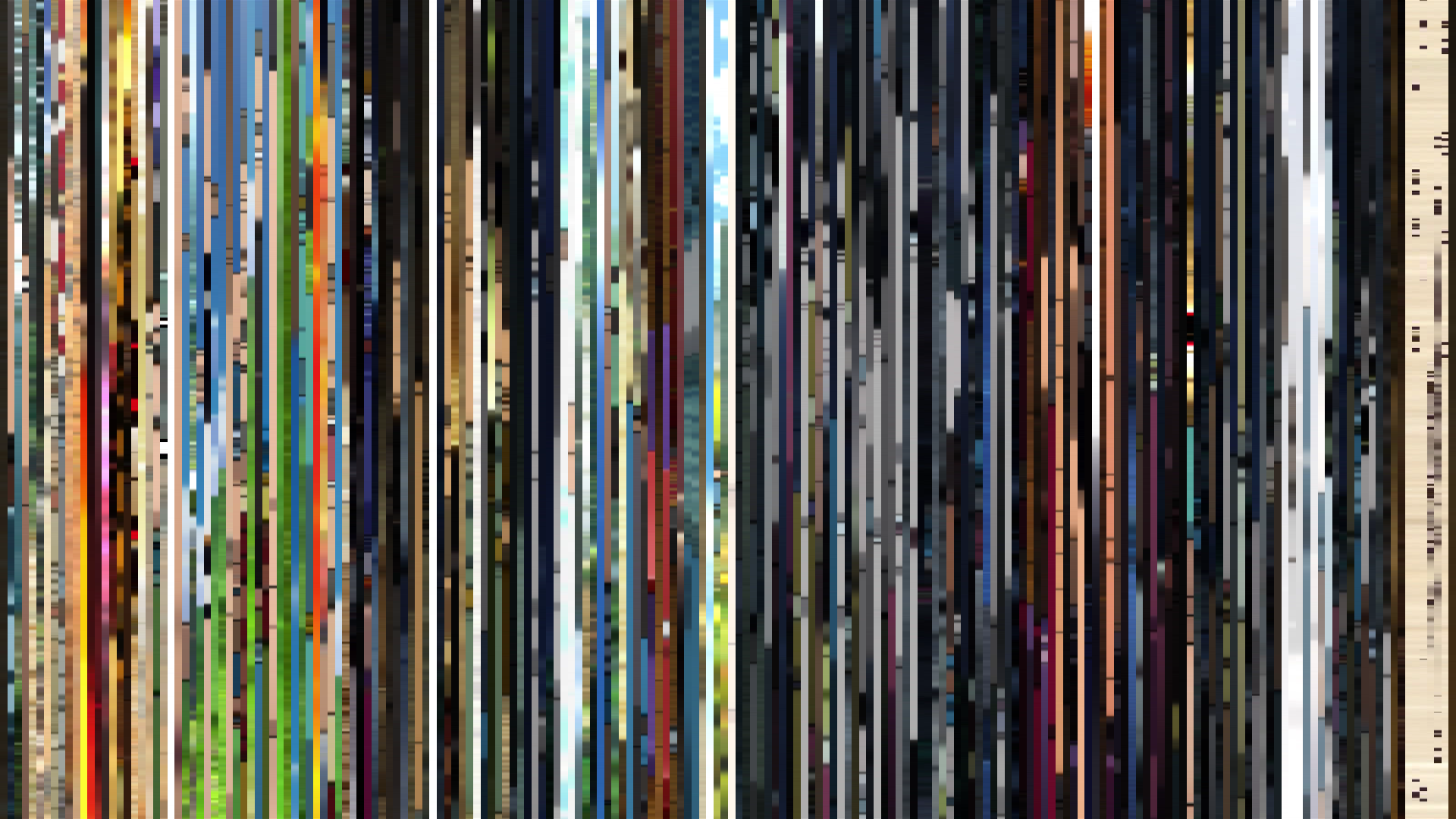
Smooth Average — mean color per frame

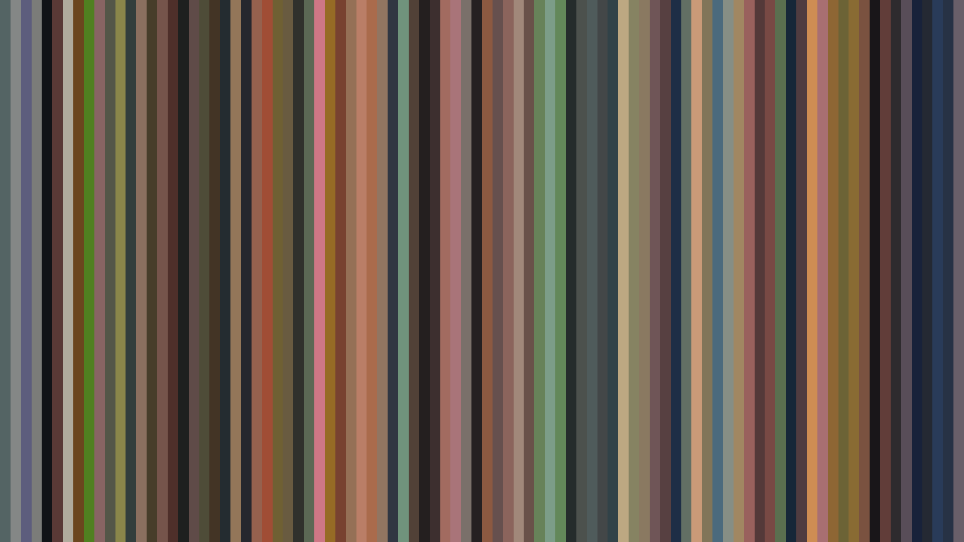
Rank Mosaic — columns sorted by luminance

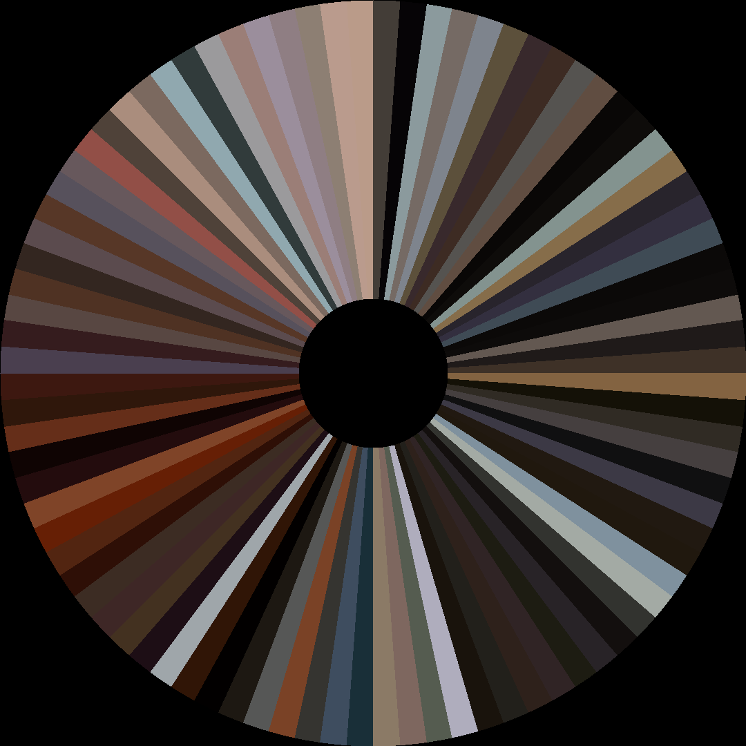
Circle / Radial — polar transform
Edit Pace — frame-to-frame color delta (bright = fast cuts)

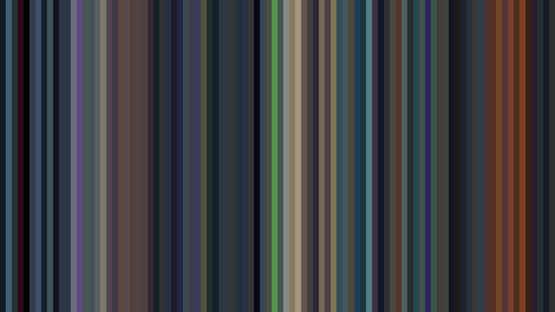
Color Temperature — warm (gold) vs cool (teal) per frame


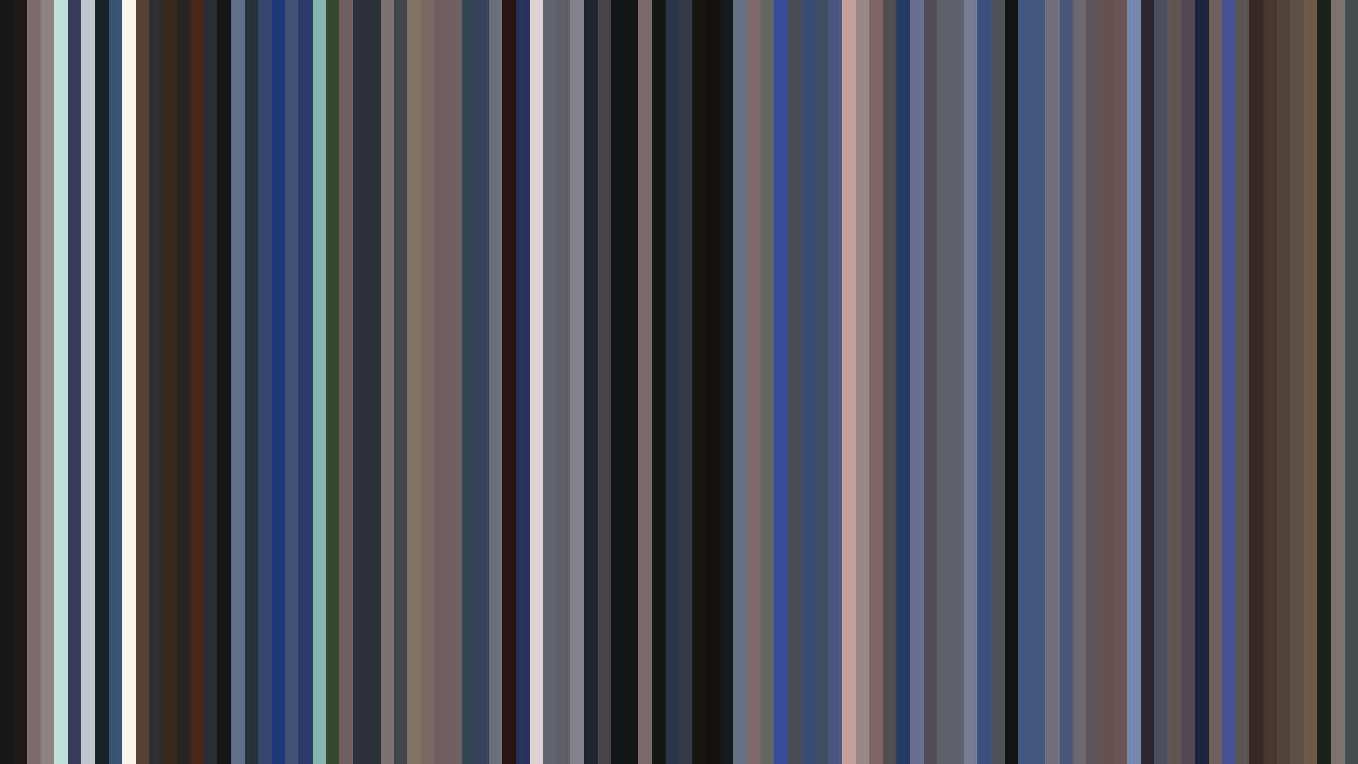


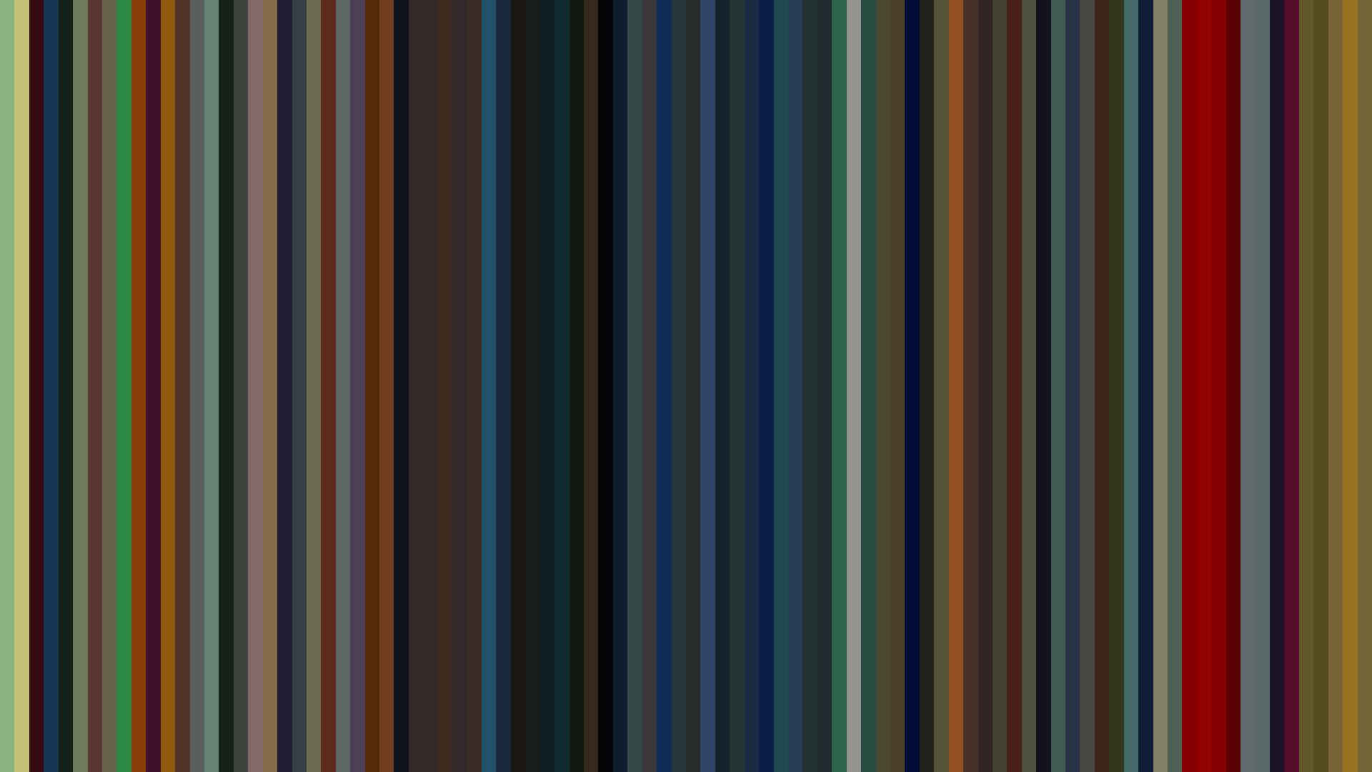
The barcode for Madhouse’s *Pet Shop of Horrors* reveals a structure that unsettles as much as its palette: a dark, red-dominant frame of blood and mahogany, yet with a sharp arc-up at the midpoint — brightness surging from 0.300 to 0.540 before retreating to 0.353. This is a horror series that dares to lighten at its most crucial turn. Director Toshio Hirata and art director Katsushi Aoki understand the genre’s oldest trick — the sudden warmth that precedes the bite. The dominant Red (51%), flanked by Red-Orange and Red-Purple, suggests a world drenched in arterial tones, but the middle act’s luminance spike doesn’t signal safety; it signals the shop’s seductive lure. Each episode works as a discrete bargain, and the bright midpoint is the moment