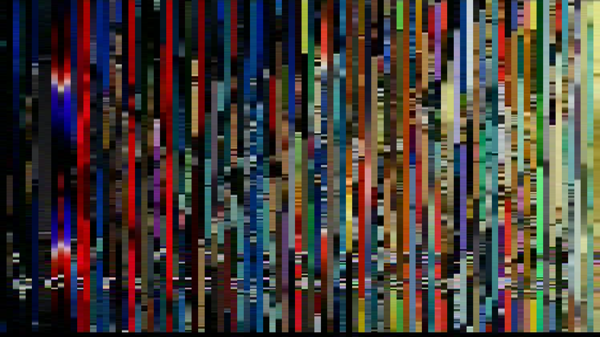
Pixel Slice — 1px center crop per frame
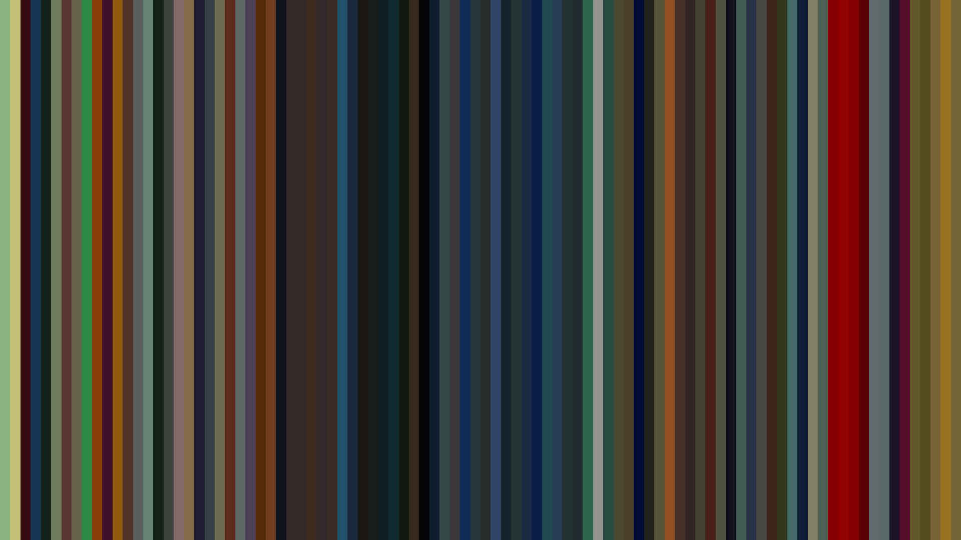
Smooth Average — mean color per frame
Rank Mosaic — columns sorted by luminance
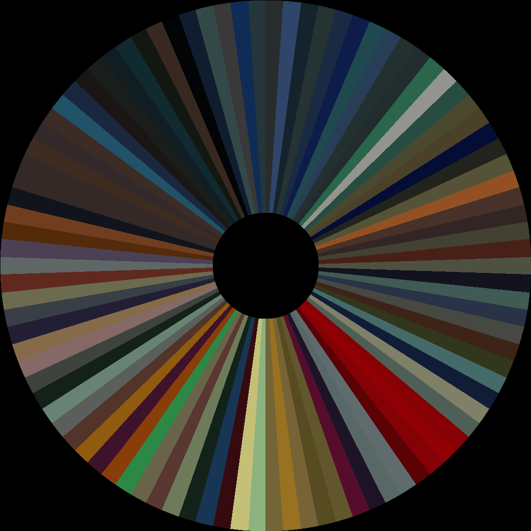
Circle / Radial — polar transform
Edit Pace — frame-to-frame color delta (bright = fast cuts)
Color Temperature — warm (gold) vs cool (teal) per frame


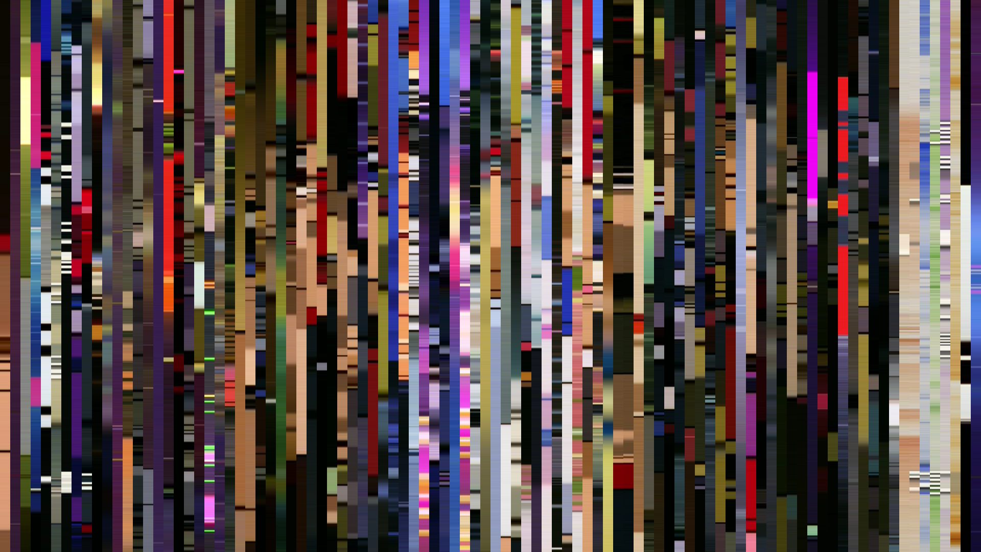

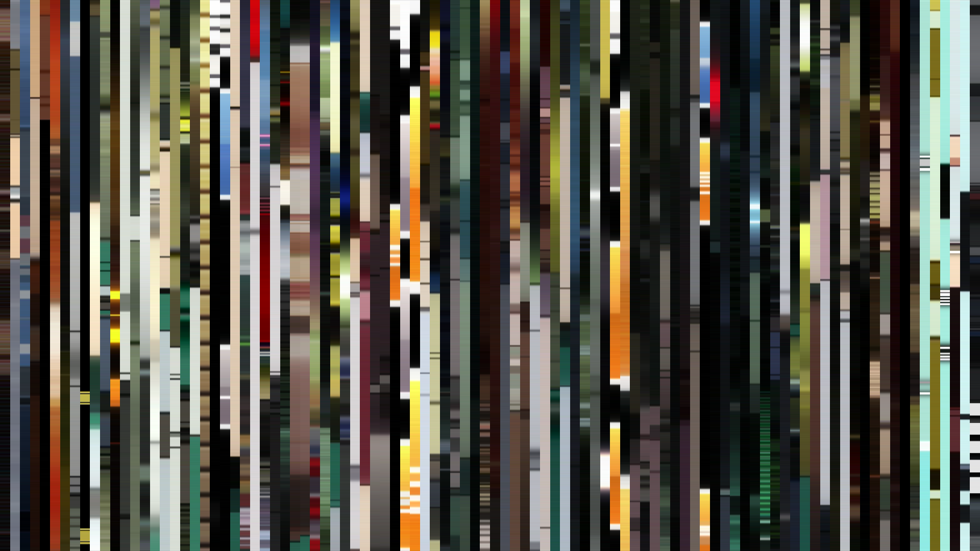
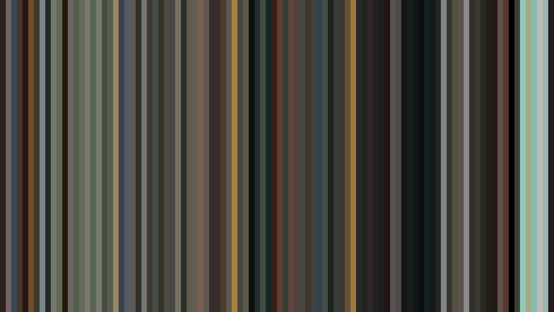
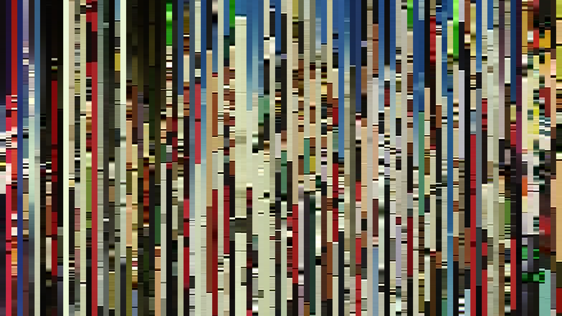

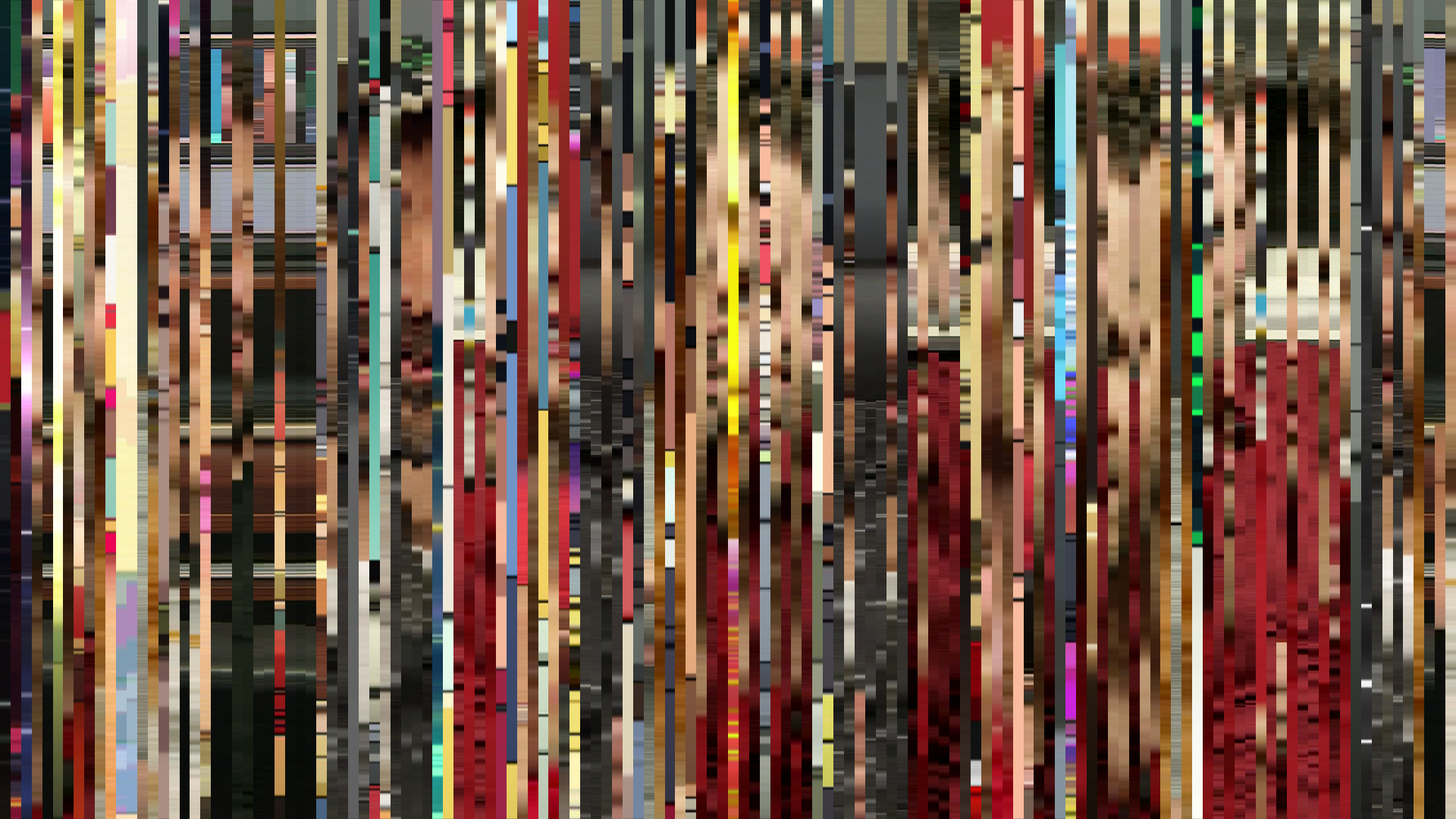
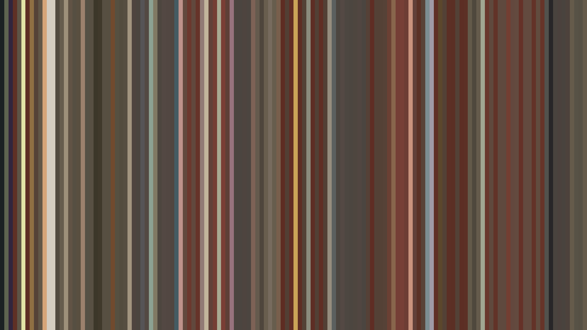
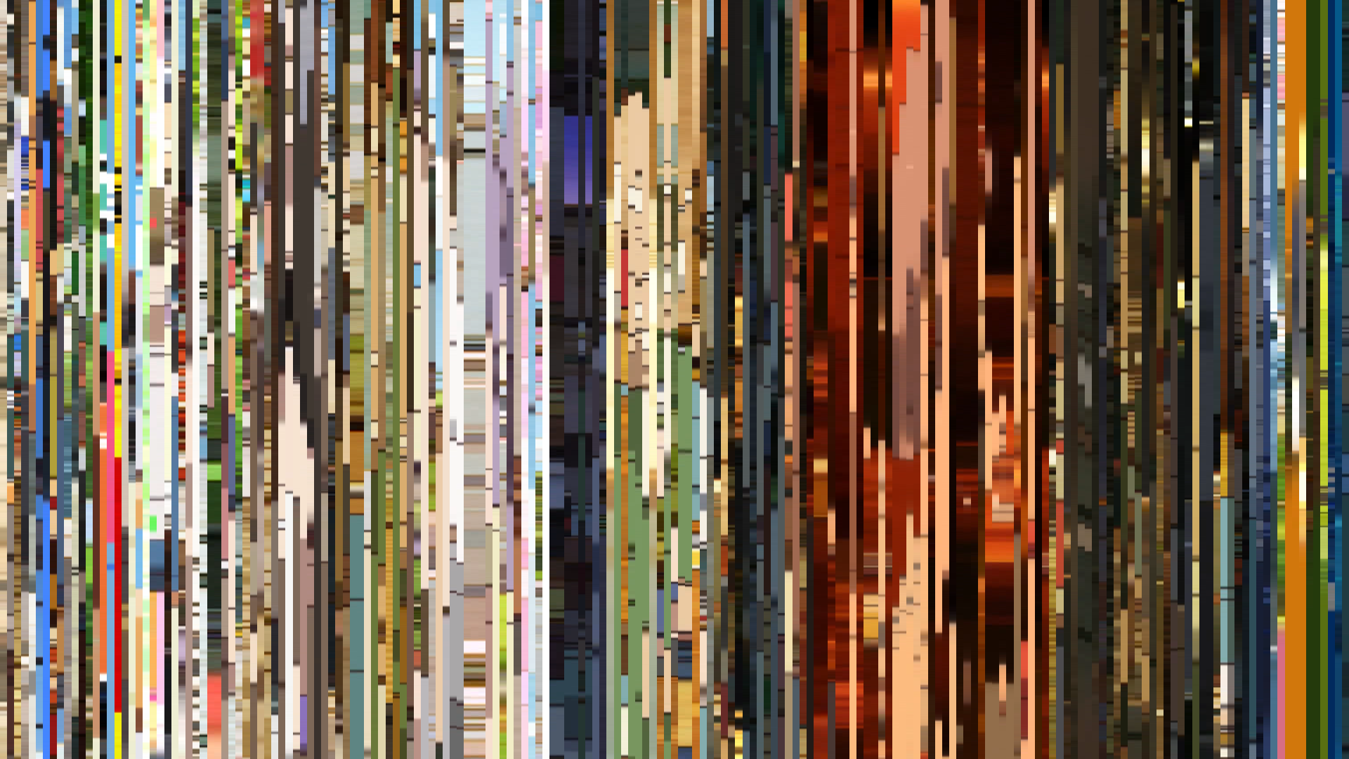
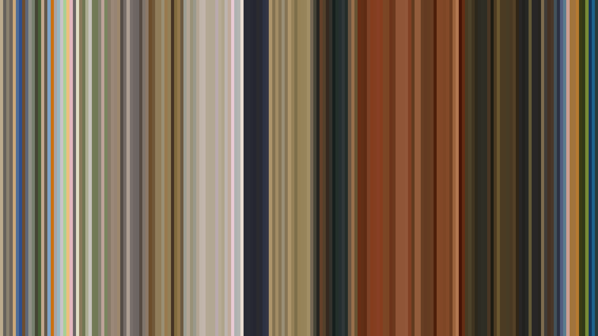

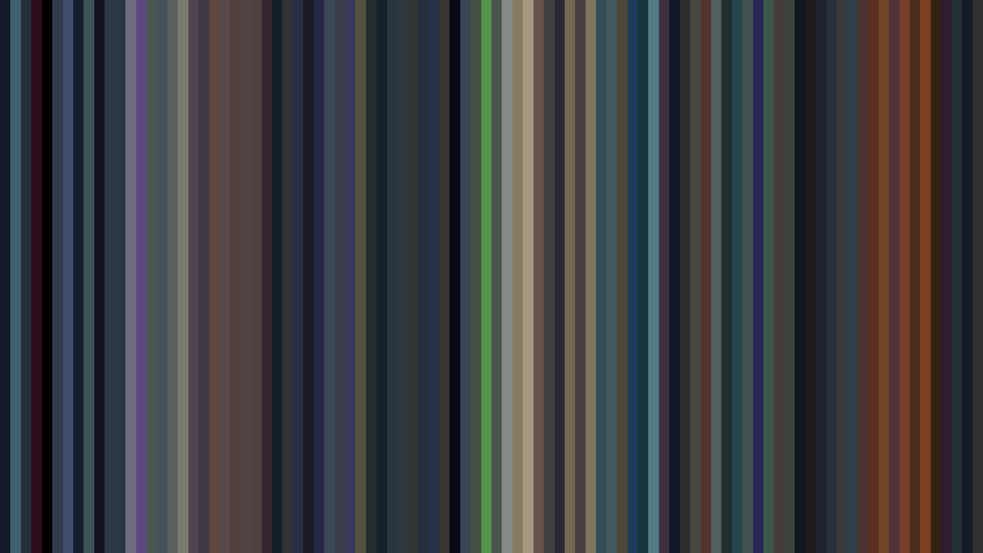
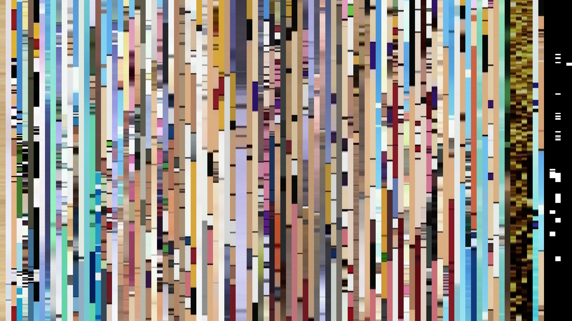

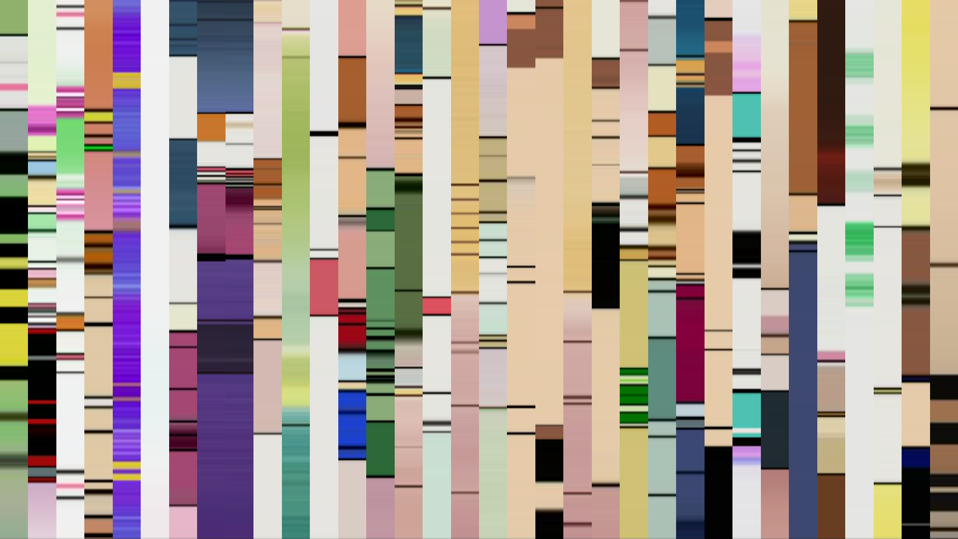

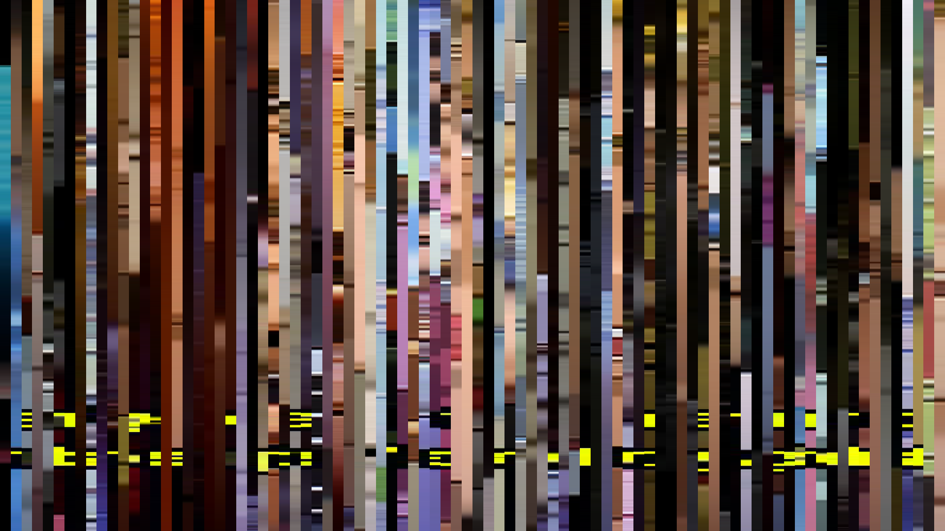

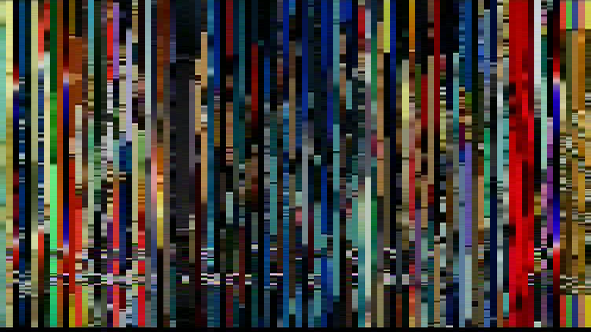
The cold pulse of Blue-Green dominates Shin Hakkenden’s palette, but what makes this barcode arresting is the way Red—tooth-clench and fire-tipped—refuses to be submerged. Public & Basic’s 1999 sci-fi adventure builds its world from two warring color camps: the clinical teal of machinery and the rusty orange of battle damage. The arc-down brightness shape is the giveaway: the opening act, bright and almost welcoming at 0.461 average, is a decoy. The middle passage drops to 0.291, a murky crawl through corridors where Red-Orange (16% of the palette) seeps in like arterial spray. This is not a story of steady heroics; it’s a descent into a darker sibling of the same genre—more John Carpenter than Akira. The closing recovery to 0.394 feels less like victory than exhaustion, the hues still tinged with the same blue-green residue of a world that never fully warms. Red and Blue-Green each claim 17% of the frame, locked in a stalemate that the narrative never breaks. Shin Hakkenden’s barcode records a fight between light and bleeding color, and the dark midpoint wins the argument.