Edit Pace — frame-to-frame color delta (bright = fast cuts)
Color Temperature — warm (gold) vs cool (teal) per frame
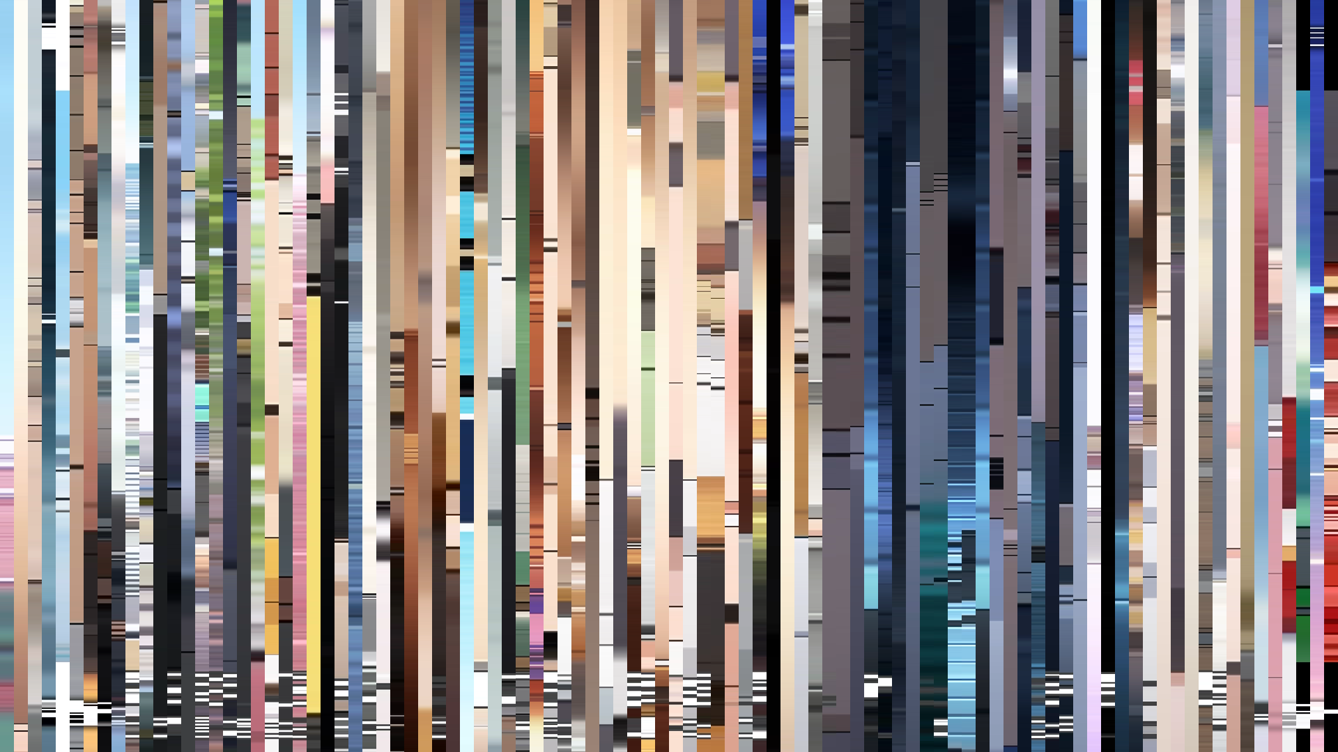
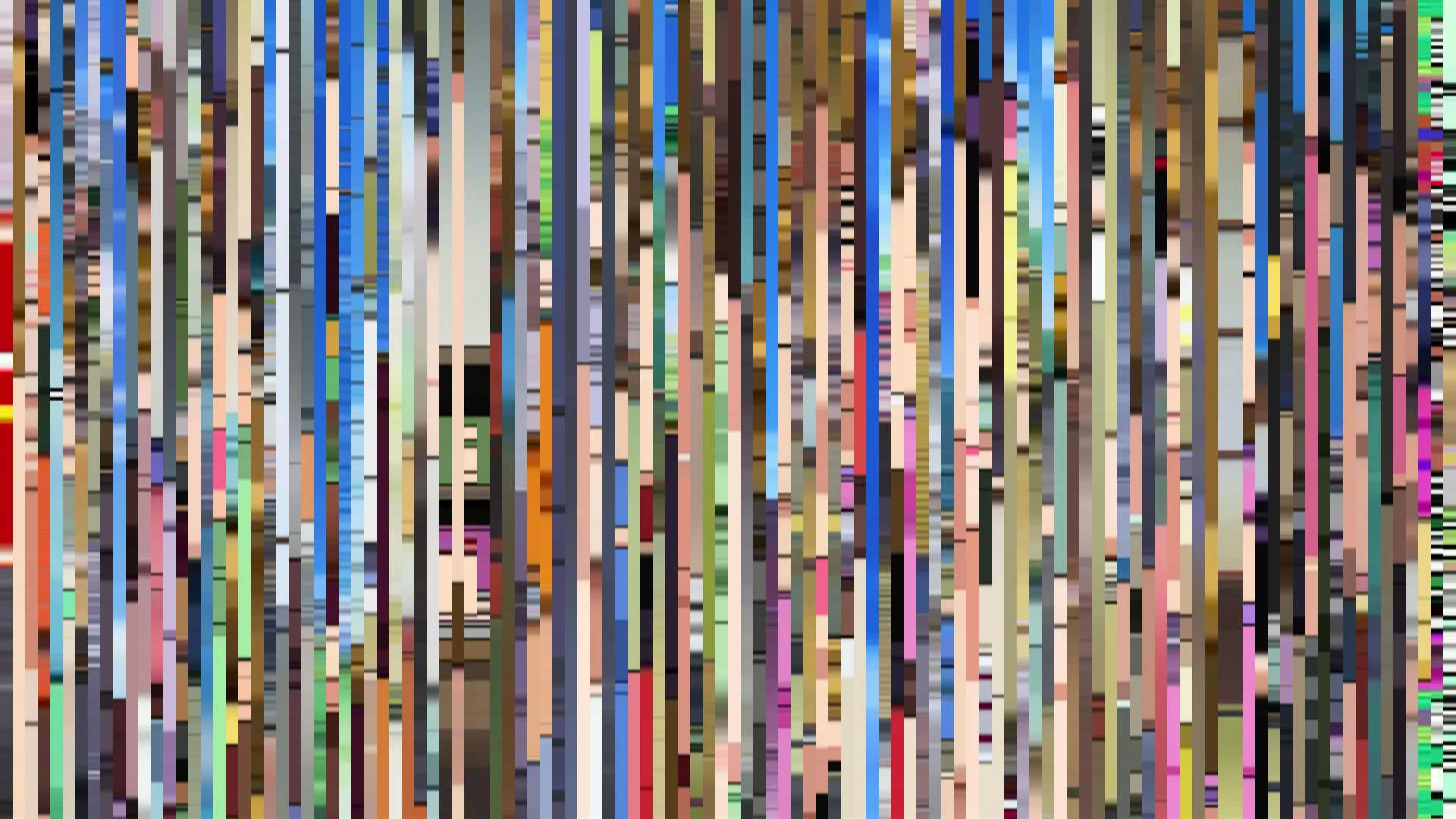
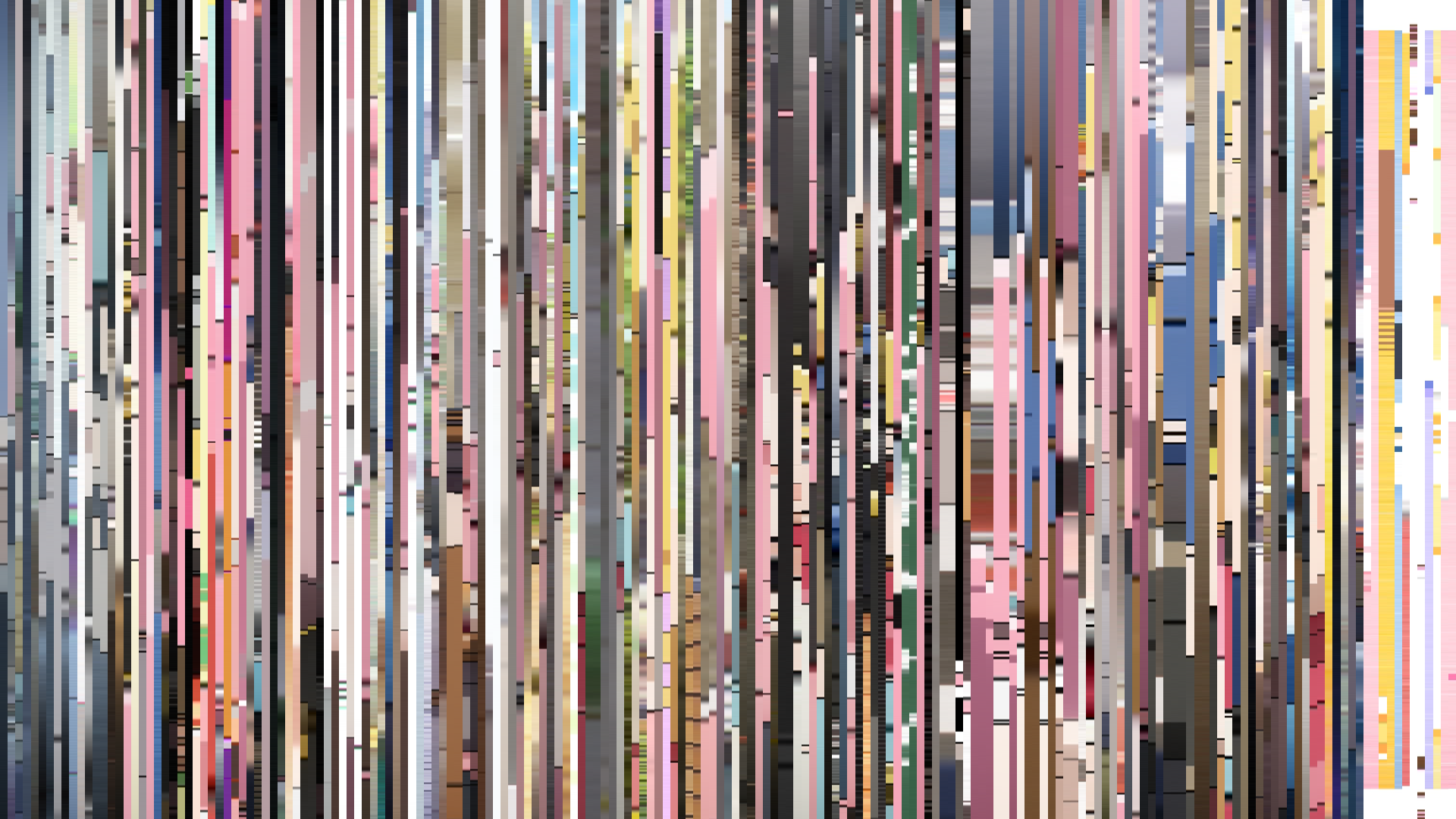
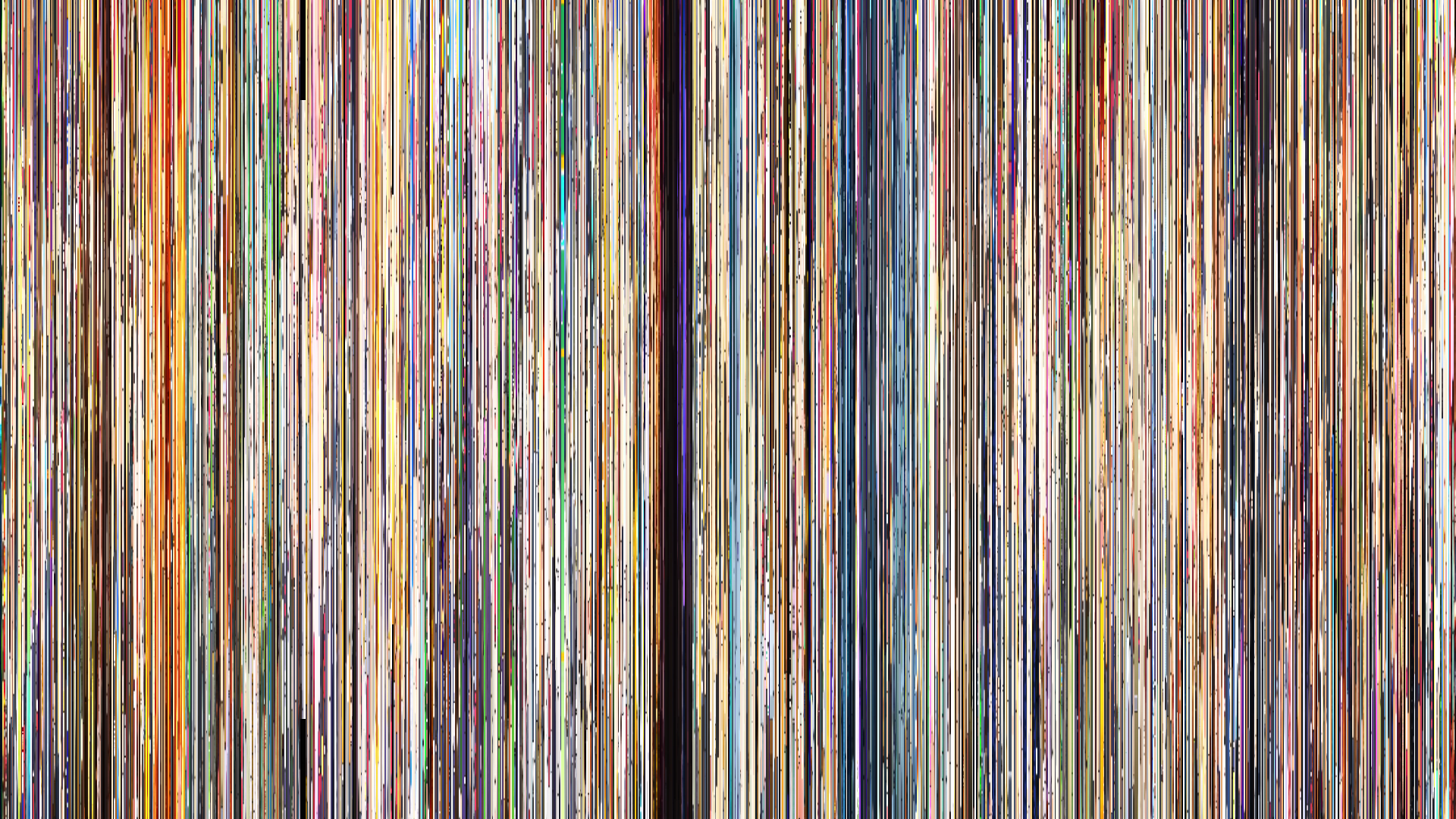
Frame Density Comparison — every 2nd vs every 4th frame
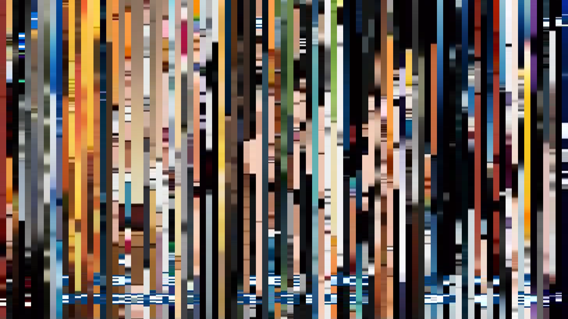
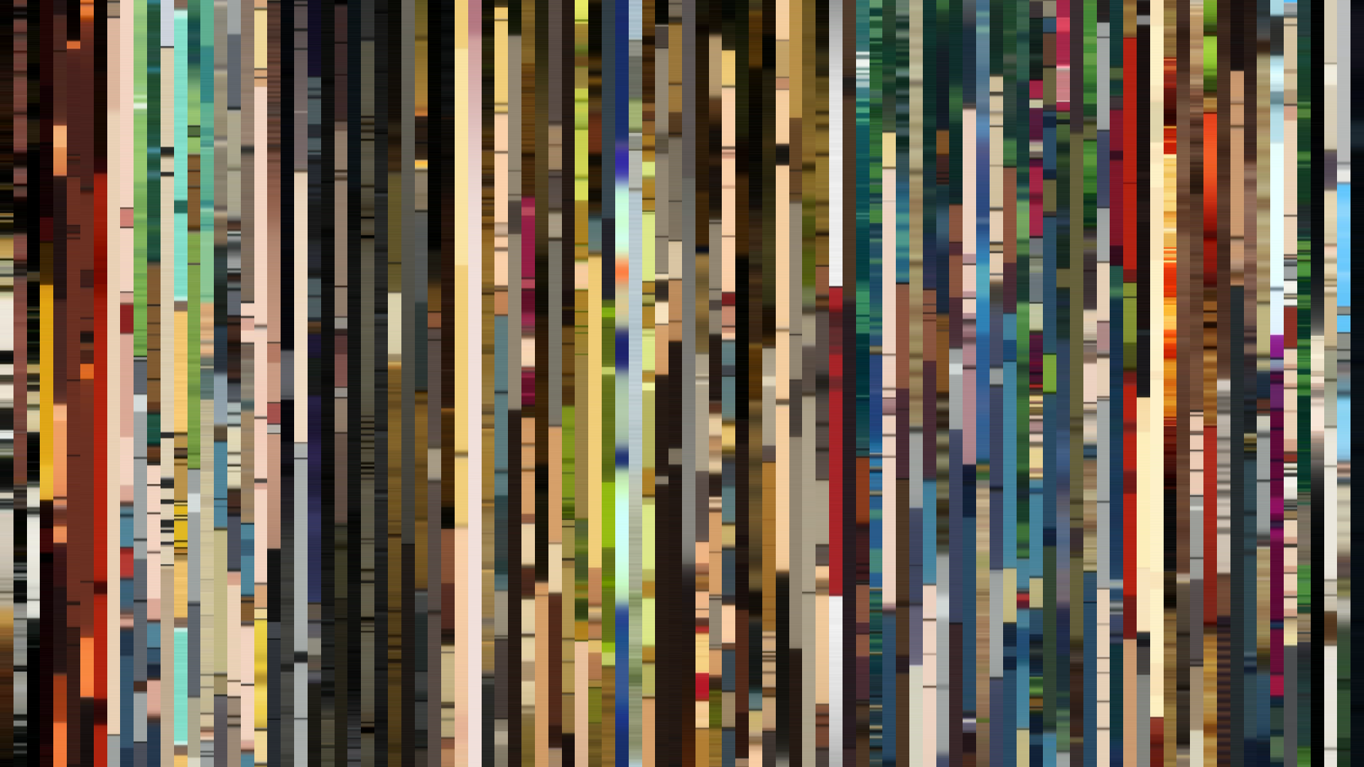
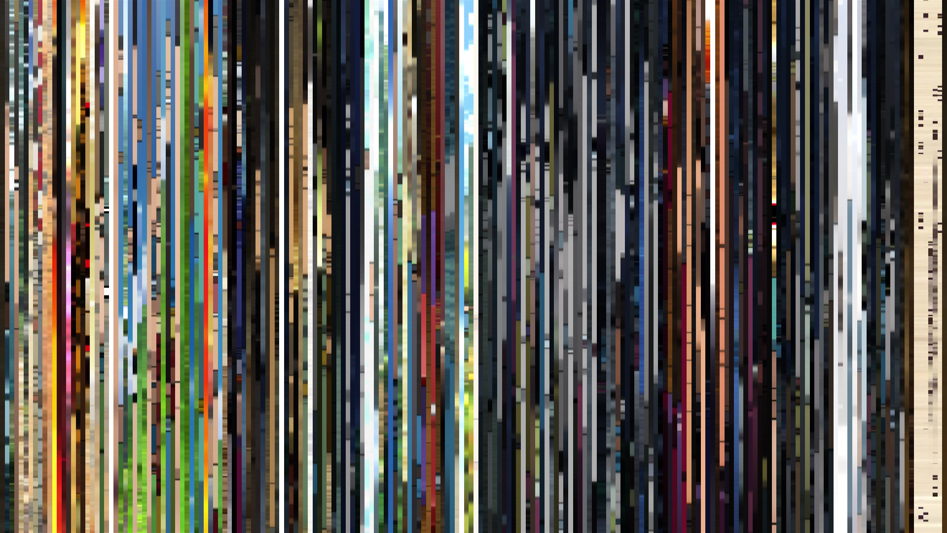
Slice · 15s
Avg · 15s
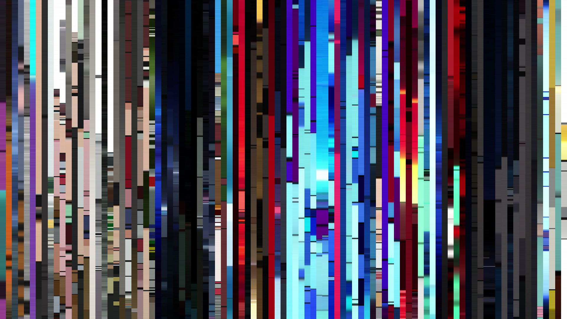
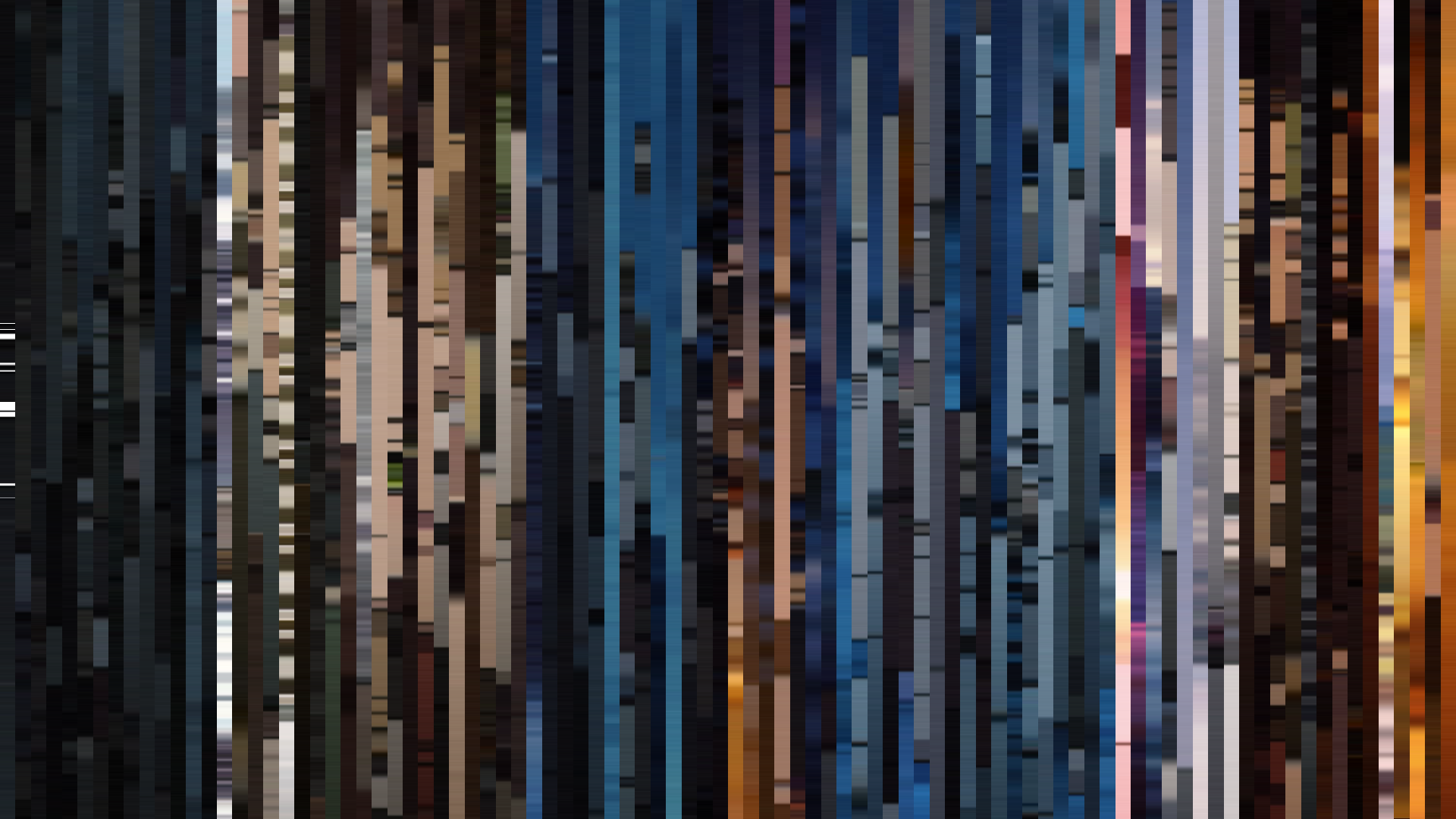
Slice · 30s
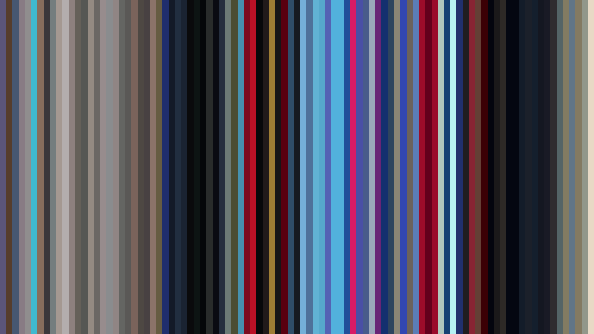
Avg · 30s
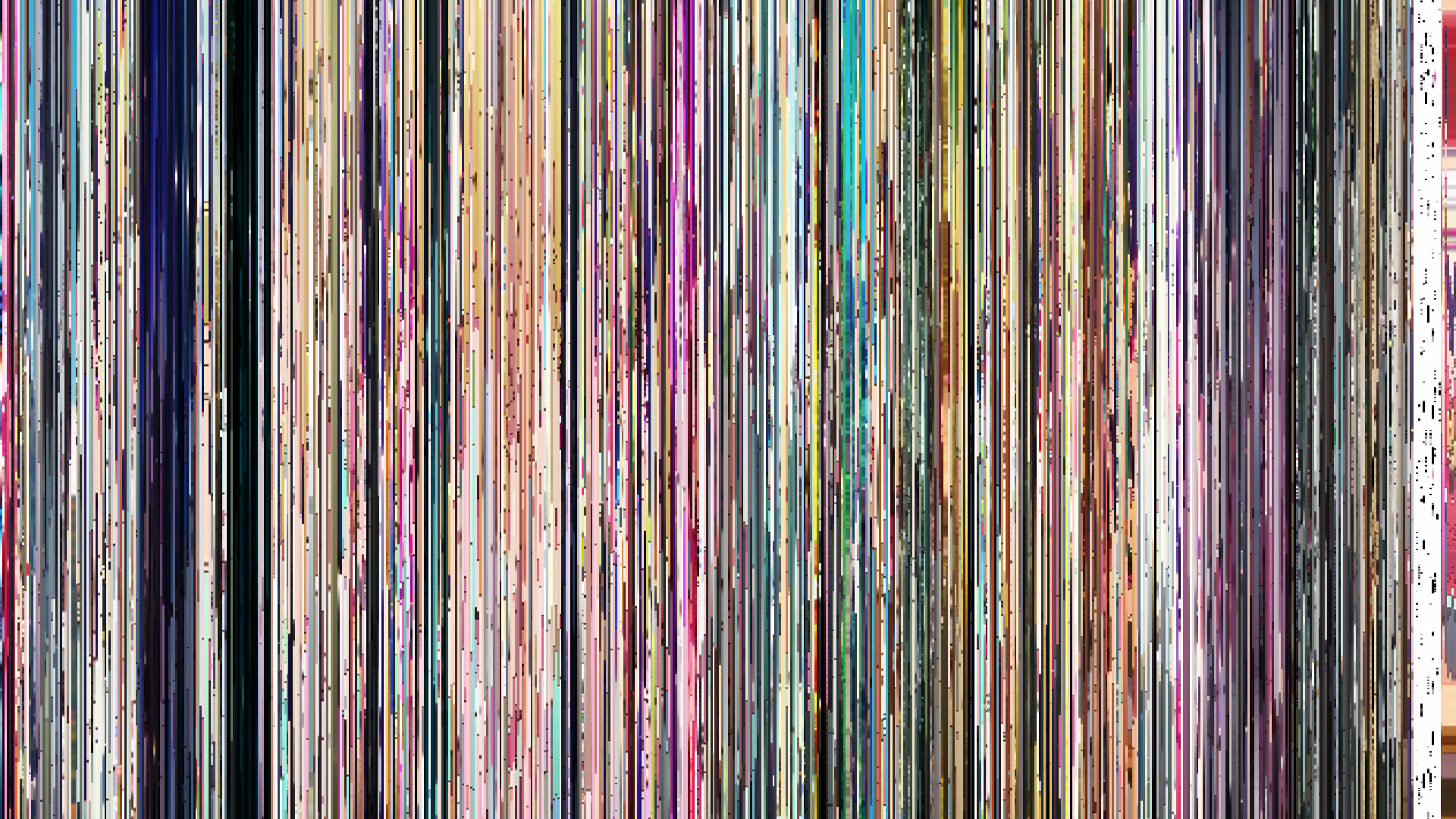
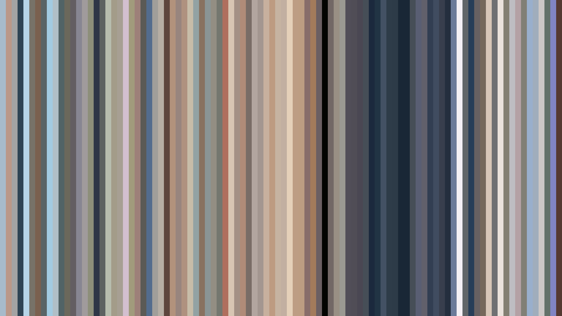
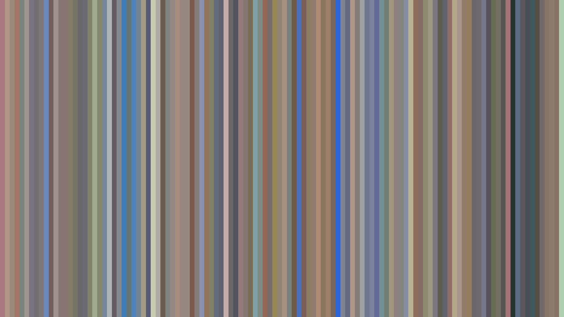
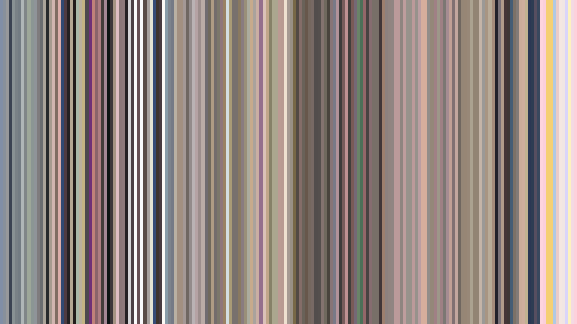
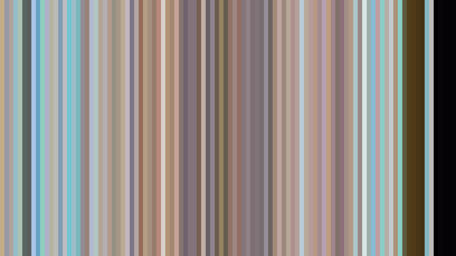
The bright opening arc of *[Oshi No Ko]* Season 2 is a lie—statistically, the middle act is actually brighter, and the closing dims only slightly. That initial ascent is the show’s most effective visual deception: the idol-pop sheen of Aqua’s revenge plan, the studio lights, the manufactured smiles. Dominated by a Red (23%) and Red-Orange (18%) palette that leans toward the desaturated #A59B9A and #E3DCD9, the series wears its warmth like a costume. The reds here are not the passionate blood of a backstage drama but the washed-out fluorescents of green rooms and the flush of exhaustion. Director Daisuke Hiramaki and art director Ayumi Satō construct a color story where saturation is drained by the industry itself—the camera lenses capture everything, but the hues fade under the glare of expectation. The bright opening is the entrance into the lie; the middle act’s slight uptick in average brightness (0.476 to 0.536) is the harsh exposure of the stage, not liberation. By the end, the reds pull toward #635D60 and #1F2127, a quiet crush of ambition into ash.
Brightness Arc (episode progression)
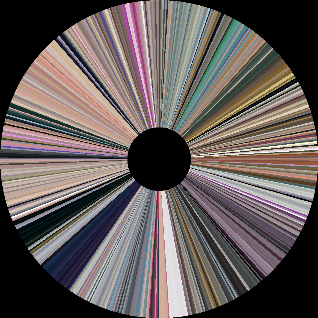
Hue Distribution
Act Breakdown
Opening
0.476
Middle
0.536
Closing
0.501
Avg Brightness
0.502
Avg Saturation
0.266
Warmth
0.548
Color Palette
#635D60
#A59B9A
#926D66
#CEABA1
#1F2127
#E3DCD9
#A08D71
#D8CAAC
3-Act Color Story
Opening
Middle
Closing
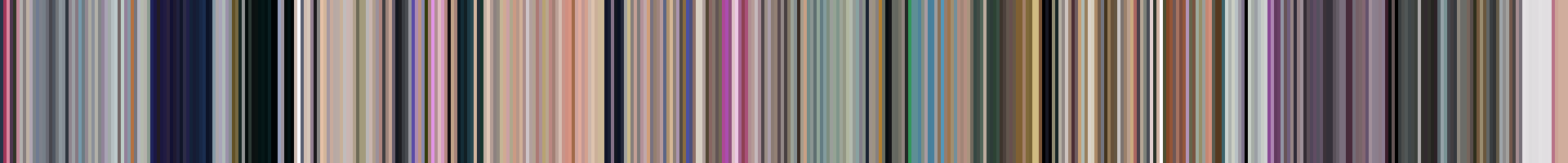
Color Twins
Perceptually nearest palettes — measured in OKLab space, not RGB


The bright opening arc of *[Oshi No Ko]* Season 2 is a lie—statistically, the middle act is actually brighter, and the closing dims only slightly. That initial ascent is the show’s most effective visual deception: the idol-pop sheen of Aqua’s revenge plan, the studio lights, the manufactured smiles. Dominated by a Red (23%) and Red-Orange (18%) palette that leans toward the desaturated #A59B9A and #E3DCD9, the series wears its warmth like a costume. The reds here are not the passionate blood of a backstage drama but the washed-out fluorescents of green rooms and the flush of exhaustion. Director Daisuke Hiramaki and art director Ayumi Satō construct a color story where saturation is drained by the industry itself—the camera lenses capture everything, but the hues fade under the glare of expectation. The bright opening is the entrance into the lie; the middle act’s slight uptick in average brightness (0.476 to 0.536) is the harsh exposure of the stage, not liberation. By the end, the reds pull toward #635D60 and #1F2127, a quiet crush of ambition into ash.